Crafting your brand identity takes time and thoughtful consideration of who you are and what you aim to share with the world. A great way to create your own unique identity is to look at other great brand identity examples for inspiration.

As you develop your brand identity by fleshing out your brand, take a look at the successful brand identities below and be inspired by how they use these identities to communicate who they are and what they do best.
What is brand identity (and why do you need one?)
—
Brand identity is a cohesive collection of branding elements that creates your company’s persona. Branding is the ways your company expresses that persona, like the images on its website or the color palette you choose for its logo. Your company’s brand identity is the collection of ways you express your company’s brand.
Before you can build a brand identity, you need to have a clear vision of your brand. Ask yourself, “how do I want my customers to describe my company to their friends?”. Then take a look at other companies you’d describe in the same terms and see how they’re communicating their brands through design choices like color palettes and choice of social media platforms

Take McDonald’s, for example. Their brand is youthful, value-focused, playful and fun. McDonald’s is the safe choice, the please-everyone choice when you need to buy lunch for an office full of colleagues or a minivan full of cub scouts. That’s McDonald’s’ brand. The red and yellow color palette, the warm, welcoming golden arches, the “I’m lovin’ it!” tagline and the upbeat tone of all their commercials are branding elements. Together, these brand elements comprise McDonald’s brand identity, the image of McFlurries and budget-conscious convenience that comes to mind when you see McDonald’s logo.
Your company needs a brand identity because it needs a way to communicate its brand to the world—and the designers who’ll be in charge of communicating that brand to the world. Don’t make people try to guess who you are and what you’re all about. Show them with a strong, cohesive brand identity.
What makes up a brand identity?
—
All the design elements we’ve discussed are ways to communicate brand identity. These branding elements include:
- Colors
- Shapes
- Fonts
- Image choices
- Voice
These elements are building blocks for a brand identity, and how and where a brand uses them is the mortar keeping them all together. How and where refer to things like the vocabulary and voice used in the brand’s copy, the kinds of packaging the brand uses, the social media platforms it’s on, basically the overall way it presents itself to the world. It’s not just color and font choice, it’s color and font choice together on a specific type of packaging or a deliberate choice of material.
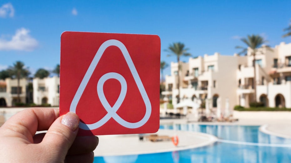
You can see how these elements work together clearly by taking a look at AirBnB and their Instagram. AirBnB’s brand identity is the agile, simple lodging app that fits adventure-seekers’ active lifestyles. Through AirBnB, you can book any kind of lodging from a run-of-the-mill hotel room to a cave, a castle or even a giant bubble. AirBnB’s brand identity puts this all on display with their Instagram account populated with bright photos of people exploring the world in bold, contrasting colors. Their bold pink geometric logo communicates that they’re modern, they’re fun and they’re always on the hunt for the next adventure with a circle nested in an upward facing triangle.
Inspiring brand identity examples
—
Colorful brand identities
The color palette is a critical part of any brand identity. So why are these brands unique? Because instead of using their color palettes as building blocks for their identities, their color palettes are their identities, with branding elements like fonts and shapes coming second.
There are a few different ways to craft a colorful brand identity. Ohnoyumo is a fun, playful brand and Sava Stoic captures that identity in their design that showcases the brand’s four contrasting colors in circles, stretched-out letter c’s and a rounded square logo. The shapes are supporting characters, but the colors are the stars of the show.
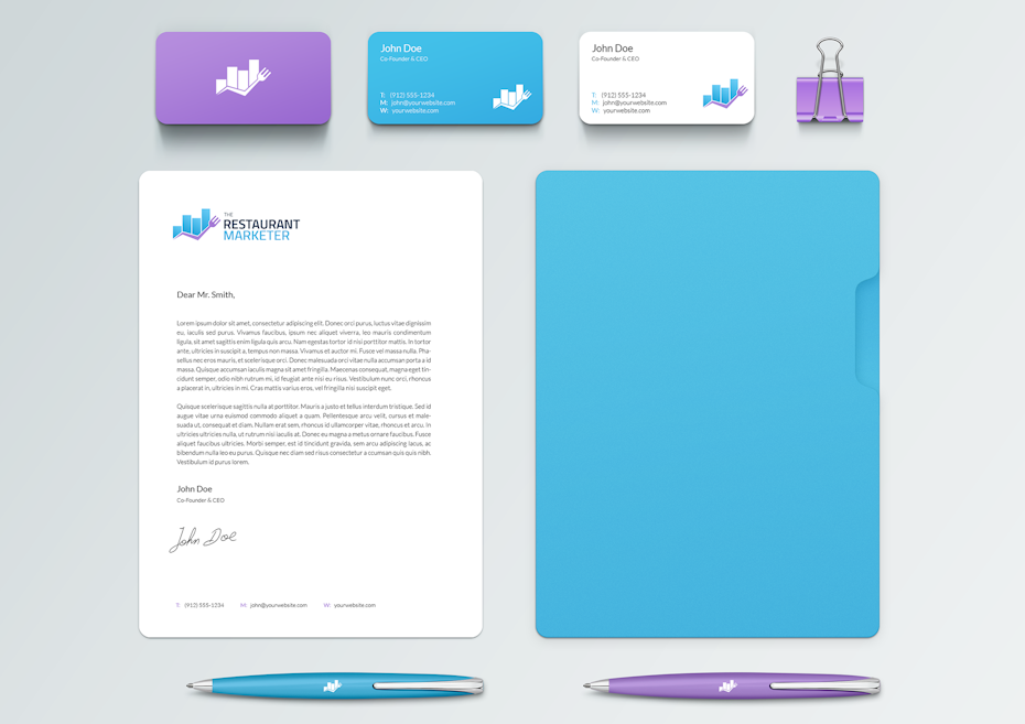
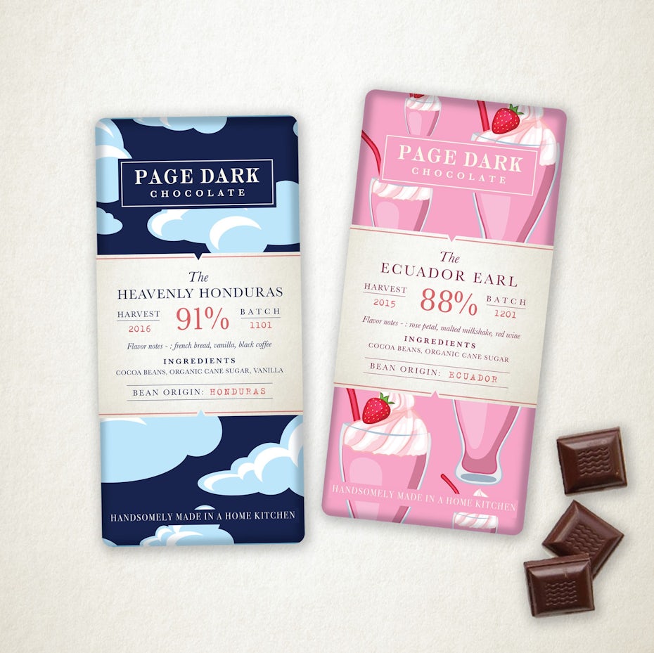
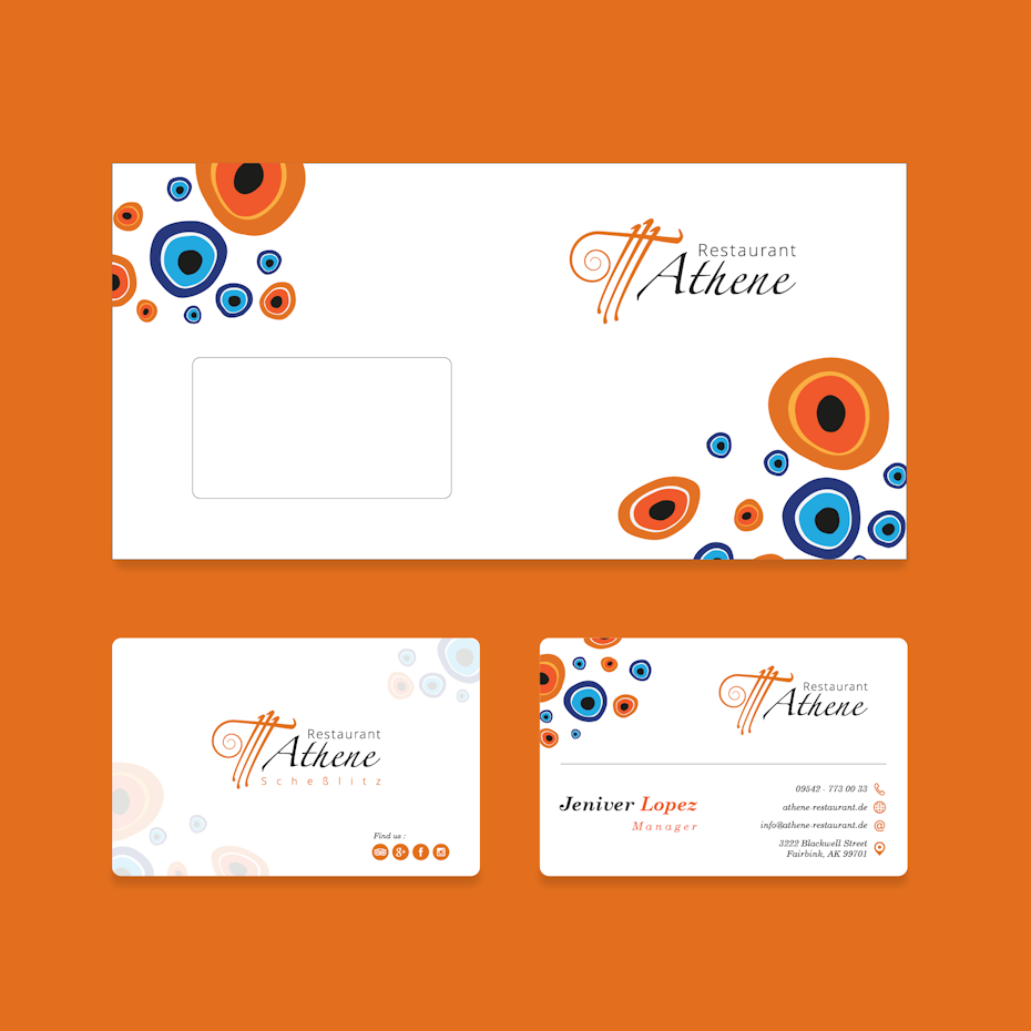
Some companies’ colorful brand identities only use one or two colors. Using a limited color palette makes a brand instantly recognizable, especially when they’re colors that aren’t often seen in the brand’s industry. BryanMaxim creates a memorable purple and blue brand identity in his restaurant marketer design, extending the logo colors to pens, business cards and packaging. Colorful brand identities work best for companies whose colors are distinctive enough to carry the bulk of the branding load, like a millennial-focused jewelry brand with a bold rose gold or Creative Rising, which combines red, blue, yellow, orange and purple in a loud, attention-demanding identity.


Sophisticated brand identities
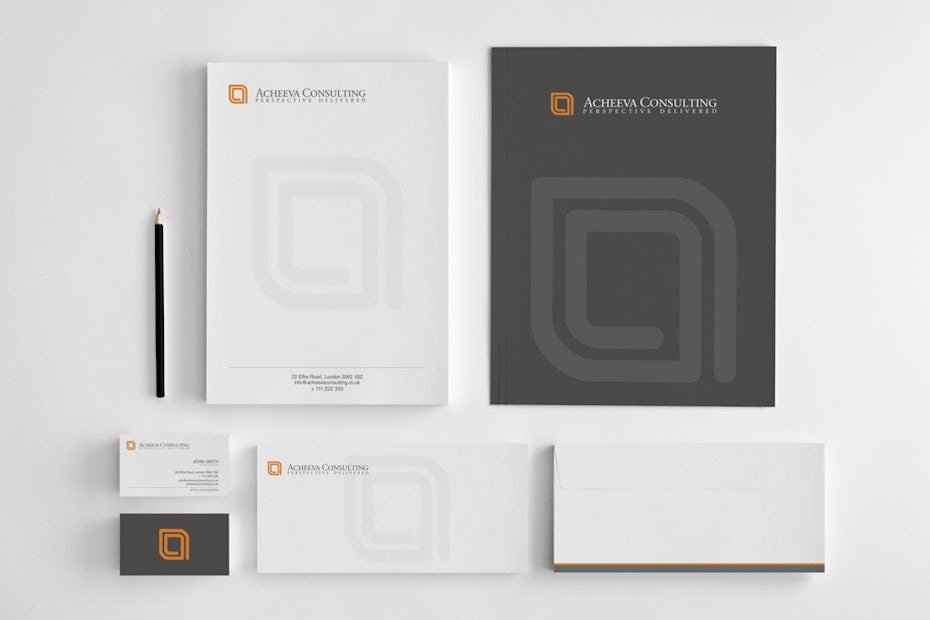
For brands courting savvy buyers, the primary goal of branding is communicating that they’re the sophisticated choice. But companies that aren’t careful can easily overshoot “sophisticated” and land in “stuffy.” The key to keeping it smart, sophisticated and dare we say, sexy, is to juxtapose branding elements that communicate luxury, like glossy black and thin geometric patterns, with more dynamic, even playful elements like bold colors and unexpected fonts. Take a look at how goretta injected zesty orange into an otherwise neutral set of design choices in their brand identity concept for Acheeva Consulting.
Minimalism is another way to communicate a sophisticated brand identity. Simply put, less is more.
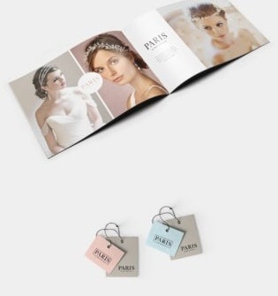
In their design for Paris by Debra Morland, CogitoDesigns sticks to a primarily black and white color palette, but allows for soft pink and blue variations to keep the brand from feeling overly formal or harsh.
The serif font communicates tradition and taste, while the collection of close-up photos of brides wearing Paris accessories communicates that these accessories are the perfect final touch for your perfect bridal look.
Edgy brand identities
Sometimes, the best way to connect with your target audience is to edge out everybody else. Brands that are on the cutting edge, appeal to really narrow niches or build their identities on their uniqueness (and by extension, their target audience’s uniqueness) can use edgy brand identities to build a fast, strong rapport with only the people who can appreciate their unique personas.
Think back to our McDonald’s example—McDonald’s brand identity is the friendly, safe choice that has something for everybody and would never offend a soul. Now contrast that with Burger King’s brand identity. Marketing choices like their recent “Not Big Macs” line in Sweden, the Whopped Detour and commercials featuring the silent, sneaky, slightly creepy King character communicate that they’re not McDonald’s and that they’re not afraid to be cheeky about it.
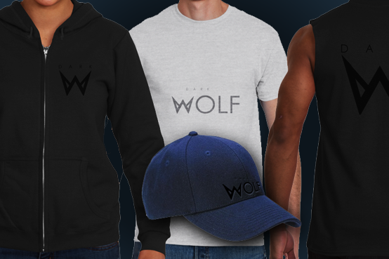
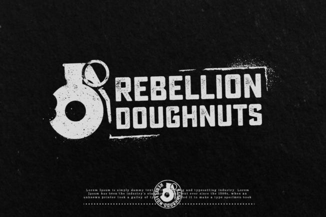
Expressing an edgy brand identity doesn’t always mean mocking your competition or creating a character that makes people uncomfortable. It can mean using an aggressive font, like the W that looks like fangs eBilal uses in their design for DARK WOLF, or alluding to subversive acts, like austinminded does with the grenade image and the spray paint text in their design for Rebellion Donuts.
Playful brand identities
Branding is serious business, but that doesn’t mean you can’t have fun with your brand identity. A playful brand identity is the obvious choice for any game or toy company—but playful brand identities don’t have to stay in the toybox. Any company that connects with consumers by offering them the opportunity to be silly, have fun and laugh can use bright colors, circles, curves and cartoony characters to do just that.
Take Nutra dog probiotics, for example. When most people think of “fun,” they don’t think of dog probiotics. But dog owners want their pets to live long, healthy lives and by making the routine of giving your dog probiotics fun, Martis Lupus’ design encourages owners to take initiative for their dogs’ health. The imperfect, organic pink shapes beside the cartoon dog silhouette make Nutra visually appealing, so it stands out as the “fun” option on shelves beside other, more medical-looking options.

Playful brand identities are an idea choice for brands that cater to the young and young at heart. Beyond toy companies, any company with a whimsical persona, like a vintage clothing boutique or an Alice in Wonderland-themed pastry shop, can use a playful brand identity to show their target audience that they don’t mean business.
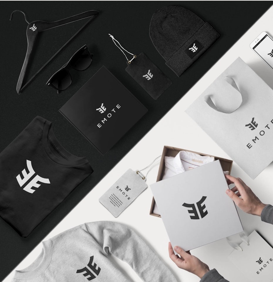
Geometric brand identities
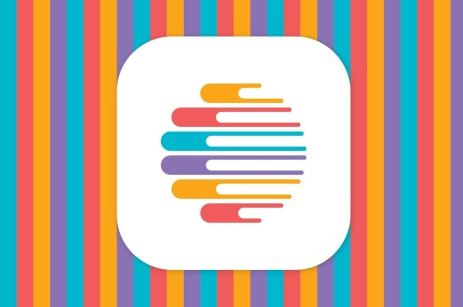
For some brands, geometric patterns aren’t part of their brand identity, but the brand identity itself—just like the brands that elevate their color palettes from foundation to frontman. These companies, like Emote, put their geometric logos front and center. With a geometric brand identity, other branding elements, like colors, need to be fairly neutral. This could mean a basic black and white color palette or a simple palette of just one or two colors. No matter which colors the company uses, they take a back seat to the geometric design.
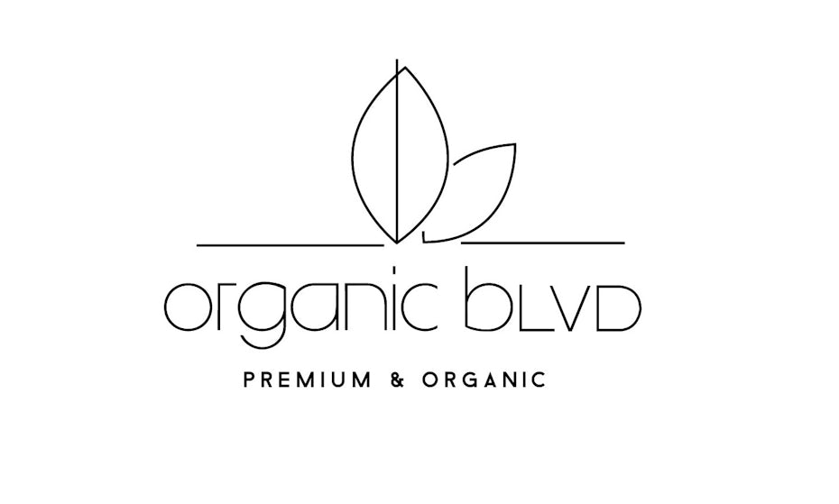
A geometric brand identity communicates precision. This makes it a great choice for a watch manufacturer or a software developer. Depending on how intricate the patterns are, a geometric brand identity can also communicate sophistication and luxury or simplicity and straightforwardness. It can even communicate both, as Fe Melo’s design for Organic Blvd does with its simple, geometric logo and thin, minimalist font.


Value-focused brand identities
Value-focused does not mean cheap. When a company crafts their brand identity around how their prices compare to their competitors’, they focus on the value they provide buyers. Though this can mean charging less than their competition, it can also mean charing similar prices but providing much more value.
Value-based brand aesthetics are largely the opposite of sophisticated brand aesthetics. Instead of neutrals and metallics, value-focused brands tend to use primary and secondary colors. Instead of complex geometric patterns and intricate illustrations, value-based branding gets right to the point… and doesn’t waste anybody’s time with serif fonts. Pepper Pack Design’s brand identity for Clean Cut Handyman Designs encapsulates everything a value-focused brand can use to show consumers that they’re the fiscally responsible choice: a simple, geometric logo that shows you exactly what the company does, in a color that’ll catch your eye and a quick description of what the company does underneath.
Rather, it’s recognizing that for a lot of consumers, price is the determining factor in whether they ultimately do or don’t buy a product. For brands that position themselves as the affordable option in their markets, brand identity has to be carefully crafted to communicate that they provide a quality product at a low price and that they’re not just “the cheap option.” This could mean showcasing that they offer options for consumers at all budget levels or that they offer a customizable experience so buyers can buy only what they want, rather than expensive products/packages that make them pay for things they don’t want or need.


Developing your unique brand identity
—
Ready to start building your unforgettable brand identity? Take the brand identity examples above as your starting point. Start with your brand values and voice. Think about your perfect color palette. Once you’ve got your colors down, determine which shapes and fonts can show the world what you’re about most effectively. With all of these together, you’ve got your brand identity.
Want more inspiration? Check out some awesome brand guideline examples here.
The post Beautiful brand identity examples to inspire you appeared first on 99designs.
No comments:
Post a Comment