Friday, February 28, 2020

A brief history of branding

We’re living in the Golden Age of Branding. There are more ways than ever for businesses to carve out their niche in the marketplace and connect directly with their customers and fans. But the history of branding actually goes back centuries. This discipline and art form has evolved over the years to become an essential part of building any successful business.

history of branding: archeologist illustration
Illustration by OrangeCrush

Branding actually begins in the 1500s, but major shifts took place in the 19th and 20th centuries. Through decades of experimentation and technological advancements, brands have learned how to break through the clutter and capture the attention of their customers, turning indifferent consumers into brand enthusiasts. Learning this fascinating backstory is a vital step in developing your own brand.

In this article, we’ll explore the history of branding: how it got its start, how it’s evolved over time and where it’s headed in the future.

  1. 1500’s: The beginnings of branding
  2. 1750’s-1870’s: The Industrial Revolution
  3. 1870’s-1920’s: The era of invention
  4. 1920’s-1950’s: Brands on the air
  5. 1950’s-1960’s: The birth of modern branding
  6. 1970’s-2000’s: Branding grows up
  7. Today: Beyond basic branding

1500’s: The beginnings of branding

In Ancient Norse, a Scandanavian language, the word “brandr” means “to burn.” Originally, a brand was a burning piece of wood and later described a torch. By the 1500s, it became common to brand cattle in order to show ownership.

Diagram of ancient cattle brands
A diagram of ancient cattle brands via Texas State Historical Association

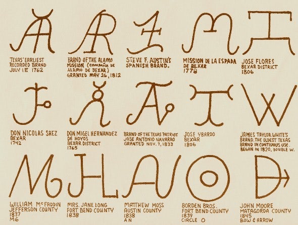
Right from the start, branding was all about making your mark, both literally and figuratively. Each branding mark was unique to the cattle ranch itself. They were simple, distinctive and instantly identifiable—the tried and true pillars of any great brand. Think of these icons like the first product logos.

1750’s-1870’s: The Industrial Revolution

Registered in 1884, Samson Ropes is the oldest US trademark still in use today. Via The Council of Industry

Europe and the United States transformed during the 18th and 19th centuries with new manufacturing processes. This historical time sparked the advent of the mass production of goods, a result of increased efficiency and technology in the workplace. More products meant more choices for consumers. Since companies now had more competitors than before, there was a sudden need to stand out and take ownership.

Enter the trademark. A trademark consists of words, phrases, symbols, designs, shapes, and colors legally registered or established by use as representing a company or product.

Registered trademarks rose to prominence in the 1870s, and the U.S. Congress passed its first Trademark Act in 1881. This was the first instance of branding as intellectual property, giving a way for companies to officially claim their products as their own and combat copycats and rivals.

1870’s-1920’s: The era of invention

The turn of the 20th century was a time when technology began to transform everyday life and we got a glimpse of what our future could hold. The Wright Brothers’ historic, inspiring flight in 1903 became an archetype for the creativity, innovation, and imagination that defined the era.

Black and white Coca-Cola ad
1920s Coca-Cola advertisement. Via Coca-Cola

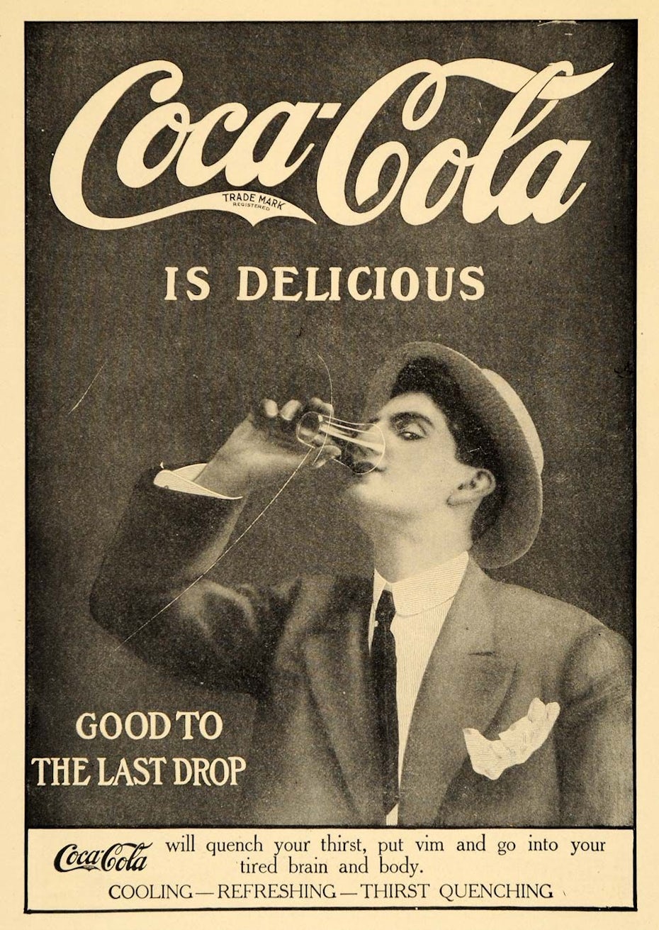
The century began with the birth of several iconic companies that would eventually become leading brands around the world. Coca-Cola (introduced in 1886), Colgate (1873), Ford Motor Company (1903), Chanel (1909) and LEGO (1932) were all first-of-their-kind pioneers, trend-setters, and brand-builders.

At the time of their introduction, these brands were ahead of their time. Ford Motor Company offered American-made, gasoline-powered vehicles before anyone else, and Chanel offered suits for women at a time when they’d only been thought of as menswear. These brands were inventive and the first of their kind, which made them instant industry leaders.

During the era, brands made their mark through newspapers and magazines. Print provided a space where brands could use words, logos, and illustrations to differentiate themselves. Advertisements were often very informational and described exactly how products worked and what they could do.

1920’s-1950’s: Brands on the air

Now that production was more efficient, and companies were finding value in officially taking ownership of their products, the next logical step was talking about them in a setting where potential customers would listen.

At the beginning of the 20th century, most radio stations were operated by radio equipment manufacturers and retailers that mostly used their stations to promote their businesses. By the 1920s, radio had become much more popular, and station owners looked to advertising as a way of making their businesses more sustainable. Branding came to life through radio jingles, catchphrases and targeted messaging.

The first paid radio commercial aired in 1922 on WEAF in New York, advertising a new apartment complex in the area. By 1930, almost 90% of radio stations in the United States were broadcasting commercials. During this time, manufacturers would not only sponsor advertisements, but entire programs as well. This took brand identity to a whole new level. It became audible, memorable and relatable.

After radio came television. On July 1, 1941, Bulova Watches aired the first television commercial before the broadcast of a New York baseball game. It was just 10 seconds long and seen by only a few thousand people. Just like radio, as television rapidly grew in popularity, companies began taking advantage of the new medium by sponsoring shows and creating commercials. With television, brands could now come into people’s homes with visuals, words, sound and music, bringing them closer to consumers than ever before.

1950’s-1960’s: The birth of modern branding

The post-World War II era was an important time in manufacturing consumer packaged goods. During this time, companies developed the discipline of brand management because of the requirements of more marketing. Brand management focuses on the development and expression of an identity, while marketing is rooted in the strategic techniques which it takes to promote a business.

Think big, loud, highly visible forms of brand recognition, like billboards, subway signs, distinctive product packaging and TV ads, which were enhanced with the creation of color TV in 1953.

Bloomingdale’s paper bagVintage Wheaties box

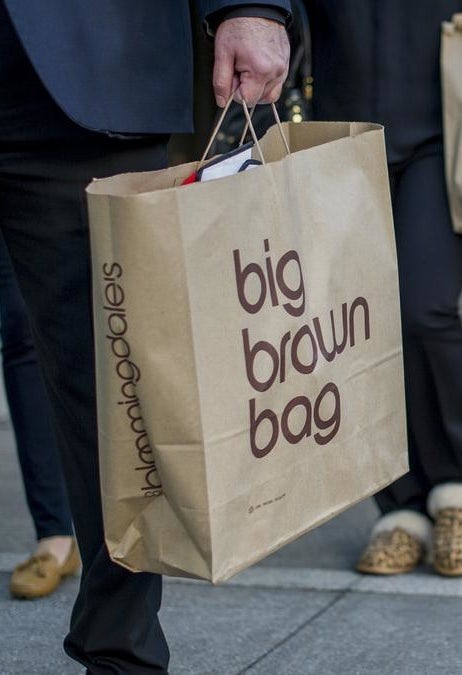
Another famous instance of tangible branding is the Bloomingdale’s shopping bag. The retailer started making its brown paper bags in 1973. Now, it’s so iconic that it is not only still their bag of choice, but also offered in several reusable keepsake iterations.

1970’s-2000’s: Branding grows up

As brands evolved over the decades, they needed to freshen up a bit or even take on a new identity to stay relevant. In the need to reinvent themselves, the end goal is typically a desire to attract a new audience. We see rebranding in many forms, both from corporations and individuals.

walmart logo evolution
The evolution of the Walmart logo, via Walmart

Consider how the Walmart logo has lightened up over the years. It’s become more approachable and fresh. And along with the logo, the store has also upgraded its employee uniforms in recent years. The change feels welcome, and in the case of Walmart, rebranding was a natural, much-needed step in the evolution of its brand identity.

Revamping campaign slogans can also play a role in reinventing a brand and taking it to the next level. The fast pace of modern branding gives brands a need to constantly stay ahead of their competitors. Sometimes, all it takes is a great slogan, even if the brand is already well-known.

Think about L’Oreal’s “because you’re worth it,” M&Ms’ “melts in your mouth, not in your hands” and Wheaties’ “breakfast of champions.” Each of these slogans took an already prominent brand to a new, more recognizable place in its journey. The brands became not just recognizable, but also conversational.

Today: Beyond basic branding

A stunning brand design by RedLogo

We’ve seen how far we’ve come. So where are we now, and where do we go next?

Looking to the future, it’s important to note that we have a lot more brand options now than we used to, and someone is always being chased by a competitor. It can be harder to stand out, so it’s important to come up with ways to break through the noise.

Today’s branding, marketing, and advertising practices differ from historic techniques in many ways. TV advertising trumps print advertising, but social media advertising outdoes them all. Advertisers have more power (like the ability to target a demographic in a Facebook ad), which can dramatically increase brand awareness.

While we certainly have advanced technology to help make a brand stand out, we also face major competition that wasn’t the case many years ago. In today’s culture, brand reputation isn’t only word of mouth: it’s word of review. Customer reviews on Amazon, Yelp, Google and Facebook now have the power to influence a brand’s perception. Buyers make decisions based on the rating of the product they’re interested in. Now more than ever, reputation is everything.

warby parker teamstarbucks mobile app next to cup

A brand like Starbucks has focused on mission-based branding. Starbucks’ mission statement is, “To inspire and nurture the human spirit—one person, one cup and one neighborhood at a time.” That’s an ambitious goal for what is ultimately a drive-thru, fast-food chain, but they do it well. With an engaging mobile app, a popular customer loyalty program, signature colors and an unmistakable logo, Starbucks has built a devoted customer following all based around their singular mission.

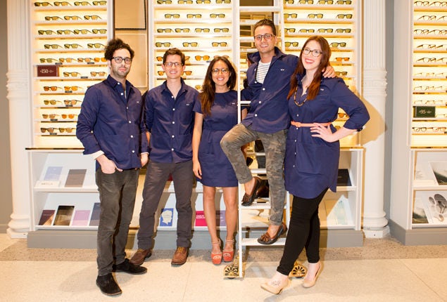
Similarly, Warby Parker became a breakout brand with its unique, meaningful brand promise: with every pair of glasses purchased, a pair is distributed to someone in need. After only 10 years in business, the brand was valued at $1.7 billion. Through social responsibility and great branding, this eyewear brand suddenly feels cooler than Ray-Ban.

Brands are also capitalizing on the person-to-person experience of their brick-and-mortar retail stores. Picture how many significant brands of women’s activewear and athleisure clothing exist right now (Lululemon, Athleta, Fabletics, Under Armour, Adidas by Stella McCartney). These brands have to get creative, and many stand out through community involvement and engagement. For example, Lululemon boosts its brand by offering free yoga classes both in their stores and online.

share a coke - coca cola ad campaign
#ShareaCoke campaign via Coca Cola

Futuristic branding is convenient and digital-focused. We’re living in a world of user-friendly apps, vanity URLs and a never-ending supply of custom hashtags. Brands are becoming more data-driven and strategic.

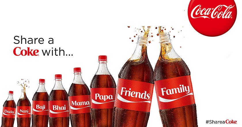
Just look at how Coca-Cola nailed the #ShareACoke campaign. Through a simple change in product packaging, they connected with customers on a personal level, all the while encouraging them to generate content—and by that, we mean using the hashtag over 500,000 times. It helped the brand stay connected, and the future of branding will continue to see constant connectivity as a driving influence.

Make your mark in the history of branding

While innovation and technology will always drive the future of branding, many of those early principles of branding will always stay the same. Consider simple, long-standing concepts like brand recognition and customer loyalty. These concepts have withstood the test of time.

Need help branding your business?
Our designers can create the perfect look for your brand.

The post A brief history of branding appeared first on 99designs.

Wednesday, February 26, 2020

What is a logo?

At the very basic level, logos are symbols made up of text and images that help us identify brands we like. But they can be so much more! A good logo is the cornerstone of your brand. It helps customers understand what you do, who you are and what you value. That’s a lot of responsibility on a tiny image! Here’s the definition of what a logo is and how to make the most of it.

what is a logo: graphic pointing out elements of a logo
What is a logo? Here are the main elements logos consist of. Logo by R2.

What is a logo?

A logo is a symbol made up of text and images that identifies a business. A good logo shows what a company does and what the brand values.

Logo design is all about creating the perfect visual brand mark for a company. Depending on the type, a logo usually consists of a symbol or brandmark and a logotype, along with a tagline.

What does a logo do?

Logos do something aside from look pretty, right? Yes! Logos serve many functions.

A logo makes you stand out from the competition

Perhaps the most fundamental function of a logo is giving your business a unique mark that differentiates you from other businesses.

Green cactus logo design
Logo design by am121.

This is especially important if your business has competition (which 99.9% of them do). Before you get a logo for your business you’ll want to research what your competitors’ look like so you can position yourself.

Check out how the Cactus Dental logo separates themselves from the sea of cliche tooth logos in the dental industry by taking a feature unique to their geography and turning it into a toothbrush.

Of course, you don’t want to be so unusual that potential customers don’t understand your brand.

A logo identifies key information about your business

wildhearts company branding
Logo design by Milica2505 for Wild Hearts.

Along with demarcating your business, a good logo also provides your customer with some crucial information about your company: it can communicate the industry you exist in, the service you provide, your target demographic and your brand values.

For example, a company might use circuit imagery into their logo to show that they operate in the software industry. Or they might use a specific color to communicate they are committed to being green/environmental. Or they might use a stylish font to highlight that they are luxurious. Check out how Wild Hearts uses an image of a book with a heart in it to show that their business specializes in romance novels

A logo builds brand recognition

24/7 hip hop producer logo
Logo design by BATHI.

Logos also leave a visual impact that reminds your customers that, well… that you exist!

In other words, logos can create strong visual associations with a business. This association helps customers keep your brand in mind.

Think about brands like Nike or McDonalds, whose logos are so ubiquitous that they can be instantly recognized with or without the name attached. It’s no surprise that logos are such a central part of brand identity.

What are the elements of a logo?

Check your inbox
We've just sent you your free logo ebook.
Want to learn how to create the perfect logo for your brand? Get the free logo ebook!
Enter your email to get the ebook, along with creative tips, trends, resources and the occasional promo (which you can opt-out of anytime).
Zionks! Looks like something went wrong.

Now that we know what a logo does, let’s look at what they are made of. Star-dust, chocolate chips, recycled board games? Close but not quite!

While there is no definitive answer, we can break down some of the common logo design elements. These elements work together to form 7 types of logos.

Typography

When it comes to form, a logo will usually contain some kind of typographic element. This can range from a monogram-style single letter, to an abbreviation or the full title of the business.

Ever South brewing logo design
Logo design by SpoonLancer for Ever South Brewing.

Imagery

Sometimes typography is accompanied by symbols or icons. These can be representative or composed of abstract geometric elements.

In certain instances, logos also include decorative elements such as line work or visual punctuations—such as small stars or dotted lines—that don’t necessarily create a specific, stand alone image.

The Ever South Brewing logo contains typography accompanied by a geometric, illustrated symbol of a sunset with a stalk of grain growing upward.

Synergy geometric logo design
Logo design by artsigma.

Color

Beyond form comes color. Logos can be black and white, monochrome or multicolored. Multicolored logos often have palettes that are either analogous, meaning colors of similar hue, or complementary, meaning colors of distant or opposite hue.

The Synergy example contains a full color, complementary color palette. For more on color, check out our Logo colors article.

Context

In some instances, a logo is also defined by the context in which it is used.

House Rules Board Game Bistro Logo
Logo design by Enola for House Rules Board Game Bistro.

With that said, it’s important to think about when and where logos can be applied.

Commonly we see logos online, on business cards, in storefronts, advertising and it print. But your business might have specific needs.

In the example on the left, the circular design is a perfect fit for drink coasters!

Static or dynamic elements

One fork in the road in logo design worth mentioning is the decision to create a static logo—one which looks the same everywhere it exists—or a dynamic logo—one which changes depending on its context. Notice how the example interchanges elements depending on the application.

lion logo
Logo design by RedLogo

What makes a good logo?

The answer: any number of different things. Let’s look at some real-life examples and talk about which elements they employ to successfully communicate their messages.

nooStance logo
Logo design by artsigma.

The nooStance logo is composed of simple typography and an illustrated mascot. It uses a multi-colored, complementary blue and yellow color palette. While the overall design is strong, this logo is largely successful in its unforgettable cuteness!

craft beer bar logo design
Logo design by beko™ for Tapp’d.

The Tapp’d logo implements an illustrated tap into the negative space between the letters of the business name. This simple but clever concept separates this logo from other businesses, makes it memorable and lets the customer know that this is a place to get fresh beer!

Lieferbrau family brewery logo
Logo design by Virtuoso” for Lieferbräu brewery.

The Lieferbräu Brewery is composed of ornate typography and decorative line-work. While the decorative grains hint at the fact that this is a brewery, the message here is class. The design is elegant and sophisticated—there’s no mistake what the brand values are here.

Rhythms app logo design
Logo design by ks_projekt for Rhythms.

Some businesses have a name that plays a part in explaining the business and doesn’t need a logo that is overly designed. In the example above, the name “Rhythms” helps let the user know that this is a beat-making app. In this case the designer has filled in the blanks with some colored geometric broken lines. These elements help to communicate the idea that there are tracks and rhythm involved. Ultimately the design does a pretty good job of clueing in the user to what they are downloading.

Skillzy logo design
Logo design by vallt for Skillzy.

Skillzy is an online education platform. Their monochromatic logo contains simple text accompanied by a symbol of an upside-down umbrella. The logo is simple and attractive. The meaning of the upside down umbrella is unclear, but it is perhaps the mystery that intrigues the viewer. Is it a spiritual reference to possession? It sure got us thinking! Whatever it means, this simple combination of elements separates the business and leaves an unforgettable mark.

Artisan Pies text logo
Logo design by Bokisha for Artisan Pies.

Some of the most successful logos are not conceptual or complex at all. In fact the Artisan Pies logo featured above is perhaps the most perfect possible solution for this business. The name tells the viewer exactly what the service is, the design communicates their no-BS brand values and the serif typeface lets you know that they take pies seriously! Not to mention the name is so simple that it’s hard to forget!

Running hot dog logo design
Logo design by Michael4682 for Fatima.

The Fatima Frankfurter 3k/5k Walk-Run uses a running hot dog mascot to tell the story. In some cases obvious is good, especially for a periodic event that wants to pull in as many people as quickly as possible. Don’t be afraid to spell things out for your target demographic.

Sketched farm logo design
Logo design by IrfanSe for Brollywood Farm.

The Brollywood Farm logo uses an ornate-yet-simple monochromatic design featuring an illustration of a farm. Not only does it quickly let the viewer know that it is a farm logo, but the vintage look communicates that the brand values are simple and rustic.

Indian Photo Printing company logo
Logo design by bo_rad.

The PrinstaIndia uses a complementary monochromatic design that proves that color choice in logo is important! In this case a CMYK palette is used which has strong connotations with printed media. It lets the customer know that if they are looking for printing services that PrinstaIndia can help them.

How is a logo different from branding?

One common confusion we see comes in understanding the difference between logos and branding. It sounds complicated but the difference is quite simple: Your brand is the set of perceptions people have about your company. In other words, it can be thought of as the big-picture impression that your company leaves on the customer. This impression can be left by many things, such as your advertisements, commercials, customer service, and yes your logo as well.

That’s right, your logo is part of your branding (not the other way around). For example, while the Apple logo is iconic and instantly recognizable, it’s not the only thing that creates their elegant, easy-to-use and customer-friendly brand identity. Those qualities are expressed through their design choices in billboard ads, commercials, web design and on-site store layout. The logo simply holds the visual association to those things. Plus let’s face it, Apple just wouldn’t be the same without that cute, partially eaten Apple.

Want to learn more about logo design? Learn how to design a logo.

Ready to get a professional logo for your business?
A logo design contest can get you dozens of ideas from designers around the world.

This article was originally written and published in 2017. It has been updated with new examples and information.

The post What is a logo? appeared first on 99designs.

The Brand Identity Prism: what it is and how to use it

The Brand Identity Prism is a well-known marketing model, also referred to as Kapferer’s Brand Identity Prism. It is a hexagonal prism that represents the six key elements that make up brand identity.

The Brand Identity Prism was a major contributor to our understanding of the role of storytelling in branding. It remains an indispensable aid for businesses looking to reinforce their brand in ways that are consistently reflective of their origins and core values.

Diagram of Kapferer's brand identity prism
The 6 elements of the Brand Identity Prism

In this article, we will break down the 6 elements of the Brand Identity Prism and help you implement them into your brand as a whole.

Your guide to the Brand Identity Prism

What is the Kapferer Brand Identity Prism?

The Brand Identity Prism is a concept developed in 1986 by Jean-Noel Kapferer, a professor of marketing strategy, in order to visualize how a brand is expressed through specific facets. Kapferer honed in on six vital characteristics of brand identity and decided that the best way to represent how they interact as parts of a whole was by putting them in a prism form.

A brand has very specific characteristics that identify it beyond its logo and other visual design materials. According to Kapferer, the brands that manage to perfectly harmonize and express these characteristics are the ones that succeed in building a strong and distinctive brand identity. The prism’s purpose is for brands to recognize the parts of their identity and make them work together to tell the brand’s story.

The 6 parts of the Brand Identity Prism explained

For the Brand Identity Prism to work as a whole, you have to start with its individual parts. We’re going to walk you through each facet of the prism and then show you how to apply these building blocks to your own brand.

Airbnb photo ad showing a man staying in a loft hotel
Airbnb’s “Live there” campaign speaks to what Airbnb is known for, homes away from home. via Airbnb

1. Physique

Physique describes the physical characteristics of your brand—that is, everything your customers can visually perceive about you. Logo, style guide, iconography, color palette, and the presentation of the product itself all go into this category.

Airbnb, for example, has a service in place of a physical product. This means their physique is important to emphasize because a tangible visual is much easier for their audience to grasp than a concept. So instead of a product, their ads show the end result of using their service: people comfortably existing in spaces that are not their homes but may as well be.

Together, all the visual elements create one consistent, attractive look that makes up their brand’s physique.

2. Personality

If physique is the face of your brand, personality is the voice. Your brand personality not only addresses what you say but how you say it, and it is not limited to verbal communication.

Personality embodies everything from font choices to the tone of any communication. This is sometimes described as a brand’s “human characteristics.” It should answer the question “who are you?” If a person was sitting in a room with your brand, what would they see, hear and discuss with you?

Nike ad showing a strong photo of an athlete paired with tagline
Nike’s brand personality is easily recognizable as confident, inspiring and fearless. via Nike

Nike’s brand personality, for example, is consistent from its famous “swoosh” to the way athletes are positioned in a frame alongside assertive text. It is confident, competitive, risk-taking and athletic. The story it tells is one of triumph, no matter the score. Nike achieves consistency in its brand personality with the athletes they choose to portray, the positions they take, their font choice and their sparse, commanding language.

3. Culture

Culture is your brand’s origin story. Where was your brand born? Where does it live? What is the belief system and values it ascribes to and why?

“Culture” is a much discussed facet of newer innovative companies. It has a way of expressing how a company lives its mission statement day-to-day, and it touches on the people who work there as well as the customers who interact with the product.

The essential question to ask to determine your company culture is: what does my brand live for? Culture brings a purpose beyond the product to your brand.

4. Relationship

Relationship is the engagement between a brand and consumers.

illustration of customer and brand connecting via smartphone
Who are you hoping to reach with your brand? Illustration by Musique!.

This is about more than a monetary transaction: think about how your brand maintains a healthy relationship with its customers from the initial interaction to the after purchase period.

Depending on the nature of your brand, a good relationship could range from social media engagement to diligent in-store assistance. At the end of the day, a strong relationship is whatever meets customer expectations and earns you brand loyalty.

Apple is a great example of a brand that recognizes and nurtures their relationship with customers. Not only is the interface focused on usability but the Apple stores are designed to be places where it is easy to find assistance as well as products. The relationship emphasizes seamless familiarity, meeting the needs of customers and developing without isolating the customers.

5. Reflection

Reflection describes who you want your customer to be. Who would you ideally like to reach? Specificity is key here. For a company that is selling biodegradable cosmetics products, it could be working women in their 20s who live in cosmopolitan areas and adhere to a vegan diet.

Once you get specific with your ideal customer, you can confidently pivot your brand identity towards that person when considering all the other characteristics of the prism.

6. Self-Image

Outdoors Ralph lauren magazine ad from the 90s
Ralph Lauren customers can feel that they are part of the storyline. via Ralph Lauren

Self-image is how customers visualize their ideal selves. Understanding this allows brands to cater to their customers more effectively. Consider how their purchases and interactions with you improve their lives.

Self-image serves as aspirational for both the brand and the audience. The consumer wants to view themselves an ideal way, and your brand can strive to help them achieve their ideals.

Ralph Lauren’s brand famously focuses on building a storyline in which the customers can feel like characters: upscale, healthy Americans enjoying the outdoors as depicted in their ad campaigns.

Putting the prism together

In total, there are six facets of the Brand Identity Prism: Physique, Personality, Culture, Relationship, Reflection and Self-Image. These are separated on the prism but grouped together in the following larger categories.

brand identity prism model with categories

Picture of Sender refers to the way the brand presents itself. Physique and Personality fall under this group.

Picture of Receiver refers to how customers see the brand. Reflection and Self-image belong to this category.

The other two categories are Internalization and Externalization. Externalization addresses all the output by the brand visible to customers such as the logo, advertising, products and service and therefore is represented by Relationship.

Internalization includes values, human resources policies, management and so on and directly addresses Culture.

Red brand identity mockup poster design images
Though these posters are different, a solid brand foundation has led to a consistent identity: vibrant red paired with jubilant imagery. Design by goopanic.

All together, these categories complete the Brand Identity Prism and provide a roadmap for your brand to effectively communicate with your audience.

How to use the Brand Identity Prism

The Brand Identity Prism works its magic when you chart your brand through each of its facets. As you move through the prism, ask yourself questions like: What is my mission statement? Who would I pick to represent my brand? What impressions do I want people to leave my store with? Keep in mind that your main goal is to create consistency in your persona, and your answers should reinforce one another.

Once you’ve created a personalized Brand Identity Prism, consider summarizing your brand into a unifying brand concept, describing who you are as a business. Be sure to keep your prism handy as a reference to guide everything from daily communications to monumental decisions. Revisit and update it regularly as well so that it stays relevant to changes in your business goals.

See your brand in a whole new light

The Brand Identity Prism is a way to develop your brand so that customers can instantly recognize its personality and its value in their lives. The prism is a helpful and clear way for you to craft a branding strategy that is aligned with your mission.

With the prism as your guide, you can grow in line with this strategy and monitor how your own prism facets change over time, making sure each one consistently supports your brand for years to come.

Need help from a branding professional?
Our designers have you covered.

The post The Brand Identity Prism: what it is and how to use it appeared first on 99designs.

Tuesday, February 25, 2020

8 Fiverr alternatives for businesses and freelancers

Businesses and freelancers alike use Fiverr because of its large, competitive community and low-cost work. But for both freelancers and businesses, there is a wide range of Fiverr alternatives out there, including platforms that are more specialized, offer more security, higher quality and more flexibility. Which one is right for you depends entirely on your needs and wants.

best fiverr alternatives
Illustration by OrangeCrush

We’ve compiled the 8 best alternatives to Fiverr along with the pros and cons of each—both for businesses commissioning work and for freelancers searching for work.

The 8 best Fiverr alternatives are:

1. Upwork

With a broad range of services and a longstanding reputation, Upwork is often the first platform that comes up when discussing Fiverr alternatives. Upwork is like an upscale version of Fiverr. It’s an open marketplace for posting jobs and connecting with freelancers that offers more safety regulations for payment exchanges and more professional standards.

Fiverr alternative: Upwork home page
via Upwork

Upwork vs. Fiverr

The biggest difference between Upwork and Fiverr is the bidding system. On Fiverr, freelancers post their price and businesses find the one that fits their budget. On Upwork, businesses post their jobs and freelancers post their bids. In some cases, you may get design work for cheaper than elsewhere. However, don’t expect freelancers to undercut themselves too much; quality freelancers don’t need to get into a bidding war.

For freelancers

Upwork is a general marketplace for all types of services: logo design, software development, even structural engineering, to name a few. They have a community of designers, but the site itself doesn’t specialize in graphic design or branding. While the fact that they’re one of the biggest freelance marketplaces might be attractive to designers, all that site traffic doesn’t translate to just design work.

For businesses

For better or worse, the search process in Upwork is very detailed, precise and focused. You can really fine-tune your searches and hone-in on particulars, but the process itself can be daunting and time-consuming. Prices and quality vary, and Upwork has a little representation of all degrees on the spectrum. If you’re sensitive about pricing, you might like Upwork’s bidding system, where businesses post their target price.

2. 99designs

The best Fiverr alternative when it comes to graphic design is 99designs. Although we may not be able to beat Fiverr’s extremely low single-digit price tags, we make up for it with design quality. Hosting the biggest, most diverse, and most talented designer community around the world, 99designs has one, singular focus: graphic design and only graphic design.

fiverr alternative for graphic design: 99designs
via 99designs

99designs vs. Fiverr

As we explained in our 99designs vs. Fiverr guide, Fiverr typically offers lower prices, so if cost is your top priority, you might like the options in Fiverr better. 99designs takes a different strategy with design contest and project options that offer higher quality and less risk. 99designs also vets designers, helps with any questions and mediates any problems during a project. Clients also receive a money-back guarantee, so if the design doesn’t turn out right, nothing is lost.

For freelancers

As you can tell by the name, 99designs specializes in design work. We’re a global creative platform dedicated to making it easy for designers and clients to work together, and our understanding of design is infused into every corner of the platform. Designers get matched with great clients and become a part of our global community of talented designers—all in a safe, secure workspace.

We also curate our entire design community so you know you’re working with the best. A professional team of reviewers evaluates each designer and assigns them a rank, so you can be sure you’re always contacted for the right projects (and right paygrades).

For businesses

99designs has several different ways that businesses can get design work done. You can browse our designer community on your own, with special filters for project type, industry, designer skill level, language fluency or custom keywords.

Or you can start a design contest, where multiple designers submit concepts based on your creative brief and you pick your favorite. If you’re not sure what’s right for you, you can also request a free design consultation.

3. Guru

Guru is a networking platform that emphasizes professional services. While Fiverr offers everything from logo design to mowing lawns, Guru sticks mainly to the services essential to business, including design work. Their features also tend to revolve around business needs.

fiverr alternative Guru
via Guru

Guru vs. Fiverr

Guru is very similar to Upwork with its priority for professionalism and security. Fiverr is often seen as the “Wild West” of freelancer communities, a harbor for scammers and con artists thanks to its lax regulations. Fiverr might win out for price, but Guru offers more safety and protections for buyers and sellers alike.

Guru for freelancers

Although Guru is a popular site for people seeking freelancers, it’s not typically regarded as a design site. Guru’s reputation comes mostly from its other business service, like programming, translation and copywriting. Design work seems to be one of its lesser services. An ambitious freelancer might be able to work that less competition as an advantage, but if you prefer your clients to come to you, you might come up dry.

An even bigger drawback for freelancers are the paid membership fees. In addition to a free membership, freelancers can purchase one of four membership plans ranging from $8.95/month to $39.95/month for special perks like more bids or linking to an external portfolio site. That pay-to-play method may rub a lot of freelancers the wrong way, as low-level freelancers can pay more to outrank top-level freelancers in searches.

Guru for businesses

If you need more than design work, Guru is a good choice because you can work with multiple freelancers and manage projects from a central dashboard. If you outsource a lot of work, this could be a huge advantage. Guru also gives you easy, time-saving methods to communicate with freelancers, receive invoices and pay through a secure internal system.

4. Toptal

Toptal, short for “top talent,” has a simple but effective business plan: their community consists of only the top 3% of freelance talent in an industry. That means they promise only the highest quality workers, but you’ll have to pay to the highest quality prices.

fiverr alternative Toptal
via Toptal

Toptal vs. Fiverr

Compared to other alternatives to Fiverr, Toptal is one of the most expensive. While Fiverr connects businesses with a broad range of freelancers for a low cost, Toptal connects them with a small range of freelancers for a high cost. With Toptal you won’t have to worry about scams or even low-quality work, making it far more secure and less risky. It’s not just the top skill you’re paying for; it’s the higher level of trust and a stronger guarantee of quality.

Toptal for freelancers

By eliminating 97% of your competition and securing adequate pricing for your skill level, Toptal is a great place for freelancers… if you can get in. Their screening process is incredibly comprehensive, with a 5-stage examination process that includes live screening, a professional review, personality tests and language proficiency exams. If you can make it into Toptal, great! But if you’re part of the 97%, you might find a more fitting home elsewhere.

Toptal for businesses

Your satisfaction with Toptal depends on your budget. With a starting price of $60 per hour, you’ll get what you pay for, the top freelance talent in your industry. Expect to pay more on Toptal than other Fiverr alternatives.

5. PeoplePerHour

PeoplePerHour has a similar setup as Fiverr, where practically anyone can join; however, it does offer more security than Fiverr, making it a great middle-ground choice. Security, talent, and affordability are its main appeals, but as a jack-of-all-trades, PeoplePerHour is a master of none.

fiverr alternative PeoplePerHour
via peopleperhour

PeoplePerHour vs. Fiverr

Of all the alternatives, PeoplePerHour is the closest to Fiverr in its business model. Like Fiverr, it’s doesn’t specialize on any discipline or industry. The big difference is security: PeoplePerHour vet their freelancers and protect against scams, something Fiverr does not. If you like the structure, usability and pricing of Fiverr, but want less risk, PeoplePerHour might be for you.

PeoplePerHour for freelancers

True to form, PeoplePerHour falls right in the middle for freelancers. While its fees are standard for freelancer markets, the abundant competition may see more talented freelancers undercut by entry-level prices. One big advantage: PeoplePerHour locks client deposits before you start, so you’re guaranteed payment, a perk that experienced freelancers know is sure to come in handy.

PeoplePerHour for businesses

PeoplePerHour is a cheaper version of other alternatives to Fiverr. They are user-friendly and offer freelancers for a variety of fields and a variety of skill levels. Like Guru, you can manage multiple projects from your dashboard, which is particularly useful if you have a lot of outsourcing work happening at the same time.

6. Freelancer

Big, broad and budgetable, Freelancer lives up to its name as a central place for businesses and freelancers to meet. With over 41 million freelancers across 1,350 disciplines, they’ll have what you’re looking for, even if it’s obscure.

fiverr alternative Freelancer.com
via Freelancer

Freelancer vs. Fiverr

Rather than focusing on single, standard gigs, Freelancer is more attuned to ongoing working relationships with the same freelancers. Moreover, their payment structure allows hourly rates or partial payment for reaching certain project milestones, great for long-term and complex projects. Fiverr, by contrast, has a faster turnaround, giving it a slight advantage over Freelancer for small, one-off projects.

Freelancer for freelancers

Time-tracking is a central pillar in the Freelancer business model. Be prepared to account for all your workable hours with the desktop app that monitors your work like a boss looking over your shoulder. On the bright side, some freelancers will love the option for hourly pay rather than a fixed price, not to mention the stable source of traffic from eager clients.

Freelancer is also built around premium memberships for both businesses and freelancers. For example, you only get to submit 8 bidding proposals per month unless you sign up for a paid membership. Also, beware of the dreaded “inactive” fee if you get fed up and stop using your account.

On top of that, because Freelancer pools all skill levels of freelancers together, don’t be surprised if clients opt for a cheaper beginner-level freelancer. Highly skilled freelancers are often seen as too expensive in this environment.

Freelancer for businesses

Freelancer tends to push people into paid memberships, so if you plan to use it often, you’ll have to upgrade your account or else waste money. Not only that, but don’t be surprised by hidden fees, such as an extra charge for currency conversions, or not-so-hidden fees, like paid visibility boosts for your job posting.

If you’re worried about freelancers billing you dishonestly, Freelancer’s required time-tracking app offers a good safeguard and prevents overcharging. But that’s more or less a moot point if you agree on a total project fee and timeline beforehand, which you can do on any of the Fiverr alternatives.

7. Truelancer

One of the newest Fiverr alternatives is also one of the cheapest. With freelancers from around the world, Truelancer gathers skilled professionals who can afford to charge less because they come from areas with lower cost of living. That works well for both foreign freelancers and businesses looking to save, but not so much for local freelancers.

fiverr alternative Truelancer’s home page
via Truelancer

Truelancer vs. Fiverr

Fiverr and Truelancer are pretty evenly matched. Both offer a wide variety of services and skill levels, and both prioritize low prices over quality. The big difference, though, lies in customized work. Fiverr tends to be more black-and-white about projects, whereas Truelancer has more room for personalizing the workflow or offering abnormal gigs, like editing a nearly-finished 3D model or recreating a logo exactly in a new software.

Truelancer for freelancers

Truelancer has a few red flags for freelancers. Aside from project fees and membership plans for freelancers, there are also aggressive policies like a 5% charge if your project is refunded 30 days after completion. Even if you don’t mind the minefield of freelancer fees, you still have to compete with freelancers from low-cost regions who can easily undercut your fee.

Truelancer for businesses

While it’s not great for freelancers, Truelancer remains attractive to businesses by helping them outsource to cheaper freelancers. Affordable freelancers can cover a wide assortment of fields that go beyond graphic design into areas like finance, SEO, marketing and accounting. Still, certain nuances or subtleties might be lost by outsourcing overseas, so make sure you partner with someone who understands your business and target market.

8. Outsourcely

Preferring the term “remote workers” to “freelancers,” Outsourcely sets itself up as a network for staffing and managing your startup with remote labor, rather than hiring freelancers for one-off projects. They focus on the reduced costs of global workers and set up special features for remote workers, setting them apart from other Fiverr alternatives.

fiverr alternative Outsourcely home page
via Outsourcely

Outsourcely vs. Fiverr

Outsourcely works best if you’re looking for a long-term working relationship. Anyone else might be more impressed with Fiverr or one of the Fiverr alternatives. If you’re looking to fill your staff with remote workers, check out Outsourcely first, but if you’re looking for a fast and cheap one-time project, Fiverr might suit you better.

Outsourcely for freelancers

How does 100% payment sound? Outsourcely “generously” lets you keep all of your earnings, an attractive and uncommon perk not seen in other alternatives to Fiverr. It’s the employer who pays Outsourcely, making you the star.

The drawback, though, is that the site is geared more towards ongoing work than single projects, so if you’re a “wild horses” type of freelancer, you might not want to be tied down. It’s also worth noting you’ll be competing against freelancers from all over the world, so pricing can get competitive.

Outsourcely for businesses

Outsourcely targets a very specific business model: small, remote, international teams for startups. If you’re an enterprise, local business or just need temporary workers, you might feel out of place here. However, if you do fall into that model, this could be just what you’re looking for. Outsourcely offers a few special features with you in mind, including excellent communication with live video and voice messaging.

Of course, these features aren’t free. Someone has to pay if the freelancers are keeping 100% of their earnings, and that someone is you. The smallest plan starts at $19/month, but the top-tier plan is $229/month.

Find the Fiverr alternatives that work for you

Fiverr does do a lot of things right. Freelancers can manage their careers with more independence and offer creative, unique and original services. But considering that some professionally designed logos go for hundreds or thousands of dollars, and someone on Fiverr offers that same service for $5, you’re right to be suspicious. And since there’s no safety net or regulations, you might think twice before handing them your money. So it’s a great idea to know your options when it comes to finding freelancers.

If you don’t mind rolling the dice, you can get some great deals on Fiverr. But for everyone else, there are plenty of Fiverr alternatives to try.

Find the perfect freelance designer!
Our design community can create just about anything.

The post 8 Fiverr alternatives for businesses and freelancers appeared first on 99designs.

Thursday, February 20, 2020

20 inspiring graphic designer portfolios from famous designers

Graphic design portfolios are an essential tool for designers to showcase work and convince clients to hire them. Even in a social media age with platforms like Behance, Dribbble and Instagram available, a portfolio website serves as a central hub to collate your best work, show off your achievements and skills, and provide a directory for visitors to contact you.

The portfolio websites of famous graphic designers are a great source of inspiration for anyone looking to make their own. You might not be a legendary designer yourself (yet), but a well put together graphic design portfolio can help you land your next design job and get you one step closer to that legendary status.

In this article, we’ll walk you through some inspiring graphic design portfolio examples from some of the most famous designers. The websites themselves are often as innovative and beautifully designed as the designers’ most famous work, and they serve to remind visitors of their legendary careers.

Here are some of the best graphic designer portfolios on the web right now:

1. Bob Gill

Bob Gill portfolio website
Funny portfolio website by Bob Gill

Only a founding partner of Pentagram, international lecturer, N.Y. Art Directors Hall of Famer, Lifetime Achievement Award-winner, co- designer of Beatlemania and author of twenty books on design could get away with such a simple, humorous portfolio website. He is both stating his long list of achievements while cheekily dismissing them, giving visitors the impression of a confident designer who doesn’t like to (or need to) brag.

The same sense of humor is present in all the design work featured on the site, and the site itself is fun to explore. Even Bob Gill’s website URL gives a nod to his infamous sarcasm: bobgilletc. Like a good book, the first page compels you to read on, curious to know more about the man behind the words.

2. David Shrigley

David Shrigley graphic designer portfolio
Simple black and white designer portfolio by David Shrigley

David Shrigley’s humorous and often dark illustrations have gained him cult status worldwide. His iconic artwork is integrated seamlessly into his portfolio website through its white background and handwritten headers and titles. His portfolio is easy to navigate and uncomplicated, giving his work all the attention.

3. Milton Glaser

Milton Glaser graphic designer portfolio
Modern and professional graphic designer portfolio by Milton Glaser

Milton Glaser’s portfolio website beautifully showcases this living legend’s vast body of work with a clean, airy interface.

Most famous for his poster designs and the iconic I heart NY logo, Milton Glaser and his multi-disciplinary design studio continue to produce outstanding work to this day.

His sophisticated portfolio website is definitely fit for a legend and industry leader, giving significant screen real estate to his widely-referenced quotes.

4. Aaron Lowell Denton

Aaron Lowell Denton graphic designer portfolio
Rising star design portfolio by Aaron Lowell Denton

Indiana-based up-and-comer Aaron Lowell Denton started off only a few years ago designing Glaser-inspired gig posters for his own band. Bigger and bigger bands soon turned to him to create collectable, often screen printed posters. His designer portfolio is laid out modestly into a grid format splitting his portfolio of poster designs into threes, giving his strikingly rich posters the space they deserve.

5. Leif Podhajsky

Leif Podhajsky graphic design portfolio
Strong psychedelic graphic design portfolio by Leif Podhajsky

Leif Podhajsky is another favorite within the indie music scene, famous for his psychedelic album artwork for Tame Impala, The Horrors and Foals. The over-saturated, colorful work samples he has chosen to feature really pop against the portfolio’s black background.

6. Caterina Bianchini

Caterina Bianchini graphic design portfolio
Urban design legend portfolio by Caterina Bianchini

London based Caterina Bianchini is making global waves in the graphic design scene. Originally gaining fame for her night club posters, Caterina now has an enviably huge catalogue of clients including Reebok, Levi’s and Yoko Ono.

Caterina’s designer portfolio arranges her design pieces in a centered alignment, echoing the infinite scroll of social media her millennial fans are so accustomed to. Links to her ‘About’ and ‘Contact’ pages are laid out vertically, reminiscent of a motif she often uses in her poster designs.

7. Marvin Leuvrey

Marvin Leuvrey portfolio website
Innovative collage website interface by Marvin Leuvrey

Multi award-winning French photographer Marvin Leuvrey is notable for his editorial imagery for fashion power houses Virgil Abloh, Hermès and Kenzo. To reinforce this, Marvin Leuvrey has laid out his portfolio website in a sleek magazine style, and he uses a clever interactive collage on his homepage to display his work. As you move your cursor around his overview page a new photo pops up, making it feel like a new piece of collage art is created with every swoosh.

8. Kaye Blegvad

graphic designer portfolio example: Kaye Blegvad portfolio website
Easy to navigate design portfolio by Kaye Blegvad

Prolific illustrator turned jewelry designer Kaye Blegvad makes a point of showcasing the variety of her work. Her selections range from static illustrations to photographed craftwork to small animations, making sure you will never get bored as you scroll through her charming portfolio. A messily hand-drawn logo at the header of her portfolio website also makes for a nice personal touch.

9. Robbie Simon

graphic designer portfolio example: Robbie Simon portfolio website
Minimal graphic design portfolio by Robbie Simon

Another wave maker in the indie music scene is LA based Robbie Simon. Working for bands such as the Allah Las and Kevin Morby, his work spans a variety of record, poster and logo designs. His scribbled logo adds a free-and-easy ambience to an otherwise modern and minimal portfolio interface.

10. Nathan Taylor

graphic designer portfolio example: Nathan Taylor portfolio website
Fun interactive graphic design portfolio by Nathan Taylor

Up-and-coming designer/developer Nathan Taylor is the brains behind the Alleycon and Rogue websites. His interactive designer portfolio is seriously fun to peruse. Almost everything you hover over is bursting with energy and comes alive through unique animations. The dynamic navigation to perfectly illustrate his skill as an interactive designer in addition to the actual work samples, as well as his beautiful use of color.

11. Thomas Pregiato

graphic designer websites: Thomas Pregiato portfolio
Strong and subtle graphic designer portfolio by Thomas Pregiato

Currently the Art Director at NIKE NYC, Thomas Pregiato uses a strong black background and a split screen layout in his graphic designer portfolio. This style gives each image significant real estate while demonstrating the extreme versatility of his art direction projects.

12. Jean Jullien

graphic designer websites: Jean Jullien portfolio
Modern and minimal graphic designer portfolio by Jean Jullien

French illustration giant Jean Jullien has opted for a minimalistic grey portfolio to let his colorful work do the talking. His portfolio images are split into various sizes to demonstrate his broad variety of work from ceramics to installations.

13. Marian Bantjes

graphic designer websites: Marian Bantjes portfolio
Hand lettered graphic designer portfolio by Marian Bantjes

Marian Bantjes’ portfolio website uses her famous hand-lettering, patterns and illustrations to showcase her most high profile projects and clients, as well as persuade visitors to buy her book and her art prints.

She also cleverly uses cropped preview thumbnails which allow her to fit more images onto her website while also enticing the viewer to click through to the full image and learn about each project in detail.

14. Created by Gabe

graphic designer websites: Created by Gabe portfolio
Integrated graphic design portfolio by Created by Gabe

Multi-disciplinary graphic artist Gabe has collaborated with some of the biggest brands in the world including Google, Nike, Adidas and Red Bull. Created by Gabe’s portfolio interface cleverly integrates his diverse body of work with a stylish, animated GIF. Each click of the navigation bar transforms the site into a long, colorful doc, taking visitors where they need to go while showing off his enviable design skills.

15. Kate Moross

graphic designer websites: Kate Moross portfolio
Fun and colourful portfolio website by Kate Moross

Highly sought after, London-based graphic designer Kate Moross is famous for their playful hand rendered type and colorful designs, used on brand giants Cadbury’s, Nike and even the Spice Girls. Such a colorful and striking body of work doesn’t need a loud portfolio background, but uses a fun yellow navigation toolbar that matches their style of designs. They incorporate photos of themselves in action, designing and painting, which gives you more of a sense of their personality.

16. Jessica Hische

graphic designer websites: Jessica Hische portfolio website
Lettering artist portfolio by Jessica Hische

Illustrator, letterer and typeface designer Jessica Hische is well regarded for her “Should I work for free?” infographic and gorgeous typeface design for the film Moonrise Kingdom. Her website makes a point of showcasing her enviable client work along with lots of amazing resources for new graphic designers.

Because Jessica Hische is a lettering artist, her portfolio website features multiple hierarchies of type. There are also subtle hints at her personal love of literature and book design, including the ribbon marker logo and the drop cap in one of the first paragraphs.

17. Alan Fletcher

 graphic designer websites: Alan Fletcher portfolio website
Clean and simple design by Alan Fletcher

Also a co-founder of Pentagram, Alan Fletcher has been named “the most highly regarded graphic designer of his generation” by the Daily Telegraph in his obituary in 2006. His portfolio website heavily features his workspace with a small selection of his designs subtly integrated into the background. This approach conveys a sense of calm and quiet while emphasizing the joy he takes in his day-to-day work ahead of the end result.

18. Annie Atkins

graphic designer portfolios: Annie Atkins portfolio website
Graphic prop design portfolio website by Annie Atkins

Annie Atkins arguably has one of the coolest jobs in the industry. Designing graphic props for Wes Anderson films such as Grand Budapest Hotel and Isle of Dogs, she creates beautiful, highly detailed and often miniature props for films. Her portfolio website takes a personal approach, starting with a photo of the artist and launching into an interview. As she shares her thoughts on the brilliance of her job, her warm and conversational tone invites visitors into her magical world. Her book Fake Love Letters, Forged Telegrams and Prison Escape Maps is out February 2020 and promises to let you in on even more of her secrets.

19. Ping Zhu

graphic designer portfolios: Ping Zhu portfolio website
Simple portfolio interface by Ping Zhu

New Yorker Ping Zhu’s beautiful expressive paintings can often be spotted in The New York Times. Her designer website is laid out methodically into a widescreen grid forma, with each painting sitting confidently on the page as if you are flicking through her sketchbook.

20. Vashti Harrison

graphic designer portfolios: Vashti Harrison portfolio website
Inviting illustrative portfolio website by Vashti Harrison

New York Times bestselling author-illustrator Vashti Harrison incorporates her illustrations and type design to demonstrate her style, giving you a clear idea of what she’s about from first glance. Notable for her children’s book Little Leaders: Bold Women in Black History, she cleverly brings some of her characters into her portfolio on the homepage and headers.

All famous graphic designer portfolios start somewhere

The best graphic designer websites reflect the designer and their work. If you are an interactive UI designer, your website is a great opportunity to use your portfolio interface design to show off your design skills. If you are more of an expressive illustrator, a simple and modern graphic designer portfolio is a great exhibition space to let your work do the talking.

Many of these portfolio websites assume that visitors already know who this famous designer is and use more innovative designs as a result. But don’t let that scare you! Even if you are not a famous designer yet, the designs you’ve spent so much time crafting deserve a portfolio that’s just as impressive.

Need help designing your portfolio website?
Our designers have you covered.

This article was originally written by Rebecca Creger and published in 2014. It has been updated with new examples and information. 

The post 20 inspiring graphic designer portfolios from famous designers appeared first on 99designs.