Many timeless brands are timeless because they keep the logos that people know and trust. Pepsi is a brilliant exception. The history of the Pepsi logo is one of constant reimagination. Over it’s 122 year history, the logo has seen 12 redesigns. And that’s not even counting the smaller changes for flavor variations like Diet Pepsi and Pepsi Max.
No matter how many times their logo changes, Pepsi keeps on delivering the flavors and brand experience that people expect.
What does Pepsi’s logo history look like? And how does it stay so recognizable with every drastic redesign? Let’s find out!
1893: Brad’s Drink
—
Before Pepsi was Pepsi, it was known as Brad’s Drink, created by pharmacist Caleb Bradham in New Bern, North Carolina in 1893. During that same era, pharmacists created a bunch of the sodas we know and love today. In 1886, Coca Cola was created to help its inventor ease his morphine addiction. Later that decade, pharmacist Charles Alderton invented Dr. Pepper to aid in digestion and as a lemon, nutmeg, caramel-flavored alternative to soda flavors of the time.
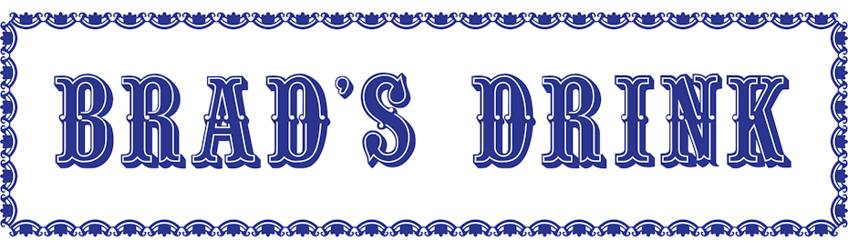
The Brad’s Drink logo was a blue wordmark against a white background. The font was bold and fairly ornate, a characteristic the Pepsi logo would hold on to for a while, even after changing colors and becoming known as Pepsi-Cola.
1898-1940: Red and swirly
—
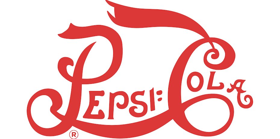
In 1898, Brad’s Drink became known as Pepsi-Cola, a name derived from the word “dyspepsia,” another word for indigestion. (Remember, these were the days when soft drinks were considered medicinal aids.)
From there, the Pepsi-Cola Company grew rapidly. In 1903, Bradham officially trademarked the name, and in just a year, he’d sold 20,000 gallons of Pepsi-Cola syrup. By 1910, there were 240 Pepsi-Cola bottling franchises across 24 states. As the company found its footing and grew, its logo changed three times.
First was Pepsi-Cola’s thin, red and spiky logo.

When Brad’s Drink became Pepsi-Cola, the logo’s main color changed to an eye-catching red. The serifs and mid-height letter spikes that decorated the original font became longer, fang-like spikes protruding from the tops and bottoms of the letters and the final “A” stretched out and coiled upward like a tail. One thing that didn’t change was Pepsi-Cola’s branding as a health aid. During this time, Pepsi-Cola’s tagline was “Exhilarating, Invigorating, Aids Digestion.”
In 1905, the logo became a bit softer. The spikes retracted and the letters got just a bit wider. Overall, the logo kept its wavy, swoopy shape, and that last “A” kept its tail curl. In this version of the logo, a long banner extends from the top of the “C” in Cola, making this version of the logo feel a little closer to symmetrical than the first version.
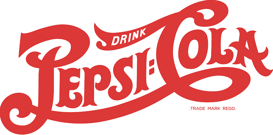
Then just a year later, the logo changed again. It was still red, it was still wavy and it still looked a lot like a certain other cola brand’s logo (more on that in a minute). The 1906 iteration of the Pepsi-Cola logo made the letters thicker again and condensed the wordmark, making the letters “P” and “C” just a bit taller than the rest of the letters.
Pepsi made a few other significant changes:
- The spiky serifs returned
- The word “Pepsi” shifted to an incline, giving the logo more energy.
- The word “drink” was added to the C’s top banner, building a call-to-action into the logo
This was also the last time there was a colon between the words Pepsi and Cola.
Let’s take a moment to talk a bit about the similarities between Pepsi and Coca-Cola during this time period. Pepsi was still decades from being branded as the young, hip alternative to Coke. Both beverages were marketed as health drinks, and both wavy, swooping, semi-cursive wordmark logos in red and white.
The 1920s and 1930s were a challenging time for Pepsi-Cola and at times, it looked like they’d be the losers in the burgeoning cola wars. As Coca-Cola opened bottling plants in Europe and came under the leadership of Robert Woodruff, who would lead the company for the next 60 years, Pepsi-Cola declared bankruptcy and was then purchased by Craven Holdings Corp. In 1930, Pepsi-Cola filed for bankruptcy a second time.
By 1933, Pepsi-Cola found their first way to differentiate themselves from Coca-Cola, just by upping the size of their bottles to 12 ounces while keeping their five cent price tag. Put beside Coca-Cola’s 6.5 ounce bottle, which brand delivered the better value was obvious. And if it wasn’t obvious enough, their 1930s jingle made their unique selling point absolutely clear:
“Pepsi cola hits the spot
Twelve full ounces, that’s a lot.
Twice as much for a nickel, too.
Pepsi-Cola is the drink for you,
Nickel, nickel, nickel, nickel,
Trickle, trickle, trickle, trickle…”
Despite the brands having a very similar visual feel, Pepsi-Cola stuck with the red and white ribbon logo until 1950, only updating it once more for a more pared-down look in 1940.
The 1940 logo, like the earlier Pepsi-Cola logos, was done through classic lettering. The 1940 version of Pepsi-Cola’s logo is characterized by the serifs on the wordmark’s smaller letters shrinking again, becoming almost invisible and the wordmark’s larger letters becoming taller and wider. Overall, the text thinned out, giving the logo a less condensed look.
1950: A third color changes everything
—
Today, we think of Pepsi as blue. It’s the “blue team” to Coke’s “red team.” But before 1950, Pepsi and the color blue had no relationship—until they unveiled their bottle cap logo. The wordmark remained the same, but now it was on a tangible canvas, rather than floating in space. In the wave of patriotism that followed World War II, making the logo red, white and blue just made sense.

In the 1950s, Pepsi-Cola continued branding themselves as the soda that delivers the better value. “More bounce to the ounce,” was the tagline of the day, which promised more than just more soda per bottle than Coca-Cola. It promised more fun.
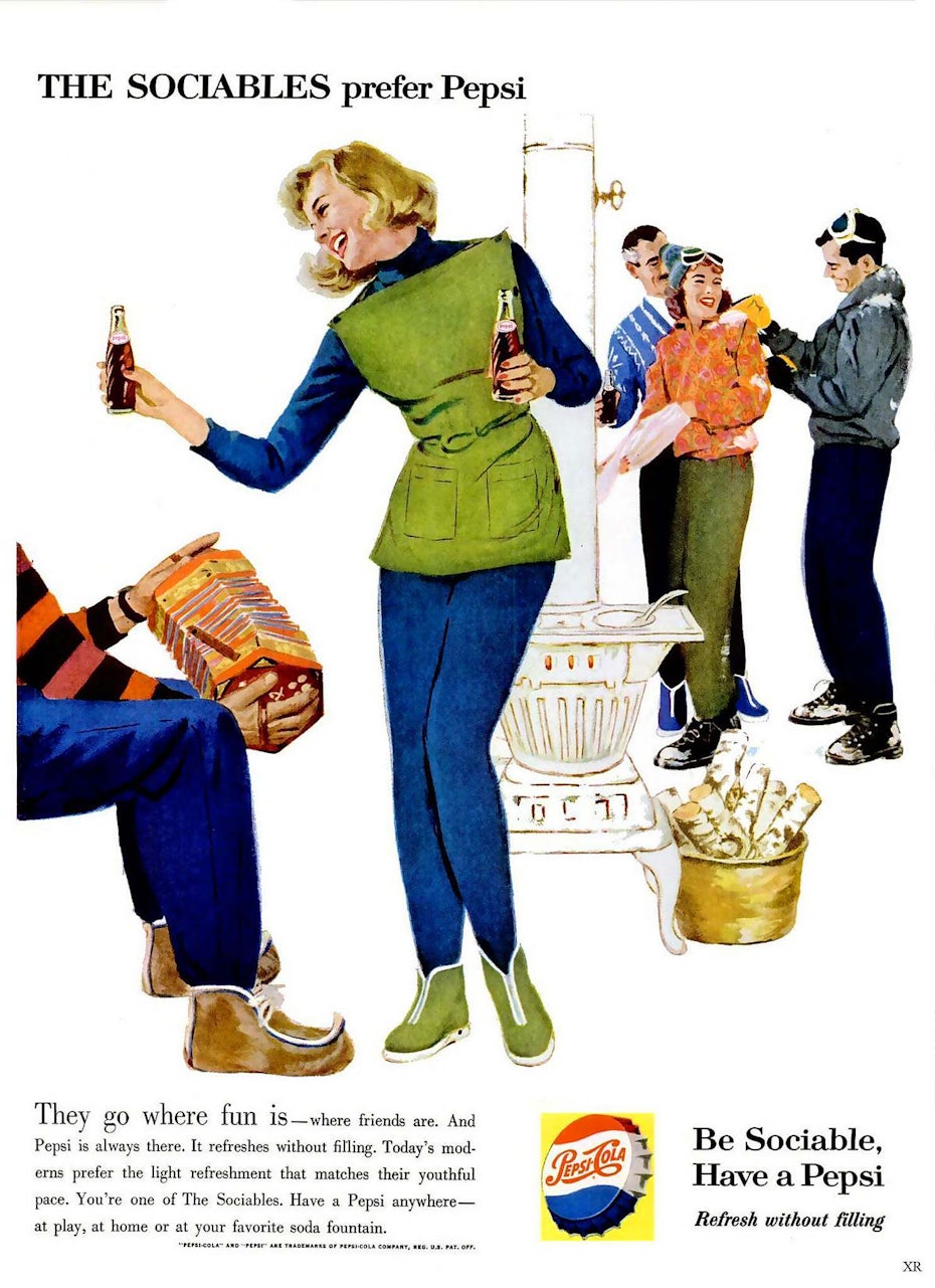

Pepsi-Cola’s ads of the day also showcased Pepsi as the perfect drink for a day at the beach or an evening socializing with friends. Specifically, it was the perfect drink for beautiful young women who wanted to keep their trim figures—it was billed as the light refreshment and the soda that refreshes without filling you up.
1962: No more cola
—
This was a pivotal year for the entire Pepsi brand. Two major things happened: The logo bottle cap now laid flat, and Pepsi-Cola dropped the word “cola.” From here on out, it was just Pepsi.
In addition to ditching the word “Cola,” Pepsi ditched the swoopy, swirly red font they’d been using for the past 64 years. Now, Pepsi told the world who they were with a bold, sans serif, stamp-like black wordmark across the bottle cap. Since 1958, Pepsi had become a drink “for those who think young,” implying that Coca-Cola was for those who didn’t, those who were stuck in old mindsets and weren’t connected to the youth culture of the day.
In the 1960s, the Pepsi logo took on a more symmetrical look. With this more modern, geometric-feeling logo and minimalist, even brutalist font, Pepsi was niching down its target demographic and overtly marketing itself to younger consumers, referring to them as the “Pepsi Generation” in a 1961 ad campaign.

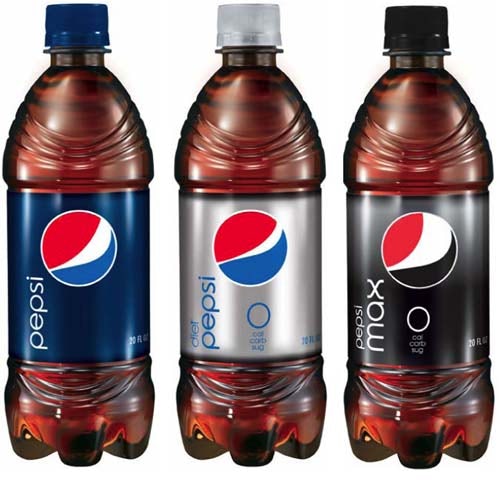
1964 was the year Pepsi introduced Diet Pepsi, giving drinkers an even lighter soda option with no sugar.
1973: From bottle cap to globe
—
Pepsi embraced 1970s minimalism when they switched to the globe logo in 1973. This was a fairly simple change; the bottle cap just dropped its ridges.
But Pepsi did more than remove the cap’s ridges. For the first time in the brand’s history, the logo had a colored background. With red on the left and light blue on the right, white was reserved for the globe’s outline and the stripe across its middle that served as the background for the word “Pepsi.” The font remained unchanged from the logo’s previous iteration, but shrank to fit inside the globe’s perimeter. And it turned blue.
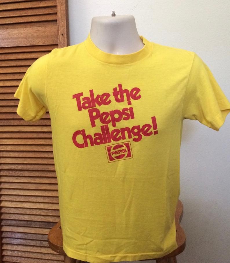
In 1975, Pepsi decided it was time to cut into Coke’s market dominance with the Pepsi Challenge. The Pepsi Challenge was a campaign Pepsi launched in 1975 to prove to the world that their soda tasted better than Coca Cola. In malls and other high-traffic pedestrian areas, passersby would be asked to do blind taste tests of Coke and Pepsi and say which they preferred. According to Pepsi, people preferred their soda over its competitor.
1980s: The Cola Wars rage on
—
But the Cola Wars didn’t end there. They were just ramping up. By the early 1980s, Pepsi was riding high on its status as the drink consumers preferred as it outsold Coca-Cola in supermarkets. End of story, Pepsi won, right? Nope.
Not to be beaten by the sweeter soda, Coke switched up their recipe and introduced New Coke to the world. And people hated it. But it didn’t make them hate Coke. And it didn’t make Pepsi the #1 soda brand. After New Coke faced a huge consumer backlash, Coca-Cola brought back the original recipe as Coke Classic, then quietly phased out New Coke so Coke Classic could just be Coca-Cola once again.
And that’s just what Coca-Cola was: a classic. Old-school. Endorsed by Santa Claus. In contrast, Pepsi was being endorsed by Michael Jackson and Michael J. Fox. Pepsi was modern and energetic; Pepsi didn’t need to overhaul their recipe to give present-day drinkers what they wanted.
In 1987, Pepsi gave the globe logo a little facelift. And although the facelift looks relatively minor, there are actually one huge changes (and a few less-huge changes) that occurred with this update.
Since 1962, Pepsi had been using a basic, all-capital sans serif font. In 1987, the brand introduced their own unique font. It was still bold and sans serif, but instead of basic block letters, these letters had a futuristic, almost digital feel. The “P”s were stretched out and the “E”’s left-side angles got rounded out while the “S” became longer, a little flatter and just a tad bit similar to the “S” in the Star Wars logo. The brand would continue using this custom font for over a decade.
This wasn’t all that changed, though. The white circle that makes up the globe’s outline got just a wee bit thicker and the red in the logo got just a tad bit violet-er.
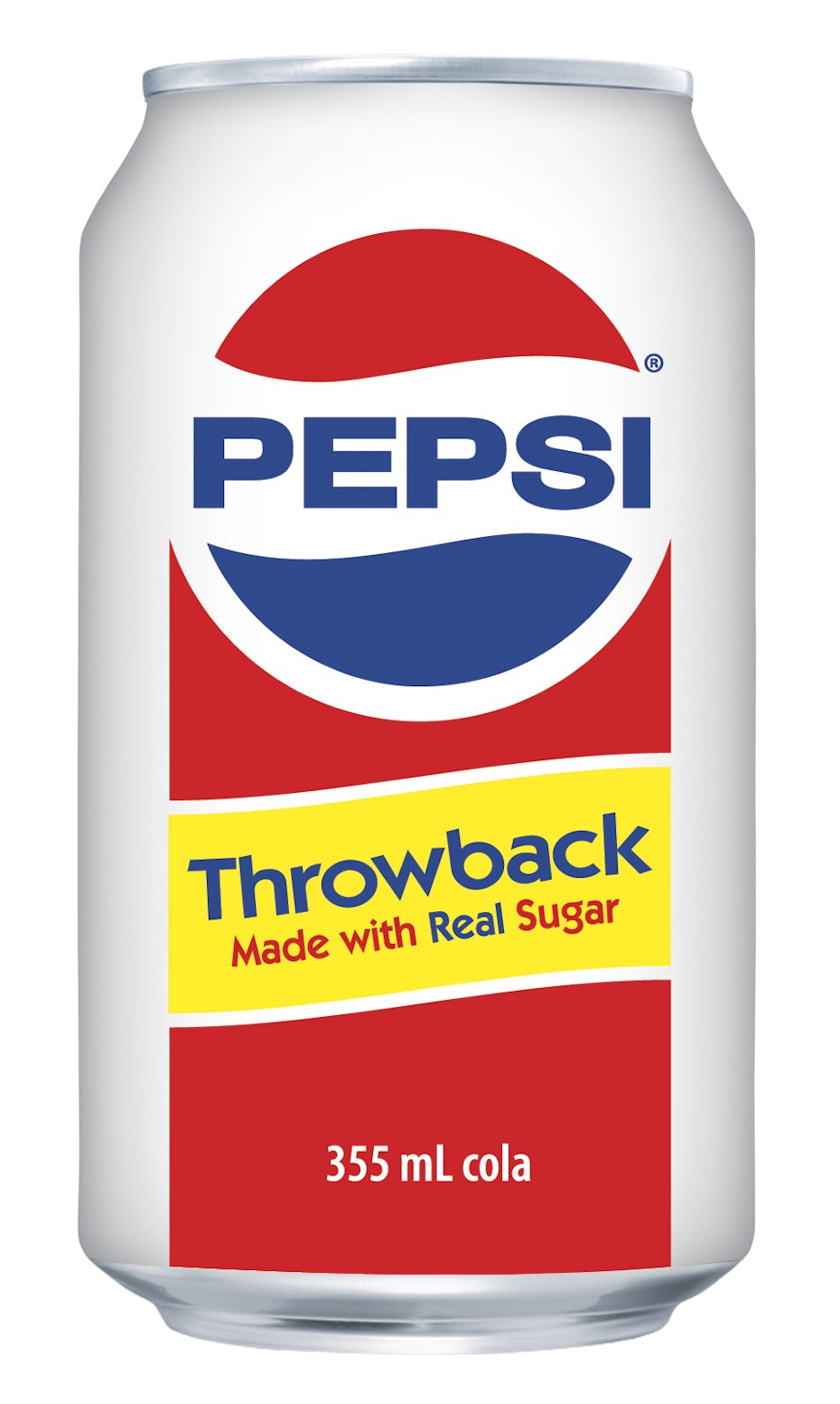
Within a few years, Pepsi moved on from this logo, but it wasn’t the last time the world would see it. In 2009, Pepsi introduced Pepsi Throwback, a version of the soda made with real sugar instead of high fructose corn syrup.
1991: The breakup
—
In 1991, Pepsi changed their logo in a dramatic way again. They kept the wordmark, they kept the globe, but for the first time ever, they were separated. The globe made its way to the bottom right of the logo while the word “Pepsi,” now italicized, stretched across the top of the logo in blue. In the negative space beneath the text and beside the globe, we see a red bar reminiscent of the red banner on earlier versions of the logo.
Slanting the font forward communicated that Pepsi was the forward-looking, forward-thinking soda brand. By the 90s, the Cola Wars were over and each side’s territory was clear. Not only were Pepsi and Coke American cultural icons in their own right, their rivalry was. Billy Joel even gave the Cola Wars a shout in his 1989 song “We Didn’t Start the Fire.”
1998: The role reversal
—
In 1998, Pepsi flipped how they used the colors in their logo. Instead of blue text on a white background, now the logo was a blue background with the word “Pepsi” in white.
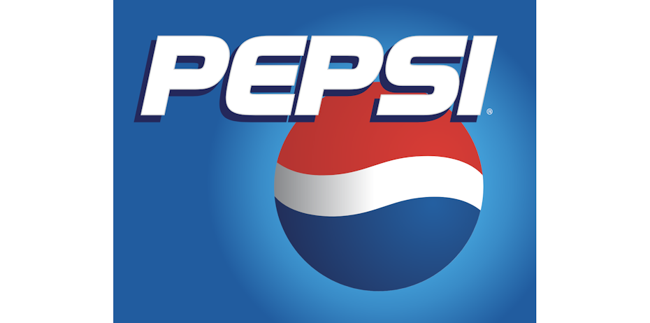
Now, the red was gone from the background and the globe moved up and over to sit just below the wordmark. And unlike other versions of the logo, the 1998 edition had depth. A gradient background made it feel like the globe itself was emitting light and shadows just behind the text gave it a 3D effect. For the first time since Pepsi began using the globe, the globe wasn’t outlined in white. It was just there, casting light against the blue background.
In 1999, Pepsi launched a new slogan and brand campaign: “The Joy of Cola.” With an all-new jingle and a series of commercials, the brand was ready for the new millennium.
In just two years, “The Joy of Cola” became “The Joy of Pepsi” and in true Pepsi style, featured none other than one of the day’s hottest artists, Britney Spears.
2003: Going 3D
—
In 2003, Pepsi’s new logo got a bit of a tweak. The globe was redesigned to have large, conspicuous white “shine” spots that made it look like it’d been vacuum-sealed in plastic, giving the logo a flatter look.
The background gradient was shifted to make the lower left corner the light source, rather than the globe, and both the wordmark and the globe were outlined in light blue, making them pop visually against the background.
The text also got a small facelift. Tiny serifs were added back onto the font and the letters got a light gray shading, enhancing their three-dimensional look.

2006: Pepsi gets cooler
—
In the Cola Wars, Pepsi secured their place as the cool soda brand. And they never stopped being cool. But in 2006, the logo literally looked cool.
This iteration of the logo turned the now fully three-dimensional globe into a cold glass of soda with glistening droplets of condensation collecting on its surface. The font stayed the same as it was in the 2003 version, bold and slanting forward.
2008: A global cola leader
—
The 2006 version was cool, but by 2008, it was time for another change. This time around, Pepsi was due for a big change. Famously, Pepsi paid Arnell Group more than $1 million to design their next logo, and the result was:

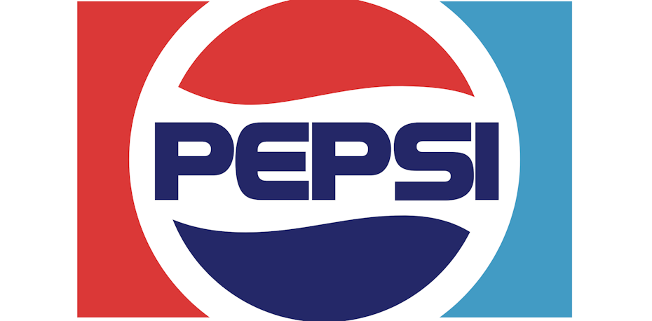
The 3D globe was flat again. The Pepsi font the world had come to love was gone and in its place, Pepsi Light by Gerard Huerta. No more serifs, no more uppercase letters and perhaps most revolutionary, no more even, symmetrical band across the globe. Now, the globe was tilted on its side, showing a band that’s wide where the globe faces upward and thinner toward the bottom.
The new logo evokes a smile. This Pepsi was still young and fun, but it was also friendly. It was down-to-earth, engaging and decidedly unpretentious. And sometimes, even a little snarky.
Not everybody was smiling. Many called it way too simple and even lazy, comparing it to other, similar logos like Obama’s and Korean Airlines’.
Others called it cheap and soulless. After Arnell Group publicly discussed the science behind the logo, like their use of the Golden Ratio to determine the perfect angle for the globe and comparing it to the Mona Lisa, critics called it pretentious and ridiculous. Despite the largely negative public response to the redesign, Pepsi stood by their choice to rebrand and in 2014, tweaked the logo slightly, removing the blue outline around the globe.

The future of the Pepsi brand
—
Who knows what the Pepsi logo will look like 10, 20 or 50 years from now? While we can take a pretty good guess what Coke’s logo will look like, Pepsi has made continually reinventing themselves—and bringing their old logos back in fresh ways—a key part of their brand.

No matter how the world changes or what happens in the beverage realm, Pepsi is there, reformulating themselves to satisfy their fans’ tastebuds.
The post The history of the Pepsi logo appeared first on 99designs.
No comments:
Post a Comment