Branding is necessary no matter what industry you’re in. In fact, it’s more important than ever today because we’re living in a highly visual, information-overload world. As an architect, creating a brand identity might not be at the forefront of your mind. But no matter if you’re launching a new firm, rebranding your existing firm or are leading a successful firm that could stand to be more successful, it may be worth making architect branding a priority. Architecture is a hugely visual industry, which only underscores the importance of giving your brand a strong visual feel.
As of 2016, there are 109,748 architects in the United States. And that number is only expanding—since 2008, the number of architects in the US has grown 10 percent, while the total population has grown just 8 percent. Across the world, it’s estimated there are somewhere between 3 and 4 million architects. That’s a crowded industry to stand out in, which is exactly why solid branding needs to be part of your firm’s business strategy.

If you’ve never built a brand before, the prospect of doing so can seem daunting, especially when the branding guides you find online aren’t tailored to the architecture field. But the path to a well-crafted brand is similar across industries. It starts with identifying who you are as a company and finishes with expressing your identity through thoughtful design choices.
4 steps to building a great brand for your architecture firm
—
Let’s be real: architecture can be a pretty serious field. And in a lot of cases, business leaders in more buttoned-up industries don’t feel they can be as creative with their branding as businesses in trendy or “fun” industries like fashion and entertainment.
That kind of thinking is how you end up with a boring, generic brand identity. Every businesses will benefit from a compelling, fleshed-out brand story. Your brand story, the story of who you are, what you do and how you got to where you are today, is where your branding takes its cues. As the head of your architecture firm, you’re the author of your brand story.
Step 1: Who are you?
The first step in building an authentic brand identity for your architecture business is getting a solid grasp on who you are as a player in your market. Take time to reflect on these questions. Your responses will help you get a solid grasp on your persona:
- Am I playful or serious?
- Am I expensive or economically priced?
- Am I sophisticated or fun?
- Am I trendy or traditional?
- Do I design homes or commercial buildings?
- What markets do I operate in?
- Which services do I provide?
There are no wrong answers here, nor do your answers have to be either/or. Your brand might fall somewhere between playful and serious or it might be both sophisticated and fun.

Step 2: Who’s your ideal customer?
When it comes to branding, understanding your ideal customer is as important as understanding yourself. Just like you answered a list of questions to really get a firm grasp on who you are, ask yourself the following questions to determine who your customers are:

- Where are your customers located?
- Are they individuals or large companies?
- Are they builders and contractors or homeowners themselves?
- What is their budget range?
- Who are the intended occupants for the finished buildings?
- How do they view themselves?
- What are their values?
- What do they need from the architects they work with?
It’s also important to think about your customers’ pain points. If you mostly work with developers in a historic city, complying with the city’s historic preservation board might be a serious challenge they contend with regularly. Making it clear that you understand the historic board’s requirements and can work them into your designs is a huge selling point for your brand. Potential clients can feel comfortable that they won’t get trapped in a vortex of never ending historic board rejections, appeals and revisions.

Understanding your ideal client makes it easy to develop a customer persona. A customer persona is a quick-glance guide to exactly who your business targets. Not every client will fall perfectly into these bounds, and that’s perfectly okay. The goal of creating a customer persona isn’t to restrict your customer pool to a very specific type of buyer, it’s to help you shape your branding and business strategies to serve clients in your niche effectively.
Step 3: What should your architect brand look like?

In some ways, designing a brand is more science than art. Once you’ve identified your brand persona and distilled it into a set of bullet point traits, you can mathematically work out the design choices that represent your firm accurately.
Colors
The colors you choose say a lot about your brand. Some colors, like grays and dark blues, read as calm and serious while others, like oranges and pinks, feel more dynamic and more fun. Take time to educate yourself about color psychology to get a feel for which colors are the best choices for your brand. If you work with a graphic designer, they can help you out with this too and suggest colors and color combinations you might not have thought of on your own.

Shapes
Shapes also communicate important information about your brand. Shapes are found in your logo and throughout each part of your visual branding—think of how you highlight specific blocks of text on your website and the patterns you use in your banner ads. Take a look at our guide to choosing shapes for your branding to determine which shapes can speak for you.


Fonts
Font choice matters, too. Just like a square can communicate your dedication to a traditional way of doing things and a triangle can show you’re progressive (and perhaps even a bit aggressive), a serif font tells the world you’re formal and fancy while a sans serif font dresses your brand in jeans and a casual button-down. Take the time to find a font that matches what your brand says.

Voice
Finally, find your brand’s voice. This isn’t so much a visual choice as a textual one, but it’s just as important as all the other branding choices you make. We’re talking about the copy you use in your headlines, in your web content and in the emails and other messaging that is exchanged between your company and the world.
Determine whether technical jargon is an effective tool for your brand (as it would be for an architect who works directly with contractors and needs to use a precise, shared language) or if it would turn potential clients off—which it may if you’re an architect who creates designs for first-time home buyers or businesses who aren’t in the construction or real estate fields. Maybe a conversational, collaborative tone works for your brand or your ideal clients respond better to a more teacher-like tone that feels like you’re holding their hand through the design process.
Step 4: Blueprint the brand identity
Once you have a solid idea of who your firm is as a brand and who your target audience is, it’s time to start actually mapping out your brand identity. Using the color palette, shapes, font choices, imagery types and copy voice you’ve identified for your brand, work with designers to create brand assets like a logo, a website, graphics and any other visuals that will represent your firm. By creating all of these assets together, you’re creating a cohesive brand identity.
Once you’ve got a few design ideas in place, test them. Ask your current and past clients for feedback on logos and website mockups. A/B test different ads with designs you’re considering. Understanding what your clients respond to will enable you to build a brand that connects with them by meshing with their expectations.
What not to do when creating your brand
—
Crafting a brand identity is a huge undertaking, and there are a bunch of pitfalls you can face as you work through the process. Putting too little effort into developing your brand, not having a clear view of what your brand is and needs to be and branding yourself in a way that doesn’t connect with your target clients are three business-killers that can take you years to recover from (if ever).
Clients want to feel like your firm is a person, or a group of people, not a faceless corporate entity. They also want to know that the architecture firms they work with can provide the designs that match their visions for the homes and commercial buildings they’re building and renovating. Effective branding doesn’t just connect your firm with your ideal customers, it assures those customers that you’re the perfect architect for their projects.
Don’t play it too safe
You want to express your brand effectively, and if your brand is one that’s prestigious, established and known for conservative designs, your design choices are going to err on the side of conservative and “less is more.” Similarly, if you’re a value-focused brand, you might try to avoid scaring potential clients off with flashy or expensive-looking design.
One of the biggest branding mistakes you can make is playing it too safe. There’s conservative, and there’s boring. There’s value-focused and there’s generic-looking. When you’re working with a designer, be open to their suggestions about how to communicate your brand persona through design choices. You might not start the conversation thinking there’s a place for a bold red or dynamic shapes in your logo, but if you’re willing to take risks and explore all potential design choices, you’re setting yourself up to build a great brand.
Don’t cheap out
Even if you’re a budget brand, don’t cheap out. Yes, you can design your own logo in five minutes with a drag-and-drop browser app, but there’s a reason why these apps are free and working with a designer can cost hundreds or even thousands of dollars. A DIY logo maker doesn’t understand market trends and it can’t think critically about how your firm fits into the market.

Don’t go with designs that aren’t “you”

Branding that works for another architecture firm won’t necessarily work for yours. You should definitely look at other firms’ branding, particularly other firms in your niche and firms you aspire to be like, to take design cues for your own branding. After identifying what you like about their branding, determine why it works for them. Then, contrast their brand personas and design choices with the persona you identified for yourself using the set of questions we listed above.
Maybe your firm would benefit from similar design choices, but maybe the design choices that work well for the other firms would feel tone-deaf for you. When you’re branding your business, it’s way more important that your branding represents your persona perfectly than it is for it to look like what everybody else in your field is doing—that’s true regardless of the type of business you run!
Don’t forget mockups
When people look at your website and social media pages, they want to see your designs as finished products. Make sure you incorporate lots of photos of your finished projects into your design, but don’t forget to include mockups, too.

 .
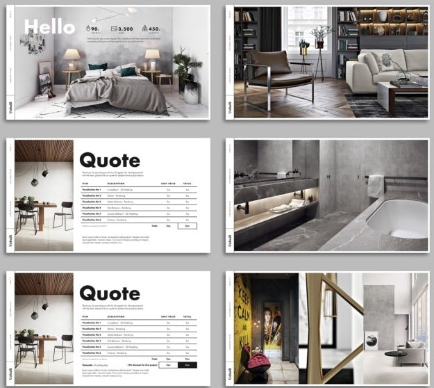
.Mockups are 3D renderings of what your designs will look like when they’re finished. Unlike photos, which show how past clients are inhabiting the spaces you’ve designed, mockups show an idealized example of how a client could use the space. With a mockup, you decide the setting for the building and what the hypothetical people in your example image are like. Doing this can help you showcase your brand.

Let’s say you’re an architect who specializes in restoring old farmhouses. Part of your approach to doing this is attempting to find old blueprints and building records for the houses you restore so you can recreate their original floor plans and design features as authentically as possible. In a mockup, you might set the scene with a red and pink sunset over vast fields out the window and communicate your prospective clients’ values with a bookshelf stocked with titles about historical preservation and design.

A mockup can also easily show the different aesthetic choices the client can take with a finished space. Side-by-side mockups of the same finished building can show two different color palettes or two different door and window options, which can get viewers’ brains churning with ideas about how they might want to customize a space.
Ready to draft some amazing architect brand concepts?
—
A well-crafted brand identity will make your firm’s personality shine. As an architect, your brand story is as compelling as any other company’s—so give it the time and effort it deserves. To see some amazing examples of what your brand identity could be, check out the architecture branding projects our designers have completed for other clients. Then, dive in and start working on your branding with a designer who gets you.
The post The complete guide to architect branding appeared first on 99designs.
No comments:
Post a Comment