With the year 2020, graphic design trends have reached an important milestone. It’s the dawn of a new decade, and graphic design is poised to reach new heights as designers begin to define the era. There’s a feeling in the air that anything can happen—that we are about to witness the next evolution of graphic design as we know it.
And that’s also what makes this moment so daunting. Here we stand at the 20s’ inaugural year, and the upcoming decade is full of mystery. You can imagine that graphic designers everywhere must be experiencing a collective blank page anxiety, gripping their tablets and stylus pens and asking: where do we go from here?
Although it might take a few more years for the 20s to hit their stride, designers are already showing us glimmers of what is to come. Let’s take a look at the reigning graphic design trends 2020 that are already starting to characterize this decade-long journey we’re about to embark upon.
The 10 graphic design trends to watch in 2020:
- Cyberpunk color schemes
- Street art styles
- Ultra thin geometry
- Paper cut-out collages
- Hand lettering with big personality
- Dystopian aesthetic
- Hyper-pastiche
- Continuous animation sequences
- Bevels and chisels
- Live data visualization
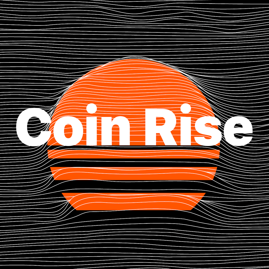
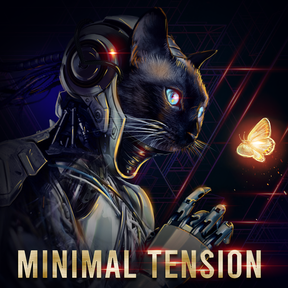
1. Cyberpunk color schemes

2020 will feature brighter & bolder colors than ever before! As the value of design rises, brands are going crazier and wackier than ever with colors to attempt to stand out from the crowd.
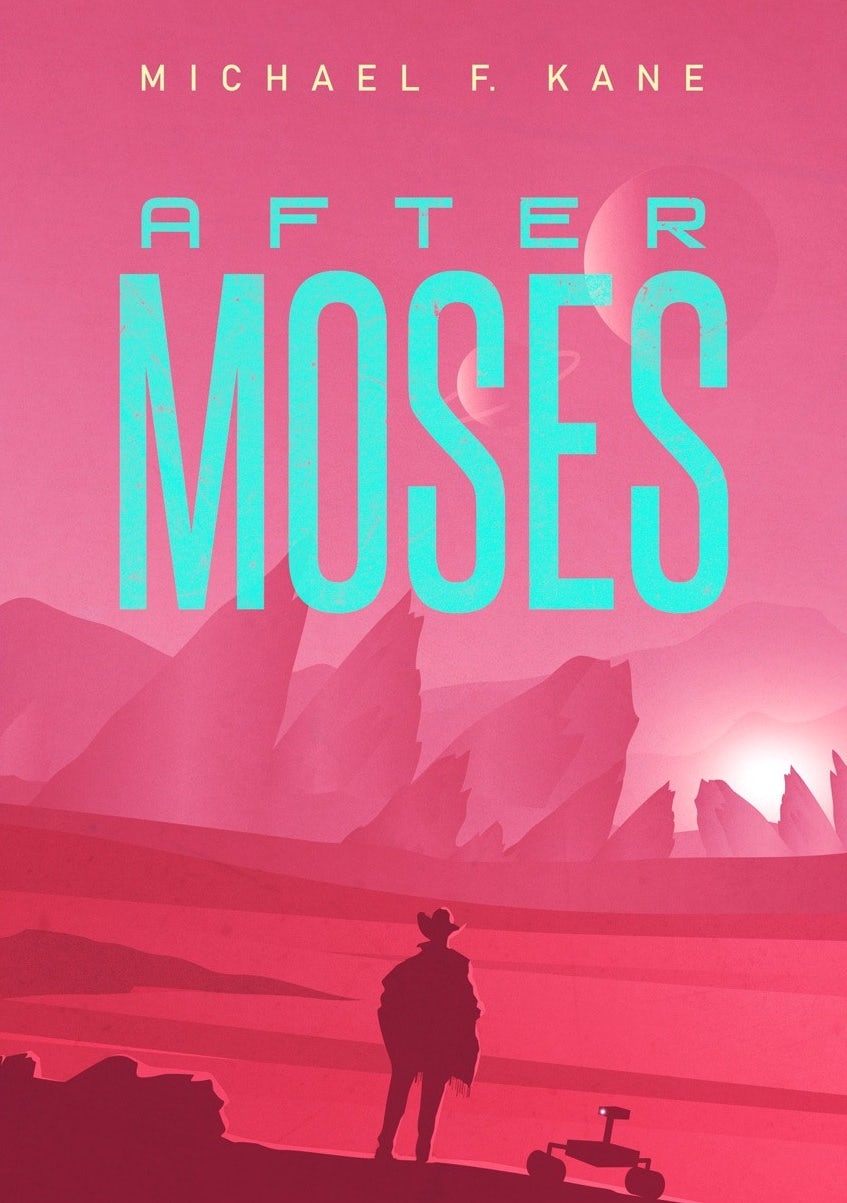
Our streets might be clogged with electric scooters instead of flying cars, but considering how thoroughly computers have integrated into our lives (right down to our pockets!) it does feel like we’re living in the future. In graphic design, futuristic themes are often expressed with color—especially bright and oversaturated hues that we don’t typically see in nature. These colors are associated with cyberpunk, a sci-fi genre that usually depicts dark, futuristic, neon-infused cities, like in the movie Blade Runner.
Expect color schemes in 2020 to get even more vibrant and luminous.


Futuristic color schemes and designs will be on trend next year, continuing with the isometric trend and bringing in colors like blues and purples and hot pink to give designs that futuristic glowing feel.
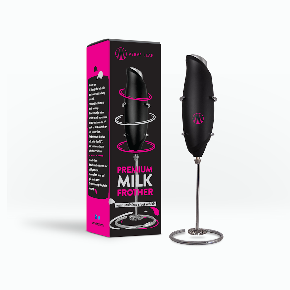
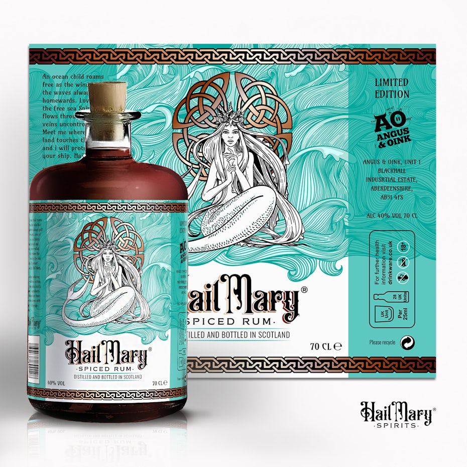
In practice, cyberpunk color schemes create surreal experiences for viewers that they are unable to experience in real life, like the otherworldly vegetation covering Pepper Pack Design’s packaging below. Their brightness also makes designs feel friendly and inviting, despite the fact that they are shamelessly calling attention to themselves.
We see 2020 ushering in a futuristic, ‘cyberpunk’ feel, building off of Japanese urbanism, blue neon, and general future-forward look and feel. There’s some about Japanese design that always seems to feel futuristic, and we see that trend picking up.
In cyberpunk, neon creates pleasant splashes of color against a dark cityscape, and likewise, designs that take advantage of color schemes like these can brighten up our own, sometimes gloomy world.
2. Street art styles
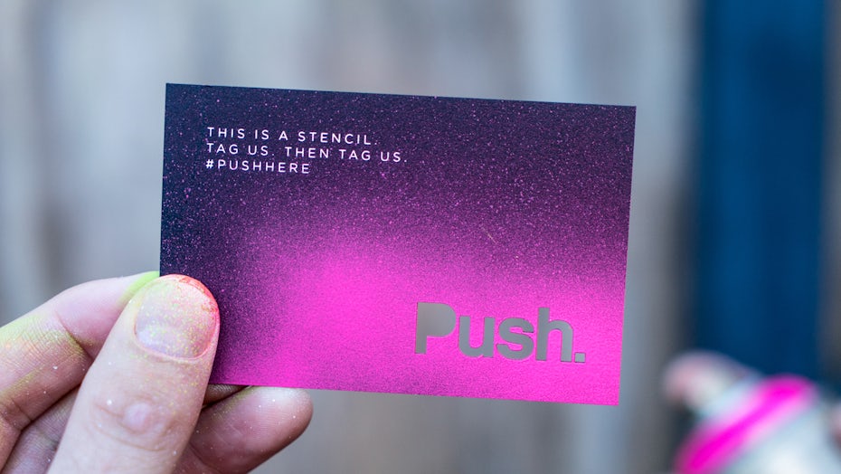
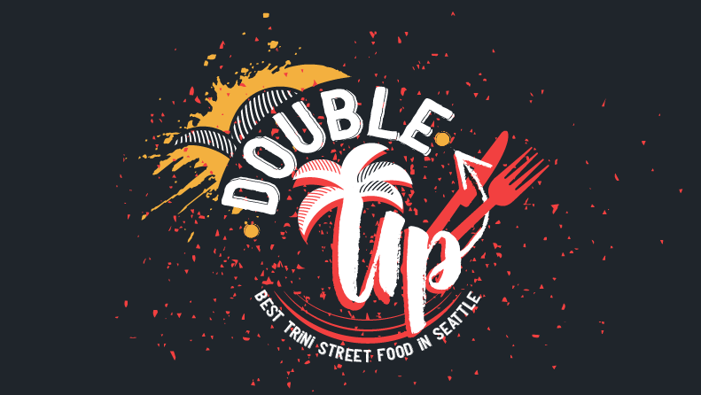
Graffiti and street art techniques have a retro appeal to them, conjuring up images of the 70s punk scene, the neon 80s and the grungy 90s. But in 2020, this trend is more than your average comeback. Street art’s return to graphic design is ripe for our particular moment in time.
Over the past decade, learning design has become more accessible than ever before. That means there are a lot of new kids on the block who’ve had to make a name for themselves on their own, an ethos that fits well with the DIY aesthetic of street art.
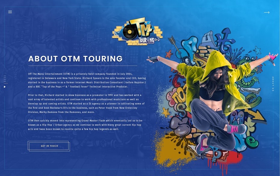
With its inherent edginess (given its association with vandalism), graffiti is also a movement of jubilance and freedom, of breaking bonds and protesting convention. That’s what makes the photo backed by street art in Anton Siribaddana’s design feel like it’s going to leap off the screen. All in all, the street art trend is the perfect aesthetic to get us feeling like the future is in our hands.
3. Ultra thin geometry
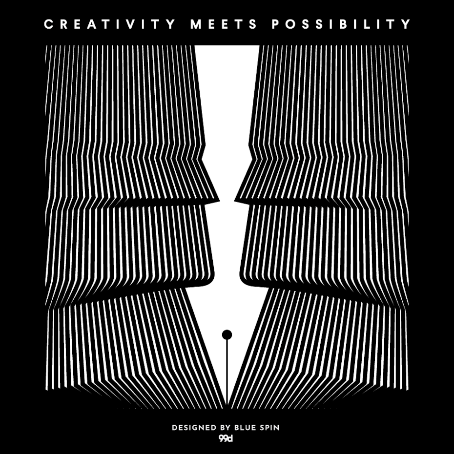
As a fundamental element of graphic design, lines express the form and nature of an object. Geometric lines illustrate objects that are man-made and technological, whereas curvy lines represent more natural and organic forms. In 2020, we are seeing designers merge these line styles to achieve impossible shapes. These designs are based on stable geometry, but they still manage to feel transient and ethereal. They look metallic but drift like smoke.


This design has a modern, futuristic and mysterious feel. Thin lines can only be displayed on digital media, something that left the age of the printing press with paper.
Ultra thin geometry is sleek, abstract, and difficult to pull off without computer assistance, which is probably why it’s popular in tech and industrial branding. This style seems to express the future of technology—something less and less physical the deeper we venture into “the cloud”—and speak to the mysterious possibilities awaiting us in the coming years.
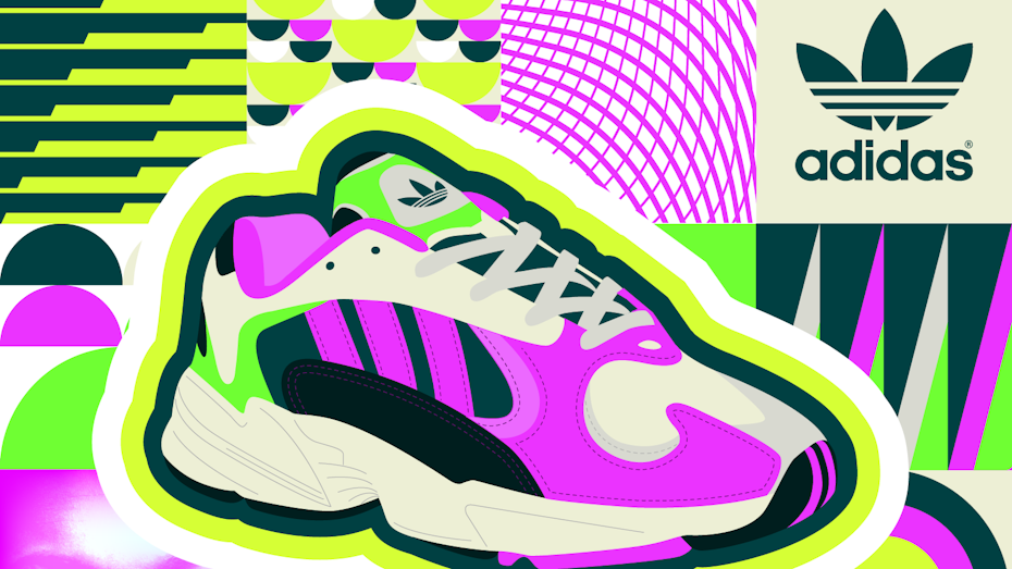
4. Paper cut-out collages

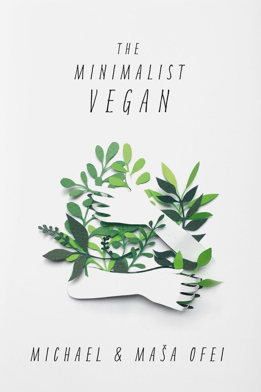
Designers are always trying to craft authentic experiences for viewers. What better way to do so than with literal arts and crafts?
My bet is on collage, because just by means of cut fragments, this technique easily opens up to new sceneries and unexpected relationships among the graphic elements.
Many collages try to trick the eye into seeing one cohesive image where several exist. But the collages of 2020 have nothing to hide. Designers are mixing images that clearly do not belong in the same universe, such as illustrations and photographs. Ditching seamless photo manipulation, they are leaving images with the angular edges and white outlines that come from quick-and-dirty cutting and pasting. The effect is to straddle the line between contrast and harmony, bringing together these disparate elements in a kind of asynchronous beauty.


2020 will be all about combining contrasting elements: vibrant colors with soft pastels, traditional patterns with geometrical shapes will be combined. This will add richness and convey fun, youth and multiplicity.
While they are visually striking, collages are largely on the artsier side, making them great for editorial illustrations, posters, and book covers. In OtomPotom’s blog cover images, for instance, mismatched elements are brought together in a surrealistic fashion to illustrate the abstract topics the content will speak to.
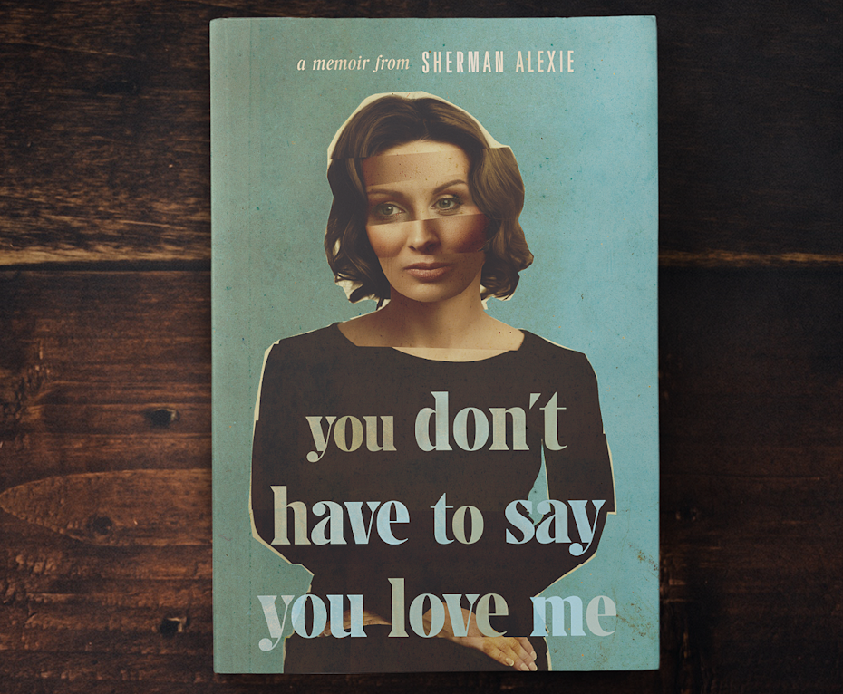
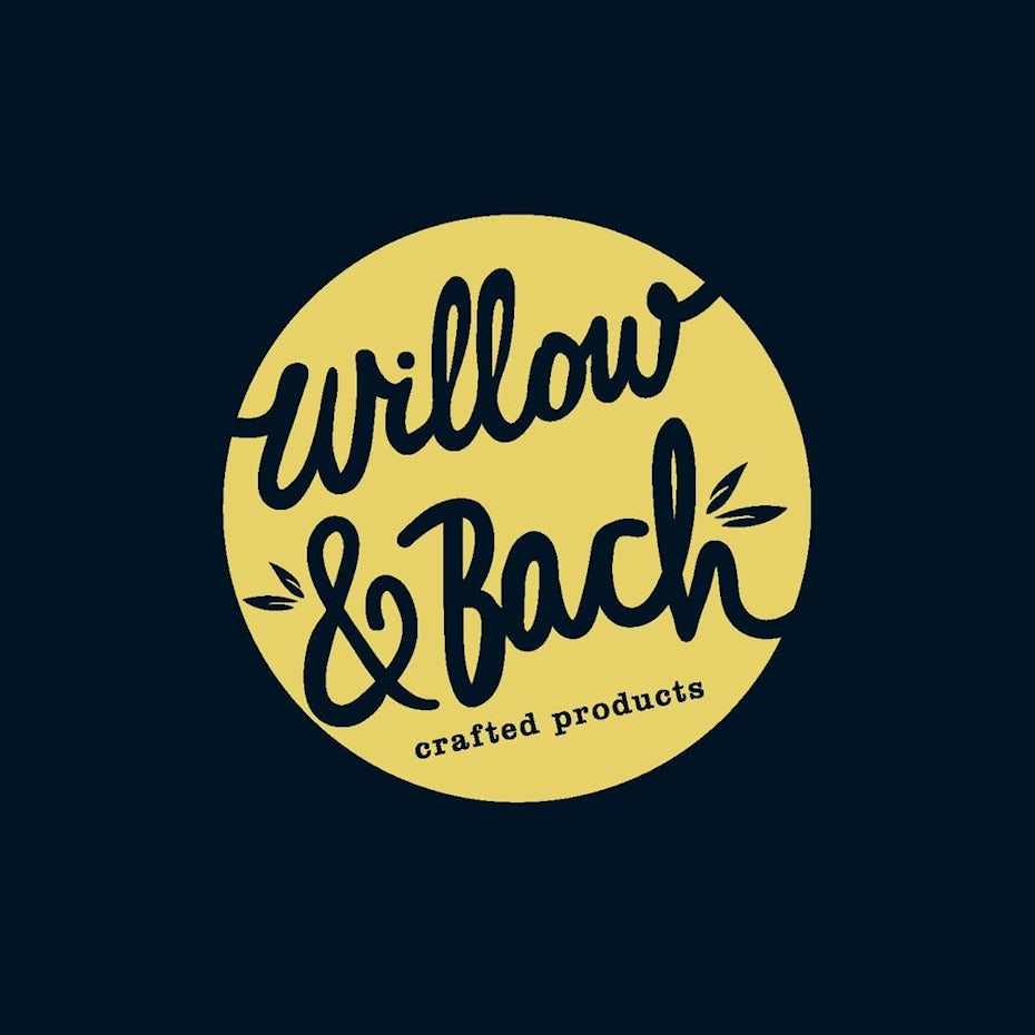
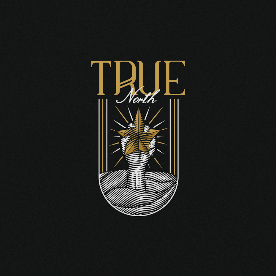
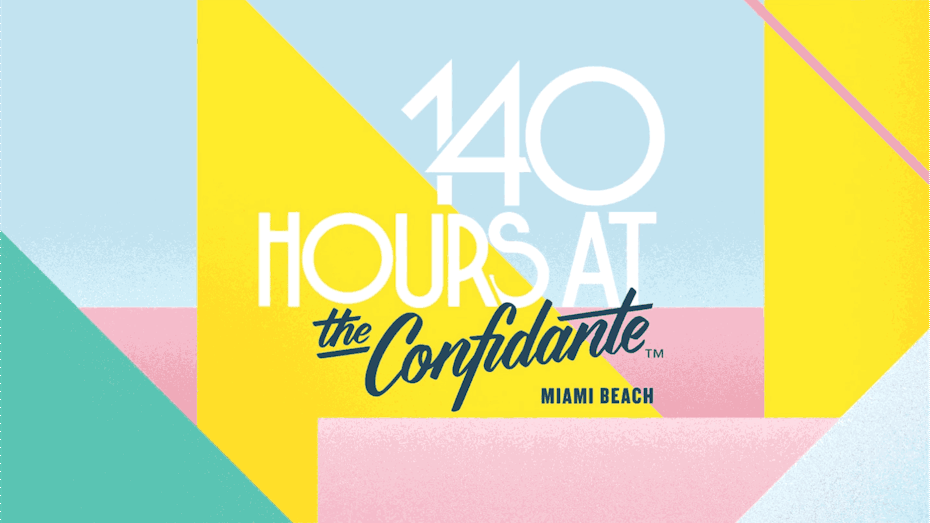
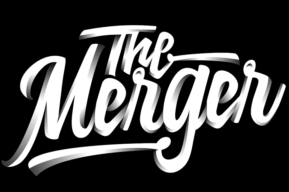
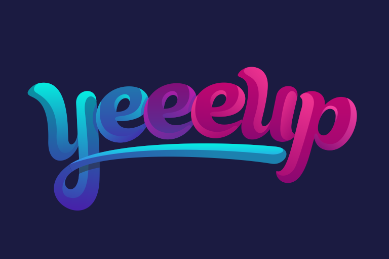
5. Hand lettering with big personality
With minimalist trends going strong, there will be a need for more personalized connection with the audiences. This will lead towards type based designs but with a personalized touch, creating trends such as graphical integrations in typography or totally customized type-face based designs.
Typography has always been a critical element of graphic design. In the digital age, when everything must make immediate sense to new users, typography became very functional by necessity. But in recent years, type has become bigger, bolder and more experimental in ways that we have not seen since print ads and magazines of days gone by.
Designers are proving that even a composition that limits itself to white space and text can still be adventurous with bold typographic forms.
Type is continuing to steal the show with bigger, bolder & more inventive uses. 2020 will continue to feature designers experimenting with the craze of typography to seek attention.
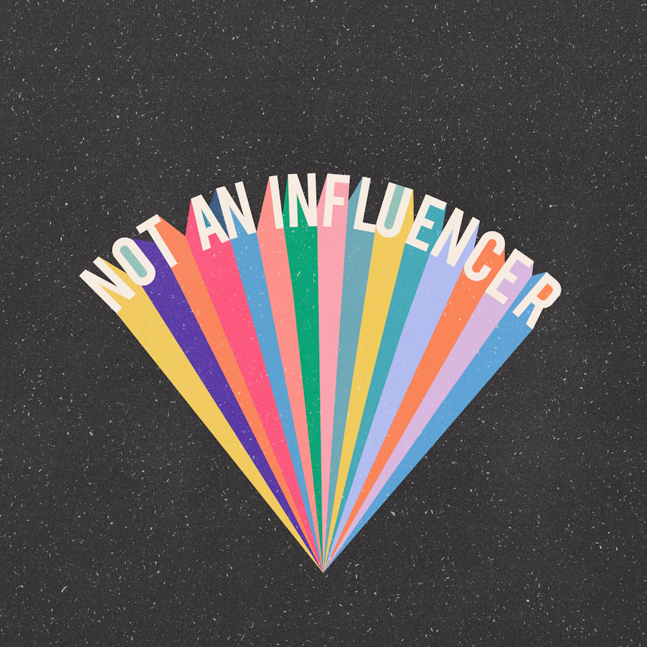

No matter what photo or illustration is used in a design, handwritten brush fonts will be dominant in the upcoming year.
In 2020, the trend of larger-than-life type will continue, but in a more human direction. Custom hand lettering is already extremely popular, and branded typography will follow by becoming more colorful, imprecise, and eccentric.
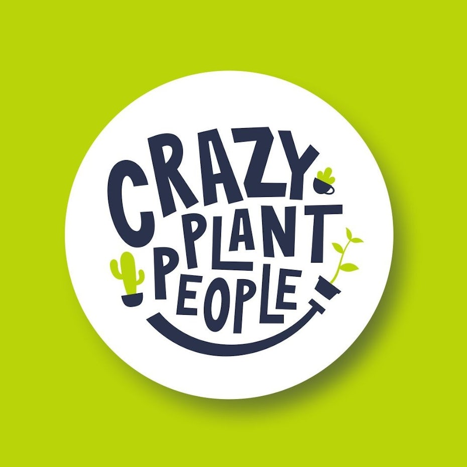

This can be achieved with lettering that comes alive like the examples above. Lettering can personify its subject matter (like the Beast Mode logo) or be offbeat and nonidentical (as in Crazy Plant People) to give a sense of the people behind the brand. In the years to come, consumers will be craving designs crafted by human hands, and it’s up to designers to deliver type that will speak to them.
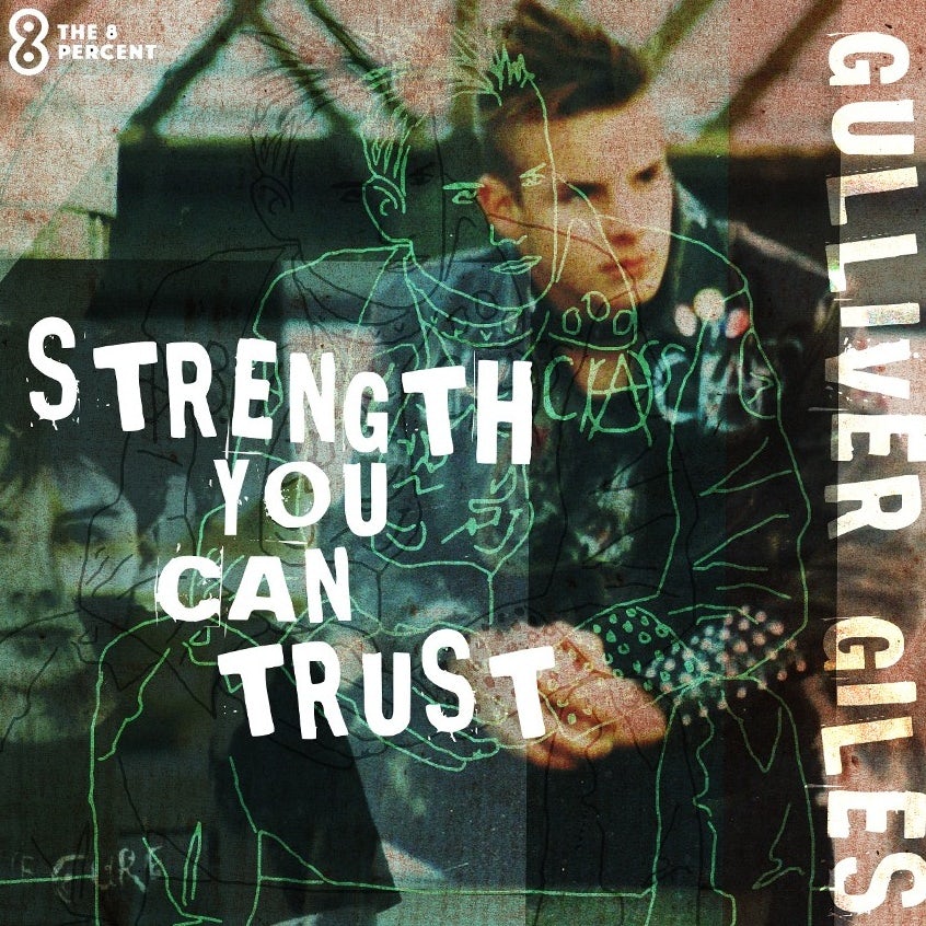
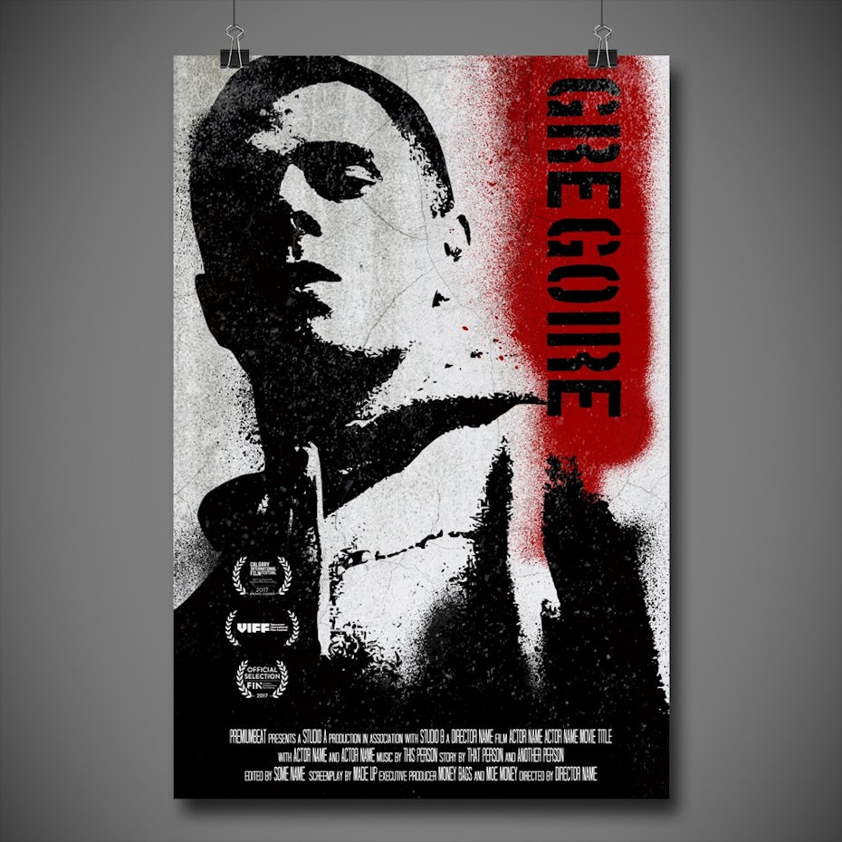
6. Dystopian aesthetic

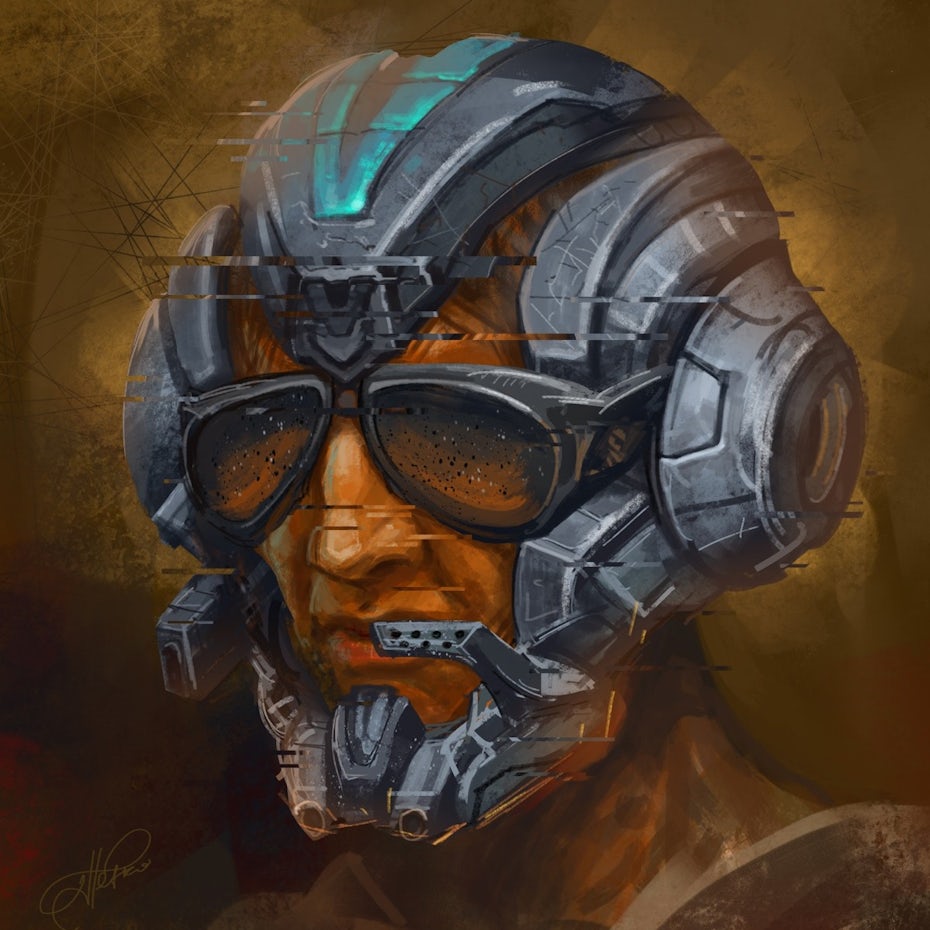
Thanks to our cultural obsession with shows like “Black Mirror” and “The Handmaid’s Tale,” dystopia is finding a voice in every medium imaginable. Dystopia (the opposite of utopia) generally refers to fictional, futuristic worlds that have taken a wrong turn somewhere in their history. From a design standpoint, dystopia finds expression through cold color schemes, mechanized typography, glitch art techniques, and imagery that merges tech with organic matter or excludes humans from the scene altogether.
Cheery.


Though the genre largely depicts a future gone wrong, things aren’t always as hopeless as it seems. Dystopia often takes the form of a cautionary tale, reminding us to keep our eyes open and wary. So far this trend shows up mostly in illustrative media such as album covers and t-shirts. While it can be unsettling, these styles are effective ways to get viewers to pause and reexamine the world around them.
Dystopia is a trend with something to say, and its popularity signals that in 2020 designers are grabbing the microphone.
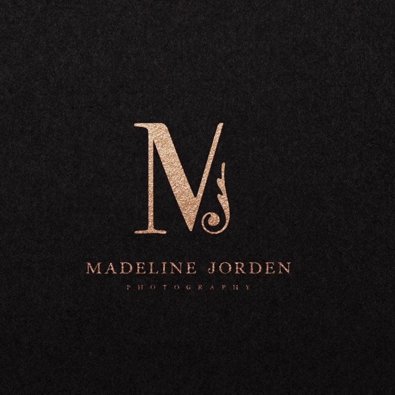
7. Hyper-pastiche


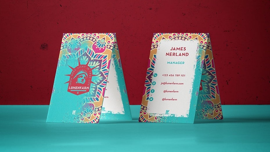
No graphic design trends list would be complete without a vintage inspired look making some form of comeback. What makes 2020 unique is hyper-pastiche: designers won’t revive one specific era but pretty much all of them. Whether it’s Victorian or Medieval, Art Deco or Art Nouveau, past art styles are merging with modern designs in one massive chronological collage.
I think the vintage style with modern elements and colors (and vice versa) will be very strong in the next year.
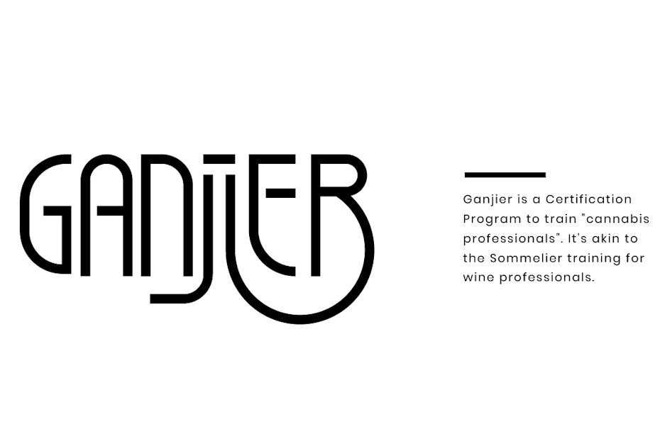
On one level, 2020 graphic designers are paying homage to their forebears. They’re seeking ways to redefine the digital aesthetic, and who better to turn to than the old masters? This is why an Art Nouveau flourish transforms what could be a basic lettermark for Madeline Jordan Photography into something special.
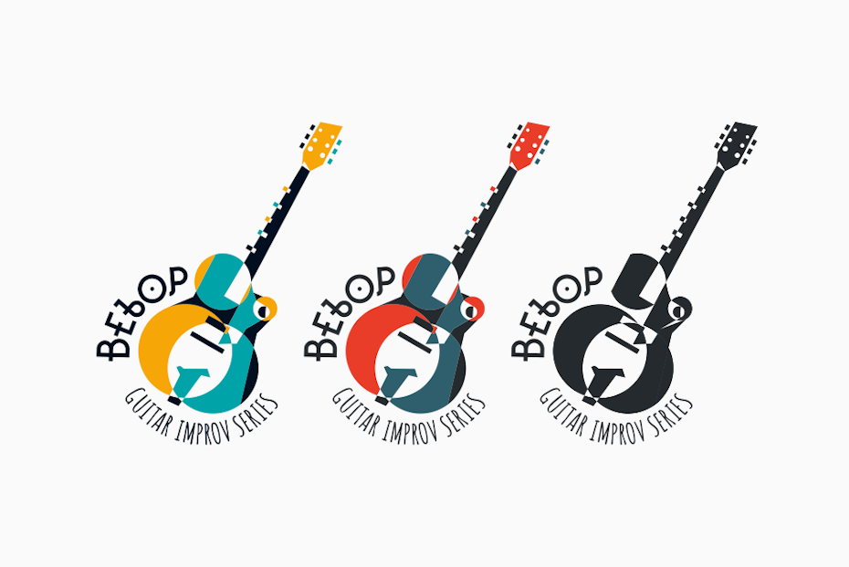
On another level, designers are taking advantage of the contrast between our digital images and past aesthetics to appeal to an old-world grandeur that is so often lost in vectorized simplicity. Bebop Guitar Series below gets the best of both worlds by fusing vector shapes with 1920s Harlem Renaissance abstraction.
The trend of Art Deco style designs is bound to stay. Some modern color implementation will change the mood for such designs. But in general the style is here to stay as it connects in a more personalized way.
The challenge of pastiche is to make these disparate aesthetics feel like each one is contributing equally to a cohesive piece. If done well, the effect is to eradicate the line between analogue and digital—maybe for good.
8. Continuous animation sequences


Though it can be a steep investment, animation is one of the most powerful ways to bring a brand to life, and it has become increasingly commonplace online. This is usually in the form of microinteractions and explanatory motion graphics, and if there’s one group of people who want to push the boundaries beyond the commonplace and the usual, it’s designers.
A seamlessly smooth animation by Daniel Tan, via Dribbble
Rather than simple motion graphics, animation sequences will evolve to be more of a story, involving continuous movement where each portion of the graphic is tied to the next scene.
In 2020, continuous animation sequences heighten immersion with seamless transitions that build each scene in real-time out of the elements of the current frame. This is useful for brands who want to take their viewers on a journey, making them feel as though they are flying through an ever-morphing world. Animation is already magical, and dynamic transitions like these keep the spell from breaking.
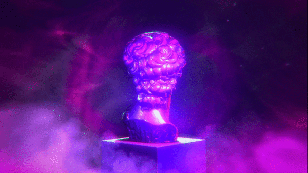
9. Bevels and chisels
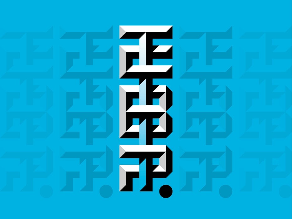
By creating 3D forms out of hard lines, the bevels and chisels trend harkens back to the classic struggle between skeuomorphism and flat design—except that designers have come up with a solution that incorporates both. On the skeuomorphic side, these designs subtly mimic real-life objects (like raised buttons, engraved coins or beveled stone), but they’re constructed out of flat colors. The end result is a flat image that looks tantalizingly real enough to touch.

I see the noise trend morphing back into bevels, with tight layering and opacity effects, combed with gradient and line for depth. I am keen to see how these styles expand as the effects are pushed and pulled. Ultimately, I wonder if realism is coming back: inner shadows on buttons, patterns and more noise.
3D stone-cutting techniques are particularly helpful in designs for digital scenarios, such as app icons and buttons. They create a tactile experience for users and mitigates the endless flatness that dominates the visual aesthetic of screens.
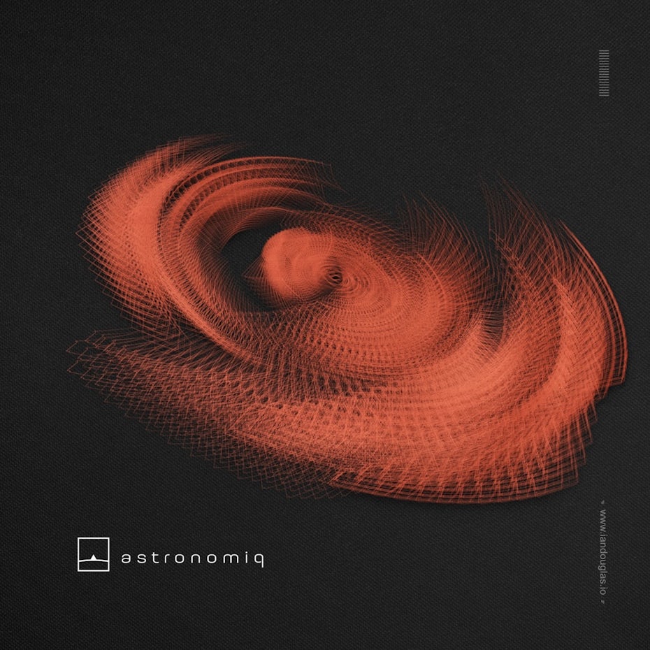
10. Live data visualization
In 2020, complex live data—like dashboard stats—will become even more immediately available, and designers will need to showcase information in a way that adapts to changes and dynamically animates. The concept is not unlike the visualizations on music apps like Windows Media Player that interpret soundwaves into abstract graphics.
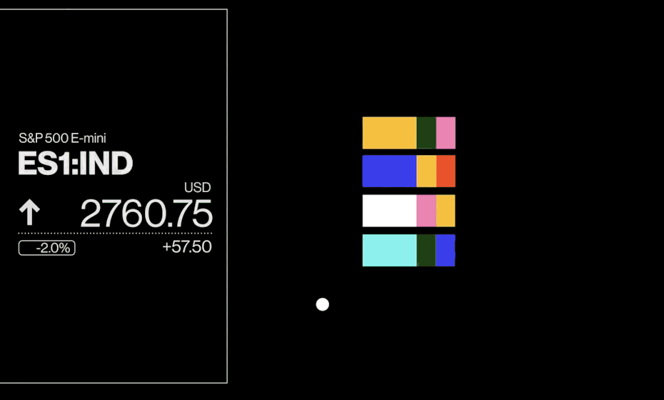
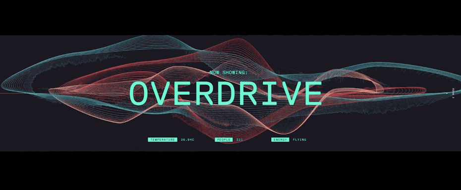
We live in a world of Big Data now, and we definitely see Data Visualization & Live Elements playing a much bigger role in design. From live, always-updating dashboards to kinetic, engaging stats, 2020 will be the year that web design and typography takes a leap into the always-changing world of live data.
From a stylistic standpoint, designers are going for a distinctly digital look with dark interfaces, heavy blues, abstract polygons and typography reminiscent of VHS technology. This is data that comes from a computer and is not trying to hide it.
This style is also a marriage of many of the graphic design trends listed above—neon color schemes, organic geometry and dynamic animations. The effect is to feel as though you’ve been transported directly into a mainframe where you can witness all of this computer magic happening in real time.
Graphic design trends 2020 are just the beginning
2020 will be about disparate elements coming together: the past and the future, the geometric and the organic, the real and the artificial. Maybe these design trends are just a coincidence. Maybe they say something about the mood we’re all in. One thing is certain: the 20s are off to an electrifying start. Whether this momentum will sustain itself over the coming decade depends on designers everywhere.
Do you need gorgeous graphic design?
Let our brilliant designer community create something unique for you.
The post 10 stunning graphic design trends for 2020 appeared first on 99designs.


