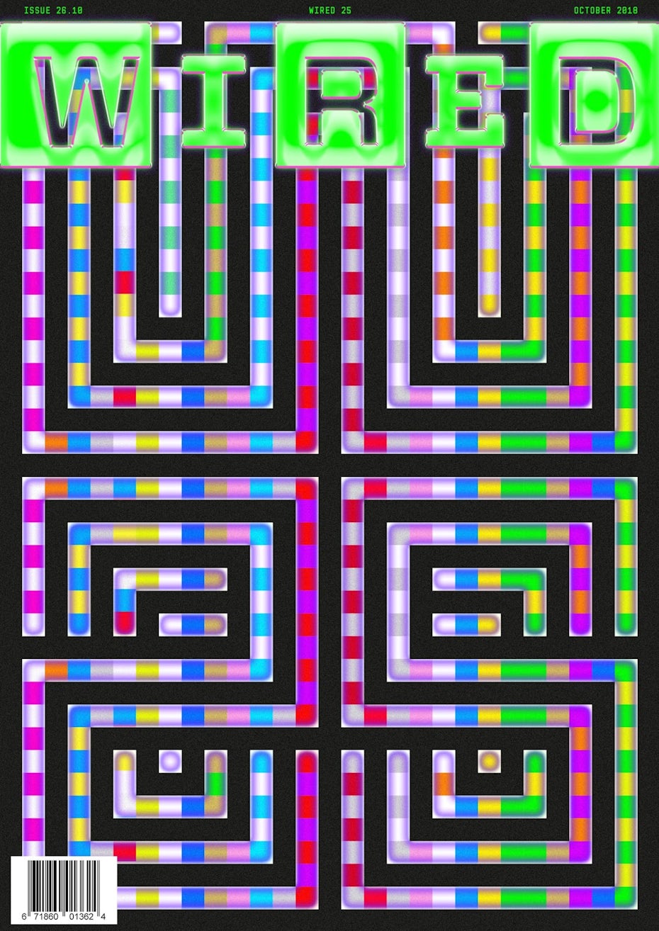
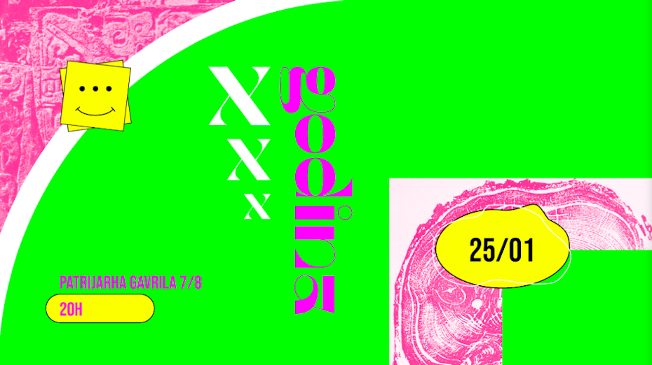
Logo fonts can make or break your logo design. Choosing the right typography can help to tell your brand story and amplify the impact of your logo whenever and wherever people see it. But the wrong font could spell trouble. There are thousands of fonts out there, and that’s exactly why we’ve we’ve put together this list the most notable, game-changing logo fonts of all time.
Many of these fonts are dazzling as is, but don’t forget that they are also a great way to get inspired about your logo design. They can be altered and modified in a multitude of ways to give your brand a unique feel. Picking the right font for your logo is important, so be sure to spend some time selecting the perfect one for your brand.
How to select logo fonts
—
Start selecting a logo font by first determining your brand personality (how your brand sounds and feels to your audience). Then consider which fonts evoke those same ideas and feelings you’re going for.
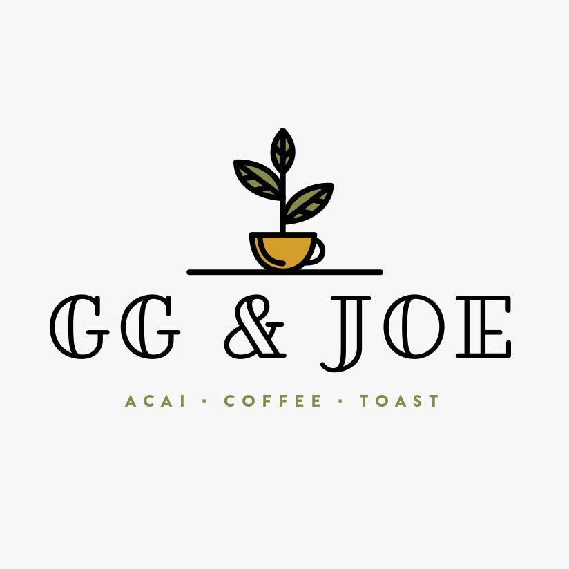
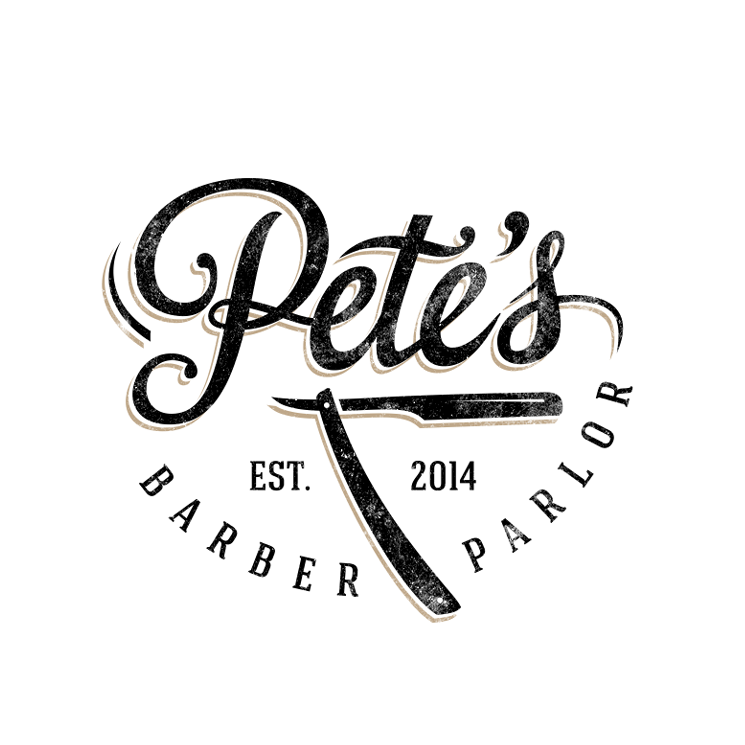
There are several types of fonts or font families to choose from, and each one tells a different brand story. Pick a font style and type that works with the style of logo you’re envisioning. Looking for a logo with a modern and minimal style? Then a sans serif font will be best for your logo. Want your logo to be more traditional and classic? Go with a serif font.
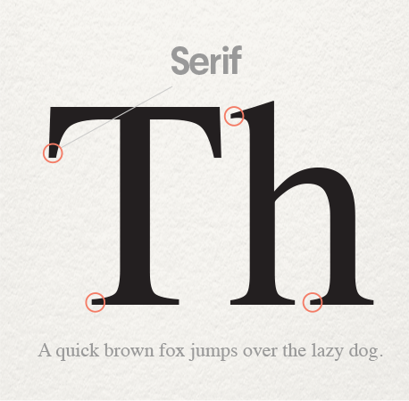
Serif logo fonts have decorative “feet” at the ends of each letterform and evoke a polished, classic feeling.
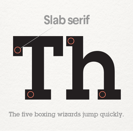
Slab serif logo fonts are bolder, louder serifs with large letterforms designed to be seen from a long distance.
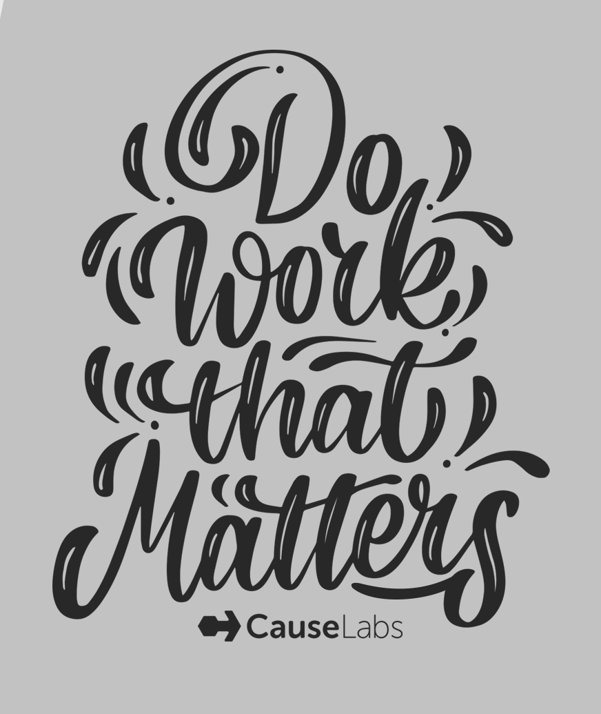
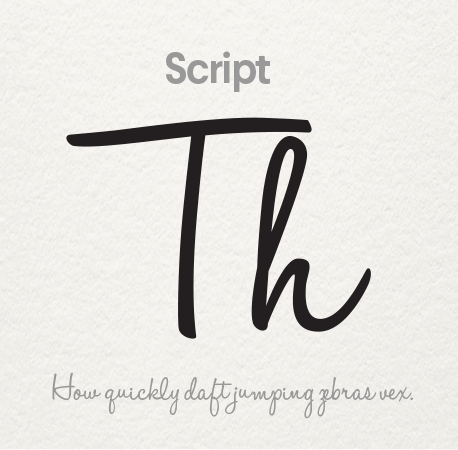
Script logo fonts are both formal and casual typefaces that have the loops and flourishes of script handwriting.
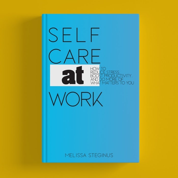
Sans-serif logo fonts lack the “feet” at the ends of each letterform and are considered more modern than their serif counterparts.

How many fonts should you use in a logo?
You should use no more than 2 or 3 different logo fonts in your logo design. Any more than that and your logo design will look too busy and inconsistent. The number of fonts also depends on the amount of text you’re incorporating in your logo. Choose one font for your main brand name and another font for additional supporting text, such as your tagline or brand description.
How to combine logo fonts?
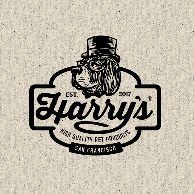
When combining different logo fonts in one logo design you want to make sure the fonts complement each other.
Pick one main font for your brand name that represents your brand’s style the best. It should be the most eye-catching out of the fonts you selected. Any additional fonts need to be more subtle.
- It’s a good idea to combine a statement font with a more subdued sans-serif font.
- Another option is to combine different versions of the same font: try combining the font of your choice in italics, bold or all caps.
- Avoid combining different statement fonts, such as serifs with slab serifs or a script font with another script font.
Learn more about selecting a font for your brand here.
Here are 61 logo fonts you should know:
—
1. Bodoni
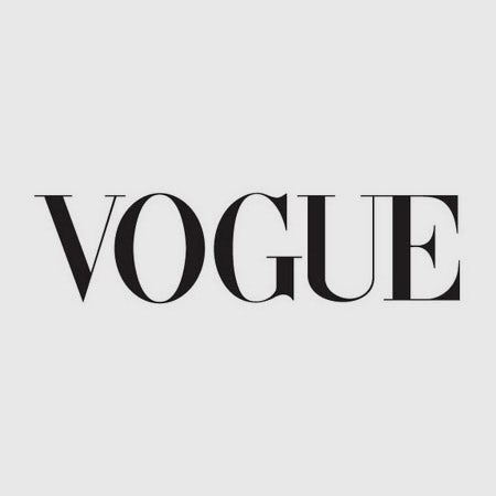

The Bodoni typeface surfaced during a time when typeface designers were experimenting with the contrast between thick and thin type characteristics. Giambattista Bodoni took that experiment to an extreme, creating this dramatic font. It has resonated through time in famous logos like Vogue and Calvin Klein, and is a great font to consider for mainstream fashion brands.
As you’ll see below, Bodoni has a lot in common with the Didot family of typefaces because it was created around the same time in history. Regardless, the Bodoni typeface has its own style.
Consider this logo font for fashion industries that are pushing the extremes on the runway!
2. Choplin
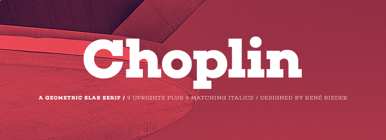
Based on the unconventional Campton font family, Choplin is a geometric slab serif by German type designer René Bieder. It’s modern, clean, and sturdy, drawing inspiration from Gill Sans and Johnston Sans while holding onto standout contemporary elements. As it lends itself well for photography layouts, editorials and assertive headlines, Choplin is a good font to consider for more assertive branding.
Choose this logo font for contemporary and narrative magazines and journals.
3. Garamond

Garamond is more of an umbrella term for typefaces than a single typeface. Many of the iterations we see in recent decades are interpretations of alphabets designed by Claude Garamond and Jean Jannon in the 16th century.
Interestingly, the Garamond typeface became one of the first “famous” typefaces when it was presented at the Paris World’s Fair in the 1900, and dozens of variations soon followed. This fame has continued into later decades, as seen in the examples above.
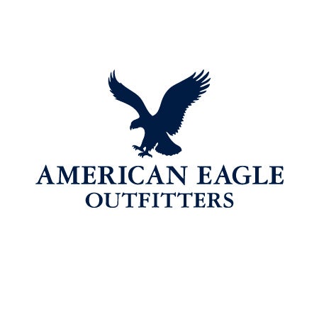
Garamond has an elegant appearance. The serifs on each letter are carefully crafted to convey their own personality, most notably the ones on the capital “T”. Because the serifs are so expressive, they can easily be used in a playful context—as seen in the early Apple branding. The refined letterforms also allow this font to be taken in a sophisticated direction—like in the American Eagle logo.
Consider this font for a professional and timeless logo with a flair of personality
4. Yeseva One
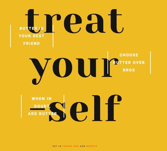
Architectural, high contrast and eliciting a particular kind of distinct, feminine essence, designer Jovanny Lemonad created Yeseva One as a serif display of “a complete agreement between a man and a woman”. Named after the phrase “Yes, Eva”, you can clearly see the friendly disposition even from its decorative feet. Yeseva One works well with Roboto, Open Sans, Roboto Slab, and other balanced serifs.
Choose this logo font if you seek to communicate a conservative, agreeable and graceful approach.
5. FF Avance

FF Avance is special typeface that pushes the envelope on asymmetrical serifs. The lower serifs of the capital “A” point to the right, while the upper serifs on the lowercase “v” point to the left.
Consider this logo font if you are looking to portray motion and energy. It’s a great choice for sports, automotive, and action-based industries.
6. Nunito Sans

Coming from Nunito, a balanced sans-serif typeface superfamily, Jacques Le Bailly created Nunito Sans as an extension and fresh alternative to one of the most popular sans-serif fonts in the Google Font Library. Nunito Sans goes along with Montserrat, Theano Didot and Abhaya Libre. Its high x-height (the distance between the baseline of a line of type and top of the main body of lower case letters) and short descenders (lowercase letters, such as g and y, that extends or descends below the baseline) grants an approachable display.
Choose this logo font for evolving and expanding corporations, to create a healthy dialogue around what currently is and what it can become.
7. Didot

Before Didot became known as a typeface, it was the name of a family composed of French printers, punch cutters and publishers in the late 1700s. They created many versions of Didot, one of which is used in the Giorgio Armani logo. Similar to Bodoni, the high contrast in line thickness creates drama. This font is also commonly seen in the fashion world. Didot works best when used simply, with careful kerning and high contrast colors.
Consider this font for a less dramatic fashion logo: one that is mature and classy.
8. Walk On

Hanson Chan designed Walk On originally as a corporate typeface for the fashion brand Wang & Lynch. Chan’s intention was to communicate a radical perspective to eras that deeply inspired him, specifically Art Deco’s straight lines and bold shapes and Art Nouveau’s organic aesthetic. Walk On’s subtle ornamentation, simple shapes and retro-feel creates so much flexibility for its application.
Choose this logo font for a nostalgic and decorative spin on a lifestyle-focused brand.
9. Neue Swift
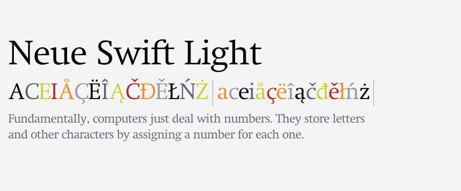
Neue Swift was designed to generate a horizontal flow, helping words and lines look separated and to read. This makes Neue Swift a great choice for wordy logos! The typeface also has distinct sloping serifs and “busy” angles.
Consider this font for financial, health or non-profit industries.
10. Gafata STD
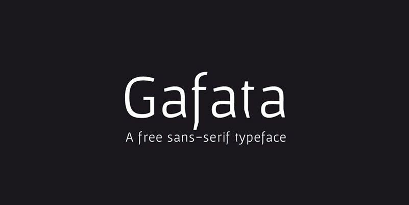
Although Gafata STD was exclusively made for small size text in a medium to long context, this flexibility allows the font to work well when used in logo design in so many different platforms and applications. This whimsical sans-serif does wonders for mixing style and legibility, leaving an impression through ease and its minimal touches.
Choose this logo font if the intention is to apply your logo to a variety of situations for a diverse audience.
11. Big Caslon
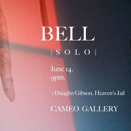
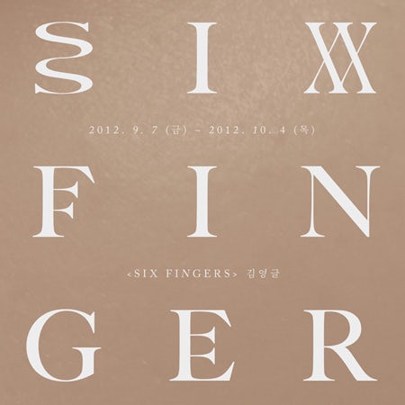
Big Caslon is a revival from a group of serif typefaces from the 1600s by William Caslon I. This typeface is a great example of classic typeface styles entering the realm of digital typography. Most of the serifs feel sharp and pointy, while some, such as on the uppercase “G” and “S” are slightly geometric. Overall, Big Caslon feels bold and strong—perfect for making a big point.
Consider this font if you want your logo to feel loud yet retain a refined and elegant side.
12. Glober
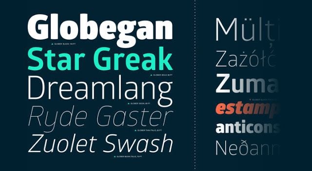
Glober is known for excellent legibility through a broad range of language support and case sensitive punctuation. Overall, it’s a classical font, but underneath those clean outlines and optimized spatial awareness, there’s a cozy appearance to these almost-too-perfect geometric forms. Make the most out of all of its options; pair Glober with bold, italicized and underlined supporting text within the same family.
Choose this logo font if you’re trying to go for technical, trendy and tender.
13. Canilari
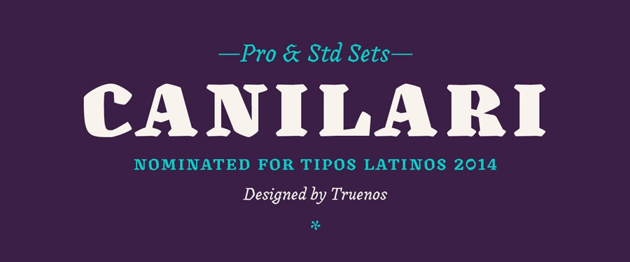
Canilari could be considered somewhat of an outcast typeface. It’s hard to pinpoint where exactly it fits into the context of typographic history, and that’s great for inspiring creativity.
Sometimes a strange typeface is what a logo designer needs to take a brand out of the box.
Consider this font if you simply can’t quite put your finger on the right font for your business. This font’s thick and crude cuts could work well for a modern butcher shop or could add a homemade touch to packaged goods. Use your imagination!
14. Ostrich Sans

Aptly named and outstretched, Ostrich is a narrow sans-serif with smooth rounds and a very long neck. It’s currently only available in uppercase lettering, so use wisely – especially if you mean to turn heads and make a long-lasting statement.
Choose this logo font if you’d rather shout than whisper, but in a politeful way.
15. Modesto

Modesto has a very interesting history from 19th and 20th century circuses and hand-painted typography. This digital iteration takes those analog forms and perfects them into a usable type family containing 23 fonts.
Consider this font for your business if you feel inspired by vintage circus styles, classic wooden crate branding or cigar box designs.
16. Abril Fatface
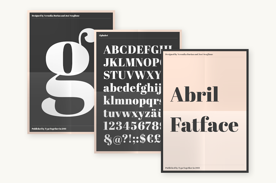
Abril Fatface was inspired by the heavy titling fonts used in advertising posters in 19th century Britain and France. Titling faces themselves are a relic from a particular tradition, where designing means each typeface exists for optimal legibility and beauty at a specific size – this is where details truly count. Thin serifs, clean curves and refined touches automatically yield an elegant appearance. Abril Fatface is a part of Abril, a larger type family system designed by TypeTogether, who are well known for creating custom designs for major corporations.
Choose this logo font when you offer bespoke services to a wider audience, and/or if the details truly matter to you.
17. Rufina

Rufina applies classic typography standards to stencil design. Where Rufina departs, however, is in the placement of the character breaks. Rather than looking like a stencil, it almost looks more like an artistic puzzle, with contrast and perceived texture. This technique allows Rufina to go in stylistic directions that other stencil fonts can’t.
Consider this font if you own an art gallery, an art-related business, or if you need to merge an artistic sensibility with a utilitarian aesthetic.
18. Aileron

Aileron is a Neo-Grotesque sans serif font with a distinguished and curved lower case letter “l”. It’s inspired by 1940’s aircraft models, where we were at the beginning of modern aircraft history. Models just began to fly higher and faster with powerful engines. Brazilian typeface designer Adilson Gonzales flew away with this concept, and created a retro-futurist typeface encouraging aerodynamic nature. It’s close to Helvetica design-wise, and conceptually close to Univers, and would partner up well.
Choose this logo font for a sleek and futuristic look, ideal for clothing brands and startups.
19. Revista

No font list would be complete without a stencil typeface, and Revista is an exceptional example. It brings the elegance of a classic serif face and merges it with the utility of a stencil font. The broken letter forms lend a down to earth, DIY vibe and makes a fashion-oriented font accessible to everyone.
Consider this font if your disruptive business aims to break—nay set!—trends.
20. Fenix STD

Uruguayan designer Fernando Diaz wanted to create a font that could be used simultaneously for long and short text without affecting legibility. Fenix was birthed; this serif typeface is inspired by calligraphy, and offers the chance for elegant readability in larger texts. It has rough strokes suggested from both sharp and edged curves. Spatial proportions are thoughtfully designed to save space in height and width. Fenix STD works well with Dosis, Open Sans, Raleway, and Exo.
Choose this logo font to evoke a classical and traditional wave amongst your logo design. If your company name is on the longer side, or if you’d like to include a slogan or motto, Fenix STD could be the right fit.
21. Rockwell
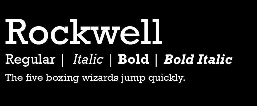
While Rockwell hasn’t been in the limelight recently, it’s a standout typeface from the 1930s. This is a classic slab serif face, which means that the serifs are unbracketed and of similar weight to the balance of each character.
Rockwell’s letterforms are pleasing in their simplicity. The shapes don’t feel overwhelming, even though they are complex.
Consider this font as the signature look of a business dealing in utility, construction or no-nonsense clothing.
22. Cassannet
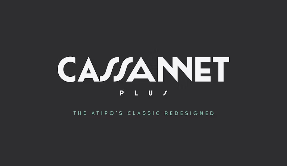
Ukranian-born and raised in Paris, Cassandre, or Adolphe Mouron, was one of the most beloved poster designers of the 20th century. Cassandre’s work celebrated modern luxury transportation and prosperous lifestyles. Using stencils and airbrush techniques to create stylized images of speeding trains, Cassandre’s work has become one of the most iconic amongst Art Deco.
Cassannet is a font based on the lettering on Cassandre’s posters. The sans-serif homage is ideal for vintage typography enthusiasts, Cassandre enthusiasts, and Art Deco connoisseur.
Choose this logo font to inspire luxurious Parisian lifestyles from back in the day.
23. Bodoni Egyptian Pro


Bodoni Egyptian Pro is a typeface which aims to subvert typographic norms. It accomplishes this by taking Bodoni and reducing it to a single stroke weight design. There are eight weights, all of which are exciting—especially the lightest weight, which seems to be composed of single pixel lines.
Consider this font if your business has a classical and robust aesthetic, or even an electronic and modern feel. That’s the beauty of such a versatile font!
24. Butler
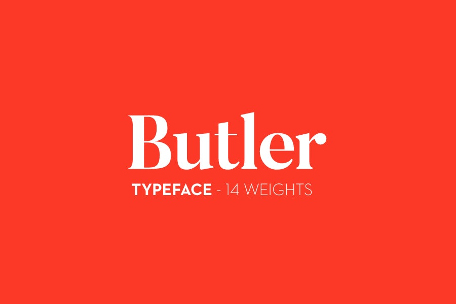
Butler is a serif typeface impressed by a mix between Dala Floda, one typeface that has roots in the Renaissance, and the Bodoni type family, a well-known serif typeface series of many interpretations by design houses. Butler’s main goal was to bring modernism to serif fonts through working on the curvature of classical serif fonts and to add an extra stencil family. It’s suggested font pairings are Twentieth Century and anything from the Bodoni family.
Choose this logo font for a more traditional food service business, or if you just want to be fancy.
25. Baltica

While Baltica fits the criteria for a slab serif, it looks very similar to a simple sans-serif. The slabs are bracketed and of different width from the letterforms, which is unusual for a slab-serif. These qualities are ultimately what set Baltica apart, giving it a signature look that helps define a brand like Winston.
Consider this font for a classic brands that want to be seen as trustworthy, or that espouse old-fashioned values.
26. Odibee Sans

London-based designer James Barnard set out on a design journey: to create his own one day build (ODB, or phonetically oh-dee-bee), and complete the entire character set, numbers and the basic glyphs in 24 hours. The result? Odibee Sans (get it?). This ambitious and bold project speaks for itself, and works harmoniously alongside monospace and handwritten fonts.
Choose this logo font for an intelligent, ambitious and whimsical logo design.
27. Grenale Slab

While you won’t read this anywhere else, Grenale Slab has a lot in common with Sassoon. The whimsical curls and bouncy rhythms are given a bold style that works well in display and fonts.
Consider this font if your company relates to health, gardening or storytelling, or seeks a robust yet playful aesthetic.
28. Quicksand
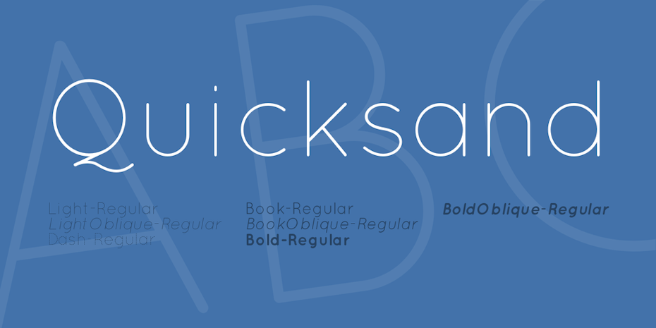
Quicksand is a display sans serif with rounded terminals (the end, whether it be straight or curved, of any stroke that doesn’t include a serif). Initiated by Andrew Paglinawan in 2008, the designer used geometric shapes as a core foundation as it was directly influenced by the geometric-style sans serif faces that were largely popular in the 1920’s-30’s. The characters have been optically corrected to be much easier on the eyes. Generally, rounded letterforms give off a warm and inviting appearance. Quicksand and Prensa are a match for font pairings.
Choose this logo font for an easy, breezy, contemporary base font for a logo.
29. ITC Lubalin Graph


A quiet standout from the past is ITC Lubalin Graph. This font is full of life, as seen in the steeply angled elbow on the lowercase “e”, the asymmetrical upper serif of the capital “A”, and the unforgettable sweeping tail of the uppercase “Q”.
This typeface was made in several different weights, and it’s said that the IBM logo by Paul Rand was an elaboration on one of the heavier weights.
Consider this font for brand names containing the letter “Q” and/or brands needing an energetic and outgoing slab serif!
30. Bowlby One SC

Bowlby One SC proved that a font can be both utilitarian and decorative, taking forms to create a design from scanned and co-mingling 20th century type specimens. During this particular era, there was a shift in typography identity to favor monumental style. Type itself then became a much more competitive business.
Choose this logo font for a slightly rough, ambitious and courageous look.
31. Bambusa Pro
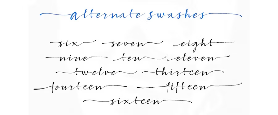
Script typefaces eluded digital capability for decades. That’s because the letters are unpredictable in handwritten cursive letterforms—no one knows where one character will end and another will begin. With the evolution of font files and new methods for making sure each letter connects properly, script fonts have become more popular than ever.
Consider this font if your business aims to feel natural and beautiful.
32. Alfa Slab One

When Napoleon returned from his Description de l’Égypt of 1809, the three year exploration made many preoccupied with any and everything Egyptian-related. Once the Egypitan typeface (also called slab serif, square serif, or mechanical) was created, the type founders took advantage of this craze, and simply named it after that.
Alfa Slab One is a fresh take on the Six-lines Pica Egyptian Robert Thorne created for the Thorowgood Foundry in 1821. The difference between the two is that Alfa Slab One was designed to be heavier. Just to name a few details, it has extreme stem weight, big serifs, more stem contrast and gradual terminals. Thicker and bolder fonts are great attention grabbers. Pair together with a thinner, smaller serif font, like Nixie One, to bring out that most important bold.
Choose this logo font to create drama and contrast behind your brand, especially if you plan to include a lengthier text.
33. Steak

Here’s a gorgeous typeface that can definitely make it in today’s market. Steak is a quirky cursive font that speaks to the handmade artisan aesthetic.
Consider this logo font if your business might exist alongside a hip flower shop, an artisanal ice cream maker or a cool silkscreen shop.
34. Advent Pro
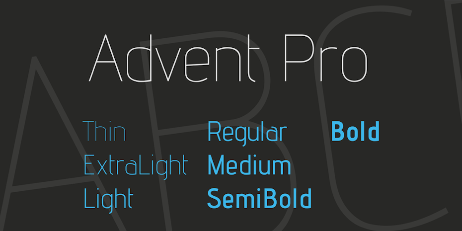
Advent Pro is an edgy display font, utilizing distinct universal characteristics of the whole sans-serif genre, but has created its own modern characteristics. Combine with Caveat for an effortless balance of familiar and friendly.
Choose this logo font to be provocative or support a politically-focused agenda.
35. Futura
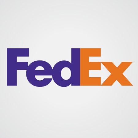
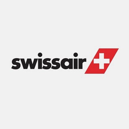
Futura might be one of the most successful and most used typefaces of the 20th century. The unusual, geometric letterforms project an optimistic modernism. The style is reflective of the radical artistic experimentation in Germany at the time, especially at the Bauhaus art school, whose values revolved around functionality and order. They also believed that the individual artistic spirit could coexist with mass production.
In the end, Futura is a classic sans-serif that holds its own against other typefaces of any era. FedEx and Swissair are two companies who have built strong brand identities with the modern—yet friendly—letterforms.
Consider this font for your logo if you are looking to create an internationally recognizable brand with a slightly unconventional and personable character.
36. Krona One

Yvonne Schüttler, the designer behind Krona One, looked to hand lettering from early 20th century Swedish posters for inspiration. This sans serif font is done in a low contrast, semi-extended style, which makes it super readable, memorable and attractive in either a small or larger display.
Choose this logo font for a chic, minimal and accessible atmosphere.
37. Univers

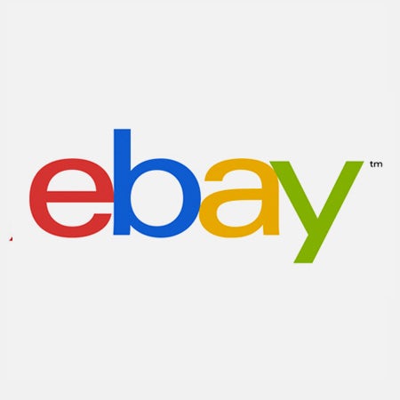
Univers was one of the first typeface styles to present the idea of a consistent font family. The Univers family includes a wide range of weights, widths and positions. Its designer, Frutiger, was not the biggest fan of purely geometric fonts and described Univers as having “visual sensitivity between thick and thin strokes, avoiding perfect geometry.” This attention to detail gives the letterforms a deep nuance.
Looking at the examples above, the cover to Europa/America creates an international and utilitarian look through its use of Univers uppercase letterforms. Meanwhile, the eBay logo shows a lot of personality. The arm of the lowercase “e” has a slightly lighter stroke than the rest of the character, the inner edge of the bowl of the “b” is shifted slightly to the left—creating interesting stroke variation—and the “a” and “y” feature delightfully unexpected shapes and cutoffs.
Consider this font for a logo with international appeal and universal accessibility.
38. Cardo

David Perry created Cardo as his version of a typeface cut for the Renaissance printer Aldus Manutius, and “designed for the needs of classicists, Biblical scholars, medievalists, and linguists”. Because it’s a large Unicode font (following the ambitious Unicode character code, a standard that provides a unique number for every single character), it works for situations that call for a high-quality Old Style font. Cardo would go well with a Neo-Grotesque sans-serif typeface, like Roboto or the previously mentioned Aileron.
Choose this logo font in a classically-focused, academic context.
39. Helvetica
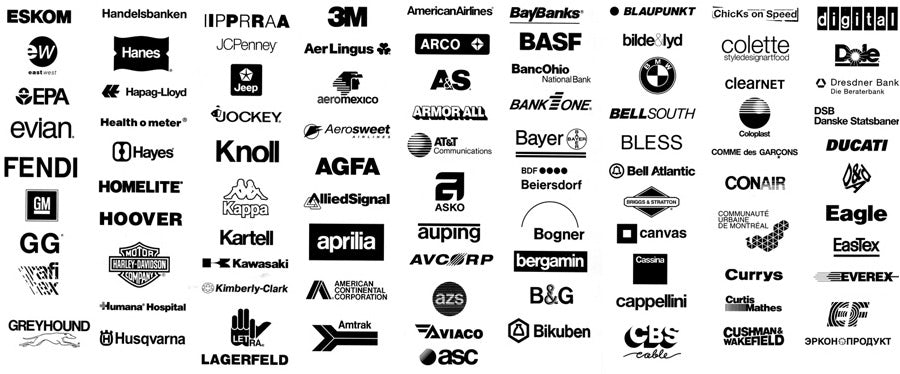
Many people don’t know that Univers was famous before Helvetica and inspired designer Max Miedinger to form a type family. Both fonts were of somewhat similar fame until the 70s and 80s, when Helvetica was licensed to Xerox, Adobe and Apple, to be one of the core fonts of the PostScript detection language.
Since then, Helvetica has gained international fame, as shown in the expansive usage above! That’s because the typeface is simple and utilitarian, with quirky touches—like the rounded square tail of the “R”, the narrow “t” and “f”, and the bracketed top flag of the “1”.
Consider this font for a tried-and-true appearance that feels familiar to new customers and seasoned design observers alike.
40. Vollkorn
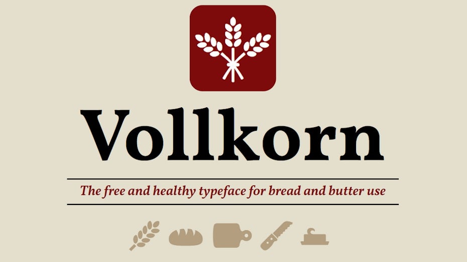
Friedrich Althausen gives us all a German lesson while simultaneously creating a classical serif font to work with. Vollkorn, pronounced “Follkorn”, is German for whole wheat flour and refers to an older term “Brotschrift”. “Brotschrift” were small fonts in hand setting times for everyday usage, ie inclusive. This was Althausen’s first humble type design attempt, where he intended Vollkorn to be quiet, modest and highly legible. This text face is surely for “bread and butter use”, producing quite the vital look.
Choose this logo font to add a bit of a rustic compliment to an existing high contrast, traditional logo design.
41. Frutiger

Remember Adrian Frutiger, the designer of the typeface Univers? Here’s another big one from him. Frutiger designed this typeface to be practical and useful for any purpose. The typeface is crafted for legibility at small sizes or at a distance. It’s no surprise that this font has been used on Swiss passports since 1985.
Consider this font for your logo when looking for a basic and utilitarian appearance that reads well in both small and large applications.
42. Rock Salt

Rock Salt was created by an artist who goes by “Squid”, a Tiki revivalist with a longtime fascination for hand-lettering from comics, toys and packaging from his youth. Squid took felt-tip markers to encompass a deeply personalized and rougher aesthetic. Use with Dancing Script to build more life into your design for a complex hand drawn logo.
Choose this logo font for a humanistic and spirited appeal.
43. ITC Bauhaus

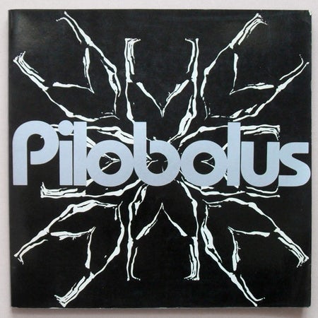
Bauhaus, and its many iterations, are reinterpretations of the forgotten 1925 font Universal. The typeface ITC Bauhaus takes inspiration from Universal and builds on it with the inclusion of upper and lowercase characters, and an overall refinement. The strokes are all the same weight and evenly geometric, yet somehow wacky in their swooping curves and slivers of negative space. The font has a retro feel and is perfect for logo designs looking to capture an old-school feel.
Consider this font for your logo design which seeks a nostalgic or retro feel.
44. FF Meta


According to font designer Spiekermann, FF Meta was intended to be the antithesis of Helvetica. Where Helvetica is more rigid, FF Meta is curved and fluid. The dot on the “i” is circular, the bends are unusual and a visual rhythm comes through when scanning your eyes across text set in this font.
Ironically, because of its popularity, FF Meta was considered to be the Helvetica of the 90s! It is used in the Herman Miller logo and The Weather Channel logo.
Consider this font for your logo if you are a Helvetica fan but want something a little different and more fresh!
45. Exo

In an attempt to convey a technological and futuristic vibe, Exo was born. Natanael Gama designed the sans serif typeface as a way to further his own research into typography. Geometric, contemporary, and masculine-leaning, Exo was meant to be incredibly versatile, and thus works well for most sizes.
Choose this logo font for a typographic techno.
46. FF Blur


In the 1990s there were two main transformations in typography. One was a decreased interest in legibility, and the other was the introduction of computers. FF Blur embodies both of these trends.
Neville Brody created this font by processing an iteration of Akzidenz-Grotesk through the Photoshop blur filter three times to create the three corresponding weights. The result is not particularly readable, but it does have an exciting look that was especially groundbreaking to those working in the early 90s.
Consider this logo font if you seek to break out of the norm and into the strange!
47. Horizon


Horizon takes inspiration from the typography used in the original Star Trek series. Quite fittingly, this font was used 21 years later in the film Star Trek: Into Darkness. In keeping with the digital experimentation of the 90s, Horizon has a space-age look—with sharp, unexpected angles that were achieved sharply with digital tools.
Consider this font for futuristic and science-fiction-based brands.
48. Sackers Gothic

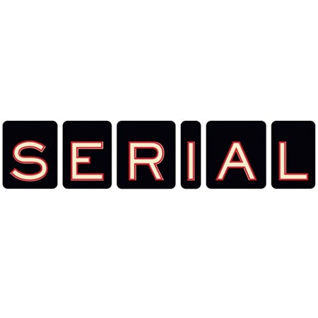
Sackers Gothic is one of those fonts that feels so human you have to love it. The curves in the “S” are perfectly imperfect, the proportions of the “E”, R” and “C” produce a visceral impact and the typeface as a whole feels warm and beautiful. Sackers Gothic would do well for wine bottle design, vintage signage, or farm to table restaurants.
Consider this logo font for an old-school vintage vibe that is also sensitive and classy.
49. FF Din
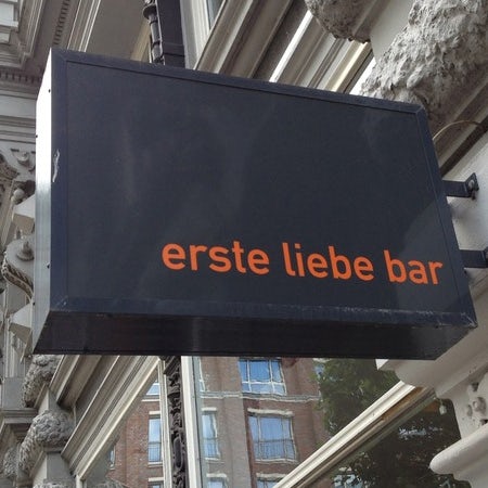

FF Din was created for the foundry FontFont by Erik Spiekermann (also the creator of FF Meta) and ended up becoming their best-selling typeface. It modernized san-serif design by extending circular elements into geometric ovals, cutting off letterforms in unexpected (but pleasing) ways and creating nuanced curves through advanced geometry.
Consider this logo font as another alternative to Helvetica. It’s a font that still has that positive, welcoming feel yet looks more modern and current.
50. Sassoon

Sassoon was designed by one of the few renowned female type designers in recent history, Rosemary Sassoon. This typeface is whimsical and friendly as a result of the swoops and curls in each letterform. It is also highly utilitarian because of its simplicity. The example above shows how Sassoon adds to the environment when used in signs throughout a children’s’ museum.
Consider this logo font in children’s applications or brands that aim to be whimsical and imaginative.
51. Neo Sans
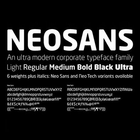

Neo Sans has become somewhat of a touchstone for sans-serif typefaces with curved corners. It was one of the first typefaces to use the technique in such a subtle and sophisticated way. It decreases the intensity of the font and creates a friendlier energy. This font was famously used by Intel, as seen in the example above, on the right.
Consider this logo font if you want to send an approachable, friendly vibe that is collected, clear and organized at the same time.
52. Proxima Nova

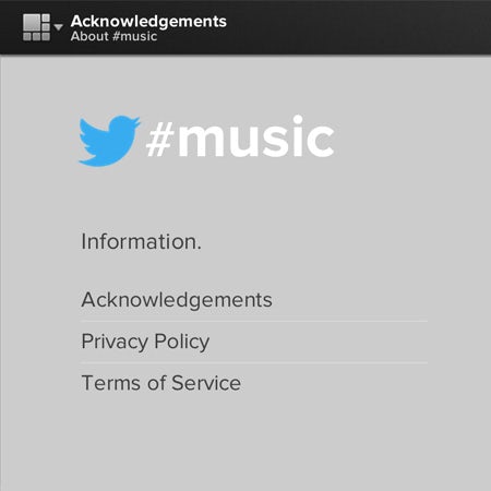
According to the designer, Proxima Nova is a font that bridges the gap between fonts like Futura and Akzidenz-Grotesk. Based on broad spectrum of typography styles, a bridge between those extremes was welcome.
Proxima Nova is a typeface that balances classic geometry and modern proportions. It is used by major companies like Spotify and Twitter music.
Consider this logo font if your business is heavily connected with social media or is going for a hip internet presence.
53. Foco

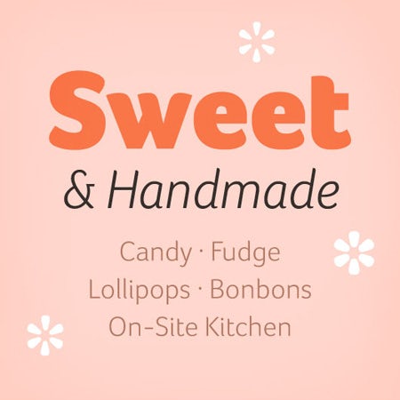
Everything comes full circle. Foco is unique because reintroduces the legibility that was lost in 1990s digital experimentation. This typeface experiments with the balance between soft corners with “quick” radii and “slow” corners with wide radii. In that respect, it displays creativity and personality.
At the same time, the character spacing and weights were carefully planned to boost readability and multi-functional use. This font reads well as the main face of a logo, a subtitle or tagline.
Consider this logo font if you want your business to feel cute, fun or tasty!
54. Tondo
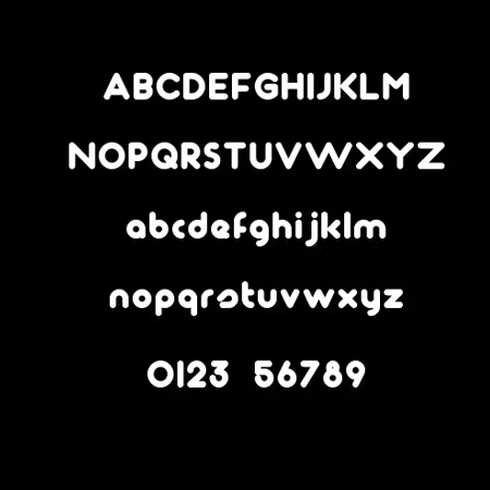

Veronika Burian (also one of the collaborators on the font Foco) is truly worth highlighting for her work on Tondo, one of the early fonts to take rounded corners to an extreme. The result is cute, fresh and healthy, which may be why it became part of the branding for the London marathon.
Consider this logo font if you (or your brand) have a bubbly personality!
55. Museo Sans
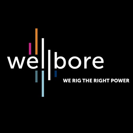

Museo Sans is a more user-friendly version of Museo, a bizarre serif font. In contrast, Museo Sans is simplified and minimal, giving the letterforms room to breath.
The letter “Q” gives a wonderful surprise—it breaks down the barrier between letterforms and abstract shapes by rendering the letter as a simple circle with a line through it. A true delight for us typographic nerds!
Consider this logo font if your business takes a minimal approach and needs a simplified aesthetic.
56. Uni Sans


The defining characteristic of Uni Sans is the way certain letterforms, such as the “N” and “M,” have extended wedges cut out of the joints. It’s unusual and opens the door for designers to play creatively with this unusual element.
Since this font pairs well with bold colors, it would do well with industries that honor strength, like fitness brands or advertising agencies. Best of all, Fontfabric has released four weights for free, so you can play with which suits your needs best.
Consider this logo font if you want your logo to stand out and “shout” in marketing materials.
57. Brandon Grotesque
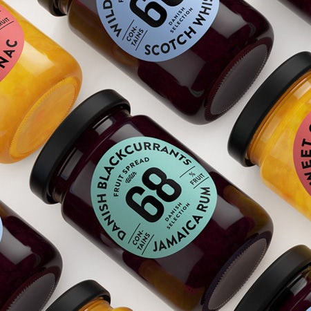

Brandon Grotesque stands apart from other sans-serifs with its low x-height, a characteristic that gives the typeface a certain compactness and warmth. Some of you may recognize it from the Comedy Central branding.
Consider this font if your logo will be used regularly on stylish packaging or modern label designs.
58. Amsi Pro

Amsi brings the classic 1900s Block Berthold typeface into the present by utilizing the subtle corner rounding of typefaces like Neo Sans, and adding three separate weights ranging from very thin to very thick.
In drawing on so many fonts that came before and combining techniques in a new way, this typeface has created a novel “comic book” style.
Consider this font for logos which need a font that reaches the extremes of thin and thick stroke widths.
59. Posterama
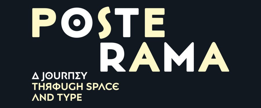
The Posterama font family contains 63 fonts that take “a journey through space and type!” This family touches on Art Nouveau, the Armory Show, the 1913 Exhibition of Modern Art, the year of Metropolis, the Art Deco period and more.
It’s well worth checking out the full font family and as seen from the example above, each face has unique character.
Consider this font if your logo aims to reference a well known artistic period from the past yet needs to feel modern and current simultaneously.
60. Docu
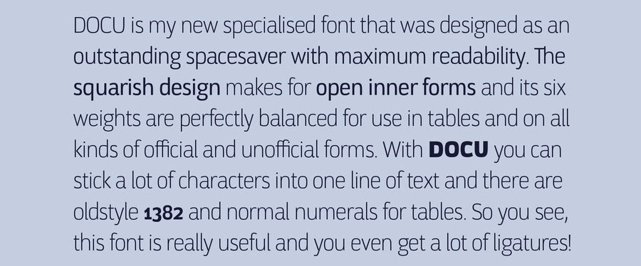
As explained in the type example above, Docu is a thin typeface and combats overly-wide logo designs.
Defining characteristics include the inward curves of the “C”, the odd curvature of the “S” and turned-in tail of the “y”.
Consider this logo font if your business needs an officious or legal look (or if your business has long name that could use a thinner font).
61. Rational TW
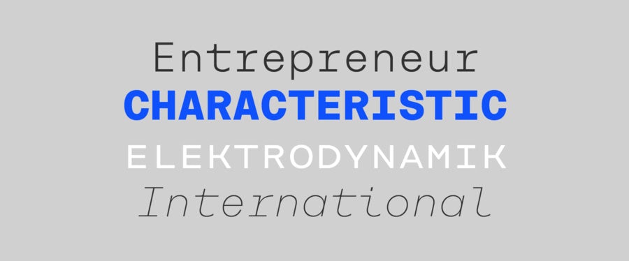
The “TW” in Rational TW stands for typewriter, meaning that this is the typewriter addition to the Rational type family. According to the designer, Rational TW combines Swiss and American gothic elements with a modern aesthetic.
This is a monospaced font, which makes it extremely legible and versatile. Extra attention was given to modifying each character to appropriately occupy equal space. This can be seen in the fun curls of the “t”, “i” and “l”.
Consider this logo font for a computer-related business targeting computer lovers and design nerds alike!
Logo fonts make the logo
—
Now that you’ve got a much better grasp on the variety of typography styles, you’ll be able to make better decisions for your logo fonts. With a keen eye, you can find the perfect typographic match for your brand. If you want to go deeper, check out these beautiful typographic logos and get inspired!
What to learn more about logo design? Check out our article on how to design a logo.
Have these logo fonts inspired you to get a new logo?
A logo design contest can get you dozens of ideas from professional designers around the world.
This article was originally written and published in 2016. It’s been updated with new information and examples.
The post The 61 best logo fonts and how to pick the right one appeared first on 99designs.