Vector and raster images differ in their resolution, the amount of detail they contain, and where they are used. It’s important to understand the fine differences between them and when to work with each—no matter if you’re a new designer, a seasoned pro or a marketer looking to hire a designer. Both raster and vector images have their own advantages and downfalls depending on the project at hand.
The answer really lies in what you are creating. We’ll look at the nuances between raster vs. vector images and help you decide which format fits your project.
Raster images
—
What is a raster image?
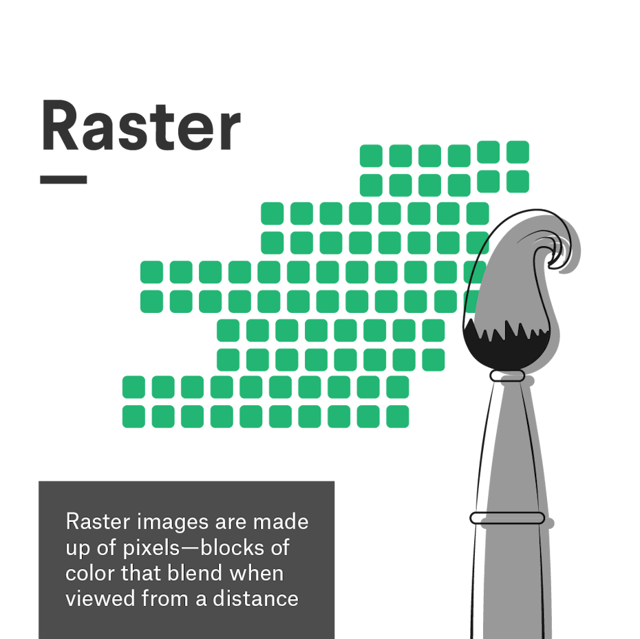
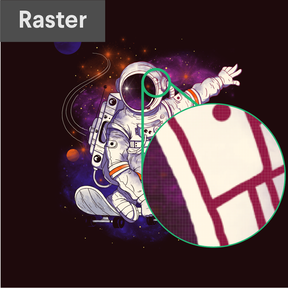
A raster image is any digital graphic that is made out of pixels arranged on a static grid. A pixel is a square of solid color made from the combination of red, green and blue light (also known as subpixels).
Think of a raster like a mosaic: from up close it just looks like a series of squares, but from further away an image forms. Although the pixel grid is not visible, designers add to it when creating graphics in a raster program like Photoshop. Whenever you use the brush tool to create a digital illustration, every brush stroke adds pixels along the brush path—the number of pixels dependent on the size of the Photoshop document and the radius of the brush you are using. When taking a photo or shooting a video, the lens translates the reflected light into tiny colored pixels that combine to form a realistic digital image.
Because each pixel is designated to a space on the grid, raster images are resolution dependent. This means that raster images cannot be resized without distortion because the number of pixels are fixed. The more pixels, the higher quality (or resolution) the image is, given that there is more opportunity for color blending when viewed from a distance. At the same time, fewer pixels means that an image will show up as tiny or will ‘pixelate’ when resized because there are not enough pixels to provide seamless shading.
Raster image pros and cons
Pros
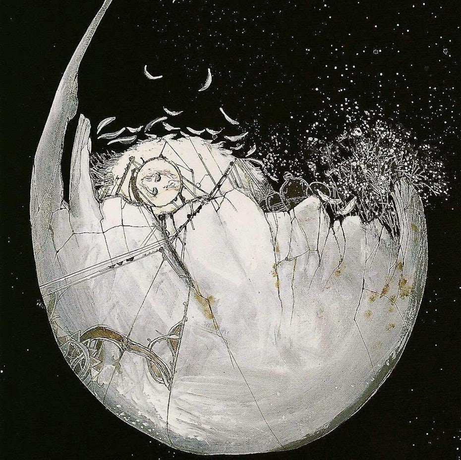
- Raster images are ideal to use when you want to show the subtleties of color gradients and shading—for example when you are editing photographs or painting photorealistic illustrations—due to the amount of color information they can hold.
- You are able to zoom in and edit each pixel for finer editing.
- Many advanced texture effects work best (or only) with raster images
Cons
- The amount of pixel and color information means that specific parts of the image can be difficult to isolate without complex masking.
- File sizes tend to be larger than vector formats.
- Raster images have limitations with scalability. For example, a large scale print like a billboard would require a huge file with a high pixel density.
- You have to pre-determine the intended size of your image which makes it hard to adapt if an unexpected change in the project comes up.
When to use a raster format
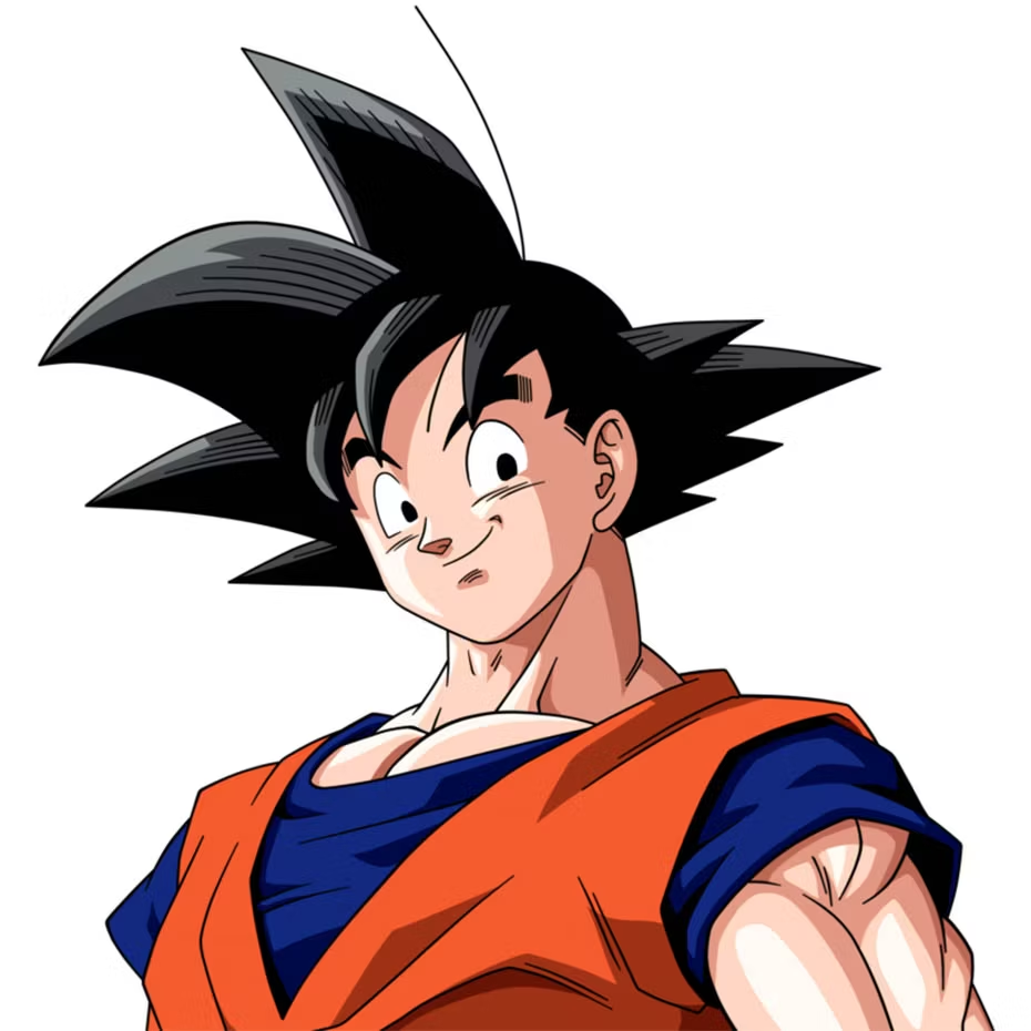
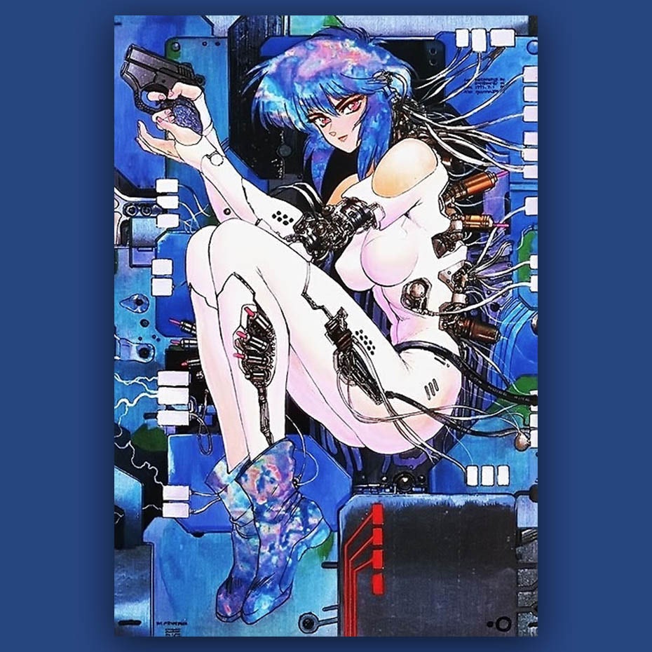
Raster is the default format for photography, video, and web-based media. When it comes to illustration, raster is ideal for photorealism and larger scale images due to the amount of detail possible. On the other hand, raster cannot be used for logos and are dependent on a high resolution when used for print.

Here is a general guide of which projects would better suit raster images:
- Photography
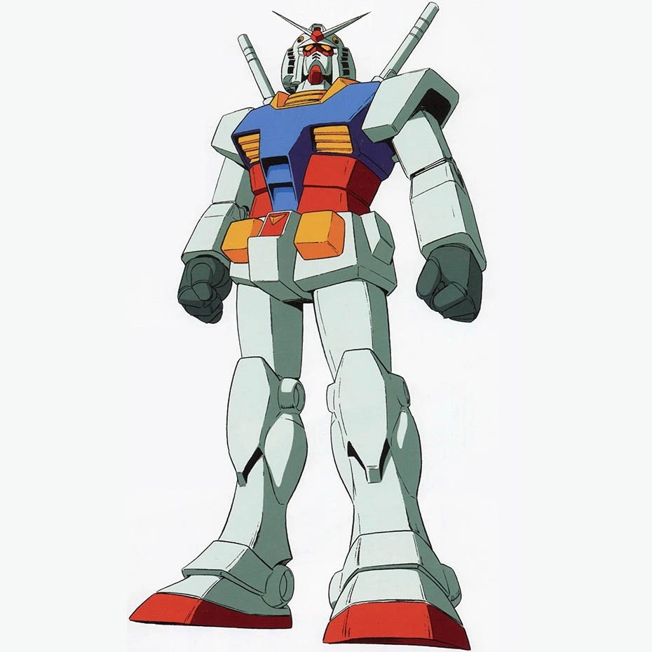
- Digital illustration/painting
- Any imagery that uses photography or collage
- Postcards
- Web design
- Mobile apps
- Photographic icons
- Banner ads
- Social media images
- Any other design intended for electronic use
Raster image software and file types
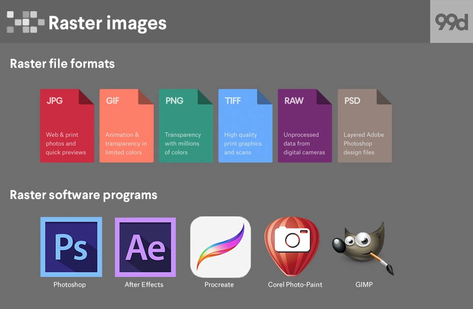
- Raster file formats
- JPG
- GIF
- PNG
- TIFF
- RAW
- PSD
- Raster software programs
- Photoshop
- After Effects
- Procreate
- Corel Paint-Photo
- GIMP
Vector graphics
—
What is a vector image?
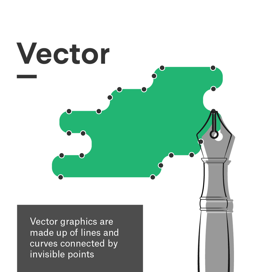
A vector image is an infinitely scalable digital graphic made out of mathematically calculated paths. Vectors are essentially geometric shapes that can be stretched or curved as need be.
There are three elements to vectors: points, polylines and polygons. Points are invisible in the final graphic, but designers can edit them within the software to change the shape of the artwork. Polylines or paths connect the points, and designers can assign color, stroke weight, and stroke profiles to them. Polygons form when paths are closed (i.e., all points are connected by a path). These can be assigned a fill color. Generally, a vector image will contain many of these elements all at once to produce a convincing graphic.
While vectors do incorporate math, you can leave your advanced calculus degree at the door when working with them. Native tools in programs like Adobe Illustrator allow designers to create vector graphics quickly and easily. The computer handles the calculations on the backend.
The key takeaways regarding the math involved are that graphics are geometric in nature and resolution independent—because there are no pixels, you can scale up or shrink down a vector image without sacrificing image quality. The computer simply recalculates the equations whenever the size or position changes.
Vector image pros and cons
Pros
- Vector graphics can be scaled to any size without losing quality.
- The mathematical components of how a vector is built allows you to create neat lines and perfect curves, making vectors ideal for symmetry and clean designs.
- Vectors tend to have smaller file sizes than rasters.
Cons
- Vectors do not display complex color gradients, textures or shading. This can result in a more flat, cartoonish style.
- Vectors prioritize crisp, mathematically precise lines which can make it difficult to replicate an imperfect, hand-drawn look.
- Learning curves of vector software tend to be steeper because the process of plotting points and combining shapes is not intuitive compared to traditional drawing.
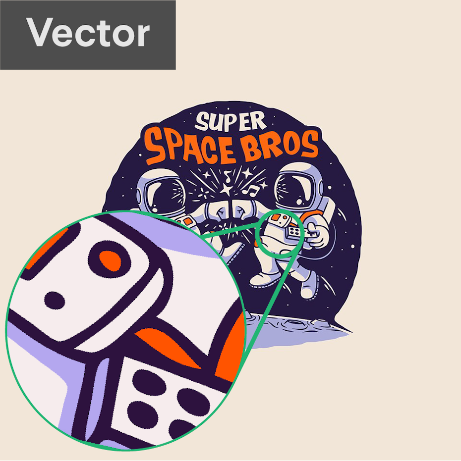
When to use a vector format
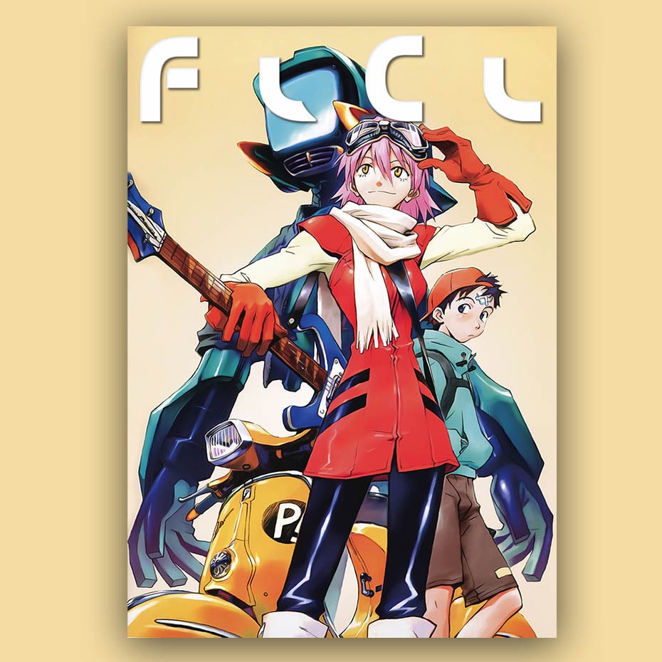
Vector graphics are ideal for print designs due to the fact that they are resolution independent. Their infinite scalability and simplified shapes make them perfect for designs like logos that must be adaptable and easily edited for a variety of contexts.
Their simplicity can also make vectors useful for animated graphics (even though the final animation might end up raster). Vectors can be used for illustration, and despite being stylistically limiting, they are capable of high geometric precision. Because vectors can be easily converted to raster, there’s no real situation when you can’t use vector graphics if the situation (and client) permits.
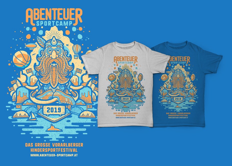
Here are some common situations that better suit vector images:
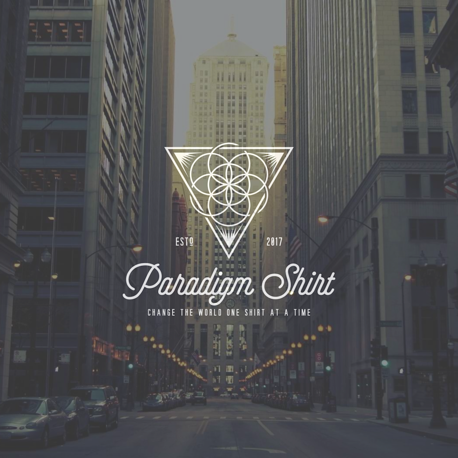
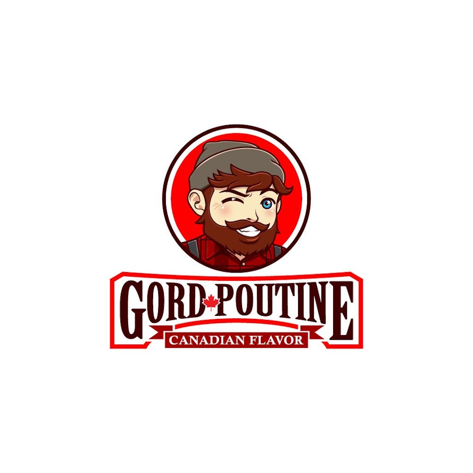
- Logo designs
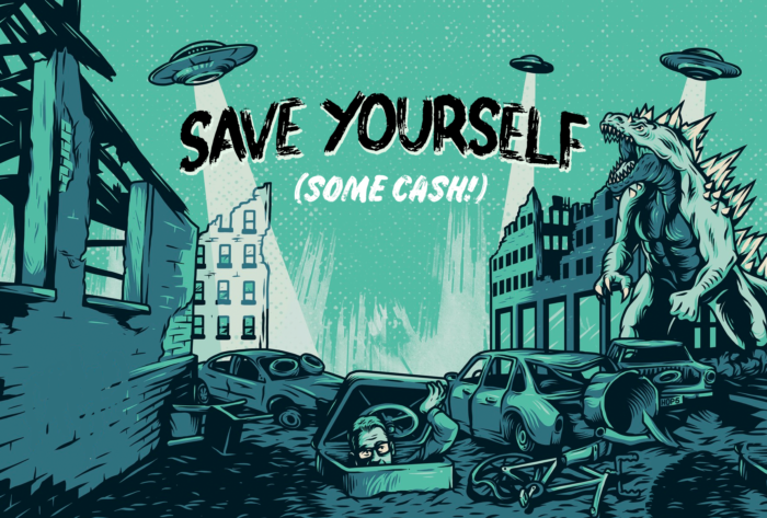
- Illustrations
- Packaging
- Brochures
- Posters
- T-shirts
- Signage
- or anything intended to be printed
Vector graphic software and file types
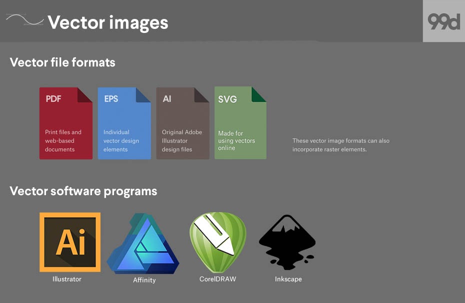
- Vector file formats
- EPS
- AI
- SVG
- Vector software programs
- Illustrator
- Affinity
- CorelDRAW
- Inkscape
Can I use raster and vector in the same image?
—
Technically, it is possible to mix vector and raster data in the same image. Whether or not it is a good idea depends on the project at hand.
Using vectors in a raster-intended design is permissible because the whole image can easily be exported as a raster file. One advantage of doing so might be to incorporate different art styles within a single image for contrast.
On the other hand, designs that are meant to be fully vector-based can become problematic when they contain raster data. Take logo design as the most obvious example. While you will need a raster version of a logo for digital spaces, logos must be infinitely scalable and editable for the many other spaces they will inhabit. This necessitates a vector source file since pixels cannot be scaled or altered as easily. When a logo is designed with any raster data, converting it to vector can be difficult and often impossible (see next section). In short, raster data here tends to lead to unusable logos and unhappy clients.
When deciding how you will create your design, make sure to review the industry standard image formats and stick to them. You may also want to check with the intended printer (if applicable to your project) as some print shops may require a specific image format as well.
How to convert between raster and vector
—
How to convert a vector image to raster in Photoshop
Converting a vector to a raster is as easy as clicking a button. Before getting started, make sure your source vector image is large enough to yield a high resolution when converted and that all text is correct—you will not be able to edit the spelling after it is rasterized.
Here are a few ways to convert a vector graphic to raster in Photoshop:
- Opening a vector file in Photoshop: you will automatically be prompted to rasterize the image. Just press OK on the dialogue box.
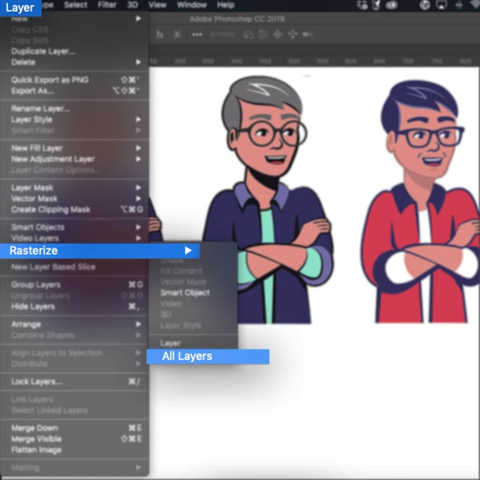
- For vector graphics created in Photoshop: Navigate to Layer > Rasterize > Layer (or All Layers if you wish to rasterize the entire document).
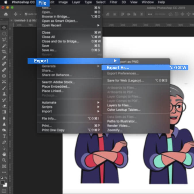
- Exporting a full raster file: Navigate to File > Export > Export As… > select a raster file format (find these in the raster file formats section above), choose a destination and hit Save.
How to convert a raster image to vector in Illustrator
Converting a raster image to vector involves recreating the image completely, and this can get complicated. Raster and vector are fundamentally different image formats, and getting them to look alike simply will not work most of the time. Because raster images can contain more complex detail and photorealism than vector images, data will inevitably be left out when you are transitioning from a complex format to a simple one. You will have better results when the source raster image is already made up of simple lines and color.
Generally, the best way to convert a raster image to vector is to trace over the image manually in a vector program, especially if you need to make sure the number and placement of your points is optimized for easy editing. Adobe Illustrator (and most vector programs) does provide automated tools for image tracing, though the results can be somewhat random.


Here’s how to use Illustrator’s Image Trace to convert a raster image to vector:
- Select the image
- Press the Image Trace button in the control panel or navigate to Object > Image Trace > Make
- Press the Expand button in the control panel or navigate to Object > Expand
- Ungroup the object to separate each shape for fine editing
Vector and raster belong in every designer’s toolbox
—
Overall, it is important to ask yourself at the start of the designing process what it is that you are designing, and what style you are aiming to achieve. Whether it is a poster, book cover or logo design, once you have a clear vision it will be easy to decide to choose between a raster and a vector image.
This article was originally written by Allison S. Gremillion and published in 2011. The current version has been updated with new information and examples.
The post What’s the difference between vector and raster images? appeared first on 99designs.


