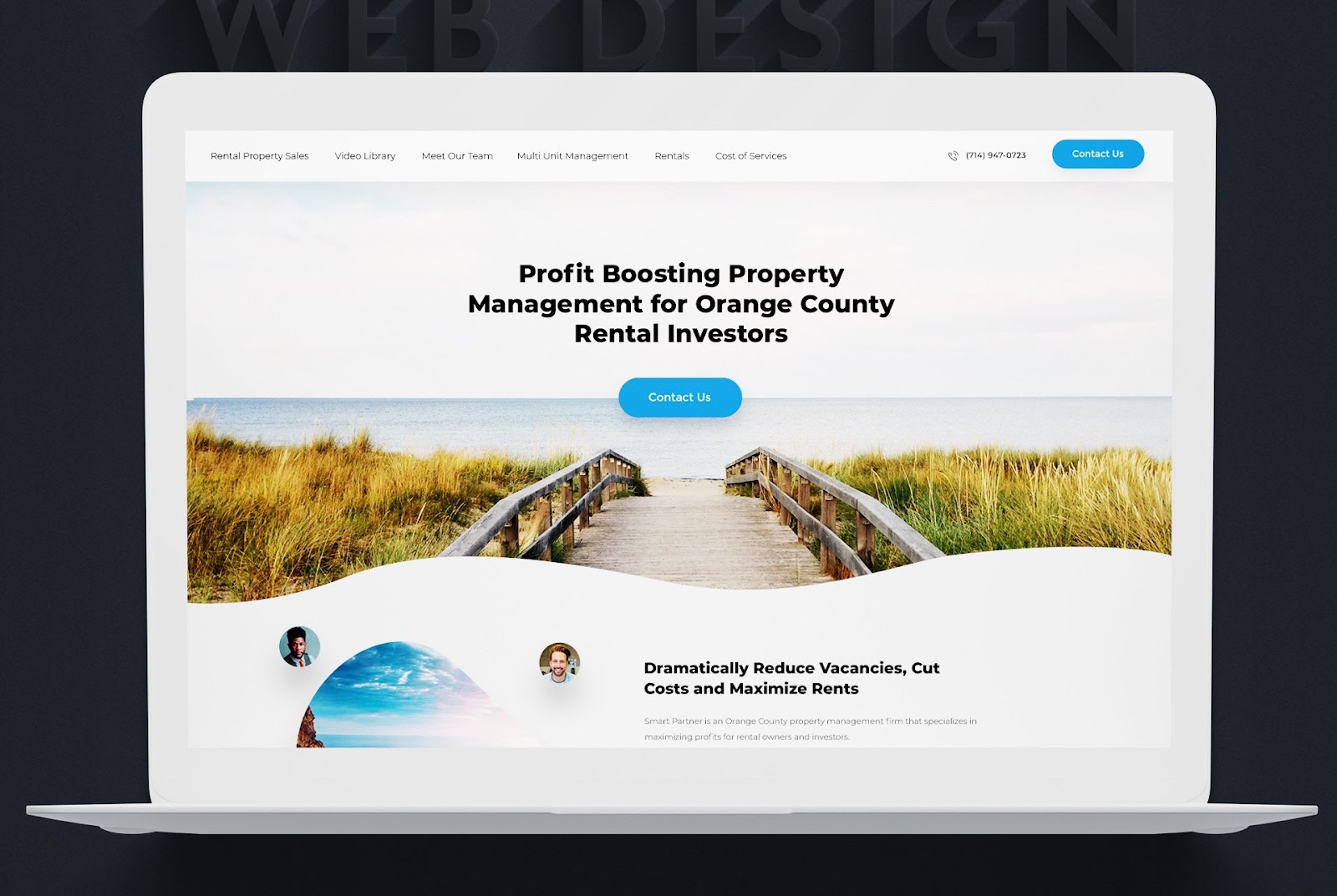
Years ago, you’d be forgiven for dismissing website builders as template services. But nowadays, website builders are exactly what their name implies: tools that streamline the construction of websites from start to finish.
Website builders have become increasingly popular for making website creation much more accessible and intuitive. Design by OrangeCrush
Although website builders still take advantage of premade templates, many also include custom design tools, hosting services, site security and analytic features within the same platform. Businesses of all sizes and budgets have integrated website builders into their workflow, rapidly building and launching web pages without much need for written code.
Website builders take a lot of the stress and cost out of the web design process, but newcomers can still find them daunting to use. There are so many options to choose from, with the sheer number of different builders out there and the vast amount of themes, templates and add-ons offered by each. To make it easy, we’ve put together this ultimate guide to choosing the best website builders as well as using them, including what to look for when deciding on yours.
What is a website builder?
—
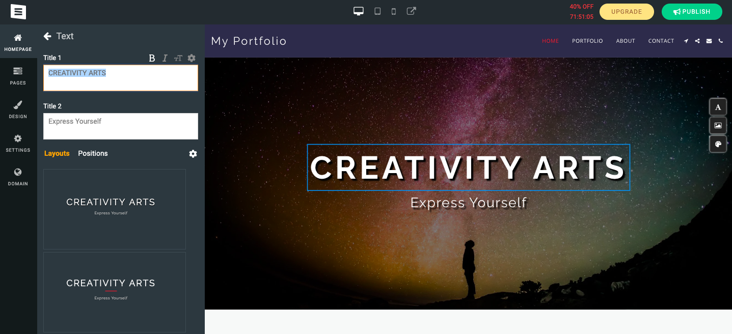
Website builders are content management systems (CMSs) in which users can create, edit and publish a functional web page using visual, menu-based tools instead of writing code.
So how do website builders work? One of the reasons website builders are so popular is that they commonly use WYSIWYG interfaces (What You See Is What You Get). In short, they allow users to live-edit a preview of how the page will look, instead of guessing how it will look from lines of code. For example, most website builders let you drag-and-drop elements like buttons where you want, a much easier system than specifying their location in the code.
Most website builders automatically generate the frontend and backend code based on the pages users create. This makes them a much more visual and intuitive way of building websites than the traditional method, not to mention they’re more helpful for web design novices and experienced developers who want to speed up parts of the process.
This example of a WYSIWYG interface from SITE123 that allows users to preview and edit their site using a menu, as opposed to writing code.
Templates are another common feature of website builders: they allow users to select from a library of premade website layouts and themes (or color and font schemes), giving users a foundation on which to build. However, higher levels of customization typically involve some coding knowledge or hiring a developer.
When the website is ready to be published, the platform usually also takes care of hosting and securing a domain name (with a recurring pricing plan).
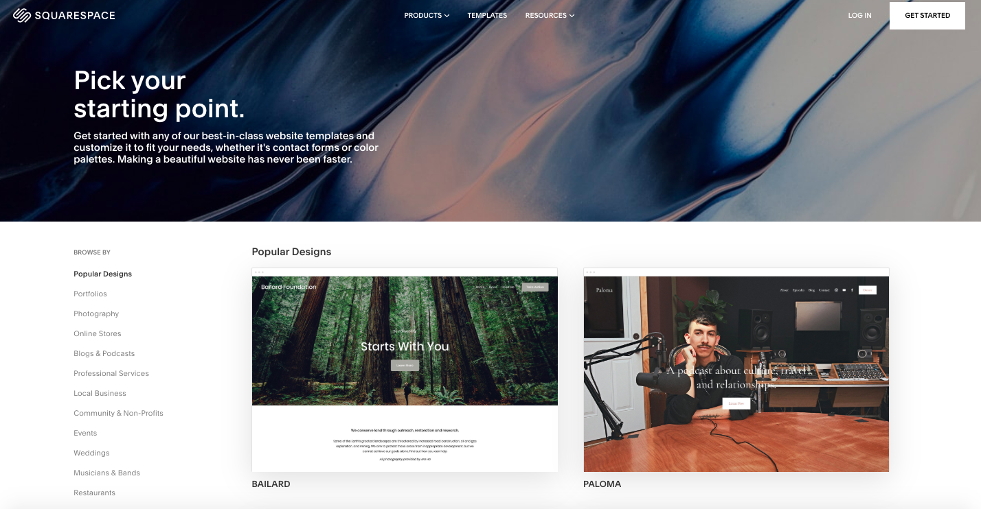
Website builders like Squarespace include a wide variety of customizable templates.
Overall, website builders by and large limit the amount of software and contractors necessary to create a web page, resulting in a significantly reduced overall cost. There are, however, limits to what they can accomplish, so it’s worthwhile to weigh your options carefully with traditional web design versus a website builder.
That said, it’s not an either/or choice. Hybrid solutions are common, like using a custom approach for the main site and using a website builder like WordPress or Square to power specific areas of the site like the blog or point-of-sale pages.
How to find the right website builder
—
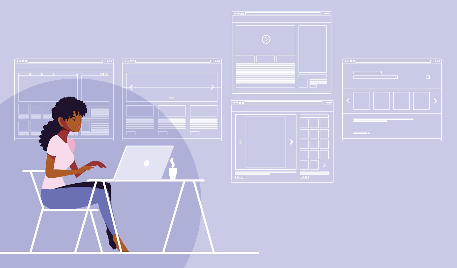
Finding the right website builder can take some time and online research. Illustration by aran&xa
Not all website builders are made equally. There are hundreds of options to choose from and making the best choice takes a bit of planning and research. At the end of the day, your decision comes down to which website builder allows you to accomplish exactly what you need, at the best possible quality, for the best price.
Before committing to a decision, we recommend assessing what your website will need beforehand and researching your options to the fullest. We’ll walk you through both below.
Assess what your website will need
Most website builders specialize in different types of website content. To make your decision, start by cataloguing everything you need. This not only gives you a checklist to compare against each website builder’s features, but also saves you a lot of time in the building process by collecting these assets ahead of time. In particular, consider…
Number of pages. This can help you understand the degree of complexity you are undertaking. Be sure to think about what task each page is supposed to perform, such as conveying information, transmitting messages between users, etc.
Media assets. How many images will you need and where? How many sections of copy or input forms? If you need video, animations or other multimedia, you’ll also need to make sure the web builder can support it.
Site functionality. What will the website need to do? Some website builders are made specifically for ecommerce, some are better for informational websites, others for blogs and forums.
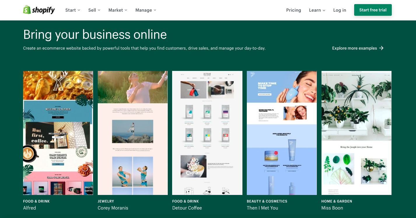
Shopify is a website builder that specializes in ecommerce.
Add-ons and plugins. Some website features are available within the website builder, but many require purchasing third party integrations called plugins. The amount of plugins you’ll need depends on the features you want, but it’s best to plan them out ahead of time for a more accurate budget. There are many, many plugins out there, but you can consider your needs through the following common categories:
user functions (live chat, support ticketing, subscription servicing, etc.)
marketing tools (SEO monitoring, Google analytics, promotional tools, etc.)
site infrastructure (speed optimization, security, file backups, etc.)
site building (tools that simplify customization and design).
Budget. How much exactly are you willing to spend? Most website builders include a subscription fee, but even those that claim to be free can get expensive quickly when you factor in asset generation, stock images/video, font licenses, add-ons, a domain space, site maintenance, hosting and media storage. Don’t forget to factor in time: how long it might take both learning the website builder software and actually building the website.
How to research your options
Shopping for website builders involves taking your time and weighing your many options. 3D design by AL_X
With your asset list in hand, it’s time to decide which website builder to commit your time and money to. There are an abundance of popular programs out there, and the subtle differences between them can be hard to identify at first glance. Here are a few guidelines to consider when finding and comparing your website builder options.
Review ranked lists. Many publications and content creators have gone to the trouble of testing out different web builders, comparing prices and features before ranking their favorites. You can search for these on blogs and YouTube.
Rule out those with limited features. Use product specs to identify and eliminate any website builders that can’t accomplish what you need them to. Don’t forget to research useful backend tools like analytics and whether plugins are supported to compensate for missing features.
Review the quality of the available templates. Compare the template and theme offerings of each website builder, checking for design quality, number, variety and the extent of customization they allow. More customization tools means that, with a little work, your website will stand out from the hundreds of others using the same template.
Research websites made with each builder. Although the quality of the templates is important, the quality of actual live websites made with the website builder show you the real possibilities. Some templates might look nice, but testing out live websites that actually use them may reveal lacking user experiences. Many website builders highlight star customers, but you can also find others by searching “websites made with” + the specific builder you’re researching.
Compare each product against user reviews. User reviews (that aren’t listed on the testimonial section of a company website) are helpful because they’re not curated by the business. Platforms like Trustpilot and sitejabber offer an unfiltered look into customers’ overall experiences—how intuitive the product was to use, what the results were like, and how effective the customer support was. While you have to consider that each individual review is reflective of that particular customer’s experience (which may be influenced by personality, expectations and taste), common complaints and praises can give you an average consensus.
Test out your top choices. Most website builders offer free trials, allowing you to test out your favorites before making a commitment. To save time, you should only do this with your favorites. Pay attention to ease-of-use and the range of features beyond those listed in the product specs. This is also where you’ll find out just how customizable the templates really are.
Make the final decision based on price and aesthetic preferences. By now you should have all the information you need to make your final decision. It all comes down to what will give you the best result (both in terms of design and function) at the best price.
How to use a website builder
—
Picking your website builder is only half the battle. Now comes the hard part: actually building the website. Although each website builder has its own specific workflow and includes its own instructions, here are some general tips on how to get the most out of any website builder.
Although website builders give you a number of templates to choose from, you should still plan the layout on your own. Go back to your list of assets and sketch out your ideas for how your website content will fit together.
These sketches don’t have to be anything fancy or detailed—most designers use simple boxes to signify content areas in wireframes. While not be an essential step, it does help you visualize the user’s journey without a premade layout to influence you. It can also come in handy when you need to narrow down which templates will or won’t work and can give you direction for customizing the template.
Choose the best template for your website
Templates are often the selling point of a website builder, an immediate visual representation for prospective buyers of what their website will be. As a result, they are often showcased in a way to heighten how attractive they are. But when it comes to choosing the best template for your website, remember that a website must be functional first and aesthetically pleasing second.
A general rule of thumb is that a website should make it as easy as possible for the user to find what they need and accomplish their tasks. For example, if you want customers to review their shopping cart costs and purchase, a simplified point-of-sale screen accomplishes this much better than one with flashy graphics or too much text.
You also want to keep in mind reading patterns and visual hierarchy when evaluating template layouts. Although most templates take these into account already, you can’t always rely on these generic setups to work with your particular website content. Review which elements of your web pages are essential for users to find or read, and then choose a layout that optimizes their placement and scale.
Also, it should go without saying, but pay attention to the type of website each template is designed for (a blog template probably won’t work for a traditional website, for example). It can be easy to fall for the visual appeal of a template and without realizing it’s made for a different functionality.
Customize the template
Once you’ve chosen a template you like, you need to replace all of the placeholder images and text copy with your own. But don’t stop there! A good website builder gives you the option to customize the template — sometimes, extensively so — and you should go above and beyond to take full advantage of these tools.
Part of the reason why you want to completely customize a template is to avoid a generic look, but even more important is how customization helps in building brand consistency on your website. Your brand is unique, and every element should be taken into consideration as to how it best exemplifies your brand, from color and font choices to spacing and alignment.
If you’re looking for even more customization, many website builders allow you to work with a web designer to make your site unique, either by customizing a template for you or by designing one specifically for your needs.
The commonplace WYSIWYG editors and drag-and-drop tools simplify editing a template, but it’s always a good idea to consult with a professional digital designer. A web designer has more knowledge in regards to design principles and what makes web pages work. Given all the money you’re saving by not making a website from scratch, you might as well put some of that towards professional design expertise to get the best result.
It’s also at this point you’ll need to integrate your third-party plugins. WordPress is one of the more popular website builders that not only supports plugins, but also makes them easy to install. There is a dedicated plugin menu, from which users can search for, purchase, install, activate, deactivate and delete plugins. In the absence of a menu like this, you‘ll need to follow the instructions outlined on each specific plugin’s site about how to install them on supported builders.
Publish website
Once you’ve finished the design, all that’s left is to publish the site at your domain and from there it’s live. A domain is simply a website’s digital address where users can find it.
Many website builders allow you to secure a domain through their platform (otherwise, you can use a service like GoDaddy). Although it can be more expensive, it’s better to purchase a custom domain made only of your brand name (www.companyname.com, for example) rather than one that includes the name of the website builder. The latter are harder for users to remember and awful for SEO, not to mention they announce to the world that your site was built on a template. Of course, there’s no shame in using a website builder if it’s cost effective and gets you a great result, but that also doesn’t mean you have to advertise it through your domain!
As a final step, be sure to test your website once it’s live. This includes testing every page and interactive element on multiple browsers and at multiple screen sizes. If anything is not working or displayed incorrectly, use the website builder’s CMS to make changes as needed.
A website builder is great start
—
Website builders are used by many businesses these days to quickly generate high-quality websites without making huge sacrifices to quality. They can be as simple as choosing a template, filling in the blanks and publishing to the internet. But even if you’re using a website builder, you want to take advantage of customization tools to ensure the template is working as well as it can. And the best way to get your design on par is to connect with an awesome designer.
Want to find the right solution for your website needs?
A great website layout is a conundrum: it’s often best when it isn’t noticed at all. Which is to say, if the designer has done her job right, the user will be able to find the product specs, the shopping cart, the promotional offers, and—most importantly—the purchase button without ever having to think about it. After all, more time spent figuring out how to use a website means less attention paid to its actual content.
Layout design provides the foundation to any great website. Illustration by OrangeCrush
Website layout design is about balancing aesthetics with practicality. The site should definitely look nice, but more importantly, it should give the user what they came for as efficiently as possible. Users have little patience for difficult web pages, which is why the highest bounce rates occur within the first ten seconds of visiting a website. True, a good website layout won’t always make a visitor stay (especially if the content is underwhelming), but you certainly don’t want it to be the reason they leave.
To ensure you get a website your visitors won’t bounce from, we’ve put together this guide to the fundamentals of website layout design. We’ll lay out the basics of what a good design should accomplish, the key techniques for effective website layout and the most common types of website layout.
The goals of a website layout
—
Simple as it might sound, the only goal of a website layout is to support the goals of the website, whether that be conversion, brand awareness, entertainment or another goal. But a website’s goals are expressed through content, and a layout design describes how to deliver that content effectively. With that said, here are some common functions a website layout can serve:
Information display: A good website layout organizes information so it fits together in an obvious sequence, is easy to scan, gives weight to the most important elements and makes the user’s tools intuitive to find and use.
A website layout should be directed towards defined goals. Design by Adam Muflihun.
User engagement: A good website layout makes the page visually engaging, guides the user’s eyes towards points of interest and encourages them to continue navigating through the site.
Branding: A good website layout plays a role in branding too, using spacing, alignment and scale in ways that are consistent with the company’s brand.
These high-level goals are what drive a website layout design, but before we look at specific website layouts, let’s discuss how to realize these goals in more detail.
The website layout design process
—
The process of mapping out a website layout should occur in the early stages of creating a website—that is, sometime after you’ve established your website strategy but before you jump into a graphics program to create the interface.
A website layout is visualized through a wireframe, which is a basic skeletal map showing how the content will fit together. It is important to distinguish wireframing from web design, which is the whole process of creating front end graphics and other visuals for the web page. Website layout design is a big part of web design, and it starts with wireframing. Ideally, the visual design should follow the wireframe layout so that graphic elements are positioned strategically, rather than on fleeting aesthetics preferences.
With that out of the way, here are the steps to creating a website layout:
Identify all content areas. Wireframes typically represent content with simple squares and rectangles, whether an image or a block of text. It is important to know ahead of time how much content you have and at each piece’s approximate size (or word count) so you can fit elements together with accuracy.
Create a series of wireframes and prototypes. A layout can be as simple as a pen-and-paper drawing, but there are also many programs (such as Whimsical) dedicated to streamlining the process. Because wireframes aren’t meant to be detailed works of art, you can churn out several at a time. Even if you fall in love with your first idea, you should design more wireframes to stretch your imagination and give yourself options. With no fancy graphics to distract you, you’re free to focus on the user’s experience and explore which arrangement will be the most intuitive to them. Be sure to account for all screen sizes—it is recommended that you start with the layout for mobile devices and build upward from there.
Test, gather feedback and iterate. Once you have some options, make sure you gather feedback from your colleagues. Apps like Invision and Figma allow you to create interactive prototypes so you can easily test buttons and navigation without building an actual web page. Having trial users screen-record themselves as they navigate the prototype can reveal UX stumbling blocks. Once you have some notes, go back to step two and iterate until it’s perfect.
Although these are the literal steps to creating a website layout, it can be hard to know what makes a layout effective or not when you are just starting out. In the next section, we’ll go over the specific techniques you can use to guide your design decisions.
The key techniques for an effective website layout
—
Website layout design is a decades-old practice, which means that a number of design conventions and principles have been established over the years to guide designers in their craft. The following are some of the most helpful of these techniques:
Visual hierarchy
Visual hierarchy is a way of styling the six design elements for heightened contrast in order to emphasize select pieces of content above others. To this purpose, the most important parts of the layout are those which the user needs to identify right away, depending on the goal of the page. These typically include headlines, value propositions, calls to action and user tools like navigation.
This website layout creates visual hierarchy using a simple black-and-white scheme, scale and font choice to draw the eye to different important landmarks on the page. Design by Shivom
Visual hierarchy can manifest itself in a number of ways, like font choice (size, weight and even different font pairings), aligning important elements higher up on the page or using complementary colors to make elements stand out.
Reading patterns describe the most common ways users scan pages and are depicted in directional lines (vectors, for the math nerds out there). Since research shows that 79% of site visitors only ever skim the page, it is essential to make scanning as easy as possible. Designing your layout with a specific reading pattern in mind is one effective way to do this.
This website layout arranges elements in a subtle zigzagging formation to support Z pattern reading. Design by JPSDesign
Incorporating reading patterns into your layouts involves strategically placing elements along the viewer’s sight lines. The most common patterns to consider are the Z pattern (a zigzagging vector; useful for image-heavy layouts) and the F pattern (a line-by-line vector; useful for text-heavy layouts).
In web design, “the fold” is the line at which a web page is cut off due to the screen size limitations. Content that is visible when the page loads is said to be “above the fold” and content that requires users to scroll down in order to reveal it is said to be “below the fold.”
This website layout cuts off graphics at the bottom of the screen (“the fold”) in order to entice visitors to scroll down. Design by Mike Barnes
When it comes to website layout design, the most important and/or persuasive content (such as a value proposition and CTA) should be positioned safely above the fold so that users don’t have to go looking for it. This space is estimated at 1000 x 600px for most screen dimensions. With that said, designers can also use the fold to cut off intriguing graphics and copy in order to encourage users to scroll down, continuing their engagement with the web page.
Grid systems
A grid system is a layout based on rigid measurements and guidelines. The grid is made up of columns (designated spaces for content placement) and gutters (the empty spaces between the columns).
Although grid systems originated in print magazines and newspapers, they are ubiquitous in web design for the mathematical order and consistency they create in the face of high volume content. At the same time, designers also need to be wary of monotony in grid design, and must use these constraints to create unexpected arrangements within the grid.
White space, sometimes called negative space, is simply the area of a design without any content—that is, the empty space. Though it is easy to overlook and often tempting to fill with content, white space can be the most important asset in a website layout.
This website layout draws the eye with effective white space. Design by masiko
Consider the way a line of text on an otherwise empty page will draw your eye much more effectively than on a page cluttered with content. Ample white space creates emphasis while making the entire composition feel less daunting to read. Unlike print pages, there is no limit to how long a web page can be, giving designers much more freedom to be strategic and generous with white space.
Website layouts are rarely created from scratch; in fact, it’s often advised that they aren’t. Most modern websites are based on common layout schemes, used over and over with small variations all across the internet.
Although some degree of originality is important in any design, websites are meant to be immediately understood and used. So when users become accustomed to certain types of layout designs over the years, it makes sense for designers to stick to them. Remember that at the end of the day, a layout must be practical, and the less time users have to spend learning a new layout, the more time they dedicate to actually using the site. With that aside, here are some of the most common website layouts:
Single column layout
A single column layout is one in which content is arranged sequentially in one column, often in a centered alignment.
Many web page layouts start here, given that mobile-first design is a long-recommended approach and mobile websites are often arranged in a single column due to size constraints. This layout is most useful for landing pages or feed-based content, such as social media and blog sites, as it reduces the amount of page elements and encourages scrolling.
Two column layout
The two column layout, sometimes in a split-screen arrangement, displays content side-by-side.
It is useful for highlighting the dichotomy between two elements (different audiences on clothing websites, a before/after style of service, or dual options for pricing, for example). It is also useful for counterbalancing graphics with copy while subtly supporting Z pattern reading.
Multicolumn layout
A multicolumn layout is often called the newspaper or magazine layout. It accommodates heavy site content within the same page.
It is common to use a grid to maintain order and hierarchy, giving wider column space to more important elements such as body content while less important elements such as a navigation menu, sidebar or banner ad receive less proportionate space. It is useful for company home pages, image- or video-heavy sites, online publications, user dashboards, and shopping websites—that is, websites with a lot of content and categories to direct users to.
Asymmetrical layout
An asymmetrical layout is where elements are arranged in unequal scale and proximity—in simpler terms, not symmetrically. But although it is the antithesis to a grid-based system, asymmetry does not mean chaos
Balance is essential in any design, and an asymmetrical layout simply achieves this in unexpected ways, such as pairing a large-scale visual on one side with many smaller elements on the other. It is useful for heightened emphasis by exaggerating some elements (either through literal size, coloring, or placement) over others. It can also support customized reading patterns (as opposed to the common ones mentioned earlier).
Brands who can afford to be unconventional in their design approach will find this layout style ideal—which is to say websites that deal in the arts, have adventurous audiences, or want to highlight an innovative or disruptive product.
Website layout all laid out
—
A great website layout design not only makes your website visually appealing, it makes it intuitive. It is the first step towards a winning first impression with users, encouraging them to stick around and see all of the content your site has to offer.
While these fundamentals of website layout design can give you a place to start, you should aspire to go above and beyond to deliver exceptional experiences for your site visitors. And the best way to get a cutting edge website layout design is to make sure you’re working with a professional designer.
Looking for an effective website layout?
Our designers can create the perfect look for your site.
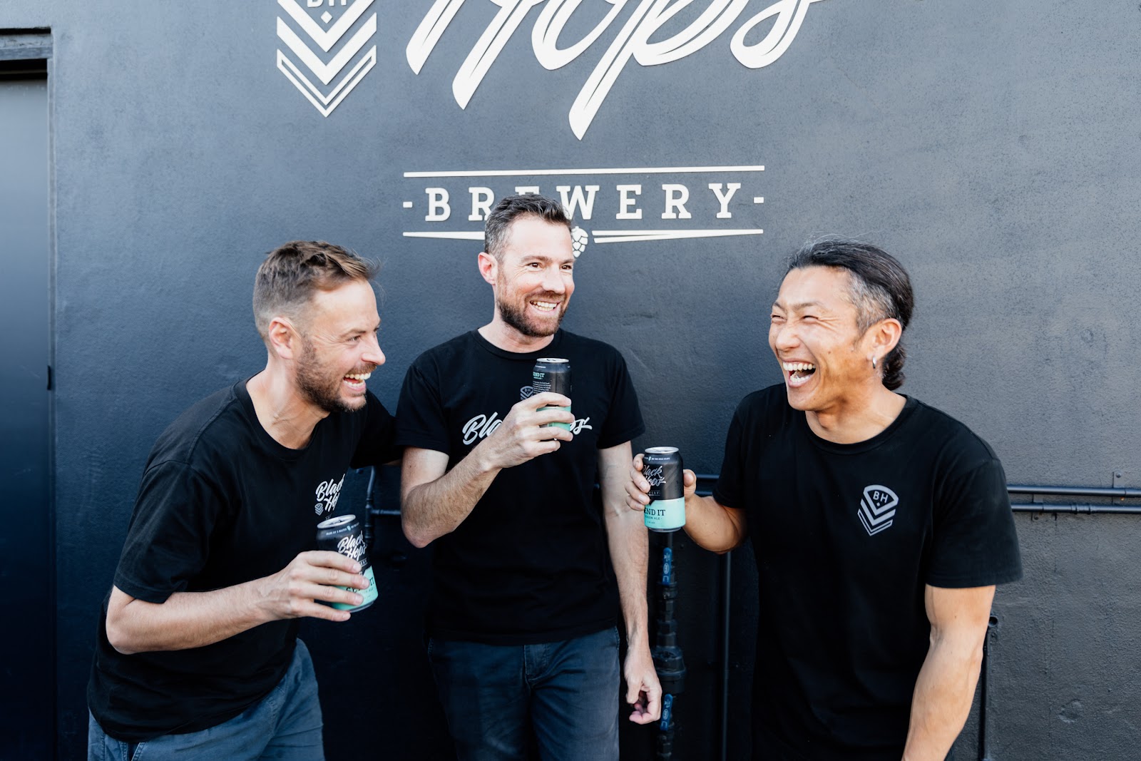
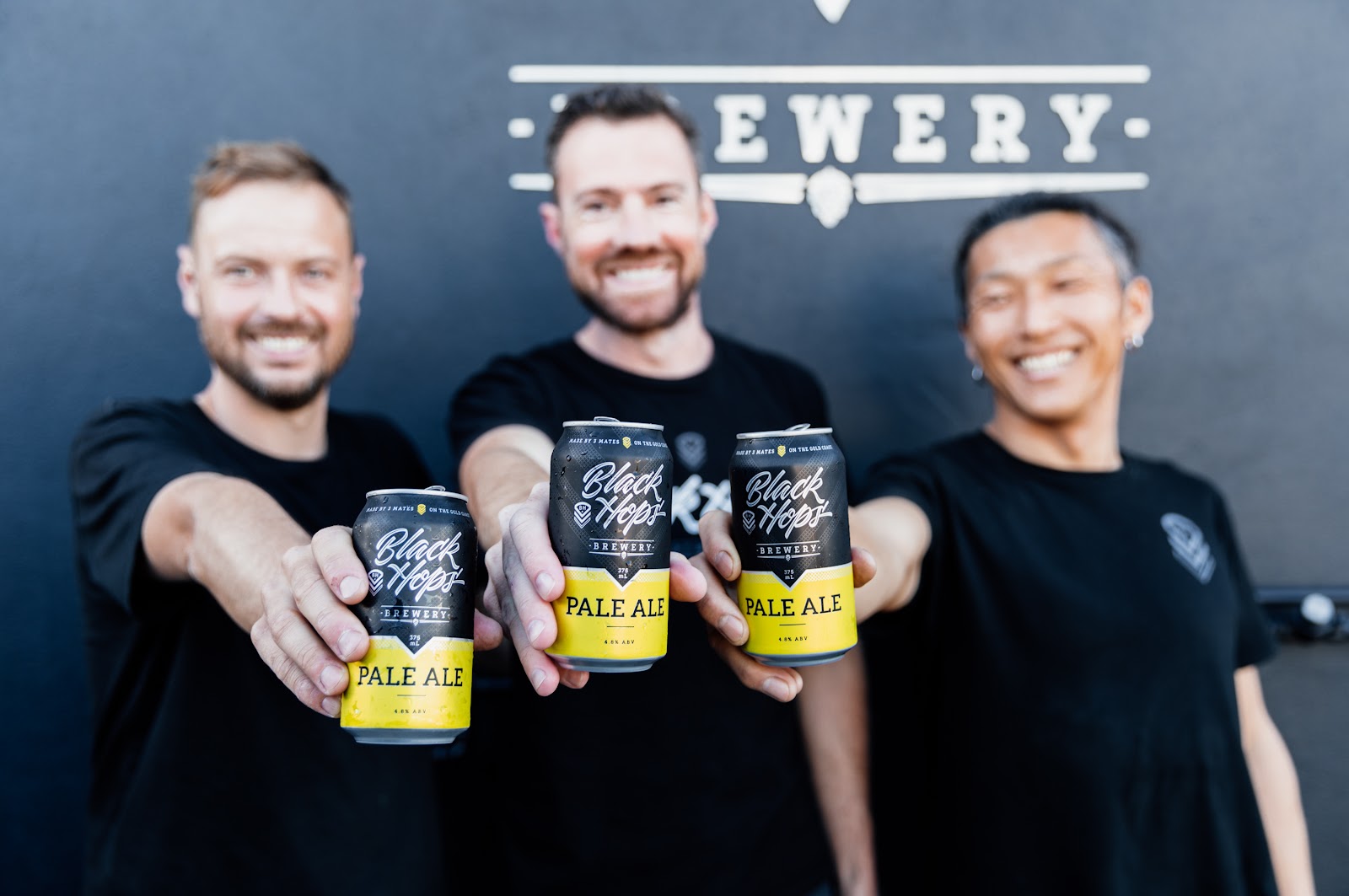
I’m often told I have the dream job and to be honest I’d have to agree. I get to spend my days running a brewery called Black Hops that I started with my mates Eddie and Govs. Not only that, I spend most of my time working with amazing designers to design really cool beer branding.
Over the years we’ve learned a few things that should be useful to business owners or designers designing beer cans or similar physical products. In this post I’ll cover what I’ve learned to date starting with the overall beer branding process, but spending more time on our approach to designing beer packaging (ie. cans).
Amazing beer deserves amazing branding. Illustration by OrangeCrush
Gone are the days of designing one central brand and product. We create up to 100 or so unique beers in any given year and the majority of them are fully branded cans. This article will cover the beer branding process by going over the various options for packaging beer, then looking at the various approaches for different types of releases and ending with some general rules for beer branding design I like to follow.
Remember, I’m coming at this from the business owner’s perspective, not the designers perspective. Don’t @ me!
Beer branding basics
—
The majority of this article will focus on branding packaged beer (cans). But before you can produce a branded can, you have to have a brand to start with. Other articles on 99designs—like this one about the process of branding—have done a great job explaining how you can develop a core brand for your business. I’ve found that the process of branding will change a lot from one designer to the next, and from one company to the next. That said, the high level steps in that article hold pretty consistently to what we did at Black Hops.
1. Build your brand strategy
At Black Hops this part was pretty easy, we had our name in place well before we started the brewery. Govsie’s military background worked well and with our approach, which basically consisted of sharing everything we learned along our journey. We became known as “the least covert operation in brewing.” We didn’t want to push the military angle too much, though, rather we wanted it to be a subtle aspect of our brand and in our beer names and stories. I feel like this part of branding can easily be overthought and you get to a point where you have everything so perfectly branded that it doesn’t look genuine.
That said, it is super helpful if you stand for something and that thing is something your customers can relate to. This is the essence of a brand strategy.
2. Do market research
This is the fun part—particularly if you’re in the beer game—though our first effort at market research turned out to be not such a great time. When we first met with our original designer for Black Hops we thought it would be great to go down to the local bottle shop and have a look at what was on the shelves. After about two minutes, the bottle shop attendant told us to leave because we hadn’t bought anything!
The research part is important because ultimately your product is going to end up on the shelves next to other beers. So even if you don’t want to do the research component for inspiration for your own design, you definitely should do it so you avoid blending in too much with other designs. I like in person research but all the usual places for designers to share their work are also a big part of the process. 99designs, Instagram, Dribble are a few great examples.
3. Develop your brand identity and style guide
Design Credit – Original brand identity by Matt Vergotis
The next step is to work with your designer on a core brand identity and style guide.
Building a brand identity and style guide has been covered on this blog very well already, check out How to Create a Brand Style Guide. I like to keep this broad and flexible because as you’ll see later on in this post, beer brands need to be super adaptable depending on the type of beer release.
For us, the key elements were:
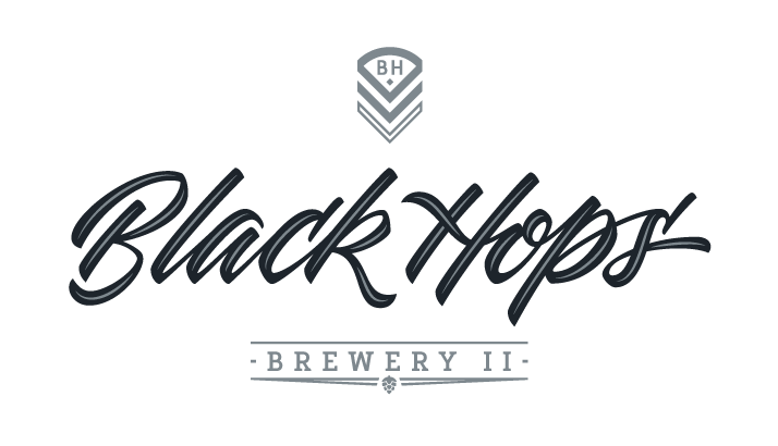
Brand name: Black Hops Brewing (a play on the term “Black Ops”)
Story: our story is an essential part of who we are. We started as a simple homebrew created by mates and have grown into a dynamic company. We build this story into everything we do.
Color palette: our core brand is made up of just two colours, the black (which isn’t black, it’s more of a blue black) and the grey. Our core range of beers also has specific colours. We have a wide range of logos in different formats so our logos can go on black, white, silver or any other coloured cans.
Typography: in our logo the company name, “Black Hops” is hand-lettered and the word ‘BREWERY’ is in a custom font designed by our designer specifically for us. It has a subtle masculine/military feel to it but it’s barely perceptible. We wanted our logo to be flexible enough to work with all kinds of design approaches. We use a simple sans serif font for most of our copy outside the main logo.
Brand voice: ours is pretty informal. Wherever possible the founders of the company speak directly to the customer and if not the founders, then the team communicates with our consumers. We try embody the opposite of a corporate style or “planned” brand. You don’t want customers overthinking what we do too much—we make beer, it’s that simple.
Logo: our primary logo features the hand-lettered “Black Hops” and the custom font ‘BREWERY’ as well as our Chevron image (more on that below). We don’t generally permit designers to change the logo at all but we do have it in a bunch of different versions so we can adapt to different needs. For example, our big stacked logo is too high to be legible on long narrow applications such as bar matts, so we have a small version with just the chevron and the hand-lettered “Black Hops” for those types of uses. We tweak it occasionally for specific uses. The example below is for our second brewery Black Hops II.
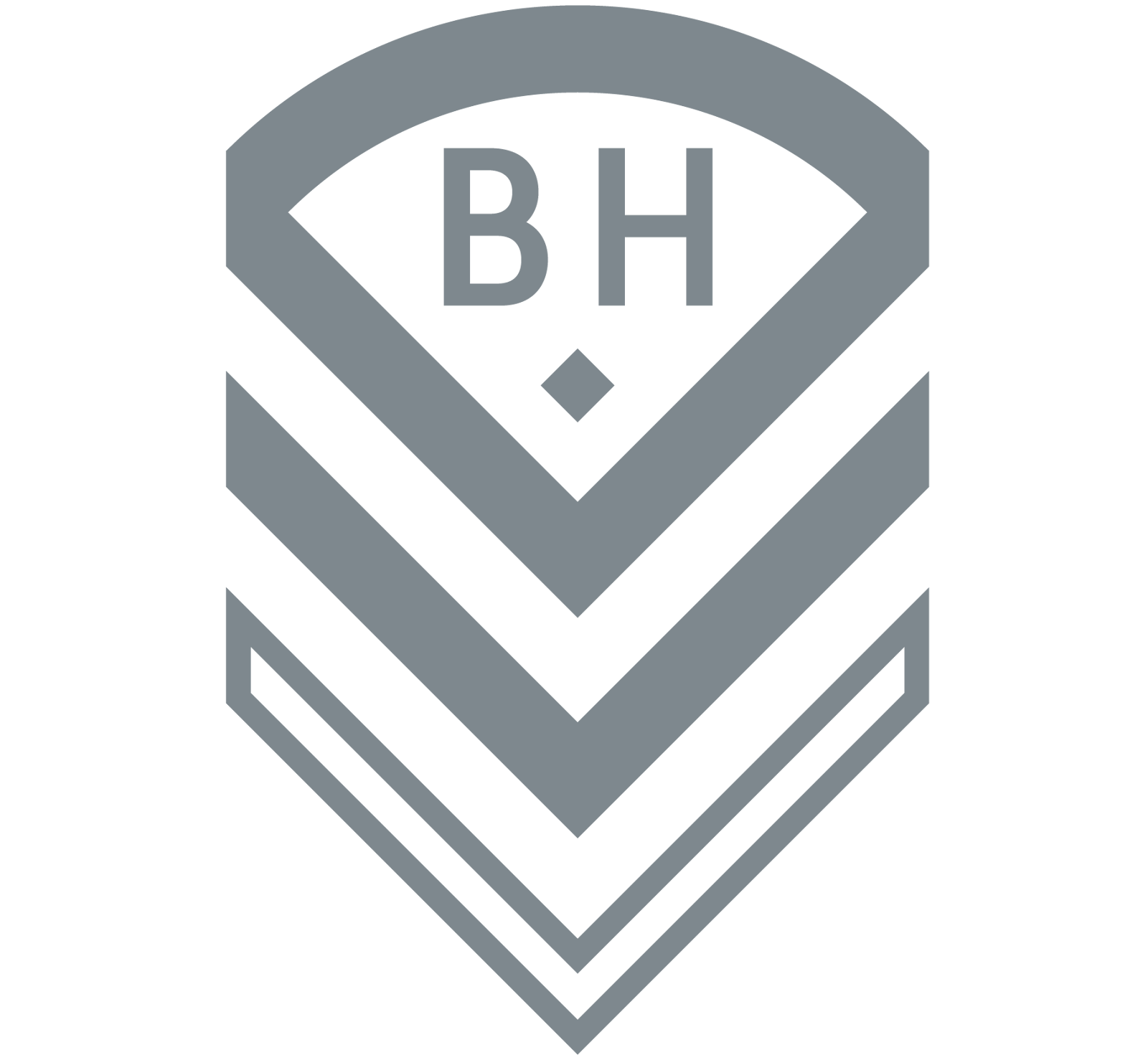
Chevron: the Chevron symbol is a smaller, simple representation of our brand. Our logo is pretty complex and is too much in a lot of cases. On a small social media bio pic you don’t want a big complex stacked logo. Our chevron is the image we try to use when the logo is too complex, or if in a particular application, the person seeing it already knows Black Hops enough to associate the Chevron symbol with our brand.
Creating your beer brand assets
—
Considering the requirements above, the next step in branding would be to come up with a list of assets that pull in elements from the style guide. Our assets range from logos, to core range beer, to corflute signs, social media handles, taproom design elements and lots and lots of merch (bar mats, decals, shirts, flannos, coasters, stubby coolers, keyrings, limited release shirts, beanies… the list goes on).
Beer packaging options
Despite the full range of assets we create to support our brewery, by far the most important element is designing beer cans. We have a core range of beers, an extended core range, seasonal releases, a monthly bottle shop release and small batch limited releases out of both of our taprooms. That’s a lot of beer for a lot of different audiences!
Before getting into the design aspect, let’s look at the different formats available for packaging a beer can.
Can sizes and shapes
There are different sizes of cans available and different shapes. The main ones here in Australia are:
375ml—these are the standard can sizes and the size we use for all of our core range beers and almost all of our other beers. It’s the size beers should be (unless they are super super special).
330ml—these are the same thickness but noticeably shorter. We don’t use them, I’m not a huge fan of them. I always feel like I’m a bit short changed drinking a small tin. I feel like my hand has mysteriously grown between drinks. Like the opposite of deadpool. Not quite as creepy, but any unexpected changes in the size of your hand is certainly not good.
355ml (or 12 ounces—the standard can size in the US)—as above, the same width but not quite as high. 330ml is obviously taking the piss, 355 feels like you’re trying to hide it.
440ml—same width but taller. These are great for smaller releases and big ABV beers that you share.
500ml—as above, a bit taller and great for bigger beers and beers you share. The prices can get expensive on beers this big so it has to be special.
You can also get thinner cans (think drinks like Red Bull) that are starting to emerge for Hard Seltzers and RTDs.
Depending on the can size, there are different considerations for design, for example on a 500ml can you have a lot more surface area to work with and the cans can look pretty striking with a solid design.
Printing options
Our can supplier Visy charges a premium for any can orders that are less than 60,000 in one design. That means you need to be pretty confident in your sales if you want a fully printed can. Luckily it’s only one of a few options for getting a design on a can. Here are the main options.
Fully printed cans
These are great, but as above you need to order a lot of them. There are also some pretty challenging printing considerations. You can’t have too many colours, the print around the top section can stretch, and some colours are hard to make work (white for example is actually a light grey because of the silver can shining through). Super thin sections may need to be outlined to prevent bleed, and you never know exactly how it’s going to look until you do a huge run of cans.
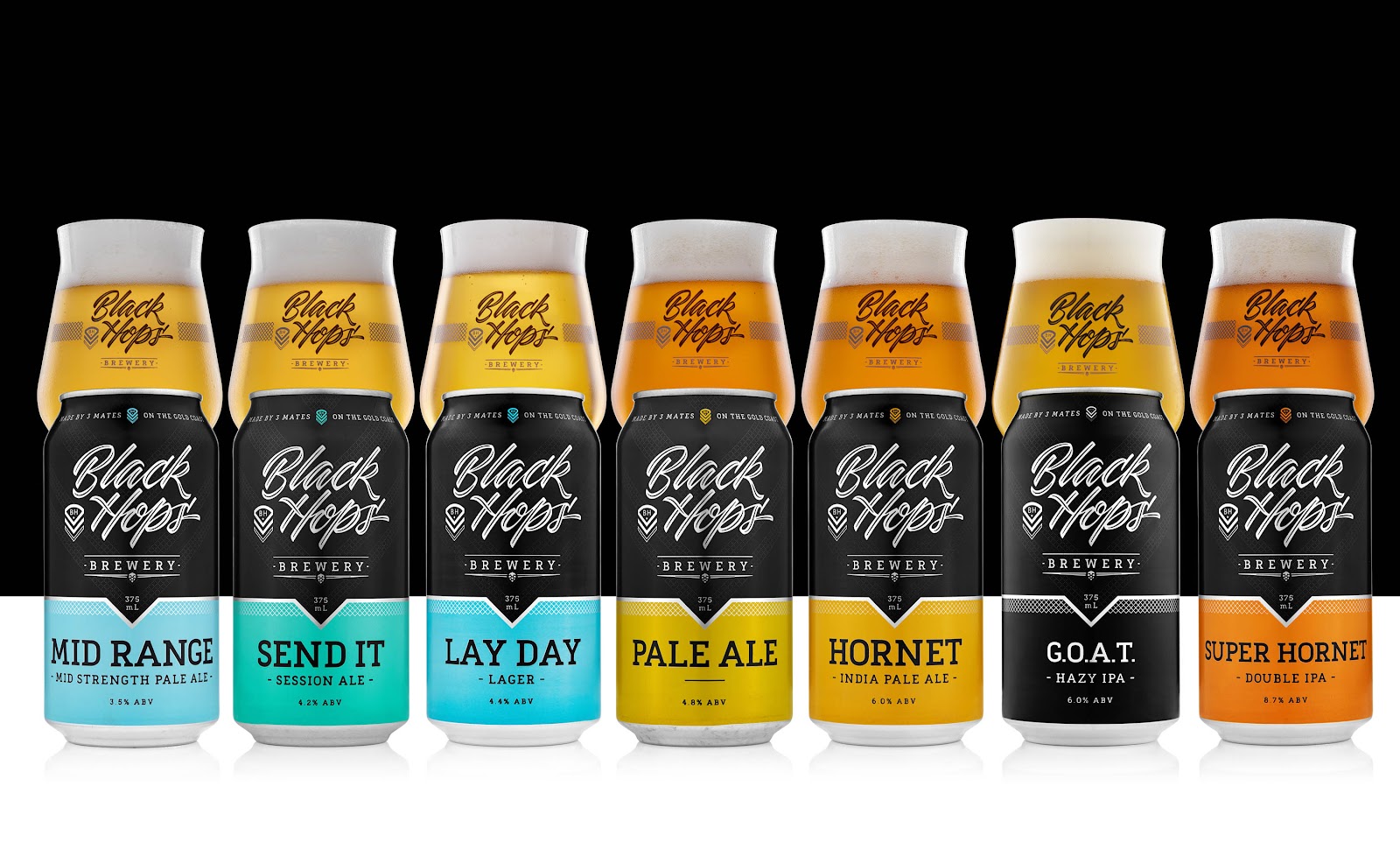
It’s expensive to make up the plates for printing and every time a design element changes, it’s expensive to re-do them. Despite this, our preference for any beer that sells well, would always be to have fully printed cans. There is less waste, they are cheaper in higher quantities, they feel right in the hand and they look professional.
Our fully printed Core Range of beers at Black Hops. Design by DKNG Design, who adapted this from our original strip label cans (see below).
Full wrap labels
The next option is to have a full wrap label that covers most of the can. This gives you a lot more flexibility with the colours and the quantities, but it can add anything from up to $1 to the cost of an individual can (much cheaper as the quantity goes up). Personally, I don’t think silver cans with labels look all that good, so when we do full wrap labels we normally go with a white can (which is actually light grey) or a black can. With the right design, full wrap labelled cans can look almost like fully printed cans.
It does however limit what you can do with the design a little bit. I don’t like a big amount of contrast from the label to the can, so when we do full wrap labels I normally match the can colour to the top of the label (light grey or black).
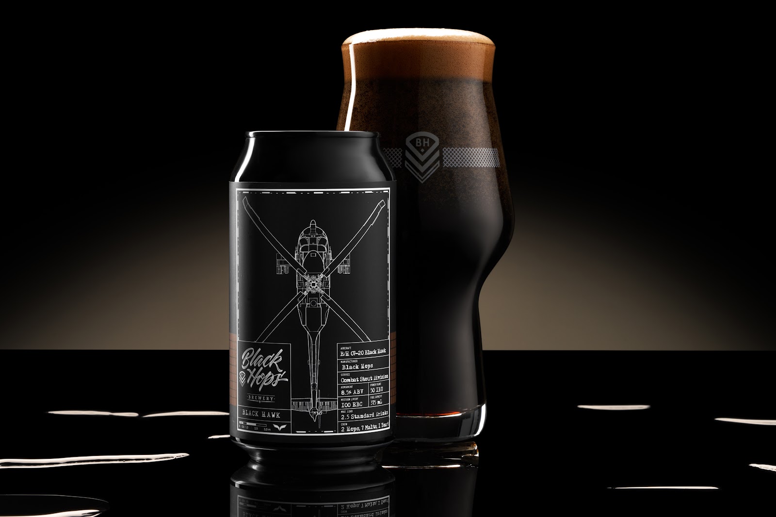
Black Hawk Imperial Stout – Black Can with Full Wrap Label. Design by Dave Heavyside of Maake.
Printed + label
When we first started out, we didn’t have the sales volume to run fully printed cans. However we didn’t want to use full wrap labels for our main beers either. So we went with a combination. A fully printed can that was designed to take a thin strip label. Another Aussie brewery Modus Operandi was doing this with a large silver can with some branding elements and a diagonal strip label. It looked great. We took this idea and tried to make it into something that looked as close as we could to a fully printed can with the majority of the rich design elements on the can itself and a small horizontal strip label for the beer details. The label was as small as we could possibly make it, just roomy enough to fit the important info, feature a colour point of difference and be as cheap as possible.
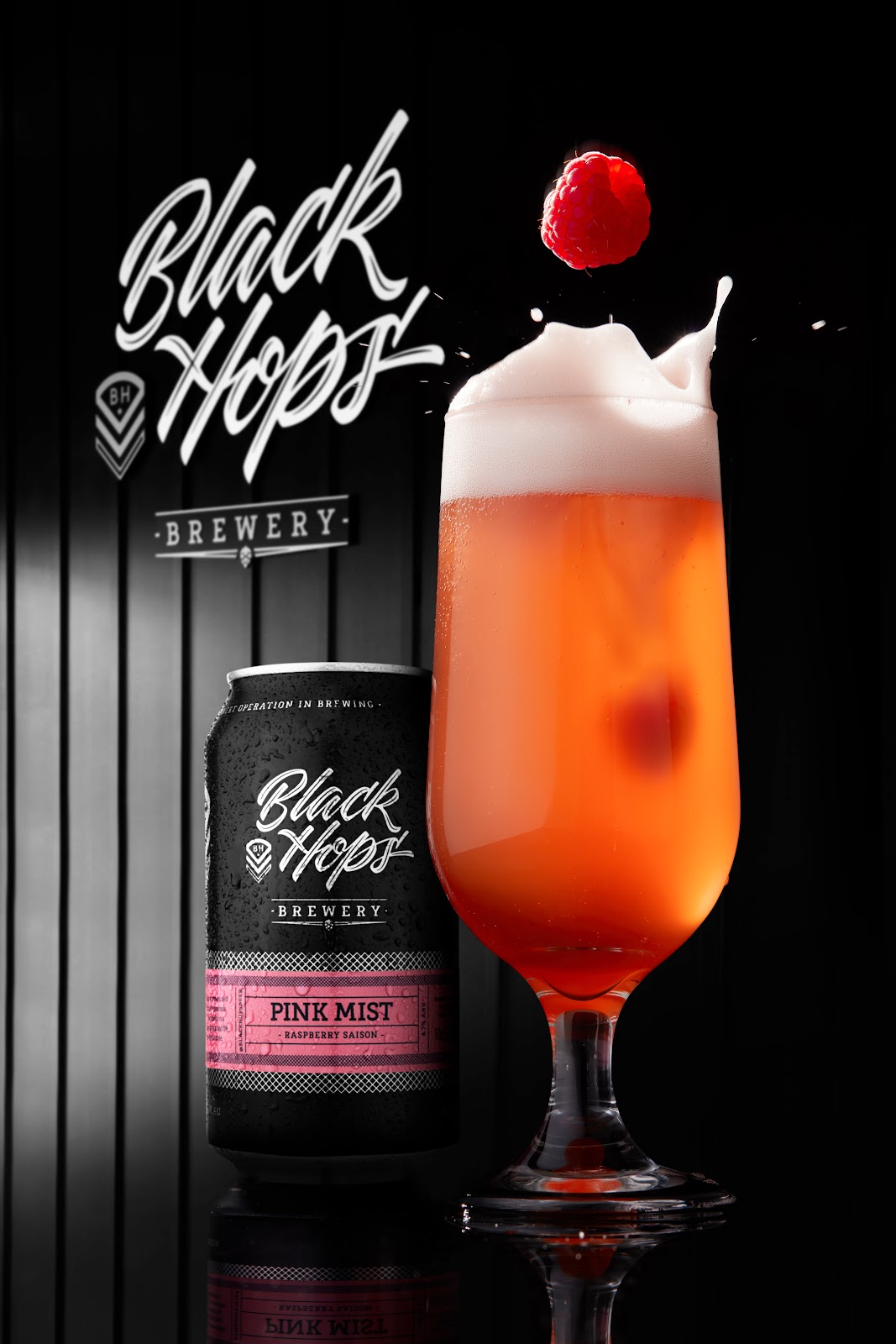
From a distance the cans looked as close as you could get to fully printed cans, and in the hand they didn’t feel like a labelled can. Also because the labels were so thin, we could get them as cheaply as 3c per label. This served us well because we could buy 60,000 of our generic printed black can and then just get a new label for every beer. We still use these for some of our lower volume regular releases like our Eggnog Stout, Pink Mist and Ginger Cider.
A lot of local breweries picked up this approach and did the same thing with their cans and this has become a bit of a standard approach for new breweries. It’s still a great option if you aren’t quite ready for fully printed cans for the whole range.
There are some downsides though.
The labels are applied at the time of canning and you can never predict where the beer name is going to end up on the can. Every time we took a photo, we would have to re-apply the label manually to line it up with our logo, but in trade our beers never lined up. It was also difficult to get the perfect height of the label each time and get them perfectly straight. Early on we lost a lot of beer due to troubles with labelling, but we dialled it in eventually.
Pink Mist – Fully printed custom can with thin strip label. Original logo and can by Matt Vergotis.
Shrink wrap
Shrink wrapped cans are an alternative to all of these options. With shrink wraps you get the benefit of branding all the way up to the lid (or most of the way), but you can do smaller quantities, because you can wrap standard silver cans.
The downsides are that they are more expensive than any other option, slow to organise since you need to get the cans and arrange for someone to wrap them, inflexible in that we can only pack the exact amount of cans that are pre-wrapped, and they also feel a bit unusual in the hand. The shrink wrap is a bit thicker than labels, so the beers don’t feel as cold and take a bit longer to chill. They just feel a bit different. Design wise they look great because they look like fully printed cans, plus they don’t have any of the design limitations of the Visy printing process.
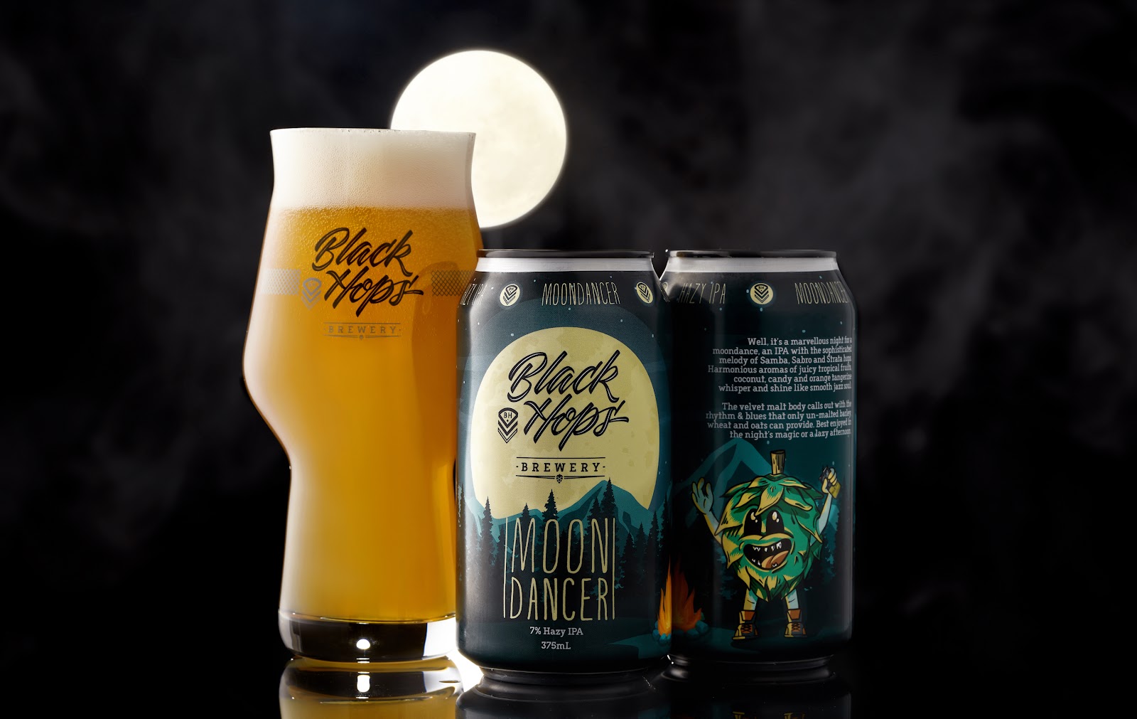
Moondancer Full Wrap design – Fun crisp design, no colour limitations, just a bit of an annoying white strip up the top. Would have been better on a black can. Design Credit: Troy Designs.
Design inclusion and templates
—
I like to work with lots of different designers, so when we engage a new one we have some guidelines and templates for them to get started (beyond the normal brand identity and style guide).
Depending on the packaging format, we will have the die lines from Visy or our label printers, so the designer has a file to start with. We also have our own template that the designer can use for some of the main elements and a list of mandatory inclusions. Based on this, we also have our own internal quality check that we perform once we get the design back to make sure it checks all of our boxes.
Design inclusions
There are a bunch of mandatory inclusions that we require on our cans based on different legislation and general best practice. I won’t go into the exact specifics here, because they change regularly and change a lot from country to country. In Australia the Independent Brewers’ Association (IBA) offers a good resource for templates for design and we base ours loosely on their guidelines. Our design inclusions include the following and we provide our designers with a .AI file that includes these things:
Beer name—on the front visible third of the can.
Volume statement:—“375mL” – on the front third of the can. Text height minimum 2mm has to be small m and capital L.
ABV as a %.
Standard drinks icon with the relevant standard drinks—minimum height 14mm.
Beer description (we normally try to make these fun—we do them in-house, it’s not the designer’s job)
Beer style if applicable—on the front third of the can.
Certified independent logo—minimum 12mm in height with 3mm space on either side.
Brewed & packed location
Recycling mandatory information.
Pregnancy warning logo (soon to be a big, red mandatory inclusion)
GS1 compliant barcode
Our social media handle and icons
In these guidelines we also list the exact size for our labels and if we are colour matching to the can, we list the exact colour of the black or white can we want to match to.
Quality check
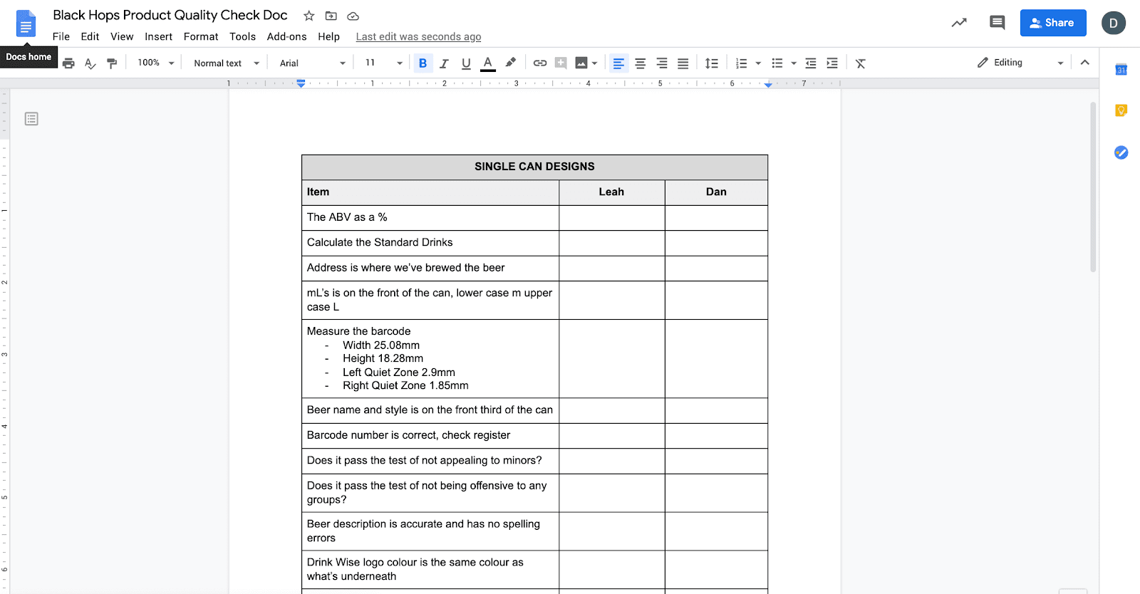
When we get labels back from the designer, we have a document where we check the quality of the label. On the left hand side of the document it lists all of the inclusions above and on the right we have columns for the signature of two different staff members to sign off on the design (me and Office (Chair Force) Manager Leah). Once we’ve signed off on it, we send it to the printers who have their own process for signing labels off (and getting us to approve again), before printing.
Black Hops product quality checklist
If you think that’s over the top, trust me, we still screw it up from time to time.
Now, let’s get back into some more fun stuff.
Designing for different types of beers
—
When we make beers at Black Hops we break them into three main categories, and each has a very different approach to design. I suspect a lot of beers made by breweries fall into these three categories.
Core range and (for us), extended core range beers
Bottle shop limited release beers
Taproom and online-only limited release beers
Designing core range beers
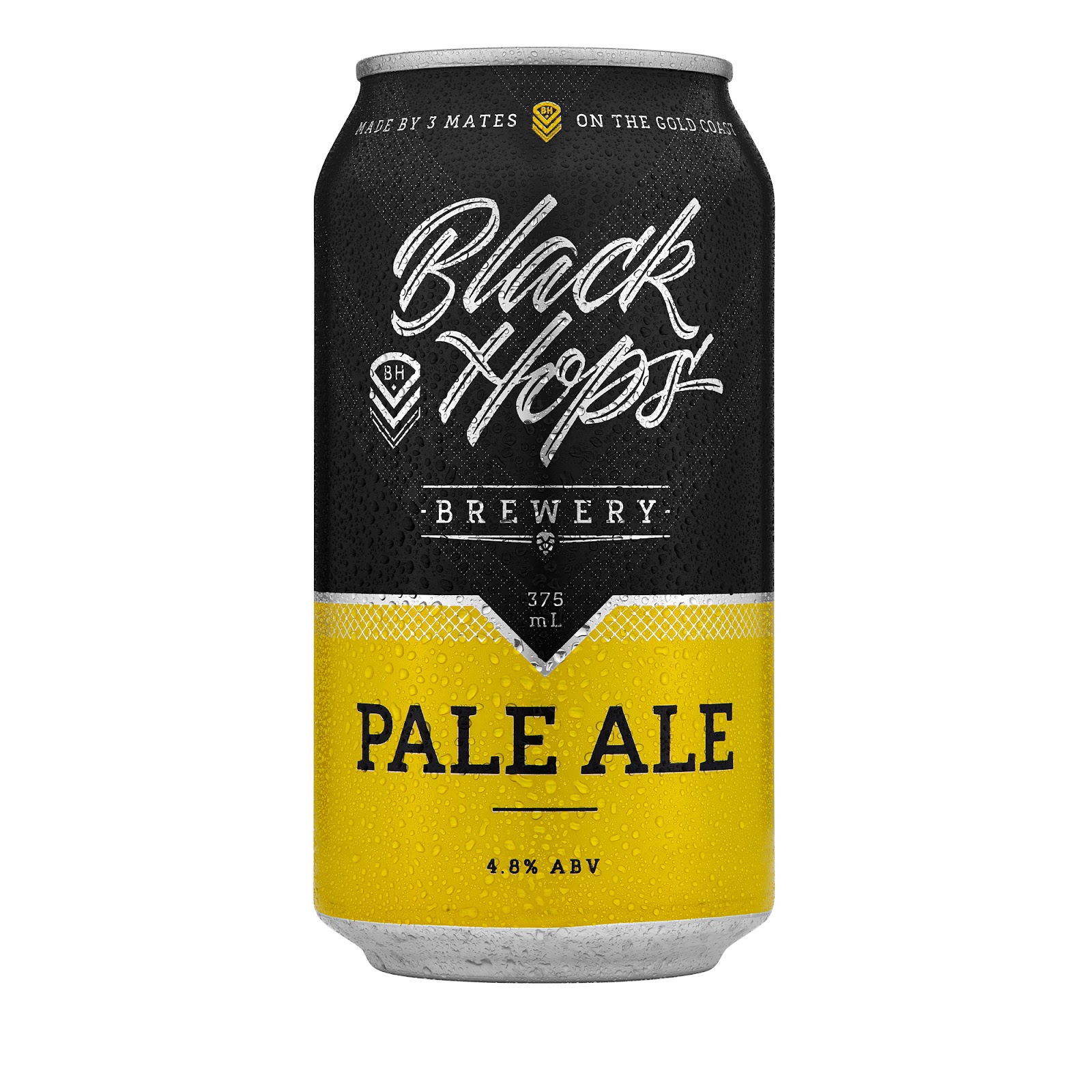
The core range beers are probably the least exciting beers to design. That said, core range beers make up 80% of our sales, so the design is critical. On top of that, they sit in massive stacked fridges and liquor warehouse shelves competing with hundreds of other breweries, so that makes things challenging.
The other challenge with core range beers is you don’t only have to sell the product, you also have to sell your brand. A lot of people who come across your beer, may have never heard of your brewery before.
This is what our core range can looks like and what follows is some of the thinking that went into it.
Up the top around we have our slogan “Made by 3 mates on the Gold Coast” to remind people that they are drinking something independent and made by mates. The chevron colour is taken from the beer colour. The Chevron colour watermark comes up from the main can below. This is the benefit of a fully printed can, you can design all the way up to the lid. That said, you don’t want to overdo it because that’s the last thing people see when they take a sip, so over-designing the top area is usually not a good idea.
The top half of the can is Black (Black Hops Blue Black) and we dedicate a good chunk to that colour because it’s our unique brand. The logo is just the can substrate shining through. We used our main Black Hops Brand identity here without much change but we also used some sharper mesh elements in some places while aiming to keep it simple. We have a chevron watermark of sorts behind the main Black Hops logo and the mesh element sits under the main line separating the Black and the beer colour (in this case yellow).
The little down arrow from the Black into Yellow gives us a of a point of difference from the normal colour on dark (or light) cans and also serves as the bottom of the chevron watermark. I think this helps it look like a Black Hops can as opposed to every other 2-tone beer can. We also have a slim silver element between the black and the can colour just to bring in the grey from our logo and make it a bit distinct from the normal dark and coloured 2-tone can, which has become very common.
It’s tough to make a core range product that stands apart from others, but I think DKNG Design did a great job of bringing our existing great assets to life in our new core range cans. If business results are anything to go by, the design has certainly worked, our business has exploded since putting our beer into fully printed core range cans.
Designing bottle shop limited releases
Level two on the fun scale are bottle shop limited releases. We do these every month and they always sell out very quickly. That means we do have a bit of room to move with being creative with the design, because we know the can itself doesn’t have to do that much education on the brand. That said, they are sold in the major retailers which means we still have to strictly abide by all the various labelling rules.
With these releases we normally get a bit more experimental and have a bit more fun. Here are a few examples and the approach we took with each:
Moondancer
The Moondancer beer shown below is a fairly typical bottle shop limited release. It features our main branding elements in the top half of the can but we still have a lot of fun with the can design itself.
Black Hawk and Mega Hornet combo
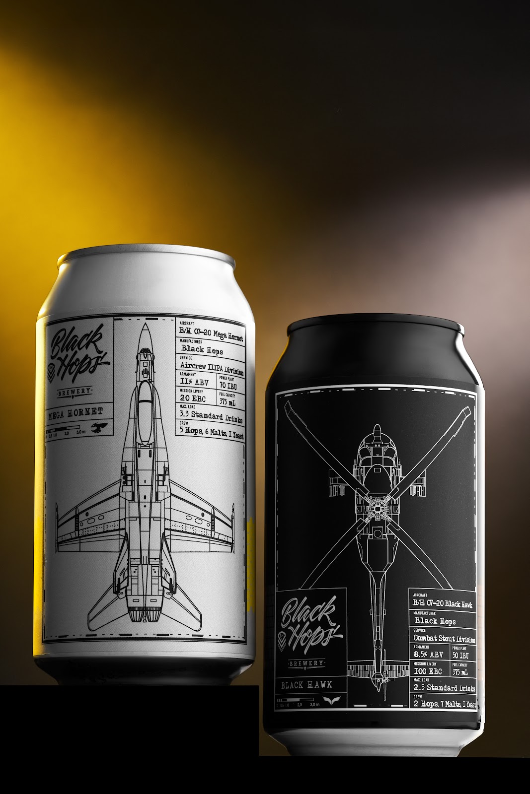
For our July 2020 limited releases, Black Hawk 8.5% Imperial Stout and Mega Hornet 11% Imperial IPA, we worked with Dave from Maake on doing something a bit different. Some tightly illustrated images, small logo and small data summary on the front gave these beers a unique and coordinated military feel. We matched the label colours to the can and as you can see from the image you’d barely know they were full label cans. Side by side these looked great and got a lot of attention. We got a lot of emails from people around the world who work with Hornets and Black Hawks who wanted to get hold of the beer, and we even sent a few out just for fun. The beer sold out in a week too!
Caribbean Haze
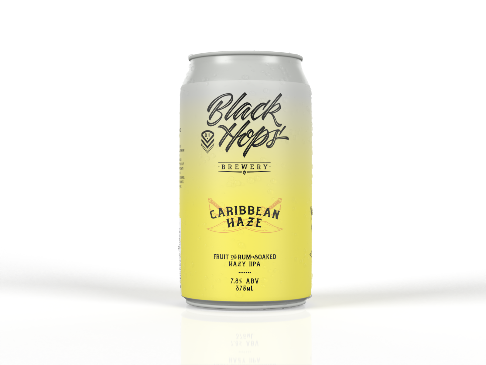
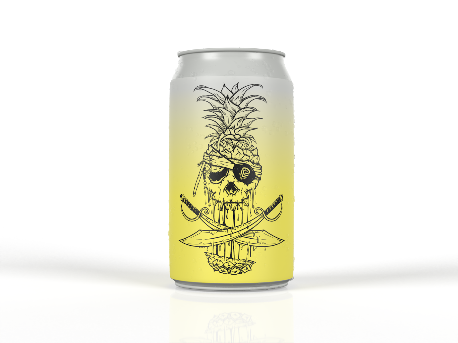
Our next release is Caribbean Haze and with this one we couldn’t fit all the cool stuff into one view of the can so we divided it up into two. We kept the front nice and simple and clean and we made way on one third of the can to include the main design image of a Pirates of the Caribbean-inspired melting sword-swiped pineapple.
This is fun because we can get a nice photo of the Pineapple image and share that before we actually announce the beer (to create a bit of suspense). And we can make it look like a Taproom release where we take a lot more liberties with the design. We measured it precisely so there’s a certain angle where all you can see is the Pineapple.
When the beer was released, so many people who shared photos of the can just showed that angle with the decapitated pineapple.
Designing taproom and online releases
Speaking of taking more liberties with the design, that’s where taproom releases come in. The rules are a bit more loose with these given they don’t need to be scanned out, everyone knows the brand already, and the batch sizes are tiny so the risk of not selling isn’t an issue.
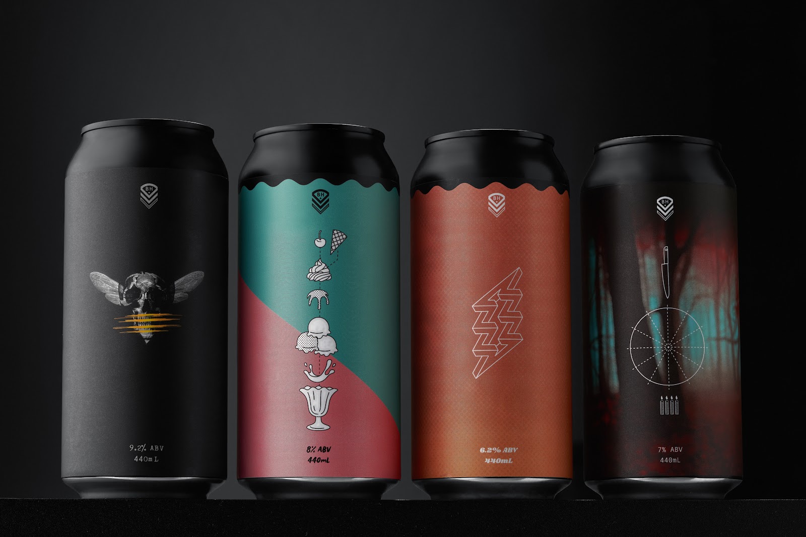
For our recent 4th birthday we decided to release 4 different 440ml beers in a mixed 4 pack. We wanted to make a good effort for the birthday and make sure we nailed the beers as well as the design of the cans.
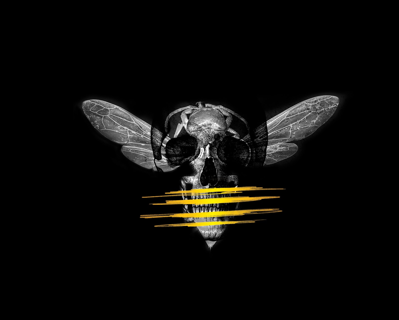
We went with four black 440ml cans, the beer styles were two black and two hoppy (for Black Hops). In order above they were Murder Hornet, Vermonster, Zappy Birthday and Birthday Cake Stout.
We worked with Dave from Maake on these cans and we obviously took a lot of flexibility in the design. We included a small version of our Chevron so our brand was present, but we were confident that anyone buying these from us knew who we were and didn’t need to see our logo.
I really liked the way he did the ripples on the top of the can as another way of softening the transition from a strong bright colour, to the black can above. It helps to make them look less like labels and look a bit different from the average beer can.
We took a very minimalistic style and Dave also added some fun elements. Zappy Birthday had a barely visible watermark of Frank Zappa on the can and Murder Hornet was…well a bit of a masterpiece.
We wanted to make a splash with these beers and we certainly did. Our website crashed after we launched them and a line snaked out the front of the brewery with people waiting to purchase the beers.
Here are some other fun ones we’ve done:
Get Railed—a staff beer for a bearded colleague called Railo
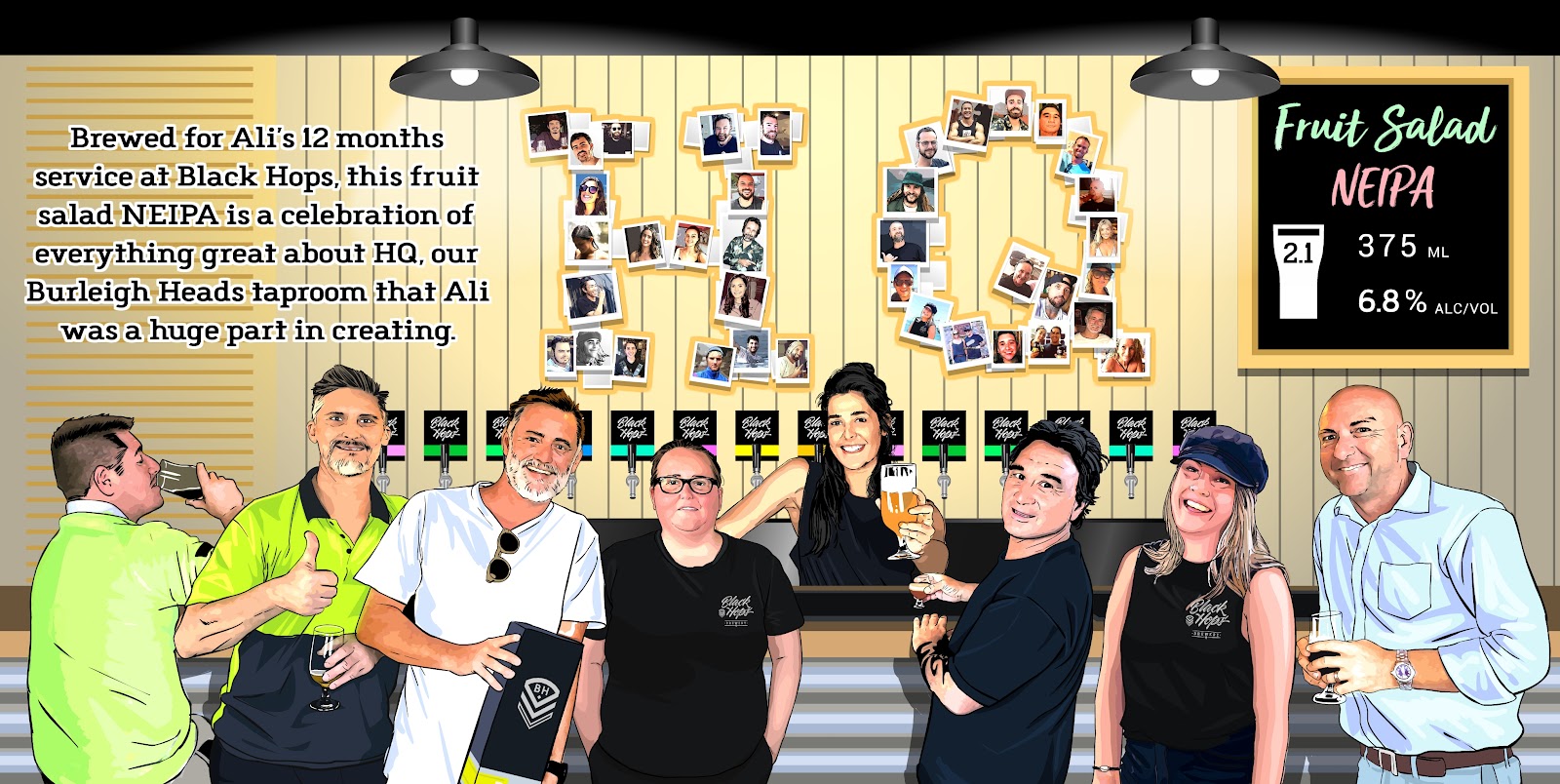
HQ—Ali’s (an OG taproom manager) tribute to our OG taproom team and customers
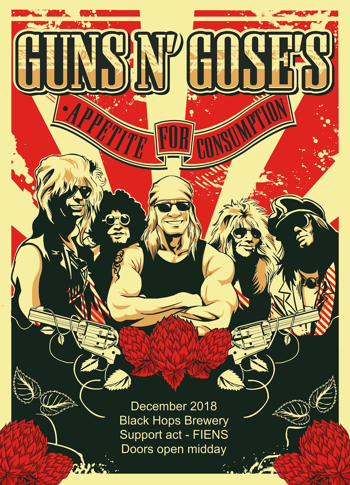
Guns and Gose’s—Kearney’s staff beer (we might get sued for this one!)
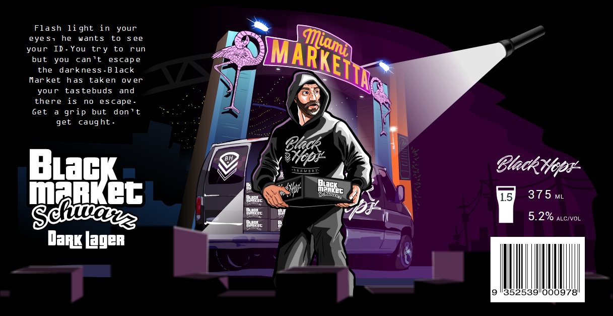
Black Market Schwarz—a venue collab with a bit of fun
More great beer branding inspiration
—
In this section, for a bit of fun and more inspiration, I’ve picked out some beer labels that I like from other breweries. A good resource here is the recent GABS Beer Label competition which lists a whole bunch of fun labels from Aussie breweries. These Craft Beer Marketing Awards also feature some great designs amongst the winners.
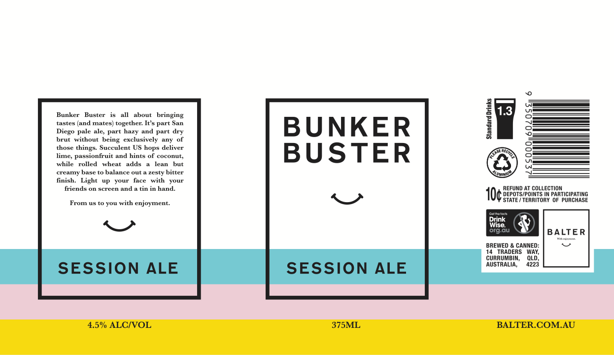
Balter—Bunker Buster
Balter nailed the minimalist design from the start and have kept the trend going with their latest beer Bunker Buster. A bit of extra colour and a simple quick design pays tribute to their XPA, Hazy and Strong Pale beers that influenced this beer.
Solid name, nice design, Balter always does a great job.
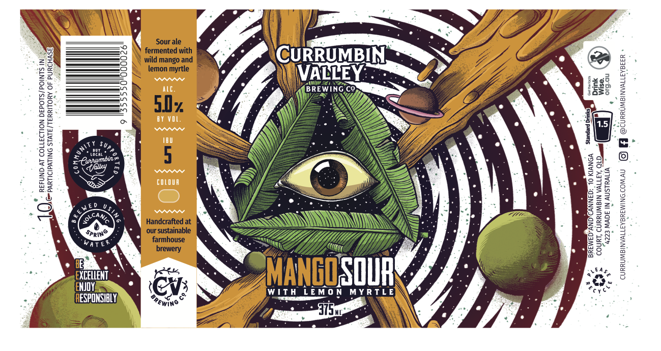
Currumbin Valley Brewing —Mango + Lemon Myrtle Sour
Our neighbours Currumbin Valley Brewing do a great job with their beer and their fun can designs. The brand is recognisable enough from the style but they still have a lot of fun with illustration on their tins.
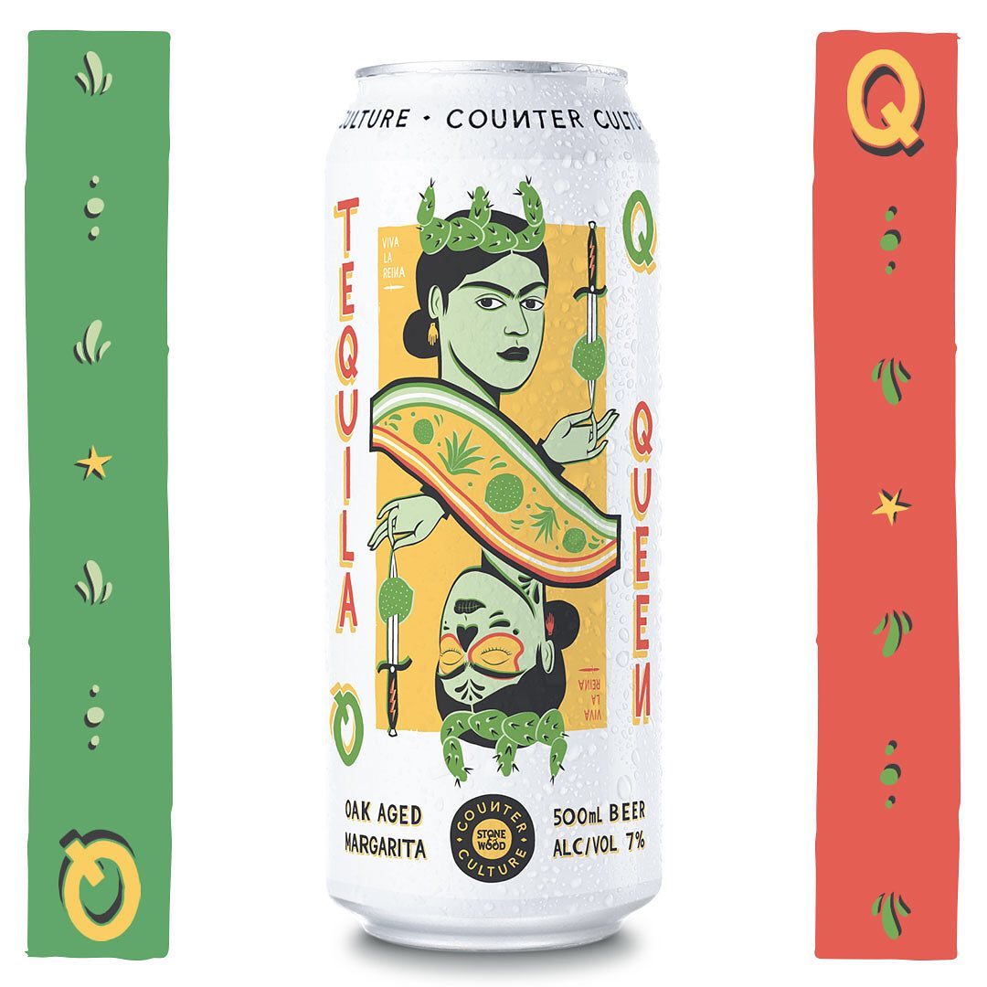
Counter Culture—Tequila Queen Oak Aged Margarita
Stone & Wood do an awesome job with their Counter Culture releases. I reckon their latest is the best of all. Paying tribute to their first release Killer Kween, they’ve put together an awesome margarita beer and a super fun name and design for Tequila Queen.
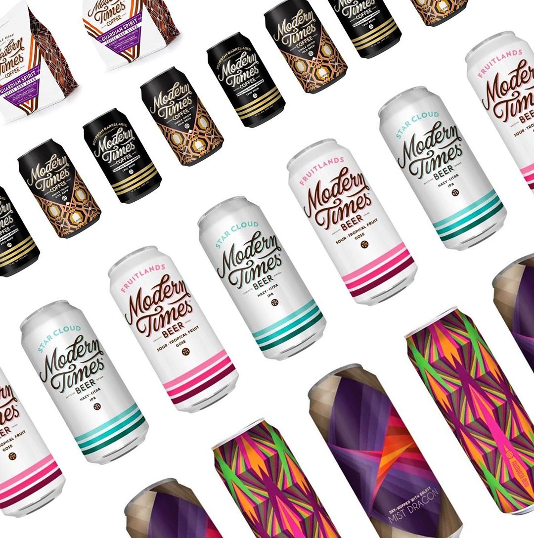
Modern Times
I’ve always liked Modern Times beers, they seem a bit less rigid with the can design requirements in the U.S., so the breweries have a lot of fun with their limited release cans.
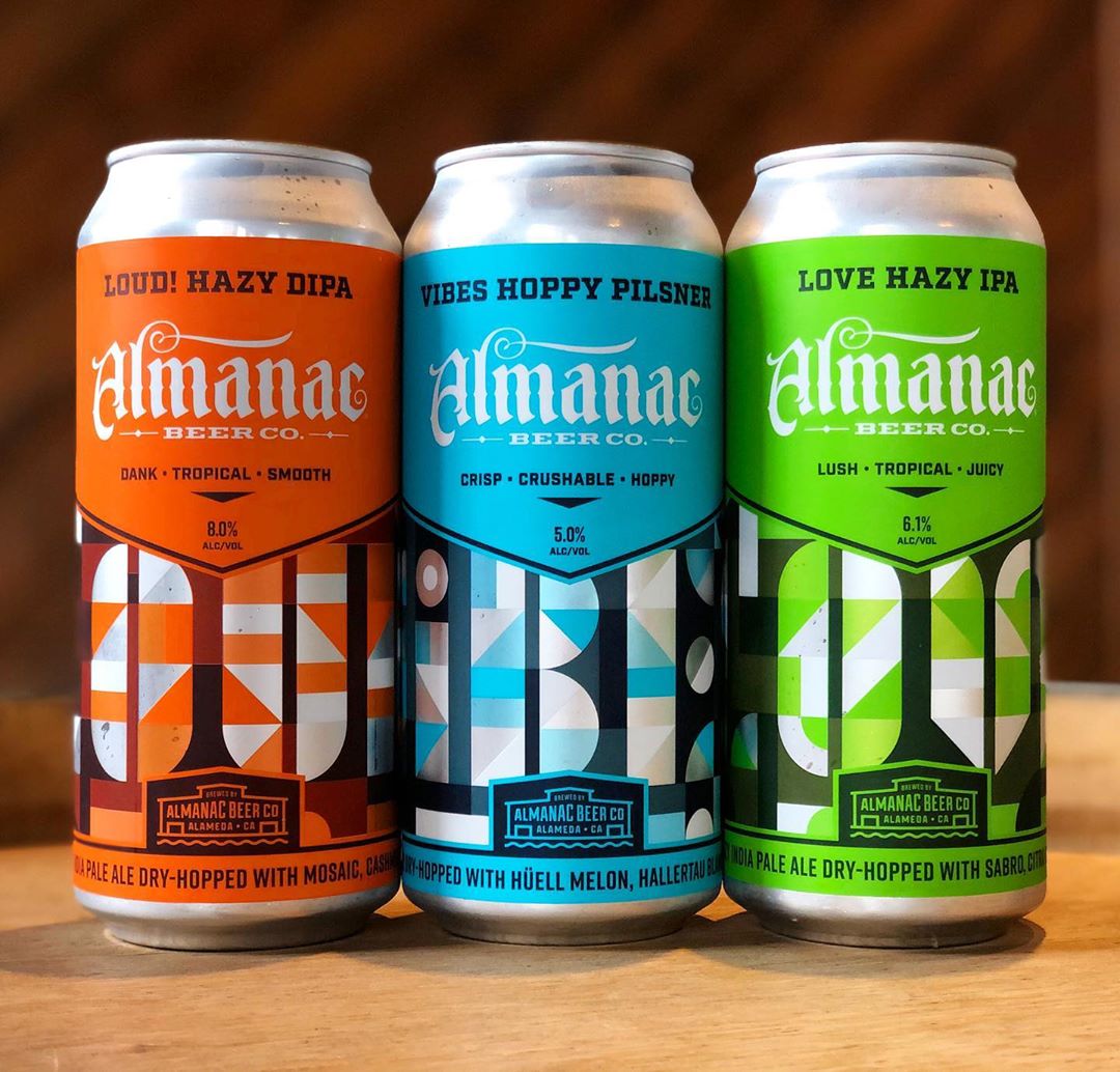
Almanac
Almanac puts out some nice looking cans. I found one of our designers on Dribbble because they’d some some work for them.
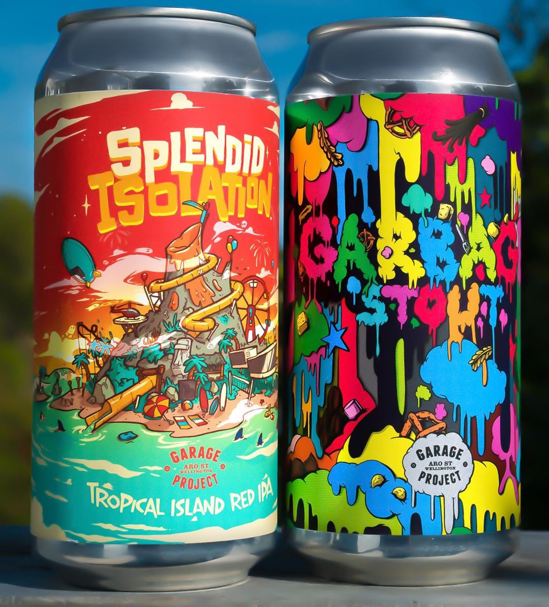
Garage Project
Garage Project creates some great stuff as well, working frequently with different local NZ artists and designers on can designs.
There are so many awesome beer can designs out there, it’s hard to stop listing them, but it’s time to move on.
General design rules to follow for great beer branding
—
Okay, let’s wrap this up with a few different design rules I like to follow. Remember, I’m coming at this from a business owner’s perspective, albeit a business owner who has worked in design for a long time and knows enough to get himself into trouble.
Put in the work. As a business owner you are also a designer. It’s not something you can delegate. You can get help with it for sure but you need to understand design. One of my favourite quotes is from Peter Thiel: “Every great entrepreneur is first and foremost a designer.”
The 3 commandments of design:
It has to look good to your buyers
it has to feel right to you, and
it has to work.
Nail those and the hard work is done.
The design problem scale
I’ve found that some design problems are very easy to solve and others are almost impossible. Sometimes the impossible ones are worth attempting, but in any case it’s good to know what you are getting yourself into. Make sure you have a good handle on this scale before tackling a project.
Don’t get feedback
Bad feedback is the enemy of good design. Make a decision, stand by it and then move on. Design by consensus is the worst type of design.
Have a good design process
Make sure you have a good process with your designer. The process should iron out all of the various awkward aspects of designing something and allow you both to arrive at something that you like (with some pain but hopefully without murder). I’m reluctant to suggest too much of a process because sometimes you have a solid understanding and it just works, but make sure whatever you do, it works.
Don’t get too carried away
It’s very easy to delve deep into design, and I love doing this as much as the next person. But it’s also a big trap to go too far. Many companies have made this mistake. There needs to be some balance. If you are designing a beer can that will be sold out within a day, you can afford to get a few things wrong.
Copy experts
As much as I hate the idea of copying people, it would be completely ignorant if I didn’t acknowledge this long held and extremely valuable passtime of every great creator. Austin Kleon said it best in Steal like an Artist: “Every new idea is just a mashup or a remix of one or more previous ideas.” Don’t be afraid to be inspired by great designs that came before you.
Remember design is contextual
I get caught up by this all the time and no many how many years I do this, it still catches me. Remember design commandment #3: it has to work. It’s critical to remember that design is contextual and whatever design you see or interact with, needs to be seen and felt in the context for which it’s intended. The obvious example here is that if you are designing a beer can or label, you absolutely must print it out and stick it on a can and put the can in the fridge next to other cans. Any time you are designing something physical you have to print it and put it in the place where it will live and almost every time you do this you will see things you couldn’t otherwise see. I often forget this, but trust me designers also forget.
Don’t be afraid to work with multiple designers
I’ve probably worked with 20 designers in the last few years for my projects. The process ebbs and flows, some designers are good for some projects, some styles come and go. I’m always clear with my designers that we own the design (and all source files) and the engagement is project by project every time. If the designer doesn’t like these terms then the designer is not for us.
Beer branding matters
—
In conclusion I would like to say a few things. First of all beer is great, please drink it (responsibly).
Secondly, cheers to all the designers who have thought about designing beer labels or have designed beer labels. The design of labels is a big part of our industry and something that gets everyone in the industry excited. We don’t talk about it enough, but it’s massively powerful and super impactful in what we do.
Finally, I hope this post has been useful, if you are a business owner I would encourage you to dig deep into design and make a strong effort in your business. If you are a designer I hope you consider trying to get into the craft beer space, because there’s a lot of fun happening and your skills are much needed!
Cheers!
Looking for intoxicating beer branding?
Work with the talented designers on 99designs to create the perfect beer label or can!