Often, your logo serves as an example for the tone, aesthetic and values of the entire brand. Setting guidelines ensures that the logo is used properly and as you had intended. These guidelines are called logo usage guidelines and they are an integral part of any brand strategy and brand style guide.
So what are logo usage guidelines? Logo usage guidelines should be part of every company’s brand guidelines because they offer a way to exercise control over how a logo looks over different backgrounds, how it is oriented over the page, the logo’s shape, proportion and more.
The guidelines help avoid things like altering the logo in any way, causing it to lose its integrity by stretching or presenting it in a way that is not harmonious with the rest of the brand’s voice.
Every brand should set their own guidelines for logo usage. Here are some essential logo usage guidelines:
- Space around the logo
- Color palette
- Typography and font
- Logo size
- Description of the logo
- Colors
- Logo versions
- Showcasing bad logo usage
Now let’s explore what each guideline entails to understand why your logo needs them.
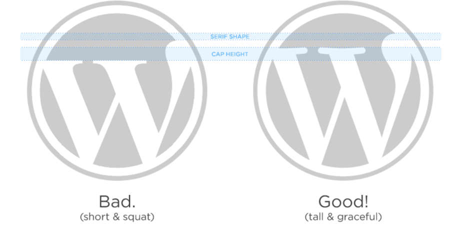
1. Space around the logo
—
There should be sufficient clear space around the logo to let it breathe and prevent it’s clarity and visual impact from being obstructed. This seems like it should be a no-brainer but let’s say someone wants to put your logo into a cramped little corner and that is all the space they have—looking at your guidelines, they will know not to do that.
Take a look at our below example of guidelines for spacing:
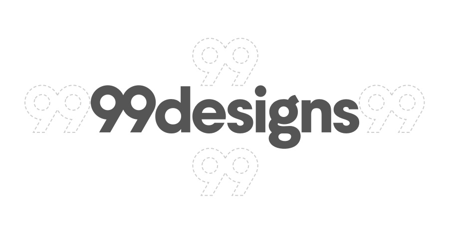
The 99designs logo uses an ’open white canvas’ as a metaphor that underpins the visual language of the brand—it’s crucial that whitespace is used liberally. A ’99’ spacer on all sides of wordmark and logomark is not the expectation, but the absolute minimum.
The guideline is specific by giving you a why and how. There’s nothing left to do but respect the absolute minimum.
2. Color palette
—
What are your brand colors? Would displaying your logo in Kelly green to celebrate Earth Day be compatible with these colors or completely throw off your consistency or tone?
A brand’s color palette is usually made up of four or five colors and either include or are complimentary with the colors of their logo.
The rule of thumb is to pick:
- One light color to use as the background
- One darker color for text
- One neutral shade that goes with everything
- One color that catches the eyes
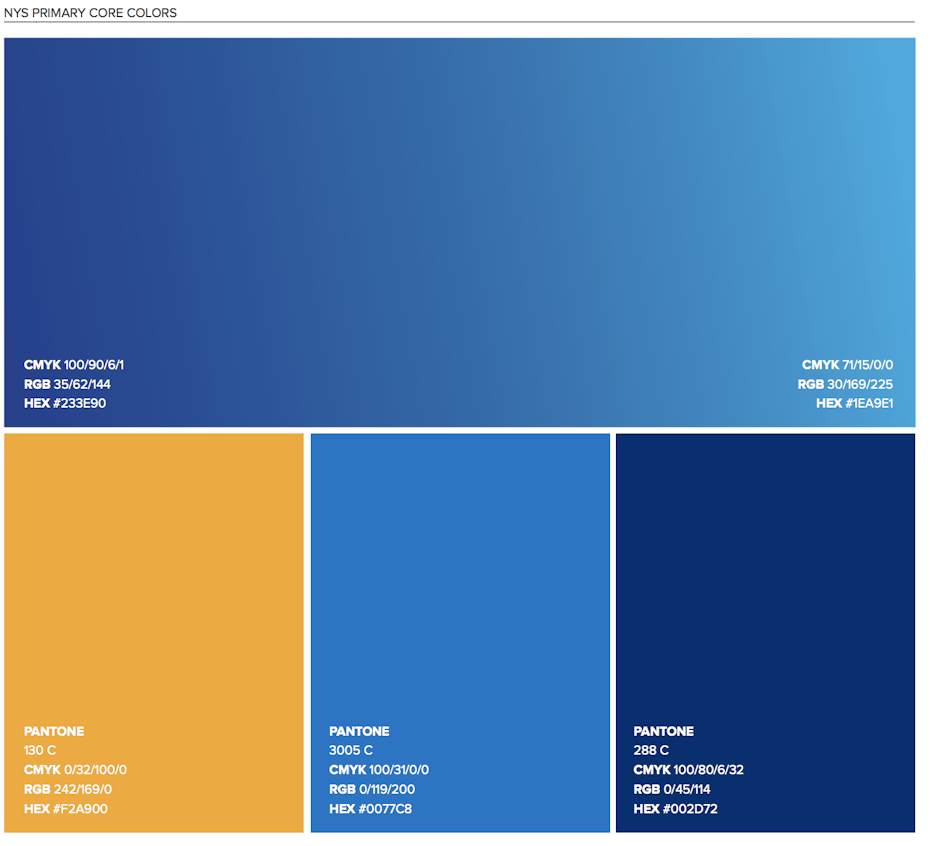
Your logo usage guideline should display these colors with accurate information including: Pantone color name and number, CMYK (print color) and the RGB and Hex codes (digital color).
3. Typography and font
—
This guideline dictates which fonts go with your logo and with your brand in general. If you think that using a script typeface underneath your modern and minimal logo will not be flattering for your design, well you better make a note of that in your guidelines. Here are some questions to help you set typography rules within your logo usage guidelines.
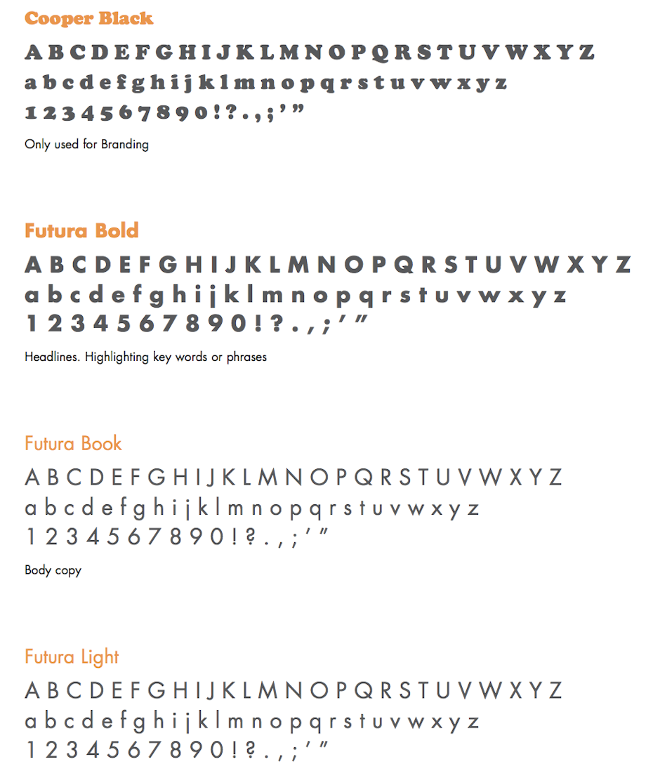
- What is your brand font?
- This is the first aspect of your typography guideline you will need to determine.
- Why is this your font?
- Tell the story of what makes this font the best representative for your brand.
- What is the font you use for other communications?
- Will you allow any shading or effects in the typography surrounding your brand.
Here’s an example from the Open Source Initiative’s logo usage guidelines: “We recommend using the Open Sans Ultra-Bold font for the ‘open’ and Open Sans Semi-Bold font for the ‘source initiative’ as complementary fonts to the OSI Logo.”
Simple, concise and doesn’t leave room for confusion.
4. Logo size
—
This is a very straightforward point in your usage guideline: set a minimum size. The minimum size is ideally in pixels for digital use and in inches or millimeters for print. Setting proportional values is as important as setting a minimum size. It is crucial for your logo to have sizing consistency across letterheads, over various products, on digital application versus print.
Your minimum size and proportional value guideline could be as simple as:
- Should be legible at any size. Do not use our full logo unless there is ample space to allow for legibility.
- Do not stretch or distort
Or as specific as:
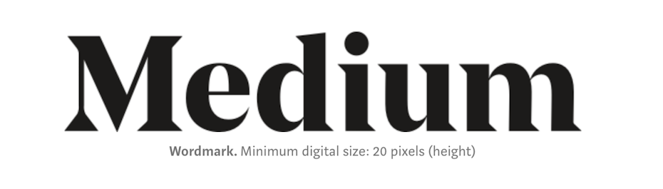
- Our favicon must always be 16 x 16 pixels.
- Minimum digital size for BOTH our wordmark and logomark is 20 pixels.
- For all our digital sign offs, the minimum size is 35 pixels.
For more sizing tips, check out our post on Logo sizes and dimensions.
5. Description of the logo
—
Spelling out what your logo is and isn’t, dictates how your logo should be used at all times. Think of times when someone mispronounces your name and then you have to correct them. Assuming that people will “just know” isn’t a strategy that bodes well with the desire to have a strong brand identity.
We’re 99designs. We’re not 99 Designs, or 99Designs or 99 designs. Just simply 99designs. You can do it!
The logo in essence, is the brand name, but not all logos need to include a name. Let me explain by saying: Apple. We are all familiar with the monochrome, minimal apple with the right corner bitten off. The name is synonymous with the symbol, the logo is an apple and the company is called Apple.
The description of your logo is a brief explanation of what your logo looks like and why. Here is an example of a logo and description from one of our top designers:
Let’s write a description for a logo that is made up of a muddy cat paw and the text “Meow”.
- This is the full Muddy Cat Paw logo and logotype for Meow. The full version of the logo will always have the muddy cat paw logo above the logotype as shown here.
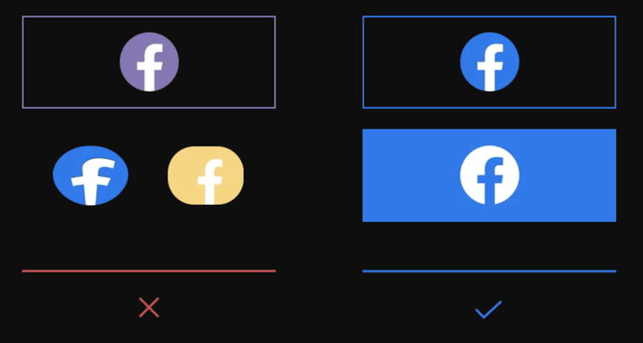
6. Logo colors
—
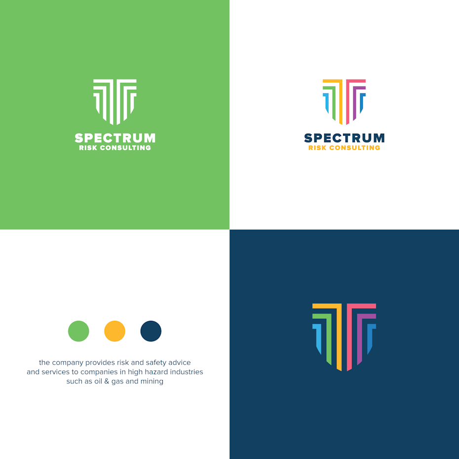
One of the key principles of logo design is that your logo should look good in black and white, in its simplest form with no effects. Which other colors could your logo be? This is something you have to determine in your logo usage guidelines. Here are logo color considerations you need guidelines for:
- Logo colors over white backgrounds
- Logo colors over dark backgrounds
- What your black and white logo looks like
- Grayscale logo vs full color
- Reversed logo colors
Your guideline should include all the acceptable color variations of your logo to set a clear precedent.

7. Logo variations and when to use them
—
Depending on your needs, it may prove useful to have a full version of your logo, wordmark, lettermark, a simplified logo version, an avicon, an avatar. All these variations need to reflect each other and stay within your logo’s general style.
For example, wordmarks are font based logos that benefit companies with catchy and memorable names. It is generally within a square and packs a succinct visual weight. While the simplified version could go over more complex, visually busy backgrounds.
Your logo usage guidelines will include variations with recommendations of where they will appear. For example: Our standard logo looks like this, it should be included on all merchandise. Our wordmark looks like this, this needs to be included to sign off any content.
To determine which logo types more accurately reflect your needs, check out our post The 7 types of logos (and how to use them).
8. Examples of bad logo usage
—
It is just as effective to show how not to use your logo as it is to show how to use your logo. Make sure that your guidelines include samples of your logo distorted, in the wrong color, too small, etc.
Examples of bad logo usage:
- Visually displays when and how your logo looks bad, or more specifically not as it was intended to look,
- Anticipates and helps avoid such as loss of resolution, illegibility and nonsensical orientation
- By placing the right and wrong side by side, your “bad logo usage” guideline makes a case for why your logo looks much better in the ways you have specified.
Conclusion: guidelines make sure your logo looks right
—
The most important aspect of setting logo usage guidelines is showing the right and wrong ways of using your logo in all the possible situations your logo should be used. Building guidelines is a creative process that works with possibility and variation. Setting these guidelines will preserve the thought and effort you’ve put into creating a logo by making sure it always looks good and correctly represents your brand everywhere your logo is used.
Want to learn more about logos? Check out our article on how to design a logo.
The post What are logo usage guidelines (and how to set them)? appeared first on 99designs.
No comments:
Post a Comment