From a global pandemic to climate instability and political uncertainty—we’ve seen it all during this crazy year. Yet as everyone prepared to stay (and work!) from home, freelancers already had the upper hand. After all, they’ve been doing this for years.
For the second year in a row, we asked the global freelance design community to open up about their 2020 experiences in our annual survey. From Sydney to Salzburg, 11,362 freelance creators across 147 countries shared their insights and stories in the most wide-reaching survey of the sector to date.
We were blown away.
Despite facing an unprecedented moment in history, freelance creatives are demonstrating a remarkable ability to adapt… and thrive.
Read Design Without Borders
Find out what happened when the whole world went freelance.
If 2020 has taught us anything, it’s to expect the unexpected.
That’s exactly what we found when we surveyed the global freelance design community and asked them to weigh in on their year. Amongst the challenges of 2020 were stories of connection, personal growth and remarkable resilience during one of the biggest global crises the world has ever seen. We collected the significant takeaways from our annual report in this handy infographic.
Want to know what it really means to be a freelance creative during a pandemic? Read on to get the scoop.
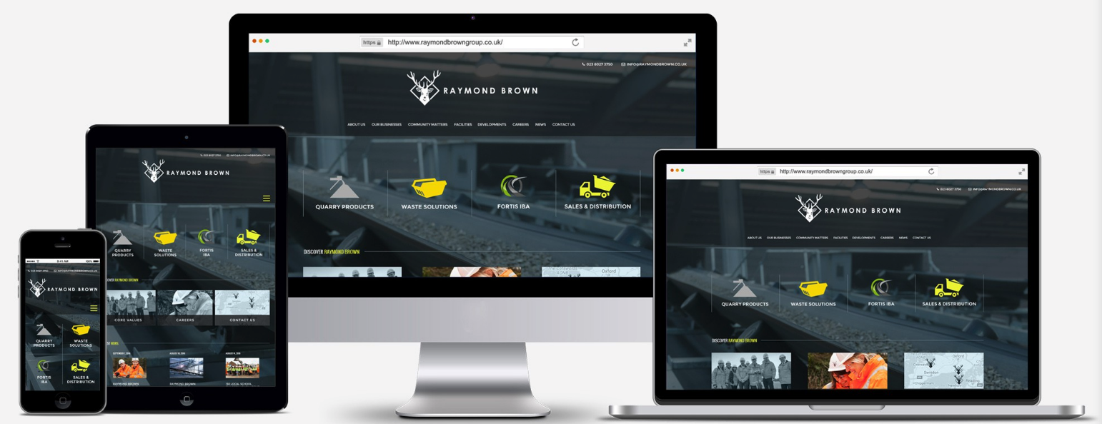
Depending on whom you ask, web designers seem to do it all these days. That’s because the term “web designer” is often used as an all-encompassing label for anyone who creates websites.
The truth is a bit more complicated than that. It takes a lot of planning, content creation, artistic effort, coding and hired specialists to make a website a reality. Web designers are one of those specialists, but they usually have a very specific role within the whole process. Whether you’re looking to become a web designer or looking to hire one, it’s important to familiarize yourself with what exactly web designers do and don’t do. Otherwise, you might end up wasting time and money. With that in mind, let’s walk through the typical responsibilities of a web designer and where they fit into the web development process.
What is web design?
—
Web design is the process of establishing the aesthetic appearance of a web page, including how content is arranged and how the elements of design are implemented. Web designers are typically focused on what is called the “front-end” of the website, the part of the website users actually see and interact with (as opposed to the “back end” code that makes the website function).
Web designers are responsible for the visual design of a web page. Design by wildanya
This means they can be responsible for choosing everything from the photos and imagery, the fonts, shape language, color scheme, buttons, as well as how all of these elements fit together. They use design software (such as Photoshop or Sketch) to create mockups, or image-based representations of how the final website should look once code is applied.
With that said, web designers are typically not responsible for building a working website—they focus on establishing the visual design only. Developers write the code that makes websites work, and website development requires a different skill set and sensibilities from design.
Where does a web designer fit into the process?
—
In order to understand what a web designer does, let’s briefly go over the most common roles involved in the steps to create a website.
Website strategist: Conducts in-depth market research to establish the business goals for the overall website and individual pages.
Graphic designer: Creates visual brand elements—logo, color scheme, typography—and graphic assets—illustrations and icons—that are used on the website.
Copywriter: Creates all written content—from headlines to body copy to button text—across the website.
UX (user experience) designer: Focuses on the user’s needs, and designs skeletal web page layouts (called wireframes) that optimize website elements around user behaviors and expectations.
UI (user interface) designer: Designs interactive elements such as buttons and forms.
Web designer: Focuses on all of the visual elements of a website, and turns wireframe layouts into finished web page designs.
Front end web developer: Uses formatting languages and code (HTML, CSS, Javascript) to implement the web design onto a web browser.
Back end web developer: Uses coding language to develop more complex functionality behind the scenes of a web page.
It typically takes multiple specialists to create a website, including web designers. Illustration by Konstantin Kostenko
In short, a web designer refers to the goals set by a website strategist and a UX designer’s wireframe, and combines the content from graphic designers, copywriters and UI designers into a finished web page mockup. Developers then take that design mockup file, separate and export the graphic elements, and use code to turn this into a live web page. This all means that if you are looking to hiring a web designer, you should have your strategy and most of your website content either roughed out or finished.
With all that said, do take these job descriptions with a grain of salt. They are generalizations and describe the traditional definitions of these roles. As mentioned earlier, many people use the term “web designer” broadly, so it can mean different things to different people. There can be overlap between roles—most web designers do their own market research, have graphic design and UX, and some can even double as developers (especially on the front end). It is also not uncommon for companies (or clients) to combine roles and responsibilities depending on their budget. Always make sure before you start a project that you are on the same page about your expectations for the role.
What are a web designer’s responsibilities?
—
Let’s get into a step by step breakdown of everything a web designer generally has to be responsible for in order to create finished web pages.
Web designers create website mockups in a design program like Photoshop. Image via Adobe.
What a web designer does
Visual design and layout: Often using wireframes and site maps, web designers order and arrange website content to optimize both visual communication, hierarchy and aesthetic sensibilities.
Mobile and responsive design: Web designers also design the look of mobile and tablet versions of web pages.
Static mockup files: Web designers create image files that represent the final look of the web page.
Exportable design assets: Web designers layer their mockup files so that each page element can be easily separated and exported for developers to implement piece-by-piece onto a working web page.
Photo editing: Web designers typically must be able to edit media assets that appear on the page.
Formatting: Web designers often use some formatting languages (especially HTML and CSS) to implement and test their designs in web browsers.
Website code is typically handled by web developers rather than web designers. Design by PANG3STU
What a web designer doesn’t do
Coding: Web designers focus on the visuals and are usually not responsible for coding the website.
Writing: Web designers should not be expected to write any website copy. Many use lorem ipsumplaceholder text in their designs if the copy is not already prepared.
Branding: Web designers are not responsible for creating logos or making broad visual brand choices as establishing the color scheme and fonts to be used on corporate assets outside of the web page.
Illustration: Web designers typically do not create illustrations for the website. They incorporate graphic assets made by other professionals into their design. Some designers may design custom elements where needed.
Photography: Web design and photography are separate disciplines. If the client has not hired a photographer, it is very common for web designers to select and incorporate stock photos into their design, the license of which the client must purchase.
Animation: Custom animations should go through an interaction designer or professional animator.
Market research: While web designers do perform some competitor research ahead of their design, they do not have access to all of the data, analytics, and expertise that an in-house marketing professional would. Usually, web designers depend on clients to deliver this information to them.
What skills do web designers need to have?
—
Becoming a web designer involves learning a number of skills. Design by damuhra
If you are thinking of becoming a web designer yourself, you should consider the kind of skills you will need in order to set yourself up for success. Although a college degree is certainly not a bad idea, it is increasingly common these days for designers to be self-taught, and there are plenty of web design tutorials available online.
Graphic design knowledge
At the end of the day, web designers are designers, and even if they aren’t making logos, they should know how to combine text, copy, images, and color in a way that is visually pleasing. In particular, they should know how to strategically leverage the principles of design to create a desired effect on a viewer. This also includes knowledge of design history, knowing which design trends are still useful and which are overdone and tired.
Industry practices
Web design has been an established career path for over two decades now, and a number of design conventions and standard practices have been established with time. Because websites are software that users are meant to find intuitive, it is important to play into these conventions to meet user expectations, even while putting your own artistic spin on them. These conventions usually have to do with an approach to a design, and they range from standard website layouts, grid systems, mobile-first design and more. This is gained partially through experience, but also by paying attention to industry conferences and talks, like those posted to awwwards YouTube channel.
Learning some web development can be useful for web designers. Illustration by Sevarika
Software skills
Although the basics of a web page layout can start with a paper and pencil, eventually web designers need to use software to create files their team and/or clients can use. Photoshop is one of the most common software used for web design, but UX prototyping apps like Sketch have become increasingly popular amongst web designers. For more on this, refer to our list of the best web design software.
Web development knowledge
Although coding should typically be left to a developer, creating a website is a technical undertaking no matter which way you slice it. Web designers should be aware of technical capabilities and limitations, which is why it is often helpful to have some familiarity with code to know what design choices will work and what won’t. Some design effects or textures may be difficult to implement with code, and some may result in file sizes that slow the loading of a web page.
Where can you find a web designer?
—
If you need to hire a web designer or you are curious about the options web designers have to find work, there are a number of possibilities. Many work in agencies and can be found through referrals from past employers or other colleagues. A common place to find web designers looking for work are professional networking and job sites such as LinkedIn.
Freelance web designers are easier find and hire these days than ever before. Illustration by Natalia Maca
But instead of wading through the profiles of all the users on a general purpose job listing site, a creative platform like 99designs can give you access to a global pool of professional freelance web designers. You can work with designers two ways: search for designers and contact one to negotiate rates and work one-to-one in a secure project space or you can run a contest in which you submit a project brief and multiple designers compete by submitting sample web page designs.
Find a web designer today
—
Web designers have a role to play in the building of a website, but contrary to popular opinion, they don’t do everything. They are largely responsible for the visual construction of a web page. But considering that the visuals are the part of the website that users interact with, it is a big job worthy of a dedicated position. In order to get a standout web design, make sure you’re working with a web designer who knows their role and how to do it well.
Want to get the perfect web design?
Work with our talented designers to make it happen.
A mask says a lot about its wearer. It can convey anything from elegance to mystery to humor. These days, a mask can say that you care about your community, that you are committed to doing your part to keep yourself and others safe. Despite all that, masks are too often missing a personality. But masks don’t have to be bleak and impersonal.
At 99designs, we know that design can speak where words fail, and design’s visual language has a primal power to connect people. We wanted to show that mask designs can represent the unique personalities of the designers who created them—and establish a connection to anyone who’s wearing them, spreading positivity and optimism in the process.
So we invited our designer community to use their artistic talents to give masks a story and create mask designs as an expression of who they are. We ran a contest in which 76 designers submitted over 316 beautiful mask designs that express their personalities and passions.
The following designs are just a few examples of how even a canvas as small as a face mask can be a platform for telling a story. Whether that story conveys optimism for a better time, a longing for serenity, or unabashed humor, there’s something to love in all of these masks. And the best part: you can get all of these stunning masks at Vistaprint to express yourself while you are helping to make the world a safer place.
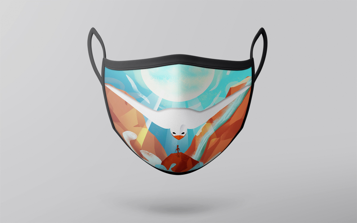
Even though masks can be something of an inconvenience, this design conveys the exact opposite idea. Nothing says freedom and the promise of a brighter tomorrow than a soaring bird over a sunny, windswept landscape. And the bird’s position directly over the mouth is no accident either. As designer Mark Ashraf puts it, ”The negative space of the bird creates a smile on anyone that wears it.”
This mask really speaks to the enthusiasm Egypt-based designer Mark Ashraf brings to all his freelance projects. He’s not only a talented illustrator but also a college student studying applied arts and science. He says, “I am delighted that I started freelancing and working with great people. I find it very rewarding to help people with their projects while doing the thing I like the most. I get excited every time I bring someone’s idea to life.” And this mask design with its swirling mist and dazzling sunlight is no exception.
The physical media of a simpler time are the subject of Kowabana’s mask design. A repeating pattern of CDs sparkles brightly in a shimmering cascade, as though we’re looking right into the rose tinted past.
As graphic designer Kowabana describes it, “This mask design is a love letter to all the things that have been keeping me creatively inspired before and especially during COVID19; which are anime, music, and pastel colors.” These glittering CDs are about more than entertainment. They are a much needed reminder of how simple pleasures like pop culture can come to mean so much.
And just as this design reaches into the past with its 80s-inspired style, Kowabana values the way their freelancing work can reach across borders: “I love being a freelance designer because I have the freedom to pick the projects and clients, get plenty of exposure (including access to out of state and international clients), expand my skills, evolve with experience, and do all of this remotely at any place I feel comfortable in.”
This mask design proves that even medical masks necessitated by a pandemic are capable of brightening our day. But putting a smile on people’s faces isn’t the only story behind this mask.
Commenting on their inspiration, designer Ksenka says, “I have a son, who dreams of becoming a designer. Over the years he’s developed his own, unique style of drawing. I figured that the characters he draws fit great as designs for masks, so I asked if he’d like to see them on a real project, to which he happily said ‘yes!’. I see that he has the talent and that there is a future for him in design.”
What drives Ksenka’s freelance career is the example it provides for their son: “Usually, children avoid pursuing the same career as their parents, but that’s not true for my boy. He really likes the type of work I do, as well as freelancing as a whole, and he sees his future in that sphere. He’s constantly drawing, and I’m very proud of his work.”
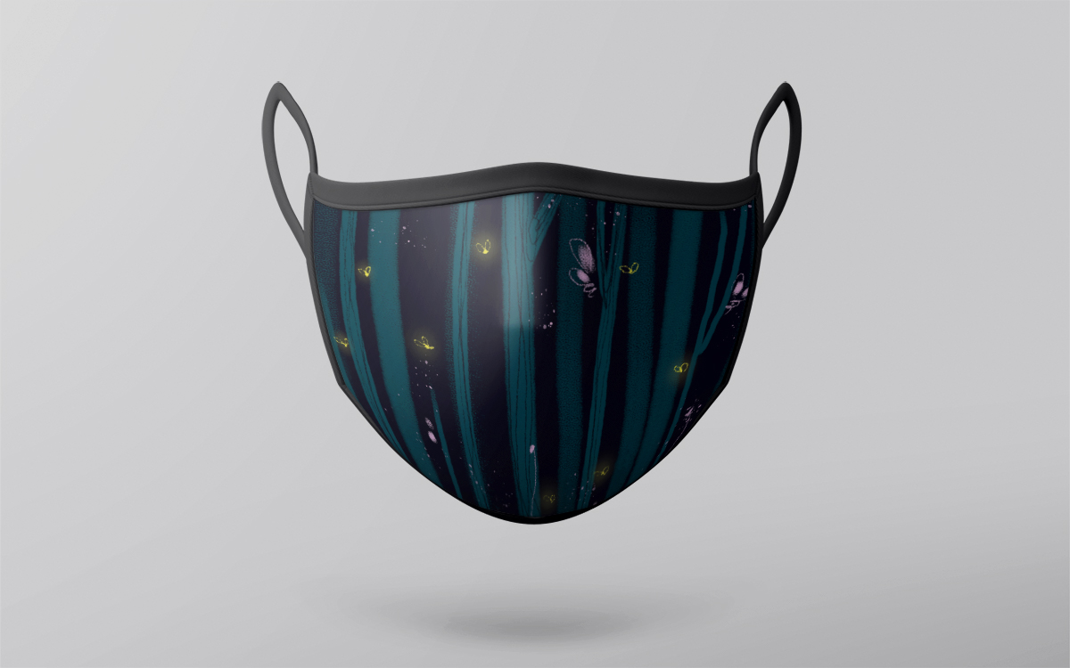
In this mask design, tantalizing nature gets the high fantasy treatment. Ukranian graphic designer olrii created an enchanted woodland that wouldn’t look out of place in a fairy tale. A line of trees are positioned against a dark background, bent slightly so that you can almost hear their creaking sway against the wind. The otherworldly blues and purples along with the glow of fireflies all contribute to a dreamlike ambience.
Olrii describes how she turned her signature style into a story: “This illustration represents me as a designer in that it is an illustration made in the style in which I usually work. And fireflies are a symbol of light in the dark, which helps not to give up and move on.” And it is her willingness to venture into the unknown that also drives olrii as a freelancer: “Freelancing for me is first and foremost a great opportunity to do what you like best and always learn something new.”
Steampunk is an example of a friendly sci-fi subgenre that romanticizes the industrial technology of a bygone era, realizing a fantastical alternate timeline that might have been. For designer Aesthetic d, the style is about embracing their passions: “I am a mechanical engineer and I also love graphic design. Steampunk incorporates both technology and aesthetics on a design—that’s why I’ve chosen it as my theme.”
Visually, the style is often characterized by pipes and gears, but Aesthetic d takes advantage of a cartoon style with thick outlines and bright colors to heighten the sense of whimsy. The clean lines and quirky theme perfectly sum up Aesthetic d’s love for design and technology, along with a drive to improve as a freelancer, “I really like to compete which pushes me to improve my work and learn from other designers.”
In designer gunadika’s mask design curious animals peer out from behind inky foliage in the midst of intricate jungle imagery. All of this is heightened by the monochromatic line art which makes the viewer feel like they could get lost in nature.
Designer gunadika from Indonesia describes how their thought process focussed on people’s craving to be in nature: “People should use masks and social distancing, but I know many people want to go to the beach or mountain and want to feel at one with nature.” This mask design allows us to at least mentally escape to the jungle. Gunadika also brings a sense of adventure to their entire freelance career. As they put it, “I love freelancing because I can work with many companies. There are always different challenges and experiences that come with the job. One day, I hope to have my own international design studio!”
This mask of lush, nested ferns offers a small window into a painted world of greenery and life. The fine shading lends an air of realism to the flora, and the interwoven pattern makes the whole composition feel hypnotic in the best way. All in all, this mask design by Brazilian graphic designer Pamella P radiates relaxation and serenity.
Pamella P is a veteran pattern designer and she describes her design process this way: “I’ve been in the design business for 10 years, but I’ve been working directly with surface design for 5 years. I really like to create prints with manual elements to give a unique character in each creation.” For her, a sense of place is important to bring to every freelance project, “I always try to add a little bit of myself in my projects, even more in surface pattern designs. I dedicate myself to manual techniques, and I get a lot of inspiration from the Brazilian flora.”
This mask design by veteran graphic designer green in blue features a pattern made out of sleek, abstract shapes. Specifically, it is a modernist style that feels immediately urban and fashionable. Green in blue is a designer from the US with a passion for creating modern yet vintage-inspired designs, and this mask perfectly represents her sense of style: “This design has a little midcentury vibe that is warm and nostalgic, while still being professional with a touch of wabi-sabi.”
A sense of freedom drives the inspiration in green in blue’s approach to freelance work because she loves being her own boss. As she describes it: “I love choosing projects that inspire me, and the ability to do things which are in line with my own values. I like finding the perfect project that will stretch me just enough, and where I can express myself by putting something I made out into the world.”
As designer (and tattoo artist) Finesse” describes it, “My concept is a mixed composition of a Hannya mask and a Gas mask. The meaning of Hannya is ‘Wisdom.’ And I integrated the Gas mask that is used for protecting the face and lungs against noxious gases. I was inspired by an alternative explanation to the Hannya mask that reads: ‘The artist would need a great deal of wisdom in order to create this mask.’”
While it might not be going for realism with its selective shading, the dark color scheme, the toothy Hannya maw, the gas cylinders and noxious vapors also give this design an edge.
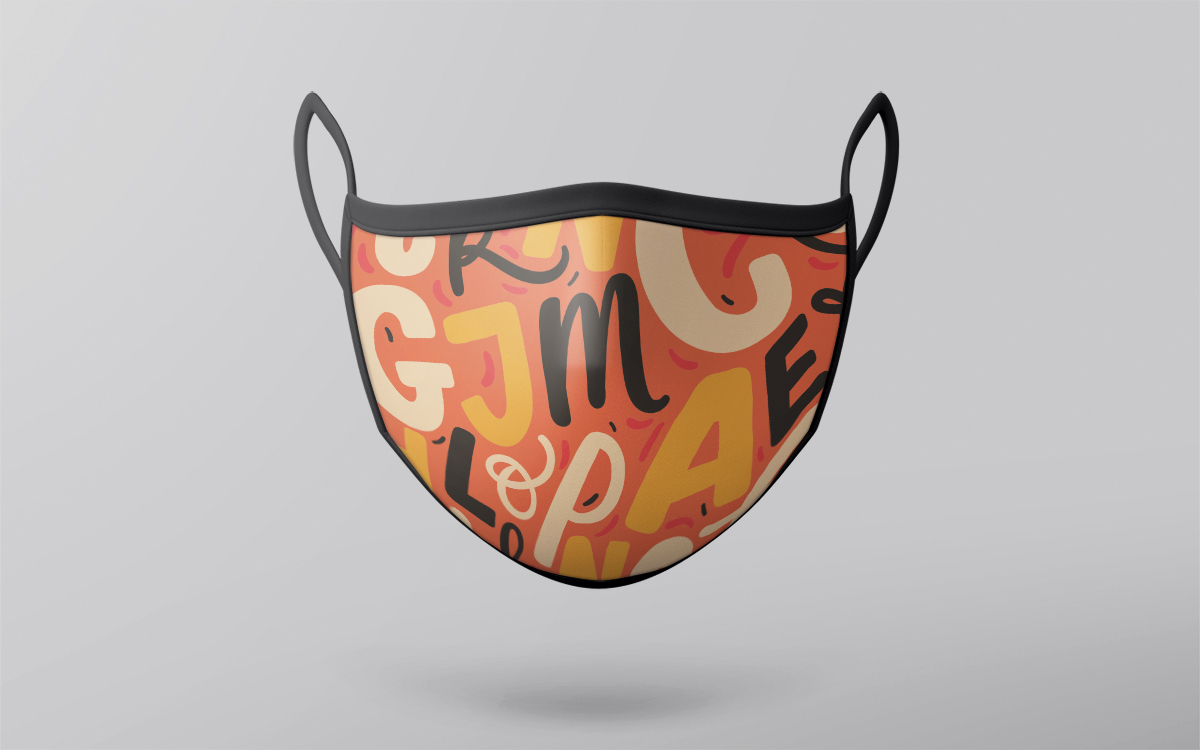
While this mask replaces the wearer’s mouth with a jumble of letters, there is an undeniable joy to the design’s bouncy typography and warm color scheme. And in the midst of social distancing, kind words are what the world needs.
Pattern designer and lettering artist Hanifa design from Kazakhstan describes their approach as revolving around the central element of letters. “For many people, letters are simply a means of communication and education. However, for me as a designer, letters are the art. Connecting with color, merging into a composition, they evoke emotions. In this design I wanted to share with you optimism which is now so important than ever for each of us. Lettering is something that brings me joy, and I hope that you will share this joy with me when looking at this mask and using it for good.”
It is the independence of freelancing Hanifa design cherishes in their work: “I love my profession. I love freelancing for freedom, both physical and mental. I work at a convenient time for myself, in a convenient place for myself, choose projects to my liking.”
Who would have guessed covering your face in sludge could be so appealing? In this radioactive mask by graphic designer Freesugar, neon greens and purples intensify cascades of goo. It is a design that is both attention-grabbing and fearless.
For designer Freesugar, this mask design is about adjusting to new circumstances: “I am a designer who really likes monsters and horror so I draw in that style. I like to draw fluid shapes because as a designer I am always able to adapt in every place I am. I must always be able to follow the storyline or brief.”
Get your mask and let it inspire you
—
Masks encapsulate much more than safety measures—they express who we are and represent our commitment to ourselves and our community. And in a time when it can feel like all the stories we tell are dystopian, our masks can showcase perseverance, solidarity, and even comedy.
It is past time to make mask-wearing more of a cause for celebration than ambivalence. And if any of these mask designs and the stories of the designers behind them spoke to you, don’t forget that you can get all of them at Vistaprint. And whenever you find that your own designs are missing that touch of personality, the 99designs designer community is here for you to create designs you’ll love.
A well-reasoned error strategy is vital to the health of backend services. It’s important to consider how to handle an error, and if it cannot be handled then how to log it, what information is useful to be logged with, and who gets notified.
The backend service responsible for launching one-to-one projects on 99designs was failing for some number of customers. Unfortunately because of a mixture of problems with the existing error strategy, it was hard to get a clear understanding of the scope of errors occurring. Errors were being handled multiple times, there were many redundant or unimportant errors, and logged errors had inconsistent metadata. This lack of intentional strategy led to drifting standards across codebases.
We spent some time investigating our existing error strategy and inventing a model for how our errors within our Go Twirp services should operate. This post gives some context on Go errors and Twirp, details on some of the issues we faced, and lays out our strategy for error handling going forward.
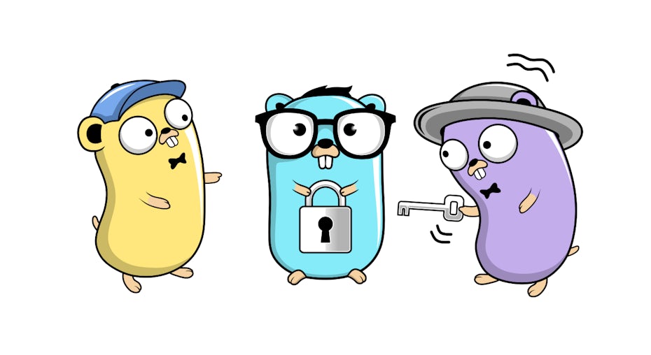
Go gophers (originally created by Renee French). Design by denidon.
It’s worth mentioning that although we use Twirp for inter-service communication, this advice should equally apply to gRPC setups, or other RPC frameworks that use Go errors as part of their handler signatures.
Background
—
At 99designs, our blueprint for new services consist of small Go binaries, that communicate via Twirp, either between each other, or to our frontend through our GraphQL aggregation service.
Errors in Go
Errors in Go are just values. Apart from having the built-in error interface, they are more a language convention than feature. By convention an error can be returned from a function if an error case occurred, and it is the responsibility of the caller to check this value and take appropriate action.
Any type can be an error as long as it implements the error interface. The default error type returned by the errors package is just a string containing the error message.
This model, in contrast to a feature like Exceptions, forces a developer to think about and handle error cases in the immediate context of the calling code. Having this be a strong convention also allows tools to easily lint for error checking and ensure good practises are maintained.
However one common anti-pattern we see in our services, is when a function returns an error, it is simply returned back up the stack to the caller, which can often similarly return the error to its own caller. In some ways this is the reverse problem that Exceptions have; the developer returns an error and hopefully there is something up the stack that knows the correct thing to do and will deal with the error appropriately.
Panic and Recover
The other error mechanism Go has are panic and recover statements. This mechanism is similar to an Exception, in that execution of the current function will stop and return to the caller. Deferred functions are executed however as the panic propagates up the stack. You can read more about how panic and recover work in this blog post.
Twirp is a protobuf API protocol over HTTP. Writing a Twirp server is convenient, because a developer can focus on service logic rather than transport or routing concerns; all that is required is writing the protobuf definition and implementing generated RPC handlers. These handlers have an error in their return type, and the Twirp server attempts to convert returned errors from a handler into an HTTP equivalent error that is returned to the client.
Twirp defines a range of useful error types that are mapped onto HTTP equivalents. Handlers may also return any valid Go error type, which Twirp will treat as if it was a twirp.Internal error mapping it onto an HTTP 500 response. We’ll unpack what this means for our handler code in the discussion below.
Bugsnag
Bugsnag is the error reporting and monitoring service we use. Errors can be submitted to Bugsnag using the Notify method of their Go client package. Because Go errors are just values, the error interface does not provide methods for retrieving stack information.
So the Bugsnag client will wrap an incoming error with stack information using the Go runtime package, and submit that along with any additional meta-data to Bugsnag. This can be done anywhere using the github.com/bugsnag/bugsnag-go/errors package, and is also done automatically upon call to Notify.
Bugsnag will collate these errors and attempt to group them such that you can see the same error grouped together. Operations such as “ignore” or “mark fixed” can then be performed on these groups.
Constructing a stack trace like this works well for normal calls to Notify, but falls short when attempting to put in place automated notifications in a part of code that is outside the stack from where the error occurred. This is because the default grouping in Bugsnag groups errors by 2 metrics: the “type” of the error (which is Go is usually just a string), and the file location of the top frame of the stack trace sent by the client. So when attempting to write something like a global error handler, stack information can be lost, and all errors can appear to originate from the place that Notify is called in such a handler.
Problems with Existing Error Strategy
—
With that context in mind, let’s take a look at some of the common issues we ran into in our Go Twirp services with our existing error strategy.
Twirp Handlers Returning Errors
As mentioned earlier, generated Twirp interfaces expect back a response message, and an error from the handler function. Any error that is not typed with a Twirp error code is wrapped in a Twirp internal error and treated as a server error.
This can be a problem in cases where there is an error with the request itself. An example might be attempting to retrieve a non-existent record, attempting an action that is not permitted, or a malformed request body. These are errors that are caused by the client side, so treating them like an internal server error does not indicate to the client that the problem is their responsibility.
Returned errors are also transmitted back to the client, and can lead to accidental leaking of information that the client should not otherwise be able to access.
Bespoke Calls to Bugsnag Notify
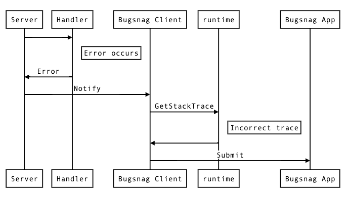
In the absence of some sort of higher-level automatic error handling code, developers are forced to put bespoke calls to notify Bugsnag at points they think they will likely encounter an error.
There are a number of issues with this approach. Firstly it’s inconsistent, and you can’t get a good picture of all the errors occurring on your platform. Errors are only logged in places that a developer remembers to call Notify.
Secondly, unless you terminate a handler on the spot, you run the risk of sending a notification for an error multiple times. This can create confusion when reviewing errors, as multiple notifications have the same source.
Bad Stack Traces
The generated Twirp server does provide hooks for running code when an error is returned from a handler. This initially seems like the perfect place to do an automated Notify call, however recall that Go errors do not have any Stack information associated with them. Recall also that Bugsnag groups errors by the last stack frame.
The automatic Notify call will have the same stack trace for all errors, and therefore all errors will be grouped together in the Bugsnag interface, meaning that bulk actions cannot be performed on subsets of errors.
No Context on Returned Errors
When returning an error from a function, it is often important that context is added to the error so that either the caller, or a developer reading the error has a better understanding of the error condition that has occurred.
Many existing calls do not do this however and return the raw error back to the caller. This leaks implementation details, and can be difficult to trace what the actual error condition is.
A Better Error Strategy
—
Our Go microservices are small enough that it should be possible to reach “Inbox Zero” in Bugsnag; all errors should either be ignored because they are unimportant, or require the attention of a developer and should be put on a backlog, fixed, and afterwards marked as resolved. Getting to this point is extremely useful, as it means that any reported error from a service can be investigated by an engineer in a timely fashion.
In practise reaching this might be difficult, but we’ve adopted some of the following strategies in an attempt to get to this ideal scenario.
General Go Error Handling
When an error condition occurs in general Go code, simply returning an error might not always be the best course of action. Consider wrapping the error with additional context if it will make it clearer to the caller what has occurred using the Go 1.13 %w placeholder with fmt.Errorf.
Panic should be used sparingly in invariant cases where a situation should never be possible. A panic indicates that a function does not think returning an error value would be useful for the caller. In these cases a developer is likely required to make a fix.
Explicit calls to Notify can still be used, but should only be used in situations where a developer wants to know that a situation occurred that was still able to be recovered.
Wrapping Errors
Errors should be wrapped before returning if the function can add useful context with a more specific error message, or wants to decorate an error with additional metadata. Useful context might include information about related domain entities, or related structured data that a caller could use to assist handling the error.
Automatic Bugsnag Notification
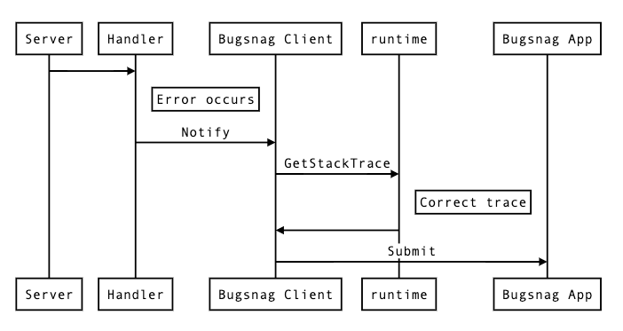
So to address issues with bespoke Notify calls, we need an automatic way of notifying Bugsnag when an error occurs that we think requires a developer’s attention. And we need to do this in such a way that it preserves a useful stack trace, and grouped correctly in Bugsnag.
Our solution is to instate a panic handler high in the stack off the application that can recover, and automatically call Bugsnag with the error. The benefit of using a panic, is that the stack is preserved for all defer calls, and so an accurate stack trace can be constructed from the point of the panic.
func BugsnagMiddleware(w http.ResponseWriter, r *http.Request) {
    defer func() {
        if p := recover(); p != nil {
            err := NewErrorWithStackTrace(p)
            bugsnag.Notify(r.Context(), err)
        }
    }()
    next.ServeHTTP(w, r)
}
In this example NewErrorWithStackTrace calls the go runtime to get the current stack, and removes enough frames from the top until the top frame of the stack is the location of the original panic. A stripped down version of this function might look like:
func NewErrorWithStackTrace(p interface{}) *Error {
    frames := GetStackFrames()
    lastPanic := 0
    for i, frame := range frames {
        if frame.Func().Name() == "runtime.gopanic" {
            lastPanic = i
        }
    }
    ret.frames = ret.frames[lastPanic+1:]
    return &Error{err, frames}
}
We add this stack information to a custom error type that meets the ErrorWithStackFrames interface exposed by the Bugsnag client.
Twirp Handlers
Errors that bubble up to a Twirp handler generally fall into one of two categories, client errors, where the error lies with the request and should be handled by the caller. And server errors, where the downstream service is at fault.
1. Client Errors
Equivalent to an HTTP 400 range status code. These are errors that are the responsibility of the client. Authentication and authorisation errors fall into this category, as do validation errors. Other examples include malformed requests, invalid arguments, or resources that could not be located.
These should be returned from the handler using the appropriate twirp error codes. Example:
err := json.Unmarshal([]byte(req.JSONBlob), &dst)
if err != nil {
        return nil, twirp.NewError(twirp.Malformed, fmt.Sprintf("could not unmarshal request: %v", err))
}
2. Validation Errors
Some concerns, such as validation, require metadata to be returned with errors. There are two main ways to implement this case.
The first is to simply include it as part of the response message. The response message itself might indicate whether the request was a success, and if not what errors were found. This is useful for validation scenarios where the client may want to display errors encountered to an end user, and each error might have some additional metadata associated.
The other implementation is to use the Twirp error metadata map—a simple key/value map that is a feature of Twirp errors, and is available to read on the client.
We don’t have a strong recommendation here, some judgement is probably necessary. We are keen to hear how developers have found the experience of working with each case.
3. Server Errors
A server error is any error that occurs not because of the incoming request, but for any other reason that the client could not predict. These errors are considered unrecoverable, and therefore should be a panic inside the handler itself. Example:
err := db.Insert(record)
if err != nil {
        panic(fmt.Errorf("could not perform database insert: %w", err))
}
These errors will be caught by a top-level panic handler and a stack trace generated at this point as described above.
There may still be some cases where a server error occurs but is expected for some reason. These cases do not warrant a developer looking at them. In such cases any error can be returned and the client will get a 500, however no Bugsnag notification will be sent.
It’s worth noting that the standard library http.Handler interface does not provide an error return value in the signature of ServeHTTP. This is a better design as it forces the handler to call panic in the case of an unhandled error occurring. By having a separate channel for errors, Twirp (and by extension grpc) creates an opportunity for users to simply return errors they incur, instead of taking a considered approach on a per-error basis.
Conclusion
—
While this is a topic that can seem boring at first glance, upon unpacking is actually complex and rewards careful consideration. Being intentional about the handling of errors can make it easier for teams to understand problems that a service is having, and quickly prioritise and resolve issues as they arise.
A good error strategy has clear guidelines defining patterns developers can reach for to handle common use-cases. While these patterns might not fit all scenarios, they are instructive and help to better inform developers about what good error handling looks like.
In this particular case, after adopting this strategy we were able to clearly identify the scope of affected customs, and the issues they were running into. This enabled us to prioritise fixes for common problems, and allowed us to trust the error reporting on an ongoing basis.
Going forward we intend to adopt this pattern across all our services, and hopefully get to a place where our backends are informing us when things go wrong in a way that we can quickly respond to.
Looking to work with a cutting-edge group of engineers?
Subjectively speaking, you could say that a lot of websites nowadays are variations of the same thing. Why is that? And is it a good or bad thing? Let’s look into it.
With easily accessible platforms (37% of websites use WordPress) and an abundance of free templates and stock images, this is no surprise. Anyone can create a decent-looking site, as long as they have the patience and some time on their hands. What’s more, thanks to those same templates, these sites can offer a relatively good user experience. They use well-developed navigation systems, color schemes, and layouts, and are, well—what web visitors are already used to. Naturally, businesses and designers alike pick up on what works and create websites that follow common trends that people know and love.
So, for quite some time now, designers have been noticing that websites are starting to look increasingly similar. And when you look at enough designs, there seems to be something to it.
Cosmetics brand homepage example by SlavianaCosmetics brand homepage example by Alex Capellan
Nonetheless, for the longest time, there was very little empirical research being done on the subject.
This changed in May 2020, when The Conversation published an article titled Yes, websites really are starting to look more similar, written by Ph.D. student Sam Goree. By studying over 10,000 sites, Goree’s team concluded that websites are, in fact, starting to look alike.
They backed up their claims by closely defining similarity and identifying the three points on which all web pages could be compared. These included color scheme, layout and AI-generated attributes. In the paper, they pointed out that since 2010, web design features were becoming increasingly uniform, even though the code behind them was becoming more diverse.
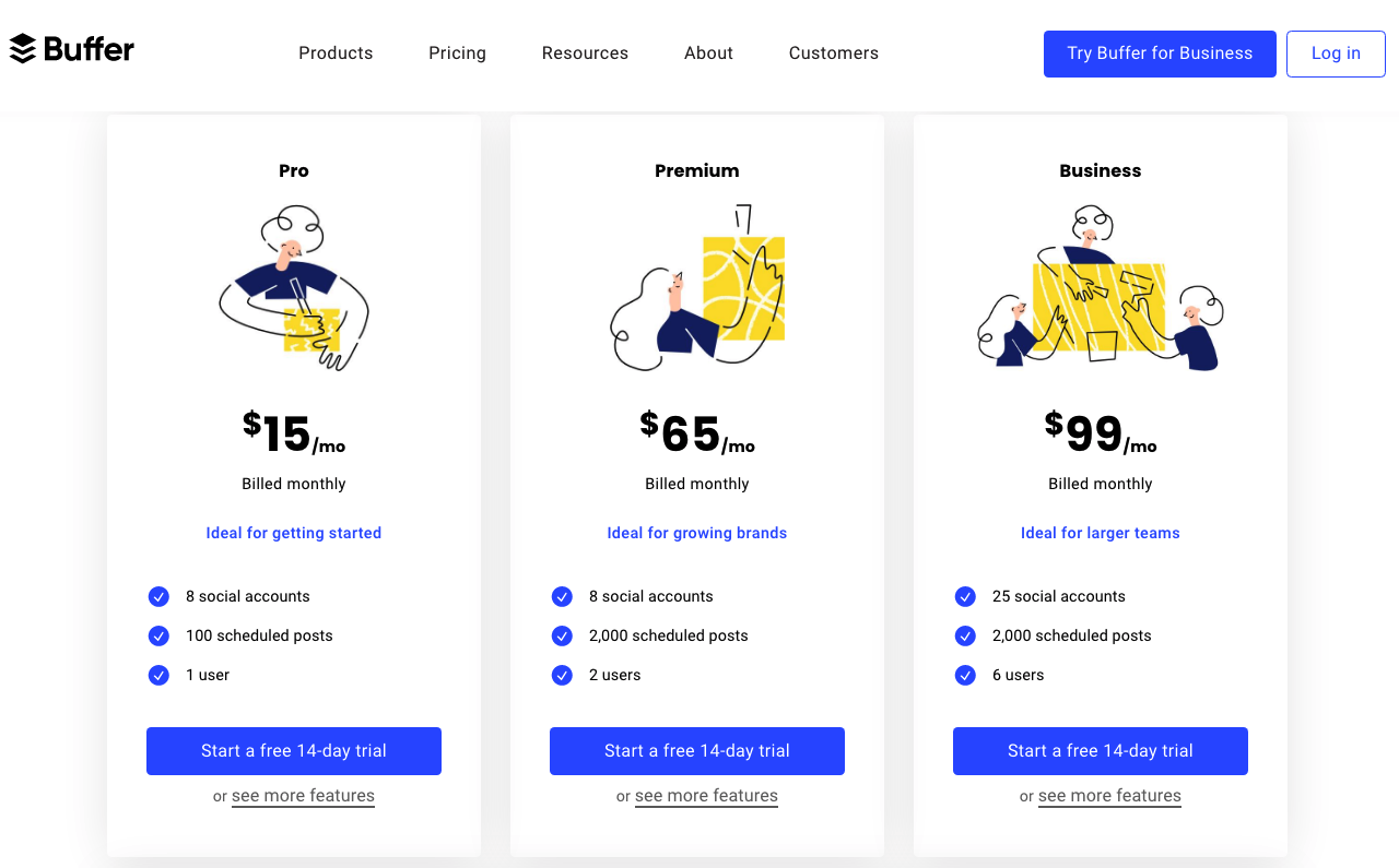
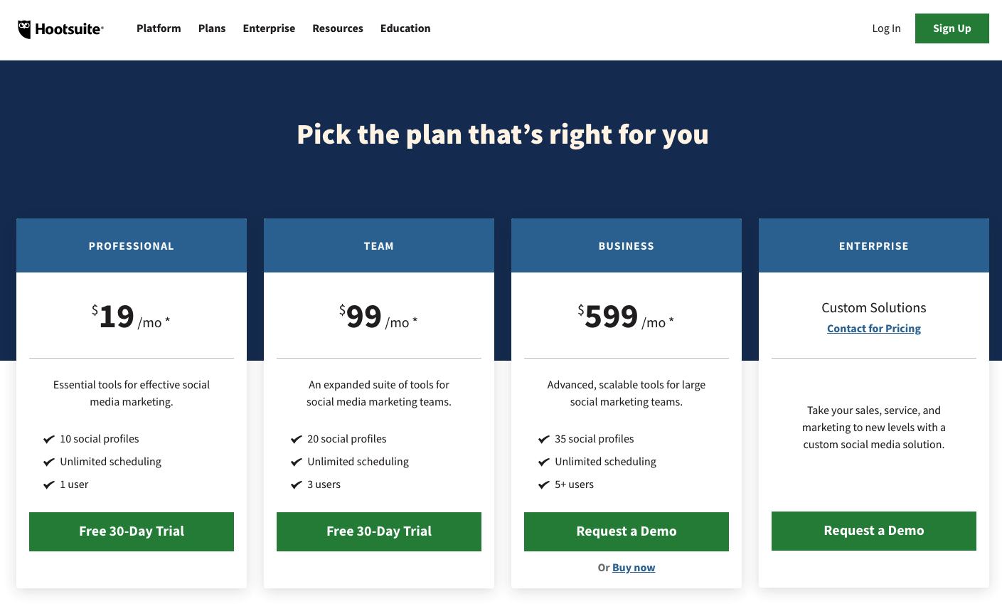
Pricing plan example from BufferPricing plan example from HootSuite
But what does this mean for designers and business owners? Should they be trying to stand out? Or are there benefits to fitting in?
The thing is, there may not be a definitive, scientifically backed answer to these questions—and certainly not one that works for everyone.
So, instead of following any web design advice blindly, organizations should be aiming to examine every aspect of their website in relation to how it serves the business.
Ultimately, the question isn’t whether you should use a particular font, layout, or color palette. Instead, it’s how those elements contribute to conversions and user experience, how they represent your brand, and how they make you look in relation to your competition.
At the end of the day, you need to stand out without sacrificing usability—a delicate balancing act that can take time to perfect.
What’s with all the website doppelgangers?
—
The increase in website similarities may be attributed to overall aesthetic trends, found in all forms of creative expression.
Over the past 25 years, as internet use became widespread, there have been several design trends adhered to by most developers. In fact, based on visual appearance, experts were able to clearly define four prominent global design periods. These were named Rudimentary, Chaos, Formative and Condensation. Web 1.0 is an example of the Rudimentary period, which had a distinct, text-heavy appearance. In a similar fashion, today’s websites also follow particular aesthetic trends.
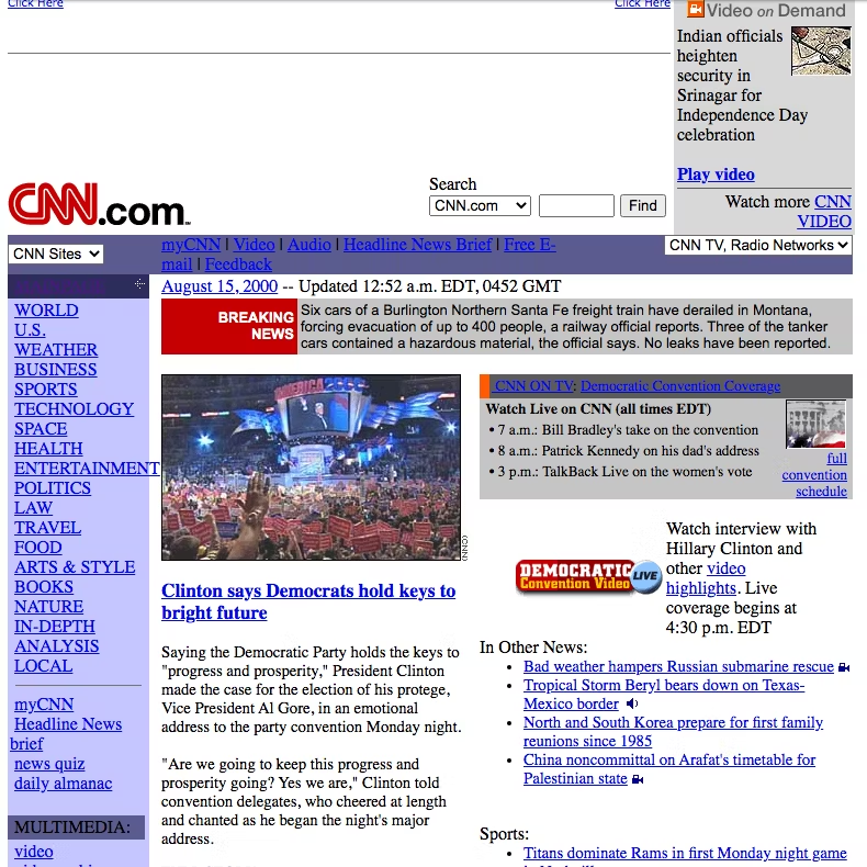
As you can see from the examples below, in the year 2000, two popular media outlets, CNN and The New York Times, both adhered to similar design choices. This is logical, especially if we consider two major factors. First and foremost, during this time, there were still severe technical limitations regarding what could be done on the internet. On the other hand, the focus of these two resources was the same: they aimed to provide web visitors with a way to read news stories online.
But, although we might have expected that technological advancement would make way for more originality, modern-day screenshots prove the opposite. Though heavily updated to follow contemporary standards, these two companies still use relatively similar layouts on their websites today, apart from a few variations in use of color and typography.
The reason behind these similarities may just hide in artists’ tendencies to follow certain rules of the period. But when discussing uniformity and originality, identifying the aesthetic (or technological) periods of web design isn’t enough. To have a strong understanding of how they came to be and how they’re evolving, we need to identify exact features that can be easily compared to one another. In this regard, what Goree’s team found was that there are three key markers of web design:
navigation menus
visual flavors
media composition
Over time, these would change in appearance, according to current technological and aesthetic trends. We can argue that they will continue to change as we adopt new technologies or form new habits regarding how we use the web.
Another factor that contributes to the similarities we see in sites is connected to the growing availability of web design guides and courses which are often uniform (um, unoriginal) in their suggestions. Ultimately, the result of these best-practice guides is a growing tendency to choose similar visual and functional elements, which are slowly but surely making the web a strangely homogenous place.
Even big players, who have considerable design budgets, tend to go with almost identical aesthetic choices. It works and it looks good, so why risk changing things? Just take a look at the examples below, one by AirBnb and the other by onefinestay. With the exception of navigation menus, the homepages of these two companies look very much alike.
Why following design rules is a good thing
—
Of course, following trends isn’t necessarily a bad thing.
By adhering to the widespread tips, designers are creating online spaces, which already feel familiar to users. In theory, this cuts down on acclimation, as users don’t have to waste time becoming accustomed to the website’s functional features.
For example, it’s standard practice for e-commerce websites to place the cart icon in the upper right corner. When users want to check out and make a payment, they will automatically look to that section of a page.
Furthermore, it’s not just user habits that cause website design similarities. Psychological research shows that UI familiarity plays an even more important role in users liking a website/product.
According to the mere exposure effect, it is human nature to like the things we are most often exposed to—and this works most significantly with the images we take in. So it’s no surprise that, biologically, humans really do tend to prefer web design that is, in some ways, known to us.
Then again, the benefits of uniformity in web design aren’t just psychological. From a technical perspective, the growing tendency to utilize similar elements resulted in the web becoming more accessible to visually impaired users. Tools and guidelines such as WCAG and WAVE have allowed developers to create websites that are more comfortable to use. This extends not just to those with eyesight issues, but the elderly as well.
When does uniformity become a disadvantage?
—
While there are many advantages to web design uniformity, there are drawbacks, too.
The first thing that happens when all websites look like one another is that the vibrancy of the internet declines. According to the 2018 Internet Health Report, one of the main areas the internet is lacking in is diversity. Not only are the users predominantly white and male, but so are those designing and developing the pages. The result of such sameness means that the requirements and viewpoints of marginalized groups are often overlooked.
Moreover, the same report calls attention to the fact that large companies, like Google, can impose global standards, which may or may not be accessible to small players. As a result, those same large corporations gain the power to censor information or use the internet for their own agendas.
Large companies like Google are proposing global design standards
But even if we disregard the fact that uniformity may lead to marginalization and security issues, it’s still important to consider the question of branding.
For any company trying to make it in today’s business world, branding plays a crucial role in reaching, and drawing in, its target audience. And while branding doesn’t rely on design alone, it’s good to remember that first impressions are mainly built on visual data. It’s all about creating a strong and unique visual identity and brand personality. This means that every single element on a company’s homepage needs to play a role in defining that company’s values, mission and offering. Now, if all websites tend to look similar, that makes it increasingly difficult to stand out from the competition.
Why is originality important?
—
Well, that’s simple. A strong visual identity isn’t just a random design choice. It’s a brand’s calling card. With a unique look, any brand can:
become easily recognizable (think of McDonald’s golden arches)
draw out an emotional response from their target audience (Coca Cola’s Christmas ads, for example)
have a uniform presence throughout all online and offline practices (franchises do this particularly well, with locations all over the world offering almost identical experiences)
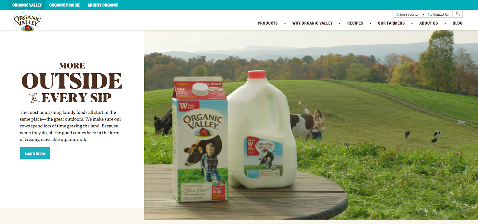
communicate values and mission (for example, it’s clear from Organic Valley’s website what they’re all about)
Coca Cola heavily relies on visuals for its brandingOrganic Valley‘s logo is an example of good branding
Thus, it becomes evident that following some design rules can offer brands an advantage in terms of user experience. However, without developing enough unique elements in their (online and offline) presence, strong branding becomes almost impossible to achieve.
Common web design best practices to stick to
—
Before you start thinking of ways to stand out, it’s important to be aware of the most commonly similar web design features. You need to understand the rules before you can break them. The following ten points represent web design best practices recommended by design experts and online resources.
The reasons why these features are being implemented on most websites vary. On the one hand, some became standard practice as an answer to common user behavior when viewing pages. Data supporting these was found either through heat maps or split testing.
On the other hand, other practices became commonplace as web designers started to look towards psychological research studying consumer behavior for cues. If a certain type of language was shown to have stronger convincing power (like the words used in CTAs), it was more likely to become implemented into web design.
Finally, some of the advice relies on aesthetic intuition as well as simple facts of accessibility. After all, it doesn’t take an empirical study for someone to realize that green text on a red background is difficult to read.
For good, user-oriented web design, you don’t necessarily have to follow every single one of these rules. But having an understanding of why they’re important may give you the required insight to make the right choices for your brand’s needs.
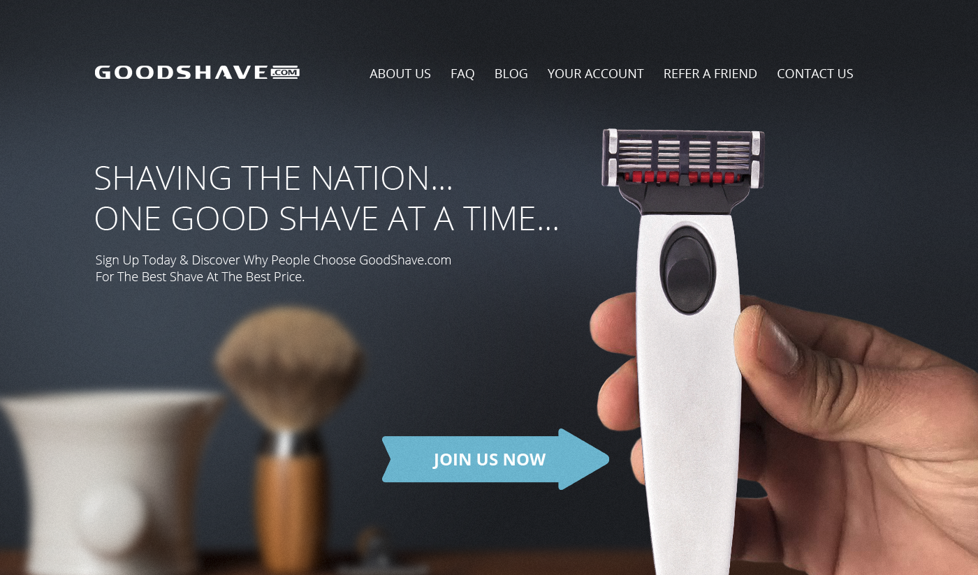
1. Logo placement
The vast majority of websites place a clickable logo in the top left corner. Even the world’s most visited websites adhere to this standard. The reason is relatively simple. In the western world, where Indo-European languages are spoken, people read from left to right. This translates to their online behavior as well. In general, they tend to gravitate towards the top left corner of the page. By placing the logo in this area, graphic designers rely on web visitors’ habits and use them to showcase information they believe to be of the greatest importance.
An example of top left corner logo placement by Adam Muflihun
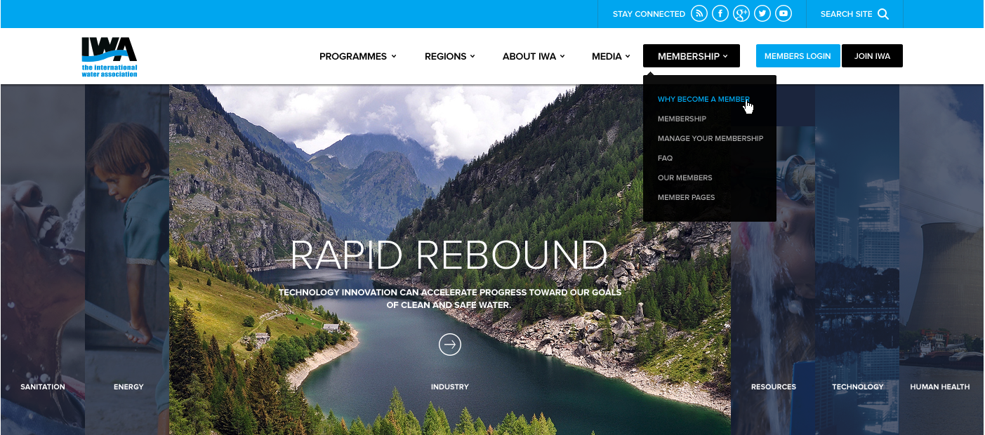
2. Navigation
When it comes to the ease with which users can explore the contents of a website, a well-made navigation menu plays a crucial role. Most experts agree that the best practice is to use established styles, which are already familiar to users—meaning they have a short (or nonexistent) learning curve.
The simplest of these solutions is a horizontally oriented navigation bar, which is used in 88% of websites. Of course, there are a few other popular options as well, most commonly the sticky menu, sidebar navigation, hamburger menu and the dropdown.
An example of a homepage using the classic navigation menu by DSKY
An example of a homepage using the dropdown navigation menu by KR Designs
3. Hero section visuals
By default, the most prominent section of a website is reserved for branding purposes. This means that the hero section, as it’s often referred to, commonly features a striking visual. Now, the thing with these visuals is that they don’t necessarily have to represent the brand’s product or service. Following advice to keep the section attention-grabbing, designers might opt for imagery that’s unrelated to a product, or go with stock photography. For many, the approach will work, but it also runs the risk of looking very similar to other websites.
The consensus is that the font used on any website needs to be legible, which is why using big, bold typography that adequately contrasts the background is standard practice. The best fonts to use on websites are web safe fonts.
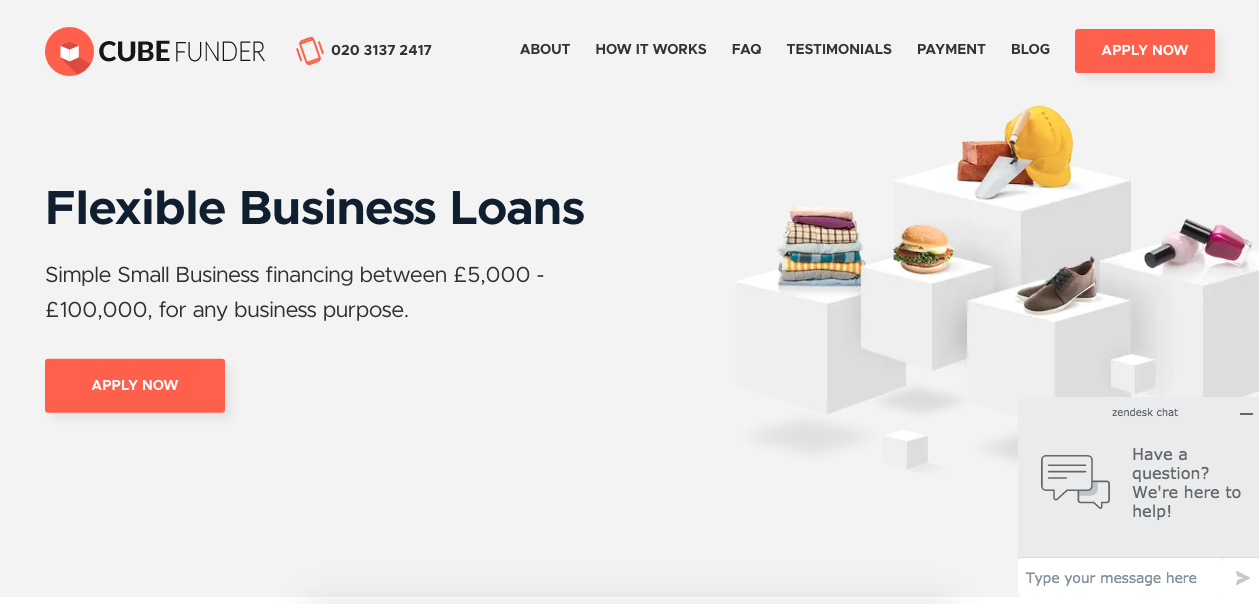
5. CTA buttons
One of the main contributors to website conversions, call-to-action buttons, get plenty of attention from developers and designers. Generally, the advice is that CTAs need to be highly visible, use short text and instructional verbs, create a sense of urgency, and address web visitors with either first-person or second-person pronouns.
The CubeFunder homepage uses the same CTA button several times throughout the page
Moreover, because of their importance, many designers choose to repeat their CTAs throughout a webpage, as seen on CubeFunder’s homepage. Here, the button is shown in the hero section, in the top right corner, and after each benefits section, aiming to make it as easy as possible for the user to convert.
6. Layout
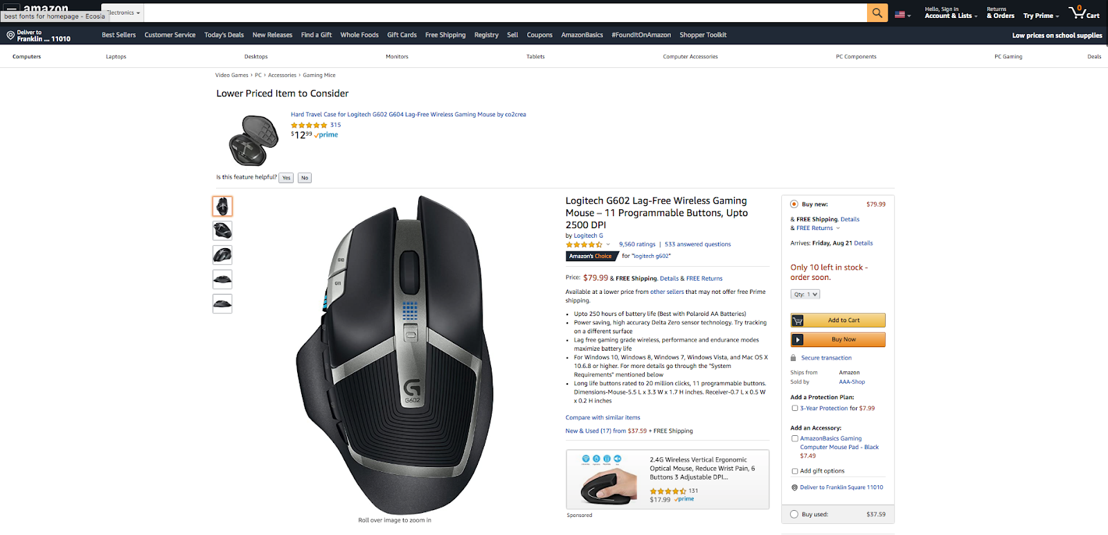
According to heatmap data, most users browse websites in one of three ways, with the F-pattern being the most common. Product pages often follow this practice, with images in the top left corner and text to the right of them, divided into bullet points. Perhaps the best example of this comes from Amazon, where all https://zomasleep.com/product pages follow this type of layout, assuming that visitors will look at the picture first, then go on to read (or more likely skim) the text.
Amazon product pages adhere to the popular F-reading pattern
7. White space
Most resources advise the use of negative space in web design. From a design standpoint, this allows creatives to get the required contrast between backgrounds, visual elements and CTA buttons. Minimalist web design takes these principles even further. It aims to remove all distractions and focus instead on providing a streamlined user experience.
8. Color schemes
While there’s very little evidence to prove that psychology can predict user reactions to colors, many sources propose using certain hues (like blue, green, red, or orange) based on people’s preferences. It’s not uncommon to see designs using green or orange CTAs, as shown in the example by Mithium below.
“Think with Google” reports a significant increase in bounce rates when page loading speeds go above 3 seconds. As designers and developers want to avoid bounces at any cost, they will be more likely to sacrifice page elements for the sake of achieving faster loading speeds. Consequently, most pages will tend to have a similar number of elements.
10. Mobile optimization
More than 50% of all internet traffic in 2019 came from mobile devices. This is a clear indicator that web design needs to be developed with smaller screens in mind. Tools such as Bootstrap have made this easier to achieve. Unfortunately, however, mobile-first may limit designers, mainly due to having to stick to grids to make websites responsive.
An example of how screen size affects layout by MVB
When and how to stand out from the crowd
—
Sure, designers can sacrifice artistic freedom to honor the guidelines and practices that promise higher conversion rates. But in the end, that type of uniformity only leads to boredom. Just imagine if everyone changed their CTA buttons to be red, based on one test showing that this color was 21% more effective than green.
Whether you’re an entrepreneur or a designer, make sure you’re asking the right questions. Having insight into web design practices that drive results is a good start. Following them is even better. But sacrificing uniqueness in the process is, ultimately, a self-sabotaging decision.
If you’re looking to make your website one-of-a-kind, here are some of the ways you can add your own flair.
1. Be yourself
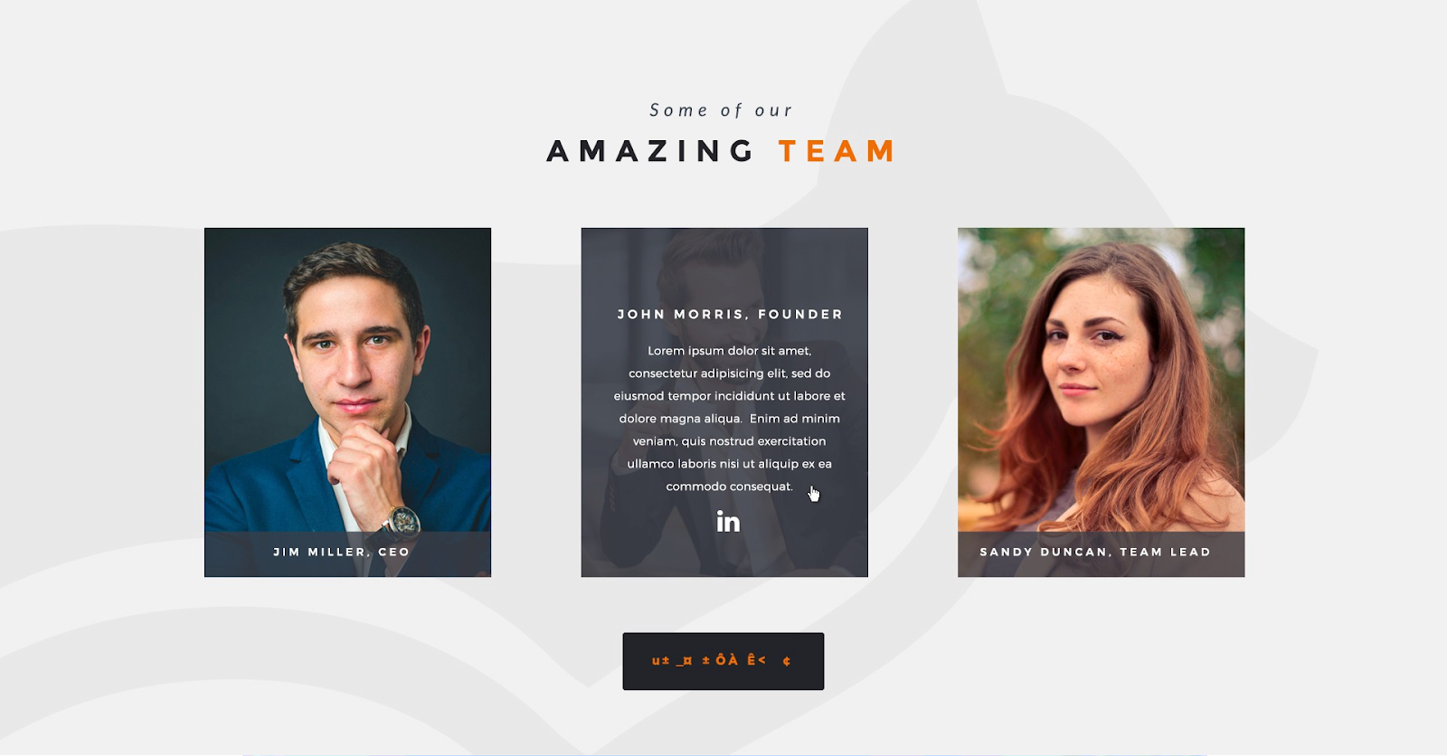
More than anything else, your website needs to showcase your brand identity. It should be integrated into every aspect of your site, from header to footer. Choose visuals that represent who you are, even if they’re different from what everyone else in your industry is doing, and take the time to introduce yourself to your visitors.
A design that prioritizes brand identity by Mike Barnes
Adding About Us and Meet the Team sections, such as in the example above by Mike Barnes, gives you the perfect opportunity to state who you are and what you stand for. This way, you’ll have a higher chance of attracting the right clientele, without having to deal with the consequences of poor expectation management down the line.
2. Showcase your audience
If you’ve done your research well, you will have a good understanding of your target audience. One of the ways to stand out is to make that audience part of your branding.
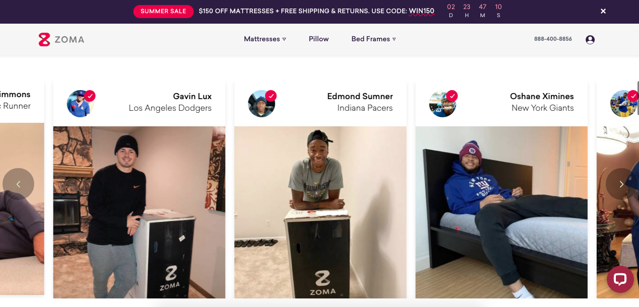
Don’t be afraid to use social proof. Reviews work well, but content works even better. Something as simple as adding user-generated content to your homepage, as done here by Zoma, can give your brand an edge over the competition. Especially because you won’t be using the same generic stock photos everyone else is putting on the web.
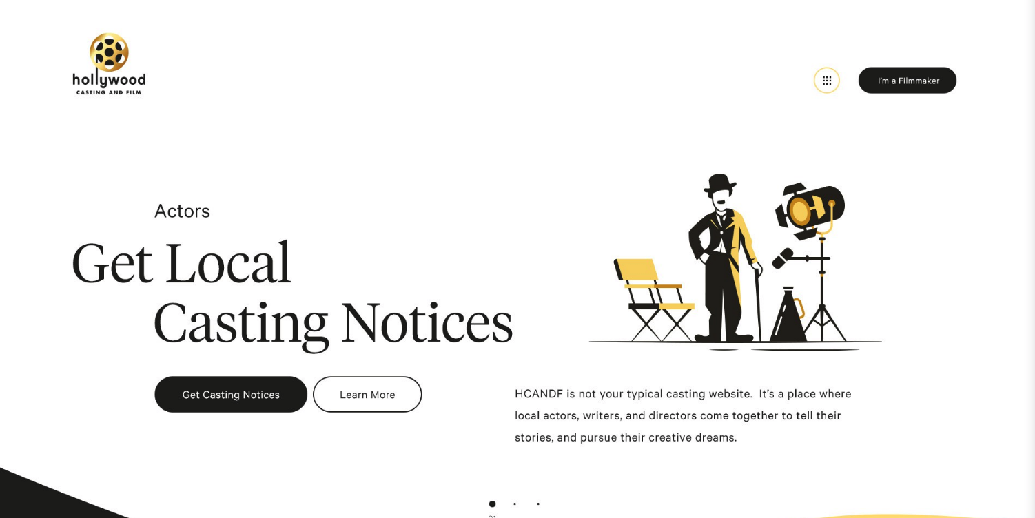
You want your audience to engage with the content on your website, so see whether you can use elements that drive engagement. Use video and animation, and you’ll not only increase revenue but will also get a unique chance to show off your products. You can also choose to skip the photos and videos and opt for creative website illustrations to drive your message home.
A creative alternative to photography by Studio Ubique
4. Show your true colors
Although color psychology can offer insights into how people react to certain hues, don’t feel like you have to adhere to a color scheme just because you’re in a specific industry or niche. Instead, aim to create harmonious web designs using branding colors that promote your brand’s identity, while helping you stand out from your competition. Think about how Pepsi and Coca Cola use very distinct color schemes, even though their products are relatively similar.
5. Give insights
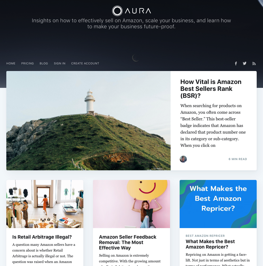
One of the best ways to use web design to differentiate yourself from the competition is to offer something extra. A resources section like the one below by Aura helps customers with added value. It’s one of the surefire ways to grab their attention, as well as to make your website, in itself, an irreplaceable tool.
Aura uses a blog section to turn its website into a tool
6. Copy
In addition to offering information, the copy on your website needs to work hand in hand with your visual identity. Make sure it’s true to your brand. If you’ve chosen fun, colorful visuals, don’t go with formal, stuck-up language. Be original, stay away from cliches, and always look for ways to give more.
7. UX
Last but not least, outstanding web design will support conversions and have a short learning curve. But, that doesn’t mean that it will limit innovation. One of the absolute best ways to stand out from your competition is to give your users an exceptional user experience—even if it means doing something that’s never been done before.
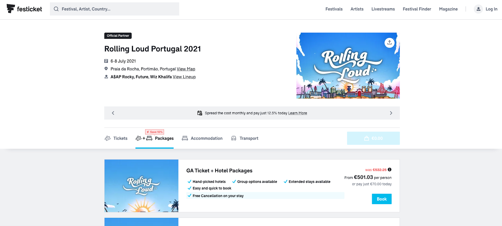
Take Festicket, for example. What originally started as a website for purchasing festival tickets turned into a single resource for all festival-related services, including accommodation and transport.
With Festicket users can book individual services or entire packages
Unique web design: should you stick to the rules or do your own thing?
—
Life would be so much easier if we had the right answers all the time. The same goes for original web design. There’s no such thing as universal advice that you can apply to your site. In the end, anyone presenting you with a definitive formula on whether you should go standard or original—except for your trusted team of designers, of course is doing you a disservice.
Think of it this way: you wouldn’t ask a musician to stop using the C-Major key just because it’s popular, would you? Just because an element is used commonly doesn’t have to mean it can’t contribute to an original work of art. Mozart loved using major keys. Does that make his compositions boring, uninventive, or bad? Absolutely not. Then again, blindly following trends isn’t the answer either.
So how do you know what to do? In the end, your mission is to seek out balance. When creating any work of art, which a great website definitely can be, you want to first learn the basics. You need to know exactly how to implement a technical detail and how to make standard practices work in your favor. Once you’ve got a strong hold of those, you can find ways to deviate from those standards, without sacrificing user experience. Of course, you want to make design choices that will support your company’s branding, communicate its mission and values and appeal to your target audience.
If you just follow what everyone else is doing, you risk becoming another unmemorable brand. But, if you manage to find a way to do something innovative, even if it’s just a fun color palette, and still retain a high level of website usability—well, in that case, you’re doing things right.
Want a truly unique web design for your business?
Work with our talented designers to make it happen.