Friday, March 27, 2020

The complete guide to food branding

No matter how much you think you know about branding, food branding is a bit trickier to pin down than other industries. The food industry relies on natural urges and “gut” feelings, and branding visuals can make your customers hungrier—or lose their appetite.

For anyone working in food—a broad category that includes manufacturers of packaged foods, brick and mortar retailers, restaurants, food bloggers, food-related services and beverage companies—the nuances of food branding strategies aren’t exactly obvious. In this guide, we give an overview on food branding, explaining what you need to know to make the right impression on customers.
food branding illustration
Illustration by Orange Crush

The basics of food branding

If your company were a person, “branding” would be how that person presents themselves—how they dress or wear their hair, plus how they act, whether they crack jokes or formally adhere to etiquette. Branding is more than just publicity; it influences how consumers perceive your company and the value they assign it.
Food branding logo: Portofino’s Italian Kitchen
Logo design by green in blue

When done well, branding creates personal, even emotional ties with your customer base, not to mention separating and differentiating you from your rivals in a meaningful way. You can accomplish these results through visuals, such as using the right colors, shapes and typography and also through the way you communicate, like your content strategy or which channels you use. We explain these five areas in detail below.

Your branding choices should complement your business strategies and goals. For example, a company whose top priority is customer acquisition benefits from different branding strategies than a company whose priority is customer retention. But to complicate things further, the food industry has to make branding decisions based on both their business style and what their audience finds appetizing.

Below we explain the best stylistic choices for successful food branding strategies, but before we get into that, let’s talk business. There are some key aspects of your company that you’ll need to understand before you dive into the creative process.

3 questions to ask yourself

Food branding logo: Blink!
Logo design by nevergohungry

You’ll need to answer some hard questions about your business before you can determine what branding strategies will work best. These three key questions will help you get to the heart of what your business is really all about

    1. Who’s buying your product? Who is your target market or customer? What are their demographics? What do they like, how do they want to be talked to and what are their pain points (related obstacles and inconveniences they want removed from their life)? Branding is tailored to your target customers, so the more you understand them, the better.
    2. How would you describe your brand? This is more of a creative exercise to help pinpoint your branding style. If you have an eloquent answer to this question, great! If not, don’t sweat it—try listing out adjectives to describe your ideal branding personality until you have a good idea. Adjectives like energetic, passionate, inviting or dependable can help you hone in on your brand’s voice and character.
    3. What separates you from your competition? In other words, what’s your value proposition? Why should customers choose you instead of your rivals? A key aspect of branding is isolating your most attractive features and playing those up so people think of you first when it’s time to part with their money.

Once you know the answers to these questions, you can begin to construct your ideal food branding strategy. But what exactly does food branding entail?

The 10 essentials of a successful food brand

The “10 essentials” a company needs for successful branding are the manifestations and deliverables of your branding efforts—the tangible results of your stylistic choices.
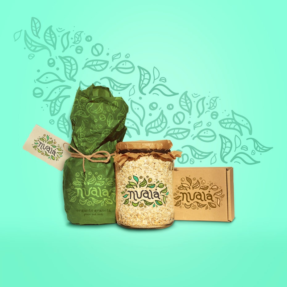
Granola food branding design
Granola packaging by Martis Lupus
  1. Logo — The face of your brand and centerpiece of your entire food branding strategy. The most important branding element, your logo anchors everything your company represents.
  2. Website — The way your website looks is important, but looks don’t mean anything if it doesn’t work. Functionality and ease-of-use are the king and queen of website design; they reveal just how adept your company really is.
  3. Brand messagingWhat is your brand saying? Your brand messaging includes its values, mission statements, beliefs, frequent talking points and, of course, the brand slogan.
  4. Product packaging — When it comes to food branding, your choice of product packaging is crucial. Packaging has the power to attract customers and is a visual representation of the culinary experience your product offers.
  5. Brick & mortar shops — This is optional for some food brands, but most food businesses need to consider how to brand their shops, stores or locations. This includes things like in-store branding, branded aprons, napkins, signs, mugs, interior design and music choice, but also the customer service and in-store experience you offer.
  6. Social media — A personal way to engage directly with customers and start a dialogue. The type of posts you publish, as well as the channels you publish on, can provide a direct link to your specific niche market.
  7. Email marketing — Emails are a favorite strategy for online marketers because they’re more intimate than other methods of outreach, and interestingly have some of the best clickthrough rates. By sharing the same communication methods as friends and family and speaking directly to the reader one-on-one, email marketing gives you the chance to present your brand in a human light.
  8. Advertising — Some traditions never die. Paid advertisements, though not as trustworthy as they used to be, are still quite effective in increasing the reach of your brand message, accessing potential customers that other avenues can’t match.
  9. Content & influencer marketing — Blog posts, videos, photos for social media, infographics and the like. Just as different artists have different styles, the various types of content you produce weave together a cohesive tapestry that tells potential and existing customers who you really are.
  10. Merchandise — This could be traditional swag, like T-shirts or mugs sold in your restaurant, or something more creative like tote bags, cardboard cups and branded take-home containers.
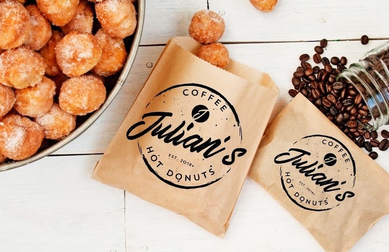
Food branding logo: Julian’s
Branding package design by Project 4

These are the 10 main areas of a successful food branding strategy, and the methods you’ll use to create a cohesive and consistent branding personality. Keep them in mind as you make decisions about the branding details we discuss in the next section.

Best branding styles for the food industry

What colors are the most appetizing? Do hungry customers respond better to circles or squares? Where do all the foodies hang out online? With a market as particular as the food industry, certain branding techniques work better than others. Here’s a breakdown of the best food branding techniques for different areas of your outreach.

(Keep in mind that your branding must also reflect your company personality; the strategies below are data-based suggestions about what works for food branding in general, but don’t forget to consider your own unique style when finalizing decisions.)

Best colors for food branding

In a nutshell, warm colors—red, orange and yellow—work best for food branding. Of these, red is the best for inciting hunger (perhaps due to the abundance of red foods in nature). And because warm colors pair nicely with each other, you see a lot of red-yellow or red-orange food branding.
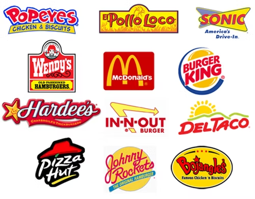
Red food logos

One trip down a street of fast food chains proves how accurate this is. We see these warm color combinations in almost all of our favorite fast food chains. Green on the other hand is popular with natural and organic food brands.

Based on color theory, it’s recommended to avoid blue in food branding. Aside from blueberries, it’s rare to find edible blue food in the wild, so consequently blue has the least effect on appetite. But for branding in general, blue is hands-down the most popular color, presumably because its link to trust and community. For that reason, you still see blue as a frequent accent color in food branding, as with Burger King, Sonic and Popeyes.

Best shapes for food branding

Food branding logo: The Organic Blend
Logo design by Bendazs!™

In branding, shapes are quite influential in how a brand’s personality is received. Brands with circular logos, for example, are seen as more inviting and casual, whereas rigid rectangular shapes are seen as more reliable or effective. This means the shape should relate to your brand identity instead of your industry.

That said, most food brands benefit from friendly brand personalities, and logos with circles or curves come across as more approachable. This isn’t just about a circular frame around the logo, but also curvaceous lines within the logo itself, as seen in the Organic Blend logo below.

Rectangular, triangular and sharp angled logos have a more formal feel and perform better in industries like legal or financial, although some high-end restaurants or wine companies (like FZ Wines below) might also take advantage of that formality.
Food branding logo: FZ Wines
Logo design by mikata

If you’d like a serious logo but still want customers to feel at home, you can always blend shapes together. Adding curves or soft corners to an otherwise angular shape makes it seem more casual, so you can implement that “softer side” to any degree you want.

Best typography for food branding

There is no single “best typography” for the food industry. The size, weight and color of your text, not to mention the font, all have their own unique connotations for your brand personality, so the best ones for you depend on what kind of brand you strive to be.

There are some common trends among the food industry, though. For example, if you’re going for an old-fashioned tavern style, like O’Leary’s Ale House, a retro font can convey that to viewers instantly.
Food branding logo: O’Leary’s Ale House
Logo design by Project 4

Or, if you want people to see you as a modern eatery or food producer like Swirl Frozen Yogurt, a minimalist sans serif typography looks the part.
Food branding logo: Swirl
Logo design by bo_rad

Like shapes, you can always blend together two opposing styles to create something distinctly you. Keep in mind that curves are “friendly” and straight lines/sharp corners are “professional.” So a font with lots of curves, like cursive, will attract a more casual clientele than a strict, classy font.

Packaging your food or beverage

Food and beverage packaging is a vast universe—and a key element of food branding. Your customers’ first experience of your product happens with their eyes, not their taste buds, so the way you house your food or drink matters a lot. Packaging also helps distinguish your product from the zillions of other options crowding shelves (or online grocery web pages) these days. Packaged foods are an $800 billion dollar industry in the US alone. That’s a lot of pasta, snack bars and yogurt!
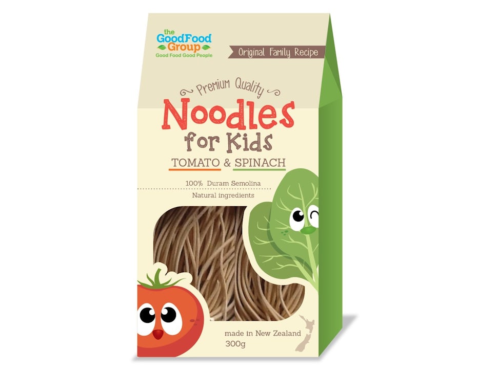
Noodles for Kids package with tomato and spinach
Packaging design by Holiday26

When considering packaging for your food, drink or snack, looks definitely matter, but appearances are meaningless if your packaging doesn’t do its job. Before you embark on a packaging design journey ask yourself, and your designer, a few key questions:

  • What is my product? What are the materials and dimensions? Is it a single product or are there (or will there be in the future) several flavors or formats? A bit of forward thinking on the front end will help you avoid trouble as your brand evolves.
Corn flakes box yellow and white with brown lettering
Packaging design by tomdesign.org
  • Who is my customer? Am I selling to eco-conscious folks, children or tourists? Will my customers have expendable income or are they on a strict budget? It is essential to understand who will be purchasing your products and brand your food product accordingly.
Black and white box pasta packaging
Packaging design by Holly McAlister
  • What purpose does the packaging serve? Does it have to keep the food soft or crunchy? Does it have to stand up to refrigeration? Food packaging carries a lot of responsibility—in the US it also has to follow FDA requirements for transparent ingredient and nutrient listing.
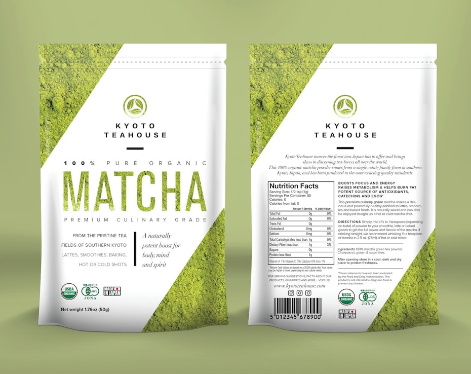
Green and white matcha tea pouch
Design by Mj.vass
  • Where will consumers see the package? (Will it be sold exclusively online? At small speciality grocers? Or at big name stores like Target or Walmart?) Where consumers see your product also influences its packaging.

When designing your packaging, keep details like logo placement, materials, colors, fonts and shapes in mind. What to learn more about product packaging? Take a look at this ultimate guide to packaging design.

In-store branding

It’s clear that online shopping isn’t going anywhere any time soon. It’s just so deliciously convenient. But the ease of one-click shopping can’t take away the allure of an in-person purchase. If you’re thinking of opening up a brick and mortar food or beverage outlet, you’ve got a few things working in your favor.
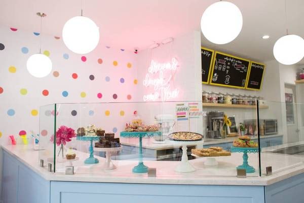
Inside DO cookie do store NYC
Do cookie dough shop in NYC offers visitors a bright, playful interior that is consistent with its branding

The first, and most notable benefit of an in-store experience is the benefit of interfacing with a knowledgeable retail associate (you can’t get that on Amazon). Visiting a brick and mortar store also allows you to see, hold and possibly try a product before committing to purchasing it and an in-store purchase also hits all the notes of instant gratification, allowing you to walk out of the store with the item in hand with zero shipping charges.

Lastly, buying a product from an actual human being in legitimate establishment lends an air of credibility to the experience (vs buying something from an unfamiliar online brand and crossing your fingers that you’ll receive a quality item).

Inside Dominique Ansel bakery NYC
Dominique Ansel Bakery is known for its clean, sleek lines and thoughtful interiors — a level of detail and quality found at each of its worldwide locations

As for branding the in-store experience, your brick and mortar store should echo the branding elements you’ve already established through your logo and your color and font choices, as well as the overall aesthetic and tone expressed in your social media marketing. If your color palette is bright and modern, with subversive, urban messaging, your store better give customers a similar experience. Your customers’ senses will be activated from the minute they walk in the door. The layout of the space, your logo placement and staff uniforms (or lack of uniform) all come together to create a cohesive sense of your brand.

Food branding on social media

Food brands can successfully post their content on any social media—even LinkedIn professionals would be interested in a time-saving recipe. But the best channels for food branding are typically the ones that revolve around visuals because they’re a hotbed for food pics. Instagram, Pinterest and Snapchat, with their emphasis on images and videos, are the best fit for most food branding strategies. (Bonus points for including your logo in the background!) If you make a branding video, you can also utilize YouTube as well, plus link your YouTube video on all of your social media channels.

When launching a social media campaign stick tight to the branding guidelines you’ve already established and follow these simple, yet powerful guidelines:

Tell a story

Random images of food products are fine, but they’ll pack a bigger punch if they’re telling a quick story, are part of a greater story about you or your brand or are connected to a story or idea that everyone can relate to.

Invest in visuals

It’s all about the visuals, baby. Shoddy images won’t fly on social media—and posts without images get significantly less action than those with striking photos. Think about the fuzzy or amateurish images you sometimes see while scrolling Instagram. Do they inspire you to stop and dig deeper into the post? Nah. This is where the concept of “you only have one chance to make a first impression” really comes into play. Take the time to teach yourself about capturing quality shots of your food product. This requires learning about cameras (yes, your iPhone may be adequate, but make sure that’s true before you post your first image), lighting, shot set-up and visual storytelling. To ensure quality shots, many brands hire a professional stylist/food photographer to take their social media shots.

Milk Bar is all about the sweet shot:

Give them video

Quality images are essential, but video is where it’s at. Quick social media videos of your food product in action can spark strong cravings in your consumers. Take Peach Mart’s quick Instagram videos of Asian snack foods. Yum!

Be consistent

Take some time to create a visual calendar for your social media posts—perhaps you’ll be posting each day of the week (a good idea!) and will feature an different image of your product or different products in your line with a different caption/story. Be sure that the images have a consistent tone and feel. You want to give your users a cohesive experience of your Instagram or Pinterest page. If some shots are dark and moody and others clean and bright it will feel jarring. Also, master the hashtag. Hashtags are your key to connecting with more people. Get familiar with popular industry hashtags as well as customized hashtags specifically for your unique brand.

Ice and Vice, a hip NYC ice cream shop, takes most of their ice cream shots against a black background.

While Moon Juice, a trendy LA-based supplement store, is all about bright, colorful images evoking feelings of good health and vitality.

Branding for the food industry: a fruitful market!

Sometimes you don’t know the perfect food brand strategies for you until you see them with your own eyes. If you’re looking for logo inspiration, checkout some of our previous articles for food branding inspiration:

Or, if you already know what you want and are ready to get started on your food logo, packaging, website or food truck wrap, click here to find the perfect designer for your style.

Need help branding your food business?
Let our community of designers create a mouth-watering design for you.

The post The complete guide to food branding appeared first on 99designs.

Wednesday, March 25, 2020

How to choose and order custom t-shirts for your company

When you want everyone on the same page, get them all in the same shirt. Whether you’re printing shirts for a company anniversary or for an annual departmental team-building exercise, matching one another helps solidify that feeling of togetherness that’s so necessary for teams to function effectively.

But how do you choose the right shirt for the right occasion? It may seem like a straightforward process, but there are a lot of moving pieces when it comes to selecting and ordering custom t-shirts. We’re here to walk you through it, with tips for making the right selections every step of the way.

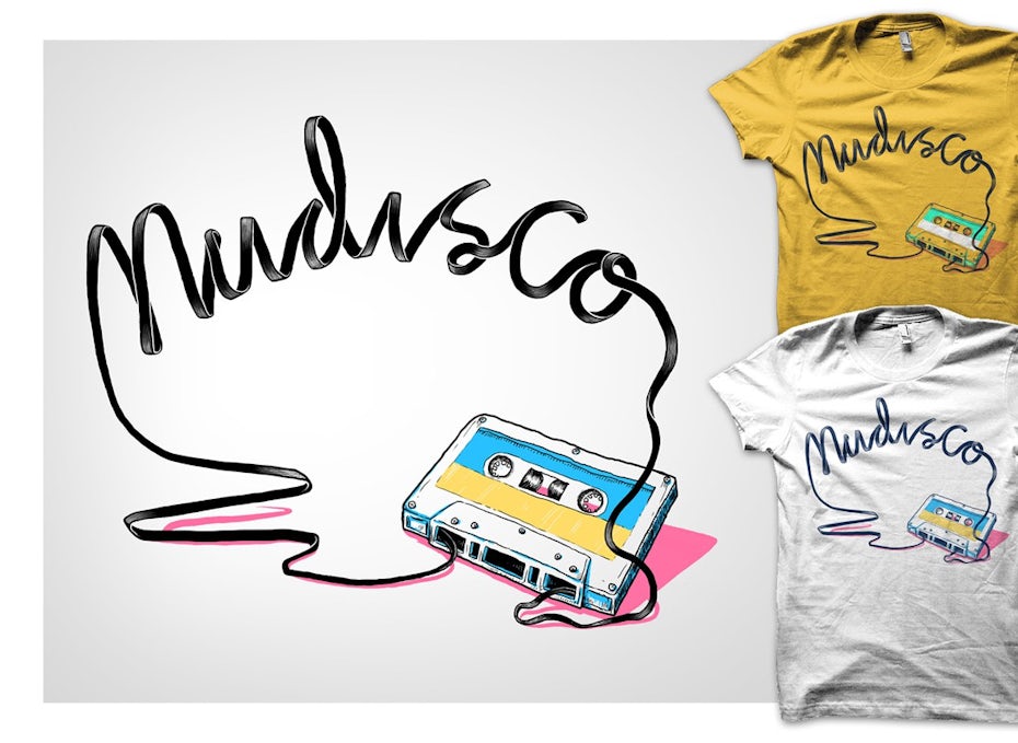
Custom retro t-shirt design with tape illustration
Custom t-shirt design by BATHI

Step 1: Choose the right fabric

When creating a custom t-shirt, the first step is to select the material you want for your shirts. There are a ton of choices for fabric out there, so get to know the differences between them and select the type that’s right for your needs.

For instance, tri-blend t-shirts are a combination of polyester, ring-spun cotton, and rayon. They’re composed of a comfortable and durable fabric blend that lends itself to a flattering fit, no matter what the cut.

On the other hand, 100 percent cotton t-shirts are breathable, strong, and hypoallergenic. They’re also a good choice for the eco-conscious, as the production of 100 percent cotton apparel is more environmentally friendly than the production of synthetic fabrics.

In between tri-blend and 100 percent cotton tees lie polyester and cotton blends, or polyblends. These can be as balanced as 50 percent cotton and 50 percent polyester or as biased as 99 percent cotton and one percent polyester. Whatever the blend ratio, these shirts combine the comfort of cotton with the durability of polyester, making them easy to care for.

Step 2: Get the proper fit

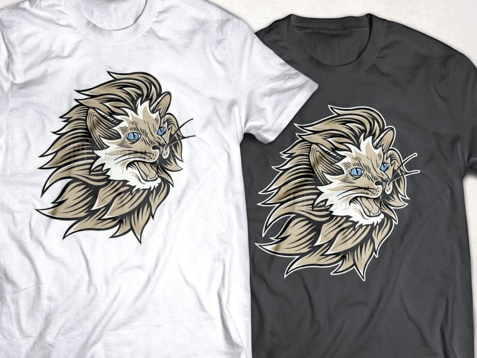
Custom t-shirt design with lion illustration
T-shirt design by Neatlines

Once you’ve chosen the material you’d like to work with, the next step is to select the right cut. Once again, you’ll find there are a lot of options to choose from out there, so familiarize yourself with the various fits available and pick the one that works best for your needs.

If you’re looking to outfit both men and women in custom t-shirts, you’ll want to select a unisex tee that will flatter all types of figures, or be cognizant of how many t-shirts you’ll need in both men’s and women’s fits.

Decide if you want a long-sleeve or short-sleeve cut. Long-sleeve t-shirts are great for winter team retreats and companies that work in cold climates. They’re pretty straightforward—just a tee with sleeves that come down to the wrists. Short-sleeve t-shirts typically end at the mid-bicep, though for those of you in hotter climates or doing summer team-building exercises, you can always go with a nice tank top or muscle tee for even more comfort.

Other fit factors to consider include whether you’d like the shirt to have a v-neck, come with a breast pocket, or come as a hoodie.

Step 3: Design your custom t-shirt

Custom t-shirt design with astronaut slipping on banana peel
T-shirt design by Pinch Studio

This step may seem overly simplistic, but it’s important to match the right design for the right audience. The more personalized the t-shirt feels in fit, fabric, and design, the more appreciation the recipient will have for it, so don’t just slap your logo on it and call it done. Give it careful thought and consideration, and you’ll see a real return on your investment. For inspiration, find some great t-shirt design ideas here.

There are lots of design decisions to consider. Start by thinking about what you’re hoping to achieve and what you want your shirt to say. Do you want it to be playful or serious? Edgy or conservative? Do you want illustration, text or both? Also, consider things like style, imagery, typography and color. For more t-shirt design guidance, check out this article on how to design a t-shirt.

Creating an amazing t-shirt design isn’t easy, so it’s a good idea to enlist the assistance of a professional and hire a t-shirt designer to create a unique, custom design for you.

Step 4: Upload your design and order your t-shirts

Once you’ve developed or selected a carefully thought-out design for your custom t-shirts, it’s time to upload it and order the quantity of shirts needed. The easiest way is to use a t-shirt printing service like Swag.com and select the t-shirt that best fits your fabric and fit requirements. Be sure to carefully consider the available color choices as well, so the color (or colors) you select complements and doesn’t contrast with your design.

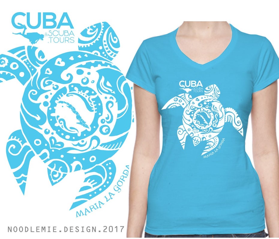
Custom t-shirt with turtle design
T-shirt design by noodlemie

Once you’ve selected the right t-shirt in the right color, upload your designs for the front, as well as the for the back and sides, if applicable. Situate them on the shirt and select the quantity of shirts you’d like to order.

This is where it can get a little tricky if you don’t know the shirt size of everyone you’re ordering for. When you decide to order 100 shirts, mathematically it makes sense to order a quantity of 20 in five sizes. But large is the average size, with medium and extra-large coming in closely behind it, so order more of those sizes than others. Skew away from smalls, extra-smalls, and sizes above extra-large, though definitely include some of each in every order.

Step 5: Printing and packaging

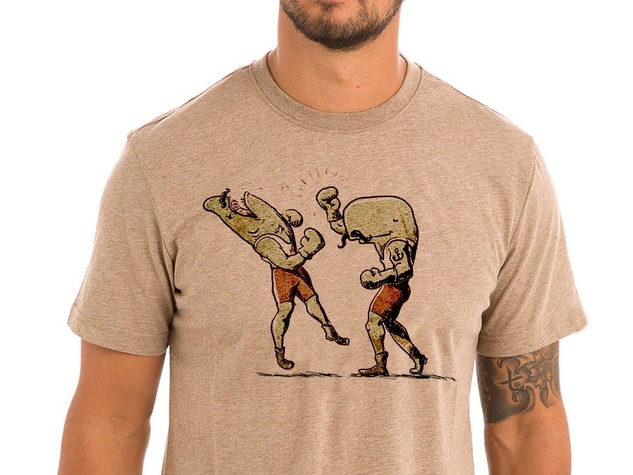
Custom t-shirt design with boxing whales
T-shirt design by Pinch Studio

Screen printing is the most common (and cost-effective) form of decorating t-shirts, so that’s the method we’ll address here. Learn more about other t-shirt printing options here. When a t-shirt is screen printed, ink is pushed through a mesh stencil in layers, creating your custom design. Ink that’s screen printed dries thicker than ink that’s digitally applied, so your design will really pop, especially against dark fabrics.

When the screen printing process is complete, the t-shirts are neatly packaged and shipped to your designated location. All that’s left to do is hand them out to your team and watch their faces light up as they inspect their new custom t-shirt swag.

Ready to order awesome t-shirt for your team?

When it’s time for you to order new custom t-shirts for your organization, give it the attention it deserves. Put some serious thought into selecting the right fabric, fit, design, and size beforehand. Instead of ordering simply what you think looks good, think about the durability of the fabric, the fit of the cut, and the implements of the design. And don’t forget to order your sizes mindfully instead of in a random assortment.

Making these considerations goes a long way toward showing your team you care, instead of just handing them an impersonal and ill-designed white t-shirt at your next event. A great team t-shirt can make your team grow closer together and boost team spirit. Time to get creative and create something unique for your team!

Elizabeth M. Jones
About the author:

Elizabeth M. Jones is a regular contributor to numerous blogs, including swag.com. She likes developing long-form blog pieces, spending time with her family, and petting her five hens. She lives in Maryland.

The post How to choose and order custom t-shirts for your company appeared first on 99designs.

Friday, March 20, 2020

The complete guide to architect branding

Branding is necessary no matter what industry you’re in. In fact, it’s more important than ever today because we’re living in a highly visual, information-overload world. As an architect, creating a brand identity might not be at the forefront of your mind. But no matter if you’re launching a new firm, rebranding your existing firm or are leading a successful firm that could stand to be more successful, it may be worth making architect branding a priority. Architecture is a hugely visual industry, which only underscores the importance of giving your brand a strong visual feel.

As of 2016, there are 109,748 architects in the United States. And that number is only expanding—since 2008, the number of architects in the US has grown 10 percent, while the total population has grown just 8 percent. Across the world, it’s estimated there are somewhere between 3 and 4 million architects. That’s a crowded industry to stand out in, which is exactly why solid branding needs to be part of your firm’s business strategy.

Collection of envelopes, tools, stationary and business cards showing an architecture firm’s branding
Your firm’s branding is how it stands out from the crowd. Brand identity design by RedLogo.

If you’ve never built a brand before, the prospect of doing so can seem daunting, especially when the branding guides you find online aren’t tailored to the architecture field. But the path to a well-crafted brand is similar across industries. It starts with identifying who you are as a company and finishes with expressing your identity through thoughtful design choices.

4 steps to building a great brand for your architecture firm

Let’s be real: architecture can be a pretty serious field. And in a lot of cases, business leaders in more buttoned-up industries don’t feel they can be as creative with their branding as businesses in trendy or “fun” industries like fashion and entertainment.

Six unique versions of a geometric logo
Who said architecture branding couldn’t be fun? Logo design by Caio Resende.

That kind of thinking is how you end up with a boring, generic brand identity. Every businesses will benefit from a compelling, fleshed-out brand story. Your brand story, the story of who you are, what you do and how you got to where you are today, is where your branding takes its cues. As the head of your architecture firm, you’re the author of your brand story.

Step 1: Who are you?

The first step in building an authentic brand identity for your architecture business is getting a solid grasp on who you are as a player in your market. Take time to reflect on these questions. Your responses will help you get a solid grasp on your persona:

  • Am I playful or serious?
  • Am I expensive or economically priced?
  • Am I sophisticated or fun?
  • Am I trendy or traditional?
  • Do I design homes or commercial buildings?
  • What markets do I operate in?
  • Which services do I provide?
Color variations on a logo presented alongside photos of blueprints, a construction worker and a finished kitchen
Your answers to every one of these questions correlates with specific color, shape, font and image choices. Brand identity design by Jack Begosian.

There are no wrong answers here, nor do your answers have to be either/or. Your brand might fall somewhere between playful and serious or it might be both sophisticated and fun.

Multicolored geometric logo
Maybe you’re a dynamic, colorful brand with a multidimensional personality. Logo design by RAKconcepts.

Step 2: Who’s your ideal customer?

When it comes to branding, understanding your ideal customer is as important as understanding yourself. Just like you answered a list of questions to really get a firm grasp on who you are, ask yourself the following questions to determine who your customers are:

Four instances of a black and yellow geometric logo
Using yellow in your logo communicates that you’re fun. But are your ideal customers fun? Do they value having fun with architecture, or are they more drawn to other values? Logo design by GIU Design.
  • Where are your customers located?
  • Are they individuals or large companies?
  • Are they builders and contractors or homeowners themselves?
  • What is their budget range?
  • Who are the intended occupants for the finished buildings?
  • How do they view themselves?
  • What are their values?
  • What do they need from the architects they work with?

It’s also important to think about your customers’ pain points. If you mostly work with developers in a historic city, complying with the city’s historic preservation board might be a serious challenge they contend with regularly. Making it clear that you understand the historic board’s requirements and can work them into your designs is a huge selling point for your brand. Potential clients can feel comfortable that they won’t get trapped in a vortex of never ending historic board rejections, appeals and revisions.

Vintage-style badge logo showing a pencil and ruler
For a client that values one-on-one, customized interactions, a badge-style logo that feels like it’s been printed by hand can be the perfect choice. Logo design by CBT.

Understanding your ideal client makes it easy to develop a customer persona. A customer persona is a quick-glance guide to exactly who your business targets. Not every client will fall perfectly into these bounds, and that’s perfectly okay. The goal of creating a customer persona isn’t to restrict your customer pool to a very specific type of buyer, it’s to help you shape your branding and business strategies to serve clients in your niche effectively.

Step 3: What should your architect brand look like?

Yellow and gray logo with an image of a home under construction
Just like designing a building, designing a brand involves careful measurements and lots of planning. Logo design by NAP_GD.

In some ways, designing a brand is more science than art. Once you’ve identified your brand persona and distilled it into a set of bullet point traits, you can mathematically work out the design choices that represent your firm accurately.

Colors

The colors you choose say a lot about your brand. Some colors, like grays and dark blues, read as calm and serious while others, like oranges and pinks, feel more dynamic and more fun. Take time to educate yourself about color psychology to get a feel for which colors are the best choices for your brand. If you work with a graphic designer, they can help you out with this too and suggest colors and color combinations you might not have thought of on your own.

Lime green wordmark logo
Lime green’s a bold choice, and a perfectly bold choice for some architects. Logo design by RT005.

Shapes

Shapes also communicate important information about your brand. Shapes are found in your logo and throughout each part of your visual branding—think of how you highlight specific blocks of text on your website and the patterns you use in your banner ads. Take a look at our guide to choosing shapes for your branding to determine which shapes can speak for you.

Square logo with different colored sections within itTaggart logo

Fonts

Font choice matters, too. Just like a square can communicate your dedication to a traditional way of doing things and a triangle can show you’re progressive (and perhaps even a bit aggressive), a serif font tells the world you’re formal and fancy while a sans serif font dresses your brand in jeans and a casual button-down. Take the time to find a font that matches what your brand says.

Geometric logo with a serif font wordmark
When you choose a font, think carefully about how it will mesh with other branding choices you’ve made, like your logo’s shape and your copy voice. Logo and brand identity design by Kiky_Gravisi.

Voice

Finally, find your brand’s voice. This isn’t so much a visual choice as a textual one, but it’s just as important as all the other branding choices you make. We’re talking about the copy you use in your headlines, in your web content and in the emails and other messaging that is exchanged between your company and the world.

Determine whether technical jargon is an effective tool for your brand (as it would be for an architect who works directly with contractors and needs to use a precise, shared language) or if it would turn potential clients off—which it may if you’re an architect who creates designs for first-time home buyers or businesses who aren’t in the construction or real estate fields. Maybe a conversational, collaborative tone works for your brand or your ideal clients respond better to a more teacher-like tone that feels like you’re holding their hand through the design process.

Step 4: Blueprint the brand identity

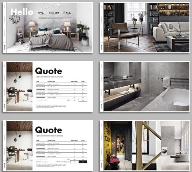
Powerpoint slides for an architectural firm’s brand identity
A cohesive brand identity covers everything your brand does and everywhere it appears. Powerpoint template design by velvetmade.

Once you have a solid idea of who your firm is as a brand and who your target audience is, it’s time to start actually mapping out your brand identity. Using the color palette, shapes, font choices, imagery types and copy voice you’ve identified for your brand, work with designers to create brand assets like a logo, a website, graphics and any other visuals that will represent your firm. By creating all of these assets together, you’re creating a cohesive brand identity.

Once you’ve got a few design ideas in place, test them. Ask your current and past clients for feedback on logos and website mockups. A/B test different ads with designs you’re considering. Understanding what your clients respond to will enable you to build a brand that connects with them by meshing with their expectations.

What not to do when creating your brand

Crafting a brand identity is a huge undertaking, and there are a bunch of pitfalls you can face as you work through the process. Putting too little effort into developing your brand, not having a clear view of what your brand is and needs to be and branding yourself in a way that doesn’t connect with your target clients are three business-killers that can take you years to recover from (if ever).

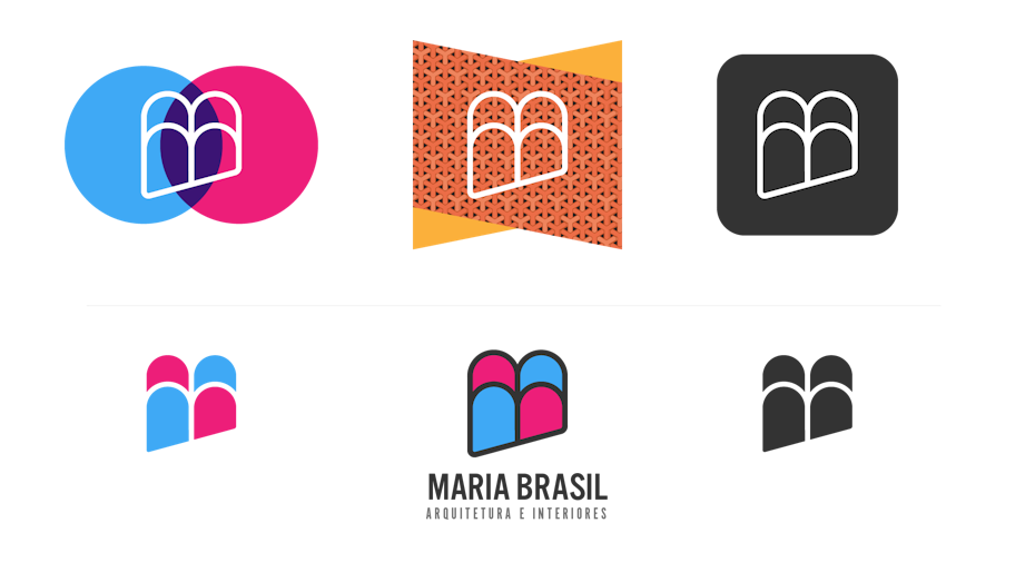
Purple initials logo that looks etched onto its background
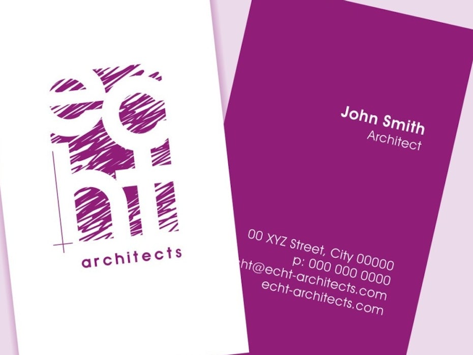
A well-crafted architecture brand doesn’t just make it clear you’re an architect, it makes it clear you’re the perfect architect for your clients’ projects. Logo and business card design by CKD73.

Clients want to feel like your firm is a person, or a group of people, not a faceless corporate entity. They also want to know that the architecture firms they work with can provide the designs that match their visions for the homes and commercial buildings they’re building and renovating. Effective branding doesn’t just connect your firm with your ideal customers, it assures those customers that you’re the perfect architect for their projects.

Don’t play it too safe

Sketch image of an ornate front door with steps
Old-school doesn’t mean boring. In fact, it means the opposite – it means you have a rich history to draw from. Logo design by Studio Ochi.

You want to express your brand effectively, and if your brand is one that’s prestigious, established and known for conservative designs, your design choices are going to err on the side of conservative and “less is more.” Similarly, if you’re a value-focused brand, you might try to avoid scaring potential clients off with flashy or expensive-looking design.

One of the biggest branding mistakes you can make is playing it too safe. There’s conservative, and there’s boring. There’s value-focused and there’s generic-looking. When you’re working with a designer, be open to their suggestions about how to communicate your brand persona through design choices. You might not start the conversation thinking there’s a place for a bold red or dynamic shapes in your logo, but if you’re willing to take risks and explore all potential design choices, you’re setting yourself up to build a great brand.

Don’t cheap out

Even if you’re a budget brand, don’t cheap out. Yes, you can design your own logo in five minutes with a drag-and-drop browser app, but there’s a reason why these apps are free and working with a designer can cost hundreds or even thousands of dollars. A DIY logo maker doesn’t understand market trends and it can’t think critically about how your firm fits into the market.

Line drawing logo showing the name “Brit Schneider Architektur” below a city skyline
Even a simple logo requires careful consideration of everything that comprises a brand. Logo design by RedLogo.

Don’t go with designs that aren’t “you”

Minimalist line drawing logo
Minimalism isn’t the right choice for everyone. Don’t choose design styles just because they’re popular. Logo design by gromovnik.

Branding that works for another architecture firm won’t necessarily work for yours. You should definitely look at other firms’ branding, particularly other firms in your niche and firms you aspire to be like, to take design cues for your own branding. After identifying what you like about their branding, determine why it works for them. Then, contrast their brand personas and design choices with the persona you identified for yourself using the set of questions we listed above.

Maybe your firm would benefit from similar design choices, but maybe the design choices that work well for the other firms would feel tone-deaf for you. When you’re branding your business, it’s way more important that your branding represents your persona perfectly than it is for it to look like what everybody else in your field is doing—that’s true regardless of the type of business you run!

Wordmark logo paired with an image of a protractor making a letter “P”
For some firms, a little whimsy leads to a lot of contact with the right clients. Logo and brand identity design by vanstone.

Don’t forget mockups

When people look at your website and social media pages, they want to see your designs as finished products. Make sure you incorporate lots of photos of your finished projects into your design, but don’t forget to include mockups, too.

3D mockup of an all-white room overlooking a beach
With a mockup, the viewer can imagine how they’d use a space you designed. 3D design by MirkoAndricDesign™.

Mockups are 3D renderings of what your designs will look like when they’re finished. Unlike photos, which show how past clients are inhabiting the spaces you’ve designed, mockups show an idealized example of how a client could use the space. With a mockup, you decide the setting for the building and what the hypothetical people in your example image are like. Doing this can help you showcase your brand.

Mockup of an old building renovated to be a homeless shelter
An effective mockup doesn’t just show a finished project; it shows how the finished project will be used. Illustration by AL_X.

Let’s say you’re an architect who specializes in restoring old farmhouses. Part of your approach to doing this is attempting to find old blueprints and building records for the houses you restore so you can recreate their original floor plans and design features as authentically as possible. In a mockup, you might set the scene with a red and pink sunset over vast fields out the window and communicate your prospective clients’ values with a bookshelf stocked with titles about historical preservation and design.

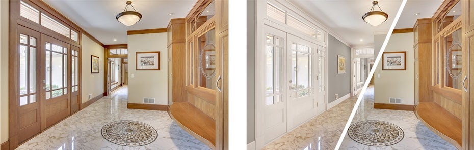
Two versions of a 3D rendering of an interior space side by side, showing different decor options
A set of mockups of the same space can show a range of possibilities. 3D design by AL_X.

A mockup can also easily show the different aesthetic choices the client can take with a finished space. Side-by-side mockups of the same finished building can show two different color palettes or two different door and window options, which can get viewers’ brains churning with ideas about how they might want to customize a space.

Ready to draft some amazing architect brand concepts?

A well-crafted brand identity will make your firm’s personality shine. As an architect, your brand story is as compelling as any other company’s—so give it the time and effort it deserves. To see some amazing examples of what your brand identity could be, check out the architecture branding projects our designers have completed for other clients. Then, dive in and start working on your branding with a designer who gets you.

Looking for unique architect branding?
Our designers can create a custom brand design just for you.

The post The complete guide to architect branding appeared first on 99designs.