Friday, May 29, 2020

How to set up a branded online store using Facebook Shops

There’s a new sales channel in town. Facebook have just announced their new Shops feature where business owners can create a storefront to sell products directly on Facebook and Instagram.

Let’s take a closer look at how Facebook Shops works, what it means for businesses and everything you need to know about setting up a shiny, branded store for your business using this new tool.
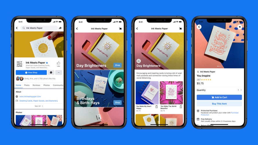
example for facebook shops on mobile
via Facebook

What is Facebook Shops and how does it work?

Faceboook Shops is a feature that allows you to create an online store on Facebook and Instagram. You can display and sell your products directly via Facebook and Instagram, taking customers from discovering your products to purchasing in just a few clicks, either through in-app sales or by redirecting to your website. Your brand’s shop is discoverable through a “View Shop” button on your business’ Facebook page or Instagram profile page, and can be found by clicking on ads or swiping up in Stories.

Our goal is to make shopping seamless and empower anyone from a small business owner to a global brand to use our apps to connect with customers.
- Mark Zuckerberg

Businesses will be able to use Shops for free, just like Facebook’s other ecommerce features. But unlike Facebook Marketplace, this new addition is aimed at businesses rather than consumers and allows for more customization.

In a video announcing the new product, Facebook’s CEO Mark Zuckerberg said: “Our goal is to make shopping seamless and empower anyone from a small business owner to a global brand to use our apps to connect with customers.”

What does that mean for businesses?

The new feature is coming at a convenient time for small businesses, as the pandemic forced brands across the globe to adjust their business models and find new sales channels.

We surveyed more than 1,200 entrepreneurs and SMBs to identify how the pandemic is impacting their behavior and the data shows that businesses are actively looking for new ecommerce solutions. Of those businesses with plans to add ecommerce to their website, 46% have either started or are discussing it as a result of the outbreak. Clearly, Facebook Shops is going to be an interesting avenue to explore for these businesses.

How covid pandemic affected smbs with ecommerce plans
Entrepreneurship and COVD-19 survey

Since Shops is going to be free to use, even small businesses with limited budgets can give this new opportunity a try—even if they can’t afford building a web shop of their own.

Rather than making businesses pay for using Shops, Facebook is counting on their willingness to promote their Shops with ads—and this seems like a clever move on their part. Our data showed that 37% of businesses started creating or are thinking about creating new online ads such as banner ads or Instagram ads due to the outbreak, which makes it likely that Facebook’s investment in this new feature is going to pay off for them.

Overall, Shops seems to be a win-win for both Facebook and businesses: brands have a new way of showcasing and selling their products, while Facebook gets to keep users in their ecosystem and fuels their advertising revenues.

Pros of Facebook Shops:

  • It’s free to use
  • Additional channel for selling directly to followers and reaching new customers
  • On-brand experience: brands can customize their shops with a cover image, product photos and accent colors
  • Shorter customer journey from discovery to purchase, which can increase conversions
  • Great for brands who are already active on Facebook and Instagram and have a target audience with a preference for mobile shopping

Cons of Facebook Shops:

  • Not available everywhere just yet
  • Like any off-site shop, it’s not entirely yours and you can’t control everything
  • There are limitations to branding options; can only be customized to a certain extent

How to set up your Facebook Shop

Shops are rolling out currently and you’ll receive an email when it’s available to you. Setting up a brand shop with Facebook Shops is pretty straightforward and only takes a couple of steps:

  1. On your Facebook Page click the “Shop” tab. If you can’t see the “Shop” tab, you need to change your Page template to the Shopping template.
  2. Then click on “Go to Commerce Manager”.
  3. There, you’ll be prompted to complete a few steps to set up your Shop, such as link your business accounts and set preferences for shipping, returns and payouts.
  4. Once your Shop is set up, you can go ahead and create a catalog of your products. To do that, access your Catalog Manager by clicking on “Inventory” in your Commerce Manager.

Once you’re done, you can manage your sales from both Facebook and Instagram in your Commerce Manager.

How to successfully brand your Facebook Shop

A big advantage of Facebook Shops is that you’ll be able to create a look and feel that actually fits your brand. Here are some things to keep in mind when branding your Shop, so you can provide your customers with a seamless, on-brand experience:
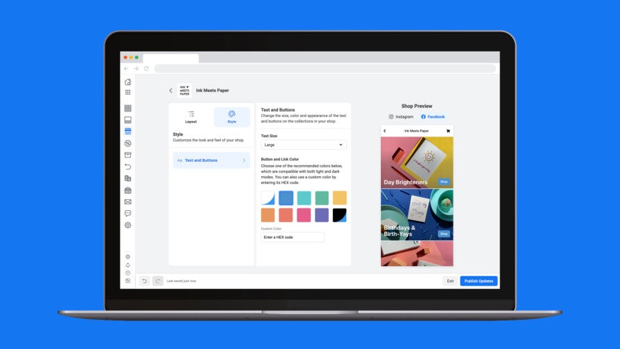
example for customization options in commerce manager in facebook shops
via Facebook

The branding options in Facebook Shops include choosing your layout and images as well as naming your collections and adding descriptions. You can also change the size, color and appearance of the text and buttons on the collections in your Shop.

Collections allow you to create custom sets of products according to types, styles or themes. Make use of this option to group your products into appealing collections that work well together visually and thematically.

Imagery

Facebook Shops is very image heavy, so make top-notch photography a priority. You should be using professional-looking photos of your products that not only present your product in the best possible light (literally, because good lighting is crucial), but also show the product in every detail.

It’s a good idea to create photos with a visual style in mind that ties them all together. Use a common color scheme or background that creates a consistent look and feel across all of your product photography.

Color

The colors you choose both for buttons and in images should all work together harmoniously. Don’t just pick one of the recommended colors. Choose one of your own custom brand colors and enter the exact HEX color code. Make sure that it’s a color with enough contrast to stand out from your images.

Typography

Typography has a huge impact on brand experience and carries a lot of meaning, so be sure to choose a font that fits your brand identity.

As you create your Shop, you’ll be able to see a preview of what your Shop will look like, so you can tweak the look and feel to get it just right.

Consistency

In addition to branding your Facebook Shop itself, remember to create a consistently branded experience across your whole online presence and all of your social media pages. Your imagery, style choices and brand voice all need to go together and create a larger, on-brand picture.

modern and classic social media branding with muted colors
A beautiful, consistent social media brand design by Daylite Designs

Just imagine if you were to use an edgy and minimalist black and white look for your Facebook Shop and a colorful, playful style for your Facebook posts and ads—visitors would be confused and they probably wouldn’t find what they were looking for.

Follow these steps for creating a smooth, branded experience across social media—and everywhere else for that matter:

  • Define your brand identity.
  • Find your brand voice.
  • Create brand guidelines and a brand style guide and stick to them.
  • Stay consistent with the style of your visuals, be it photography or graphics.
  • Make use of all customization options that are available to you, don’t settle for the default look.
  • Create branded assets like ads, pages, posts, banners and page covers that work together and tell a coherent story.

Conclusion

As businesses are looking for new ways to connect with customers, Facebook Shops is going to become an interesting new playground for entrepreneurs to explore. Especially brands that already have a strong focus on social media marketing might benefit from this new and much more direct way of selling on Facebook and Instagram.

If you’re planning to set up your own Facebook Shop, remember that unique branding is what sets your branded shop apart from all the others. Never underestimate the power of distinct and well-crafted branding—it’s what grabs people’s attention and makes them remember you.

Struggling to create professional looking designs for your brand? Consider enlisting the help of a professional graphic designer to create them for you.

Need stunning design for your brand?
Our talented community of designers is here to help.

The post How to set up a branded online store using Facebook Shops appeared first on 99designs.
Thursday, May 28, 2020

Merchandise branding: how to create great merch for your brand

It’s simple, but it’s true. People love stuff. But people don’t just love stuff for stuff’s sake—they love things they have an emotional connection to. And that’s exactly what good merchandise branding does.

Think about that t-shirt you bought at your favorite concert. That shirt may not be much different than a cheaper, store-bought one, but to you it’s special. It reminds you of that amazing concert and when you wear it, it tells the world your tastes and experiences.

merchandise branding illustration
When it comes to creative merchandise branding the sky’s the limit. Illustration by OrangeCrush.

Basically, it brands you—merchandise can turn you into a grassroots brand ambassador. Merchandise branding furthers brand recognition and makes buyers feel like they’re part of the brands they love. In other words, branding merchandise gives you a direct connection to your fans.

Let’s take a closer look at merchandise branding to see how brands across the globe are doing it and which pitfalls to avoid when you’re designing your own branded merchandise.

What is merchandise branding?

Merchandise branding is simply the process of branding your merchandise—printing your logo on t-shirts, creating stuffed animals of your mascot to give out at corporate events, getting stickers made of your logo or creating custom drinkware to enjoy your branded craft beer in.

Before we dig deeper into merchandise branding, let’s talk about branding as a concept.

Branding is the process of communicating to the world who you are. It’s the action of making deliberate design choices to show off your brand identity to prospective buyers, vendors, investors, business partners and competitors.

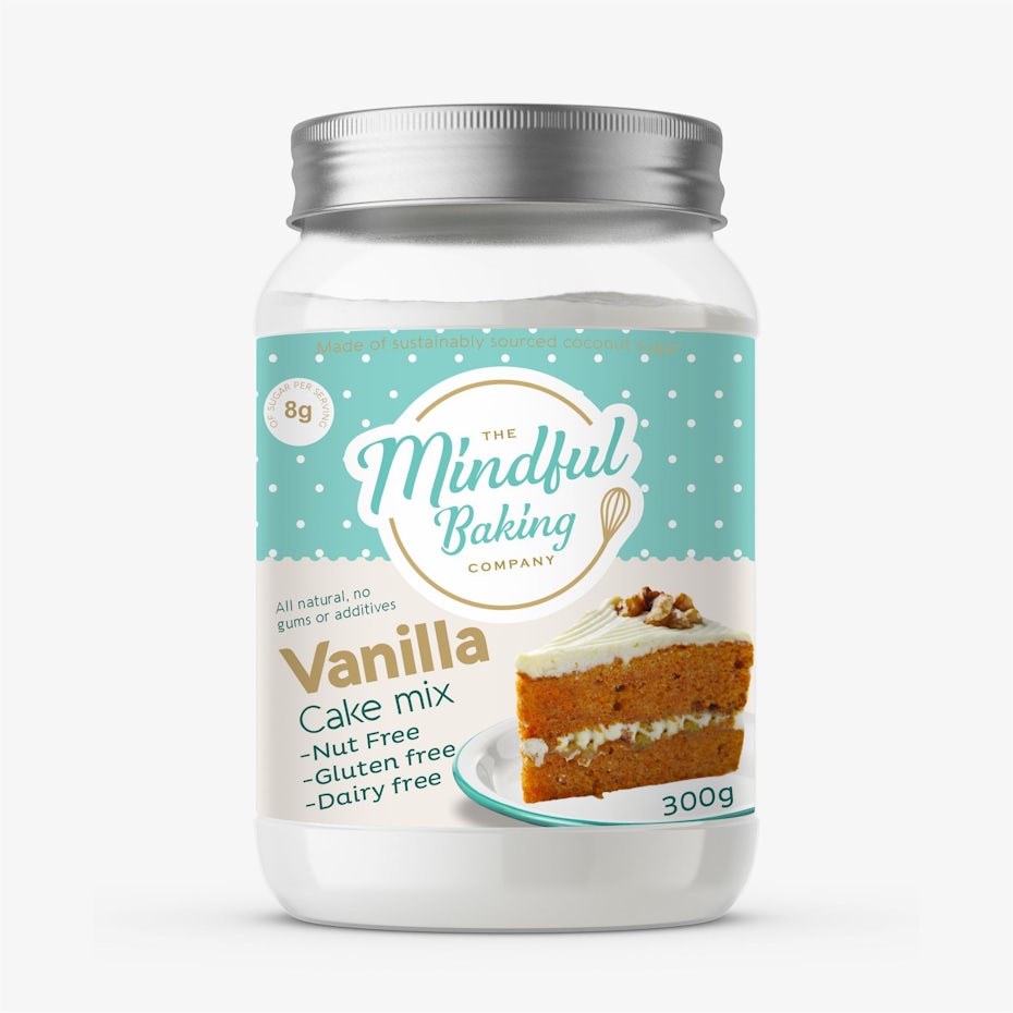
merchandise branding with cake mix in a container with a green label and photo of a carrot cake slice
Clear branding makes it obvious which audiences you’re targeting… and which you aren’t. Product label design by neoflexdesign

In their label design for The Mindful Baking Company, neoflexdesign communicates key points about the company through design choices. For example, the combination of cheerful green and white shows it’s an eco-friendly, approachable and clean brand that’s free of artificial preservatives. This is branding in action.

Your brand identity comprises those deliberate design choices that you make. It’s the color palette of your website, the voice of your text content and the imagery of your logo. Let’s break down the design choices on neoflexdesign’s label for The Mindful Baking Company individually:

  • the simple, sans serif font on the bottom half of the label
  • the script-inspired font within the circular logo
  • the soft color palette
  • the prominent photograph of the finished carrot cake
  • the retro polka-dot pattern at the top

Put them all together and you’re looking at The Mindful Baking Company’s brand identity.

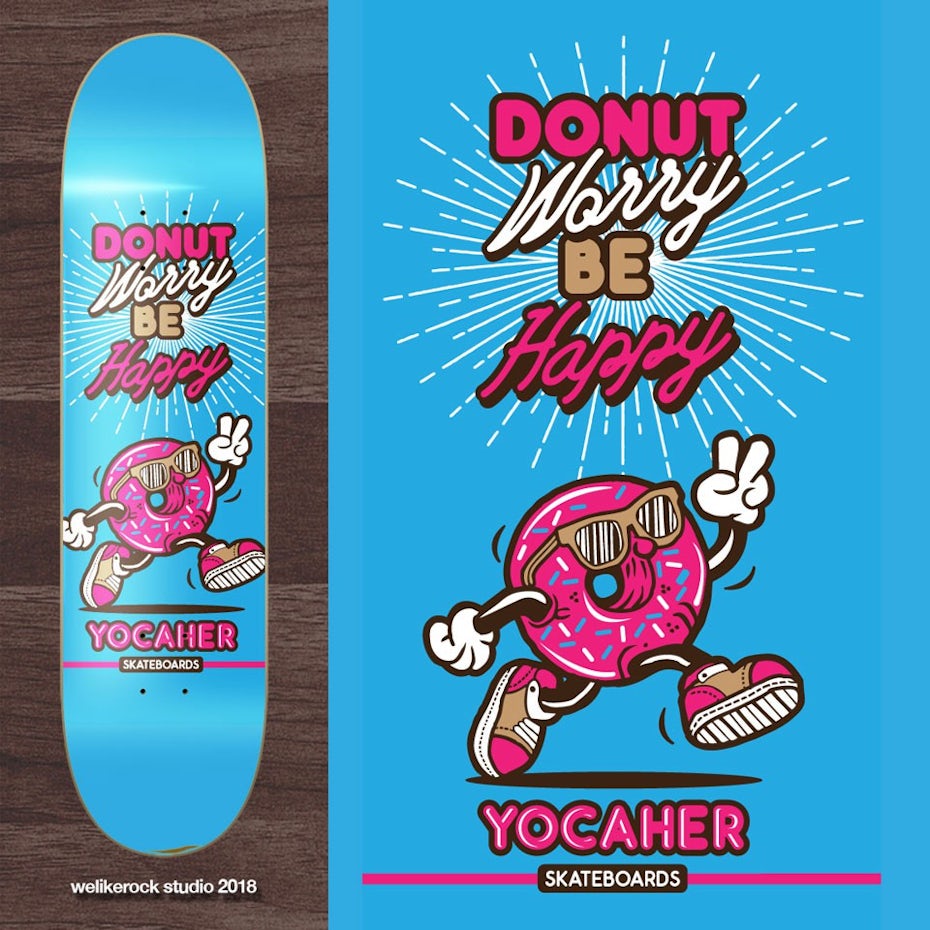
merchandise branding with blue skateboard deck with a pink anthropomorphized donut
Maybe your target audience responds enthusiastically to a pink donut with sunglasses. Merchandise design by welikerock

Another crucial factor is the world’s perception of you: effective branding means clearly defining your position within your industry and creating something your target audience responds to.

Looking at welikerock’s skateboard deck design for Yocaher Skateboards, how do you perceive  Yocaher as a company? The color palette, the messaging, the fonts, the illustration style of the walking donut and the sunbeam-like lines expanding behind the mascot work together to intentionally create a unique impression. And that impression is Yocaher Skateboards’ brand.

No matter how you do it, the end goal of merchandise branding is to make your brand tangible so that customers can own a little piece of… you.

Who are you?

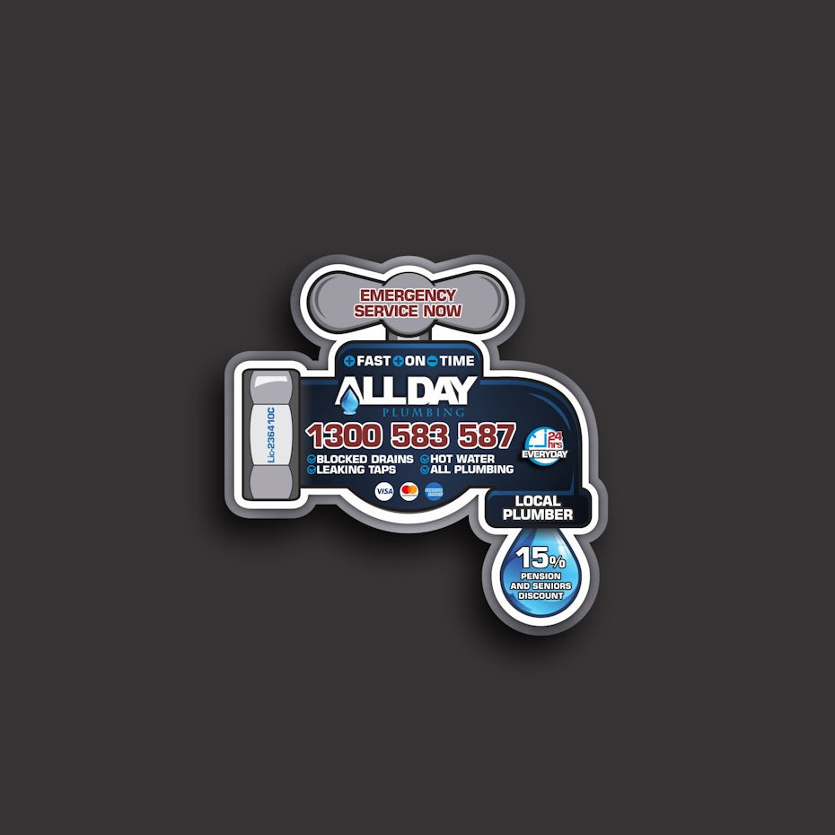
merchandise branding with magnet shaped like a faucet with water coming out of it
Maybe your answers will be part of your merch’s design… Sticker design by Elis Barros

The first step in successfully branding yourself and your merch is getting a clear picture of who you are as a brand. Take some time to envision your business as a person and ask it the following questions:

  • Are you playful or serious?
  • Are your products or services priced higher, lower or about the same as your competition?
  • What do you offer your customers?
  • How are you different from your competitors?
  • How are you and your competitors – and the brands you aspire to compete with – similar?
  • What are your values?
  • Are you modern or old-school?
  • How large of a company are you?
  • What do you do best?

Think about the brand behind milomilo’s tote bag design. There’s a reason they opted for an illustration over an abstract image, just like there’s a reason they chose straps made of rope rather than fabric or another beachy cord like a surfboard leash. What do these choices communicate about their brand?

merchandise branding with tote bag with rope handles and a tropical scene design
…or maybe they’ll come through in your design choices. Bag design by milomilo

Who are your customers?

After you’ve determined who you are, determine who your customers are. Just as before, answer a few questions about your target audience, such as:

  • What do they value?
  • What do they expect from companies?
  • How do they want companies to speak to them?
  • What would they enjoy for merchandise?
  • Would certain features on merchandise be more helpful or effective?
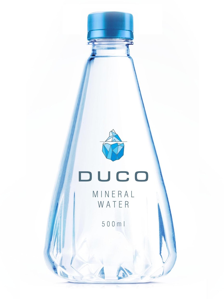
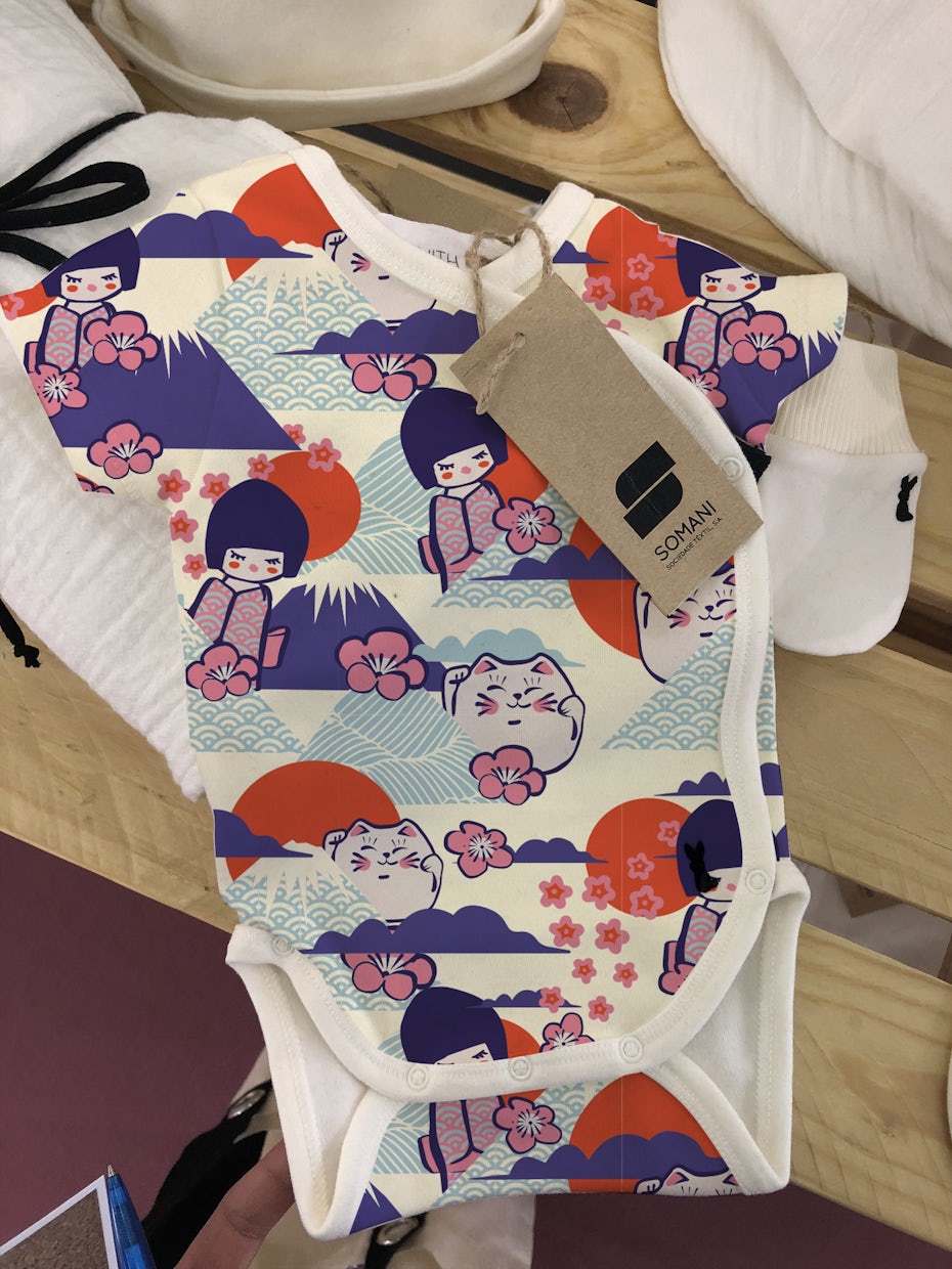
merchandise branding with triangular water bottle with an iceberg on itmerchandise branding with onesie with a Japanese-inspired pattern

Duco’s target consumers are people who consider themselves water connoisseurs, people willing to pay extra for crisp, glacier-pure water so they don’t have to sip who-knows-what’s-even-in-it tap water. So, to let those consumers know Duco delivers the kind of water they want, neoflexdesign created a crystal-clear bottle adorned with a small, simple iceberg in a fitting style.

merchandise branding with different-colored pet pads
Branding the kinds of things your audience is already buying is an effective way to score with them. Merchandise design by agnes design

Knowing what they value and what they need from your company helps you flesh out your brand’s visual identity. You can zero in on exactly which kinds of merchandise you should be branding to make a genuine connection with them.

Creating a visual brand persona

Once you’ve got a strong grasp on who you are, who your customers are and how these mesh together, you’re ready to brand yourself. Create a cohesive brand identity means by choosing:

  • Typography. The fonts you use in your logo, web design, ads and elsewhere play a big role in how people perceive your brand. Think about it: script fonts tend to feel fancy, while block letter fonts feel straightforward and utilitarian. Serif fonts add a dash of class, whereas sans serif fonts feel accessible and affordable.
  • Color. Colors have a subliminal influence on people. For example, red can elicit feelings of passion, anger or general intensity. White often symbolizes purity, cleanliness or a fresh start. So as you craft your brand identity, think about who you are, what you’re all about and which kind of audience you’re targeting – then choose your colors accordingly.
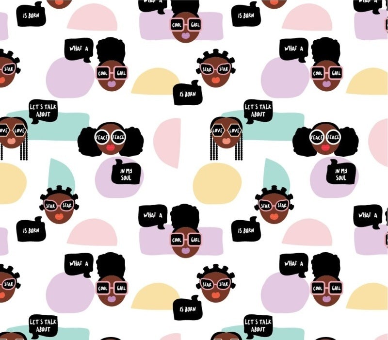
  • Shapes and graphics. Another key part of your brand identity is the shapes you use in your logo, as well as other branding materials like a custom pattern on branding merchandise apparel. Triangles symbolize action and motion, whereas squares symbolize boundaries and stability. Circles, a common choice for logo frames, represent openness and friendliness.
  • Voice. This is the tone of voice your brand uses in its copy. Are you the kind of brand that uses the latest slang or are you a total grammar nerd? Does your brand paint flowery, highly-detailed word portraits on its blog, or do you say just enough to give your photos context? While your copy isn’t necessarily a visual component of your brand identity, it still needs just as much consideration as every other part.
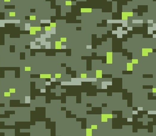
merchandise branding with sweatshirt and tote set showing pastel shapes and cartoon women’s facesmerchandise branding with camo-pattern leggings

Creating consistently branded merchandise

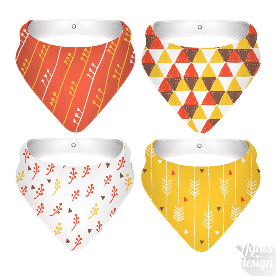
merchandise branding with four bib designs sharing the same color palette and similar patterns
Once you’ve got a color palette and general visual identity, you can play with it to create unique pieces of merchandise. Merchandise design by agnes design

Once your brand identity is complete, it goes everywhere! Publicize your logo, your website, your business cards, your product packaging and of course your branding merchandise wherever you can.

Remember that successful merchandise branding relies on consistency. If your merchandise doesn’t have the same feel as your other branded property, it won’t immediately register as yours. To see on-point, consistent branding, take a look at agnes design’s bib designs. Although each of the four bibs is unique, they all retain a consistent look and feel, largely in part to the warm color palettes and hand-drawn style. It’s clear that they’re all part of the same set, and it’s easy to imagine buying them together in a four-pack.

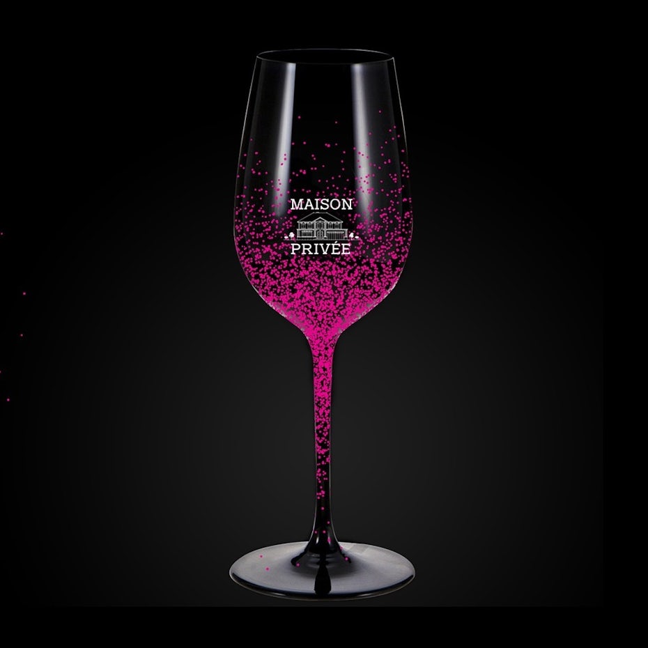
To really understand the importance of consistency in branding merchandise, consider the consequences without it. Angiangi’s wine glass design, blasted with hot pink, appeals to a certain niche with its modern, luxurious visuals and bold color choice. That may be a perfect choice for targeting bachelorette parties, but what if your brand identity is more of a traditional and classic winery? That wine glass would send mixed messages next to more rustic visuals of your other branding merchandise.

merchandise branding with wine glass design with pink flecks on itmerchandise branding with sticker depicting a VW bus driving in front of a mountain

Choosing which kinds of merchandise to brand

The next stage in branding merchandise is choosing which items to brand. To make this decision, refer back to your answer for “who are your customers?” Determine what people in that audience like, because the goal of branding merchandise is to provide something your target audience finds valuable.

To get you started, some popular items for merchandise branding are:

  • T-shirts
  • Baseball caps
  • Pens
  • Notepads
  • Mugs
  • Water bottles
  • Tote bags

These can all be great choices, especially if you’re new to merchandise branding. But think of them as a jumping-off point, not a complete list. The only limits of branding merchandise are what makes sense for your brand and fits your budget—if you can brand a piece of merchandise no one ever has before, it’ll work as long as your target audience is into it.

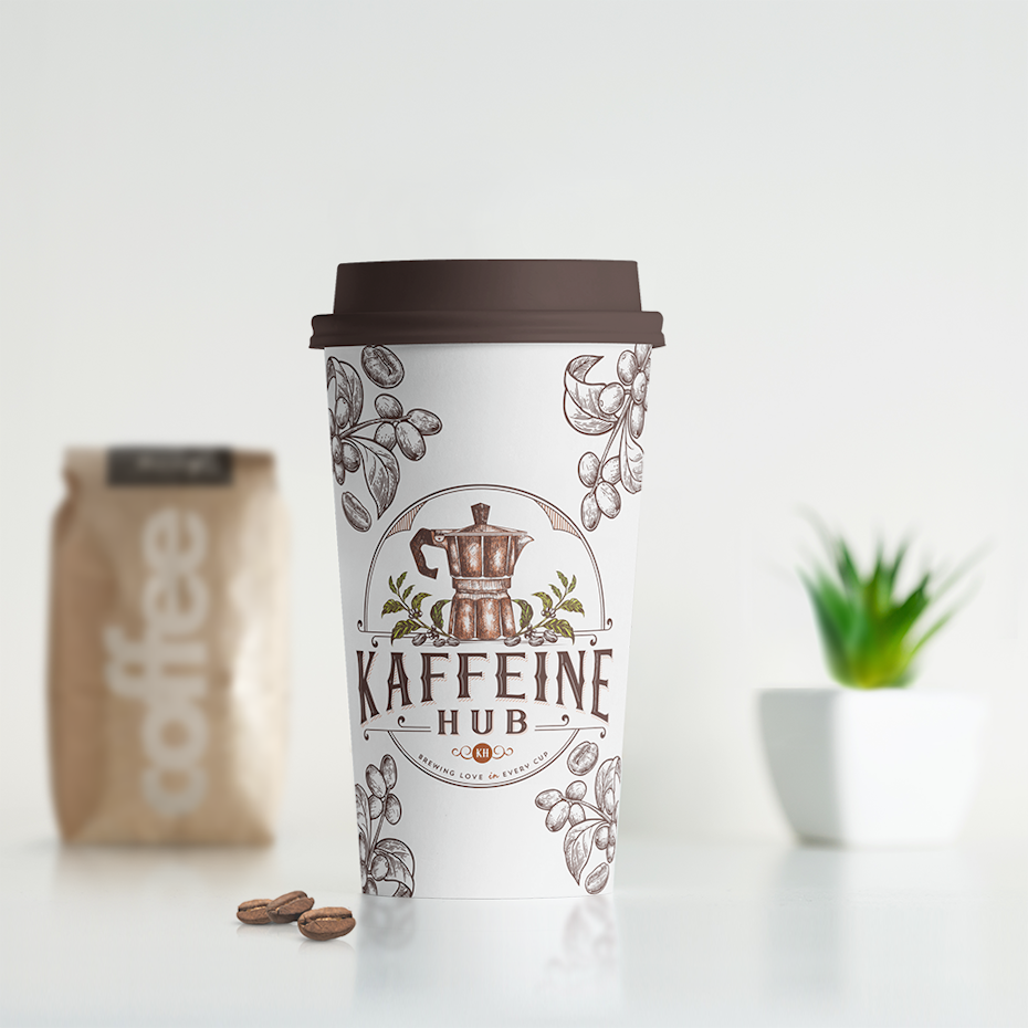
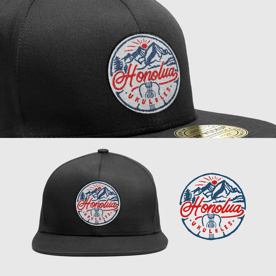
merchandise branding with disposable coffee mug with a vintage-inspired logomerchandise branding with baseball cap with a hawaiian-inspired ukelele logo patch

What you want to avoid is the bare minimum. Lots of brands just slap their logos on t-shirts, stickers and mugs and call it a day. Don’t do that.

Take the time to analyze your audience thoroughly and determine which products they’ll actually want. That could very well be t-shirts and mugs… but it could also be tote bags, tech gadgets, auto accessories, home decor, stuff for their pets or apparel other than t-shirts. For example, Honolua Ukeleles determined that fans of their ukeleles were also regular baseball cap-wearers, so designer stevenmink turned their logo into a great-looking cap patch.

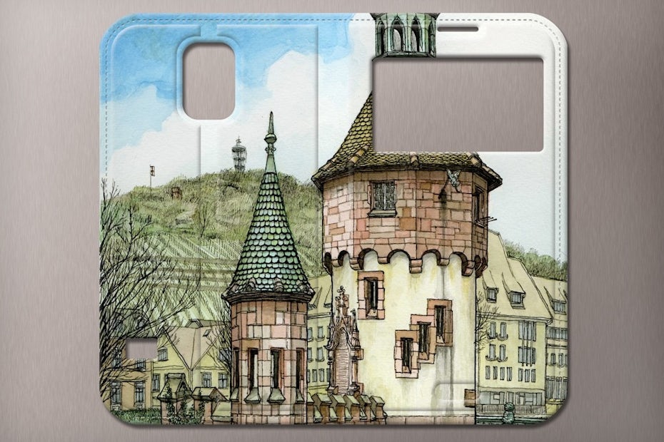
merchandise branding with phone case with an image of a brick building and a hillmerchandise branding with beer glass with a logo for a craft beer event

Don’t be afraid to ask your audience directly what products they’d like to see from you. Email surveys, online polls or social media banter are effective ways to get a clear sense of what they’d respond to best.

And you might be surprised—maybe branded gardening tools will be a hit with the people buying your organic, GMO-free seeds or a line of experience-inspired incense blends will go viral with fans of your free-spirited travel blog.

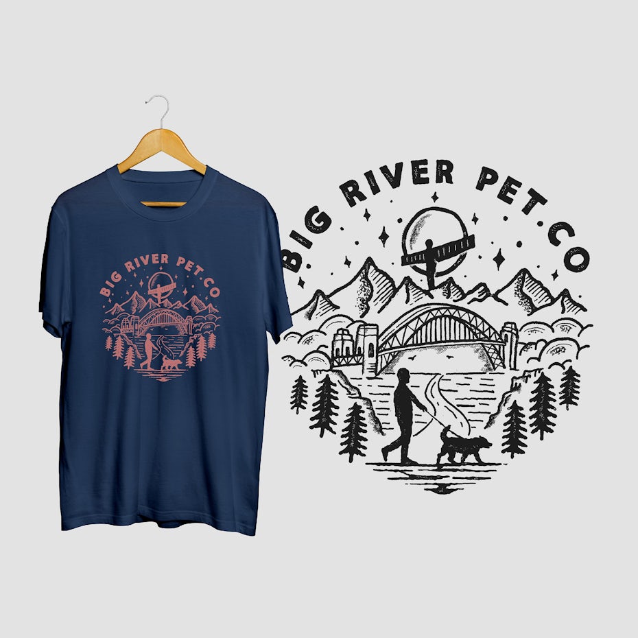
merchandise branding with light blue and purple handbag with a pattern of holesmerchandise branding with dark blue tshirt with an image of a man and dog in pink

Beyond branding merchandise

Branded merchandise doesn’t exist in a vacuum—it’s part of a larger brand strategy. Keep this in mind and think beyond the merchandise itself when you’re developing your strategy.

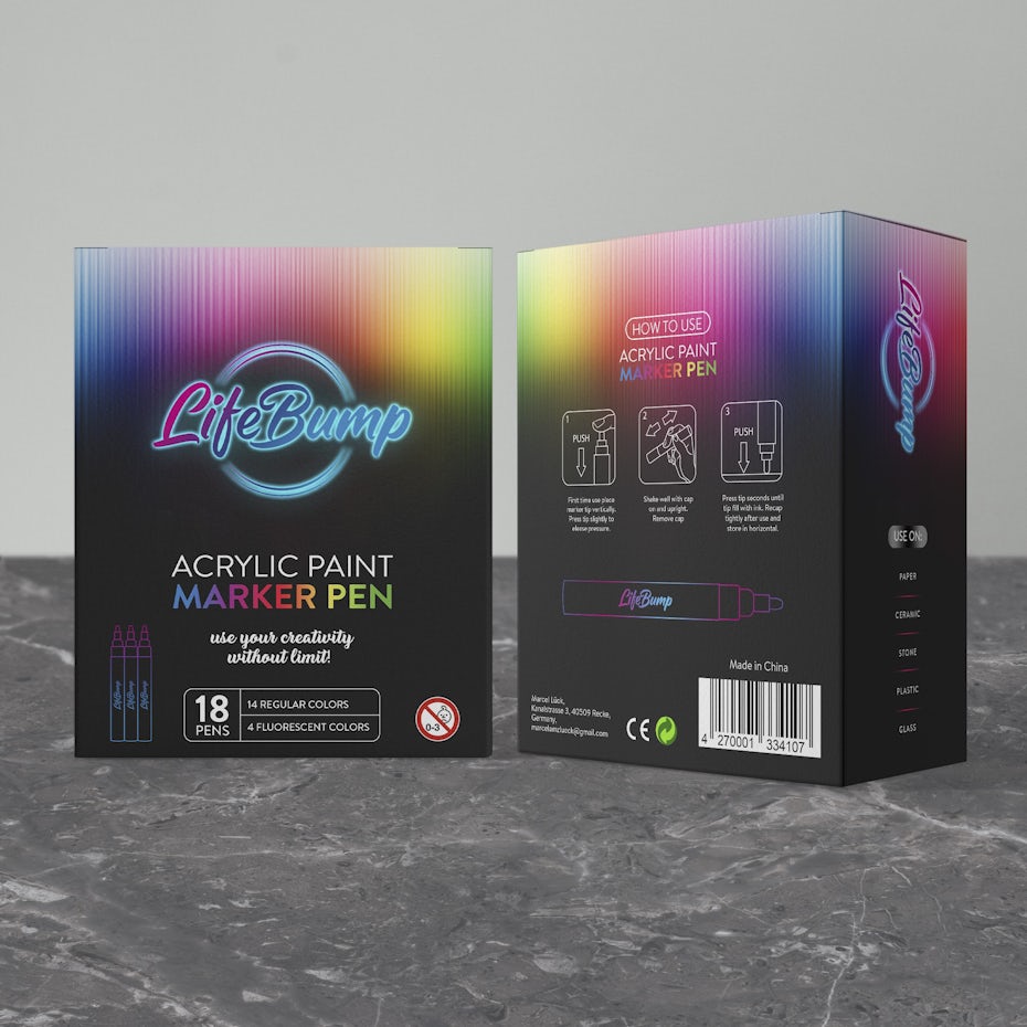
merchandise branding with black and neon box for markers
If your product’s on a shelf next to its competitors, make sure it stands out with on-point packaging. Packaging design by Stan Brand Design

The packaging your merchandise comes in should be designed as carefully as the branded goodies it contains. After all, the package sets the tone for the buyer’s interaction with your product. Stan Brand Design kept this in mind when they designed the packaging for Life Bump acrylic marker pens. People buying art supplies are attracted to eye-catching visuals, so making art from their packaging—the very first thing shoppers see—was a no-brainer.

Branded merchandise can also tie into other promotions. For example, let’s say you operate a coffee shop. You can offer discounts to customers who bring in branded refillable mugs when they visit for their daily cup of java. Or if you’ve got branded t-shirts, hats and other apparel out there, create a social media promotion around fans sharing pics of themselves wearing your gear.

merchandise branding with baseball cap with a patch showing an elk
Create something your audience will want to wear. Hat design by Irudh

Ready for merchandise that’ll sells out in seconds?

Branded merchandise is a way for your fans to take home a little piece of your brand and make it part of their daily lives. Take some time to really get into their heads to figure out what they’d like best, then give them exactly what they want—or maybe something awesome they didn’t realize they wanted until you unveiled it.

Want unique merchandise design for your brand?
Work with our talented designers to make it happen.

The post Merchandise branding: how to create great merch for your brand appeared first on 99designs.
Wednesday, May 27, 2020

What is digital design? An in-depth look at a complex field

At the heart of it, digital design is any design made to be interacted with on a digital device. While that might seem simple—and self-explanatory—the definition of digital design does little to capture the depth of what it actually accomplishes.

What is digital design illustration
Digital design is a complex field made up of different categories. Illustration by OrangeCrush.

There are an overwhelming number of digital devices these days, and for each of those, an exponential amount of use cases that design must consider. Understanding the various shapes digital design can take as well as the purposes each one serves is essential if you want to achieve the best result, whether it’s for a specific project or for your career overall.

You may be planning to focus on one type of digital design (or a digital design position), only to discover that your needs or abilities may be better suited for another.

As broad a field as it is, digital design can be broken down into a handful of categories, each with specific benefits. We’re here to walk you through the many incarnations of digital design and to point you in the direction of a winning interactive product.

What is digital design?

Digital design is a type of visual communication that presents information or a product or service through a digital interface. Put simply, it’s graphic design made specifically to be used on computers.

A black-and-white hand-sketched illustration of various people working at computers
by Konstantin Kostenko

This encompasses more than simply viewing graphic design on a screen. Any document these days can be scanned and uploaded to a computer, but digital designs are crafted specifically for devices, taking into account factors like user experience, interactivity, differences in screen size and more. In short, they are often designed to be used rather than read.

The difference between digital design and graphic design

Graphic design is for print products and digital design is for digital content. This is, of course, a generalization. These days the realms of print and digital overlap more often than not. Many digital designs rely on skills from the graphic designer’s playbook, such as brand implementation and typographical layout. Graphic design projects, meanwhile, commonly have to account for digital distribution in addition to print. And to make matters more confusing, “graphic design” is commonly used as a catch-all term for every type of visual communication.

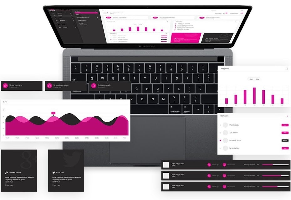
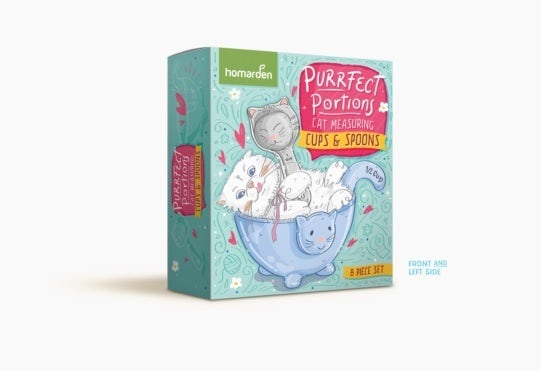
example of digital design: App design showing magenta-colored charts and graphs displayed on a computerexample of graphic design: Blue illustrated packaging box design for cat food measuring

At the end of the day, a designer is often expected to have skills in both graphic and digital design no matter which one they specialize in. The difference comes down to the medium (print or digital) in which viewers will most commonly encounter the design product. Digital designs must take into account user interaction whereas graphic designs are designed for static visual impact.

The difference between design and development

A t-shirt illustration showing a cartoon man working with code on a laptop
by PANG3STU

Digital designs require code to be functional and traditional graphic designs require paper and ink to be printed. Just as graphic design projects have a separate process for printing and distribution, digital designs have a separate process for coding, which is called development.

Digital designers make decisions on the visual direction of the product, and what they deliver to the client is typically an offline mockup (whether through Photoshop or a prototyping tool like Figma). Developers then use coding language to turn this mockup into a working digital design, like a website or newsletter.

While digital designers do sometimes offer development services (especially on the front-end), design and development are different disciplines that require different skillsets. When commissioning a digital design, keep in mind that you will likely need to hire both a designer and a developer to get a functional final product.

Types of digital design and when to use them

Digital design is a vast category encompassing a wide variety of digital interfaces, each with their own uses. To get a better idea of which one is the best match for you, let’s go over some of the most common types of digital designs.

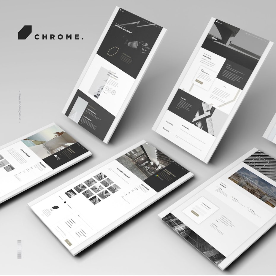
An image showing web pages laid out like physical tablets
by Ian Douglas

Web design

Web design is the most popular incarnation of digital design: a website is about as common for businesses these days as a logo. Websites act as hubs for a topic or service, incorporating many branching pages, and are used for information, business and commerce, entertainment and much more.

Learn how to create web design here.

>> Get a professional web design

Landing page design

Landing page design is a subset of web design, but it is more focused towards marketing purposes. Whereas a business’s website will act as the central channel for all things related to that business, a landing page is a single web page devoted to a specific product/service and usually culminates in a call-to-action. Often businesses will use a different landing page for each of their products/services and digital designers must ensure there is cohesion between all of them.

Check out this article for some inspiring landing page design ideas.

>> Get a landing page design

App design

App designs often resemble web pages, but they are designed to perform a specific function. Whether that function is shopping, scheduling, messaging or playing music, apps are essentially digital tools for users. Though they are commonly implemented on mobile devices, apps can be desktop-based as well.

Learn how to design an app here.

>> Get an app design

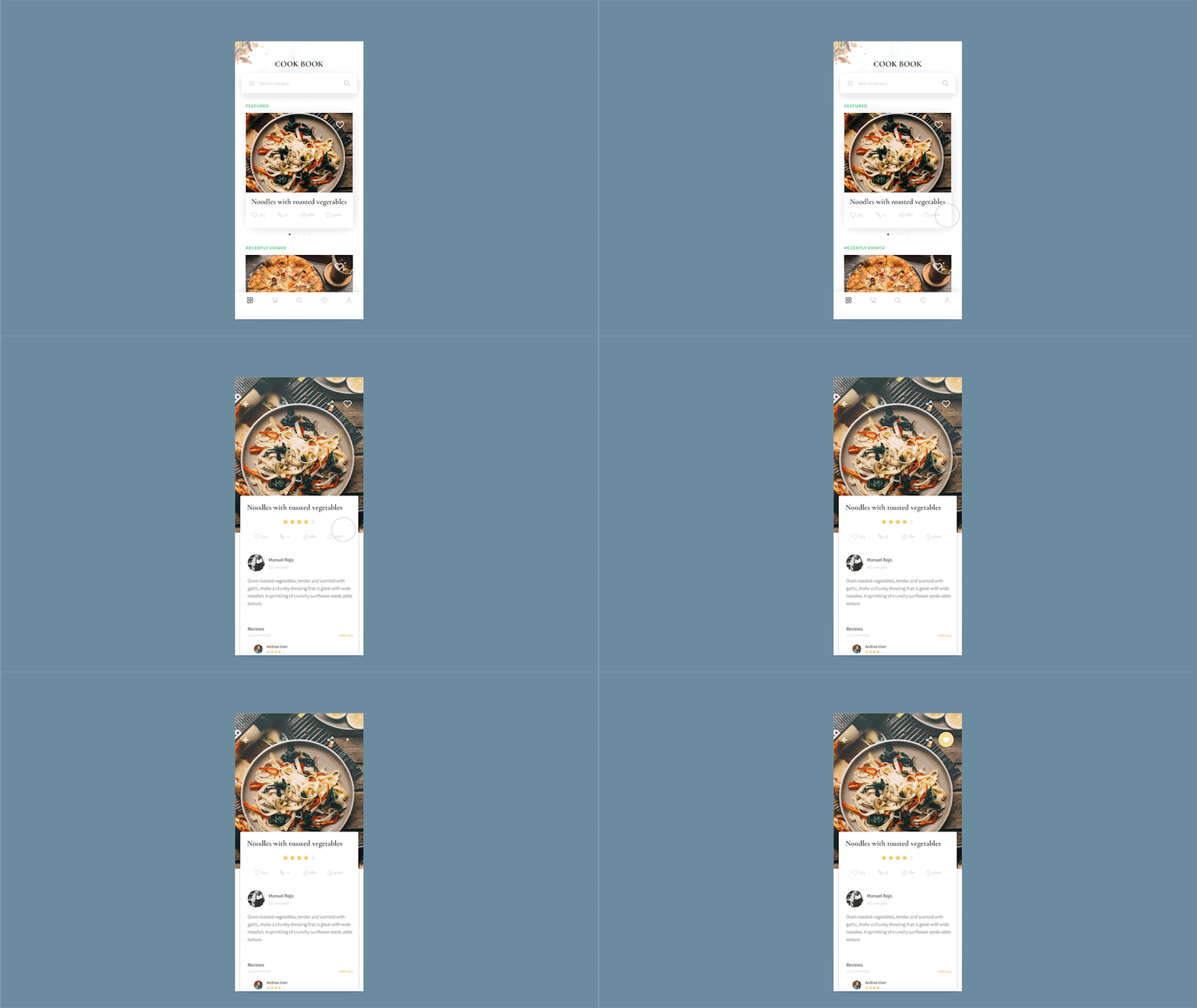
An animated mockup of a design for a recipe app
by Ider E.G.

App icon design

App icons are buttons users press to launch an app. They act as both an advertisement for the app (within the app store) and as branding. Though they are related to the app design, the icon is important enough and different enough in its goals and construction that often it requires a its own designer/design process, similar to a logo design.

Check out our guide to app icon design.

>> Get an app icon design

Infographic design

Infographics are data on a subject presented with engaging graphics. Though infographics can be either print or digital, digital versions take advantage of animation and motion graphics to tell a story with information. Digital infographics are great for creating shareable content that entertains and informs readers about a brand or a topic related to the brand.

Learn more about infographics here.

>> Get an infographic design

Email design

Emails are used by businesses for newsletters and marketing promotions, and email designs create cohesive branding across a company’s communications in the same way that printed letterheads do. A great email design also increases reader retention by visually engaging recipients all the way to the bottom of the email.

Take a look at this article for some email design inspiration.

>> Get an email design

Banner ads

Banner ads are small advertisements which are showcased on web pages where a brand has purchased advertising space. They function similarly to billboards and print ads in that they are designed to increase brand awareness and sell a product, but they are interactive, taking users who click on them to a landing page with more detailed information about the product.

Check out these banner ad design tips.

>> Get a banner ad design

Social media page design

A social media page layout design mockup for Instagram
by Daylight Designs

Social media images include avatars, cover images and posted content for everything from Twitter to company blogs. Though photography is a common type of social media image, digital designers will often repurpose branding such as logos to create custom social media images for companies.

>> Get social media design

Ebooks

Ebooks stand for electronic books, and brands often use them to share downloadable booklets with their customers. As is the case with traditional printed books, ebook designs encompass the cover and the interior typesetting.

>> Get an ebook design

Powerpoint template design

Powerpoint designs are branded templates that companies use for all of their presentation needs. This might include sharing business plans and updates internally with employees or crafting pitch decks to sell their company or services to third parties.

>> Get a Powerpoint design

3D design

3D designs are realistic, three-dimensional images made on a computer. While they can be used for entertainment (often in the video game and animated film industry), brands use 3D designs to render a product or create mockups of planned construction projects.

Learn more about 3D design here.

>> Get 3D design

Types of digital designers and how to work with them

When looking to hire a digital designer, it is important to keep in mind that the disciplines within the broad field of digital design are just as varied as the designer themselves, and you’ll want to make sure you approach the right designer for your project.

You can start by searching for a designer on a freelancing platform like 99designs or a portfolio site like Behance or Dribbble. When reviewing a designer’s portfolio, pay attention to the kind of projects they’ve worked on and how they brand themselves to determine whether they offer the kind of services you need.

An illustration of a man working at a computer
by Maxim Andreev

Although many designers do work on a variety of different projects in different mediums, here is a brief rundown on the specific disciplines within digital design.

Graphic designers

Even though graphic design, as we discussed previously, often refers to print, it is also a general term for many design practices, especially in the realm of branding. When it comes to digital design, a graphic designer can help with art direction, typography, color, and graphic assets such as icons or illustrations.

>>Find a graphic designer

Web designers

A web designer specializes in the layout and visual design of websites, landing pages, and any other related pages, including tablet and mobile versions. Though they often deliver static mockup files for clients to hand off to their developers, some also offer front-end development services (using formatting languages like HTML and CSS to create static web pages).

>>Find a web designer

App designers

An app designer specializes in the visual design of mobile apps, usually working closely with (or incorporating the skills of) a UX designer. App designers will also deliver offline mockup files, and a developer will be needed to make the app functional.

>>Find an app designer

UX designers

A UX (user experience) designer combines user research and standard usability principles to create the framework for how a user will interact with a digital design. Their deliverables come in the forms of wireframes or prototypes that web or app designers will base their layouts and aesthetic choices around.

>>Find a UX designer

UI designers

A UI (user interface) designer specializes in the design of the actual buttons, text fields and other interactive elements of a digital design. Their goal is to create a pleasing and consistent look for the interface, and they usually deliver style guides and template sheets for all interactive components.

>>Find a UI designer

Product designers

Product designers are closely related to UX designers (for some companies, the terms can be interchangeable), but they make decisions about how a digital design product should work and what services it should offer, beyond how the user experiences it.

Interaction designers

An interaction designer designs each moment-to-moment interaction a user experiences with a digital design. Whenever a user clicks on something or scrolls down a page, they receive some form of visual feedback (usually a short animation) that an interaction designer has made.

Animators

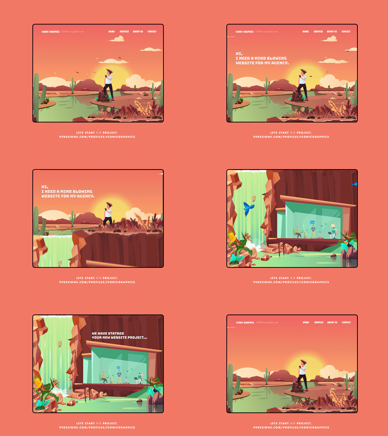
A colorful, illustrated fully animated scrolling web page mockup
by Iconic Graphics

An animator designs custom animations as needed in a digital design. In contrast to an interaction designer, these animations are often more robust, such as a hand-drawn animated scene that plays in a website header or an animated version of the logo that plays during a loading screen.

>>Find an animator

What makes a digital design successful

Choosing the right project and the right digital designer is a great start, but you’ve still got to make it through the entire design process. This is the final test of your knowledge—you not only understand what digital design is all about, but can actually recognize quality digital design.

There are many ways a digital design can go wrong, and though these can vary depending on the type of project, here are some general tips on making your digital design a success. A great digital design is…

Researched

A good digital design should aspire to be more than just good looking (though you’ll want to make sure it’s at least that). It should be backed by solid planning and piles of data. Do research beforehand to understand what your potential users’ pain points are, the kinds of apps they typically interact with and the kind of functionality that is known to put them off.

Your marketing team or a third party consultant can help with discovery, market research and user testing throughout your project. You should have a clear idea of the problem you are setting out to solve and of how exactly your digital design will solve it even if you haven’t begun the design itself yet.

A web page design for a scooter company
DSKY’s web design uses visual hierarchy to separate content and guide readers down the page, it invites interactivity with bright button colors and a carousel of enticing images and it even includes customers in the header photo

Readable

The lack of physical boundaries is one of the best things about digital designs. They can scroll infinitely and can blow up or shrink down on the fly. But this does not mean that there are no rules. A good digital design will plan for a variety of screen sizes and adhere to fundamental design principles, such as visual hierarchy and use of white space, to make your content easy to understand.

Remember that digital designs are more commonly used than passively read, and usability demands ease-of-use. You’ll also want to take into account accessibility, which is not only humane but often legally required.

Interactive

Users can engage with digital designs more actively than they can with analogue media. But that doesn’t mean that they will. A good digital design will encourage users to interact and participate. This means that your page will be optimized so that users will want to click and scroll through; they will quickly understand the value of inputting their information (when asked to do so) and will generally feel inspired to like or comment on your content. Even though your digital design may present static information, a good digital design will take full advantage of its presence on interactive media.

Adaptable

Your digital design is finished and has gone live—you can finally go on that trip to the Bahamas and rest easy! Not so fast … you’re not quite finished. One of the best and worst things about digital designs is that they can change, and you need to be ready to change with them.

Good digital designs will undergo regular testing and maintenance after launch to ensure users are encountering no issues. Even with the most scrupulous planning and research, unforeseen problems will arise, but the good news is those problems are opportunities to expand your services beyond what you had originally anticipated. Your digital design may never truly be finished, but that’s exactly what makes the digital medium great.

Digital design is the future

Digital design is a nebulous category covering many different types of designs and designers, but there is undeniable power in the digital sphere. Digital designs excel at breaking the boundaries of space and inviting active user engagement. With so many possibilities at hand in the realm of digital design, it’s hard to imagine why you would design for any other medium. If starting a digital design project still seems daunting, turn to a great designer to arrange those 1’s and 0’s into a work of art.

Want a unique digital design?
Work with our talented designers to make it happen.

The post What is digital design? An in-depth look at a complex field appeared first on 99designs.
Tuesday, May 26, 2020

34 website illustration designs that bring brand stories to life

In a world where a brand’s digital footprint is just as important as the in-person impression it makes, great web design is a must-have. Web design is extremely complex and truly an art form in itself. There are many important aspects to consider when designing a website like functionality, usability and aesthetics. Prioritizing one of these aspects can sometimes mean limiting yourself to certain types of design.

But what if one form of design did all of the above? Picture a singular design solution that makes a website more functional, engages the user and just looks good. The answer: website illustration.

Website illustration
Illustration by OrangeCrush

People are tired of website designs that overload them with too much copy. They’re also bored with stock photos and overly photoshopped images. In contrast to these, illustrations are a breath of fresh air.

Here, we’ll review all things website illustrations, from finding the right style for your website, identifying several success stories and showing how illustration can be used as a creative means of storytelling. Remember: great branding starts with showing, not tellingand illustrations do just that.

Table of contents

  1. Finding the right illustration style for your website
  2. Flat and semi-flat illustrations
  3. Textures and gradients
  4. Outline illustrations
  5. Navigation through illustration

Finding the right website illustration design style for your website

Just like there are many different styles of painting or sculpting, there are several different art styles that work well for websites. Website illustrations can be bold and courageous, playful and punchy or simple and straightforward. It’s all about what brings out your brand essence best.

So let’s start there. Begin by understanding what branding is and how to build your brand identity. Once you’re confident in who you are as a brand, you’ll have an easier time narrowing down your ideal website illustration design style.

Cartoon-like illustrations are a great choice if your brand has a fun, easygoing attitude. Sharp, angular illustrations give your brand a cool, modern look. Whatever route you take, illustrations help your website stand out from all its competitors who are using the same photos and graphics.

And just like fonts and colors, illustrations enable you to build up your overall brand persona. Sticking with one illustration style everywhere your brand appears on the web helps you maintain a singular voice, and it’s a very effective way of showing visitors who you are from the moment they click onto your site.

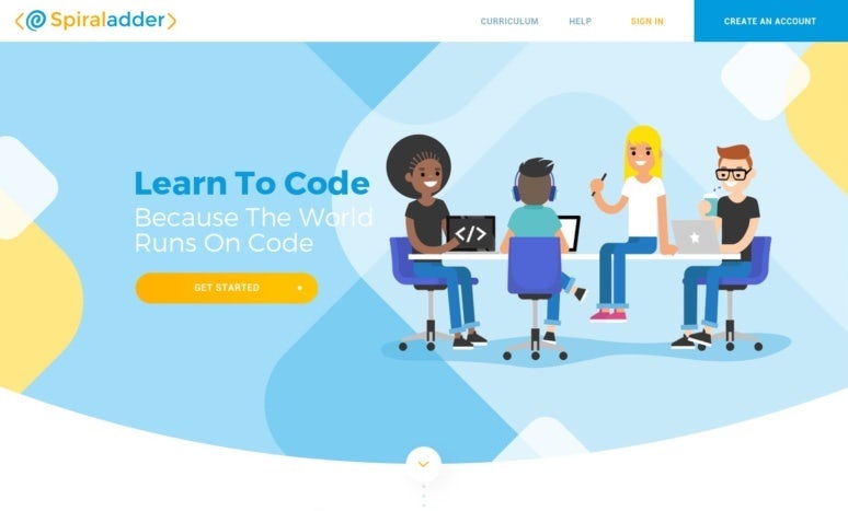
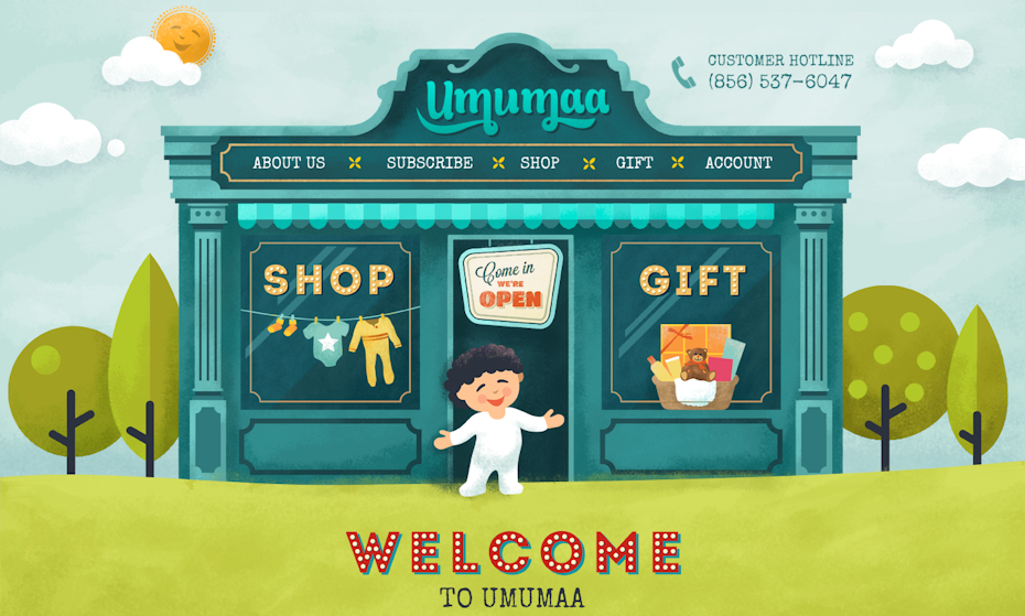
Frank Body websiteBreathing Room websiteSpiraladder websiteUmama websiteWe Build Spaceships websiteSnow Day Survival Kit websiteNaturbit websiteSurfside Kids Pediatric Dentistry website

Flat and semi-flat website illustration examples

Some of the greatest website illustration designs are the simplest ones, and often, they’re rendered in a flat design style. This style works well for depicting human life, animals, characters and objects.

Flat artwork offers a classic, approachable way to incorporate illustrations into web design, as it all happens on one visual level. Flat design refers to a two-dimensional image that lacks gradients and shading. Even the edges and corners are typically the same shade as the rest of the illustration, emphasizing the two-dimensional effect. Semi-flat design incorporates more elements of gradients, highlights and shading without taking the illustration to a full-on three-dimensional level.

Flat illustrations can be playful or sophisticated, depending on the voice of the brand using them. This style translates well with a cohesive color palette throughout the page design (the semi-flat illustrations on Guarantee Quote, for example). Additionally, flat illustrations can easily take on the form of playful, cartoon-like, recognizable icons. They lend themselves well to website mascots, like the charismatic birds on the Duolingo site.
Another perk to using a flat website illustration is their adaptability. In the case of the Live & Dare website, whimsical illustrations are blended with website photography to create a multi-faceted visual design. By carefully curating the color palette and paying attention to proportions in the landing page design, the mix of photography and illustration feels balanced.

Retail One website
Retail One website by Hitron
Co Op Vision websiteGuarantee Quote websiteDuolingo websiteLander websiteSite Leaf website characterLive and Dare website

Textures and gradients in website illustration

Unless a brand goes all-out with flash animation, the average landing page is a very flat, static space. With website illustrations, a once-flat setting gains a sense of depth. Textures and gradients provide websites with a sense of beauty and scenery that can elevate their brands’ aesthetics to new levels.

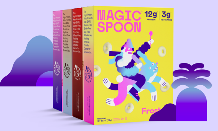
Check out Magic Spoon Cereal’s packaging and website (yes, we’re talking about gluten-free, low-carb, totally hipster cereal here). The gradients on their product information pages echo the vivid color palettes and funky illustrations on their cereal boxes. It’s a rare instance of successful website illustration design in the field of e-commerce because in this industry, we’ve become particularly accustomed to seeing product photography instead of illustrations. But when they’re done rightwhich means they depict the product realisticallythey work. It’s important to show products realistically to make sure the customer knows what they’re buying, and there’s no reason why you can’t do that with illustrations.
For great texture, look to the Wisecube website. A galaxy-esque overlay turns the boring blue background into a stimulating visual display. There are lots of ways to create texture, like designing intricate patterns, using overlays of color or just playing around with opacity. For the viewer, texture helps the flat space come alive. And for the brand itself, texture can emphasize its unique point of view.

Superhero Studios website
Superhero Studios website via Web Design Inspiration
Sparq Storytelling websiteMagic Spoon Cereal websiteIT Heroes websiteHeyware websiteWisecube websiteINDOSE website

Outline website illustration designs

We’ve seen outline illustrations become trendy in recent years (White Claw packaging, anyone?). The popularity of adult coloring books could be the underlying cause of this trend and honestly, it’s great. Outlines feel nostalgic and charming, and when looking at these website illustration examples, they’re some of the most compelling.

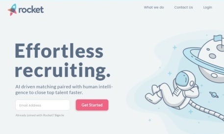
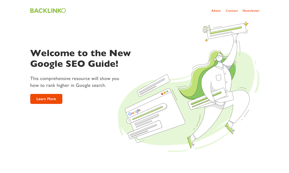
The use of white space is a common feature with this illustration style. Depending on the approach, outline illustrations can be scaled down and minimalist or highly detailed. No matter what, an outline illustration has a bit of a DIY feel to it and feels personalized, yet professional. Outlines are easy on the eyes, yet highly engaging. Look to the Rocket website for a straightforward approach to outlines or Brand It Guru for a more intricate interpretation.

Good Things Brewing Co. website
Website design via Good Things Brewing Co
Rocket websiteRailsware illustrationSmart Data website illustrationBacklink websiteBank of England websiteBrand It Guru website

Navigation through illustration

The term “navigation” applies to web design in two different ways.

First, it can refer to the navigation menu itself. Navigation is the core of any well-designed website, and illustrations can make navigation engaging and clear. Look to GiftRocket for a striking example of an unexpected, illustration-based navigation menu where each product category is represented by an illustration.

Second, navigation also describes the way in which the user explores and visualizes the website’s content. Illustrations can assist with that goal through traditional means of navigation (the menu) as well as through new, creative forms (the infographic). And in cases like Trailhead, illustration doesn’t just help the user navigate the website; it literally maps out an engaging quest.

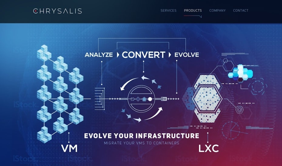
For successful use of visualization in website illustrations, check out Chrysalis. The very first thing the user sees on Chrysalis’ homepage is its chart-inspired illustration that tells the user what the brand does.

Think about classic visualization tools like flowcharts. Website illustrations are great visualization tools and beyond that, an effective way to connect with your audience. Plus, they’re often more mobile-friendly than photos. Keep that in mind when you’re designing the mobile version of your site.

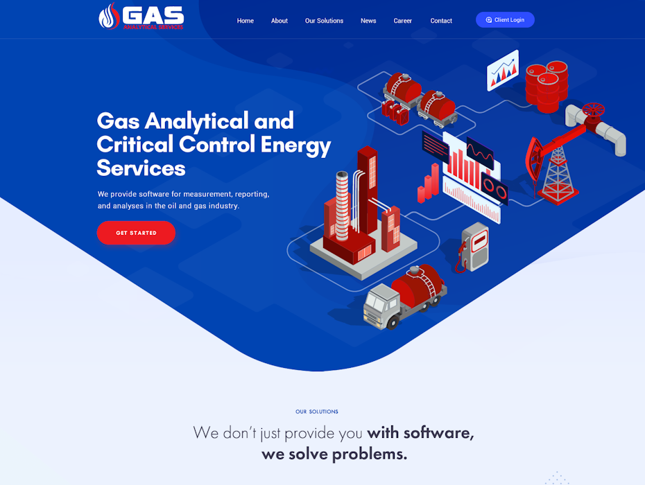
Basecamp website illustrationTrailhead websiteGiftRocket navigation menuGas Analytical website
Chrysalis website
Chrysalis website by Mithum

Show and tell your story with website illustration

From brand voice through illustration to various illustration styles, there are a lot of ways website illustrations foster engagement, guide users through websites and combine the need for functionality, usability and aesthetics. If you’ve already built your website, think about ways you can use illustrations like the website illustration examples here to make your site the best it can be. And if you’re starting from scratch, consider a dynamic, illustration-based website.

Not sure where to start? Check out our global community of designers to find an illustration-focused website designer who’s perfect for your brand.

Ready to draw a ton of clicks with website illustration?
Our designers can create the perfect look for your brand.

The post 34 website illustration designs that bring brand stories to life appeared first on 99designs.