In the ‘90s and early 2000s, gradients were a popular technique for bringing vivid color to a variety of designs. One of the most prominent gradient logos of the time was the Playstation 2 logo, which launched in 2000. The trend continued and gradients stayed in the limelight until the late 2000s, when they took a backseat to flat design. Then, the gradient logo trend came back in a big way in 2018.
Why? Because gradients are eye-catching, attention-grabbing and unapologetically pretty. Modern gradients use bright, luminous color combinations that feel fresh and exciting.
We see gradients in many places out in the wild—from tangible items like business cards and packaging to digital environments like website hero images and landing pages. But we’re here today to discuss using gradients in one specific place: your logo.
Remember, your logo is your brand’s everything. It’s your brand’s face, your elevator pitch, your mascot, your spokesperson and the best dang first impression you can make. A gradient can add a unique, memorable aspect to your logo and make you stand out from your competitors. Here, we’ll explore gradient logos in several prominent industries and explain why they work so well.
First thing first: what’s a gradient?
—
Gradients (sometimes known as color transitions) are a gradual, blended progression from one color to another color (or, if you’re feeling ambitious, from one color to another color to another color—gradients aren’t limited to two shades). Gradients can feature colors from the same family, like a light blue to a dark blue, or completely different, contrasting colors like bright purple to deep red.

Modern gradients tend to be quite bold in comparison to previous iterations, as seen in the warm-toned neon gradients trend for 2020. Whether they’re uber-saturated or subtle and subdued, gradients are incredibly versatile. The application, execution and placement of a gradient can be transformative, creating a standout visual experience.


Gradient logos in tech
—
With innovative, ultra-creative minds at play, tech brands are the ultimate trendsetters. They’re on the pulse of what’s new and what’s next, and in a world where we’re glued to our phones, tech brands are with us at all times.
Technology logos can vary greatly, from the simple and scaled-back to the bright and the brilliant. But one thing’s for certain: more than any other industry, the tech field benefits from visual cues that create depth on flat screens. When a company’s entire business is digital, a gradient logo gives it an almost-tangible beauty and intrigue, keeping the user engaged.
Take a look at the logo rebrands from Instagram and Mozilla Firefox. Both tech brands went from static shapes to psychedelic sunsets, and it’s a welcome change. We’ve seen warm-toned gradients continually emerge in tech environments. It’s a look that pops digitally and catches the eye without overwhelming it.
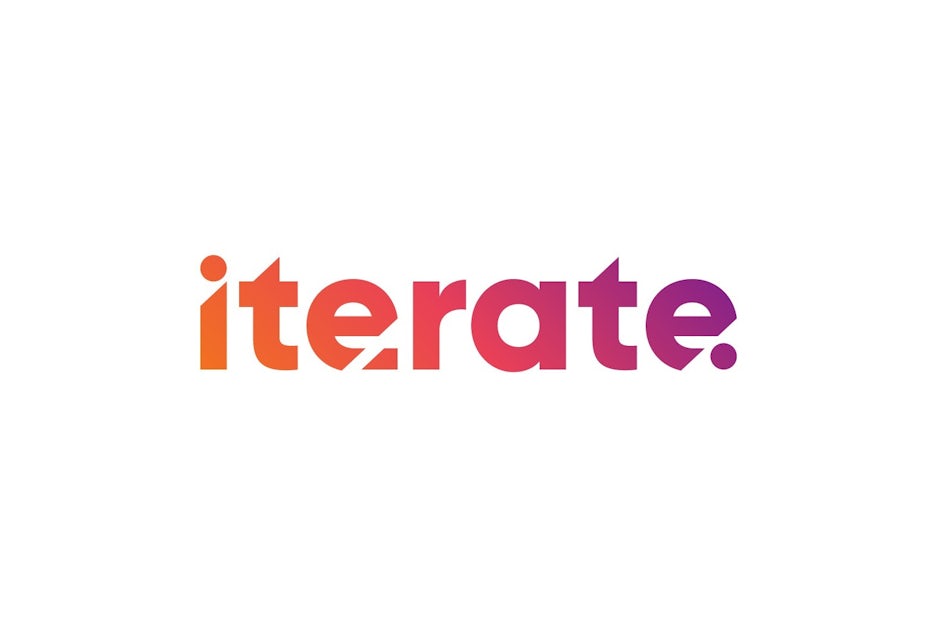
Sometimes the word “technology” immediately makes people think “boring” or “stuffy” or “nerdy,” especially when the technology in question isn’t something flashy and shiny. But the right logo can make any brand cool. Check out the Iterate logo for a well-designed example—they’re a technology recruitment company whose saturated gradient logo gives them a warm, engaging feel that says “you’ll just love your new tech job!”
Gradient logos in fitness, beauty and wellness
—
Plain and simple: people want to feel good. From boutique yoga studios and designer activewear to a gigantic spike in the number of CBD products available, wellness has evolved from a state of being to a true lifestyle over the past decade.
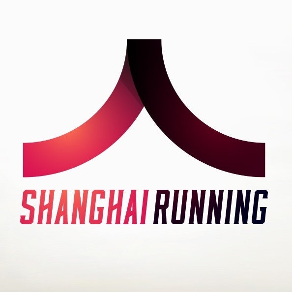
Gradients have made their mark on the fitness world, perhaps because the shift in color simulates a shift in movement, as seen in the Shanghai Running logo or Under Armour’s Map My Walk app logo. Gradient-infused fitness logos feel more dynamic and exciting than their flat counterparts.

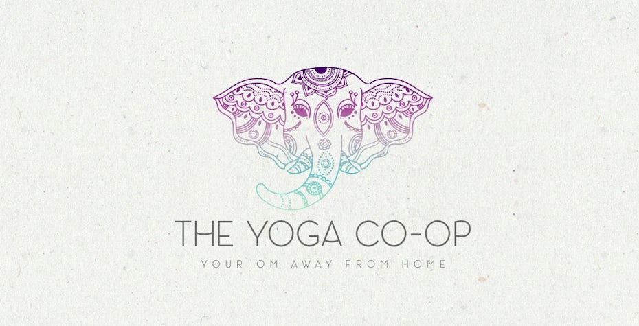
In contrast, gradients can also serve a completely different purpose when it comes to wellness branding. Particularly in cool colors, a gradient feels relaxing (like in The Yoga Co-Op logo, for example). Cool-colored gradients often feel like the perfect choice when you’re building an identity for a relaxation-based wellness brand, like a salon or a spa.
For the beauty industry, a gradient is the perfect fit. Think about the overarching purpose of beauty brands: they’re all about stellar presentation.
While we do see a lot of all-black beauty logos, particularly when it comes to makeup brands, there’s something so refreshing and attractive about a gradient logo like the pastel rainbow used by Beauty Stack. It’s soft and pretty, reflecting on the artistic, creative quality of makeup—and hey, who doesn’t love a good contour of color? Honestly, we don’t just want to feel good, we want to look good, too (yep, we said it). This principle translates to beauty logos as well. If you’ve got a beauty brand, you want to make it look good.


Gradient logos in travel
—
Whether it’s a quick weekend road trip or a long-awaited honeymoon in Europe, we all need to get away sometimes. Thankfully, the travel industry is here for us with splendid airline deals on Priceline, snazzy hotels with free WiFi and an abundance of oddly decorated AirBnbs.
When it comes to travel branding, it’s about both the journey and the destination, and that journey begins with a great logo. We see the silhouette of a sun incorporated into many travel logos, and it tends to feel overused. Instead of going with the same imagery we’ve all seen before, a gradient can help a travel logo stand out, all the while emphasizing the destination’s beauty. One example of a travel logo doing this is the Auckland Multi-Pass logo, which uses a gradient to communicate the natural beauty and diverse settings the city has to offer.

Gradients work particularly well with app logos, and the travel industry is no exception. Think about the clutter of apps which are on the average person’s phone. Locating each app can be tricky, so it’s ideal for an app logo to be simple, but memorable. It should be bold, and it should reflect the overall purpose of the app. The Ready Set Vacation! logo does just that: it catches the eye, and the sunny gradient colors feel inviting: just like the perfect getaway.


Gradient logos in food
—
From local restaurants and drive-thru chains to perfectly packaged treats, food is an ever-present part of our daily lives. It’s with us seven days a week and for three meals a day… and then some. Food is constantly advertised and constantly on our minds. It’s also the most common impulse purchase out there and for many, our greatest vice.
Whether you’re just grabbing a carton of milk from the fridge or you’re heading out to grab pizza to-go, we see food logos every day, all day long. When it comes to food logos, the most successful are the ones that appeal to our senses. It’s easy for a food and beverage logo to feel static, but the use of a gradient creates visual depth.
Think about it: many food logos are monochromatic or two-toned and they often lack texture and depth. A gradient can help a food brand stand out. For example, think about the cereal aisle at the grocery store. The possibilities feel endless, and an indecisive customer may gravitate toward an item with a well-designed logo.
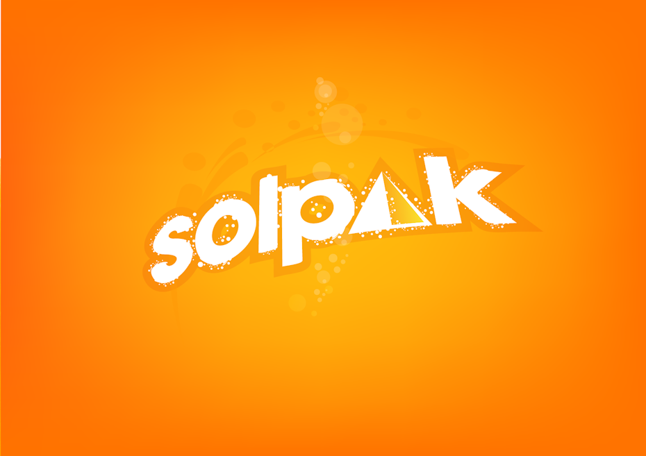
Let’s look to one of the most obvious examples of color-based food out there: orange juice. We’re used to seeing orange juice logos that include dark text and the silhouette of an orange, but what if—just what if—we were ready for something totally different, but still with plenty orange, obviously. This is the ideal opportunity to use a gradient of colors from the same color family, like the yellow and orange gradient in the Solpak logo.
Gradient logos also fit in well when it comes to desserts and treats (think candy, ice cream and cake logos). Dessert is exciting, much-anticipated and undeniably lovable. A well-placed gradient just emphasizes the spirit even more, like the cheerful fading of colors in the Sweetie candy logo.
After all, this is an industry which thrives on artificial colors and flavorings: things we don’t see in nature. Electric blues, punchy purples and shocking pinks in gradient logos enhance the whimsical experience of a candy or dessert, and this is what the customer wants to see. In contrast, it would be odd to see a colorful gradient on a logo for, say, a steak sauce. Be strategic! But let’s face it: gradients are fun. Have fun with your food by embracing the gradient logo trend.

Fade into it
—
Let’s make one thing clear: gradient logos aren’t going anywhere. Get in on the gradient logo trend by using one to take your brand to the next level. Not sure where to start? Search our global community of designers to find one with a colorful vision for your logo.
The post 34 gradient logos that are made with the shades appeared first on 99designs.
No comments:
Post a Comment