Friday, July 31, 2020

Best sports logos: 31 winning examples for your club or team

When designed well, sports logos can rally together your entire fan-base and send shivers down your rival’s spin—or, at least, show a picture of a pretty bird.

sports logo for St. Louis Cardinals
The terrifying sports logo for the St. Louis Cardinals strikes fear in the hearts of their enemies. And worms, too.

Major league sports teams may have millions to throw away on their logos, but local teams, sports clubs and school sports don’t have such robust budgets. So if you’re looking for a winning sports logo for your team, a few pointers can go a long way.

To help give you some sports logo inspiration, we’ve collected 31 of the best sports logos below and share some insight into what makes them so great.

Let’s start by dissecting some of the best sports logos in the professional leagues to see what they do right, and then we’ll explain how you can apply those trends to your own team.

How amateur teams and clubs can get professional-level sports logos

If you want a crash course in logo design for your sports brand or team, the best information often comes from the professionals. Check out what the big leagues are doing and see if you can notice some patterns. Once you recognize these recurring design trends, you can implement them into your own design at a fraction of the cost.

Let’s take a look at some of the most successful sports logos in history.
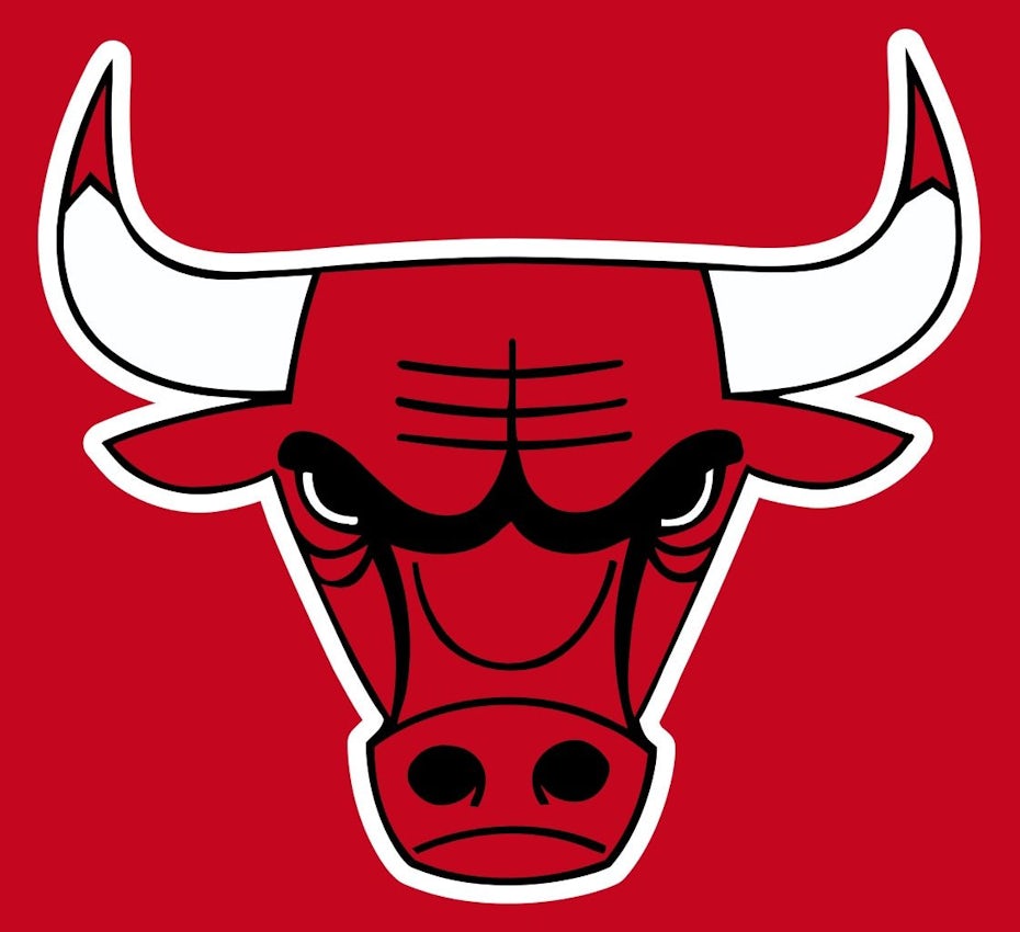
Chicago Bulls

sports logo for Chicago Bulls
Sports logo design for Chicago Bulls

One of the most effective logos is from one of sports most beloved franchises—the Chicago Bulls logo. This unmistakable logo is a great place to start when considering your own logo, just don’t turn it upside-down.

Here we see two of the most prominent design techniques in sports logos, the aggressive mascot and an abundance of sharp points.

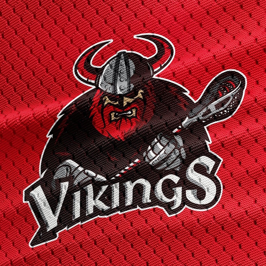
Angry mascots are a staple of sports, and the teams’ logos tend to depict those mascots in an exaggeratedly aggressive way. The idea is to make your team seem powerful and strong enough to intimidate opponents and inspire fans.

Similarly, you see a lot of sharp points in sports logos, in this case the horns and even the ears. We’ll explain more about why they work below, but in short, sharp points energize a design and make it more dynamic.

Arsenal FC

sports logo for Arsenal FC
Sports logo design for Arsenal FC

The Arsenal Football Club logo takes a unique spin on the aggressive mascots mentioned above. While a cannon isn’t exactly an angry mascot, it is a serious weapon and a symbol of aggression, making it a good fit for a sports logo.

But the reason Arsenal’s logo stands out is its frame, in this case a shield. Your sports logo frame can add additional depth to you logo even if it’s simply a circle to unify the whole design and draw people in. The use of a shield, though, achieves the same ends as a circle, but also adds connotations of strength and fortitude, appropriate for the sports industry.
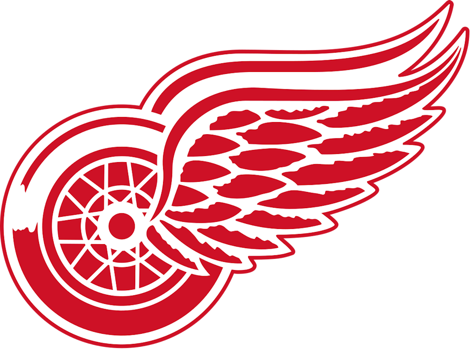
Detroit Red Wings

sports logo for Detroit Red Wings
Sports logo design for Detroit Red Wings

One of the most important principles of logo design is memorability. Remembering a logo is the first step in brand recognition. The right logo will serve as a beacon to loyal customers.

With sports logos, it’s hard to stand out when everyone is using the same design playbook. But the Detroit Red Wings break the mold about what a sports logo should look like. The result is something wholly unique and easily recognizable, not to mention adored by its fans.

The lesson: don’t be afraid to be weird, as long as it works. No one would have guessed a nonsensical flying wheel, designed in a semi-realistic manner (look at the detailed feathers and intricacy of the wheel hubs), would become one of the most iconic logos in sports.

New Zealand Rugby Union

sports logo for New Zealand Rugby Union
Sports logo design for the New Zealand Rugby Union.

As rugby is the national sport of New Zealand, it makes sense that the governing body would invest in their logo. After all, it serves a dual purpose of representing not just the organization that manages the country’s rugby teams, but also some of their teams.

What’s most impressive about this logo is that it manages to satisfy the requirements for both a business logo and a sports logo simultaneously. The stark black-and-white design with a simple, yet artistic visuals is right at home with company culture. At the same time, the vibrant images (including lots of the sharp angles mentioned above) and attention-grabbing typography check all the boxes for a sports logo.

Now that you’ve seen what sports logos are supposed to look like, let’s take a look at some practical advice for designing your own. Here are 5 expert tips for sports logo inspiration, and some examples of how they’re applied from our 99designs community.

Top tips and inspiration for creating amazing sports logos

1. Get aggressive

One of the most obvious sports logo trends is to use an exaggeratedly aggressive version of your mascot. Most of the time, this is an aggressive animal, typically an apex predator like a bear or big cat.

But don’t neglect one of the most fearsome animals alive, the human. While not as common as the angry animal, many teams use an iconic type of person, known for their fighting skills or just generally viewed as scary. More often than not, these are historical figures: specific cultures like the Spartans or the Romans, but also general figures like pirates, ninjas or medieval knights.

Of course, this trend depends on your sports team name, which unfortunately isn’t also up to you. The good news is that you can make stylistic choices to help whatever mascot you’re stuck with appear more frightening. A quick shortcut is to add a steep angle to their eyebrows—the “angry eyes” you see in every cartoon.

sports logo for Cobra Youth Basketball Club
Sports logo design by Alvianks
sports logo for Bulls Youth Football Academysports logo for L.A. Renegadessports logo for Praetorians Teamsports logo for Centurion Battalion

2. Sharpen your points

Designers know that the human eye instinctively follows any lines it sees. These gives certain shapes a specific emotional connotation, in other words, a specific “feeling” or “vibe.” For example, circles come across as playful because the eye goes around and around; horizontal lines come across as comforting because the eye goes back and forth in a level, stable way.

Sharp points, though, create a jarring effect when viewed—the eye must quickly double-back and dart in almost the opposite direction. This not only makes an image more visually interesting, but also tends to make the viewer more attentive, as if driving down a winding road.

That kind of alertness and invigoration is precisely what sports logos are going for with sharp angles. Along with the associations to knives and spikes and other aggressive imagery, the sharp angles stimulate viewers up and keep them on their toes. This is a trend we also see in metal band logos for similar reasons.

Sharp angles aren’t only for your mascot. More often than not, they’re also incorporated in the sports logos’ typography.

sports logo for Torit Tigers
Sports logo design by MA.XXI
sports logo for Thunder Buddiessports logo for Haverford Hawkssports logo for Sharks for Lifesports logo for CISM Canada

3. Energize your typography

You can’t rely solely on your sports logo’s image to convey the tone you want, you also need to work on your logo’s typography. For one thing, if your typography doesn’t match the imagery, your whole logo will seem off. Strong typography is also essential as the visual elements of logos are often dropped for jerseys or merchandise—the text of your team name will sometimes have to speak for itself.

As mentioned above, you can add sharp points to your lettering to keep both energy and enthusiasm high. Typically, this involves “spiking” the serifs. But if you look at enough sports logos, you start to notice other typography trends as well.

For example, the buckling of the middle of the word is also common, so that the first and last letters extend lower than the other to form an arch from the word shape. This adds a slightly 3D effect to your sports logo and makes it fun to read.

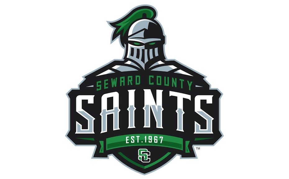
But you can also experiment with flashy fonts. Stuff that’s too garish for a business logo seems to fit naturally in a sports logo. Check out the way  JK Graphix uses a stencil font below. A common favorite is lettering with small spikes in the middle, as seen in the logos for the Boston Red Sox, Oakland As and Pittsburgh Pirates—and the Seward County Saints below.
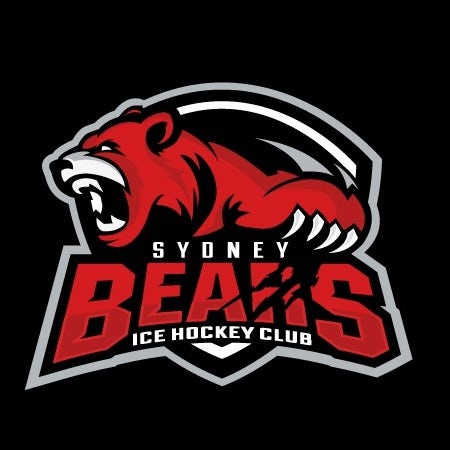
sports logo for Seward County Saints
Sports logo design by SJ Designs™
sports logo for Alpha Arms Football Clubsports logo for Chennai Sharkssports logo for Riptide Lacrossesports logo for Noosa Cyclones

4. Focus on framing

The idea of framing in logos has deep roots in graphic design. On the surface, frames tie together all the elements of a logo, the visuals and the text, to help create a unified feel and to make the image more aesthetically pleasing.

But there’s also a deeper and more sub-conscious meaning. The logo’s frame suggests a sense of togetherness and unity, perfect for the community-building aspect of sports. A team needs a solid, unified fan base, and logos with frames encourage that. “You’re either with us or against us.”

Other industries rely mostly on circles for their frames, as circles are friendlier and more welcoming. But with sports logos, you want something more aggressive and powerful. Shields are common, as they represent strength and fortitude, but triangles also work well as symbols of authority and stability, not to mention their sharp points. Don’t be afraid to combine shapes to customize the feeling you’re going for. Notice how the Sydney Bears logo rounds the edges of its shield frame to appear more circular.

sports logo for BOM SQUAD
Sports logo design by FLYCR
sports logo for Rugby Genevoissports logo for Sydney Bearssports logo for Angry Unicornsports logo for Tampa Bay Pelicans

5. Find your symbol

The big league teams don’t need to explain who they are. Even casual fans know the Dallas Cowboys are an American football team. But unfortunately for small and local teams, that’s not the case. Before you get people to come to your games, you have to tell them what sport you play.

For small teams, an effective logo trend is to include some kind of symbolism in the design to show what sport you play and what you stand for. This could be as obvious as including a ball or instrument, but you can be as suggestive as you want.

sports logo for Arlington Trojans
Sports logo design by JK Graphix
sports logo for Swarm Basketballsports logo for Vikings Lacrossesports logo for Diamond Duckssports logo for Morristown Colonials

No one roots for an uninspired team

Your sports logo is the first impression your team or brand will make with new fans, so it needs to be as impressive as possible. If your logo is powerful and commanding, people will flock to join your community.

If you’re having trouble getting your passion and athleticism across in your sports logo, consider hiring a professional. The right logo designer will bring your vision to life and create the perfect sports logo for you.

Get a winning sports logo for your team
Our talented designers can help you knock it out of the park!

The post Best sports logos: 31 winning examples for your club or team appeared first on 99designs.

Thursday, July 30, 2020

How to design a landing page: the ultimate guide

A successful landing page design is about transformation, turning curious observers into confirmed buyers. But how a landing page works is no magic trick: digital strategy and visual design come together to create a compelling product presentation. When done well, a one-time buyer might even change again—into a repeat customer.

Flat design illustration of a designer working on a laptop
Landing page design is no magic trick: it takes both digital strategy and visual design. By OrangeCrush.

Even though well-designed landing pages are much more likely to earn buys, they are sorely undervalued—with 44% of companies directing traffic to their homepage instead of a targeted landing page. It takes so much advertising, SEO and general marketing resources to generate interest for a product that businesses can’t afford to fail at the last step. But as much revenue potential as landing pages hold, they are only as effective as their design.

To make sure your design sticks the landing, we’re going to cover how landing pages work, the components of a landing page and tips on designing a great landing page. Though you might feel unsteady walking into a landing page design, we’ll help you find your footing.

How landing page design works and why it matters

A landing page, sometimes called a product page, is designed for marketing a specific product/service or otherwise getting the viewer to perform a specific action. It is often where users will be directed to when they click on a promotional link or when they search for products on Google.

Flat design illustration of a designer working on a laptop
Landing pages are designed to market specific products. Design by 2ché.

A business’s website acts as a hub for all its products and services in addition to general company information. While landing pages are part of the company website, their goal is immediate persuasion and sales, and they accomplish this through specificity. A landing page is focused on one product, the copy is focused on describing and selling that product and the design is focused on making that copy readable, the product presentable and engaging the viewer. As such, landing pages (especially multiple landing pages) are much more effective at generating leads than the business’s website homepage.

Because landing pages are marketing tools, the success of their design is often measured in numbers: those of conversion and traffic. Conversion is the amount of page visitors who purchase the product (they convert from non buyers to buyers). As visually stunning as a landing page might be, if conversion rate is low (around 2% is considered average), your design is failing to meet its ultimate goal.

Flat design landing page for a product management brand
Landing pages are focused on getting users to perform a specific action. Design by FaTiH™.

Traffic includes information on who is visiting your page, including the total number of visitors and how long they stay. When visitors leave a page without purchasing, they are said to have “bounced” off of it. Though traffic metrics might not be as important as conversion (a high traffic landing page with a low bounce rate isn’t much use if no one is buying), the amount of people who make it through your entire landing page can give you insight into how engaging your design is. The good news is that viewers who stay on a page longer than ten seconds are significantly more likely to read through the entire page. Great design combined with clear and compelling information is your best asset for holding their attention through this critical window.

Looking for landing page inspiration? Take a look at this article full of stunning landing page design ideas.

The anatomy of a landing page design

There’s no one way to design a landing page. After all, what is most important is that your landing page effectively informs and persuades viewers. That said, years of landing page design have created conventions users are accustomed to, and these can act as foundations on which to build. The following is a breakdown of the most common elements of a landing page design.

Header

The header is the first section of a landing page—a rectangular space usually taking up most of the initial page screen. Though its size can vary, it usually contains these components:

Landing page design for a video sales app
The header is focused on grabbing the user’s attention, succinctly introducing and pitching the product. Design by thecreatv.
  • Branding: The company logo and the product logo (if applicable).
  • Hero image: The main, most compelling image associated with the product, usually in the shape of a banner. It can be of the product itself or an illustrated or photographed scene that captures the experience of using the product.
  • Headline: The copy that accompanies the hero image, making a succinct pitch.
  • Sub-headline: This identifies the product and gives a more detailed summary of its benefits (referred to as a value proposition)
  • Call-to-action: Otherwise known as CTA, this is the button (and inset copy, “Buy now!”) users click to be taken into the purchase flow. CTAs are important, but be wary of overusing them—this can clutter the page and come across as hard-selling. Consider instead a fixed bar that keeps the CTA at the top of the screen as users scroll. (Note: CTAs might have other purposes, such as gaining subscribers or downloads, but for simplicity’s sake, we will be largely referring to purchasing throughout this article.)
Landing page design for a children’s food competition
The header should include compelling imagery and headline to captivate viewers. Design by Janki14.

One common header design element you want to minimize whenever possible is navigation. Though most web pages include a navigation menu, a landing page is not a “normal” web page. It is designed to keep viewers on the page until they are ready to buy whereas a navigation bar with lots of options encourages them to travel elsewhere.

Content

The content section is the main body of your landing page. While the header is meant to introduce the product and capture the user’s attention, the body should be focused on detailing the value proposition and building out a convincing argument for conversion. The content of a landing page often includes:

Landing page design for a bicycle manufacturing brand
Supporting graphics and product specs help build the content section of the landing page. Full design by Prismonline ⭐⭐
  • Supporting graphics: Secondary product images (of other angles or of customers using the product), icons that simplify bullet points and colors or abstract shapes that guide the viewer’s eyes down the page.
  • Product specs: Copy that breaks down how the product works in clear steps. Links that expand on each of these steps (i.e. “Learn more”) can be helpful for settling doubts, but again be wary of transporting users away from the landing page.
  • Benefits comparison: This makes the case for how the product improves customers’ lives, sometimes by comparing it to those of competitors or by identifying and resolving consumer pain points.
  • Peer validation: Past customer ratings, reviews and/or testimonials, all of which build the viewer’s trust in the product through positive social references.

Footer

The footer is the end of the tarmac for your landing page, where viewers will have to make their final decision. It usually includes the following:

Duotone landing page design for a LinkedIn educational course
The footer contains closing information, such as contact and legal details. Design by Adam Muflihun.
  • Links to other pages: You may want to link to other relevant pages on your site, such as your FAQ page.
  • Social media links: This can be a controversial inclusion (as mentioned before, you shouldn’t encourage users to perform actions that don’t involve the CTA) but it can improve traffic to provide links for users to share the landing page with their followers on social media.
  • Contact info: A phone number or email address gives customers a place to turn if they have more questions.
  • Legal information: Website and product copyright along with other legalese. This is generally contained within a dark bar at the very bottom of the page to separate it from the rest of the content.

6 tips for designing a landing page

It’s one thing to know the common components and goals of a landing page, but how do these translate to visual design principles? Although a landing page’s look will vary based on the designer and the brand, the following are general guidelines and tips for effective landing page design.

1. Adhere to minimalism

Minimalism refers to restricting the design elements of your page (color, typography, imagery, etc) to the bare necessities. As you design, interrogate your every decision. If a design element isn’t adding to the user’s understanding of the product or to the argument for purchasing, get rid of it.

A colorful landing page design for a children’s GPS tech brand
This design uses a few elements per section (some copy, an image, and CTA buttons) with plenty of space between them to simplify the landing page’s focus. It also uses blocks of solid color to make section borders easy to identify. Full design by Skalak.

There are two major reasons why this is important. First, it is good practice to assume that, even though they chose to visit the page, users are only marginally curious about the product, and every distraction risks losing their already wavering attention. Alternatively, giving the copy room to breathe with plenty of whitespace emphasizes the information and makes the text less intimidating.

Landing page design for a men’s fashion clothing brand
This design uses a central alignment and plenty of whitespace to create a minimalist feel. Design by RAZS.

Second, more graphic elements often means longer load times. Given that bounce rate increases exponentially with every second a page takes to load and search engines even penalize slow pages, your landing page should prioritize speedy loading over flashy graphics.

2. Take advantage of “the fold”

Although a less-is-more approach might tempt you to think short pages without scrolling are better, longer landing pages tend to be more effective at retaining viewers. A longer page creates an opportunity for increased spacing between elements whereas a short page could make the same design feel cramped and cluttered. And scrolling is a small touch that makes pages feel more interactive than, say, an in-your-face billboard might.

Underwater themed landing page design for a scuba diving brand
Like the underwater sea creatures it guarantees scuba divers, this landing page’s graphics are cropped at the fold entice users to dive down deeper. Design by set4net.

The best way to capitalize on scrolling is to design around what is known as the “the fold.” This is the line at which a web page is cut off due to screen resolution, forcing the user to scroll down to reveal what lies beneath. Though physical screen sizes vary, most above the fold resolutions are 1000 x 600px. By having intriguing, half-hidden graphics or copy peek just over the fold, you can tempt the user to scroll down and further interact with your page.

3. Optimize for reading patterns

Reading patterns describe the common ways that users scan web pages (based on eye-tracking research), and designers can use alignment and spacing to organize text to facilitate this. Because most users scan web pages before committing to reading them (with 79% never moving beyond the scanning phase), it is in your best interest to optimize your design for scanning. Split up copy and graphics in a way that makes lines of text easy to read at a distance but that also subtly guides readers down the page and towards the CTA.

Landing page design for an analytics app
Arranging alignments in a Z pattern helps users quickly scan. Design by iva.

These are the two most common reading patterns your landing page design should take into consideration:

  • Z pattern: Users trace an invisible “Z” with their eyes as they scan left to right. This is useful for image-heavy designs and can make page layouts feel more dynamic by scattering elements in a zigzag and having users dart their eyes quickly from one side to the other.
  • F pattern: Users trace an invisible “F” with their eyes as they scan left to right. This tends to be more useful for text-heavy pages as the shape is more conducive for line-by-line reading.

4. Design for interaction

Interactive elements are one of the biggest assets the web offers designers over print products. Landing page designers can use interaction to invite users to participate rather than passively read marketing materials, which can make the experience feel more like a game than an ad.

Animated gif of a scrolling landing page
Animations that are triggered by scrolling can make landing pages feel alive and interactive. Design by Adam Muflihun.

Standard scrolling is one obvious form of interaction, and though not to be discounted on its own, designers can ramp this up with animations such as vertical or horizontal swipe transitions. Hover animations can make the page come to life under the user’s mouse cursor, with graphics either moving, fading in/out or changing color. If you are selling a physical product, allowing users to rotate a 3D rendering of it can invite them to virtually test it out.

The CTA button is your most important form of interaction, so clicking on it should feel positive and satisfying. This can be achieved by creating an animated physicality as the user clicks on it. Even though these animations should be subtle to avoid distraction and long loading, they will go a long way to keeping users entertained and engaged.

5. Design shared landing page schemes

If your business produces a number of different products or services, make separate landing pages to maximize conversion for each one. But the more landing pages you create, the harder it can be to scale the design process. The way to mitigate this? Take advantage of the same layouts.

Landing page design for a cheese brandLanding page design for a cheese brand

Though landing pages should be tailored for each product, they are also a part of your brand. Maintaining consistency between them is important for creating a recognizable visual signature (which helps users trust your brand), but it also makes designing and budgeting multiple landing pages more feasible.

Start with one landing page and rigorously test it for performance (more on that in the next section). Once you have a working design, use its layout scheme as a blueprint for the rest of your landing pages. Different products may have different audiences, so make sure you continue to test each of these pages and differentiate their design if necessary.

6. Test every design element

The unfortunate truth is that despite following these tips, your landing page may not convert the way you expect it to. Landing page design comes down to more of a science, where facts and figures take precedence over aesthetic preferences. The key variable in your design equation is the target audience. Every audience is unique, and the only surefire way to know whether your landing page design is resonating with them is to test and adjust your designs accordingly.

An image of multiple versions of a landing page
Test multiple versions of every element of a landing page until you find a design that works. Design by Ian Douglas.

Split tests, sometimes called A/B tests, in which two different versions of a design are tested on two separate customer groups, are a common way designers and marketers decide on the best result. Use this method to test every element of your webpage, from the header to the ad copy to the images to the shape of the buttons. In this way, you can be confident that your landing page design not only looks good but that your users agree.

It’s time for a landing page design that takes off

As you start your landing page design you have to assume that your viewers are looking for any reason to bounce off, and that it is up to your design to keep them grounded.

Though there are many factors that can contribute to a high bounce rate—unclear descriptions, overpricing or even just an underwhelming product—good design is one of the best factors in reducing it. While this guide is intended to give you a place to start with your landing page design, the most reliable way to get a great landing page design is to work with a professional designer.

Want to learn more about web design? Here’s a step by step article on how to create a website from start to finish.

Get a landing page design that will take flight!
Our talented designers can help you create the ideal landing page for your product.

The post How to design a landing page: the ultimate guide appeared first on 99designs.

Tuesday, July 28, 2020

Typography design 101: a guide to rules and terms

Typography design is everywhere. Do you ever notice the line spacing on the list of ingredients on the back of a crackers package? Or the shape of the numbers on a price tag or even the weights of the letters (a.k.a how thick or thin they are) on street name signs? These may not be your go-to inspirational sources, but they’re an everyday part of life.

In fact, we’re constantly surrounded by letters, everywhere we look. All these sources offer us different perspectives and insights, and show us the endless ways typography can be used.

type exampletype example

Before we dive deeper into typography design, let’s take a look at what typography is, and where it came from.

A brief history of typography

What is typography design? In short, typography design is the art of arranging a message in a readable and aesthetically pleasing composition. It’s an integral element of design. Typography doesn’t ask the designer to draw their own letterforms, but to instead work with typefaces that already exist. This process requires the designer to go through a series of decisions like selecting the proper typeface, choosing the point size, adjusting kerning and line spacing and coming up with a layout that makes sense.

This can be done quickly and easily using laptops, computers and even phones. Thanks to technology, typography and its rules are being challenged each day by new generations of designers who are envisioning letters in ways we couldn’t have imagined just a few years ago. But it wasn’t always about technology. Movable type was invented in the early 15th century thanks to Johannes Gutenberg, and revolutionized typography by allowing the mass production of printed materials. Yet even before printing techniques existed, people were still determined to create books or type-based posters. They just did it by hand, with a lot of patience and dedication. Human beings have alway created written messages—a lack of paper and proper writing tools never stopped us. Ancient civilizations carved their glyphs into stone or wood.

If we look at the evolution of typography and all the tools and techniques used so far, we will notice an ongoing battle between the hand crafted and the machine made, between the organic and the geometric. Today, radically separating the two worlds, as well as harmoniously merging them, gives birth to new and unusual results, fueling a never ending cycle of typographic exploration.

Typography design terms you need to know

There are some basic rules and design terms you need to know before you dive into typography. Here are the most important ones:

Style

Letters come in many many different shapes and styles. Categorizing them can be challenging as there are many factors to take into consideration: their looks, the inspiration for them, the era they appeared in and their usage. For the sake of simplicity, we often refer to three major style categories and then split those into smaller ones.

Serif

The first serif typefaces were inspired by traditional calligraphy, and are called Humanist or Old Style. This style is characterized by smooth and rounded forms and slight weight variations.

humanist typeface

Around the mid 18th century a new type of serif emerged, which we now call Transitional. This style marks the transition between the Humanist and Modern styles, so it combines a little of both styles’ characteristics.

Transitional typeface

By the late 18th and early 19th centuries, a mode radical serif style was born: the Modern. We can recognise this style by the sharp weight contrast and the thin, straight serifs.

Modern typeface

With the rise of advertising in the 19th century, Egyptian or Slab Serifs were introduced. Thanks to their bold appearance and heavy serifs, they were the preferred style for displaying commercial messages.

Slab typeface

Sans Serif

Sans serif typefaces became popular in the 20th century, and they also had a calligraphic influence, so we call them Humanist as well. We can observe a slight weight variation and an overall warm vibe.

Humanist typeface

In the mid 1900s Helvetica was created, setting the bar for Transitional sans serifs. These letters are uniform and more rigid than the previously used ones, lacking the hand crafted element.

Transitional typeface

Geometric sans serifs are the equivalent of Modern serifs. They are built on geometric forms (the letter O is a perfect circle) and the peaks of letters like A or N are sharp and strong.

Geometric typeface

Cursive

Script letters imitate handwritten and calligraphic styles and they can be anywhere from sleek and formal to messy and effortless.

Script typeface

Brush faces are close to Scripts, but they draw inspiration from brush lettering. This makes them bolder and less elegant.

Brush typeface

Finally, the Gothic or Blackletter style has traditional felt tip calligraphy at their base. The style is developed from Carolingian minuscule, and by the mid-12th century a new style was created with sharp, straight and angular lines.

Gothic or blackletter typeface

Font vs. typeface

I’m certain we’ve all been confused at some point in life about the difference between a font and a typeface. I definitely was!

A typeface (or a font family) is the visual design of the letterforms and it consists of multiple font formats. In metal typesetting, a set of physical letters is considered a font, containing every existing letter, numeral and punctuation mark as a separate element. In the digital world, the font is the software we install and use.

A full font family can have an overwhelming amount of styles: from super thin to ultra black and from extra condensed to super wide, all in regular and italic.

Font types

But wait, that’s not all. Some faces also have small caps (uppercase letters that only extend to the x-height), lining numerals and non-lining numerals (numbers that extend beyond the baseline and x-height, integrating more seamlessly into blocks of text) and in some cases even a few extra alternate characters. That’s quite a lot, huh?

Font types

Anatomy

The anatomy of letters is quite complex—every little detail and element has its own term.

Here are a few of them:

Type anatomy

And here are a few punctuation marks, along with their names and proper usage:

Recognizing typographic illusions

Letters are awesome not only because they express so many emotions, but also because they possess the ability to trick our eyes.

Let’s look at a few optical illusions found in typography design:

Illusion 1

The S seems like a perfectly symmetrical letter, right? Well, it’s not. Just rotate it 180° and you’ll see that the top is actually smaller than the bottom. This makes it look more stable and confident.

Font illusion

Illusion 2

Even though all letters seem to be the exact same height, the round shapes are actually slightly bigger. The intersection of the O, for example, with the baseline and cap height is just a single point. While the intersection of the letter E, for example, touches those lines with its full surface. Because both letters are technically the same size, they will seem disproportional. We need to overshoot the O a little in order to make them visually equal.

Font illusion

Illusion 3

To make the letter O seem symmetrical and consistent in weight, we actually need to make it—not consistent in weight. Flip the letter O 90° and you’ll realize that the sides are a bit thicker than the top and bottom.

Font illusion

Illusion 4

Since we’re flipping letters, let’s try the same trick on the letter A. Flipping it 90° will reveal that this seemingly symmetrical letter is actually not symmetrical. Little cheats need to be applied to certain letters, even if that means going against the mathematical rule, in order to have them visually pleasing.

Font illusion

Illusion 5

If you know anything about calligraphy, you know that the upstrokes are thin, the downstrokes are thick and the cross strokes are thin again. This rule needs to be applied to even the most simple and geometric letters, like the letter T for example.

Font illusion

Illusion 6

The crossbars in the letters E and A theoretically are found at the middle of the letter, one might think. Well, think again. In order for the letter to look well balanced, they need to be moved just a bit. You can clearly see that the crossbar is off centered by turning the letter upside down.

Font illusion

Illusion 7

The letters B, P and R are sister shapes, one being derived from the other. However, that doesn’t mean they have the same proportions. The bowl of the R needs to be slightly thinner so that when we connect the leg to it, it won’t become super thick. While the upper bowl of the B needs to be smaller than the bottom one, so that the letter appears more stable.

Font illusionFont illusion

The rules of typography design

Yes, I know, rules are meant to be broken, but in order to break the rules in a way that won’t make a designer cry you need to learn them first.

When working with type and arranging paragraphs on a page we need to pay attention to a few factors and make sure the thing we’re designing will be legible and clear. Except of course, if you’re creating some abstract, experimental typographic poster, aiming for total chaos and anarchy. If that’s your jam, go for it. But if you’re working with long bodies of text, meant not only to catch the viewer’s eye but to actually portray a message in a straightforward way, you need to be mindful of every decision you make.

Alignment

Alignment refers to arranging a body of text on a page, more specifically, aligning its edges to those of the page. There are 4 types of alignment, but bare in mind that none is less correct than the other, they simply have different looks and express different vibes.

Flush left

This is probably the most commonly used alignment, as it follows the natural flow of most languages. When using this alignment one must pay attention to creating a well balanced right edge, with row lengths that have a natural feel.

Make sure to avoid lone words on new rows. These are called “widows” and they are sad.

Font flush left

Flush right

Opposed to the flush left alignment, the flush right goes against the natural flow of most written languages, which can also be used to our advantage. Be mindful though, that this alignment creates an unusual look and it can be hard on the eyes when used in long paragraphs. In order to have a clean right edge, try to avoid lots of full stops or commas at the end of the rows.

Font flush right

Centered

If done poorly, a centered alignment can look rather boring and messy. With a lot of attention though, it can create an elegant yet dynamic feel. The key is to play with the lengths of the rows, while maintaining an overall balance.

Font centered

Justified

Although it can look modern and clean when done well, justified alignment can go really wrong very fast. Because the words have to fill the whole row, awkward spaces can occur between them. Be sure to even everything out nicely and again, if necessary, play with the size of the text, the lengths of the text box and the kerning.

Font justified

Tracking

The process of adjusting the overall space between letters is called tracking or letter spacing. In most cases one will apply positive tracking rather than negative, in order to create a more open and airy composition.

The bigger the text gets, the bigger the space between the letters gets and so the tracking needs to decrease. Similarly, if the text size gets smaller, we need to increase the tracking.

Font tracking

Increasing the tracking can get tricky, as we often have the tendency to apply more than actually needed. A tip to remember is that uppercase letters allow a more generous tracking than lowercase.

Font tracking

Kerning

Kerning refers to modifying the space between individual letters. Even though in most cases we can get away with applying tracking, we sometimes need to get in there and tweak the space solely between two letters. These “kernable” gaps will most commonly appear around letterforms like A, W, V, T.

Oh look, here’s a little game to test your kerning skills!

If we work with well-constructed typefaces, we won’t need to apply massive amounts of kerning. If we do though, we have the possibility to apply optical kerning (which is automatically executed by the program we’re working in) or metric kerning (which will use the kerning the type designer intended when designing the typeface) in our editing app, or we can do it all manually (using our intuition and experience).

Font kerning

Analyze your letters and apply the tracking method that best suits the purpose. Also, keep in mind that just because optical kerning will work fine for a certain typeface, doesn’t mean it will be the best choice in all situations.

Leading

The distance between two lines of text is called leading or line spacing. By adjusting it, we can play with the texture and color of the paragraph, creating visual interest and building hierarchy. The optimal size of the line spacing depends on various things, such as the volume of words in relation to the usable space, the display size or simply the vibe we are going for.

Font leading

Hierarchy

Hierarchy helps us in creating visual interest and in guiding the viewer’s eyes across the page, making the process of absorbing text a lot easier and intuitive. The most obvious and easy way we can create some hierarchy is have our information written in different sizes.

We can also create an interesting hierarchy by tweaking a letter or the line spacing or by adjusting the size of our text. We can also mix up the styles used or the colors or use special characters or different alignments and layouts.

The way we decide to arrange our text—specifically what parts to bring to the front—is highly dependent on what type of material we are preparing the text for: print or digital. If it’s for print, is it a newspaper spread with lots of text, a magazine cover with a main title and some shorter ones presenting the content of the magazine or a poster with title and some info, such as dates and locations? If it’s for the web, what is our goal with the page: what is the length of the text we need to display and who are we designing it for?

type example
We can’t talk about typography without mentioning the identity system Paula Scher created for the Public Theater.

However, using hierarchy is not always about highlighting certain parts of the text. We can also use hierarchy to create visually interesting compositions, like patterns and shapes, by changing the weights, the colors and sizes.

Keeping all these references in mind will help us in constructing a proper hierarchy, without overwhelming the reader.

hierarchy example
The perfect example of a clean and straightforward hierarchy: title, body text, and image caption. Via erdem özsaray.
hierarchy example
We can use hierarchy not only to categorize certain information, but to create engaging imagery as well. Via Macmillan.
hierarchy example
Notice the gradient-like effect thanks to the gradual change in the weights. Via Typografische Monatsblätter.

Grids

One of the most important elements in the process of working with bodies of text is the grid, and it can be anywhere from simple to complex. By using grids, we are basically framing the information on a given page. This gives us better control over how we arrange the elements on our page. With the correct usage of grids, we can create compositions that guide the viewer’s eye, making the information easy to process and understand.

As with everything, we can work with simple and plain grids, or we can go totally wild and come up with intricate and complex ones.

grid example
Even though the overall grid for this layout is rather simple and static, the big box in the center along with the two smaller ones on the sides gives it some movement, making it visually engaging. Via Süddeutsche Zeitung, illustration via Dirk Schmidt.

Another very important thing to keep in mind when arranging information on a page is white space. Befriend it and keep it close to you at all times.

Many have the urge to fill every corner of the page with text or images but having generous amounts of white space is usually a good idea. It gives the information breathing space, it makes the composition more airy and it helps the reader move through the information.

grid example
Beautiful examples of type and white space working together to create a clean and airy composition. Via Arbeitsform: Rochade.
grid example
There’s nothing wrong in going absolutely crazy with with your layout, as long as you text remains legible. Via futuraproject.cz.

The power of typography

Typography design has massive power to influence a message. When used in the right way—a proper combination of style, size, hierarchy, kerning and line spacing—there’s nothing you cannot express with it. From formal and elegant pages to dynamic and mind-bending compositions, you can do whatever your imagination can come up with.

By understanding the rules and facts about letters and the various ways they can be used, we are able to express ourselves through them in endless ways. These rules are nothing but a guide. I highly encourage you to go ahead and break all of them! Learn, experiment, forget what you learned, make mistakes and start over. By doing so you will develop a style that is unique to you.

Want to learn more about typography? Check out the newest font trends, the best font pairings and the top logo fonts.

The right typography can make your brand!
Our talented designers can create the ideal design just for you.

The post Typography design 101: a guide to rules and terms appeared first on 99designs.