Website backgrounds are sort of like breathing. They’re part of our daily lives, but we never really pay attention to them unless there’s something glaringly wrong. And like every breath you take, website backgrounds are integral to the success and life of your website; they make every other part of your site work better.
What are website backgrounds, anyway?
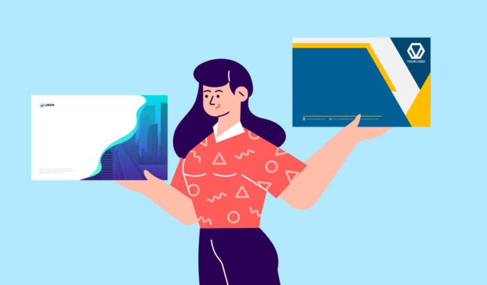
Website backgrounds are the images, splashes of color or design that fill the screen of your website. It’s also often the first impression a visitor will make of your website, brand and business, so it’s important you get it right. The ideal background will convey your brand story, while the wrong one can throw off your message. Your website background is like the outfit you would wear to a job interview or first date. Are you going for a fun and approachable look or something sophisticated and exclusive?
In fact, there’s actually a lot more to this seemingly basic aspect of web design than you think. It’s not enough for your website background to simply look good. Just like when you go on a first date or job interview, you need to make sure you tell your story, confirm the place you’re meeting is accessible and ensure the person you’re speaking to is enjoying their experience with you. Similarly, website backgrounds are expected to deliver a good User Experience (UX) and to be legible for your audience.

Website background basics
—
Before we jump into the tips, it’s essential to bone up on the basics.
Meet the two types of website backgrounds
The body background
The body background is the area that covers most of the screen. It’s where you’ll find backgrounds made up of illustrations, textures, a full image or color gradients. Oftentimes, it’s just plain white.
The content background
The content background doesn’t encompass the whole screen, but rather surrounds the area around other sections, like an image or text. It gives structure and helps emphasize and separate different website sections.

Use headers for extra pop
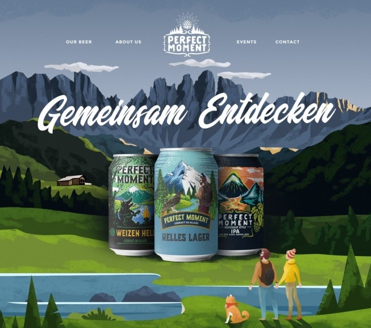
Your header is the top part of your page and is an important way to show off your website’s personality. It’s a great place to use eye-catching elements, like illustrations or a splash of color, because it probably won’t distract from the content underneath.
Go graphic
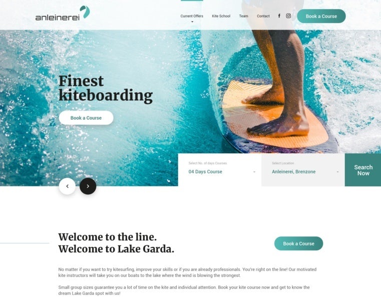
Using graphic elements gives your website a distinctive feel and tells a story by using just visuals. But make sure the style of using graphic elements is in line with the overall vibe of your website, so you deliver a consistent experience to users.
Beef up your background
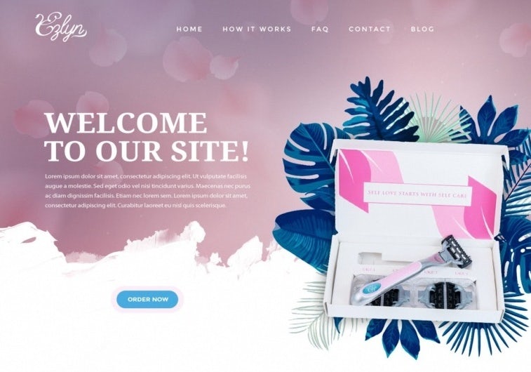
White website backgrounds are a simple and timeless choice, especially when you want to add lots of graphics and images. But full body backgrounds in web design (like using a gradient, full image or a solid block of color) can create a huge impact when executed correctly. Make sure the image isn’t too bright or that it doesn’t have any dark spots, to ensure it doesn’t distract from your content. You want to make sure your users can easily and instantly read what your business is all about.

Say hello to highlights
Highlights (very thin lines that are made up of different colors to separate sections of your website) help to break up solid color blocks and increase legibility.

8 tips for creating your ideal website background
—
1. Use clever color UI
Choosing your colors and their combinations when it comes to web design backgrounds is important as they contribute to how users will read your site. Color in web design can act as a way to garner attention, trigger emotions, generate desire, drive conversions and earn a user’s loyalty.
Make sure you take color contrast into consideration too. The wrong contrast can make it difficult to read the content on your website, making it inaccessible to visitors, so be sure to check your contrast ratio.
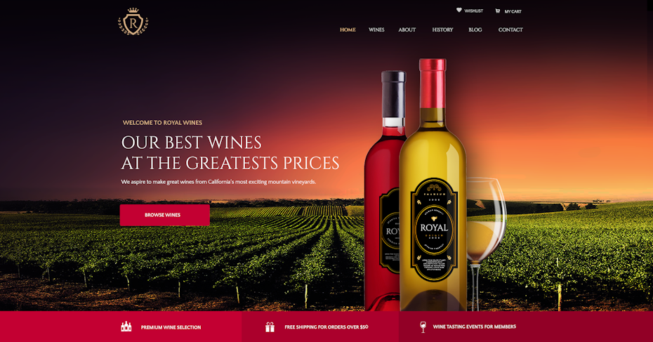
2. Make your background image super readable
The perfect background image needs to look good, but more importantly, it needs to make your content look great. There’s no point choosing a beautiful website background image if you can’t read the text on top of it. If you’ve found the perfect image but your text isn’t legible on top of the content, try using photo editing software or CSS to alter things like the contrast, opacity or even add layer masks. If that’s not helping, try choosing the right font and font size for the content itself.

3. Give solid color backgrounds a go
Photography not right for your website? Why not try using one solid color for your website background. Usually this is a great way to ensure your website is legible as long as the contrast is right. Just make sure that the color aligns with your brand, industry and the impression you want to give about your business. For example, warm colors like red and pink have an energetic effect on the user and could be great for fitness brands, whilst cool colors like green and blue generally have a calming effect and are actually the most common colors used on websites.
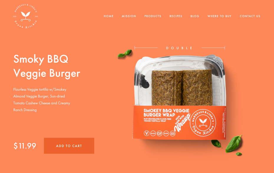
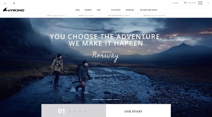
4. Avoid busy and cluttered images
This is especially important when adding text over your image. Even though you want to choose a striking image for your website, it shouldn’t take away from the message and story you want to tell. For example, landscapes can make great website background images, as they are both eye-catching and uncluttered.
5. Make it trendy
A website background that features a trend can make your design feel contemporary and new. Try using some of the biggest web design trends , geometric shapes, immersive 3D elements, glowing, luminous color schemes, dark mode or using the Pantone color of the year in your design. Just remember that using something trendy over a timeless design might mean that you’ll have to update your background sooner rather than later.

6. Get animating
An animated website background is a really good way to bring your website to life. Just remember to make sure the animation is subtle so that it doesn’t distract from the main image or messaging and doesn’t overpower the foreground of the design. Because animation has such an energetic feel to it, incorporating a subtle color palette is a good idea too.
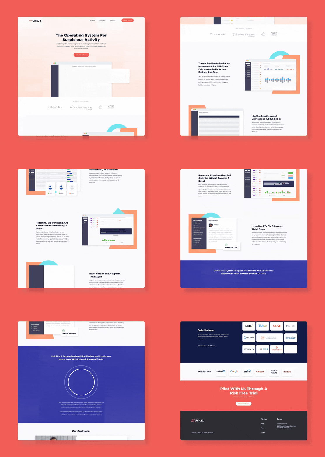
7. Go with a gradient
Yep, 90s trends are back, including the one that’s taking the design world by storm: gradients. Also known as color transitions, gradients are a gradual blending from one color to another color. They’re visually engaging and can be used as a stand-alone background or layered over a photo to really make your website pop.

8. Make it mobile friendly
We’re in 2020. Even if you’re designing your website on a desktop, the truth is that most online content is consumed via mobile devices. Make sure you consider the below website commandments to make your website mobile friendly:
- Make your website responsive.
- Make information people look for easier to find.
- Don’t use Flash.
- Include the viewport meta tag.
- Turn on autocomplete for forms.
- Make your button sizes large enough to work comfortably on mobile.
- Use large font sizes.
- Compress your images and CSS.
When choosing a website background image, make sure you select an image that’s likely to scale nicely for smaller screens. For example, a really wide image might not work on a handheld device.

How to get the website background of your dreams
—
Choosing the right background can take your website from mediocre to magnificent. Remember that user experience is everything, so choose colors and images that speak to your visitors and ensure that when choosing a website background image, you can read text over it clearly and easily.
Consider solid background colors, avoid cluttered images at all cost, and think about including a trend like a gradient or geometric shape, to stay contemporary and modern. Try your hand at animation if you really want to stand out from the crowd and make sure to always select a background that scales nicely for smaller screens.
Most importantly, remember that in design there are no firm rules. In fact, the best designs often don’t stick to the rules at all. What matters most is your user’s experience. Use these tips as a starting point and don’t be scared to trust your artistic reflexes.
The post 8 tips for creating ideal website backgrounds appeared first on 99designs.
No comments:
Post a Comment