If you’ve done any kind of design, you at least know a little bit about color psychology in terms of the associations we make between colors and emotions.
Red = passionate, blue = calming, and so on. We know that yellow is a playful shade, but why is yellow so uplifting? It’s tempting to say “it just is,” but that’s too easy of an explanation. Think about it—if our emotional associations with each color were innate, they wouldn’t vary across cultures. And they wouldn’t change over time, like how pink went from being associated with little boys at the beginning of the 20th century to being associated with little girls by the end.
One thing’s for sure: color matters. This is why it’s important to familiarize yourself with the fundamentals of color psychology before you start defining your brand’s best hues. Once you understand why a color evokes specific emotions you can harness color power in your branding to communicate at a subconscious level.
What is color psychology?
—
Color psychology is the study of how the colors we perceive impact our thoughts and feelings.

But before we dive into color psychology, we need to define what color is, exactly.
We see it as different hues and shades, yet technically, colors are how your eyes and brain perceive light waves of differing lengths. All light exists on the electromagnetic spectrum, the spectrum from longest to shortest light waves. Radio waves, microwaves, infrared light, gamma rays and x-rays are all at different length segments on this spectrum. Right in the middle is a small spectrum of light waves measuring from 400 nanometers to 700 nanometers, including all the light that’s visible to the human eye. The different wavelengths within this segment make up the variety of colors humans can perceive.
Researchers who work in the field of color psychology study our primal and cultural associations with specific colors and how exposure to these colors impact our biases and behaviors.
Let’s look at a real life example. Evidence from Scotland and Japan has shown that when a neighborhood’s street lights emit blue light, the crime and suicide rates in that neighborhood decrease. Color psychology researchers try to answer why phenomena like this occurs.
It could be because blue is an unusual color for streetlights, which makes would-be criminals feel like something’s “off” and drive them to abandon their plans. Or it could be because blue lights is often associated with a police presence—think the blue light emergency phone boxes on college campuses—and that drives people to be more cautious. Or it could be because blue is an almost universally recognized calming color, and walking under a relaxing blue light puts people in a less agitated state of mind than they’d be in under more red- or yellow-toned streetlights.
Humanity’s colorful history: how language influences color psychology
—
Ancient people didn’t see the same colors you see. In fact, people in other parts of the world don’t see colors the way you see them. It can be a bit of a trip to think about, but it’s true—research has shown that language influences how we perceive color.
A 2006 study found that members of the Himba tribe, a culture from Namibia that doesn’t have a word for the color “blue,” couldn’t pick out the one blue square within a circle of green squares when presented with the image on a computer screen. To English speakers, the blue square is obvious, but to the study participants, it was just another one of the green squares in the circle.
Interestingly, when presented with a circle of green squares that to English speakers, appeared to be very close in shade, Himba tribe members could immediately pick out the one square that wasn’t the same color as the others. That’s because the language they speak, Otjihimba, has words for many of the distinct hues we group as “green.”
Now think about how the ocean and the color blue feel inextricable to us. To an English speaker, the ocean just is blue.

Yet that’s not how Homer saw it. In The Odyssey, the sea is described as “wine-dark.” Honey is described as green and sheep are described as violet. Homer wasn’t the only ancient author whose world didn’t include blue, either—intrigued by the lack of “blue” as a color descriptor in Homer’s work, nineteenth century British scholar William Gladstone, followed by German philosopher Lazarus Geiger, closely studied ancient texts from cultures around the world and found that only one, the Egyptians, had a word for the color blue. They were also the only culture that produced blue dye.
Further, Gladstone and Geiger’s work found the same pattern in ancient languages spanning from India to Iceland: the first recorded “color words” were words for black and white.
Next, references to the color red were found in texts, with later texts introducing words for yellow and green. In each of these languages, blue was the last color officially recognized.
For Russian speakers, blue doesn’t stop there. Where English speakers see light and dark blue, Russian speakers see two distinct colors: goluboj and siniy, respectively.
The psychology behind color associations: how did we get here?
—
Researchers have determined that after white and black, red was the next color identified by nearly all cultures with written language. Why?

This may be because red is one of the most important colors in nature. Red is nature’s stop sign. It’s the color of an angry rival’s flushed red skin that says “back off or you’ll get your butt kicked.” Being able to identify red—and not just as a warning label, but also as the color of ripe, ready-to-eat fruit—was so critical to our survival that our primate ancestors evolved the retinal cells necessary to see it millions of years ago.
Not every animal needed to see red the way primates need to see red. So they didn’t develop the eye structure necessary to see the range of colors we see. You’ve probably heard that dogs are colorblind. That doesn’t mean they see in black and white. Dogs, and many other mammals, see a more blurred, lower-contrast world than we see:

Other animals evolved eye structures to see the colors they need to see to survive. For example, birds can see UV light. We can’t. Here’s an example of how the world looks to a bird:

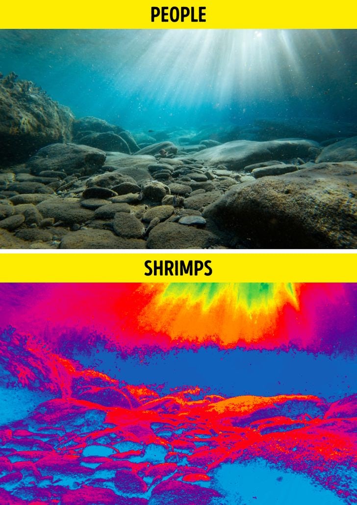
Some animals, like mantis shrimp, evolved to see the world in ways we could never imagine. Not only can mantis shrimp, the species with the most complex eyes we’ve identified so far, see UV light like birds, they see different colors of UV light. Check out how the world looks from a mantis shrimp’s point of view:
Just like our ability to see colors in specific ways evolved as a survival mechanism, so did many of the associations we make with specific colors. Universally, brown is seen as an “ugly” color. When you think about what’s brown in nature, it makes sense—rotting food, feces and mud are all brown. Brown is also the “reliable” color, perhaps because so many things in the environment, like tree bark, dirt and lots of different animals are brown. Similarly, green is the color of vitality and freshness because it’s the color of fresh, healthy vegetation.
Color psychology and culture
—
Some color associations, like red and brown, can be explained by looking at where they appear in nature and what they meant for early humans. But that doesn’t explain why black feels luxurious or why yellow feels fun.
Some associations come from culture, rather than nature. That’s why color associations aren’t all universal and color meanings can vary widely in different countries and cultures. In China and India, the color white is associated with death and worn to funerals. In the west, black is. Similarly, yellow is the fun, happy color in the United States, but in Japan, it’s the color of courage.
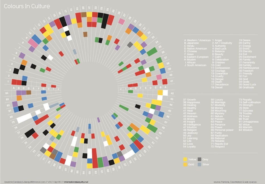

A color’s cultural associations can also change over time. Green, the color of rebirth and new life, changed to the color of death in Europe during the 18th century. Why? Because the era’s green dye contained arsenic and prolonged exposure to the dye literally killed people. Today, remnants of this association remain. Green is still sometimes associated with toxicity—ever feel “green” after a roller coaster ride or long, winding road trip? Now you know why.
Using color psychology to connect
—
There’s a reason why plant-based products almost always have green packaging. It’s the same reason why cleaning products are so frequently packaged in white. It’s color psychology; brands capitalize on our subconscious associations with specific colors to communicate their products’ values.
Remember that brown is the “reliable” color? UPS chose to make brown the focal point of their branding to emphasize that they’re trustworthy and dependable—exactly the kind of company you want handling your packages.

Whole Foods is another famous brand that uses color psychology to make a subconscious statement about their values. The logo is a medium green, the same color as a fresh spinach leaf or leek stalk. By going with a green logo, the company primes shoppers to view their store as the fresh, healthy choice.
Then there’s Target. The mega-store taps into our primal attraction to red. Target’s logo is bold; it makes you look and holds onto your attention.
A color cheat-sheet: the associations we make with popular hues
—
As you embark on your color journey, considering what shades best support your logo, website or other branding initiatives it’s helpful to keep our most common color associations in mind.
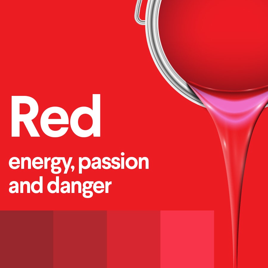
Red
Red is all about passion, action, energy and danger. Think stop signs, flames, the Target logo and roses.

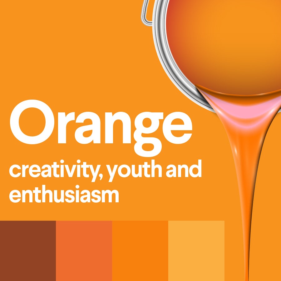
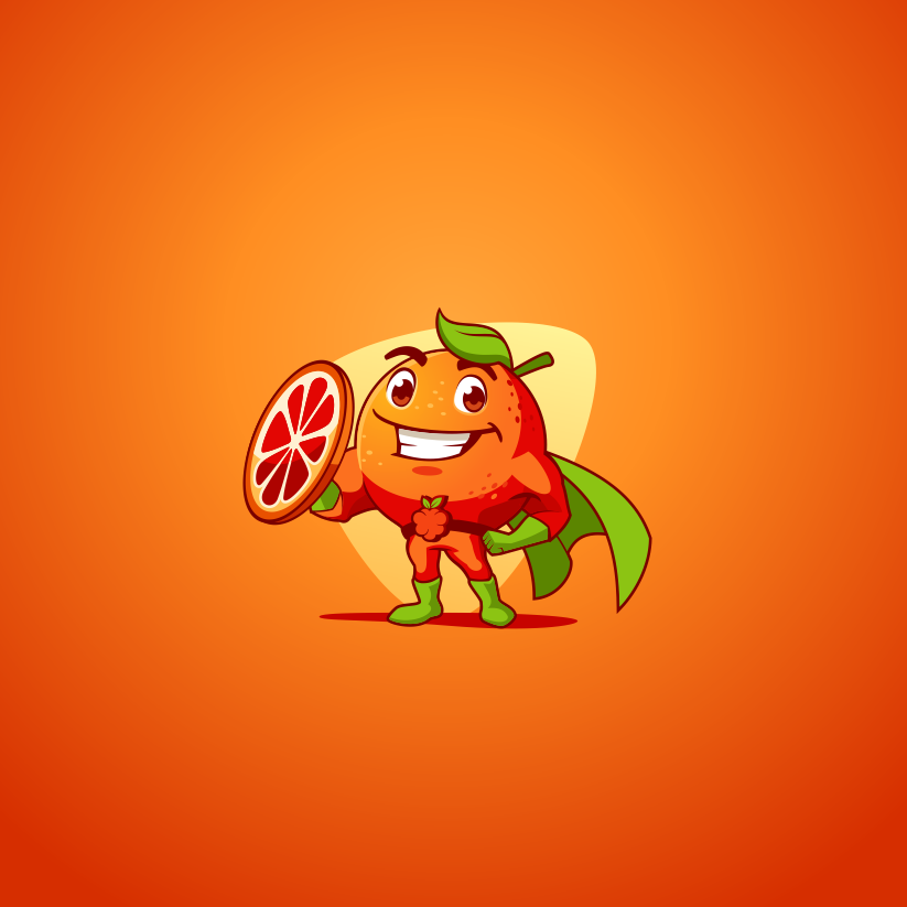
Orange
Orange is about creativity, enthusiasm, energy, creativity and youth. Think traffic cones, high-visibility clothing and a juicy orange bursting with vitamin C.
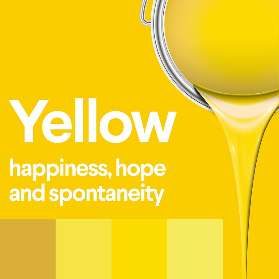
Yellow
Yellow is about joy, hope, playfulness, spontaneity and positivity. Think sunshine and smiley faces.
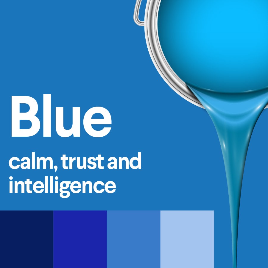
Blue
Blue is about calm and trustworthiness. Think financial institutions (Visa, Paypal, American Express) and major corporations (General Electric, Lowe’s, Boeing).

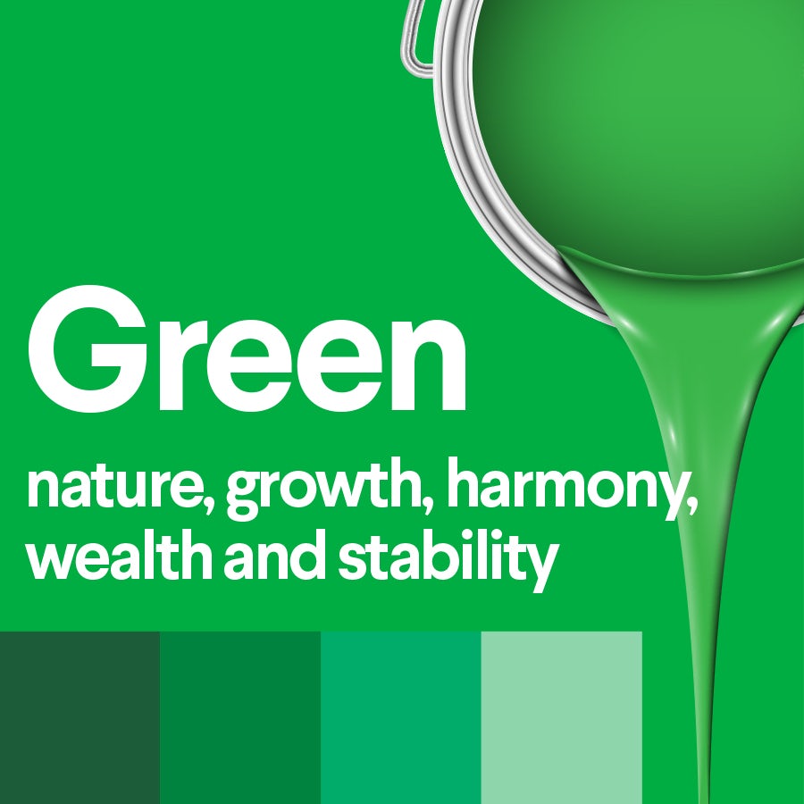
Green
Green is about nature, growth and wealth. Think trees and money.

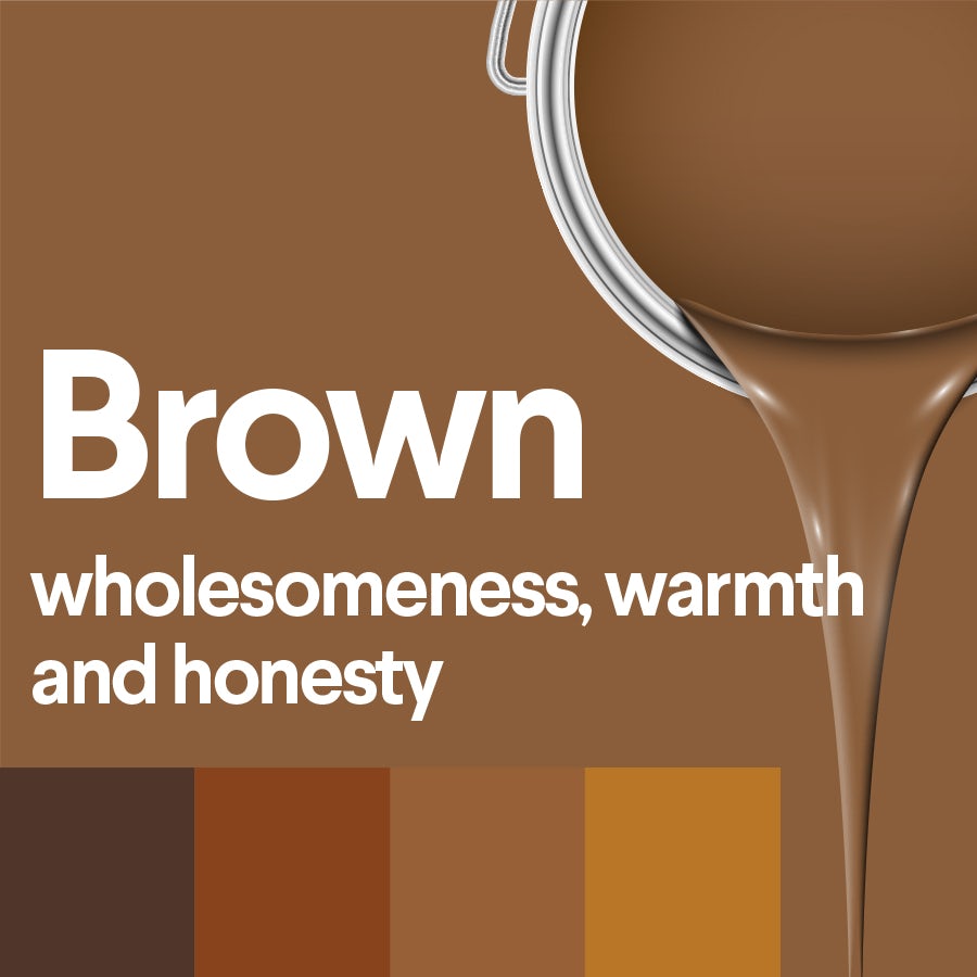
Brown
Brown is a down-to-earth color that stands for warmth, nature, honesty and wholesomeness.

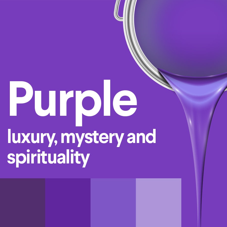
Purple
Purple is a mysterious color that stands for creativity, luxury, spirituality and wealth.

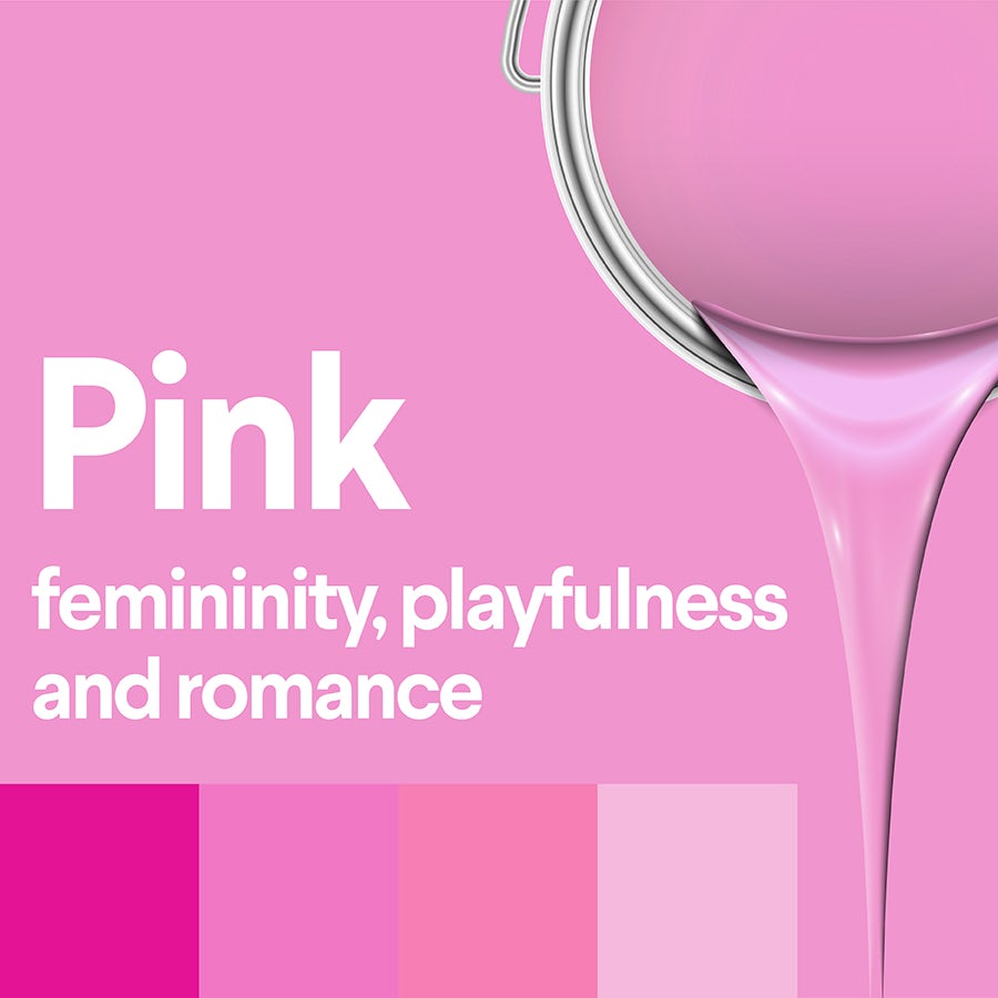
Pink
Pink is a youthful color that stands for romance, playfulness and femininity.

Color goes hand-in-hand with branding!
—
When you’re designing your logo, product packaging, website and everything else associated with your brand, be sure to keep color psychology and color theory in mind. Colors are powerful tools, and you can make a powerful statement, or send the completely wrong message, with the color palette you choose.


Need help figuring out which colors represent your brand best? Work with one of the knowledgeable designers on our platform to develop the perfect palette.
The post The fundamentals of color psychology appeared first on 99designs.
No comments:
Post a Comment