A successful landing page design is about transformation, turning curious observers into confirmed buyers. But how a landing page works is no magic trick: digital strategy and visual design come together to create a compelling product presentation. When done well, a one-time buyer might even change again—into a repeat customer.

Even though well-designed landing pages are much more likely to earn buys, they are sorely undervalued—with 44% of companies directing traffic to their homepage instead of a targeted landing page. It takes so much advertising, SEO and general marketing resources to generate interest for a product that businesses can’t afford to fail at the last step. But as much revenue potential as landing pages hold, they are only as effective as their design.
To make sure your design sticks the landing, we’re going to cover how landing pages work, the components of a landing page and tips on designing a great landing page. Though you might feel unsteady walking into a landing page design, we’ll help you find your footing.
How landing page design works and why it matters
—
A landing page, sometimes called a product page, is designed for marketing a specific product/service or otherwise getting the viewer to perform a specific action. It is often where users will be directed to when they click on a promotional link or when they search for products on Google.
A business’s website acts as a hub for all its products and services in addition to general company information. While landing pages are part of the company website, their goal is immediate persuasion and sales, and they accomplish this through specificity. A landing page is focused on one product, the copy is focused on describing and selling that product and the design is focused on making that copy readable, the product presentable and engaging the viewer. As such, landing pages (especially multiple landing pages) are much more effective at generating leads than the business’s website homepage.
Because landing pages are marketing tools, the success of their design is often measured in numbers: those of conversion and traffic. Conversion is the amount of page visitors who purchase the product (they convert from non buyers to buyers). As visually stunning as a landing page might be, if conversion rate is low (around 2% is considered average), your design is failing to meet its ultimate goal.
 .
.Traffic includes information on who is visiting your page, including the total number of visitors and how long they stay. When visitors leave a page without purchasing, they are said to have “bounced” off of it. Though traffic metrics might not be as important as conversion (a high traffic landing page with a low bounce rate isn’t much use if no one is buying), the amount of people who make it through your entire landing page can give you insight into how engaging your design is. The good news is that viewers who stay on a page longer than ten seconds are significantly more likely to read through the entire page. Great design combined with clear and compelling information is your best asset for holding their attention through this critical window.
Looking for landing page inspiration? Take a look at this article full of stunning landing page design ideas.
The anatomy of a landing page design
—
There’s no one way to design a landing page. After all, what is most important is that your landing page effectively informs and persuades viewers. That said, years of landing page design have created conventions users are accustomed to, and these can act as foundations on which to build. The following is a breakdown of the most common elements of a landing page design.
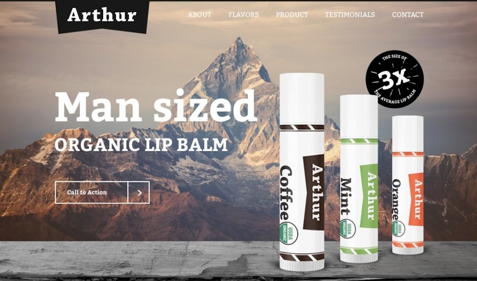
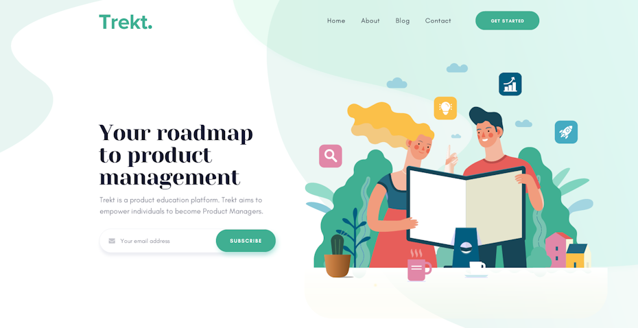
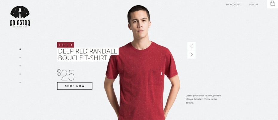
Header
The header is the first section of a landing page—a rectangular space usually taking up most of the initial page screen. Though its size can vary, it usually contains these components:
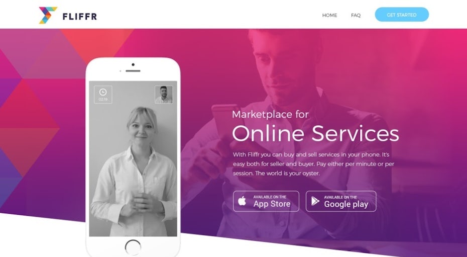
- Branding: The company logo and the product logo (if applicable).
- Hero image: The main, most compelling image associated with the product, usually in the shape of a banner. It can be of the product itself or an illustrated or photographed scene that captures the experience of using the product.
- Headline: The copy that accompanies the hero image, making a succinct pitch.
- Sub-headline: This identifies the product and gives a more detailed summary of its benefits (referred to as a value proposition)
- Call-to-action: Otherwise known as CTA, this is the button (and inset copy, “Buy now!”) users click to be taken into the purchase flow. CTAs are important, but be wary of overusing them—this can clutter the page and come across as hard-selling. Consider instead a fixed bar that keeps the CTA at the top of the screen as users scroll. (Note: CTAs might have other purposes, such as gaining subscribers or downloads, but for simplicity’s sake, we will be largely referring to purchasing throughout this article.)

One common header design element you want to minimize whenever possible is navigation. Though most web pages include a navigation menu, a landing page is not a “normal” web page. It is designed to keep viewers on the page until they are ready to buy whereas a navigation bar with lots of options encourages them to travel elsewhere.
Content
The content section is the main body of your landing page. While the header is meant to introduce the product and capture the user’s attention, the body should be focused on detailing the value proposition and building out a convincing argument for conversion. The content of a landing page often includes:
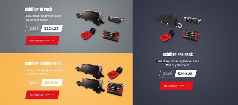

- Supporting graphics: Secondary product images (of other angles or of customers using the product), icons that simplify bullet points and colors or abstract shapes that guide the viewer’s eyes down the page.
- Product specs: Copy that breaks down how the product works in clear steps. Links that expand on each of these steps (i.e. “Learn more”) can be helpful for settling doubts, but again be wary of transporting users away from the landing page.
- Benefits comparison: This makes the case for how the product improves customers’ lives, sometimes by comparing it to those of competitors or by identifying and resolving consumer pain points.
- Peer validation: Past customer ratings, reviews and/or testimonials, all of which build the viewer’s trust in the product through positive social references.
Footer
The footer is the end of the tarmac for your landing page, where viewers will have to make their final decision. It usually includes the following:

- Links to other pages: You may want to link to other relevant pages on your site, such as your FAQ page.
- Social media links: This can be a controversial inclusion (as mentioned before, you shouldn’t encourage users to perform actions that don’t involve the CTA) but it can improve traffic to provide links for users to share the landing page with their followers on social media.
- Contact info: A phone number or email address gives customers a place to turn if they have more questions.
- Legal information: Website and product copyright along with other legalese. This is generally contained within a dark bar at the very bottom of the page to separate it from the rest of the content.
6 tips for designing a landing page
—
It’s one thing to know the common components and goals of a landing page, but how do these translate to visual design principles? Although a landing page’s look will vary based on the designer and the brand, the following are general guidelines and tips for effective landing page design.
1. Adhere to minimalism
Minimalism refers to restricting the design elements of your page (color, typography, imagery, etc) to the bare necessities. As you design, interrogate your every decision. If a design element isn’t adding to the user’s understanding of the product or to the argument for purchasing, get rid of it.

There are two major reasons why this is important. First, it is good practice to assume that, even though they chose to visit the page, users are only marginally curious about the product, and every distraction risks losing their already wavering attention. Alternatively, giving the copy room to breathe with plenty of whitespace emphasizes the information and makes the text less intimidating.
Second, more graphic elements often means longer load times. Given that bounce rate increases exponentially with every second a page takes to load and search engines even penalize slow pages, your landing page should prioritize speedy loading over flashy graphics.
2. Take advantage of “the fold”
Although a less-is-more approach might tempt you to think short pages without scrolling are better, longer landing pages tend to be more effective at retaining viewers. A longer page creates an opportunity for increased spacing between elements whereas a short page could make the same design feel cramped and cluttered. And scrolling is a small touch that makes pages feel more interactive than, say, an in-your-face billboard might.

The best way to capitalize on scrolling is to design around what is known as the “the fold.” This is the line at which a web page is cut off due to screen resolution, forcing the user to scroll down to reveal what lies beneath. Though physical screen sizes vary, most above the fold resolutions are 1000 x 600px. By having intriguing, half-hidden graphics or copy peek just over the fold, you can tempt the user to scroll down and further interact with your page.
3. Optimize for reading patterns
Reading patterns describe the common ways that users scan web pages (based on eye-tracking research), and designers can use alignment and spacing to organize text to facilitate this. Because most users scan web pages before committing to reading them (with 79% never moving beyond the scanning phase), it is in your best interest to optimize your design for scanning. Split up copy and graphics in a way that makes lines of text easy to read at a distance but that also subtly guides readers down the page and towards the CTA.
These are the two most common reading patterns your landing page design should take into consideration:
- Z pattern: Users trace an invisible “Z” with their eyes as they scan left to right. This is useful for image-heavy designs and can make page layouts feel more dynamic by scattering elements in a zigzag and having users dart their eyes quickly from one side to the other.
- F pattern: Users trace an invisible “F” with their eyes as they scan left to right. This tends to be more useful for text-heavy pages as the shape is more conducive for line-by-line reading.
4. Design for interaction
Interactive elements are one of the biggest assets the web offers designers over print products. Landing page designers can use interaction to invite users to participate rather than passively read marketing materials, which can make the experience feel more like a game than an ad.

Standard scrolling is one obvious form of interaction, and though not to be discounted on its own, designers can ramp this up with animations such as vertical or horizontal swipe transitions. Hover animations can make the page come to life under the user’s mouse cursor, with graphics either moving, fading in/out or changing color. If you are selling a physical product, allowing users to rotate a 3D rendering of it can invite them to virtually test it out.
The CTA button is your most important form of interaction, so clicking on it should feel positive and satisfying. This can be achieved by creating an animated physicality as the user clicks on it. Even though these animations should be subtle to avoid distraction and long loading, they will go a long way to keeping users entertained and engaged.
5. Design shared landing page schemes
If your business produces a number of different products or services, make separate landing pages to maximize conversion for each one. But the more landing pages you create, the harder it can be to scale the design process. The way to mitigate this? Take advantage of the same layouts.


Though landing pages should be tailored for each product, they are also a part of your brand. Maintaining consistency between them is important for creating a recognizable visual signature (which helps users trust your brand), but it also makes designing and budgeting multiple landing pages more feasible.
Start with one landing page and rigorously test it for performance (more on that in the next section). Once you have a working design, use its layout scheme as a blueprint for the rest of your landing pages. Different products may have different audiences, so make sure you continue to test each of these pages and differentiate their design if necessary.
6. Test every design element
The unfortunate truth is that despite following these tips, your landing page may not convert the way you expect it to. Landing page design comes down to more of a science, where facts and figures take precedence over aesthetic preferences. The key variable in your design equation is the target audience. Every audience is unique, and the only surefire way to know whether your landing page design is resonating with them is to test and adjust your designs accordingly.
Split tests, sometimes called A/B tests, in which two different versions of a design are tested on two separate customer groups, are a common way designers and marketers decide on the best result. Use this method to test every element of your webpage, from the header to the ad copy to the images to the shape of the buttons. In this way, you can be confident that your landing page design not only looks good but that your users agree.
It’s time for a landing page design that takes off
—
As you start your landing page design you have to assume that your viewers are looking for any reason to bounce off, and that it is up to your design to keep them grounded.
Though there are many factors that can contribute to a high bounce rate—unclear descriptions, overpricing or even just an underwhelming product—good design is one of the best factors in reducing it. While this guide is intended to give you a place to start with your landing page design, the most reliable way to get a great landing page design is to work with a professional designer.
Want to learn more about web design? Here’s a step by step article on how to create a website from start to finish.
Get a landing page design that will take flight!
Our talented designers can help you create the ideal landing page for your product.
The post How to design a landing page: the ultimate guide appeared first on 99designs.
No comments:
Post a Comment