You’re an airplane flying around the internet at breakneck speeds. Suddenly an ad catches your eye—it’s a free webinar for that new skill you’ve totally been meaning to learn for the past six months! You click it and immediately, you’ve landed. You’re scrolling down a new page, reading about everything the webinar covers and, finally, you’re at the bottom looking at a big bright button. Click it to reserve your spot in the webinar. You’re not on just any page; you’re on a landing page. But, what is a landing page?
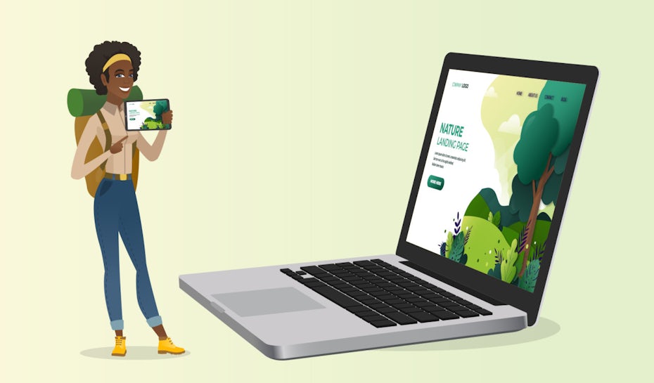
Exactly what the name implies, it’s where internet traffic “lands.” If a website’s a city, its landing page is the airport where inbound flights meet the ground and let their passengers out. And just like people get their first impressions about a city as they walk toward the airport’s exit, so too do visitors get impressions about you, your brand and what you’re offering the moment they arrive on your landing page.
And that’s why your landing page has to be on point. It’s where you grab readers’ attention and drive them to do what you want them to do. An effective landing page not only impresses, it also suggests, guiding visitors to a particular location, convincing them to “sign up”, “buy” or “subscribe”.
In this guide, we explain the ins and outs of landing pages: what they are, how they’re used and more importantly, how to make them effective.
What is a landing page?
—
A landing page is a web page that’s focused on marketing a specific product or service or otherwise getting the viewer to act on a “call to action”. Often, a person’s journey to a landing page starts when they see an attractive beacon like a social media ad or a link in an email. When they click it, they’re taken to a landing page.
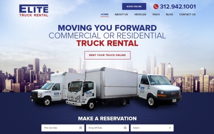
A landing page isn’t the same as a homepage or a splash page. A landing page is hyper-focused, optimized to get viewers to take one specific action—all the text, images and navigation are directly related to whatever outcome the page is driving. Every element is designed for the logical progression leading the visitor towards a button to click or a form field to fill in.
Landing pages exist to drive conversions. And they’re transparent about it. When you’re on a landing page, you know exactly what you’re being offered and what you’re being asked to do from the moment it finishes loading.

In contrast, a homepage is more like a website’s table of contents, its main navigation hub that gives you a quick look at what the site’s all about. It’s usually where you land if you got there via search engine or a social media profile. As opposed to landing pages, homepages don’t have a single focused goals; they’re more open-ended, giving the visitor all their options so they can go where they want.
A splash page is a gatekeeper that visitors pass through to reach a website’s homepage. In many cases, a splash page verifies visitors before they get onto a homepage, for example, a brewery’s website might have a splash page that asks visitors to enter their date of birth. Or a splash page might tell visitors about an offer or promotion they can take advantage of, sometimes requiring them to share their email addresses in order to get it.
Although similar, the main difference between splash pages and landing pages is that splash pages are always closely connected with the main website, whereas landing pages can exist on their own.
Anatomy of a landing page
—
Every landing page is unique, but the successful ones usually contain the same key elements. Each of these elements plays a role in driving the reader to take a specific action.

Headline
Your headline is your attention-grabber. It piques the reader’s interest and makes the idea of scrolling down irresistible. Here’s where visitors first meet your unique selling proposition (USP), or what you’re offering to them that they can’t get elsewhere. Even if you’re offering a common service, your USP could be your low price or some other perk/feature offered by only you.
Subhead
Underneath the headline, you’ve got your subhead. This is a follow-up to the headline that adds details and/or further persuades the reader to continue engaging with the text. The subhead is ideal for putting all the essential information about you that didn’t make the cut for the headline.
Supporting copy
The supporting copy follows up your subhead by explaining your offer in more detail. It discusses your company, why you’re great at what you do and how the reader benefits from taking the action you prescribe. Here, you explain exactly what the reader can expect to get by taking you up on your offer.
In the supporting copy, you also build urgency. Tell readers how long the offer’s going to last and what will happen if they don’t act now. Maybe they’ll have to pay full price, maybe they’ll miss the opportunity completely. The point is, give them a reason to click on that lead capture right now—not later, not tomorrow, now.
Images
Show your readers what they can have with some high quality images. Depending on your offer, you could use images of the items for sale or photos about how your company improves people’s lives.
Don’t cheap out on images. Your landing page isn’t the place for generic stock photos; make sure you have eye candy that underscores your offer’s value.
Benefits
Here’s where you really “sell” your offer. Often, benefits are in bullet lists for scannability because that makes them really easy for readers to glance at and take in.
The benefits may be part of your landing page’s supporting copy or they can be a section of their own. Their purpose is to quickly explain exactly why your offer is so great.
Trust-builders
Trust-builders are images and text you include on your landing page to get the reader to trust you. Often these entail testimonials from previous buyers or logos from famous clients (known as social proof), as well as stats about your success or your customers’ satisfaction. You can also include badges showing your credentials, like proof of a secure checkout system.
Lead capture
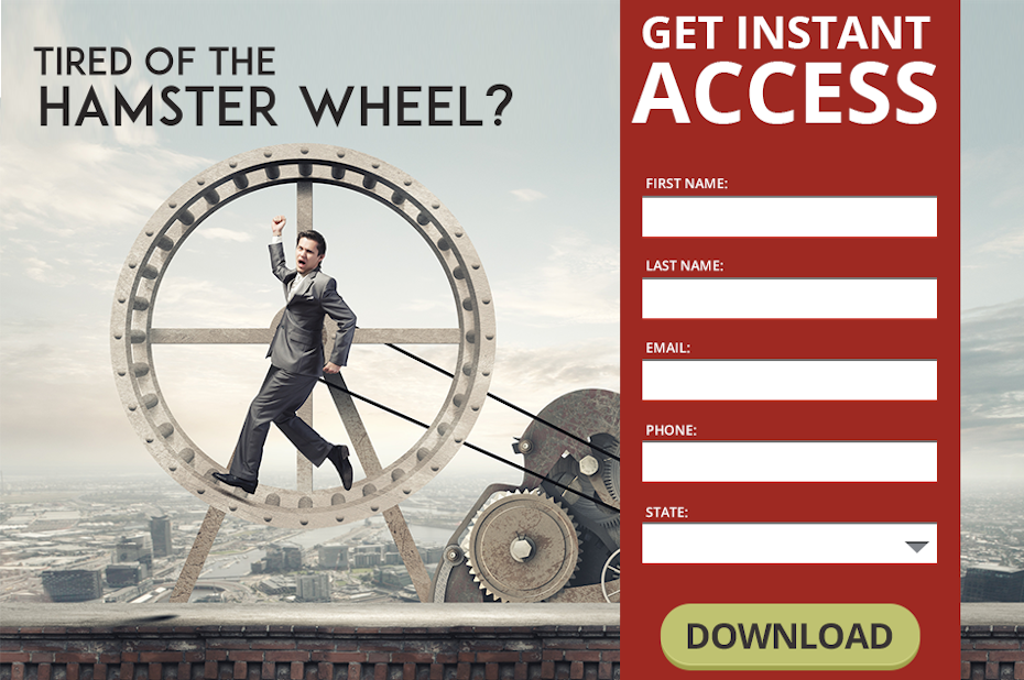
Finally, this is where your visitors convert—or don’t. Your lead capture is the action you want them to take, the culmination of all your landing page’s hard work. It could be a form right on the page where readers share information or it could be a button that brings them to another page where they give you the info you’re after.
Whichever it is, it needs to be big, bold, obvious and visually appealing—the whole purpose of the landing page is to drive readers here. A common trick is to use a contrasting color to draw attention to your lead capture.
Lead captures should also have clear calls to action (i.e., “sign up now”) nearby to encourage people to engage the lead capture through the power of suggestion. You can improve conversions by telling your reader explicitly what you’d like them to do, just be careful about not sounding pushy.
Keep in mind that a landing page doesn’t have to have all of these elements in this specific order to be effective. Some landing pages have the lead capture form at the bottom, others have it along the right-hand side of the page. Some landing pages have lots of text explaining the offer, while others explain it through a video.

It will probably take a few tries to find the arrangement that works best for you. Figure this out faster by split-testing two designs at once and taking a look at which performed better. Tools like Google Analytics can help with this.
Want more landing page inspiration? Check out these inspiring landing page design ideas.
Why landing pages matter
—
According to truelist.co, readers spend about eight seconds on a landing page before they decide whether to keep reading or X out. Only about 50 percent of landing pages are optimized for mobile devices, and targeting a page correctly can increase conversions by 300 percent. A one-second loading delay can lower conversions by seven percent.
If you’re not certain what those phrases mean, we’ll define them for you in a minute. But first, take a look at a few more landing page statistics:
- The average landing page conversion rate across all industries is 2.35 percent
- Of all the visitors who read a page’s headline, 90 percent also read its call to action
- Videos on landing pages can improve conversions by 86 percent
Landing page conversion rates vary by industry, so be sure to research the average rate for yours to set realistic goals.

As you can see, landing pages are a critical part of online marketing. They enable you to get valuable information about your prospects and often they’re key milestones in your sales funnel. Let’s quickly define a few important concepts to understand when you’re developing an online marketing strategy:
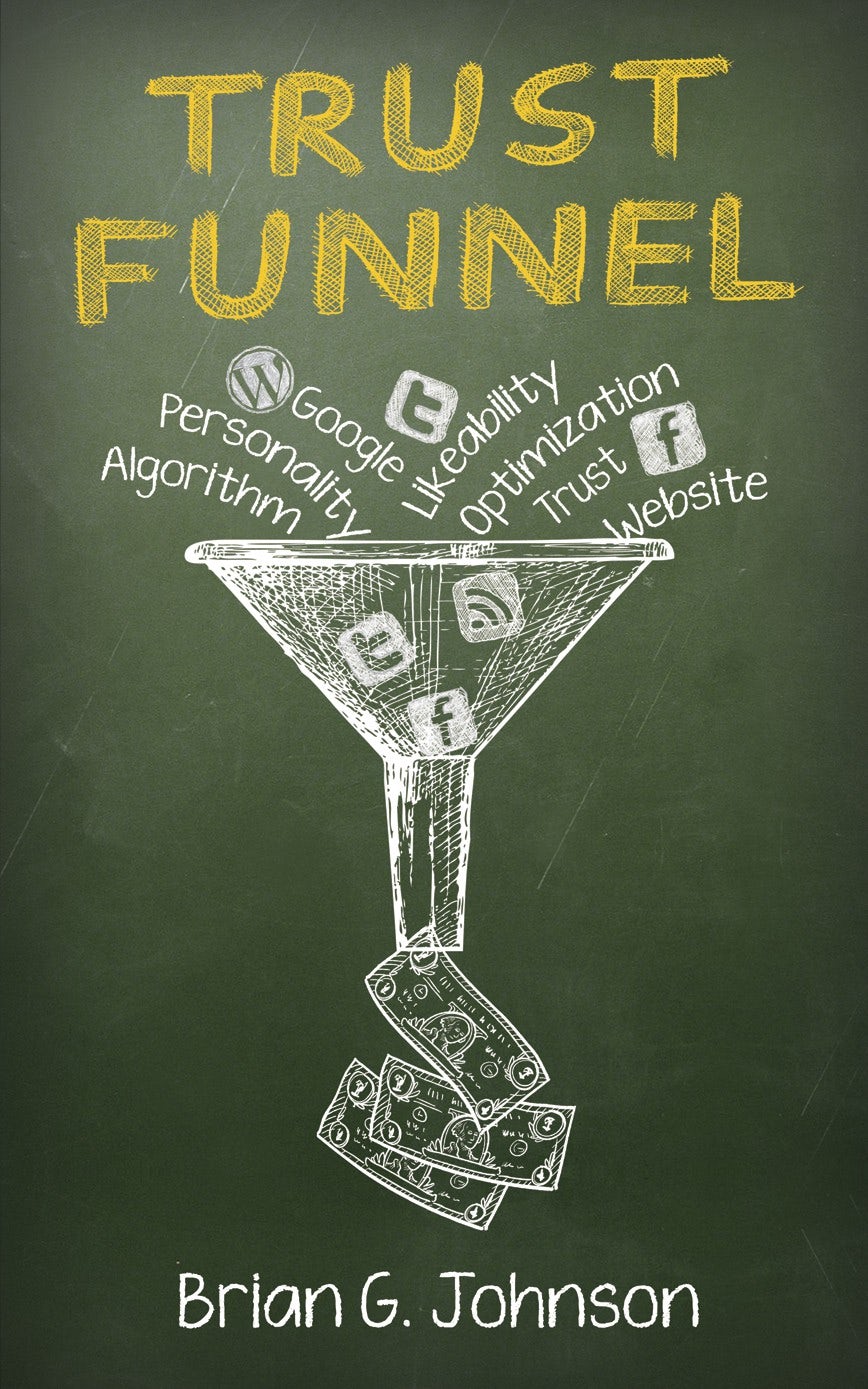
Sales funnel. A sales funnel is a series of steps designed to turn people who are interested in your product or service into people who actually buy your product or service. The term comes from pictorial representations of this process: imagine a wide pool, like all the people who see your brand’s posts on Instagram. That’s the top of the funnel, the people who are aware of your brand. Within this pool, a smaller group of people—your brand’s Instagram followers—are interested in your brand. They’re a step down the funnel, a step closer to buying from you. Within that group, there’s a smaller group who’ve decided to buy from you. And of those people, there’s an even smaller group of people who actually do buy from you—the narrowest segment of your funnel.
In this scenario, you might create a post offering the opportunity to get access to your next launch before it officially launches. Interested followers click the link in the post and reach a landing page where they can get access by giving you their email address.T his landing page sits at the threshold between interested and dedicated, bringing visitors closer to becoming buyers.
Leads. Leads are the people who’ve shown interest in your brand and are likely to be converted. Using our sales funnel example, they’re the people who’ve shared their email addresses on the landing page. In other words, leads are the individuals who’ve chosen to engage with your brand and expressed that they’d like to continue a relationship with you.
Lead generation. Lead generation is all the effort you put into cultivating leads, like posting to social media, running ads, creating landing pages and building brand awareness in general. It’s the very top of your sales funnel, the widest part where you introduce your brand to the world.
Conversions. A user “converts” when they take the action you want them to take. On a landing page, a conversion would be clicking a button or sharing an email address. On a sales page, a conversion is a purchase. Depending on your goals, conversions could also be clicking an ad to reach a landing page or following your page on social media.
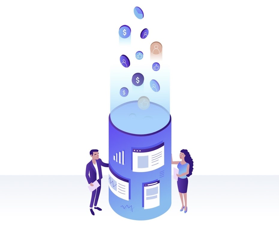
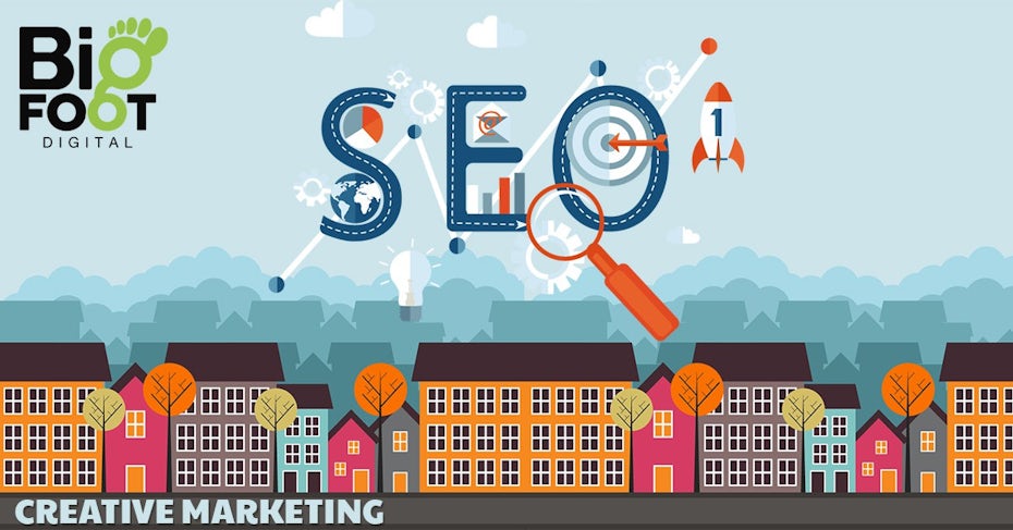
SEO. Search engine optimization (SEO) is a category of strategies to help your landing page (or any kind of page) rank higher on search engines. SEO strategies involve:
- Using high-ranking keywords in your title, metadata, headers and copy
- Including quality content on your page
- Adding images and videos to your page
- Ensuring your page loads quickly
Call to action. A call to action is a piece of copy that directly tells the reader to take a specific action. Call now, read more, click here—these are all phrases used as calls to action. Calls to action are a crucial part of any landing page and the best practice is to use them in multiple spots, like right below the benefits, immediately following the supporting copy and on the button readers click to submit their info. In fact, the landing page as a whole is a call to action.
What makes a good landing page?
—
A good landing page doesn’t leave any room for readers’ questions. It tells them everything they need to know so they feel like clicking that lead capture button is a great choice.

With this in mind, you need to carefully research exactly who your target audience is after and what they respond to. Refer to the ideal customer persona you’ve created and imagine you’re speaking directly to this person when you’re writing your landing page copy.
Regardless of your customer persona, certain design and copy choices are proven to work for landing pages. These include:
- Clear, catchy headlines (that include keywords!)
- Uncluttered page layouts
- Short, simple forms
- Clear, frequent calls to action
Want to learn more about landing page design? Here’s how to design a landing page from start to finish.
An effective landing page also makes clear what your company does for visitors who aren’t already familiar with your brand. Again, a landing page is a confusion-eliminator—if there’s any possible way a reader can reach the end of your landing page and still have questions about who you are, what you’re offering and why it’s an amazing offer, you need to rework the copy to make these points clear.

Take a look at landing pages from other brands like yours. You can find these by signing up for their newsletters, following them on social media or simply googling their brand name + landing pages. Make copies of the ones you like best to find inspiration in them and analyze why they work well. This collection is known as a swipe file.


What makes a bad landing page?
—
Just like eye-catching copy and direct calls to action make great landing pages, wishy-washy copy and passive suggestions make lousy landing pages. Here’s what else can hurt a landing page:
- Cluttered design
- Irrelevant images
- No images
- Poor SEO
- Unclear calls to action
- Slow loading speeds
- Not being optimized for mobile
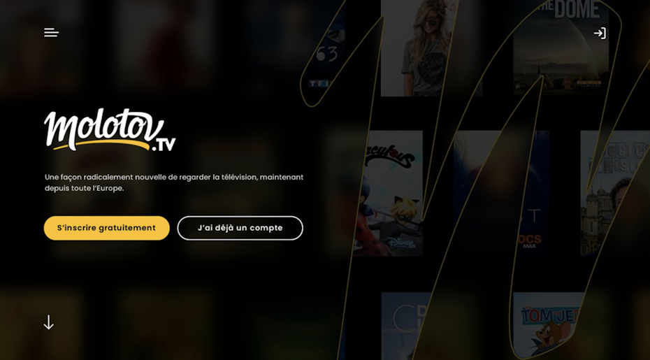
As of 2020, about half of the world’s web traffic is via mobile devices. That means about half of your audience—possibly more, depending on your niche and your brand—is engaging with you on their phones. Make sure your designer optimizes the page for mobile as well as desktop screens.
In that same conversation, make sure your images and videos are compressed small enough so they don’t slow your loading speed. Loading speed does impact SEO, as do images that aren’t tagged properly.
I have a landing page… now what?
—
A landing page isn’t something you plop into a marketing strategy; it’s an integral part of your marketing campaign from the drawing board. As you develop marketing strategies, think about where landing pages fit into them. If you think about these strategies like funnels, think about where in the funnel a landing page could help most.
If you’re looking to add subscribers to your email list, add a link to a landing page that tells readers to “subscribe for more great info” at the bottom of each of your blog posts. Similarly, if you’re offering something your followers want, like an ebook or valuable PDFs, you might create a social media post that links to the landing page where they can get the ebook or PDFs.
Drive more traffic home with an awesome landing page
—
When you’re selling a product, building an audience, seeking clients or giving away great content, a well-designed landing page isn’t optional. The internet’s buzzing with thousands of people who’d love to engage with your brand, so you’ve got to give them a clear path to follow to reach you. A landing page is a direct route to you, and a direct route to conversions for you.
Ready to up your game with stunning landing pages?
Work with a skilled landing page designer to make it happen.
The post What is a landing page? And why do I need one? appeared first on 99designs.
No comments:
Post a Comment