Thursday, October 15, 2020

Go Service Error Strategies

A well-reasoned error strategy is vital to the health of backend services. It’s important to consider how to handle an error, and if it cannot be handled then how to log it, what information is useful to be logged with, and who gets notified.

The backend service responsible for launching one-to-one projects on 99designs was failing for some number of customers. Unfortunately because of a mixture of problems with the existing error strategy, it was hard to get a clear understanding of the scope of errors occurring. Errors were being handled multiple times, there were many redundant or unimportant errors, and logged errors had inconsistent metadata. This lack of intentional strategy led to drifting standards across codebases.

We spent some time investigating our existing error strategy and inventing a model for how our errors within our Go Twirp services should operate. This post gives some context on Go errors and Twirp, details on some of the issues we faced, and lays out our strategy for error handling going forward.

go gopher illustration with three gophers holding lock and key
Go gophers (originally created by Renee French). Design by denidon.

It’s worth mentioning that although we use Twirp for inter-service communication, this advice should equally apply to gRPC setups, or other RPC frameworks that use Go errors as part of their handler signatures.

Background

At 99designs, our blueprint for new services consist of small Go binaries, that communicate via Twirp, either between each other, or to our frontend through our GraphQL aggregation service.

Errors in Go

Errors in Go are just values. Apart from having the built-in error interface, they are more a language convention than feature. By convention an error can be returned from a function if an error case occurred, and it is the responsibility of the caller to check this value and take appropriate action.

Any type can be an error as long as it implements the error interface. The default error type returned by the errors package is just a string containing the error message.

This model, in contrast to a feature like Exceptions, forces a developer to think about and handle error cases in the immediate context of the calling code. Having this be a strong convention also allows tools to easily lint for error checking and ensure good practises are maintained.

However one common anti-pattern we see in our services, is when a function returns an error, it is simply returned back up the stack to the caller, which can often similarly return the error to its own caller. In some ways this is the reverse problem that Exceptions have; the developer returns an error and hopefully there is something up the stack that knows the correct thing to do and will deal with the error appropriately.

Panic and Recover

The other error mechanism Go has are panic and recover statements. This mechanism is similar to an Exception, in that execution of the current function will stop and return to the caller. Deferred functions are executed however as the panic propagates up the stack. You can read more about how panic and recover work in this blog post.

Error Wrapping

Since Go errors are just values, Go does not provide much in the way of tooling in the standard library to work with them. However Go 1.13 added some utilities for dealing with common error patterns; specifically providing a standard way of wrapping errors with additional context made popular by packages like github.com/pkg/errors.

Twirp and Errors

Twirp is a protobuf API protocol over HTTP. Writing a Twirp server is convenient, because a developer can focus on service logic rather than transport or routing concerns; all that is required is writing the protobuf definition and implementing generated RPC handlers. These handlers have an error in their return type, and the Twirp server attempts to convert returned errors from a handler into an HTTP equivalent error that is returned to the client.

Twirp defines a range of useful error types that are mapped onto HTTP equivalents. Handlers may also return any valid Go error type, which Twirp will treat as if it was a twirp.Internal error mapping it onto an HTTP 500 response. We’ll unpack what this means for our handler code in the discussion below.

Bugsnag

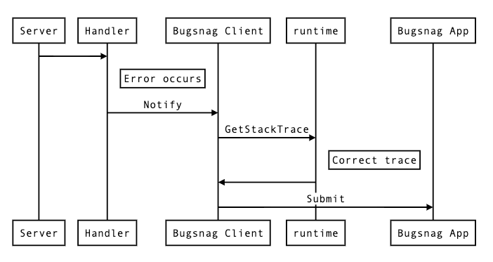
Bugsnag is the error reporting and monitoring service we use. Errors can be submitted to Bugsnag using the Notify method of their Go client package. Because Go errors are just values, the error interface does not provide methods for retrieving stack information.

So the Bugsnag client will wrap an incoming error with stack information using the Go runtime package, and submit that along with any additional meta-data to Bugsnag. This can be done anywhere using the github.com/bugsnag/bugsnag-go/errors package, and is also done automatically upon call to Notify.

Bugsnag error process

Bugsnag will collate these errors and attempt to group them such that you can see the same error grouped together. Operations such as “ignore” or “mark fixed” can then be performed on these groups.

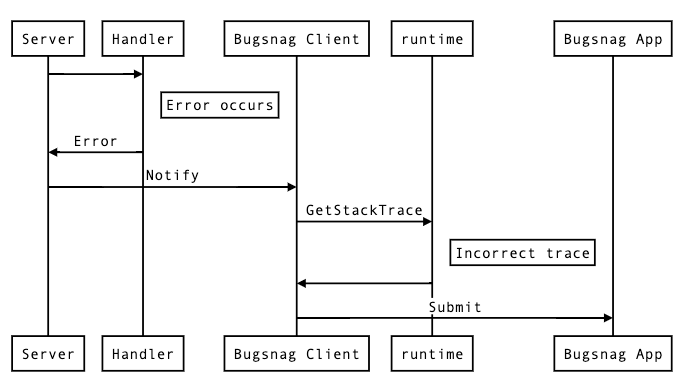
Constructing a stack trace like this works well for normal calls to Notify, but falls short when attempting to put in place automated notifications in a part of code that is outside the stack from where the error occurred. This is because the default grouping in Bugsnag groups errors by 2 metrics: the “type” of the error (which is Go is usually just a string), and the file location of the top frame of the stack trace sent by the client. So when attempting to write something like a global error handler, stack information can be lost, and all errors can appear to originate from the place that Notify is called in such a handler.

Bugnsag error process

Problems with Existing Error Strategy

With that context in mind, let’s take a look at some of the common issues we ran into in our Go Twirp services with our existing error strategy.

Twirp Handlers Returning Errors

As mentioned earlier, generated Twirp interfaces expect back a response message, and an error from the handler function. Any error that is not typed with a Twirp error code is wrapped in a Twirp internal error and treated as a server error.

This can be a problem in cases where there is an error with the request itself. An example might be attempting to retrieve a non-existent record, attempting an action that is not permitted, or a malformed request body.  These are errors that are caused by the client side, so treating them like an internal server error does not indicate to the client that the problem is their responsibility.

Returned errors are also transmitted back to the client, and can lead to accidental leaking of information that the client should not otherwise be able to access.

Bespoke Calls to Bugsnag Notify

In the absence of some sort of higher-level automatic error handling code, developers are forced to put bespoke calls to notify Bugsnag at points they think they will likely encounter an error.

There are a number of issues with this approach. Firstly it’s inconsistent, and you can’t get a good picture of all the errors occurring on your platform. Errors are only logged in places that a developer remembers to call Notify.

Secondly, unless you terminate a handler on the spot, you run the risk of sending a notification for an error multiple times. This can create confusion when reviewing errors, as multiple notifications have the same source.

Bad Stack Traces

The generated Twirp server does provide hooks for running code when an error is returned from a handler.  This initially seems like the perfect place to do an automated Notify call, however recall that Go errors do not have any Stack information associated with them.  Recall also that Bugsnag groups errors by the last stack frame.

The automatic Notify call will have the same stack trace for all errors, and therefore all errors will be grouped together in the Bugsnag interface, meaning that bulk actions cannot be performed on subsets of errors.

No Context on Returned Errors

When returning an error from a function, it is often important that context is added to the error so that either the caller, or a developer reading the error has a better understanding of the error condition that has occurred.

Many existing calls do not do this however and return the raw error back to the caller. This leaks implementation details, and can be difficult to trace what the actual error condition is.

A Better Error Strategy

Our Go microservices are small enough that it should be possible to reach “Inbox Zero” in Bugsnag; all errors should either be ignored because they are unimportant, or require the attention of a developer and should be put on a backlog, fixed, and afterwards marked as resolved. Getting to this point is extremely useful, as it means that any reported error from a service can be investigated by an engineer in a timely fashion.

In practise reaching this might be difficult, but we’ve adopted some of the following strategies in an attempt to get to this ideal scenario.

General Go Error Handling

When an error condition occurs in general Go code, simply returning an error might not always be the best course of action. Consider wrapping the error with additional context if it will make it clearer to the caller what has occurred using the Go 1.13 %w placeholder with fmt.Errorf.


func doOperation() error {
    err := callService()
    if err != nil {
        return fmt.Errorf("operation failed: %w", err)
    }
}

Panic should be used sparingly in invariant cases where a situation should never be possible. A panic indicates that a function does not think returning an error value would be useful for the caller. In these cases a developer is likely required to make a fix.

Explicit calls to Notify can still be used, but should only be used in situations where a developer wants to know that a situation occurred that was still able to be recovered.

Wrapping Errors

Errors should be wrapped before returning if the function can add useful context with a more specific error message, or wants to decorate an error with additional metadata. Useful context might include information about related domain entities, or related structured data that a caller could use to assist handling the error.

Automatic Bugsnag Notification

So to address issues with bespoke Notify calls, we need an automatic way of notifying Bugsnag when an error occurs that we think requires a developer’s attention. And we need to do this in such a way that it preserves a useful stack trace, and grouped correctly in Bugsnag.

Our solution is to instate a panic handler high in the stack off the application that can recover, and automatically call Bugsnag with the error. The benefit of using a panic, is that the stack is preserved for all defer calls, and so an accurate stack trace can be constructed from the point of the panic.


func BugsnagMiddleware(w http.ResponseWriter, r *http.Request) {
    defer func() {
        if p := recover(); p != nil {
            err := NewErrorWithStackTrace(p)
            bugsnag.Notify(r.Context(), err)
        }
    }()
    next.ServeHTTP(w, r)
}

In this example NewErrorWithStackTrace calls the go runtime to get the current stack, and removes enough frames from the top until the top frame of the stack is the location of the original panic. A stripped down version of this function might look like:


func NewErrorWithStackTrace(p interface{}) *Error {
    frames := GetStackFrames()
    lastPanic := 0
    for i, frame := range frames {
        if frame.Func().Name() == "runtime.gopanic" {
            lastPanic = i
        }
    }
    ret.frames = ret.frames[lastPanic+1:]
    return &Error{err, frames}
}

We add this stack information to a custom error type that meets the ErrorWithStackFrames interface exposed by the Bugsnag client.

Twirp Handlers

Errors that bubble up to a Twirp handler generally fall into one of two categories, client errors, where the error lies with the request and should be handled by the caller. And server errors, where the downstream service is at fault.

1. Client Errors

Equivalent to an HTTP 400 range status code. These are errors that are the responsibility of the client.  Authentication and authorisation errors fall into this category, as do validation errors. Other examples include malformed requests, invalid arguments, or resources that could not be located.

These should be returned from the handler using the appropriate twirp error codes. Example:


err := json.Unmarshal([]byte(req.JSONBlob), &dst)
if err != nil {
        return nil, twirp.NewError(twirp.Malformed, fmt.Sprintf("could not unmarshal request: %v", err))
}

2. Validation Errors

Some concerns, such as validation, require metadata to be returned with errors. There are two main ways to implement this case.

The first is to simply include it as part of the response message. The response message itself might indicate whether the request was a success, and if not what errors were found. This is useful for validation scenarios where the client may want to display errors encountered to an end user, and each error might have some additional metadata associated.

The other implementation is to use the Twirp error metadata map—a simple key/value map that is a feature of Twirp errors, and is available to read on the client.

We don’t have a strong recommendation here, some judgement is probably necessary. We are keen to hear how developers have found the experience of working with each case.

3. Server Errors

A server error is any error that occurs not because of the incoming request, but for any other reason that the client could not predict. These errors are considered unrecoverable, and therefore should be a panic inside the handler itself. Example:


err := db.Insert(record)
if err != nil {
        panic(fmt.Errorf("could not perform database insert: %w", err))
}

These errors will be caught by a top-level panic handler and a stack trace generated at this point as described above.

There may still be some cases where a server error occurs but is expected for some reason. These cases do not warrant a developer looking at them. In such cases any error can be returned and the client will get a 500, however no Bugsnag notification will be sent.

It’s worth noting that the standard library http.Handler interface does not provide an error return value in the signature of ServeHTTP. This is a better design as it forces the handler to call panic in the case of an unhandled error occurring. By having a separate channel for errors, Twirp (and by extension grpc) creates an opportunity for users to simply return errors they incur, instead of taking a considered approach on a per-error basis.

Conclusion

While this is a topic that can seem boring at first glance, upon unpacking is actually complex and rewards careful consideration. Being intentional about the handling of errors can make it easier for teams to understand problems that a service is having, and quickly prioritise and resolve issues as they arise.

A good error strategy has clear guidelines defining patterns developers can reach for to handle common use-cases. While these patterns might not fit all scenarios, they are instructive and help to better inform developers about what good error handling looks like.

In this particular case, after adopting this strategy we were able to clearly identify the scope of affected customs, and the issues they were running into. This enabled us to prioritise fixes for common problems, and allowed us to trust the error reporting on an ongoing basis.

Going forward we intend to adopt this pattern across all our services, and hopefully get to a place where our backends are informing us when things go wrong in a way that we can quickly respond to.

Looking to work with a cutting-edge group of engineers?
99designs is hiring software developers.

The post Go Service Error Strategies appeared first on 99designs.

Wednesday, October 7, 2020

Why do so many websites look the same? And how to make sure yours is unique.

Subjectively speaking, you could say that a lot of websites nowadays are variations of the same thing. Why is that? And is it a good or bad thing? Let’s look into it.

With easily accessible platforms (37% of websites use WordPress) and an abundance of free templates and stock images, this is no surprise. Anyone can create a decent-looking site, as long as they have the patience and some time on their hands. What’s more, thanks to those same templates, these sites can offer a relatively good user experience. They use well-developed navigation systems, color schemes, and layouts, and are, well—what web visitors are already used to. Naturally, businesses and designers alike pick up on what works and create websites that follow common trends that people know and love.

So, for quite some time now, designers have been noticing that websites are starting to look increasingly similar. And when you look at enough designs, there seems to be something to it.


cosmetics company homepage with product image and View Products CTA
Cosmetics brand homepage example by Slaviana
cosmetics company homepage with product image and View Products CTA
Cosmetics brand homepage example by Alex Capellan

Nonetheless, for the longest time, there was very little empirical research being done on the subject.

This changed in May 2020, when The Conversation published an article titled Yes, websites really are starting to look more similar, written by Ph.D. student Sam Goree. By studying over 10,000 sites, Goree’s team concluded that websites are, in fact, starting to look alike.

They backed up their claims by closely defining similarity and identifying the three points on which all web pages could be compared. These included color scheme, layout and AI-generated attributes. In the paper, they pointed out that since 2010, web design features were becoming increasingly uniform, even though the code behind them was becoming more diverse.


SaaS pricing plan featuring columns and bullet points
Pricing plan example from Buffer
SaaS pricing plan featuring columns and bullet points
Pricing plan example from HootSuite

But what does this mean for designers and business owners? Should they be trying to stand out? Or are there benefits to fitting in?

The thing is, there may not be a definitive, scientifically backed answer to these questions—and certainly not one that works for everyone.

So, instead of following any web design advice blindly, organizations should be aiming to examine every aspect of their website in relation to how it serves the business.

Ultimately, the question isn’t whether you should use a particular font, layout, or color palette. Instead, it’s how those elements contribute to conversions and user experience, how they represent your brand, and how they make you look in relation to your competition.

At the end of the day, you need to stand out without sacrificing usability—a delicate balancing act that can take time to perfect.

What’s with all the website doppelgangers?

The increase in website similarities may be attributed to overall aesthetic trends, found in all forms of creative expression.

Over the past 25 years, as internet use became widespread, there have been several design trends adhered to by most developers. In fact, based on visual appearance, experts were able to clearly define four prominent global design periods. These were named Rudimentary, Chaos, Formative and Condensation. Web 1.0 is an example of the Rudimentary period, which had a distinct, text-heavy appearance. In a similar fashion, today’s websites also follow particular aesthetic trends.

As you can see from the examples below, in the year 2000, two popular media outlets, CNN and The New York Times, both adhered to similar design choices. This is logical, especially if we consider two major factors. First and foremost, during this time, there were still severe technical limitations regarding what could be done on the internet. On the other hand, the focus of these two resources was the same: they aimed to provide web visitors with a way to read news stories online.

CNN website look in 2000 The New York Times website look in 2000

But, although we might have expected that technological advancement would make way for more originality, modern-day screenshots prove the opposite. Though heavily updated to follow contemporary standards, these two companies still use relatively similar layouts on their websites today, apart from a few variations in use of color and typography.

The New York Times website look in 2020 CNN website look in 2020

The reason behind these similarities may just hide in artists’ tendencies to follow certain rules of the period. But when discussing uniformity and originality, identifying the aesthetic (or technological) periods of web design isn’t enough. To have a strong understanding of how they came to be and how they’re evolving, we need to identify exact features that can be easily compared to one another. In this regard, what Goree’s team found was that there are three key markers of web design:

  • navigation menus
  • visual flavors
  • media composition

Over time, these would change in appearance, according to current technological and aesthetic trends.  We can argue that they will continue to change as we adopt new technologies or form new habits regarding how we use the web.

Another factor that contributes to the similarities we see in sites is connected to the growing availability of web design guides and courses which are often uniform (um, unoriginal) in their suggestions. Ultimately, the result of these best-practice guides is a growing tendency to choose similar visual and functional elements, which are slowly but surely making the web a strangely homogenous place.

Even big players, who have considerable design budgets, tend to go with almost identical aesthetic choices. It works and it looks good, so why risk changing things? Just take a look at the examples below, one by AirBnb and the other by onefinestay. With the exception of navigation menus, the homepages of these two companies look very much alike.

onefinestay homepage featuring a search interface, bold visual, and mission message AirBnb homepage featuring a search interface, bold visual, and mission message

Why following design rules is a good thing

Of course, following trends isn’t necessarily a bad thing.

By adhering to the widespread tips, designers are creating online spaces, which already feel familiar to users. In theory, this cuts down on acclimation, as users don’t have to waste time becoming accustomed to the website’s functional features.

For example, it’s standard practice for e-commerce websites to place the cart icon in the upper right corner. When users want to check out and make a payment, they will automatically look to that section of a page.

product page showing cart icon in top right corner
E-commerce store design by NetDesigner


website homepage showing cart icon in top right corner
E-commerce store design by Artyom Ost

Furthermore, it’s not just user habits that cause website design similarities. Psychological research shows that UI familiarity plays an even more important role in users liking a website/product.

According to the mere exposure effect, it is human nature to like the things we are most often exposed to—and this works most significantly with the images we take in. So it’s no surprise that, biologically, humans really do tend to prefer web design that is, in some ways, known to us.

Then again, the benefits of uniformity in web design aren’t just psychological. From a technical perspective, the growing tendency to utilize similar elements resulted in the web becoming more accessible to visually impaired users. Tools and guidelines such as WCAG and WAVE have allowed developers to create websites that are more comfortable to use. This extends not just to those with eyesight issues, but the elderly as well.

When does uniformity become a disadvantage?

While there are many advantages to web design uniformity, there are drawbacks, too.

The first thing that happens when all websites look like one another is that the vibrancy of the internet declines. According to the 2018 Internet Health Report, one of the main areas the internet is lacking in is diversity. Not only are the users predominantly white and male, but so are those designing and developing the pages. The result of such sameness means that the requirements and viewpoints of marginalized groups are often overlooked.

Moreover, the same report calls attention to the fact that large companies, like Google, can impose global standards, which may or may not be accessible to small players. As a result, those same large corporations gain the power to censor information or use the internet for their own agendas.

Google’s proposed web design guidelines
Large companies like Google are proposing global design standards

But even if we disregard the fact that uniformity may lead to marginalization and security issues, it’s still important to consider the question of branding.

For any company trying to make it in today’s business world, branding plays a crucial role in reaching, and drawing in, its target audience. And while branding doesn’t rely on design alone, it’s good to remember that first impressions are mainly built on visual data. It’s all about creating a strong and unique visual identity and brand personality. This means that every single element on a company’s homepage needs to play a role in defining that company’s values, mission and offering. Now, if all websites tend to look similar, that makes it increasingly difficult to stand out from the competition.

Why is originality important?

Well, that’s simple. A strong visual identity isn’t just a random design choice. It’s a brand’s calling card. With a unique look, any brand can:

  • become easily recognizable (think of McDonald’s golden arches)
  • draw out an emotional response from their target audience (Coca Cola’s Christmas ads, for example)
  • have a uniform presence throughout all online and offline practices (franchises do this particularly well, with locations all over the world offering almost identical experiences)
  • communicate values and mission (for example, it’s clear from Organic Valley’s website what they’re all about)


Coca Cola homepage screenshot
Coca Cola heavily relies on visuals for its branding
Organic Valley homepage screenshot
Organic Valley‘s logo is an example of good branding

Thus, it becomes evident that following some design rules can offer brands an advantage in terms of user experience. However, without developing enough unique elements in their (online and offline) presence, strong branding becomes almost impossible to achieve.

Common web design best practices to stick to

Before you start thinking of ways to stand out, it’s important to be aware of the most commonly similar web design features. You need to understand the rules before you can break them. The following ten points represent web design best practices recommended by design experts and online resources.

The reasons why these features are being implemented on most websites vary. On the one hand, some became standard practice as an answer to common user behavior when viewing pages. Data supporting these was found either through heat maps or split testing.

On the other hand, other practices became commonplace as web designers started to look towards psychological research studying consumer behavior for cues. If a certain type of language was shown to have stronger convincing power (like the words used in CTAs), it was more likely to become implemented into web design.

Finally, some of the advice relies on aesthetic intuition as well as simple facts of accessibility. After all, it doesn’t take an empirical study for someone to realize that green text on a red background is difficult to read.

For good, user-oriented web design, you don’t necessarily have to follow every single one of these rules. But having an understanding of why they’re important may give you the required insight to make the right choices for your brand’s needs.

1. Logo placement

The vast majority of websites place a clickable logo in the top left corner. Even the world’s most visited websites adhere to this standard. The reason is relatively simple. In the western world, where Indo-European languages are spoken, people read from left to right. This translates to their online behavior as well. In general, they tend to gravitate towards the top left corner of the page. By placing the logo in this area, graphic designers rely on web visitors’ habits and use them to showcase information they believe to be of the greatest importance.

landing page with top left corner logo placement
An example of top left corner logo placement by Adam Muflihun

2. Navigation

When it comes to the ease with which users can explore the contents of a website, a well-made navigation menu plays a crucial role. Most experts agree that the best practice is to use established styles, which are already familiar to users—meaning they have a short (or nonexistent) learning curve.

The simplest of these solutions is a horizontally oriented navigation bar, which is used in 88% of websites. Of course, there are a few other popular options as well, most commonly the sticky menu, sidebar navigation, hamburger menu and the dropdown.

homepage with a classic navigation bar
An example of a homepage using the classic navigation menu by DSKY


homepage with a dropdown navigation bar
An example of a homepage using the dropdown navigation menu by KR Designs

3. Hero section visuals

By default, the most prominent section of a website is reserved for branding purposes. This means that the hero section, as it’s often referred to, commonly features a striking visual. Now, the thing with these visuals is that they don’t necessarily have to represent the brand’s product or service. Following advice to keep the section attention-grabbing, designers might opt for imagery that’s unrelated to a product, or go with stock photography. For many, the approach will work, but it also runs the risk of looking very similar to other websites.

homepage with a stock image in hero section
Example of hero section visual by Mithium

4. Typography

The consensus is that the font used on any website needs to be legible, which is why using big, bold typography that adequately contrasts the background is standard practice. The best fonts to use on websites are web safe fonts.

5. CTA buttons

One of the main contributors to website conversions, call-to-action buttons, get plenty of attention from developers and designers. Generally, the advice is that CTAs need to be highly visible, use short text and instructional verbs, create a sense of urgency, and address web visitors with either first-person or second-person pronouns.

screenshot of a website with a CTA button in more than one position
The CubeFunder homepage uses the same CTA button several times throughout the page

Moreover, because of their importance, many designers choose to repeat their CTAs throughout a webpage, as seen on CubeFunder’s homepage. Here, the button is shown in the hero section, in the top right corner, and after each benefits section, aiming to make it as easy as possible for the user to convert.

6. Layout

According to heatmap data, most users browse websites in one of three ways, with the F-pattern being the most common. Product pages often follow this practice, with images in the top left corner and text to the right of them, divided into bullet points. Perhaps the best example of this comes from Amazon, where all https://zomasleep.com/product pages follow this type of layout, assuming that visitors will look at the picture first, then go on to read (or more likely skim) the text.

Amazon product page screenshot
Amazon product pages adhere to the popular F-reading pattern

7. White space

Most resources advise the use of negative space in web design. From a design standpoint, this allows creatives to get the required contrast between backgrounds, visual elements and CTA buttons. Minimalist web design takes these principles even further. It aims to remove all distractions and focus instead on providing a streamlined user experience.

8. Color schemes

While there’s very little evidence to prove that psychology can predict user reactions to colors, many sources propose using certain hues (like blue, green, red, or orange) based on people’s preferences. It’s not uncommon to see designs using green or orange CTAs, as shown in the example by Mithium below.

website with orange CTA
This design by Mithium uses an orange CTA button

9. Page loading speed

“Think with Google” reports a significant increase in bounce rates when page loading speeds go above 3 seconds. As designers and developers want to avoid bounces at any cost, they will be more likely to sacrifice page elements for the sake of achieving faster loading speeds. Consequently, most pages will tend to have a similar number of elements.

10. Mobile optimization

More than 50% of all internet traffic in 2019 came from mobile devices. This is a clear indicator that web design needs to be developed with smaller screens in mind. Tools such as Bootstrap have made this easier to achieve. Unfortunately, however, mobile-first may limit designers, mainly due to having to stick to grids to make websites responsive.

the same web design shown on different screen sizes
An example of how screen size affects layout by MVB

When and how to stand out from the crowd

Sure, designers can sacrifice artistic freedom to honor the guidelines and practices that promise higher conversion rates. But in the end, that type of uniformity only leads to boredom. Just imagine if everyone changed their CTA buttons to be red, based on one test showing that this color was 21% more effective than green.

Whether you’re an entrepreneur or a designer, make sure you’re asking the right questions. Having insight into web design practices that drive results is a good start. Following them is even better. But sacrificing uniqueness in the process is, ultimately, a self-sabotaging decision.

If you’re looking to make your website one-of-a-kind, here are some of the ways you can add your own flair.

1. Be yourself

More than anything else, your website needs to showcase your brand identity. It should be integrated into every aspect of your site, from header to footer. Choose visuals that represent who you are, even if they’re different from what everyone else in your industry is doing, and take the time to introduce yourself to your visitors.

an original software development design
A design that prioritizes brand identity by Mike Barnes

Adding About Us and Meet the Team sections, such as in the example above by Mike Barnes, gives you the perfect opportunity to state who you are and what you stand for. This way, you’ll have a higher chance of attracting the right clientele, without having to deal with the consequences of poor expectation management down the line.

2. Showcase your audience

If you’ve done your research well, you will have a good understanding of your target audience. One of the ways to stand out is to make that audience part of your branding.

Don’t be afraid to use social proof. Reviews work well, but content works even better. Something as simple as adding user-generated content to your homepage, as done here by Zoma, can give your brand an edge over the competition. Especially because you won’t be using the same generic stock photos everyone else is putting on the web.

an original software development design
User-generated content by Zoma

3. Experiment with media

You want your audience to engage with the content on your website, so see whether you can use elements that drive engagement. Use video and animation, and you’ll not only increase revenue but will also get a unique chance to show off your products. You can also choose to skip the photos and videos and opt for creative website illustrations to drive your message home.

website using illustration in the hero section
A creative alternative to photography by Studio Ubique

4. Show your true colors

Although color psychology can offer insights into how people react to certain hues, don’t feel like you have to adhere to a color scheme just because you’re in a specific industry or niche. Instead, aim to create harmonious web designs using branding colors that promote your brand’s identity, while helping you stand out from your competition. Think about how Pepsi and Coca Cola use very distinct color schemes, even though their products are relatively similar.

5. Give insights

One of the best ways to use web design to differentiate yourself from the competition is to offer something extra. A resources section like the one below by Aura helps customers with added value. It’s one of the surefire ways to grab their attention, as well as to make your website, in itself, an irreplaceable tool.

blog section of the Aura website
Aura uses a blog section to turn its website into a tool

6. Copy

In addition to offering information, the copy on your website needs to work hand in hand with your visual identity. Make sure it’s true to your brand. If you’ve chosen fun, colorful visuals, don’t go with formal, stuck-up language. Be original, stay away from cliches, and always look for ways to give more.

7. UX

Last but not least, outstanding web design will support conversions and have a short learning curve. But, that doesn’t mean that it will limit innovation. One of the absolute best ways to stand out from your competition is to give your users an exceptional user experience—even if it means doing something that’s never been done before.

Take Festicket, for example. What originally started as a website for purchasing festival tickets turned into a single resource for all festival-related services, including accommodation and transport.

festival booking site offering advanced UX functionalities
With Festicket users can book individual services or entire packages

Unique web design: should you stick to the rules or do your own thing?

Life would be so much easier if we had the right answers all the time. The same goes for original web design. There’s no such thing as universal advice that you can apply to your site. In the end, anyone presenting you with a definitive formula on whether you should go standard or original—except for your trusted team of designers, of course is doing you a disservice.

Think of it this way: you wouldn’t ask a musician to stop using the C-Major key just because it’s popular, would you? Just because an element is used commonly doesn’t have to mean it can’t contribute to an original work of art. Mozart loved using major keys. Does that make his compositions boring, uninventive, or bad? Absolutely not. Then again, blindly following trends isn’t the answer either.

So how do you know what to do? In the end, your mission is to seek out balance. When creating any work of art, which a great website definitely can be, you want to first learn the basics. You need to know exactly how to implement a technical detail and how to make standard practices work in your favor. Once you’ve got a strong hold of those, you can find ways to deviate from those standards, without sacrificing user experience.  Of course, you want to make design choices that will support your company’s branding, communicate its mission and values and appeal to your target audience.

If you just follow what everyone else is doing, you risk becoming another unmemorable brand. But, if you manage to find a way to do something innovative, even if it’s just a fun color palette, and still retain a high level of website usability—well, in that case, you’re doing things right.

Want a truly unique web design for your business?
Work with our talented designers to make it happen.

This article was written by Natasha Lane

The post Why do so many websites look the same? And how to make sure yours is unique. appeared first on 99designs.

Thursday, October 1, 2020

How to make a Wix website—a step-by-step guide

Out of all the best website builders for small businesses, Wix has captured the lion’s share of attention lately (not to mention the market’s share). But even if you like its design style and pricing, that doesn’t mean you know how to make a Wix website.

How to make a Wix website
Illustration by OrangeCrush

Second only to Squarespace, Wix features a user-friendly, WYSIWYG site editor at affordable prices, with a healthy library of templates to get you started. Even if you have no experience whatsoever with web design, Wix lets you design and customize sites with ease—or simply fill-in-the-blanks on a standard template if you still want to avoid design.

But how does it work? In this guide, we explain how to create a Wix website, from setting it up to designing your web pages. We even talk about how to unpublish a Wix website if you’re having trouble removing it from online. But before you do any of that you need to sign up, so let’s start at the beginning.

How to set up a Wix account

First things first, let’s walk through not only how to sign up at Wix, but also the Wix pricing plans, so you know which one is best for you.

1. First things first, go to the Wix main page.

2. To get started, click on the big blue button that says Get Started. You can also click on the Sign In button in the upper-right corner—both links go to the same page.

3. Now you’re on the log in page, but you need to create an account first. Click Sign Up near the title.

4. Finally, you’ve reached the sign up page. This is pretty straightforward: just enter the email you’d like to use with your account, or sign up with your Facebook or Google account.

5. From here, you’re taken to an onboarding questionnaire to help personalize Wix for you. Although it’s skippable, filling in the multiple-choice questions affects what templates are recommended or how automated sites are built.

6. Ultimately, you have two choices: build the site yourself off a template or let the ADI (artificial Design Intelligence) auto-generate it. Building it yourself takes longer, but lets you customize more, whereas using the ADI gives you a ready-made site in no time, but without customization.

Of course you can also customize your ADI site later, but if you want to get your hands dirty anyway, you might as well start out designing off a template you’ve chosen. For this guide, we take the Create Your Website with the Editor approach.

How to create a Wix site using a template

1. You need to access the Wix template page, either by following the instructions above or clicking here.

Choosing your template is one of your most important design decisions. Pay attention to how the templates organize your site, in particular navigation and user interface. You can always change your images or color scheme, but changing the structure of your page is more daunting.

Thankfully, Wix makes browsing templates easy with their categories. At the top of the page, you can see templates organized by industry (Business & Services), the types of goods you sell (Store), themes for creative or business portfolios (Creative), themes for other organizations like events or non-profits (Community) or styles for a blogging website (Blog).

2. Browse through a bunch of templates until you find one you connect with. Keep in mind the specific visuals can often be changed (if you put in the effort), so focus more on structure and usability. You can view a sample of the template by hovering over a selection and clicking View, or you can jump straight into editing by clicking Edit.

3. You can also design a website on a blank canvas. Just click Blank Templates in the upper-right, under the search bar. These “maximum minimalist” templates let you virtually build your site from scratch if you don’t like any of the detailed templates.

How to choose Wix payment options

Wix offers a fairly generous free site builder, including hosting, so you may not need to pay Wix at all. However, consider some of the main drawbacks of a Wix free account:

  • Forced ads on your site
  • Cannot change your template once your site is published
  • Generic URL

If you’re serious about your website, it’s worth it to invest in a Premium plan for more features and freedom. And if you’re planning on upgrading, it’s best to do it before you start designing so you don’t have to redo anything.

1. If you want to start a Premium account, just click Upgrade at the top of the screen from the site editor. You will be prompted to save if you haven’t already, and have the opportunity to register your custom domain.

2. Wix offers 4 premium plans for standard websites and 3 premium plans for ecommerce sites. Compare the features and benefits below to see which is the best for you, and then click Select on the plan you’d like.

Standard:

Ecommerce:

3. Next you choose your subscription type, or how long you’d like to subscribe for. Like most sites, Wix offers price breaks the longer you sign up, but you have to pay the whole subscription at present.

4. Last is the checkout, where you enter your payment details. Wix accepts all major credit cards and a few international banks. When you’ve finished, click Submit Purchase and wait for confirmation.

5. Once your account has been upgraded, you’ll have all the available features in your plan ready to go. That means it’s time to roll up your sleeves and start designing. You’re also free to publish your site at any time, but we recommend sprucing it up first.

How to create and design a Wix website

After choosing your template, you’re free to explore the site editor and make any customizations you want. Although the interface is fairly user-friendly, it can be a bit overwhelming at first, so here we’ll explain some of the basic controls.

Functionality

Essentially, you click on the area you want to edit, and that brings up the control menu. Want to change the navigation menu? Click on it. Want to change the background image? Click on it. Want to rewrite text? Click on it. The only problem is that some elements overlap, so you might have to click a few times before hitting the one you want.

If you double-click on an element, that brings up a specialized editing window with even more commands—which commands again depends on the type of element.

Different elements have different controls, but you’ll notice sometimes the same icons are used (for example, animation). We’ll explain what those controls are below.

Top Navigation

The top navigation menu (of the Wix editor, not the site you’re editing), has all of the actions not directly related to editing. Here’s a brief explanation of what each item does, from left to right.

  • Page:_____ — go to a different page or manage all your pages
  • Desktop and Mobile icons — choose between desktop view and mobile view (for more responsive mobile sites)
  • Site — actions for the entire site, such as saving, duplicating or trashing.
  • Setting — this is an important area where you adjust the behind-the-scenes settings of your site, including analytics, social sharing, SEO options and your favicon. When you have some free time, it’s worth it to explore and personalize these.
  • Tools — affects the display for the editor, what you see and don’t see.
  • Dev Mode — although it’s just in preview at the moment, this mode offers more technical options, like customizing code or connecting to external APIs.
  • Help — your basic help section.

On the far right:

  • Four arrows icon — zooms out for a more bird’s eye view of your site
  • Curved arrow to the left — undo the previous action
  • Curved arrow to the right — redo an action you just un-did.
  • Save icon — saves your site manually
  • Preview — enter Preview mode, where you can browse your site as if it were live (but not edit it)
  • Publish — publish your site to make it live online.

Left Menu

For all your editing options, the column menu on the left of the screen has your main control. Keep in mind that you can sometimes access the same pages in multiple different ways, so don’t be confused if you see the same listing twice.

From top to bottom:

  • Menus & Pages — this is the central command for managing your site overall, such as adding or renaming pages, or which pages appear on your site’s navigation menu.
  • Background — change your background image, whether photo, video or matte color, and preview stock designs.
  • Add — one of the most important tools, this is where you add new elements. Some people will be satisfied by revising the text and images that are present in the template, but if you want to go the extra mile with your site, you can add elements like buttons, contact forms, lightboxes and many more.
  • Add Apps — this button simply takes you to the Wix app store, where you can add or buy specialized add-ons for extra features.
  • Media — here you can upload original images, browse Wix’s stock library of images or use a photo editor to spruce up either.
  • My Blog — this is the central command for your blog (if you have one), where you can add or edit posts, as well as play manage the structure of your blog.
  • Bookings — take advantage of Wix’s booking widget, which lets users set up appointments through your site.

Once you publish, you’ll also have an option here to set up email marketing, though that’s completely optional.

Floating menu

You also have a free-floating menu that defaults on the right side. This menu has your standard editing icons, most of which should be familiar to you, such as copying, deleting and alignment.

In particular, this menu is helpful for fine-tuning your placement, with the option to specify precise coordinates for elements (in pixels). There’s also options for tilting or flipping images, as well as determining which layers go on top of others.

Because these commands are more optional, you can get rid of this window completely for a better view of your site.

Element menu

As we mentioned above, clicking on an element like text or a button brings up an editing menu for that element and double-clicking brings up a new window. Different elements have different commands, for example, double-clicking on text brings up a standard text editor, whereas double-clicking on the background image brings up the background image editor.

The commands are pretty straight-forward, so we suggest exploring freely. If you’d like to change a certain aspect of an element, browse the window that comes up and you should find the option you’re looking for.

Before we move on, there are some commands worth pointing out, though.

  • Scroll Effects [icon looks like a box falling] — these control animations when users scroll down, such as parallax or zooming in effects. These can add some flair to otherwise bland sites, but be careful of loading times and lagging.
  • Animation [icon looks like a box moving right] — for smaller elements like text block or separate images, you can add animated effects for how they first appear: bouncing, fading, spinning, etc.
  • Layouts [icon looks like a screen broken into boxes] — these let you control how many columns are in a section, and what alignment they use, in case you want to change up your page structure.
  • Stretch [icon looks like a line with arrows on both ends] — this is for fitting all your elements in a screen; you can play with margin sizes until you get it how you want.
  • Page Design [paint brush icon] — If your background is a matte color, you can customize it here.
  • Help [question mark icon] — a shortcut to the Help window.

Wix has a lot of options and aims to be as user-friendly as possible. That means if you don’t know how to do something, chances are you can figure it out by just a little exploration. You can always use the Help menu as well.

How to unpublish a Wix site

Last, one of the most popular concerns is how to unpublish a Wix site. The platform makes it obvious how to launch one, but not quite so obvious to delete it. But once you know how to unpublish a Wix site, it’s actually quite easy:

1. Go to your account Dashboard.

2. In the left column menu, scroll down and click on Settings (near the bottom). Double-check the upper-left corner to make sure you’re in the site you want to unpublish.

3. You’re taken to the Overview tab within Settings, which is exactly where we want to be. You’ll notice that the third option is Publish Status. Click on Unpublish to the right.

4. This brings up a confirmation screen. Simply click Unpublish and your Wix site will be taken offline.

Easy to use, but not easy to design

Wix is set up to make it simple to use, but that doesn’t necessarily make the designing aspect any easier. Creating a successful website requires an understanding of web design principles, which in turn require an understanding of graphic design principles. While you may be able to make a fully-functional site without web design experience, if you want to truly maximize your site’s potential, you should enlist the help of a professional.

99designs web design services help you pair with the professional designer that best matches your style and business goals. You can browse our top web designers yourself to find someone who catches your eye, or you can commission a design contest, where multiple designers send you design concepts and you simply choose the one you like best.

Want to get the perfect website for your business?
Work with our talented designers to make it happen.

The post How to make a Wix website—a step-by-step guide appeared first on 99designs.