Online shopping habits are constantly evolving, so it’s no surprise that ecommerce design trends are evolving right along with them.
The latest ecommerce design trends 2020 focus on cutting-edge technologies like VR and artificial intelligence, along with creative marketing techniques that offer more personalization and better usability across the countless devices that modern consumers have.
Check out our list of the biggest 2020 ecommerce design trends. Here’s what today’s customers want and expect from online shopping.
9 ecommerce design trends that will be huge in 2020
—
- Motion in product images
- Unconventional grid layouts
- Landing page-product page hybrids
- Branded delivery boxes
- Personal product descriptions and quizzes
- Shoppable social media posts
- Smarter AI chatbots
- Interactive product visuals
1. Motion in product images
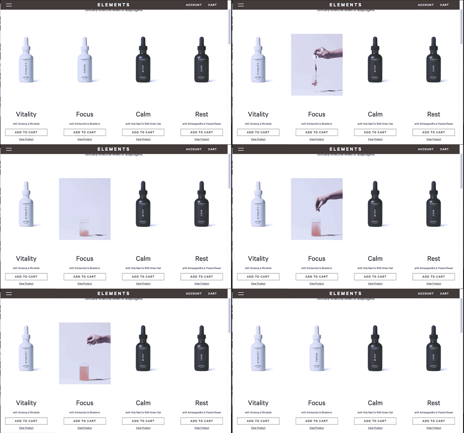
Straight off, 2020 ecommerce design trends makes use of more advanced visuals, starting with motion design. That means less static images and more dynamic, moving ones. We’re looking at more videos, cinemagraphs, animation and microinteractions.
We’ve seen these motion design elements used sparsely in the past, but modern technology has made them more and more commonplace. Ecommerce sites, among other industries, are relying on them for more than just grabbing attention.
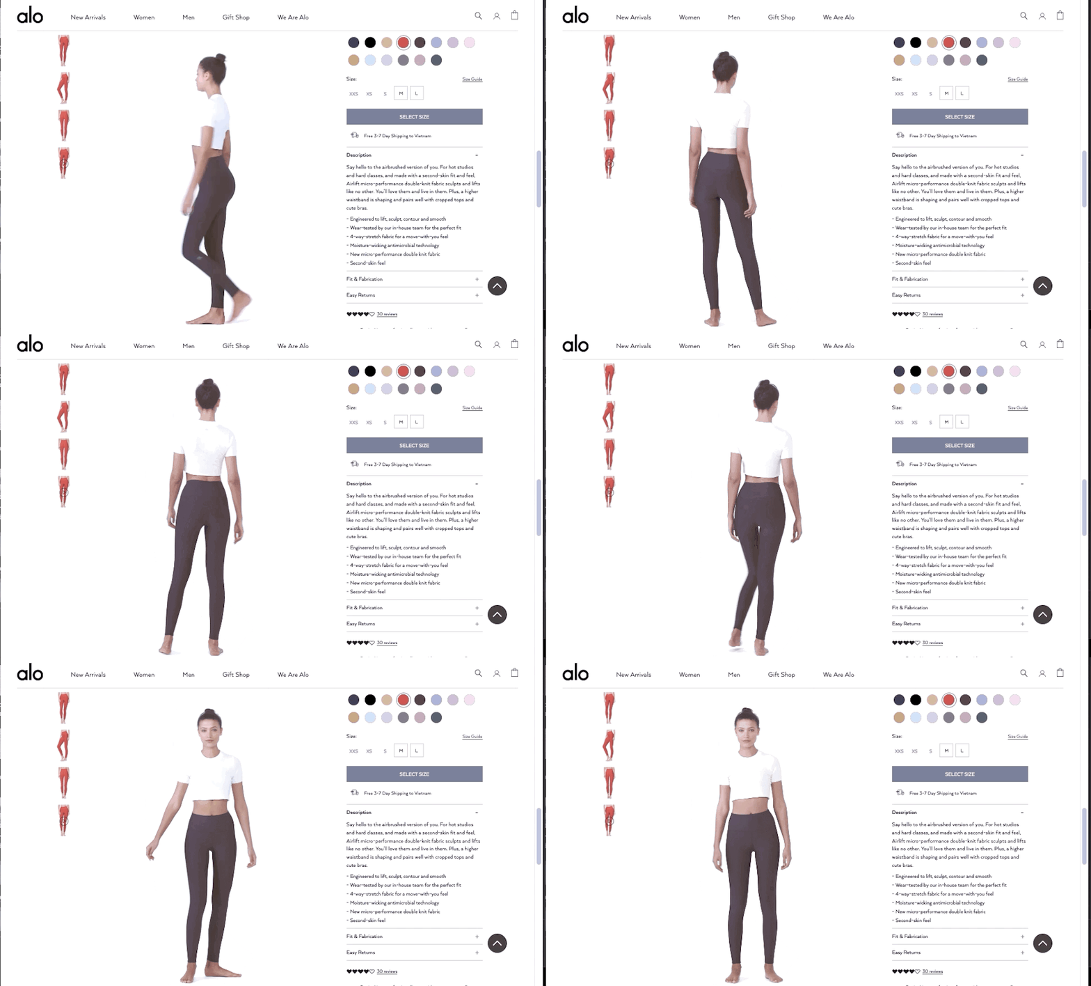

Motion in ecommerce design offers lots of practical advantages, ideal for showcasing products in a more realistic light. As the Alo Yoga example above proves, motion design in product visuals gives shoppers a better sense of what they’re buying, increasing conversions and decreasing returns by giving consumers more information.
2. Unconventional grid layouts

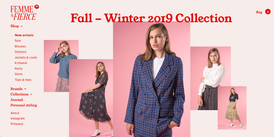
For years, the square grid layout has dominated ecommerce (think Amazon’s endless scroll of thumbnails). Strict rows and columns of same-sized products keep everything structured, make browsing easier and work well for responsive design. But for some brands, experimenting with new layouts is paying off, leading to more and more online stores jumping off the grid bandwagon.
What’s the advantage of abandoning the homogenous grid layout? For one thing, you’ll stand out, since this design style is still by far in the minority. But it also gives your brand an edgy and modern feel, especially useful for fashionable or young industries.
If you design your site right, you can also draw more attention or emphasis to certain products, like strategically highlighting best sellers without overtly pointing them out.

One word of warning though: this ecommerce design trend works best for brands with a fairly limited product range. If you sell a lot of products, this setup may take up too much space on screens and get confusing for shoppers. For the benefits of alternative grids without going all in, try diversifying the size of the product cards like Dôen, above.

3. Landing page-product page hybrids
Old ecommerce design trends revolve around the idea that shoppers start at the site’s homepage and then find the product they’re looking for. While this still holds true for some shoppers, plenty of other approaches have cropped up in the last few years that bypass the homepage completely.
Ads and social media posts often direct shoppers straight to the product page, so many visitors never see the homepage. With that in mind, ecommerce designers are now more elements typically found on landing pages to their product page designs. The resulting hybrids are like mini-stores, centered around a single product or category with clear navigation that makes it easy to explore the rest of the site.
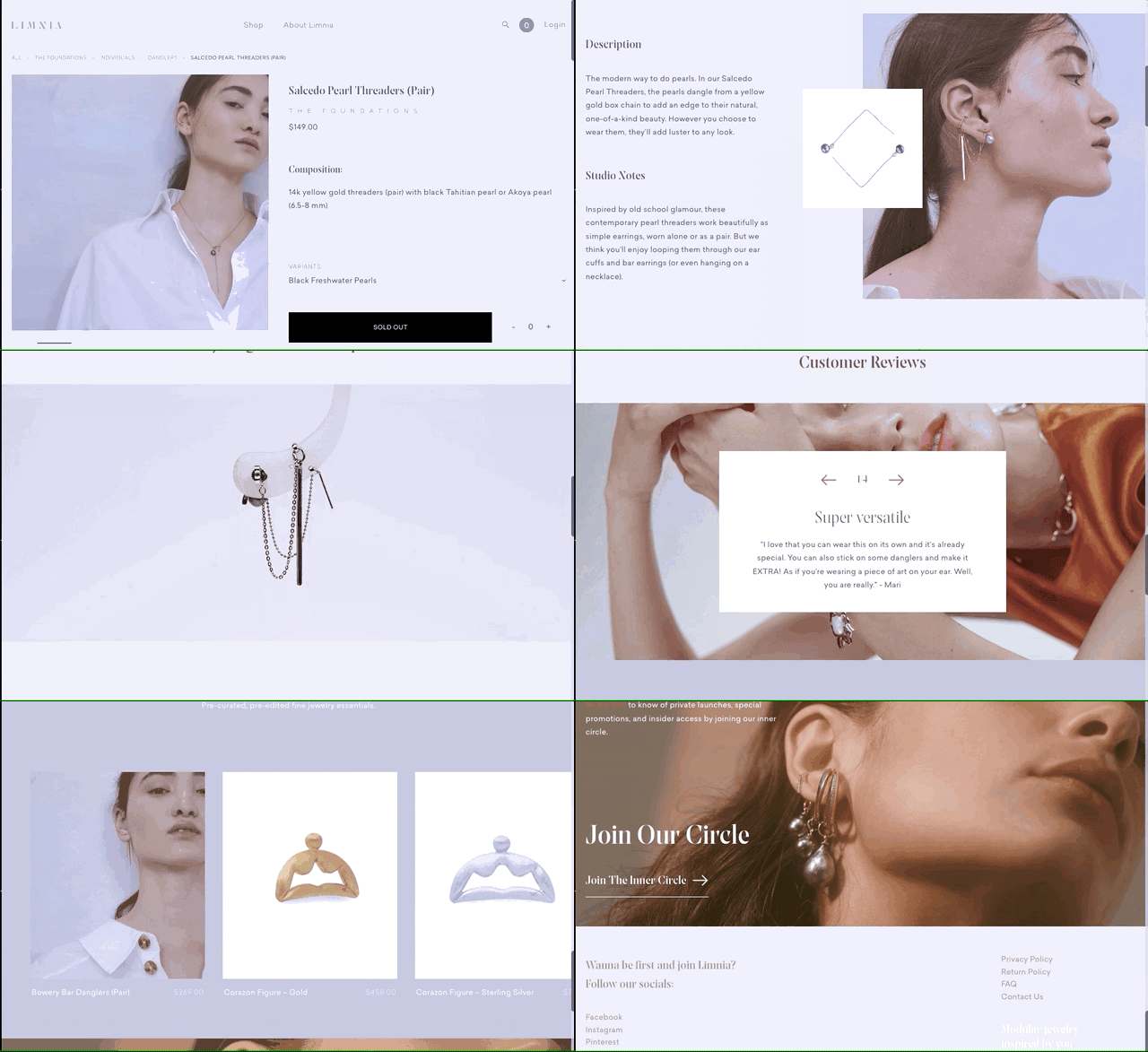

What we’re seeing are more standalone product pages, often used as “umbrella” pages for a certain category of products (like the Youth + Love example above). These kinds of product pages give visitors everything they need to know about your online store—and that’s a better, faster and more convenient experience for shoppers.


4. Branded shipping boxes
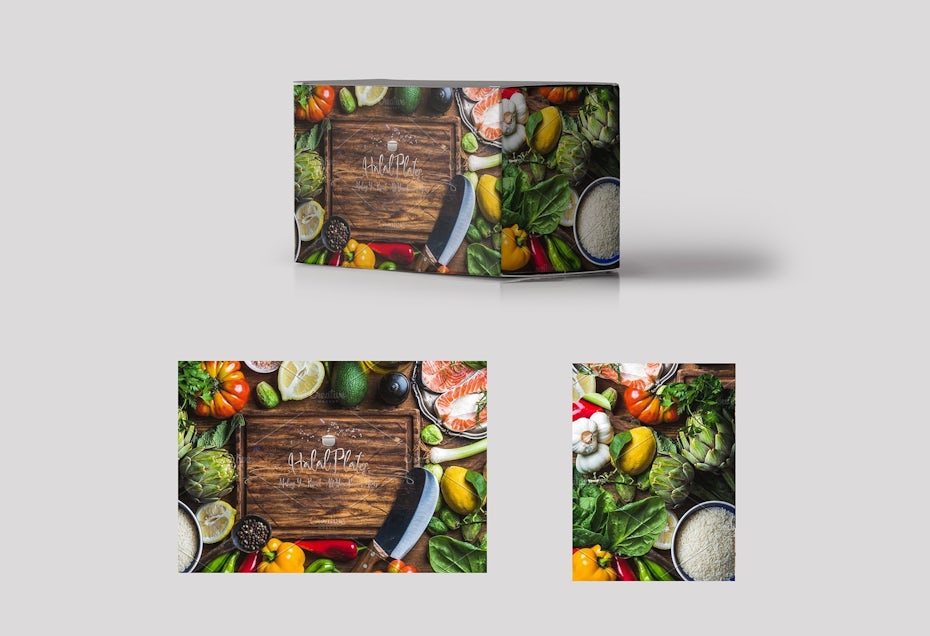
One rule of thumb for branding is never miss an opportunity. Most companies already know the importance of branding on product packages, but for online stores and subscription services, there’s another often overlooked blank slate for branding: the shipping box itself.

 .
.Custom shipping and delivery boxes do more than just promote your brand, they make customers more excited about deliveries and encourage loyalty. It’s a chance to advertise your special features, website, social media or even just your brand colors. Some companies are even going the extra mile by using eco-friendly boxes and packaging.


5. Personal product descriptions and quizzes
Like so many other industries, 2020 ecommerce design trends are leaning towards personalization and a more human approach to addressing customers. While the more rigid format of “fluffy promotional description + bullet points” has been a cornerstone of product pages for decades, today online stores are opting for something a little less mechanical.

See how the CBD vendor Feals (above) coddles skeptical, first-time cannabis buyers with a gentle approach, spelling out the benefits in new ways and addressing common concerns, all through creative product page design and a sensitive tone of voice in their copy.
You can add more humanity to your product descriptions with sections like usage advice, testimonials or even product recommendation quizzes like Fur and Curist (below). All of these new, compelling ways to list product features are a huge progression in ecommerce personalization.


6. Shoppable social media posts
As we mentioned in our 2020 digital marketing trends, social media platforms are making it easy to sell products directly through posts. The golden rule of UX is to have customers do as little work as possible, so letting them complete a transaction without ever leaving their favorite social media site is a shortcut to more sales.
The benefit of selling directly on platforms like Instagram and Snapchat is pretty clear: these visual mediums are perfectly set up for online shopping. The social media channels themselves are starting to realize this as well, and they’re implementing newer features to accommodate ecommerce stores.


Another rising trend is to promote these posts on your website. The example from Moe’s (above) “previews” their shoppable Instagram feed on their website. While shoppable social media posts increases sales among followers, advertising these posts on your website also encourages loyal customers to follow you on social media.
7. Smarter AI chatbots
Chatbots aren’t new. We mentioned their incredible evolution back in our 2019 web design trends. So why are we mentioning them again now? Because the chatbots of 2020 are so advanced, they’re practically unrecognizable to their predecessors of just a few years ago.

When it comes to ecommerce, it was technology that has previously held chatbots back. AI is a lot harder to master than sci-fi movies would have you believe. But in 2020 and beyond, chatbots are more capable of doing what they’re supposed to do—in this case, helping human shoppers with purchasing decisions.
The benefits of chatbots remain the same: virtual, inexpensive sales assistants available 24/7 to give online shopping a little of that brick-and-mortar convenience. What’s new if their effectiveness. If you were worried about clunky and antisocial chatbots irritating your customers, those days are over. Now, you can even connect them to your social media messages, like the Bombom below.
To make the most out of chatbots, read our detailed guide on how to use chatbots in your digital marketing strategy.


8. Interactive product visuals
Advanced interactive visual design like virtual reality (VR), augmented reality (AR) and 3D imaging are more accessible than ever, even for small- and medium-sized businesses. Just like motion design, this tech helps shoppers better understand what to expect with their product. Better shopping experiences lead to more sales and repeat business.

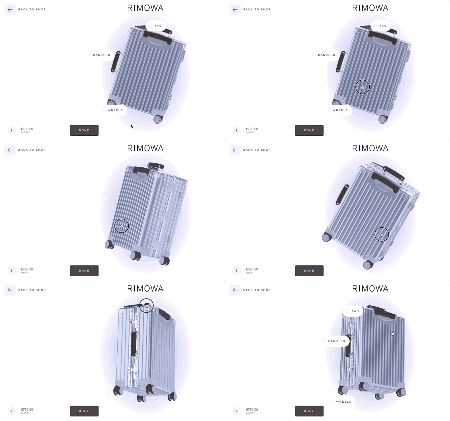


This technology works well for fashion accessories like sunglasses, but it’s also particularly useful for furniture or home improvement, like the Dulux example above. But AR, VR and 3D imaging can help practically product by giving shoppers extra control over viewing options—even luggage like Rimowa.
Online stores are getting a little ahead of technology here, but we’re sure this trend will continue to grow exponentially in the future. Soon the time will come when interactive visuals are the new norm, so it’s best to implement it now when it’s still seen as impressive and futuristic.
The human face of ecommerce design trends in 2020
—
Better visuals, better technology and, interestingly, better communication. As ecommerce becomes more advanced, it’s also becoming more human as many of the ecommerce design trends 2020 focus on how the customer feels. Connecting with customers is just as important as “wow-ing” them with something they’ve never seen before—but luckily, you can accomplish both at the same time with excellent ecommerce design.
The post 8 ecommerce design trends for 2020 to captivate your customers appeared first on 99designs.
No comments:
Post a Comment