As we wrap up the final year of the decade, the font trends 2020 are already spelling out a bold, new era of type design. While some designers are embracing technology to innovate fonts, others are mining the past to resurrect and reframe trends for the modern world. This interplay between the past and future gives us plenty of contrast—and plenty of exciting trends to keep an eye out for!
One of the more challenging things about fonts is that they are always shifting on the stage of design between supporting players and leading roles. It’s imperative that designers stay abreast of how font usage is evolving and what trends are coming around the bend to keep fonts and their audience on the same page.
Here we’ve gathered the 9 most exciting typography trends of 2020 along with tips on how you can use them in your next design.
The 9 big font trends for 2020 are:
—
- Humanizing serifs
- Round san serifs
- Swiss style typography
- Rustic fonts
- Wide open minimalism
- Classical influence
- Pixel art fonts
- Seventies and eighties fonts
- Kinetic fonts
1. Humanizing serifs
—

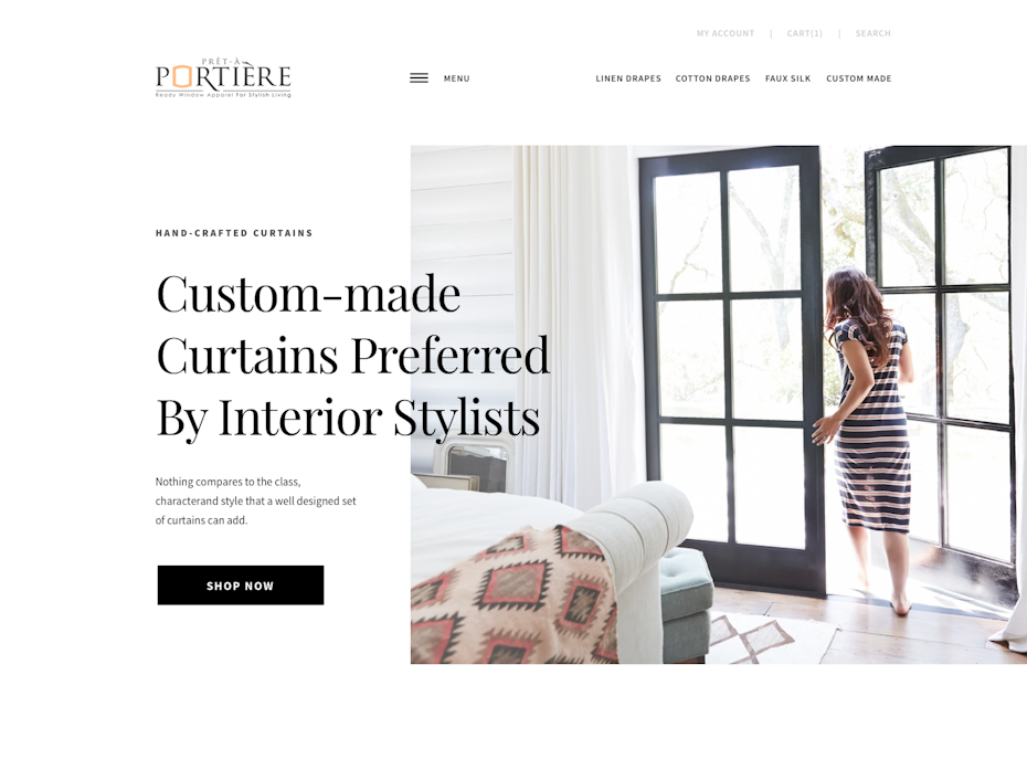
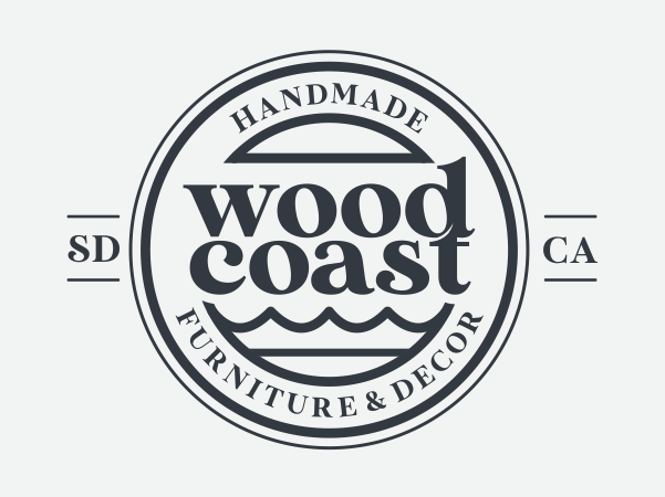
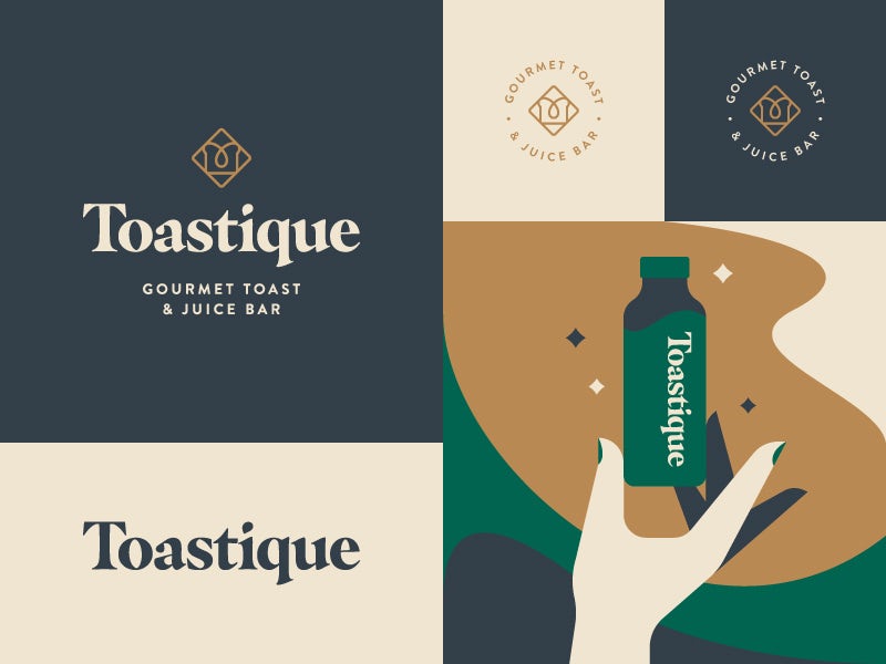
In our digital age, we often gravitate towards sans-serifs because they have always been considered more “modern.” But we’re seeing a marked uptick in brands using bold, high-contrast serifs in their logos and website copy, and we expect this to be a leading trend in 2020.
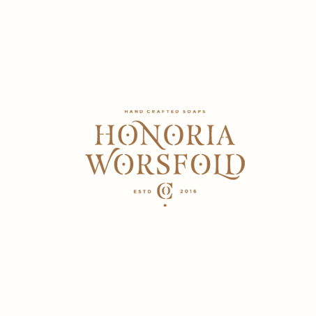
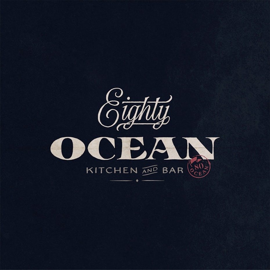
The reason? Serifs are great for storytelling. They feel nostalgic without being stodgy because they connect us to an earlier time before the world was so digital. All of these associations have a deeply humanizing effect for brands that use them.
2. Round sans serifs
—

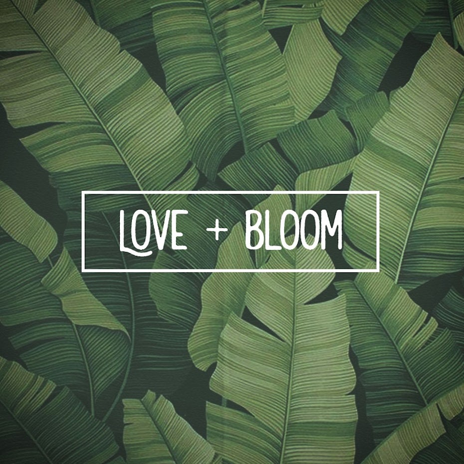
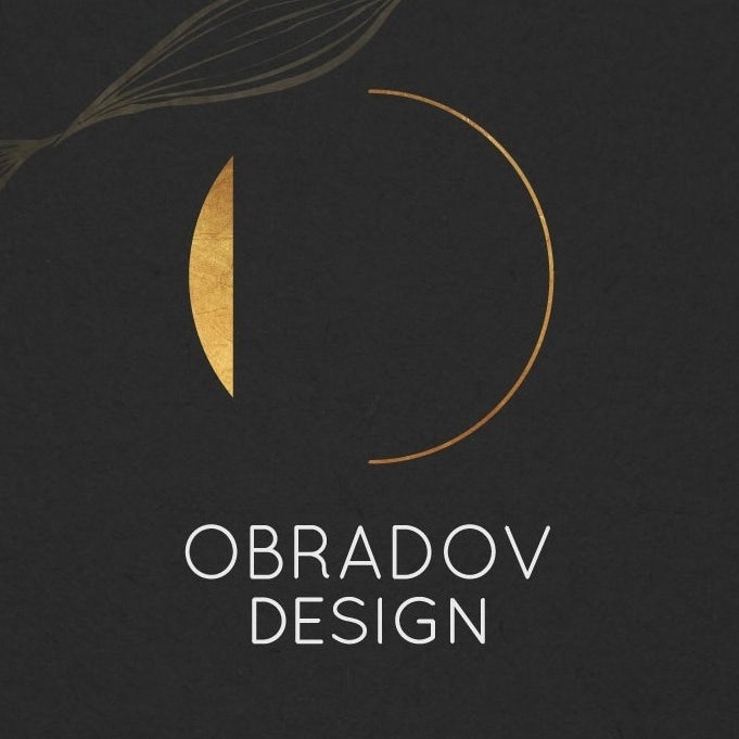

The trends for sans serifs in 2020 all point to clean and very round. This move toward highly friendly geometrics is popping up in logos for an increasing amount of visible brands like AirBnB, Google and Spotify. While there is a risk rounded sans serifs can read childish, these fonts instead project simplicity and straightforwardness.


The Cuppa logo is perfect example of branding that feels serious while leaning into a friendly and approachable vibe. These sans serifs are often paired with a bold and playful color palette and are perfect for a business that wants to generate a feeling of trust and positivity.
3. Swiss style typography
—
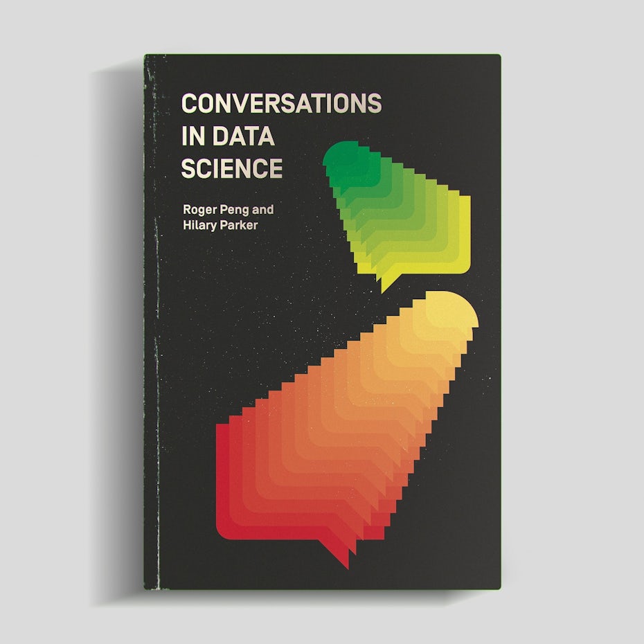


Type designers across the world are attempting to redefine the storied International Typographic Style for the digital age. Swiss style, as it’s informally known, is the design movement that grew out of a handful of iconic designers working in Switzerland in the mid-century and is defined by readability, simplicity and objectivity.
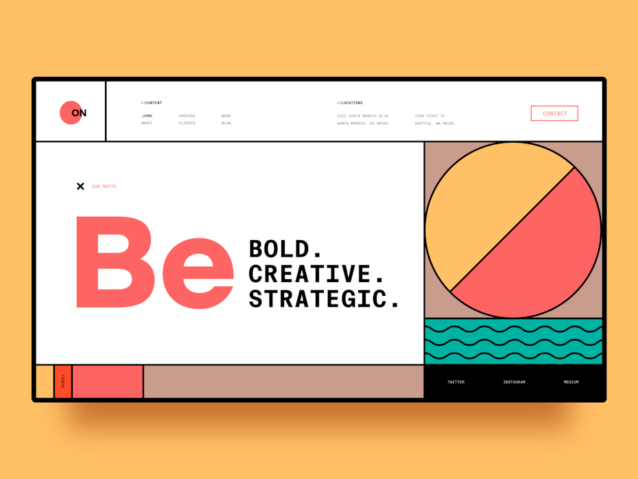
Even though the style was perfected in print (on posters, book covers, pamphlets and other printed collateral), it has shown itself to be incredibly adaptive to our modern age. It’s adherence to grid-based designs with clear, unfussy sans-serif fonts, builds natural and immediate hierarchy and translates well to digital spaces.
Perhaps because we’re inundated with so much information every single day, designers still feel pulled to the Swiss style with its essential tenet that design is at its best when it’s invisible.
4. Rustic fonts
—


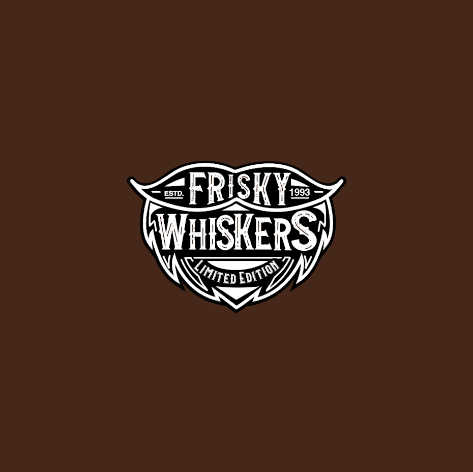
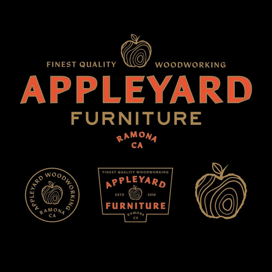
Over the last few years, handwritten script fonts have exploded, with thousands of highly customized typefaces becoming available. While the popularity of hand-lettered scripts will likely never fade entirely, we’re beginning to see that level of customization in non-script typefaces.

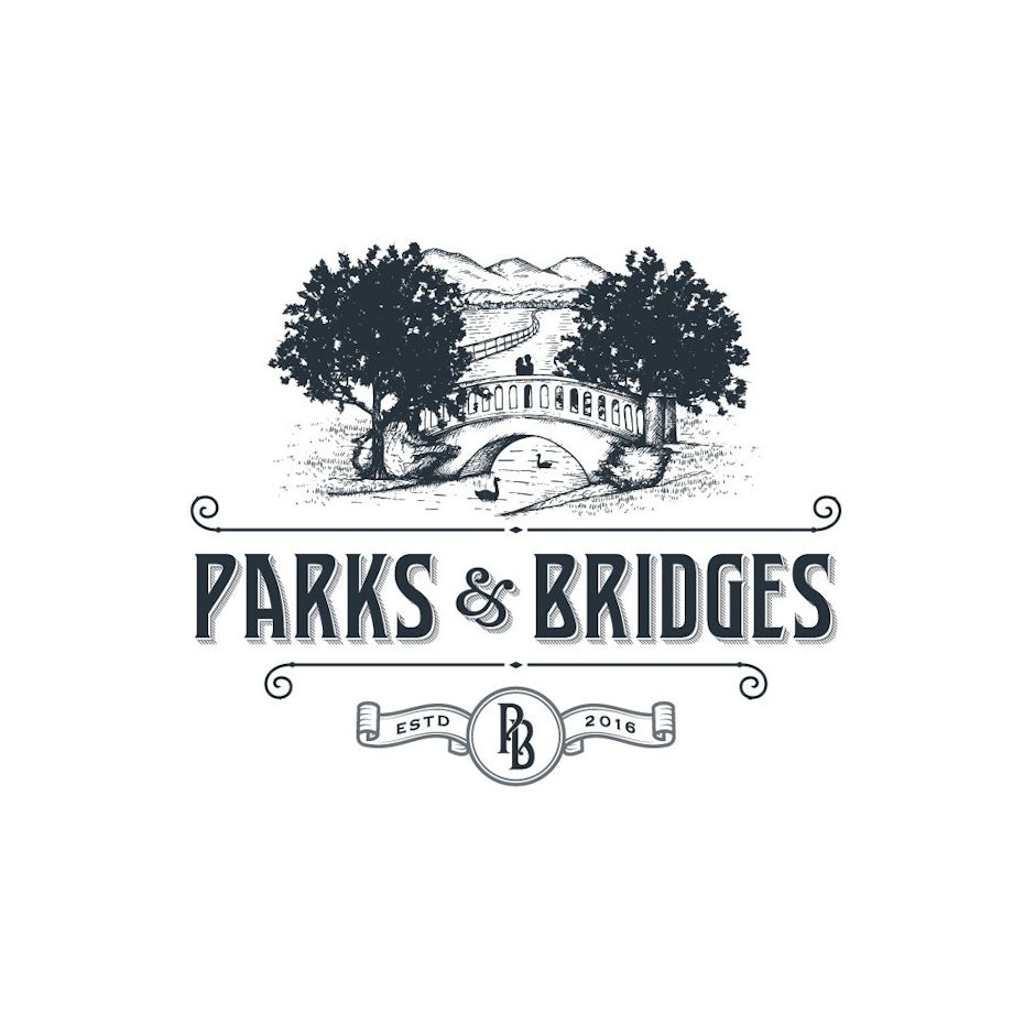
These new bespoke typefaces often fall into the slab and serif families and are popping up in branding for breweries, farms, bakeries and other traditional industries. While the font in the Gold Country Renovations logo feels familiar, its extra-wide Tuscan serifs make it fresh and authentic, and its line weight feels perfectly tied into the custom illustration of the logo.
5. Wide-open minimalism
—
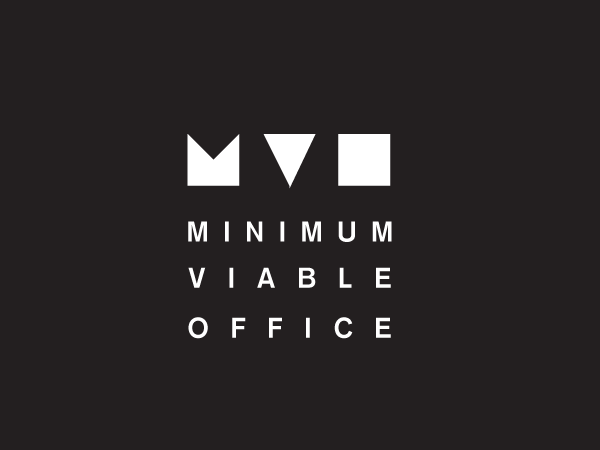
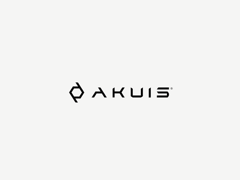

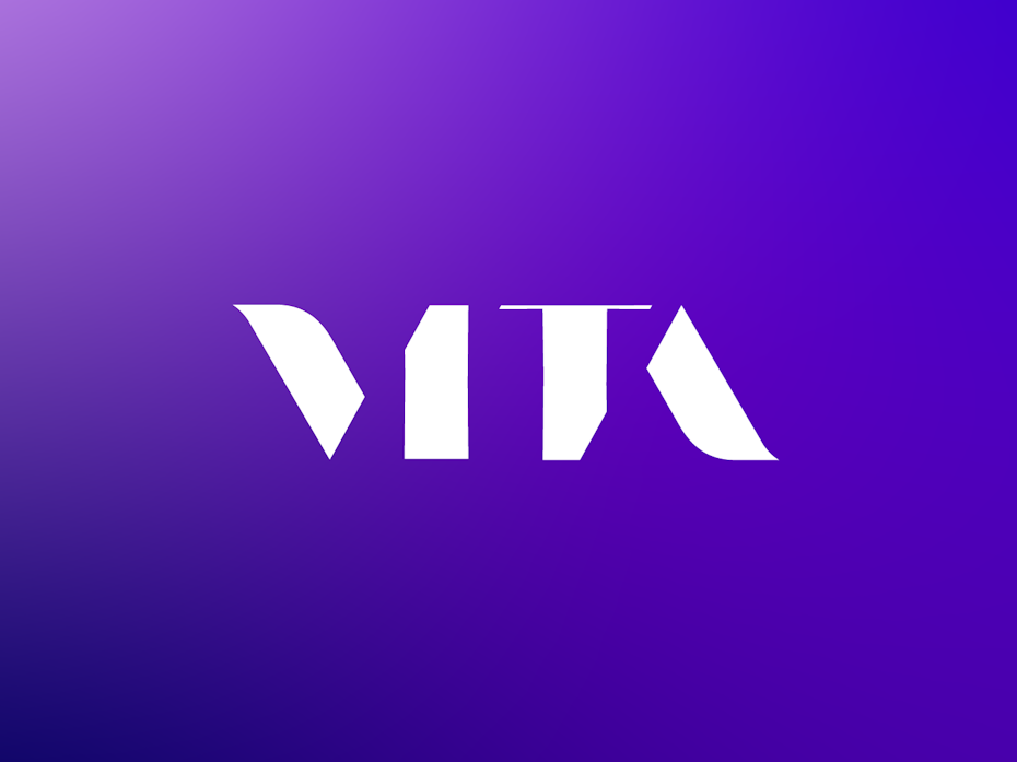
Many type designers are experimenting with negative space and removing the eyes and crossbars of letterforms to create more expansive shapes. Despite the minimalist nature of this approach, it has the effect of strengthening the font and heightening the sense of importance of each letter by granting plenty of breathing room. The resulting font becomes both airy and bold.
by Nathan Riley via Dribble
When executed well, fonts like these can give the viewer a thrill of being able to solve the puzzle of the missing pieces of type. More broadly, these letterforms are design-forward, sleek and open—inviting the viewer into a feeling of limitless possibility.
6. Classical influence
—

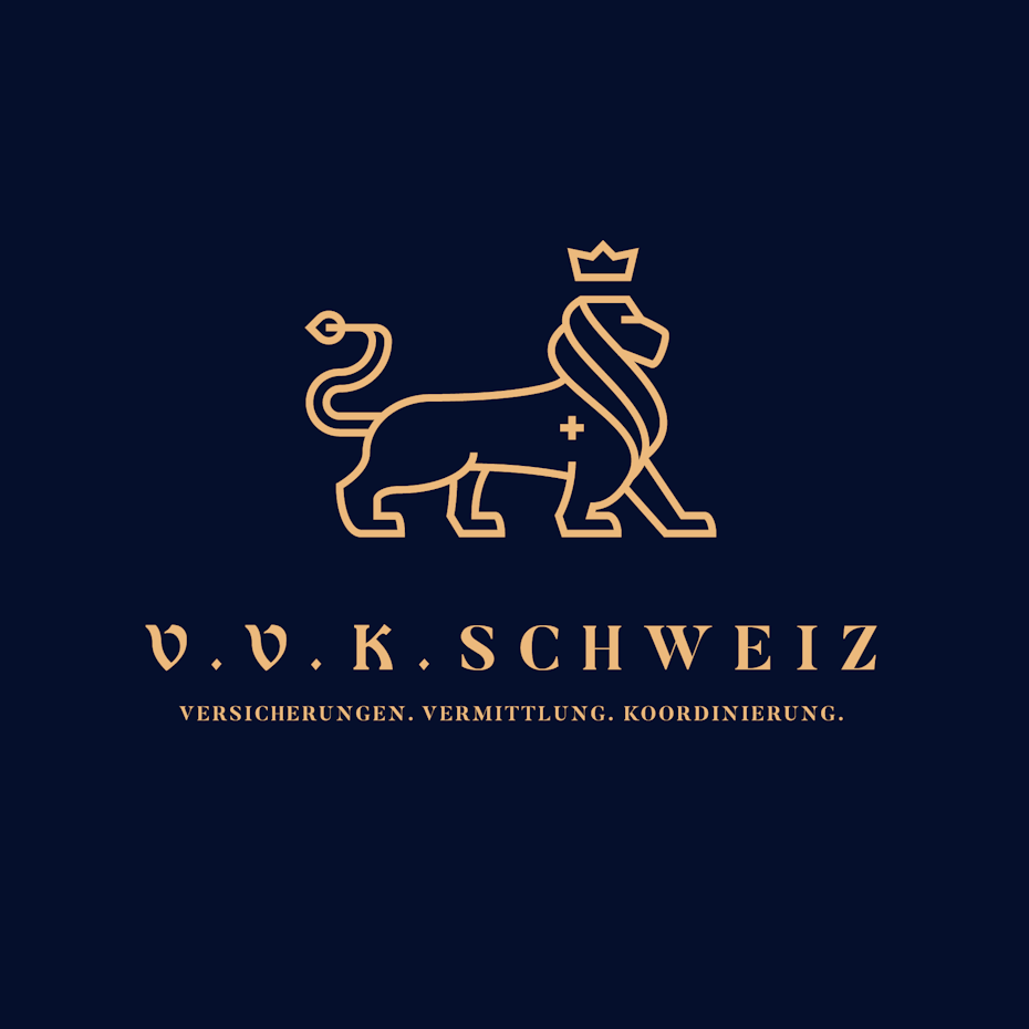


Particularly in logo design, there has been a marked return to more classical typefaces. These delicate and refined fonts employ small serifed slabs or light serifs to exude warmth and luxury. They feel incredibly fresh for their lack of showiness and integrate beautifully into illustrated logomarks.
In direct contrast to the popularity of heavy sans-serifs and bombastic serifs, this trend asks us to enjoy a moment of quiet repose. Often these fonts are in compositions that lean botanical and seem pulled directly from the beauty of the natural work.
7. Pixel art fonts
—


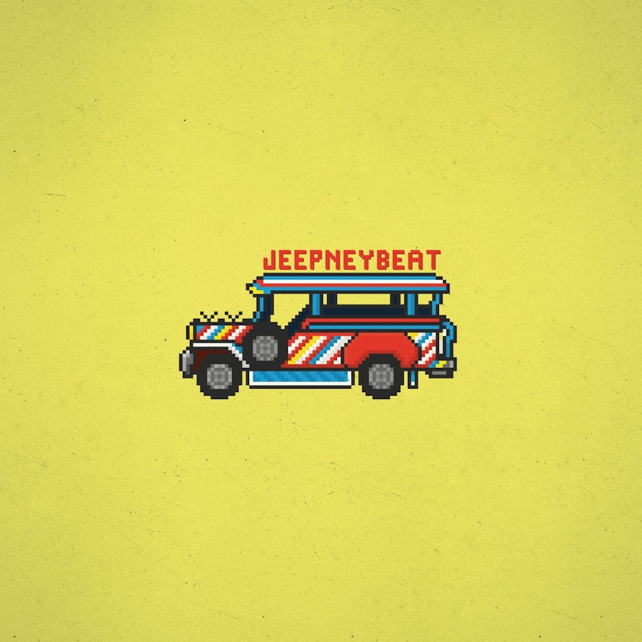
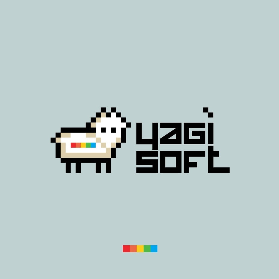
Pixel art evolved from the 2D computer graphics of the 70s through the 90s, and now in 2020 pixel style fonts are again having their moment. While these fonts are fun and whimsical, they’re being used far outside of just video game inspired designs.
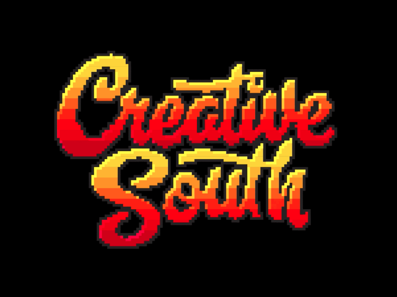
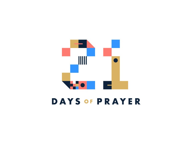

We’re seeing pixel art fonts pop up in logos for bars and food trucks as well as poster and packaging designs. And it’s easy to see why: for generations of people who enjoy video games, 8-bit design evokes joy and fun, freedom and possibility. Who doesn’t want more of that feeling in our day to day?
8. Seventies and eighties fonts
—
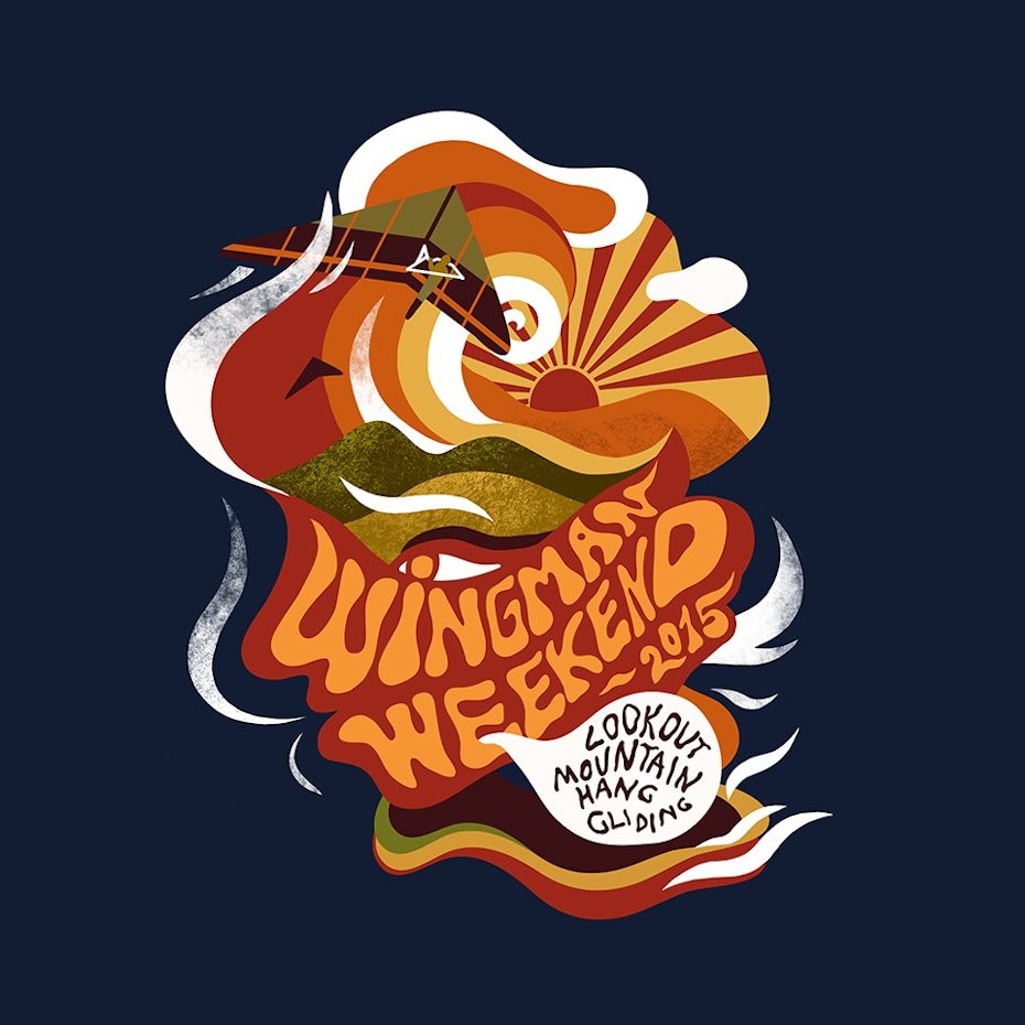
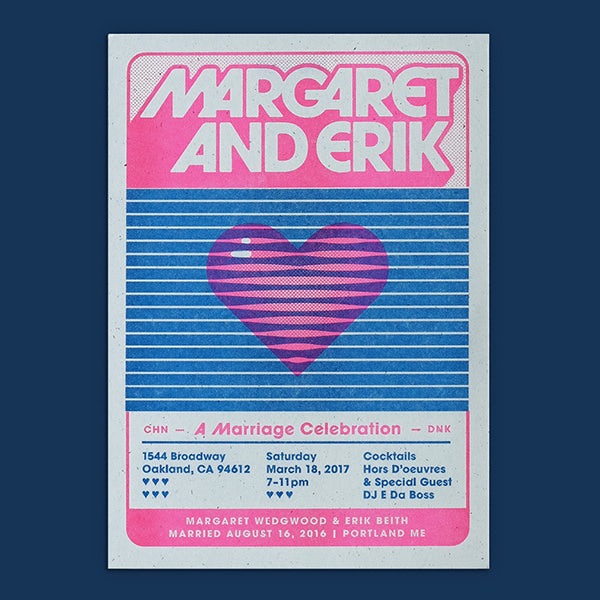
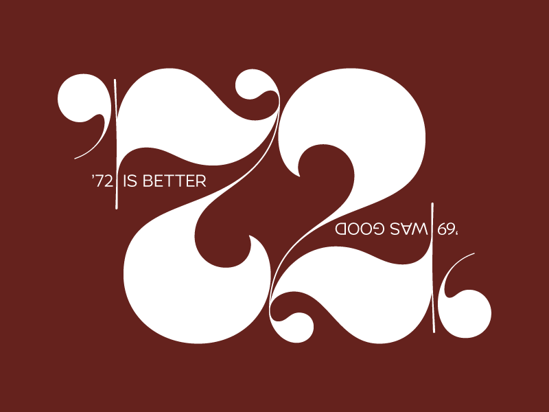

It may have all started with the credits for Stranger Things: once the typeface ITC Benguiat was revived, the Pandora’s Box of late seventies and eighties type was opened. This retro trend goes further than the expected kitschy, neon characters that feel like they were pulled directly from Miami Vice. Instead, it dives deep into Souvenir Gothic, Grouch and the type of Herb Lubalin (who created iconic typefaces of the period) to generate truly evocative, throwback designs.
This also goes deeper than just the type—we’re seeing a slide back from the heavily spaced out letterforms of the past few years and a slow and steady embrace of the tight kerning that defined the decade’s style. This trend works particularly well on the younger crowd, who were born late enough in the eighties to see these fonts with entirely new eyes.
9. Kinetic fonts
—
by Nathan Riley via Dribble
Kinetic typography is a fancy way of saying “moving type.” It combines old-fashioned typography with the power of video and animation in order to create really eye-catching, memorable designs. Unlike standard type, a designer working with kinetic type has to also take into account style, effects and timing in addition to normal considerations like alignment, weight, and hierarchy.
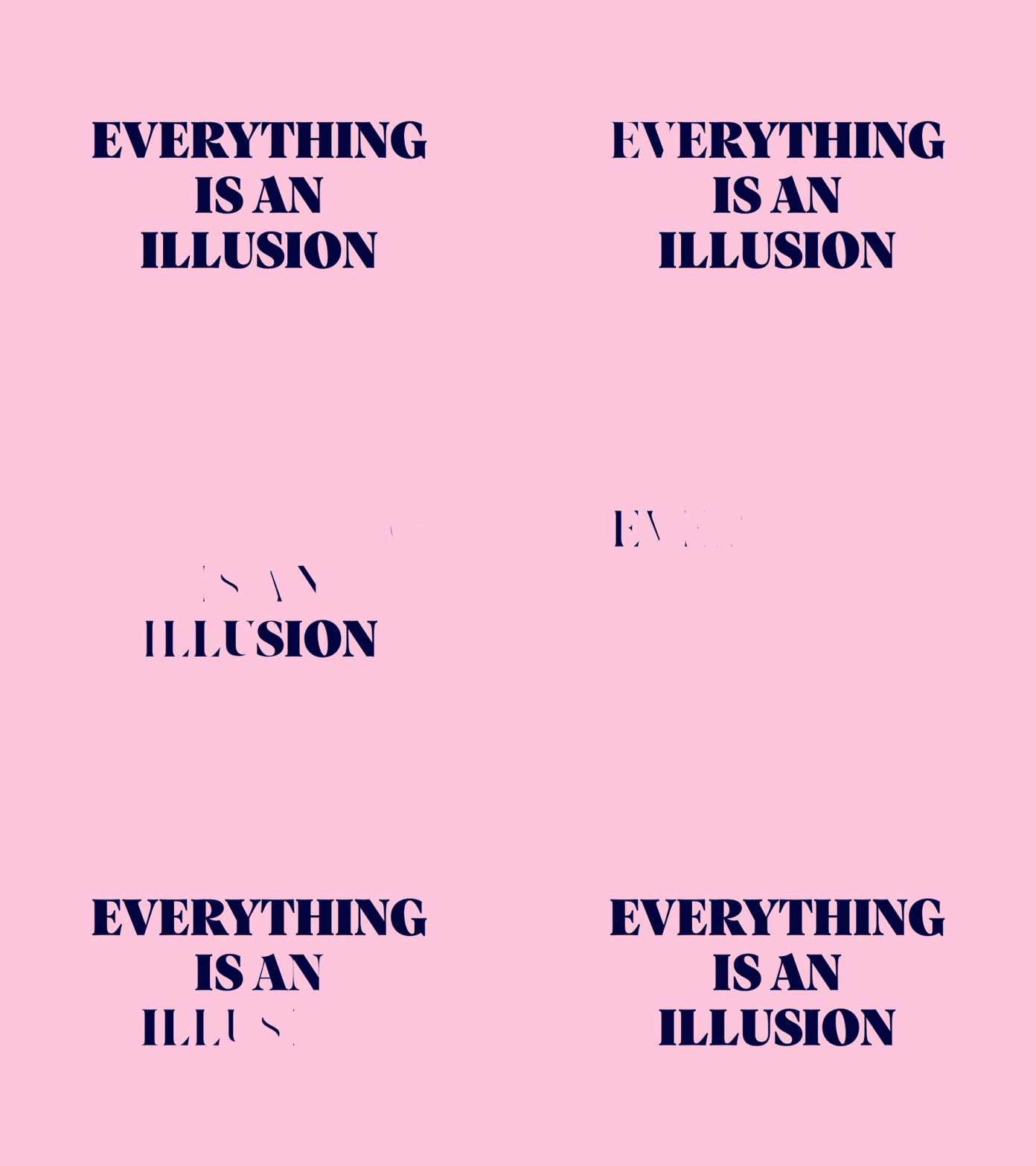
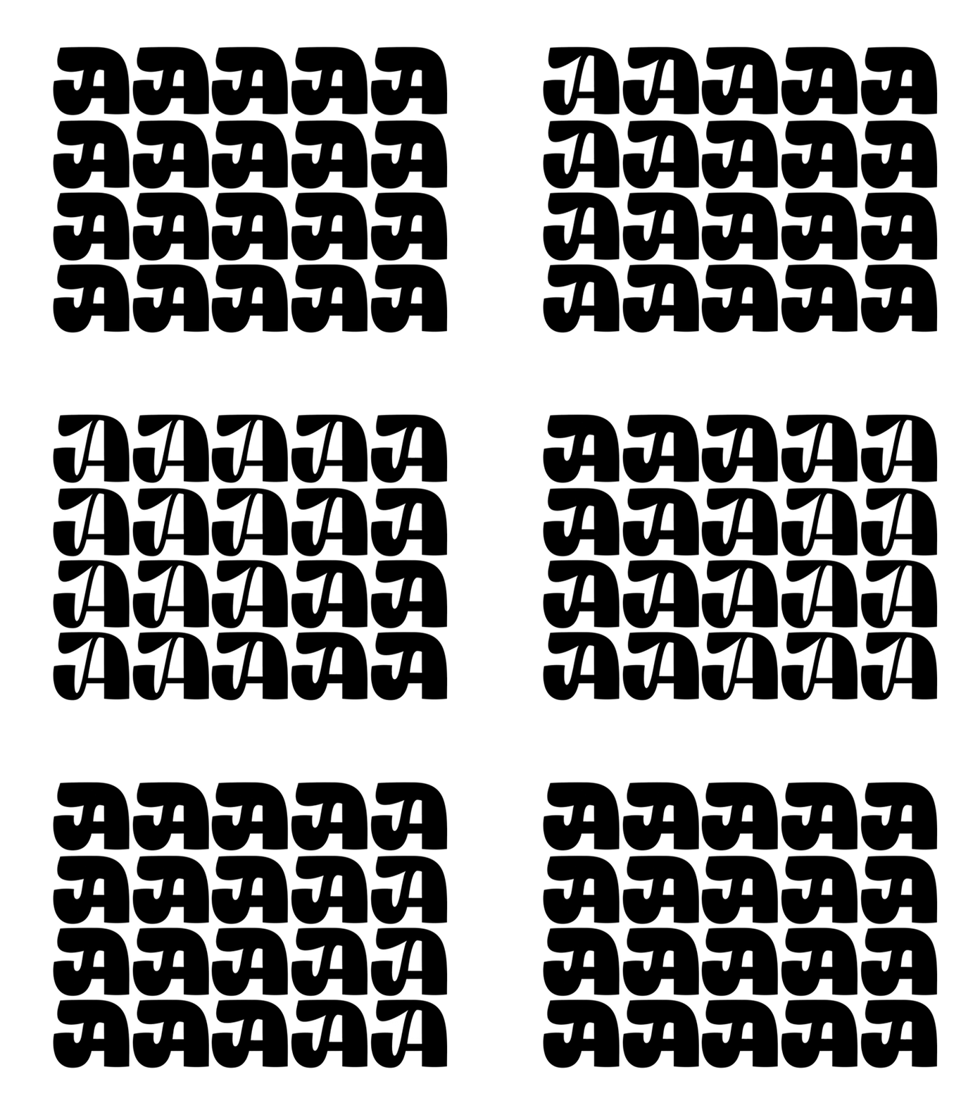

The “Everything is an Illusion” design by Animography appears for a second to be a standard type design by giving the viewer a brief second of rest before the text begins to warp and vanish. For typography nerds and novices alike, these kinetic type experiments are wildly exciting and surprising. Look for them on website landing pages and popping up more and more in app design in 2020.
Font trends for 2020 and beyond
—
It’s clear that 2020 is going to be an exciting year for font trends. From amazing throwback sans-serifs pulled from the mid-century to kinetic animated fonts, from bare bones minimalism to ornate vintage styles, designers are figuring out how to use past trends to make fresh designs we can’t get enough of. As type design continues to push the boundaries, we can’t wait to see what the new decade has in store.
Do you need gorgeous graphic design?
Let our brilliant designer community create something unique for you.
The post 9 creative font trends for 2020 appeared first on 99designs.
No comments:
Post a Comment