When you look at the up-and-coming app design trends 2020 below, you’ll notice a couple things. One, lots of apps look way more vibrant, more polished, more immersive, and really in every way just more than the apps we’ve seen in the past thanks for our phones’ evolving tech specs. But at the same exact time, plenty of app designers are looking back in time for inspiration and working retro flair like pixely fonts and throwback color palettes into their designs to connect with users’ sense of nostalgia.
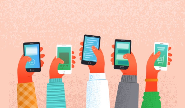
The app design trends for 2020 aren’t that way by accident. As apps continue to take on bigger, more important roles in our lives, their designs evolve to reflect and drive how we interact with them. Ready to see what’s coming to your phone next and find inspiration for your next app design? Here we’ve gathered up the 9 app trends projected to be 2020’s hottest.
Here are the 9 biggest app design trends 2020:
—
1. Illustrations front and center
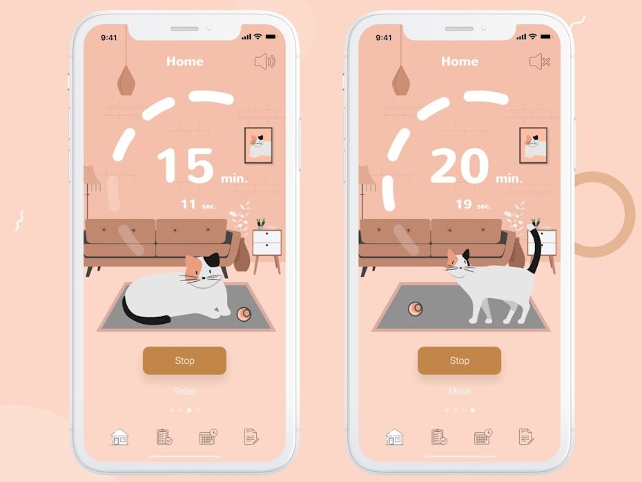
In 2020, illustrations in apps are gonna be big—literally. Not just graphics, but true illustrations that showcase the works of art that the apps are. In a lot of cases, we’re seeing flat and semi-flat illustrations in contrasting, eye-catching palettes like Outcrowd does in their design for Rent a boat. An illustration can feel more organic than a photograph or a graphic that feels, well, graphic-y. By giving users images that feel organic, apps designate themselves comfy, familiar environments.

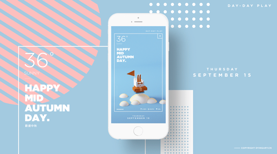
Be honest – how many times have you opened an app or gone beyond an app’s landing page, been greeted with a wall of text, then said “nah, tl;dr” and navigated away? This app trend aims to catch users’ attention and hold onto it long enough to make sure they’ve got all the information they need, like Angelina Skiba’s weather app design that shows users exactly what’s happening outside so they know how to plan their outfits and their itineraries.


2. Serif fonts
As long as apps have been a thing, they’ve been dominated by sans serif fonts. In 2020, that’s changing. Sans serif fonts aren’t going anywhere, but designers are demoting them to support roles and giving serif fonts top billing.
Using two kinds of fonts together creates a visual hierarchy, instantly separating headlines from supporting text like we see Martin Zagawa does in his concept design for a social app. In his design, serif fonts are for the structural, unchanging text in the app like the user’s name and their upcoming events feed. Sans serif fonts, in contrast, are for all the temporary and changeable information, like the names and dates of specific parties.
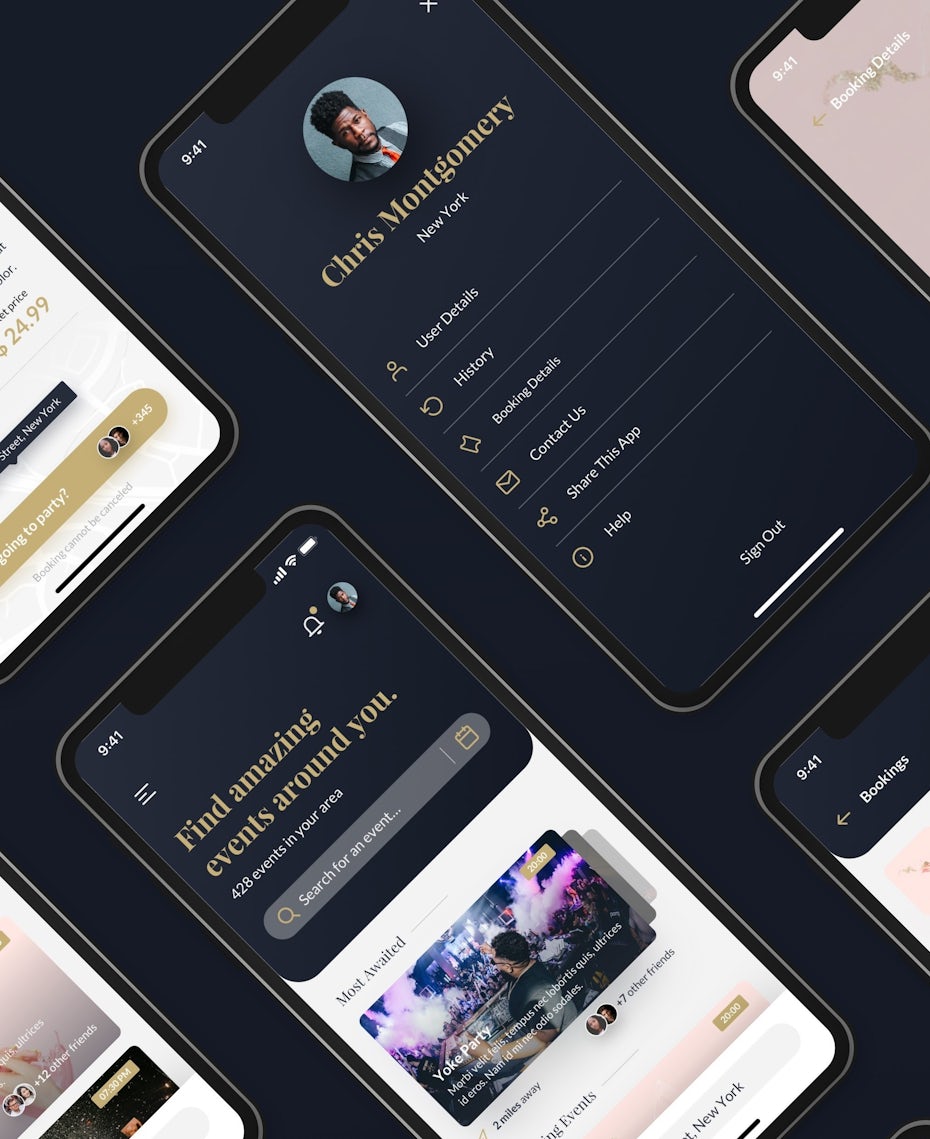
It’s clear that apps are way past the world of Whisper and Angry Birds. We use apps to manage our investments, broker business deals and discuss our deepest thoughts with our therapists. As apps take on a more serious role in our lives, serif fonts underscore this role and visually give them the gravity they deserve.


3. Futuristic color overload
Another one of the top upcoming app branding trends for 2020 is maxed-out colors. And although app designers are working every color of the rainbow into their designs, a few in particular—purple, blue, pink and other neon colors—appear to be the stand-outs. Why? They’re the colors of the future. In contrast to browns and greens—earth tones—the purples, blue and pinks we’re seeing dominate app trends are colors that don’t appear in nature, colors that can only be made by a human designer. That, and they’re colors that really pop against dark backgrounds, giving them a glowy, even cyberpunk feel.
Beyond looking hip and techy with purple and blue, there’s another reason why designers are playing with color in bigger ways than they have before, and it’s tech-related, too: today’s phones can show bold, vibrant colors off to their full potential.

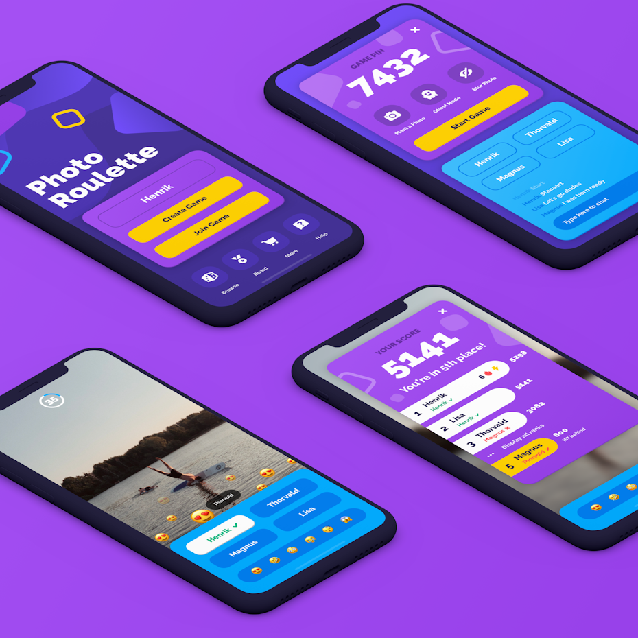
In their meditation app design, Entrain uses a bright, bold purple to frame the user’s personal log, then differentiates their different sessions and goals below with pink, purple and peach gradients. Bold purple and blue are the main colors again in Hazki’s photo game design, where a light blue box visually separates the chat from the rest of the game. Joharwn also uses a bright, almost neon blue as a secondary color in his design podcast app design, but goes in the opposite direction with his maximalist color palette: bright yellow, bold orange and punchy, bright backgrounds behind artists’ photos to make their faces pop against the dark background.


4. Transparent elements
As we see in other up-and-coming design trends, gradients are still going strong in 2020. In the app world, what separates them from how we’ve seen them being used in the past few years is how designers are working with gradients. In 2020, gradients, overlays and color pops are all going to be transparent and semi-transparent on your screen.
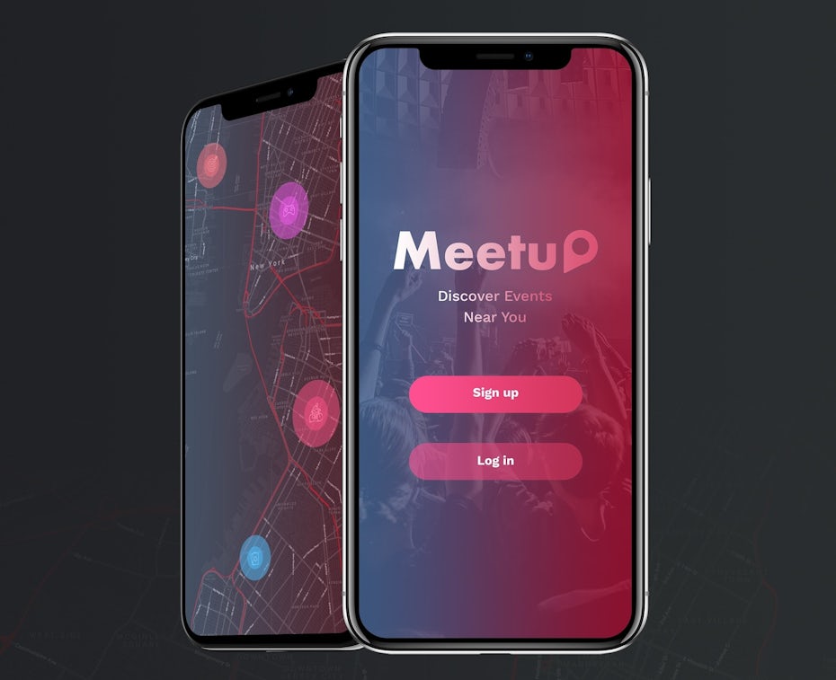
When you can see through an image, it feels lightweight. It feels like you can reach right through and touch what’s behind it, and that’s exactly the sensation app designers are riffing on this year. BrioRom does it in his design for Meetup, where the transparent red overlay makes it possible to keep Meetup’s red branding while showing users exactly what the Meetup is all about: going places IRL and meeting up with people face to face.

By making certain design elements transparent, a designer makes it easy to fit a lot of information into a page without it seeming overwhelming or heavy. This is important because on a phone, you don’t have a ton of space to work with. In Elias craft’s workout app design, a transparent purple, green and gray gradient sets the app’s color palette while allowing the user to clearly see an image and text of whichever workout they’re currently doing. It creates a visible barrier between the text and the image, but a barrier that feels more like a sheer curtain than a solid wall.


5. Rounded, organic shapes
Rounded, organic shapes are another upcoming trend we’re seeing in places beyond app design. Like a lot of app design trends 2020 on this list, these imperfect, soft shapes are gaining traction because they make stereotypically cold, sterile tech environments easier to interact with. Finance is one area where round shapes in app design can be used to subvert uncomfortable expectations.
Instead of the dark blue and gray squares and rectangles we usually expect from finance apps, Oversight below uses imbalanced shapes in soft pink to illustrate where the user’s been spending money with a nightingale plot graph. Confronting where our money’s going isn’t usually comfortable… but with soft, organic, imperfect shapes, Oversight’s design takes all the fear and stress out of personal finance and makes it approachable, human and even fun.


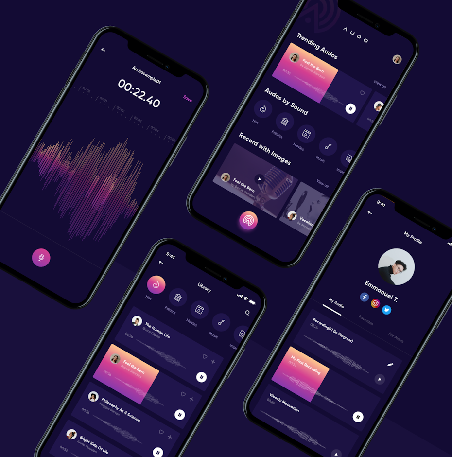
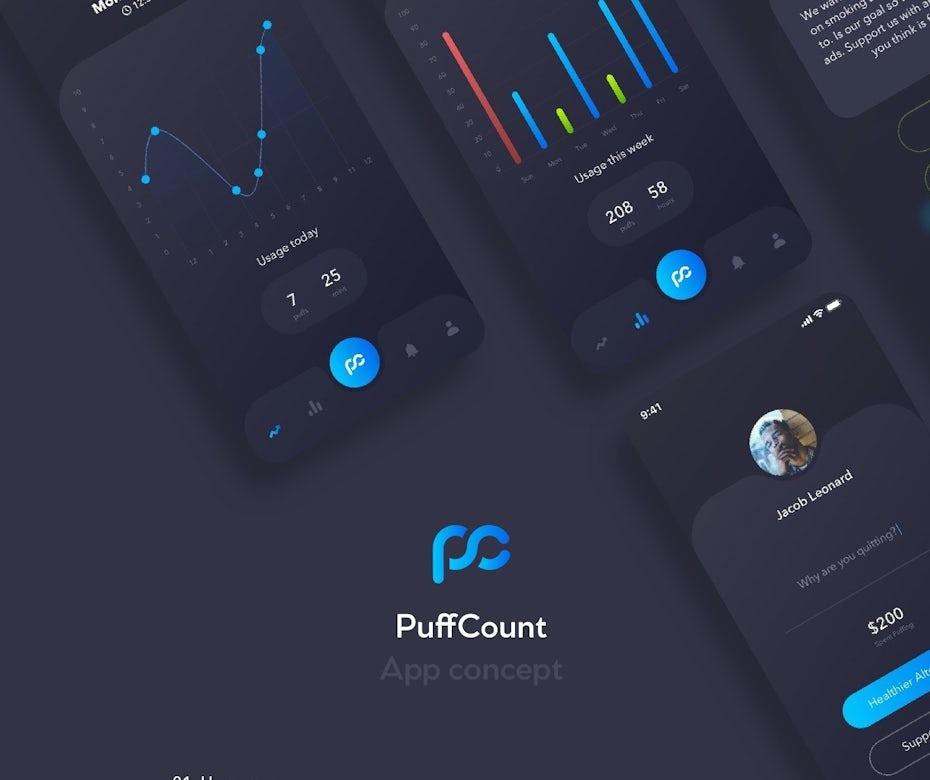
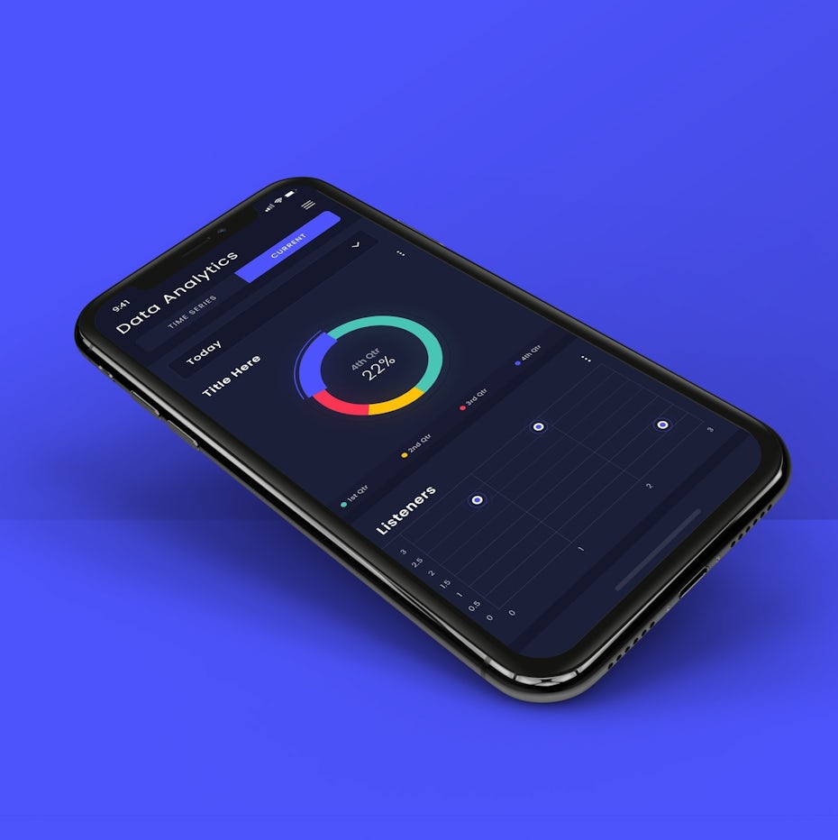
6. Dark mode
We spend between three and five hours a day looking at our phones and even though that can hurt our eyes and drain our batteries, our habits aren’t changing any time soon. In 2020, app designers are adapting to our phone habits and focusing on dark mode. In dark mode, light (but not stark white) text is contrasted against dark-colored backgrounds. Not only can viewing apps in dark mode protect your eyes from eye strain when you’re scrolling and texting in dim rooms, it’s less taxing on your phone’s battery.
In 2020’s upcoming dark mode app designs, we’re seeing designers use neons and glowing gradients to make elements pop against dark backgrounds. A.D.S. uses bright colors in a really cool way in their music data analytics app, where each music genre is assigned its own color and the user can see which genres they listened to each day and at various points in the day.

7. 3D elements
A few of the biggest branding trends for 2020 are focused on showing off what our latest phones can do, perhaps this one most of all. Designers are making 3D elements the focal points of their app designs, showing off the immersive worlds they can create through them. When a fully three-dimensional image renders perfectly on a flat phone screen, it turns the app into a physical space that the user feels they can step into.
The Glyph does this exceptionally well in their design for Soap Store, which features rotating 3D renderings of specific products the store carries. Looking at this app doesn’t feel much different from perusing a Lush store; the slowly rotating soaps are so realistic-looking that users might lift their phones and try to take a few sniffs.

8. Retro vibes
Another one of 2020’s up-and-coming app design trends is a trend we’re seeing (and loving!) in a bunch of other places: retro styling! Specifically, we mean designs that call back to video games and computer screens of the late 80s and early 90s with pixely text and blocky, simple graphics.
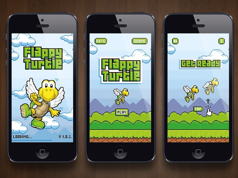
In some apps, like Jessica Alvaro’s design for screenity, the retro font is kept to one spot, drawing the user’s eye to the start button by contrasting it against more modern fonts in other places on the screen. It’s a similar strategy to using serif fonts to designate headlines vs. supporting text like we see in other app designs this year. Other designs don’t keep it contained—they go full retro, like Morzsamx’s design for Flappy Turtle that brings users right back to the 90s.

Although a lot of the retro-inspired designs we’re seeing incorporate pixels and other screen-y elements, not all of them do. Some, like Olivia King’s Look Book app, also work in retro-inspired color schemes and illustrations.


9. Personalization and customization
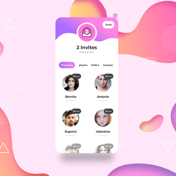
Another up-and-coming app trend that capitalizes on what technology is capable of is highly customizable apps. That’s because customization is what we want and what we’ve come to expect nowadays. We’re used to our apps getting to know us, like Spotify curating custom playlists and Facebook somehow knowing exactly what we talked to our friends about over brunch. In 2020, we know our apps can treat us like individuals. So app designers are giving us exactly what we want by creating designs that make it possible to personalize our experiences with them, ultimately giving us better experiences with the apps.
Manoj Bhadana’s quote generator app gives users the kind of motivation that works for them by giving them a bunch of different choices. These choices include font and the type of motivation the user responds to. This way, the generator doesn’t just dole out generic, one-size-fits-all motivation. It gives users the tools to generate quotes that speak directly to their unique souls.

Customizable apps give us choices we didn’t have a few years ago. Now, a user can build their own personalized experience with an app, which makes them feel like they’re in the driver’s seat. This kind of design is ideal for apps that users hold close to themselves and want to interact with on their own terms.

Ready to see how designers are “app”lying these trends?
—
2020’s upcoming app trends are feel-good design. Dark mode feels good on our eyes when we’re reading late at night and nostalgic pixel art transports us back in time to when everything felt simpler, more fun and just good. These trends are only the beginning for how we’ll see app designers push boundaries and take old ideas in unexpected directions in the next decade, and we’re here for it!
The post 9 creative app design trends for 2020 appeared first on 99designs.
No comments:
Post a Comment