As we head into a new decade, the color trends 2020 are already waiting to spring into action. The biggest color trends for 2020 not only send a message, but really speak up, whether they’re bold and brave or soft and subtle.
First impressions are everything, and color can often make an impression even before a shape, a word or a spelled-out message. In a consumer-driven culture, color can make or breake a brand persona. While some classic color palettes are here to stay, there are many design settings where distinct shades will continue to evolve. Color trends are no different from fashion trends, design trends and more—they’re fast-paced and ever-shifting.
Here are the top 8 color trends we can expect to see in 2020:
- Glowing neons
- Transparent color overlays
- Futuristic color schemes
- Vintage-inspired palettes with a modern twist
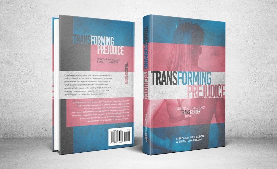
- “Dark mode” color schemes
- Unique monochromatic color palettes
- Colors that carry meaning
- Classic Blue—Pantone’s color of the year 2020
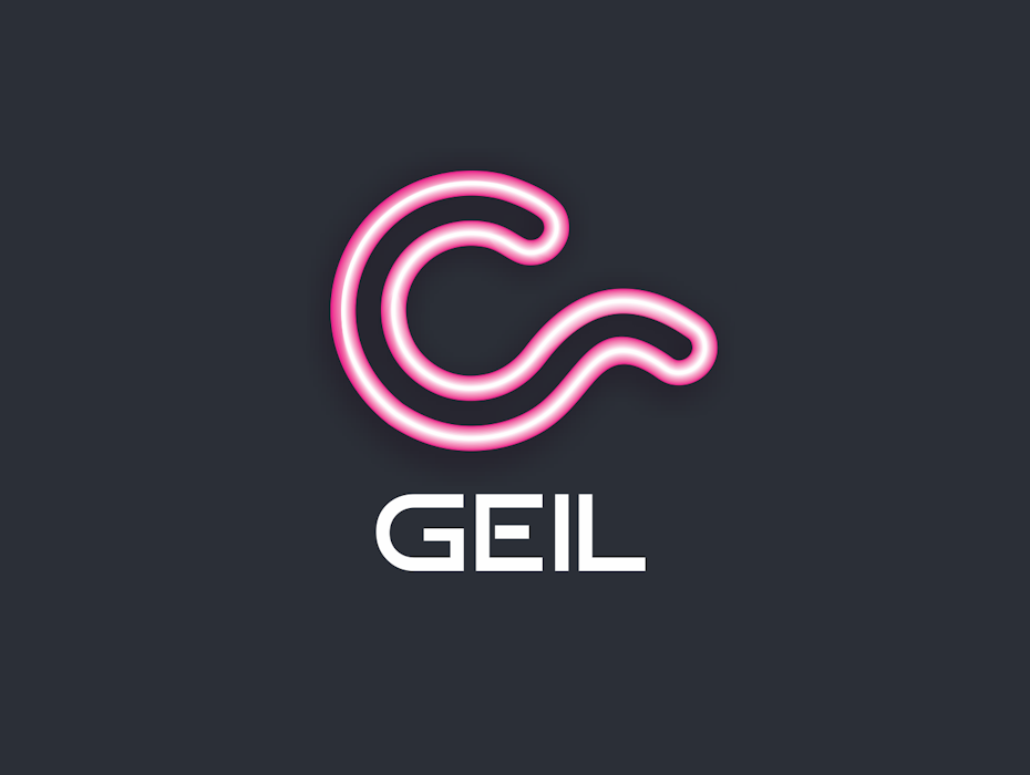
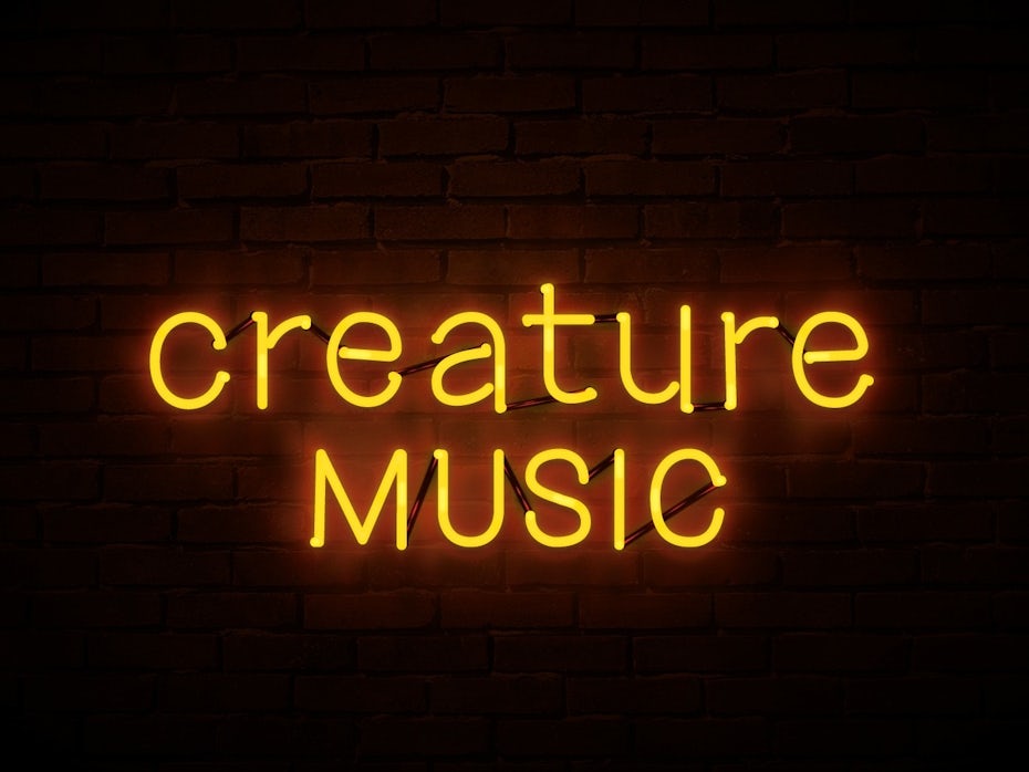
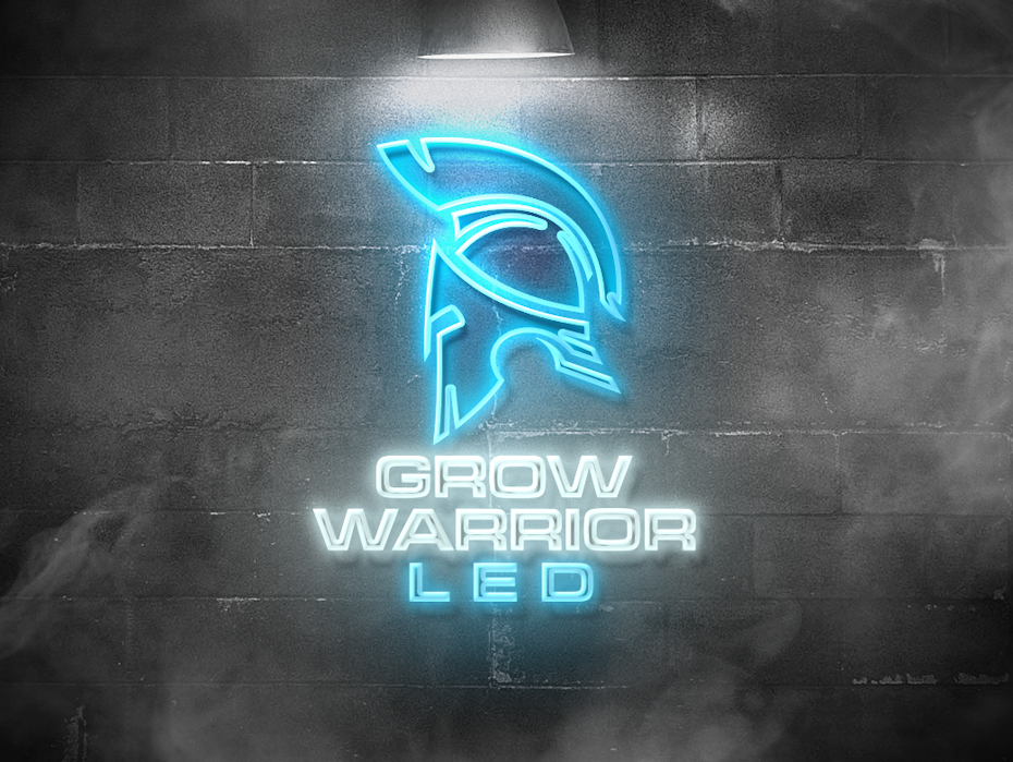
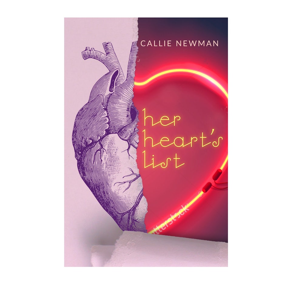
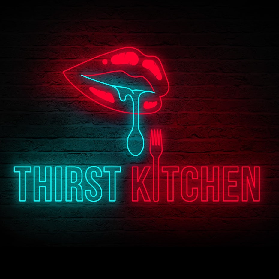
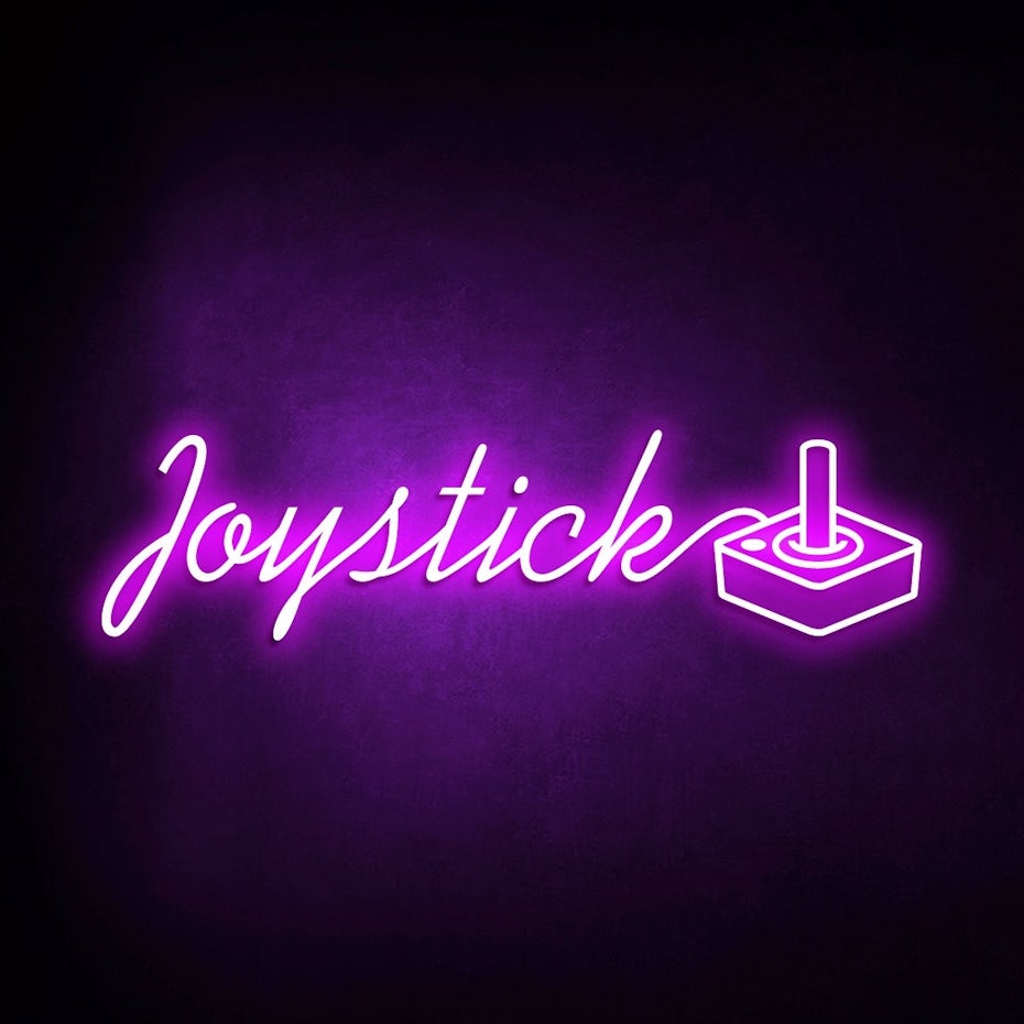
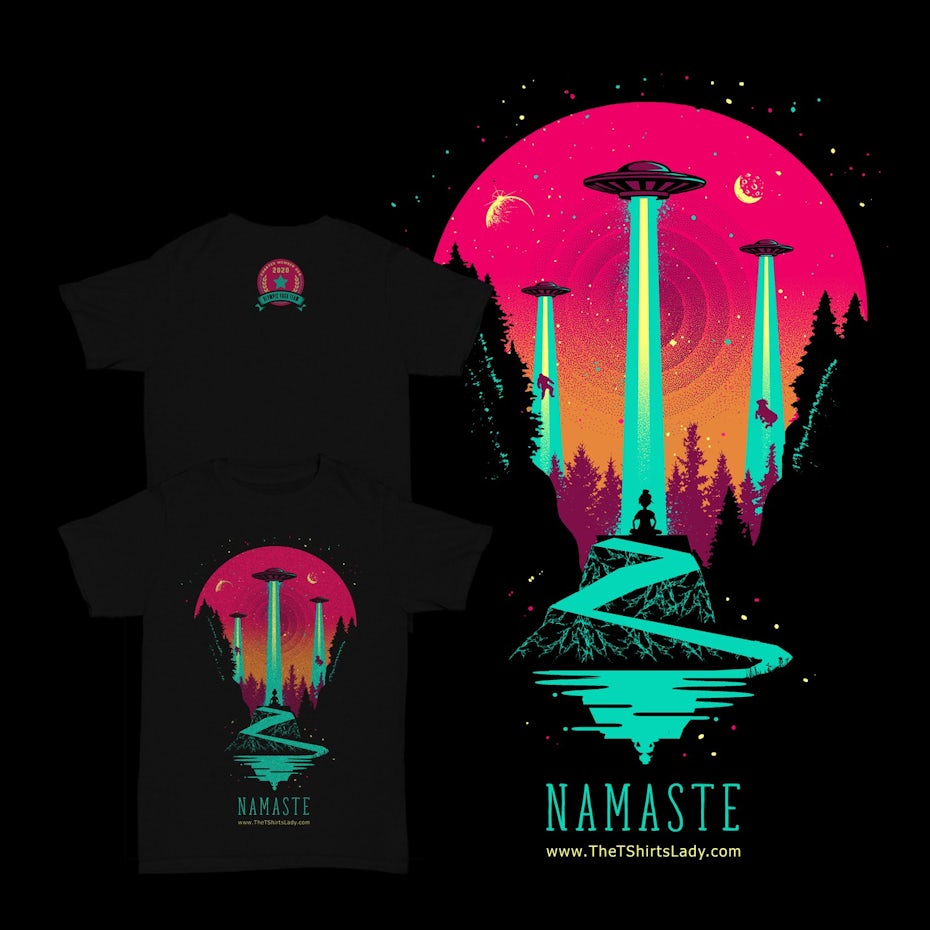
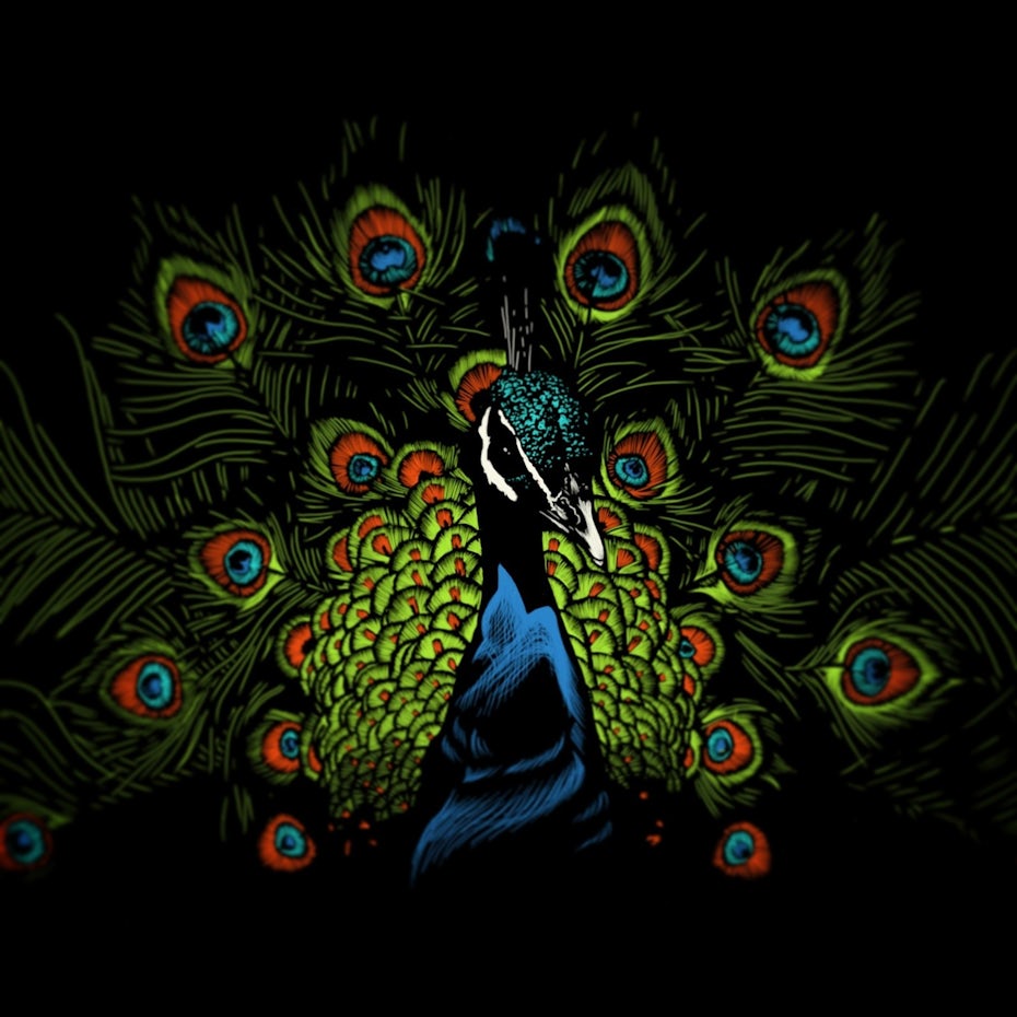
1. Glowing neons
—
Sure, exploring color trends is all about looking to the future, but in doing so, we also look to the past for inspiration. This is because many design and style trends are cyclical. The trends can go away, reappear, then go away again in a heartbeat.
Color trends for 2020 are pulling from one of our favorite decades: the 80s. Everyone remembers tapered jeans, feathered bangs, the Care Bears and “Thriller.” But color-wise, the name of the game was neon and it’s on the rise once again. Neon sign-inspired colors don’t necessarily have to be fluorescent and blinding. Whether they’re bright or deep, it’s the outline which creates a luminous effect.
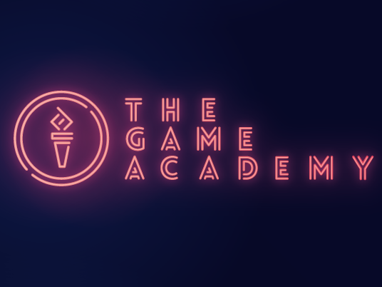
There is a lot of demand for the aesthetics of the 1980s. The heritage of the 80s lives on because people are collecting and consuming vinyl, cassette tapes, video game consoles, vintage computers, arcade machines and pinball machines again.
Neon sign colors feel right at home in a variety of design settings such as packaging, book covers or logos. The glowing finish catches the eye without going completely overboard. So go ahead, bust out that retro flamingo light and put it on display. It’s right on trend.
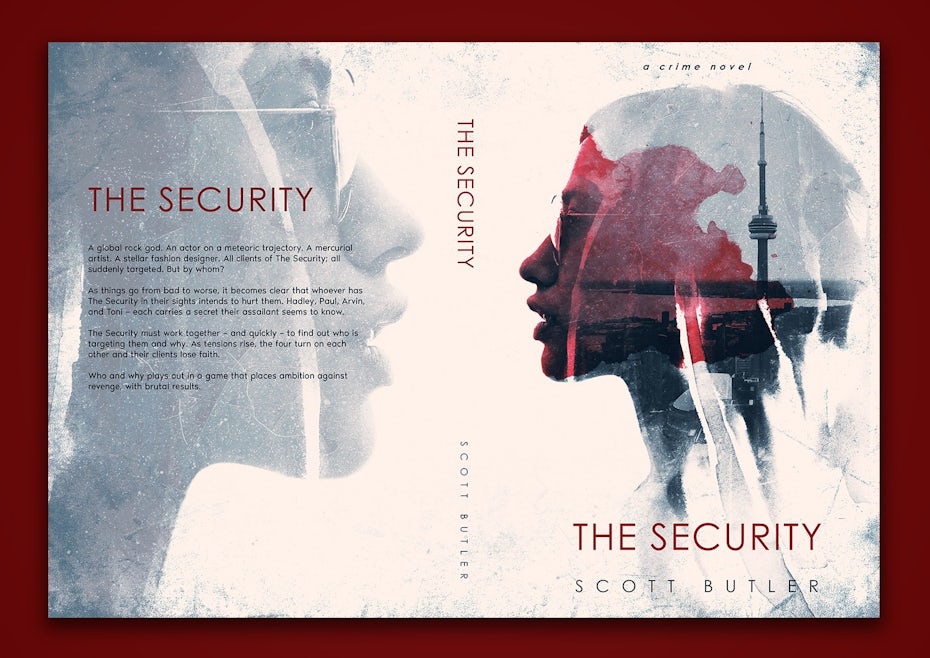
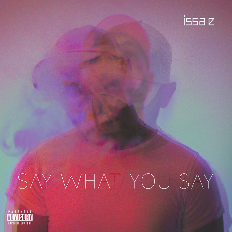
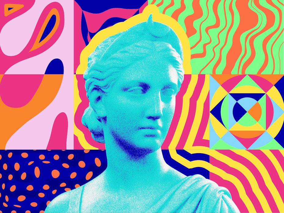
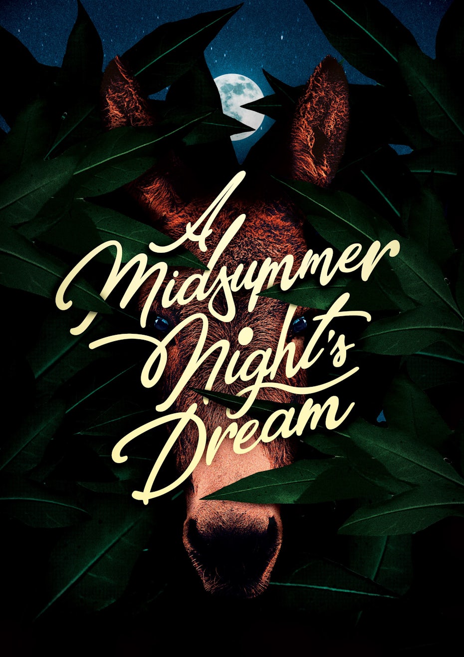
2. Transparent color overlays
—
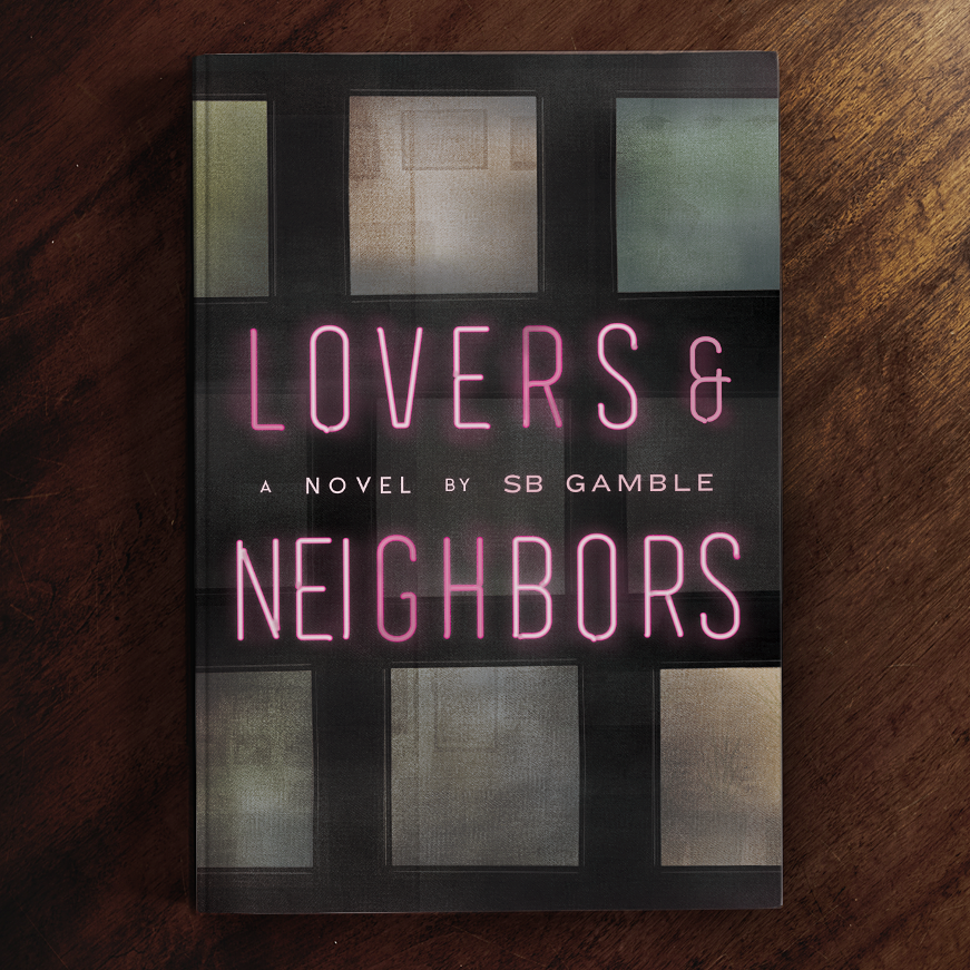
Remember how we said trends were cyclical? Well, they’re also evolutionary. As one trend develops, it can lead to another noteworthy trend. In past years, we saw lots of pastels, which have evolved into a trend of layered, see-through color and transparent color overlays. The layered effect feels lightweight and subtle, while also remaining deep and visually intriguing. Due to the intricate layering involved in the blend of colors, it works best in flat settings like posters, album covers, book covers or murals.
The overlay trend has lasting appeal in that it creates interesting, unexpected visual effects. At times, it’s almost glowing. It’s complex, but approachable. Each time a viewer sees a design of this nature, they may notice a different nuance to its composition. Design-wise, this is the gift that keeps on giving.

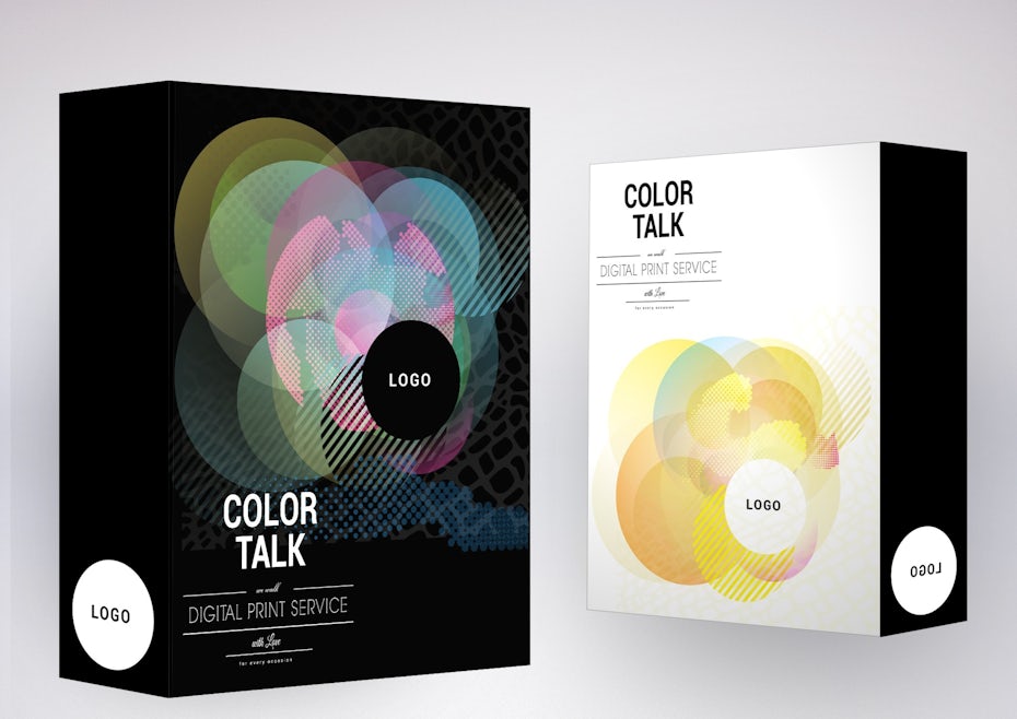
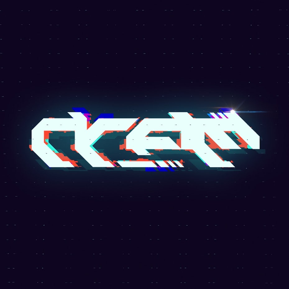
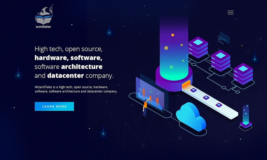
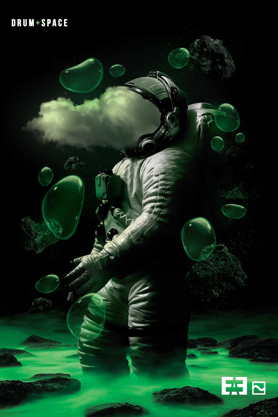
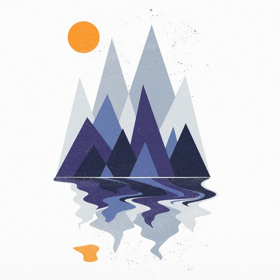
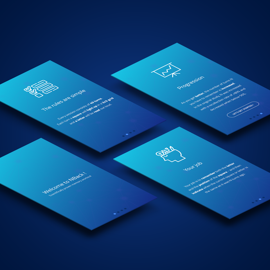
3. Futuristic color schemes
—
The isometric trend has been going strong for a while, and it has now blossomed into futuristic color schemes within various designs which are simultaneously flat and 3D (yep, it’s possible). Saturated blues, rich purples and blazing pinks have taken the futuristic look to another level. The result feels fresh, multi-dimensional and fun in a visionary way.
Futuristic color schemes and designs will be on trend next year, continuing with the isometric trend and bringing in colors like blues and purples and hot pink to give designs that futuristic glowing feel.
Remember: “futuristic” doesn’t have to mean self-driving cars, bitcoin and virtual reality. It can be evoked through a strategically placed palette which evokes a dimensional, glowing aesthetic.


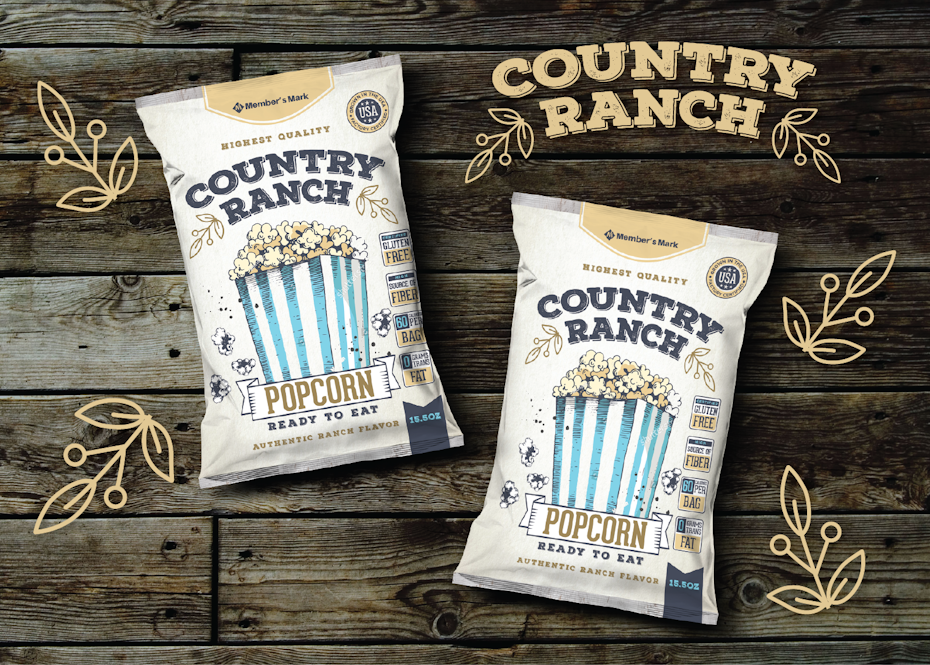
4. Vintage-inspired palettes with a modern twist
—
Vintage-inspired colors take us back to a simpler time—and honestly, it’s a much-needed throwback to an era when we didn’t spend hours upon hours staring at our phones. Remember that?
I think the vintage style with modern elements and colors (and vice versa) will be very strong in the next year.
Sure, there’s nothing new about vintage, but what makes it noteworthy for 2020 is the updated, modern approach to established ways. It’s all about taking something we know and love and making it even better. Picture muted, retro-style colors like mustard and cream, then imagine them in a fresh setting with interesting contrasts, pops of bright or pastel colors, minimalist shapes and sans-serif fonts. It’s like sifting through grandpa’s basement but only taking the really, really good stuff home to display on the mantle. Vintage yet absolutely modern-looking.

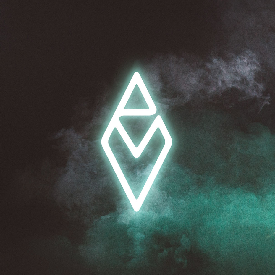
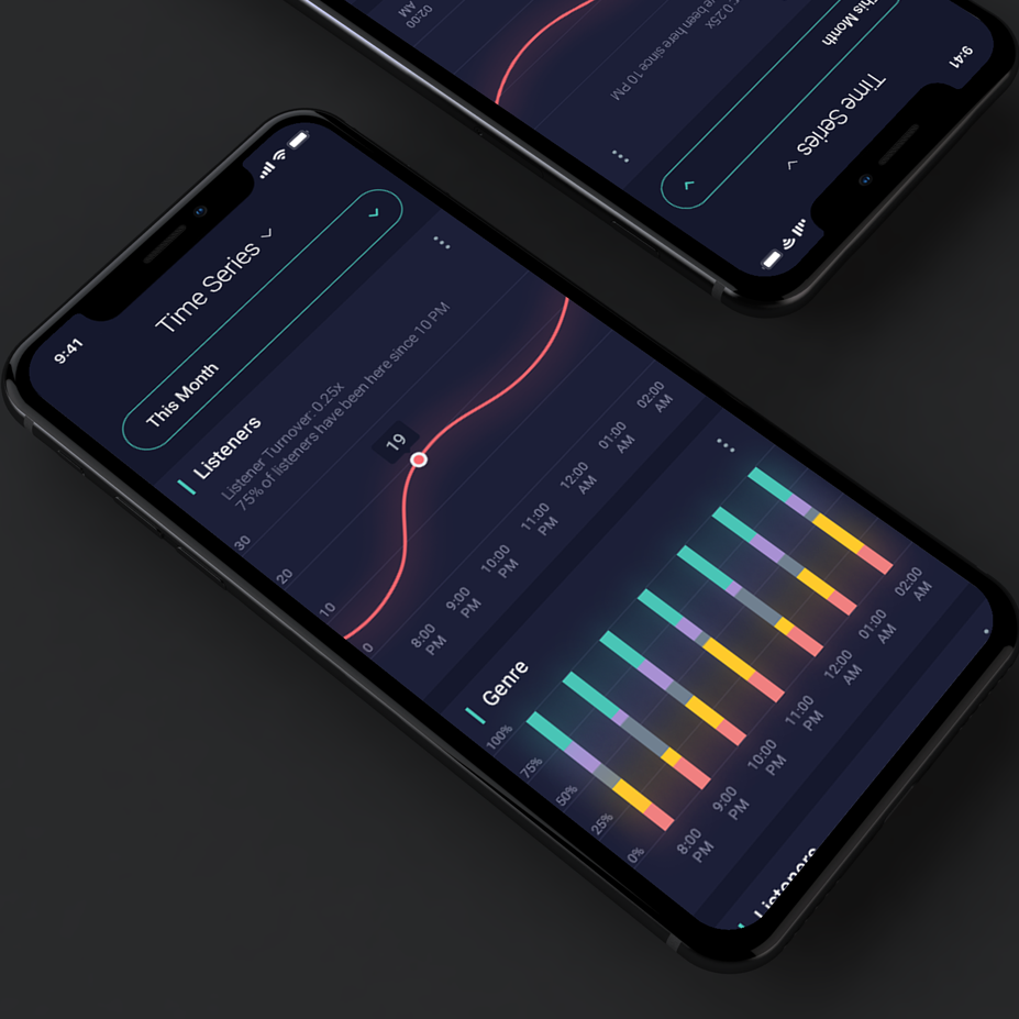
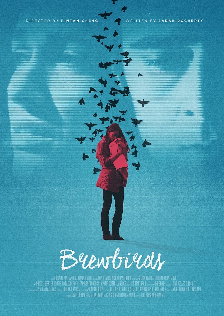
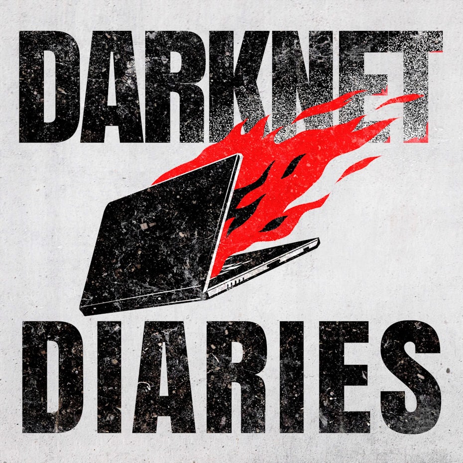
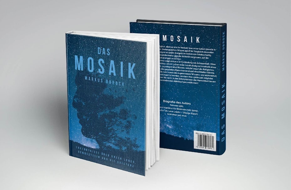
5. “Dark mode” color schemes
—
Dark mode grants the user the ability to experience an interface which is predominantly black or grey instead of white. The contrast allows for fascinating color combinations with saturated colors that pop on the dark background. Dark mode has become incredibly popular in web and app design. It’s easier on the eyes, more energy-efficient, and it also feels less harsh in environments with low lighting. But in 2020 dark color schemes aren’t restricted to websites anymore, we’ll see them basically everywhere.
Dark backgrounds make design elements stand out more, creating a higher contrast ratio with the use of other colors, but still improving visual ergonomics by reducing eye strain.
In continuing the trend, this aesthetic has also been front and center on several hit TV shows which feature a vintage and/or dystopian theme (do Stranger Things, Handmaid’s Tale and Black Mirror ring a bell?). It’s a winner, really. You can achieve the aesthetic by aiming for dark, edgy and gloomy color schemes with deep accents of color.


6. Unique monochromatic color palettes
—
Nothing says harmony like a monochromatic color scheme embracing many shades of the same color family. It’s easy to look at, simple to comprehend and it just feels right. Monochrome designs are a timeless trend that will never go away. But in 2020, designers are venturing away from simple black and white designs, focussing on more unique color families.
This color trend allows designers to boost their variation, contrast and interest while maintaining balance and unity. Another perk: this trend is tidy, but not nearly as one-dimensional as ordinary black-and-white designs. It offers a splash of color without being too colorful—basically, a win-win.


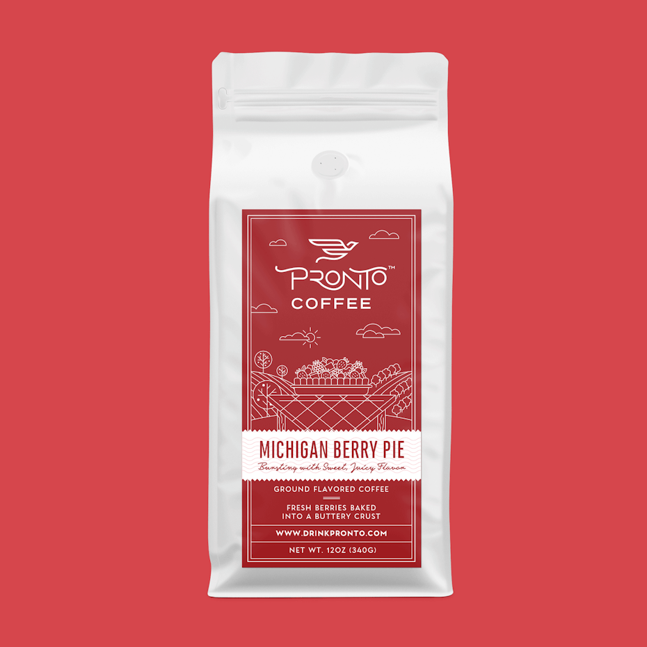
7. Colors that carry meaning
—
Think about today’s digital world: it’s cold, disconnected and often impersonal. To counteract this, we need colors which carry meaning—colors which move us. The meaningful color trend does just that by offering carefully placed colors which convey meanings and feelings.
Think about the strategic shade of red in the logo and branding for the American Heart Association. The red heart is a trigger, but in a good way. The color creates an emotional connection with the viewer, emphasizing the overall importance of the design.
To utilize meaningful colors in your next design—be thoughtful. Think about the shade of the color and place it strategically, so it can convey a meaningful message.


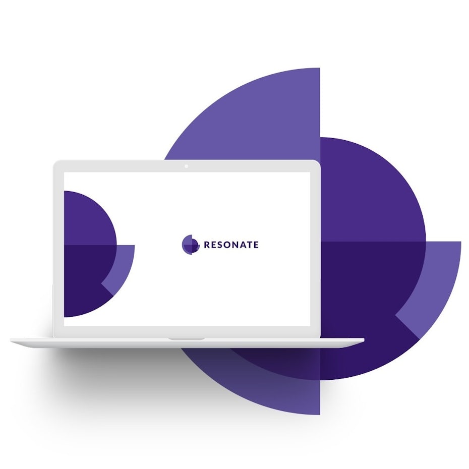
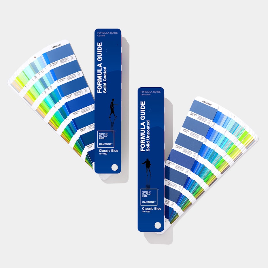
8. Classic Blue—Pantone’s color of the year 2020
—
Of course we can’t talk about color trends without mentioning Pantone’s color of the year. In 2020, Pantone chose “19-4052 Classic Blue”, a soothing, timeless shade that falls somewhere between mid-tone and deep blue on the color spectrum.
We gravitate to colors that are honest and offer the promise of protection. Non-aggressive and easily relatable, the trusted PANTONE 19-4052 Classic Blue lends itself to relaxed interaction.
According to color psychology, a classic shade of blue like this one represents intelligence, trustworthiness and maturity. That explains why blue is by far the most popular of all colors when it comes to branding, appearing in over half of all logos.
Classic Blue clearly captures the global mood of 2020. It evokes feelings of tranquility, trust, confidence and relaxation—things we all seem to crave heading into the new decade. Get ready to see lots of Classic Blue this year!

Dream in color for 2020
—
Diversity in design is a beautiful thing, and the 2020 color trends promise to deliver variety, depth and intrigue. From translucent pastel layers to repurposed vintage hues, there’s something for everyone. Dive in and have fun! This is your year for incredible design.
Do you need a design with on-trend color?
Let our brilliant designer community create something unique for you.
The post 8 inspiring color trends for 2020 appeared first on 99designs.
No comments:
Post a Comment