Take a look at your email inbox right now. Chances are, there’s at least one newsletter from a company you’ve bought something from or a creator you follow. When you’re looking for newsletter design ideas, one of the best places to get started is your own inbox.
There’s a reason why brands communicate with their audiences through newsletters: newsletters work. Statistics by Optinmonster found email click-through rates to be 6 times higher than engagement rates on Facebook, Instagram and Twitter combined.
Newsletters are a critical part of digital marketing because they maintain an ongoing conversation with your subscribers. Those conversations accomplish a lot: they position you as an authority in your field, keep readers in the loop about promotions, share new offerings, widen your brand’s audience and drive engagement. And just like you can communicate more through a video chat than a phone call, a lot of your newsletter’s messaging is conveyed through its design, rather than its words alone.
If you’re not publishing a newsletter yet, now is the time to start. Find newsletter design inspiration by taking a look at how brands in a variety of industries are using newsletters to connect with their audiences.
What’s in a newsletter?
—
Before we look at specific newsletters, let’s talk a bit about what makes up a newsletter, and how it’s different from other email marketing.
A newsletter isn’t just an email. It’s an email sent to educate and engage readers with the sender. Sure there’s a few calls to action, maybe even some promos or direct marketing woven into the content, but the overall goal of a newsletter is not making sales. It’s building and nurturing relationships…that ideally lead to sales.
Email marketing, on the other hand, is much more direct. Whether it’s a one-off blast about a new service or a six-part drip campaign starting with the promise of a free webinar and ending with an urgency-inducing hard sell, the goal is simple: close a sale.

So what’s in a newsletter? There’s no set-in-cyber-stone template every newsletter is required to follow, but generally a newsletter contains:
- A header. A clear HTML header sets newsletters apart from regular emails
- A footer. Just like headers, a footer gives your newsletter an official, professional feel
- Contact information. You can put it at the top or the bottom, but every newsletter you send should contain any relevant contact info like your email address, your social media links and your phone number
- A clear layout that organizes the content in a logical, easy-to-follow way
- One or more links to your website
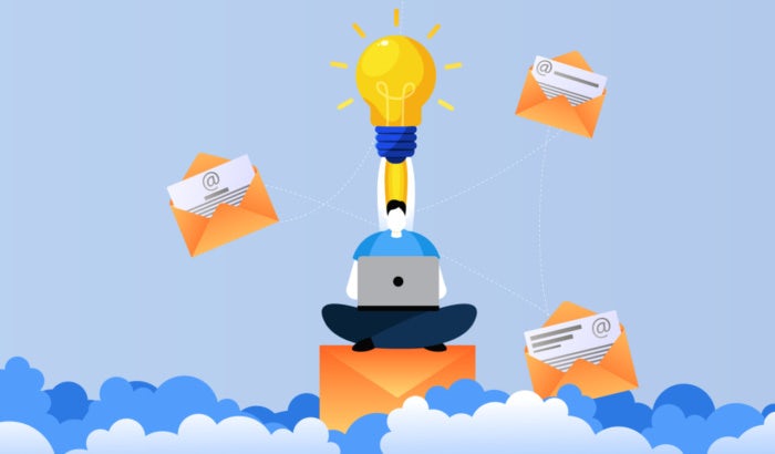
- And of course, images. There’s contradictory stats on whether image-heavy or text-heavy newsletters perform better with readers, so it depends largely on the kind of content you’re publishing and the audience you’re publishing it for. Test image-heavy newsletters against text-heavy ones to figure out which resonates best with your audience.
What can I expect from my newsletter?
—
According to GetResponse.com, the average open rate for email newsletters is 20.48 percent. The average click-through rate — the percentage of readers who not only open newsletters, but also click links within them — is 2.84 percent. That might not sound like a lot, but when there are tens of thousands or even hundreds of thousands of people subscribed to your newsletters, that’s a lot of clicks on your content.
Email marketing in general is considered one of the most effective forms of digital marketing. Here are a few more email stats from Hubspot to keep in mind:
- 99 percent of email users check their email every day
- Of the email users surveyed, over half of those who live in the US check their email more than 10 times per day
- Among the users surveyed, email was their preferred way to communicate with brands
- 56 percent of emails with an emoji in the subject line had a higher open rate than those without
- 93 percent of B2B marketers share content via email
Take a look below at how brands design the newsletters they send. Notice how these designs differ according to the content in the newsletter they’re sending.

Info-heavy newsletter designs
—
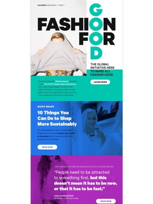
A newsletter’s primary goal is to share information. In fact, every newsletter shares information—but not all share the same kind of information. Some newsletters are all about the news, whether that’s a rundown of the latest industry info, a collection of articles from different news outlets or a spotlight on one of your articles that you want to push front and center.
The important thing to remember with this kind of newsletter is that text-heavy shouldn’t mean a dull (yet somehow overwhelming) wall of text. A single well-placed header image can set the tone for a newsletter that’s composed of links and article blurbs and make the list feel cohesive. This kind of newsletter is also where a clear, minimalist design really shines.
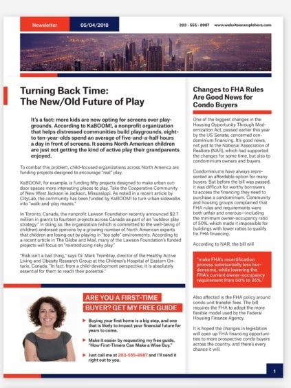
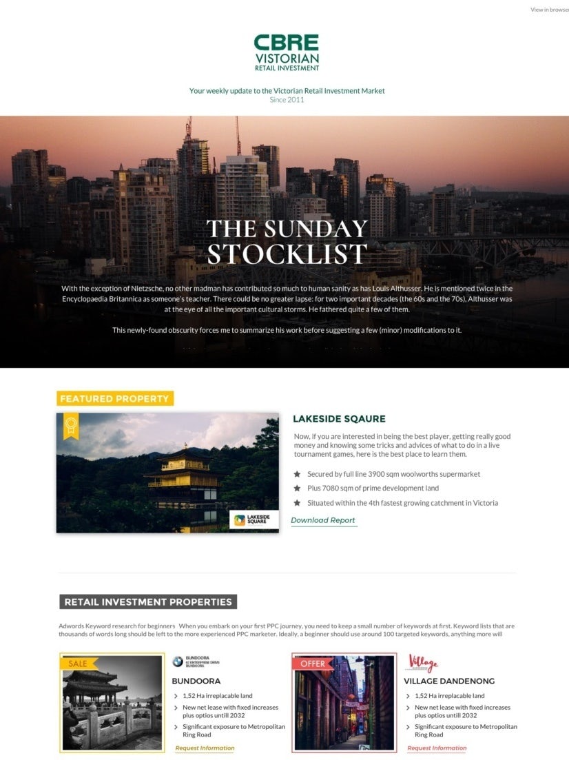
In their newsletter template, Jdr1992 breaks a huge amount of text into reader-friendly chunks by organizing it with colorblock design. The clear borders separate the stories and sections so they don’t run into each other, and bold-colored backgrounds highlight the key points and calls to action. Ahammad Sabbir’s design sections off the text into the center of the newsletter with thick, bold red borders, making the blocks of text feel less imposing.

Introductory newsletter designs
—
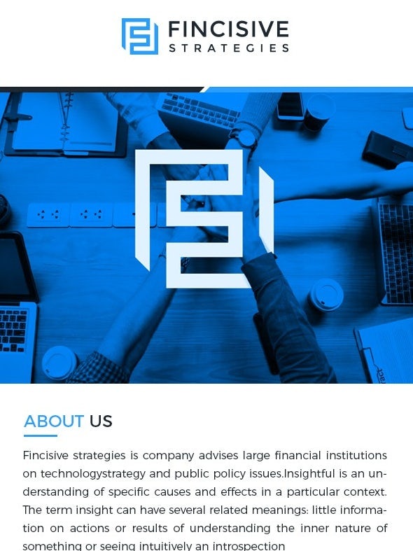
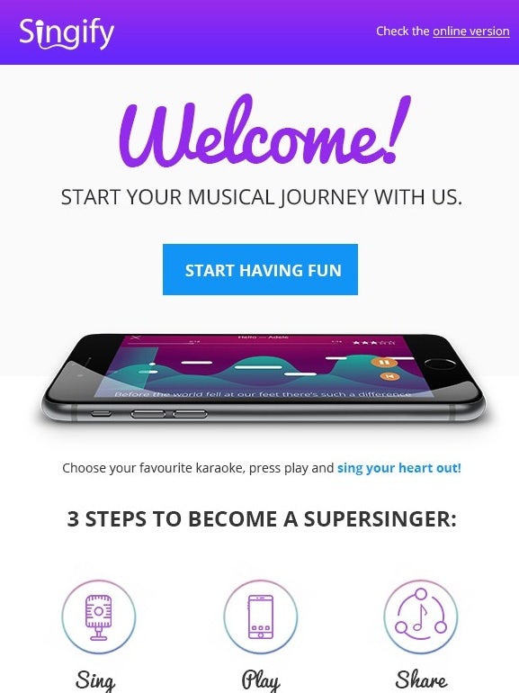
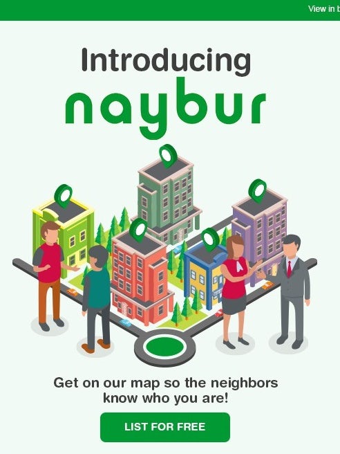
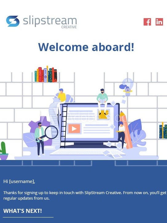
When a new subscriber signs up for an email list, the first newsletter they usually receive is a welcome email. This evergreen email gets sent to every new user and introduces them to the person or brand behind the newsletter they’re about to start receiving. This kind of newsletter can get fairly personal to start things off on the right foot, and also sets expectations for future newsletters.
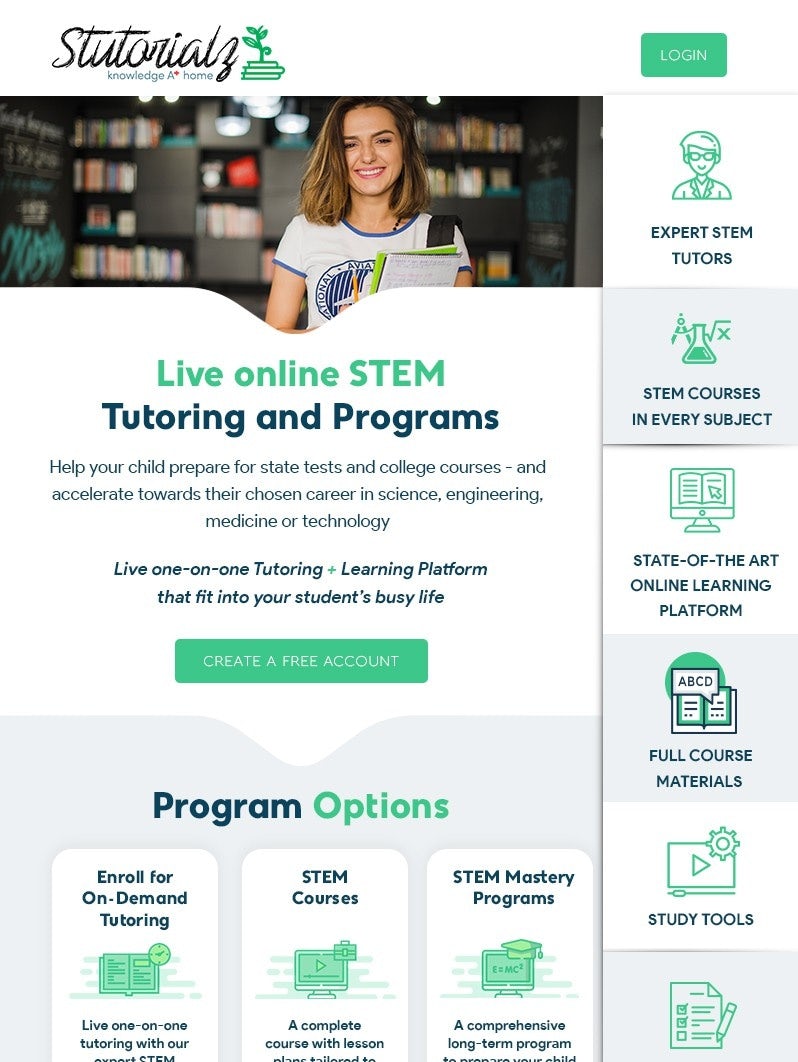

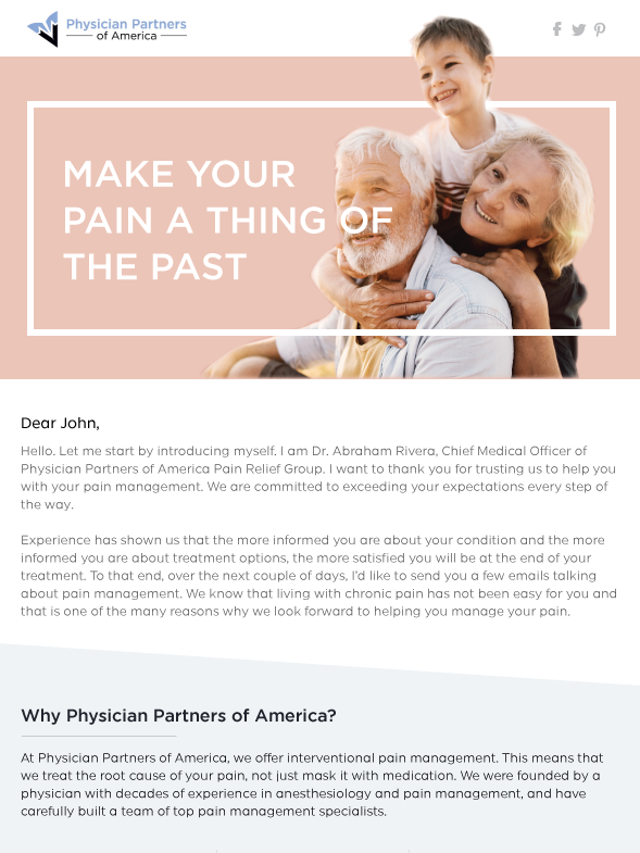
MailDesigner makes an impression on newsletter receivers immediately with their design that positions the sender’s pictures right next to the greeting. Paired with the greeting and intro in the first line, this casual newsletter builds quick familiarity with readers.
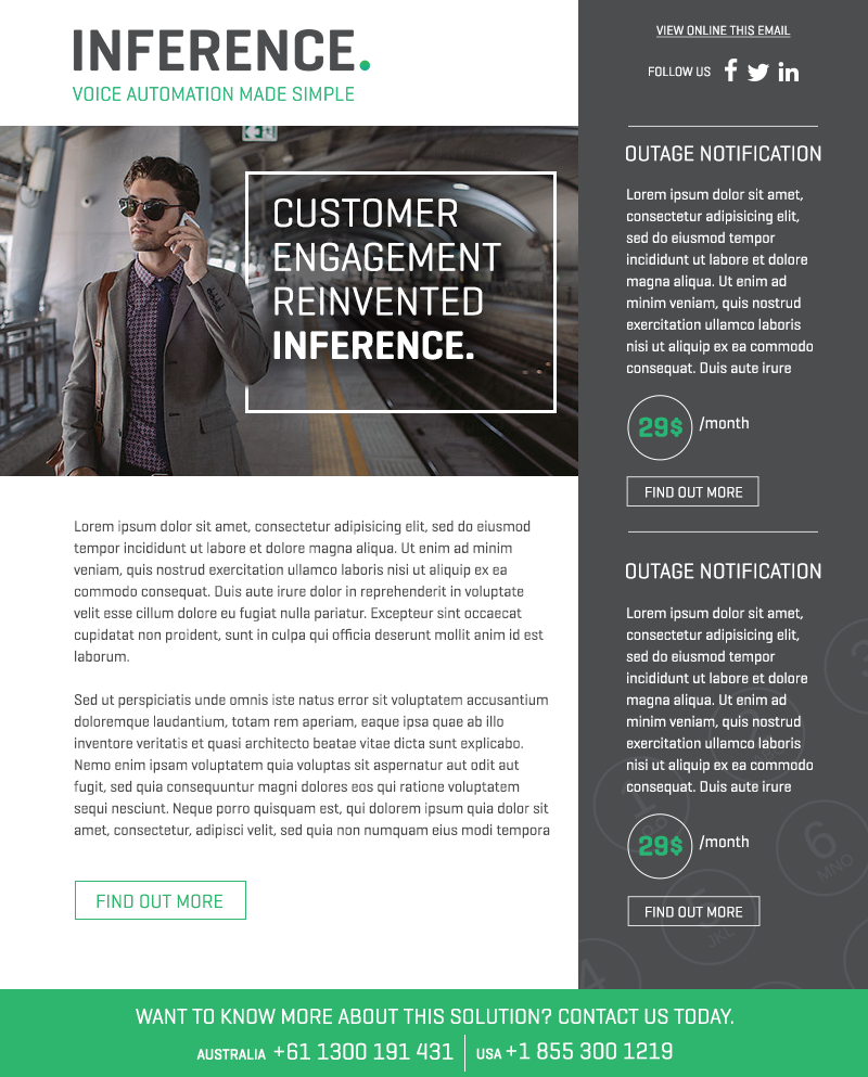
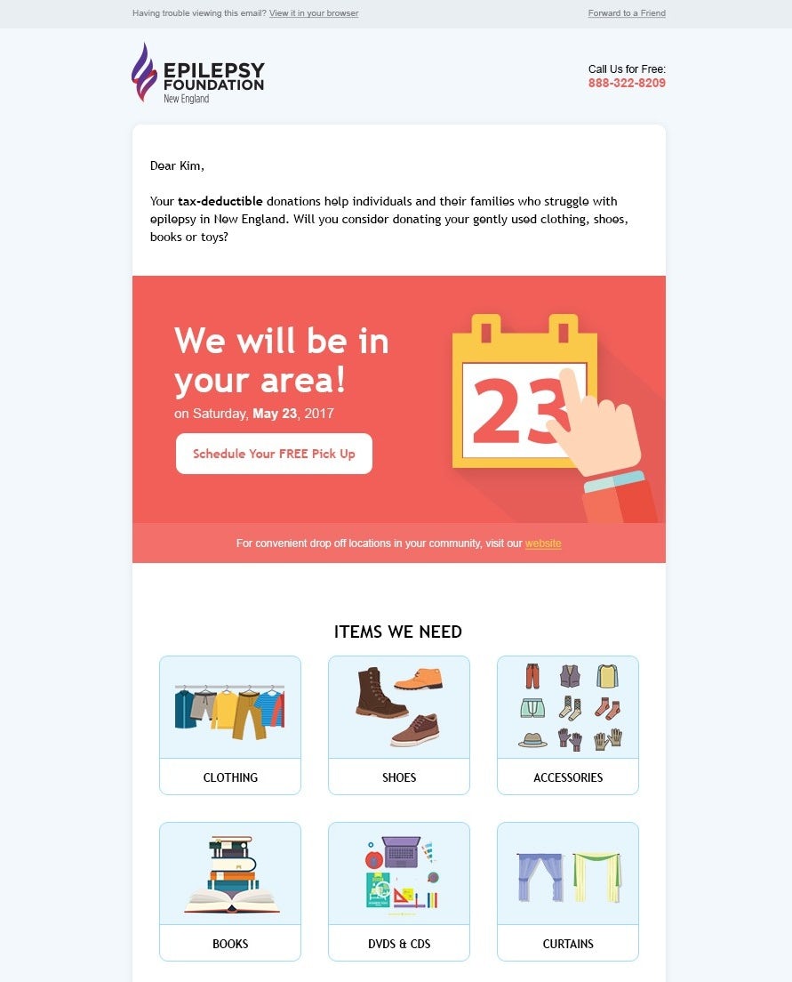
Promo newsletters
—
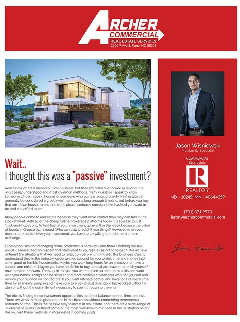
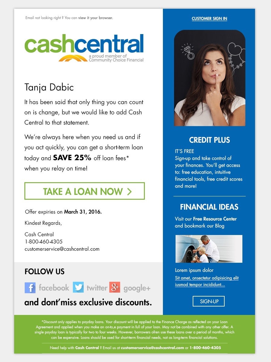
One of the most common ways brands use newsletters is to tell their email lists about current promotions. Sometimes, the only way to get in on a promotion is by clicking a link in the email. With this kind of newsletter, a design that emphasizes the promo code or link to the sales page is critical.
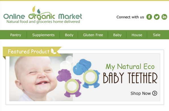
Although these kinds of newsletters promote new products and services, they aren’t strictly promotional. That’s the difference between a newsletter that includes promotional information and a marketing email. MAK Studios works a section featuring Online Organic Market’s latest blog post into an otherwise-promotional newsletter to blend info with advertisement. It’s not just a random blog post choice, either—it’s one that ties directly into the current promo code and encourages readers to take advantage of the promo.
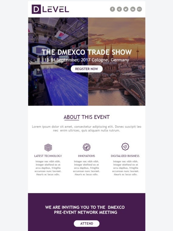
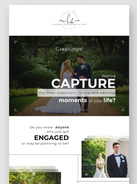
Take note of how individual brands design their newsletters differently, even when the newsletters are for the same purpose. In his design for Lakeshore Photography & Video, Mohyminul specifically chose a collection of photos that showcases different photography techniques. In MailDesigner’s design for D Level, there’s a lot more text. Specifically, there’s text promoting who’ll be speaking at the trade show and where the trade show will be, in contrast to Mohyminul’s design that promotes the photographer’s skills and experience.
Showcase newsletters
—
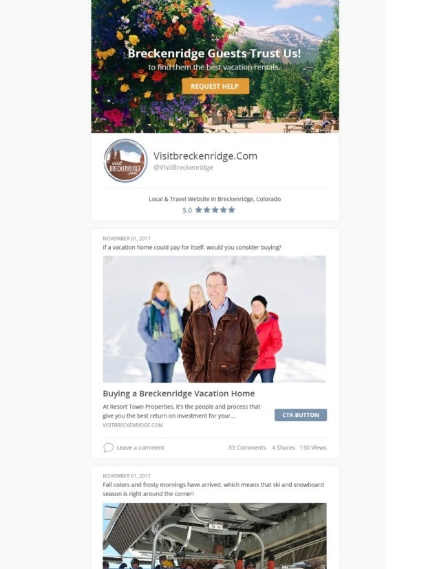
Another common way brands use newsletters is to showcase their latest content. It could be just one blog post/video, or a list of various pieces of content that share a theme. Often, there’s an introduction paragraph and in some cases, there’s a closing paragraph too.

These newsletters are strictly for promoting content, for whatever reason—to entertain readers, to inform readers, to drive readers to like and subscribe the sender’s channel or other platform, etc.
The design of jsae for 50 States of Blue provides a roundup of everything subscribers want to know, like the latest news on specific pieces of legislation and candidates. In the design, every piece of information has its own space to shine, without any specific stories or sections overshadowing the others.


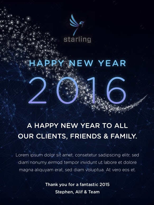
Celebratory newsletters
—
Newsletters in this category are less promotional than in other categories—but that doesn’t mean they don’t play an important role in building and maintaining relationships. These newsletters might go out on holidays, on subscribers’ birthdays or when the company hits exciting milestones.
If your regular newsletter is a weekly sitcom, this one is its holiday special. Some are glitzed-up versions of regular newsletters while others are just short and sweet, wishing their readers a happy holiday.

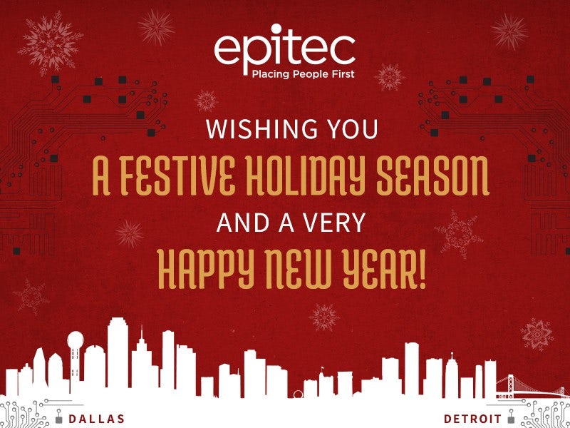
In her design for Epitec, Ruky keeps the greeting short, sweet and to-the-point with a warm holiday greeting. The connected Dallas and Detroit skylines at the bottom communicate how the holidays bring loved ones together, no matter how far apart they are physically.
Ready for a better newsletter?
—
Much like website design, effective newsletter design doesn’t just look great—it gets results. Once you’ve got a great newsletter design, you’ll most likely tweak it again and again to improve your open and click-through rates. Working with a designer who understands your goals and needs can make the tweaking process a whole lot smoother and easier, not to mention add in their own design expertise. Take a look at our platform now to find the newsletter designer who can take your brand from “Mark as Read” to “Favorited!”
Want a newsletter design that makes subscribers click?
Our community of designers can create a stunning newsletter just for you.
The post 32 newsletter design ideas to get your subscribers clicking appeared first on 99designs.
No comments:
Post a Comment