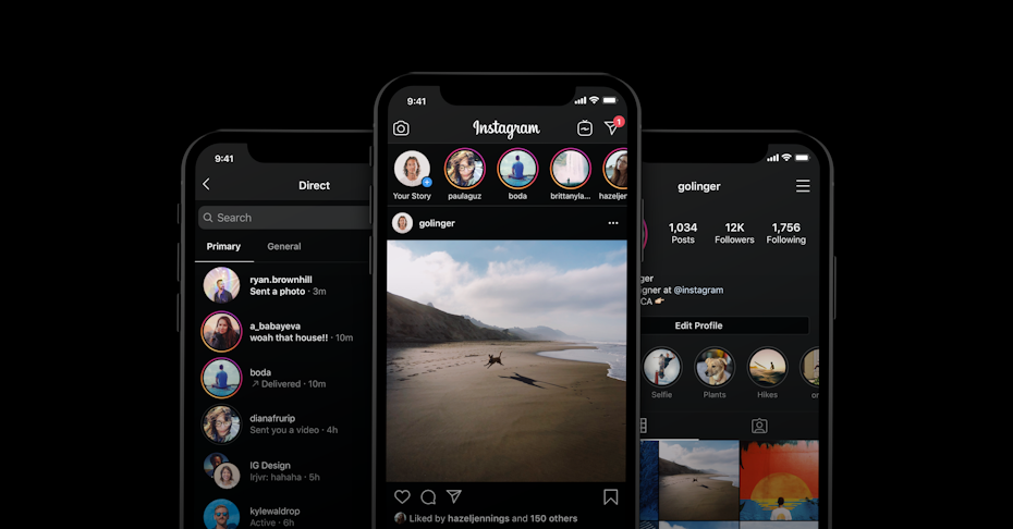
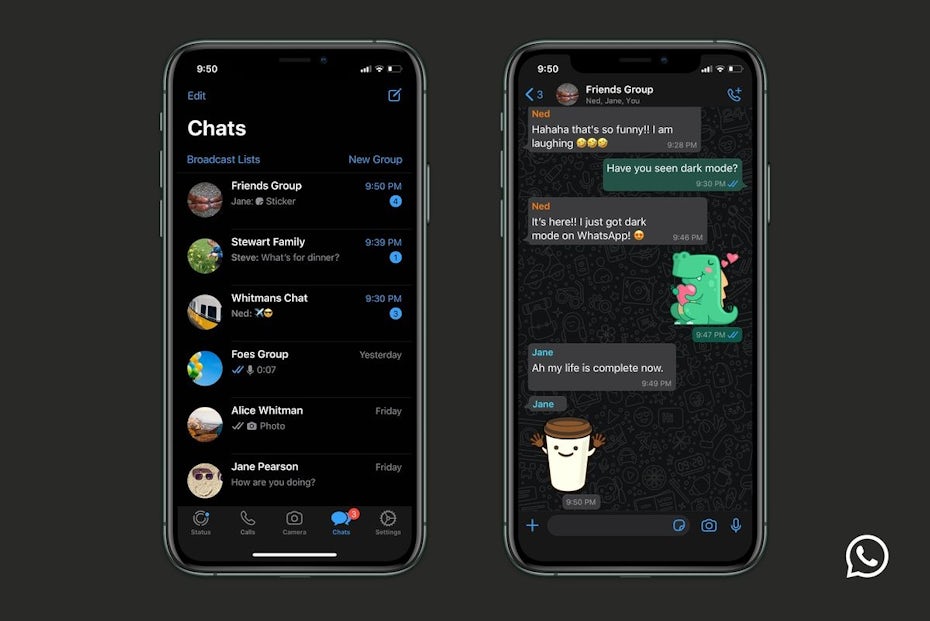
Dim the lights, relax your eyes and save your energy. Dark mode UI is one of the biggest trends in design, and world-class brands like WhatsApp, Instagram, Google, Facebook and Apple have already jumped on the dark mode train.

Let’s take a look at what these top brands are doing and how you can bring dark mode UI into your own designs. You’ll learn the pros and cons of dark mode and essential best practices to make sure your web and app designs look and function perfectly.
What is dark mode?
—
Dark mode is a low-light user interface (UI) that uses a dark color—usually black or a shade of grey—as the primary background color. It’s a reversal of the default white UI that designers have used for decades. In response to our increased screen time, developers discovered that dark mode UI helps with eye strain, especially in low-light or nighttime situations. Less eye strain meant fewer headaches and a better work experience.

But dark mode actually isn’t anything new.
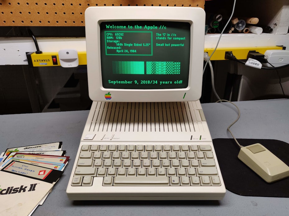
Remember the green computer code raining down a black background in The Matrix? That was a nod to the original dark mode: those old-school, monochrome monitors of the first computers.
That classic dark look went out of style in the 80s in favor of black text on a white background designed to mimic the look of ink on paper.
For nearly three decades, this was the norm, until dark mode made its first comeback in Windows Phone 7 in 2020. Once Google verified that dark mode saves battery life, they added the feature to their Android OS in 2018. A year later, Apple followed suit with a dark mode on iOS and iPadOS.

Pros of using dark mode
Not only is dark mode easy on the eyes (when done right), but this style saves battery life and even can be healthier. Let’s check out the practical advantages of dark mode vs. light mode.
Reduces eye strain
You’re not supposed to feel your eyes. But, anyone who analyzes data on a screen for a long time knows that after a while, you start to. Computer Vision Syndrome (CVS) includes eye pain, blurred vision, double vision, headaches, neck/back pain and more. When it comes to charts and graphs, dark mode can help literally reduce the pain.

Increases visibility in low-ambient lighting
If you’re asleep and someone turns on a bright light, you’re going to get a headache. The same principle operates with people working in front of a computer screen late at night or early in the morning. Dark mode reduces that bright light and makes it easier to see content in low-light situations.
Saves battery life
Certain digital gadgets with OLED screens can switch off black pixels when they’re not being used. Dark mode uses an increased number of black pixels, which force the device to use less energy.
Gives an emotional boost
Lots of dark mode UI users are in it for the health and energy-saving benefits rather than the aesthetic reasons. Dark mode reminds them they’re doing something a little healthier, which triggers a good feeling—kind of like that good feeling you get when you load up your reusable shopping bag or water bottle.
Prevents ADD
Well… kinda. White light and colors tend to make your attention drift, which makes it harder to stay on task. Dark mode UI can increase focus by directing your concentration toward the content zones of your interface, letting that content pop and the background disappear.
Cons of using dark mode
Like anything, Dark mode has its disadvantages. Let’s get familiar with the reasons that a dark theme could be a drawback to your purposes.
Reduces emotional connection
Bright colors can create bright emotions. If that’s what your viewers are looking for, then dimming the colors can create a mental barrier with them. They’ll have a harder time making an emotional connection with the dark theme. If your brand is motivational, inspirational, or spiritual in nature, dark mode UI can be a gamble. If bright colors can create bright emotions, the opposite can be true. So who’s your audience? Don’t bum them out if they’re looking for a lift.
Shrinks space
Rooms with dark walls can feel claustrophobic. On a device, dark mode can work the same way. If you’re trying to create a sense of space, dark UI’s can make space feel smaller.
Low contrast colors can be hard to read
If you don’t get your colors and contrasts right when designing a dark theme website or app, it can make text harder to read, so keep that in mind when creating a dark mode email, app or website design.
How to use dark mode in design
—
Dark mode design can work anywhere. From mobile apps to smartwatches to TV interfaces, this design trend can move your brand forward. Do it right and dark mode can work like gangbusters. Do it wrong and your design could turn users off immediately. Here are some top tips when designing a dark theme website or app interface:
When to use dark mode
Match your brand colors
When a brand’s existing color palette is already dark mode compatible, the dark mode gods are smiling on you.
Think twice about going dark if it seems like you have to change the brand to fit the aesthetic. Similarly, if your brand needs to use a wide spectrum of colors, consider a lighter UI. The full color spectrum doesn’t read pleasantly on dark backgrounds.
Highlight your industry
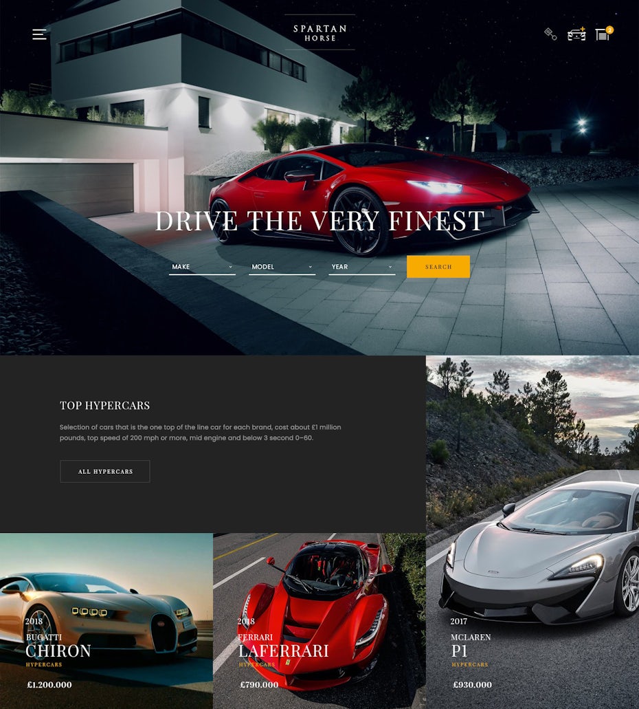
Dark mode UI is also useful to enhance specific industries. For example, brands focused on nightlife and entertainment are perfect match for dark mode because their high-energy content is often paired with a dark background in real life.
Go minimalist
If your design aesthetic is already minimalist with limited content, your conditions are good for dark mode. In a situation where text is the primary content, dark UI can make legibility an issue. Typically, dark mode amplifies visual clutter making a cluttered screen even more chaotic.
Generate emotion
Trying to create a certain emotional response? Like an air of mystery or a little drama? Since low-visibility creates curiosity and amplifies emotional tension, dark mode might be the perfect vehicle for your brand.
Status symbol
If you want to generate a feeling of status, dark mode UI can be an effective tool. Darker colors evoke emotions associated with luxury and affluence. If you want to draw attention to fine craftsmanship, consider dark mode UI.

Best practices for dark mode design
—
There are certain processes that need to work properly when creating dark mode UI. After all, you want your product to kick-ass, right? Let’s check off all the boxes on our dark mode best practices checklist:
1. Don’t go too dark
Book publishers don’t use pure white paper because the contrast with black ink is too stark. It makes you squint and can lead to headaches. The same goes for digital devices. Steer clear of pure black. It’s hard on the eyes to look at a high contrast screen. Good dark mode colors are shades of grey combined with desaturated colors.
2. Have proper contrast
Dark mode backgrounds have to be dark enough to show white text. The suggestion from Google Material Design is to use a text-to-background contrast level of at least 15.8:1.
3. Desaturate your colors
Keep away from fully saturated colors on dark backgrounds. The shades often seem to “vibrate” when viewed on dark surfaces. Instead, use desaturated colors like pastels and muted colors—shades that have grey and white added.
Also, consider adjusting your brand’s color palette. Your company’s blue might read differently on black than on white. Colors in dark mode often have to be tweaked to elicit the same response you’d get in light mode.
4. Use the right “on” colors
What’s an “on” color? One that shows up on top of elements and key surfaces. “On” colors are usually used for lettering. Dark mode UI default “on” color is pure white (#FFFFFF). Don’t use it. #FFFFFF appears to vibrate when viewed against dark backgrounds. Go with a light grey.
5. Don’t just reverse
If you’re switching to dark mode from standard mode, there are probably valuable visual cues in the original theme. Don’t simply invert the colors to get your dark theme. You might be turning colors that had a psychological purpose into meaningless muted colors. Be intentional about your color selection.
6. Get deep
The higher a layer is, the lighter it should be. This will create a visual hierarchy in dark mode that goes from the most used elements in your display to the least.

7. Test and offer freedom
Test both dark and light mode versions of your design. Experiment with each style and make the appropriate tweaks based on user feedback. Ultimately, people’s preferences can be unpredictable, so don’t pigeon-hole your users. Let them toggle their display from light mode to dark mode. This gives users the chance to control their own experience and let them feel more like an individual.
Go dark!
—
The dark theme revolution is just getting fired up. That means it’s the perfect time to go dark and get creative. Get ready to become a pioneer of dark mode!
The post Dark mode design: tips for creating dark theme websites and apps appeared first on 99designs.
No comments:
Post a Comment