As the first and most important statement your brand will make, a quality logo design is one of the most essential vehicles for branding success. Whether you’re building a new brand or refreshing an existing one, evaluating the quality of your logo is an important step to take.
Let’s make one thing clear: “good logo design” is subjective. Personal taste and preference will inevitably become a factor when assessing logo quality. Still, there are certain principles of logo design that a high-quality logo needs to adhere to, so it’s wise to try and look at the logo objectively. Pare it down and approach it with fresh eyes, even if it’s hard to step back. We recommend thinking of the logo as a communication tool: it should always speak clearly.
We’re here to help distinguish what makes a quality logo. Remember: whether your brand is bold and edgy or refined and elegant, you deserve to look good—and “good” doesn’t always mean flashy and expensive.
4 key questions to ask yourself when evaluating logo quality:
—
1. Does the logo embody the brand itself?
2. Is the logo aesthetically pleasing?
3. Is the logo memorable and identifiable?
4. Is the logo functional?
Does the logo embody the brand itself?
—
First impressions are everything, and for many newcomers to your brand, your logo is likely their first experience of who and what your brand is all about. A high-quality logo will say exactly who you are, right from the start. To get there, you simply have to ask, what makes your brand unique? Make sure you’re confident about the answer and then ensure that your logo matches up.
A successful logo will often have a built-in message or meaning which supports the brand’s overarching purpose and goals. Here, we’ll look at two top-quality logos—one long-standing logo and one from a rebrand effort—which both thoughtfully convey a message.

FedEx has used the same logo since 1994, and it has become a pillar of the brand as a whole. What makes the logo so special is the strategically placed arrow between the letters E and X. It adds excitement for the consumer—especially when they discover this treasure for the very first time. The arrow upholds the company’s goal and purpose, as it’s a business which was founded on the principle of speedy delivery. The arrow is an intriguing visual element which symbolizes speed and efficiency. The execution of the spacing is absolutely perfect, and the bold colors stand out nicely on their white packages. The FedEx logo is honest. What more do you want from a shipping company?

Now, let’s look at a modern spin on successful messaging. The Tour de France logo has seen several iterations, but it has remained constant since its 2002 rebranding effort. What made this rebrand so unique was its drastic change from past logos which felt stuffy and corporate, to the current logo which feels artistic and adventurous.
The message in the logo is crystal clear: the letters and symbols form an active cyclist on a ride. The logo embodies the excitement and movement of this major sporting event. And in addition to the bike, the script feels fluid and full of motion. It’s an athletic logo with artistic vision: a clear gold medalist.
In contrast, not-so-great logos are the ones which don’t embody their brand and don’t get the message across. London hosted the 2012 Olympics, and while the event was met with much excitement and buzz, the logo fell short.
Sports fans criticized the jagged shapes and neon colors within the logo. It felt too retro-inspired for the year 2012, and critics jokingly noted its resemblance to Lisa Simpson’s hair.
But the issues went beyond the shapes and colors, as this logo also didn’t fulfill its overall purpose: conveying the message of the Olympic spirit. The Olympics are all about global athletes coming together for the love of their sport. Just like the interlocking Olympic rings in its parent logo, any corresponding Olympic logo should display a sense of togetherness and unity. The pulled-apart pieces in the London logo fell short. They came across as disconnected; almost as if they’d had an argument and were drifting apart. Famed design firm Wolff Olins has stood by its creation, but many onlookers continue to disagree.
Is the logo aesthetically pleasing?
—
Let’s talk about aesthetics. A great logo should not only look good, but it should also acclimate well to any space, and also have a sense of individuality. A quality logo is adaptable in various environments and unique to its brand. Let’s break down these two aesthetic concepts.
A quality logo is adaptable
Great logos are chameleons: they look good anywhere, any place and in any color scheme—yet still recognizable. Logo quality shouldn’t be impacted by whether the logo is big or small, or even digital versus tangible. It just needs to adapt.
A unique success story is Adidas. The global brand actually has several similar-but-different logo variations to offer, but Adidas makes it work. Why? Because these logos always look good. While they’re most commonly seen on wearable items, they can easily work elsewhere (on a soccer ball or a gym bag, for example). They’re obviously sporty (as Adidas should be), but more so, they’re versatile.

Unlike Adidas, Verizon for example has a tough-to-adapt logo. Despite several rounds of redesigns, the logo still isn’t quite as outstanding. A logo should be aesthetically pleasing, and Verizon’s really doesn’t have much to offer in terms of aesthetics. Simple is good and less is more, but this isn’t a logo that you’d particularly want to look at on a billboard, and it wouldn’t make you feel good to wear it on a T-shirt. It’s an instance where a company’s logo doesn’t add as much value as it could.
A quality logo is unique
Nobody likes a copycat—or a generic logo that blends into the crowd. It can lead to a lack of identity, as well as confusion for the consumer.
Think about the Playboy logo: say what you will about this brand and its purpose, but the logo is iconic. It is undeniably Playboy, and it would be hard to find another logo with similar aesthetics. In terms of quality, the Playboy logo is a major success.
On the other hand, there’s Pandora. In 2017, the popular web-based radio station redesigned its logo, and the result looked shockingly similar to the existing logo for PayPal. The design felt so referential that PayPal opted to file a lawsuit against Pandora.
When looking at the two side by side, it’s important to remember how both brands’ customers typically utilize their services. Whether you’re listening to music or sending money to a friend, it’s likely happening in app form on a pretty small screen. That single logo for the app tells the customer everything they need to know, right away.
The similarities between PayPal and Pandora’s logos are particularly confusing in a mobile environment. Remember that more and more brand interactions are happening in mobile settings. So, when you think about your logo looking unique, don’t forget about what its going to look like in different settings, such as your app icon. It’s essential.
Is the logo memorable and identifiable?
—
Face it: some of the best logos in the world are also the most widely identified. But being memorable and identifiable can mean many things.


For Shell, it means that a logo can speak for the brand without using any words. The average consumer sees the Shell logo and knows exactly who the brand is, what it’s all about and what to expect. But for others, it’s a more strategic, nuanced experience. The Disney logo is a great example. Not only is it explicitly associated with the brand, but it also utilizes a custom font to enhance its overall voice. It’s the ultimate branding experience.
Interestingly enough, one of the most memorable, identifiable global logos has barely changed since its inception in the late 1800s. We’re talking about Coca-Cola. The logo is truly timeless, and despite many technological advancements in culture and society, the logo has remained constant through the years. Even the beverage packaging has barely changed, and consumers still appreciate the nostalgic nature of the glass bottles. Coca-Cola is easy to spot in a crowd. It’s approachable and relatable. It’s ingrained in the minds of consumers young and old, male and female, working class and wealthy. Coca-Cola speaks to all, and that’s what makes it great.
Remember, a logo needs to be functional
—
In addition to being easy to remember, a great logo needs to be functional. In this day and age, this means serving its purpose in both tangible and digital environments. Think about all of the places where a logo can live: a T-shirt, a shopping bag, a business card, a website, an app—the list goes on.
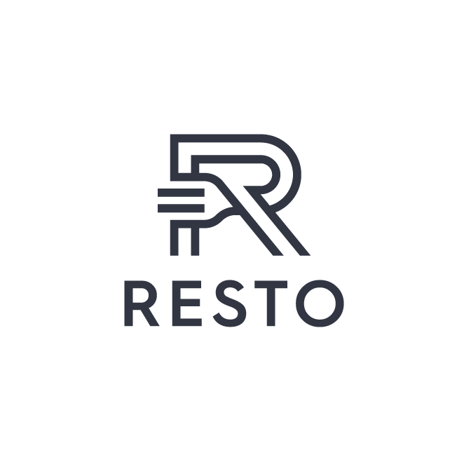
Think about what the user wants to see in a digital space. More than anything else, the logo should provide convenience and ease of use. Symbol-driven logos tend to be the most versatile in both types of environments (look to Swirl, Resto, LovedUp and FitMarguerite for fresh examples of multifunctional logos).


Don’t sacrifice quality when it comes to logo design
—
Making a quality logo comes down to embodying a brand, offering good aesthetics and being memorable. Now is the time to examine your approach to logo quality. Remember its sizable impact on your overall success! And if you need a little help, turn to the global community of designers at 99designs.
The post How to evaluate logo quality appeared first on 99designs.
No comments:
Post a Comment