The beauty of collage design is that there are no rules. It is an extremely freeing form of design with endless possibilities—each added element fleshes out the new world you’re building on the page or the screen.

It’s no surprise that collage continues to be a popular and widely recognized form of contemporary design, constantly evolving as new technologies enable it to evolve.
The collage trend of 2020 is more confident, expressive and abstract than previous collage trends. You’ll see less carefully placed vintage imagery and more of an “anything goes” attitude: playful mark-making, abstract photography clippings and tons of texture.
In a world where climate and economic realities drive us to be more resourceful, contemporary collage design utilizes the materials all around us and boldly illustrates our modern culture.
In this article, we’ll look at a brief history of collage art and how new collage trends are being used in today’s graphic design.
What is collage art?
—
The most simplified description of collage is this: a piece of art made by sticking various photos and paper onto backing. But collage design doesn’t end there. There are many different styles and expressions of collage, ranging from its humble arts and crafts beginning to cutting edge graphic design and illustration.

Collage revolutionized modern art as part of the early 20th century Cubism movement. Picasso and Braque first coined the phrase collage from the French verb coller, meaning to glue. Since then, collage has been used by many artists and movements like Matisse’s legendary cutout series and Jon Savage’s British punk aesthetic. And it never went away—collage is ever-present in contemporary art and remains an essential and relevant art form.
Paper collage
Paper collage, otherwise known as analog collage, is the original form of collage art.
Whether you are cutting images out of old books or working like Matisse and cutting shapes out of painted paper, paper collage is the prototypical form of collage.

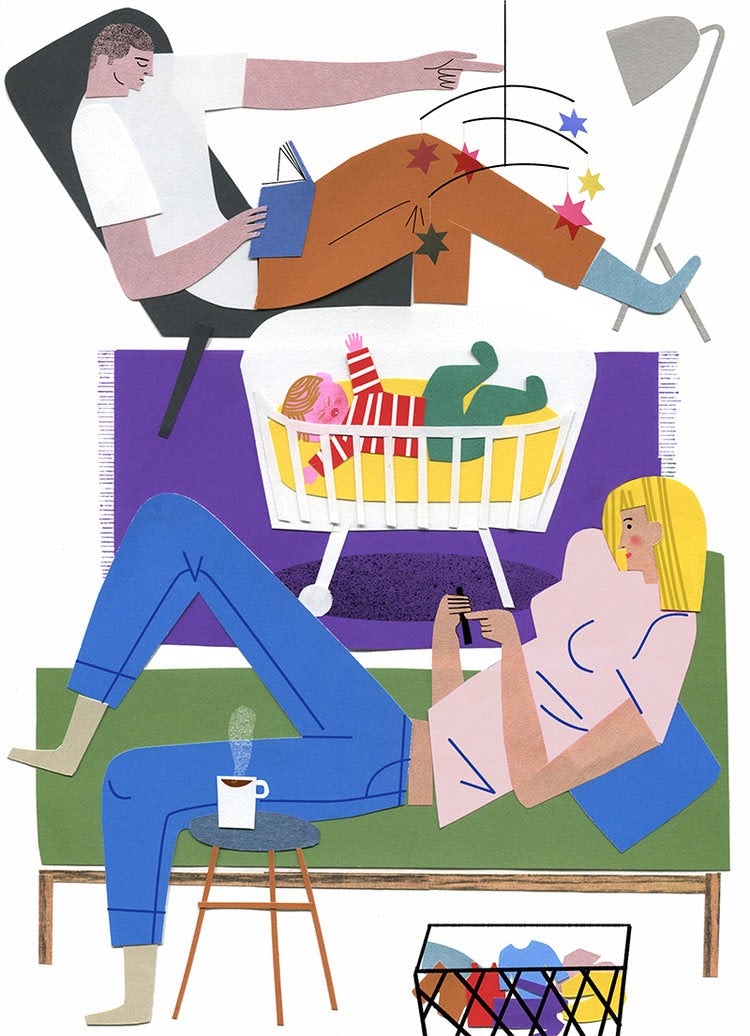
It’s also the kind of collage art that’s trending most now. Ripped, raw paper shreds are a clear contrast to the seamless, tidy look achieved with design software. It feels authentic because this kind of art requires the creator to work with their hands, physically tearing paper and arranging it just so.
Designers are fairly limited with paper collage in that they can only compose with the materials they can find. However, this constraint can drive creativity by forcing the designer to find unconventional ways to express ideas. This might mean combining two separate images to create something completely new, like combining a set of bird wings with a bus for a creative take on an airplane or using different colors to create the illusion of depth on a flat surface.
Digital collage

Digital collage is an entirely different beast to paper collage because there are no physical materials—and none of the constraint that comes with using them. With digital collage design, unique images are created by using software like Photoshop to alter textures, layer multiple photos and illustrations and distort source material. The effect is usually a lot sharper and modern-looking than a paper collage, but it often lacks the tactile quality of paper collage.
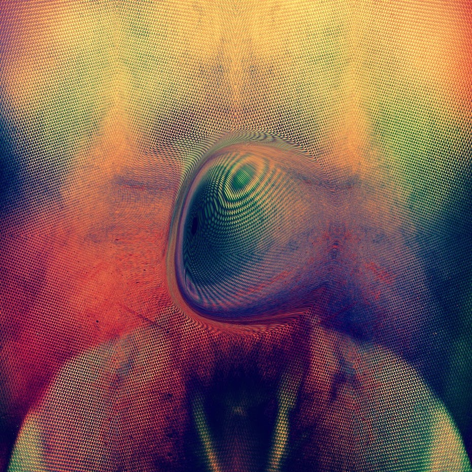
Leif Podhajsky is a master of digital collage experimentation, creating atmospheric and psychedelic album covers for bands including Tame Impala, The Horrors and below, Young Magic.
Mixing materials = the key to all collage art
Although we said earlier there are no rules to collage art, there’s actually one rule: be creative. Designers aren’t limited to paper and photography in their collage designs; many mix drawing, brush strokes and a variety of textures to build their designs.

Na Kim’s book covers are a masterclass in experimental collage utilizing different illustrative techniques. For her Enigma Variations cover design, she brings photography and illustration together digitally to create an entirely new image.
The better you understand collage art, the more you’ll notice just how pervasive it is in pop culture and your day-to-day life. That intriguing book cover you saw last weekend, the striking packaging design on the overpriced craft IPA you’re sipping, that kaleidoscopic album cover you couldn’t stop staring at…collage art is everywhere.
Take a look at a few of the places it’s trending hardest with designers:
Collage in book cover design
—
Collage is a great art form for book cover design because with it, there are lots of ways to illustrate a book’s content and touch on its themes. And there’s something a little bit daring about using ripped paper to create a book cover design—so many readers think of tearing book pages as sacrilegious, so seeing a design made of paper shards elicits an almost visceral, definitely eye-grabbing response.
Rather than creating seamless imagery, today’s paper collage trend sees book cover designers confidently owning the rips in paper and the shadows they cast onto their compositions, making the book covers really stand out in a book shop. The expressive, artsy quality of playful paper collage also makes it ideal for editorial illustrations and magazine covers.


Editorial collage design
—
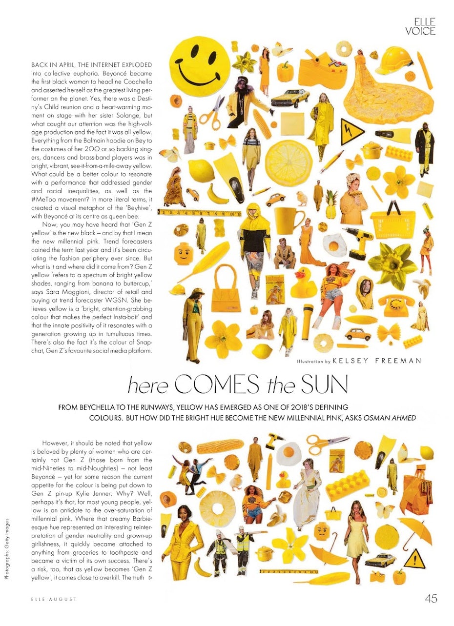
As we mentioned earlier, collage design works perfectly for editorial illustrations because the layered elements make images feel like they’re jumping off the page. You’ll find collage illustrations in glossy fashion magazines, newspapers and blog posts.
Color blocking, psychedelic layering and colorful paper cutouts stand out and encourage the reader to pause on the page and enjoy the article. In many editorial collage designs, the collage is used to create a sense of movement that brings the article it’s accompanying to life.


Collage in brand design
—
The inherent arts and crafts nature of collage design shows consumers that any product bearing it is alternative and designed with boutique buyers in mind. This kind of beautifully designed packaging sticks out to people who are inclined to spend extra on luxury quality goods, which are often goods handcrafted in small batches.
There are lots of ways brands can use collage art to communicate that their products aren’t the same as their competitors: playful paper-cut characters, organic paper textures, vintage imagery, layers upon layers of different colors and patterns and juxtaposing contrasting images to create intriguing combinations.


Collage in music artwork
—
In recent years, there’s been a huge resurgence of vinyl sales. A big part of that resurgence is that with records, the album artwork is often almost as prized as the music itself.
Similar to book cover, editorial and brand design, collage art is a popular way for designers to make album artwork stand out in the crowd and entice audiences. Both analog and digital collage lend themselves well to alternative music genres because they can visually represent the music on these albums.
A common feature of collage design is its psychedelic nature. Using contrasting elements of photography gives an album an otherworldly feel; an atmosphere you can’t quite put your finger on.


Get a one-of-a-kind look with collage art
—
Collage design is a joyful, expressive and freeing form of art. Using collage art in your design is a sure way to signal to viewers that you are offering something unique, something that was created with care, rather than something mass-produced.
Since the early 20th century, collage art has continued to be a popular form of contemporary design. Although it ebbs and flows in and out of design trends, collage design will always be a recognized and respected form of art. Is a unique collage design the right choice for your brand? Check out our community of designers who can create something beautiful for you.
The post How collage design creates layers of meaning appeared first on 99designs.
No comments:
Post a Comment